RxFlect
Reflect Better, Heal Better
Team
she/her

he/him

he/him

he/him

he/him

Problem and Design Overview
Managing medication can affect people in a lot of different ways, and it is often hard to keep track of how you feel from day to day. Most people want to notice patterns in their mood, symptoms, or side effects, but daily journaling usually feels confusing or repetitive. A lot of the tools that already exist do not help users stay consistent, and the information they collect does not translate into anything useful when talking with a trusted or medical individual. Because of this, it becomes easy to lose track of important details about how the medication is actually affecting them.
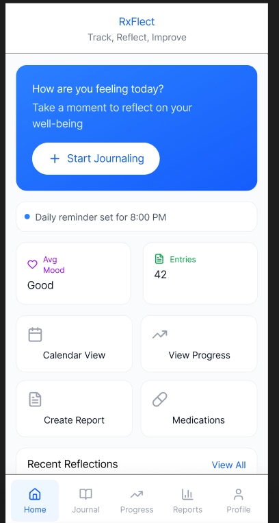
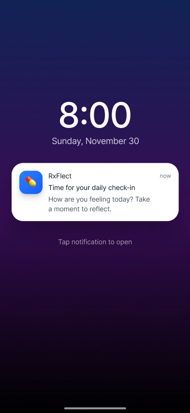
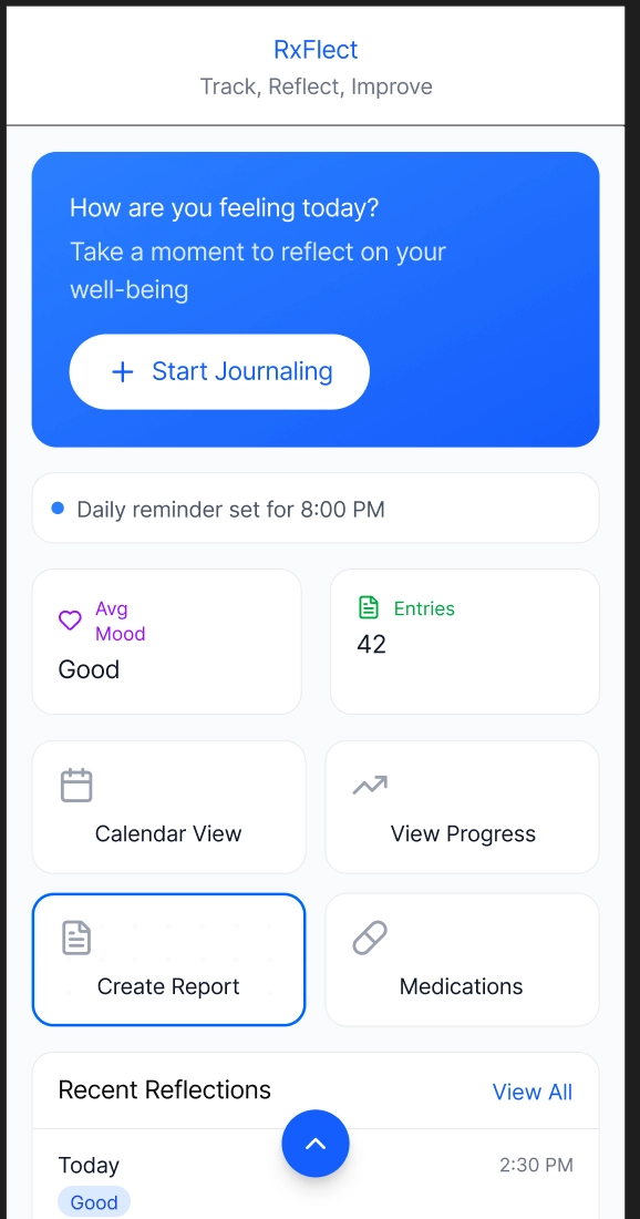
RxFlect addresses this by making reflection manageable and meaningful. The app guides users through personalized daily check-ins with adaptable prompts and automatically synthesizes entries into clear, visual reports. This turns fragmented notes into actionable insights, empowering users to understand their medication journey and communicate effectively with their care team.
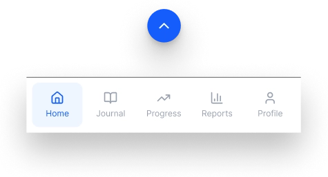
The arrow hints that the navigation bar can slide up when needed.
Design Walkthrough
RxFlect is built around two core experiences that help users better understand and communicate about their medication journey: making daily reflection effortless and transforming reflections into shareable insights. These tasks work together to make tracking symptoms and changes feel easier and more meaningful and more meaningful.
Expressing Their Well-Being Through Guided Journaling
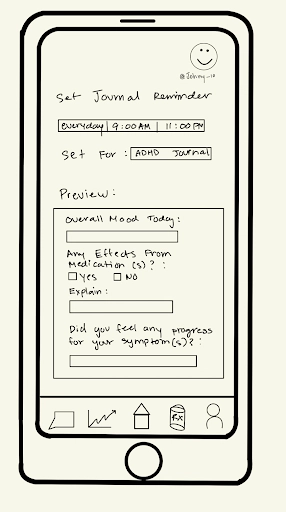
With users using Rxflect, it helps provide guiding questions based on a journaling mode and information about their medical condition and medication effects. As when user inputs their medical condition and medication, the journaling provides specific questions to different medical conditions and how much a user wants to journal. This design provides structured yet flexible journaling guidance, helping users determine what to record and how much to write based on their daily health.
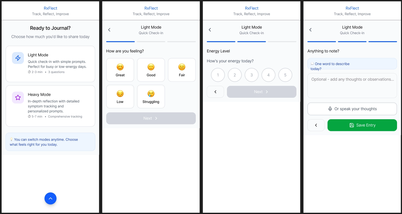
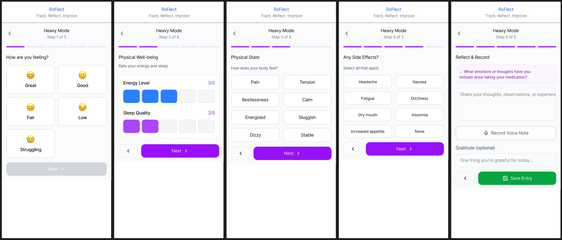
Choose between Light or Hard mode to journal depending how much a user want to journal on a given day.
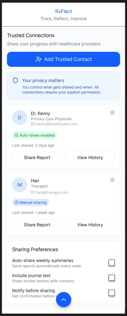
Reflecting on Medical Treatment with a Trusted Individual
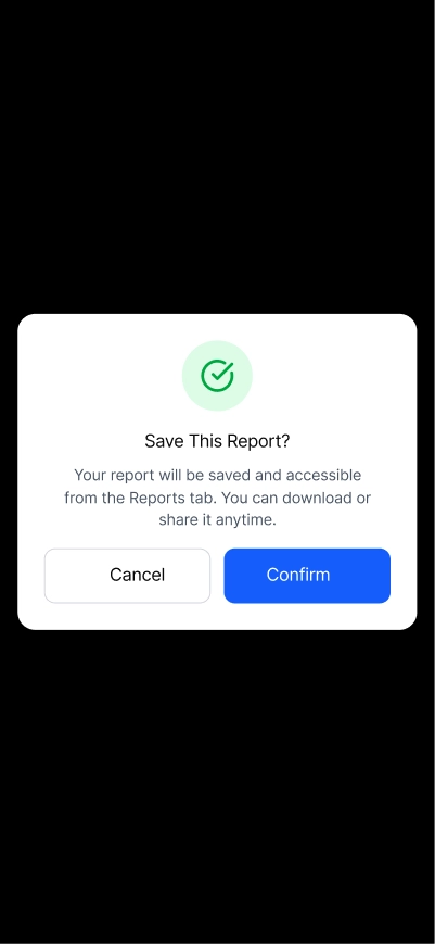
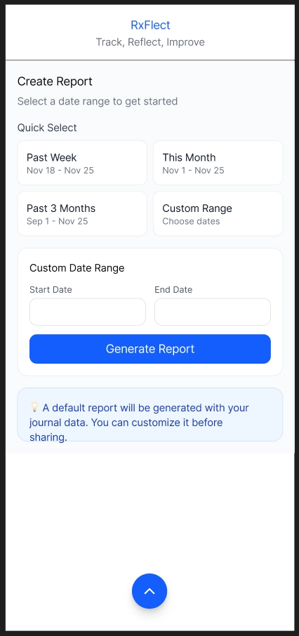
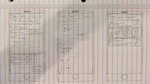
With all the journaling a user does, we wanted a way to provide users to share the information with a trusted individual. Sharing information can be difficult as it’s time consuming to review each journal entry and remember what you experienced. So to help reflect on your medical treatment, users can generate a report within a given time frame to aggregate information that they had been recording within that time frame. Furthermore, before saving the report, the user can review and edit the report to better reflect what they have been experiencing. This design helps a user better understand what they have been experiencing and provides a well informed report that they can share to discuss with trusted individuals.
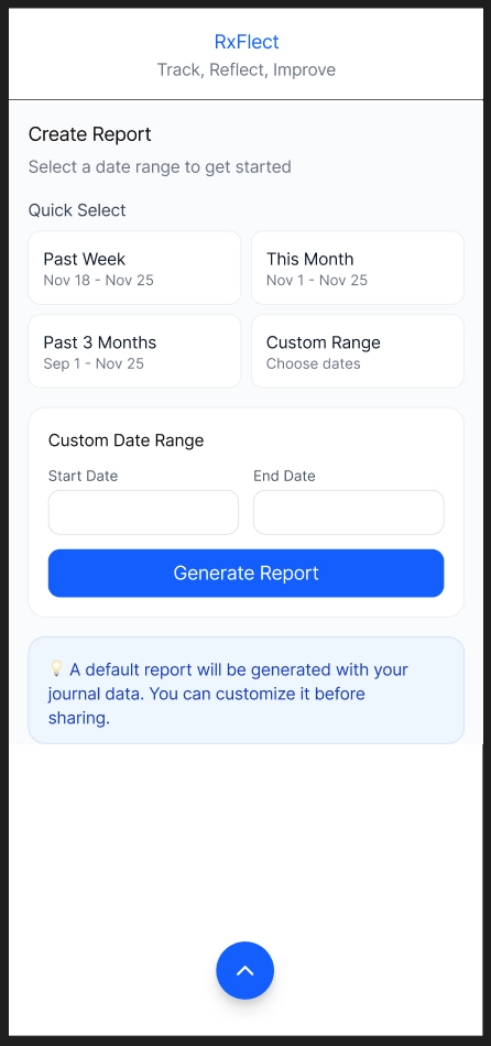
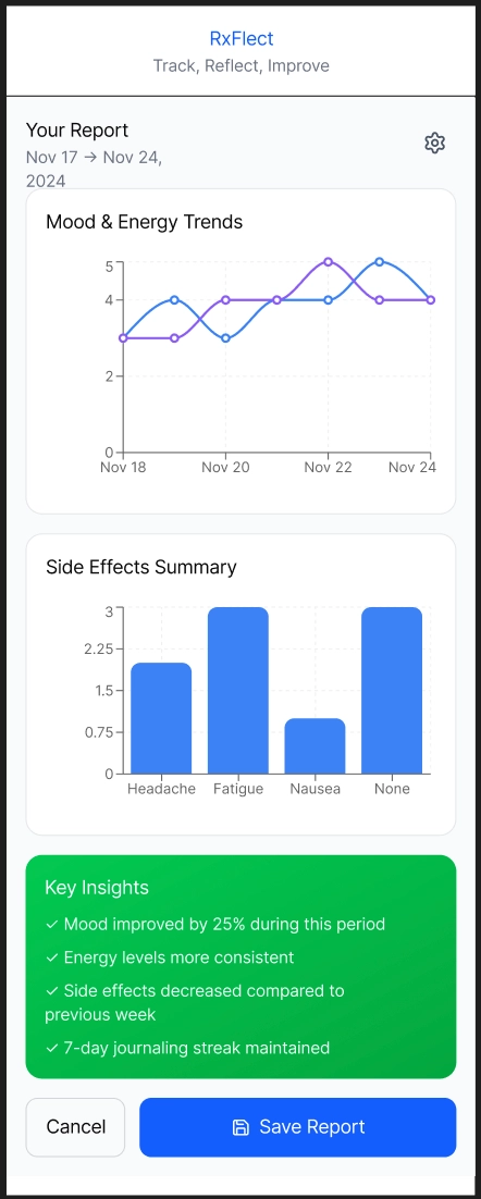
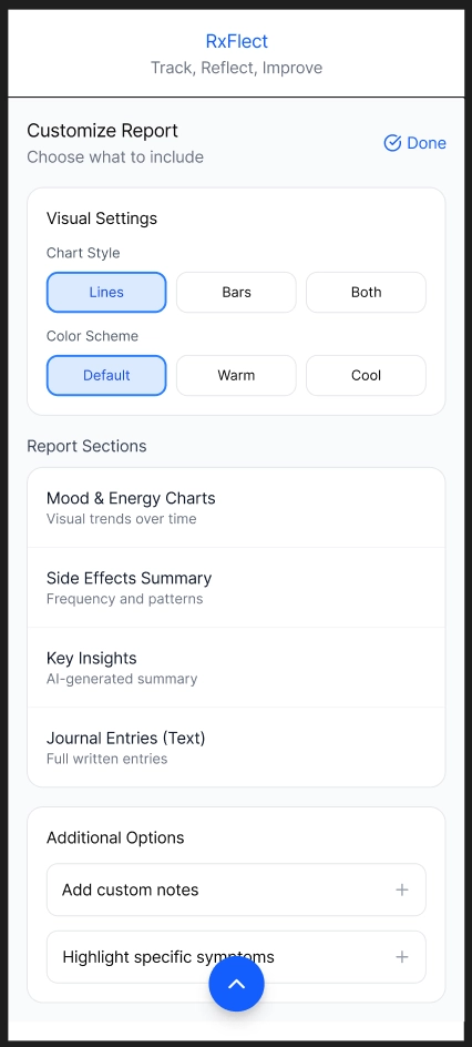
Users can create and edit a report to better reflect on their experience with their medical condition and treatment.
Design Research and Key Insights
Our design research focused on understanding how people manage their medication routines and how they make sense of the physical and mental changes that come with it. We wanted to learn what makes symptom tracking helpful, what feels overwhelming, and what people actually need when preparing to talk with a healthcare provider or someone close to them. To do that, we interviewed participants with different levels of experience, including people currently taking medication, people who do not take any medication, and a small number of healthcare workers who regularly talk with patients about symptoms and treatment plans. We paired these interviews with early design critiques and small feedback sessions to see what parts of journaling feel helpful and what quickly becomes overwhelming. We chose interviews because medication experiences are personal, and conversations helped us understand the reasons behind users' habits and frustrations. Talking with healthcare workers also gave us a better sense of what information actually helps during check-ins and what gets lost when people do not track how they feel. This helped us design something that supports clearer communication on both sides.
Journaling Regarding Medication is Difficult
From our design research, a key insight that came up often was journaling about medication is difficult. Multiple participants expressed that they would like to journal more but are unsure what they should write about the effects of their medication. As they are not sure what is important to write, especially when they are taking multiple medications at the same time. This led us to wanting to focus on making journaling easier and help understand common symptoms that might be worth noting down. This resulted in Rxflect to have guiding questions for journaling, common symptoms for specific medical conditions, and medicine side effects and interactions of other medicine.
Clear Visualization of Patient History and Reporting
Interviews with both patients and clinicians showed how difficult it is to make sense of large amounts of unorganized medical information. Healthcare professionals like Cenny and Derpy highlighted the need for clear weekly or monthly trends, simple timelines of key events in a patient's medical journey, and easy visuals that help clinicians quickly understand consistency or changes in a patient’s condition. Issues such as recency bias and incomplete or overly vague patient recollections further reinforced the importance of accessible, accurate historical context. These findings shaped the design direction toward creating clear visualizations based on patient history and reporting, such as graphs, to help doctors efficiently review patient histories and make more informed decisions.
Clear Summaries for Communication Between Patients and Doctors
Finally, our design research also revealed major communication gaps around treatment updates. Patients such as Patch and Benny tended to focus on only the most recent weeks when speaking with doctors, even with consistent journaling, leading to discussions with their doctor about their most recent state, not their state throughout the treatment. Healthcare professionals like Cenny and Derpy noted that they typically had to almost rely entirely on patients’ reports, and their prescription refill dates which may not reflect actual day-to-day behavior or feelings. This finding guided the design toward creating concise and cumulative summaries and reports to help present accurate and balanced information between patients and their doctor.
Iterative Design and Key Insights
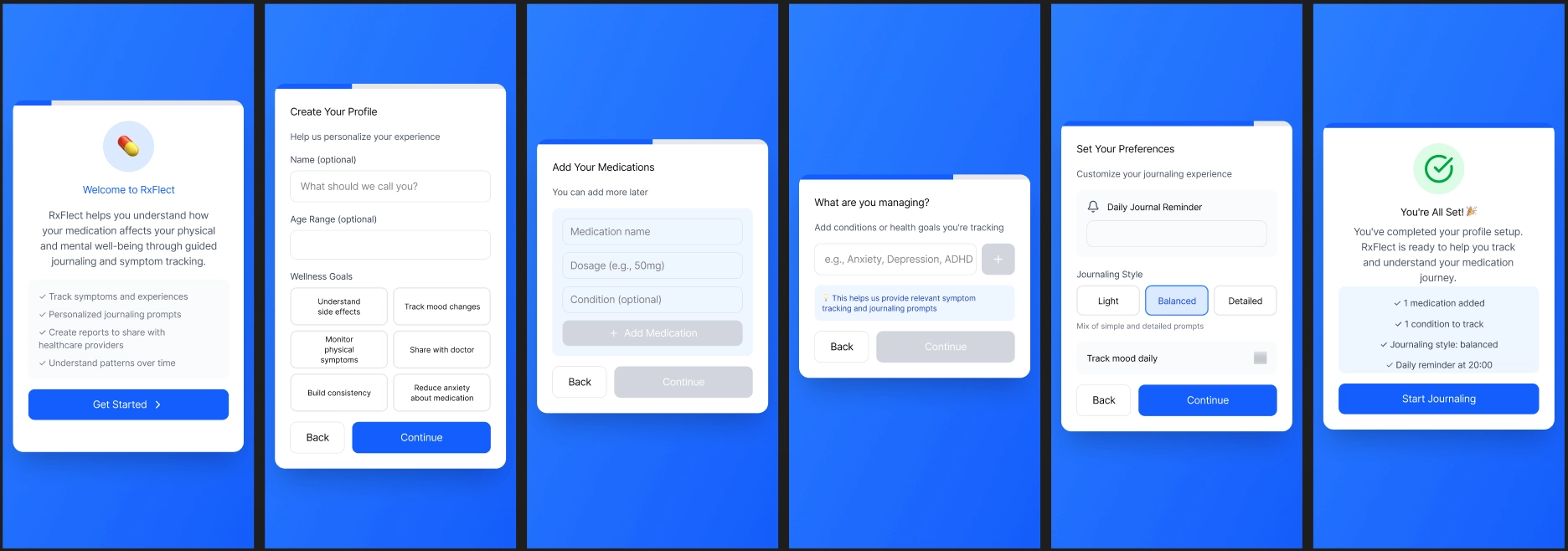
Our iterative design process began with many sketches to get our initial ideas into potential designs, with storyboards better defining our focus tasks from our interviews, creating user personas, and narrowing down our target audience. This led to us initially choosing a high level journaling health design but upon reflection, we realized we were trying to encapsulate all different types of medications and symptoms to record, even if it wasn’t specific to a patient and their medication. So upon further discussion and iteration, we wanted the journaling to be more personalized with their conditions rather than a generic template to capture everything.
Once we decided on this design, we started creating paper prototypes with the goal of allowing people to have personalized journaling based on their medical condition they want to track and improve communication with trusted individuals. With our initial paper prototype, we conducted heuristics and usability tests with our peers. Through heuristic tests, we identified areas of improvements regarding navigation of our pages, lack of system confirmations, and consistency. Whereas the usability tests revealed more functionality problems with users such as users feeling restrictive with the app and potential of being overwhelmed depending on a user's day. Thus with these insights, our revisions with our paper prototype to digital mockup focused on a simpler design, more user control, and flexibility of core features.
Minimalistic Design
In our design process, we wanted to ensure that our design would be minimalistic to avoid people being overwhelmed and can easily journal. Still, in our heuristic and usability testing, many people commented inconsistencies with home bar, icons, and layout of pages. This is in part that we had multiple people drawing the paper prototypes, which led to conflicting visuals and layouts. So going into our digital mock up, we standardized how we wanted our layout and visuals to look to ensure consistency is upheld to satisfy our minimalist design.
Preview screen(left) originally wasn't clear how to exit, what it achievied, had a confusing layout and what you could select. In the revised preview(right), made it clear what you have accomplished with a straighfoward button to move on to the next task.
Presentation of Information
Participants commented that a lot of screens either showed too much information at once or did not show enough for users to understand what was happening. For example, the calendar screen did not show which days the user actually journaled, so people were confused about what days they could review. On the journaling side, some participants felt overwhelmed by long lists of prompts, while others wanted more context or simpler options.
In response to this feedback, we redesigned key screens to convey more or reduced information so users don’t feel overwhelmed nor get lost. Such as our calendar screen now has color icons to indicate different types of actions a user did and reducing the journaling prompts text into more slides to not overwhelm the user with info.
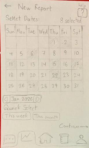
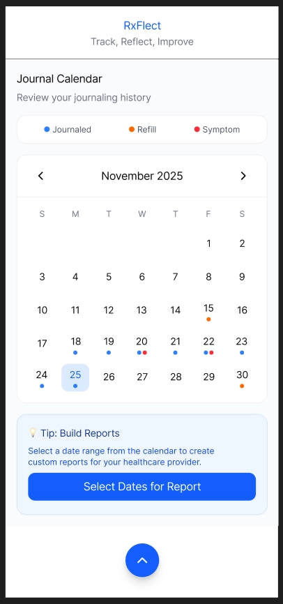
Left image was our initial calendar design to select days to report for journaling, where the right image is our revised version to help show more actions a user done.
Flexibility of Journaling and Report Creation
From our usability testing, we realized that the overall flow of the app felt too strict and did not match how people actually journal or create reports. A lot of participants said they felt “locked in” to a certain path. For example, the journaling screen always showed the same types of prompts, even if the user was not feeling that way that day. Some users wanted to skip questions or choose an easier option, while others wanted space to write more. The report creation flow also forced users through every step in a fixed order, which made things feel slow and repetitive.
These reactions showed us that our design needed more flexibility so people could choose how they want to interact with the app on different days. We updated the journaling flow to support different levels of detail and added more optional steps. We also loosened the report creation process so users can jump between sections without being forced into a single path.