
Team
Song
Lopez-Martinez

Sheng

Raghunathan

Shao

Problem and Design Overview
Many people fall victim to unsustainable clothing habits (e.g., impulse purchases, irregular closet maintenance), despite being aware of existing sustainable practices. We see that people tend to accumulate clothing over time as a by-product of their lifestyle and environment.
There is a clear need for a convenient and accessible tool that would help bridge the gap between simply consuming and taking action in a way that reinforces sustainable habits. Current common habits include donations and hand-me-downs, but other options are often hard to come by and organize for, especially beyond close personal circles.
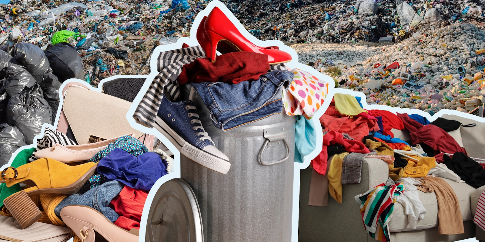
In the US, about 17 million tons of textile waste is produced annually, with most of it ending up in landfills.
Our app aims to go beyond building a digital closet by incorporating outfit tracking habits and building community through shared senses of style to build sustainability in practices people already engage in naturally. Track, RE:FORM, Style: an article swap platform for users to sustainably explore styles and clothing. The platform enables users to curate their personal style and see what they wear most, create a digital closet with outfit checks, and build a community through local clothing swap events, removing the stress of expenses from fashion while staying sustainable!
Design Walkthrough
Our design aims to help users track and explore different ways of styling clothing items, while also encouraging them to engage and trade with people around the area who share a similar sense of style. By centering this process on a mobile application, individuals can conveniently log and track their outfits while also connecting with others who share the goals of building style and sustainability.
Building Personal Style Through Outfit Management
When users start building their digital closet, their outfits can be uploaded through (out)fit checks, which can be uploaded to a clothing inventory or to a social feed. Users have the option to add tags to individual pieces, which allows for convenient organization and categorization. They can also add individual items to their digital closet along with items extracted from their (out)fit checks.
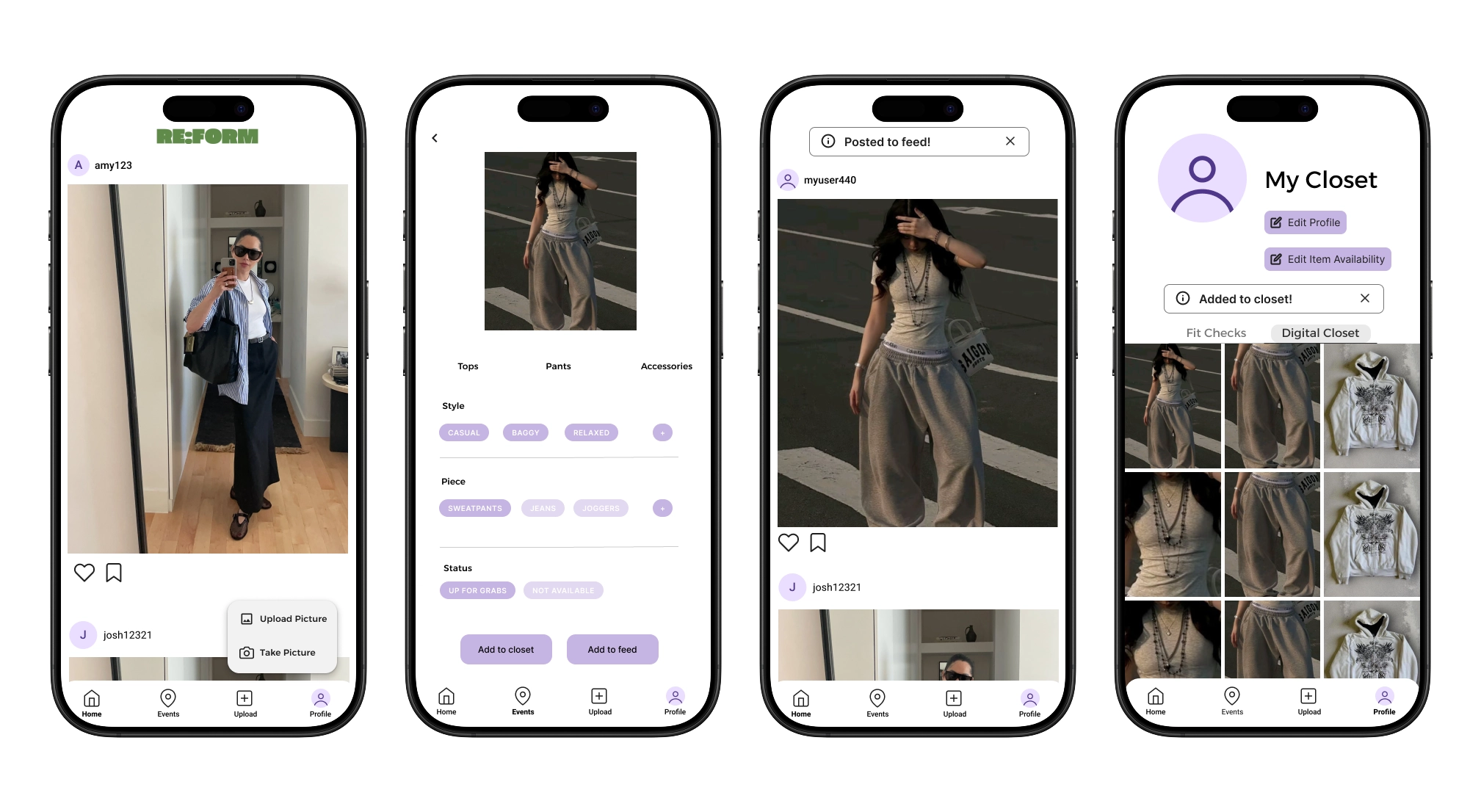
Users can keep track of fits (whether they choose to share or not to their friends), as well as label articles with tags.
Users can edit the availability of their clothes for others to see.
Explore Social Clothing Events
As users start to build their digital closets, they can also explore community clothing swapping events around the area. Events are organized by various factors, including location, style/occasion, and mutual degrees of connection. Users can create and attend various clothing events, meet users with similar styles, and explore and preview items in others’ closets.
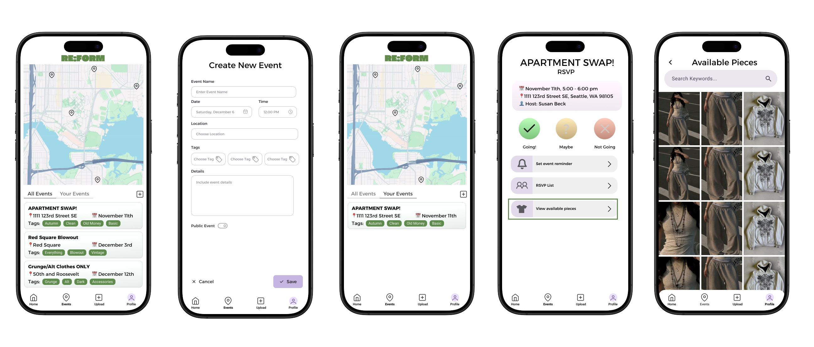
Users are able to create and join public or private events local in the area, and can scope out pieces ahead of time.
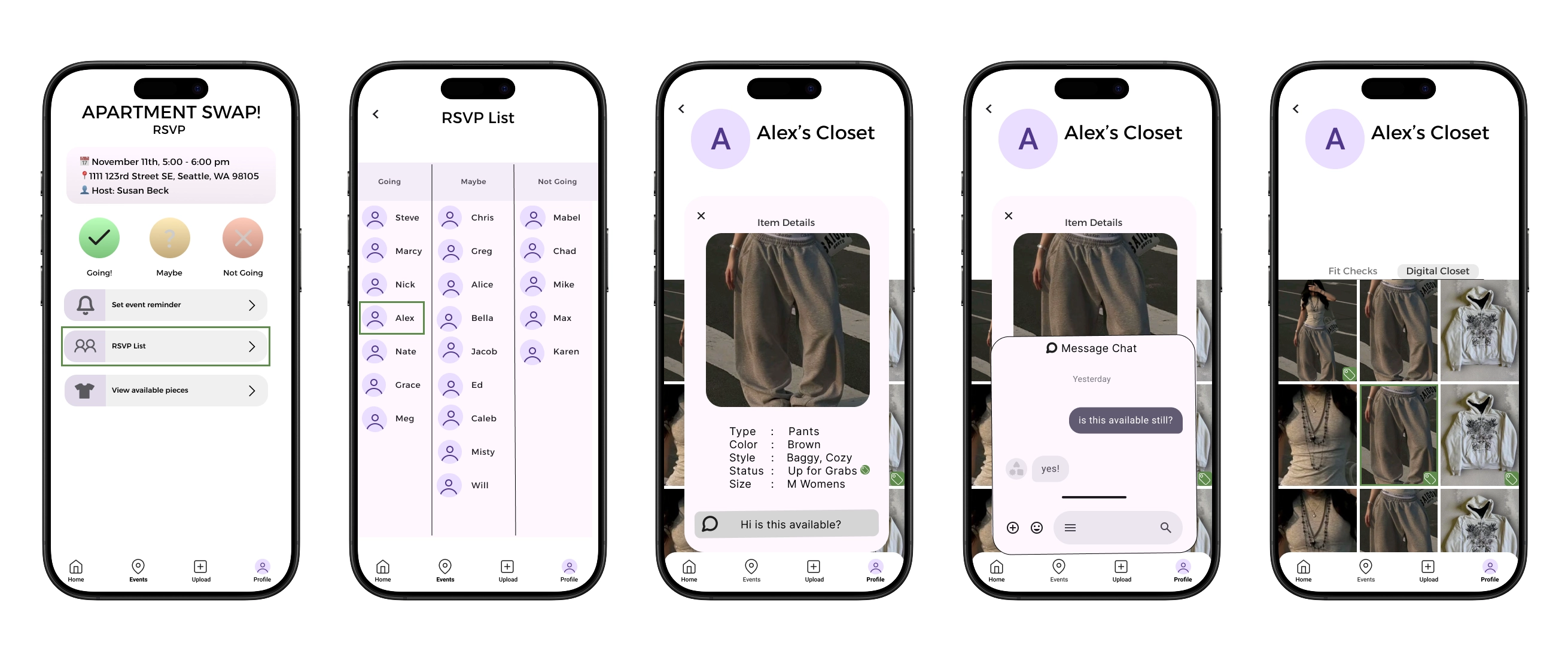
Users can see the profiles of other users attending events.
Design Research and Key Insights
We focused our design research to learn more about how people have developed their personal relationship with sustainability and their closets over time. Our research aimed to understand the various sustainable habits people already have with their clothes, as well as the barriers they commonly run into (costs, knowledge, etc). Ultimately, we wanted to gain a deeper understanding of the motivations and barriers that influence how people incorporate sustainability into their clothing habits.
Our design research was conducted through a series of 1:1 interviews with individuals from similar socio-economic backgrounds, but varying experiences with sustainability and style. We decided this was the best research method since we were able to create personalized and reflective conversations with our participants to more learn about how their environment and communities shape their relationship with their clothes.
Communities and Socialization Affect Style and Sustainability
Our primary goal was to promote sustainability, and identifying this important factor created a pathway toward that goal. Communities influence behaviors; as one participant said, “I’m inspired by people around me and surrounded by people who care [about sustainability].” This impacts both personal style and sustainable habits, so we wanted our platform to emphasize both facets. Multiple participants mentioned they explore styles and outfits through social media, such as Pinterest and TikTok. This, in combination with our knowledge of how community influences sustainability, motivated us to structure our platform similar to social media. One participant also mentioned holding “mini thrift trades” with friends, which served as inspiration for the clothing swap events to bring people together beyond their own circles.
Shared experiences and fulfillment results in better retainment and satisfaction.
Avoiding Shopping Barriers
One of the main barriers to sustainable shopping is the lack of affordable options. Ethical labor and natural materials often reflect the cost of new clothing, which can deter people despite being aware of sustainable fashion. Fast fashion, on the other hand, is cheap and convenient, and multiple participants reported buying from fast fashion even though they want to be sustainable and ethical. To create an alternative that stays one level cheaper than fast fashion, we deliberately omitted a price tag to convey the intention of all items being free. This moves our platform away from shopping and encourages users to form sustainable habits with existing clothes. For convenience, we created a messaging and communication system. The original idea was a mass group chat for clothing swap events, but eventually pivoted to private messages about specific clothing articles for better organization and management.
Without the additional processes of shopping, people are more inclined to practice sustainably while feeling fulfilled!
Low-Effort Usage Maintains Engagement
Another main barrier that we found was that most users don’t have the time nor energy to be manually uploading pieces of their closet and accessories with each new update. While there are many apps already out there that support digital closet functionality, most people do not use them because of how much manual setup and updating they require. In order to create something that people would actually use, it would need to be easily accessible with minimal menial work from the user themselves. Thus, we tackled this problem by implementing the use of artificial intelligence, in which a person’s uploaded photos (whether that be through fit checks, close up of articles, or even mundane photos in their camera roll) are analyzed to derive what items a user has in their closet. The app will automatically upload their findings into the user’s digital closet, requiring the user to do nothing more than a quick set up configuration and continued interaction with the community through fit checks (if they choose to do so, but not required).
Iterative Design and Key Insights
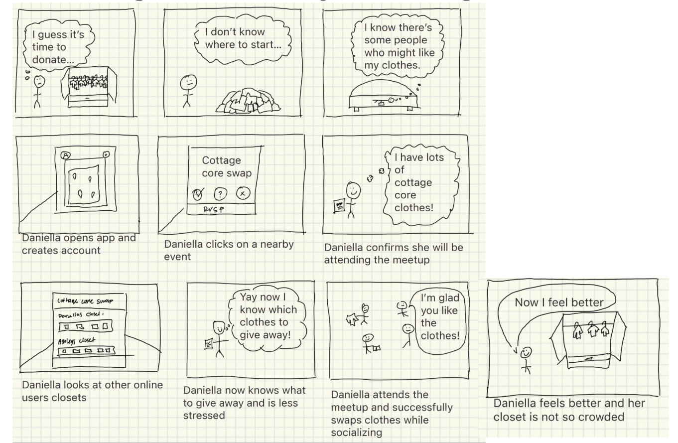
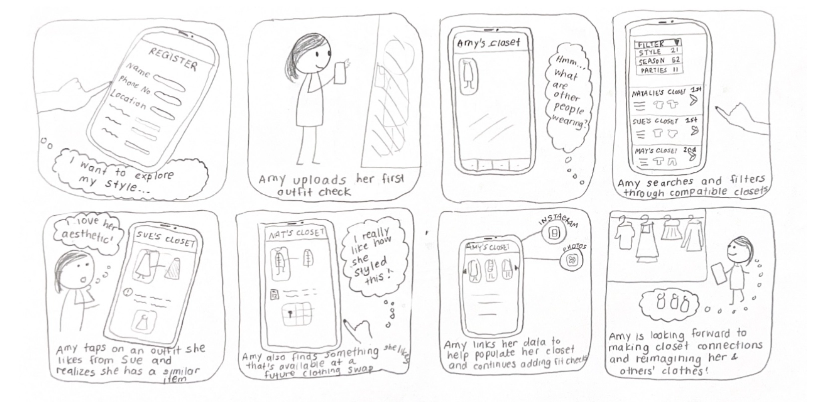
Our iterative design process focused on creating a platform that felt intuitive and convenient to navigate, while also ensuring users felt confident in their ability to manage and connect their information with others. In the early stages of paper prototyping, we initially had a rough idea of how we envisioned user profiles and event pages would look. Through inspection and usability testing, we were able to fine-tune specific aspects of this design to improve app navigation and user control, especially while moving between different screens. In our digital mockup, we were then able to bring these improvements together by introducing more consistency through cohesive design choices.
Confirmation Interrupting Workflow
In early versions of the paper prototype, there was a heavy usage of small pop-ups that were used to confirm the actions made by the user, such as having created or saved a swap event, were successful. Through testing, we were able to identify a common issue that came up from the testers, where we observed that most of them would have some hesitation or confusion when interacting with the indicators/pop-ups. Based on this, we decided to change them to be temporary pop-ups in empty spaces on the screen that were unused, so they wouldn't block user interactions and could be manually dismissed by a clear ‘X’ on the corner of the pop-up. This redesign reduced confusion, respected the flow between the user and the design. And allowed the users to continue to use the app with full confidence when it comes to receiving confirmation notifications of their actions, overall resulting in the experience being a lot smoother and intuitive for users.
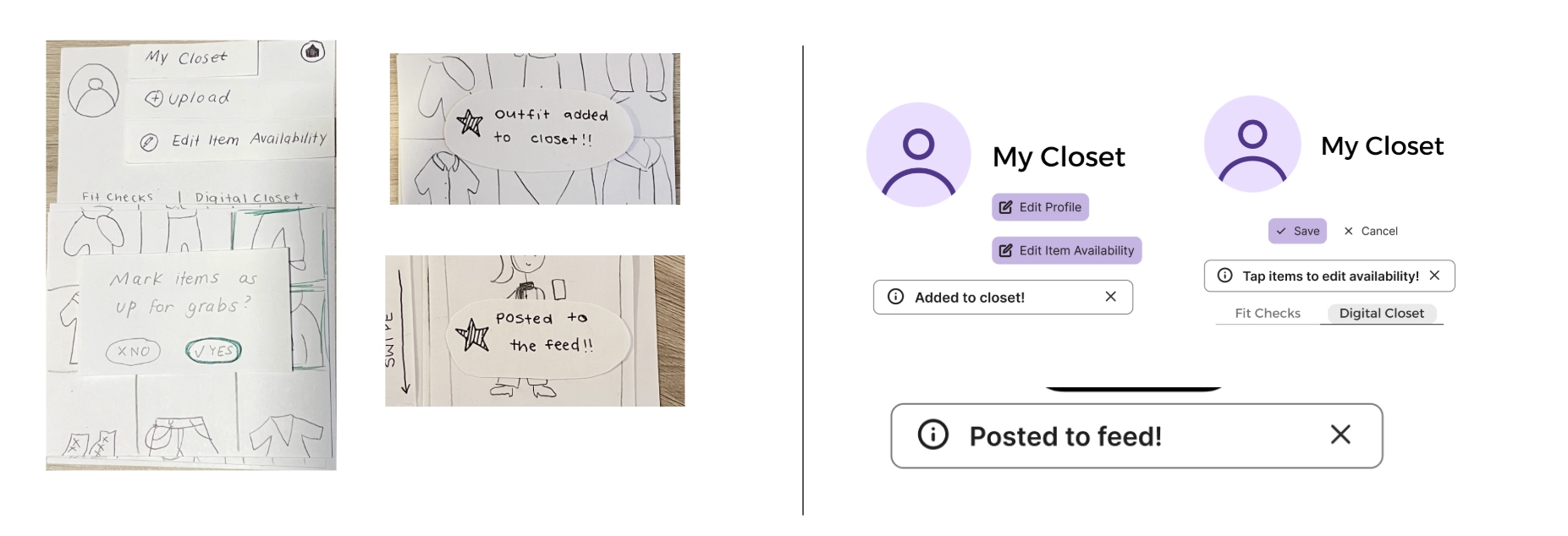
This shows the before and after of us applying the changes to the pop up notifications.
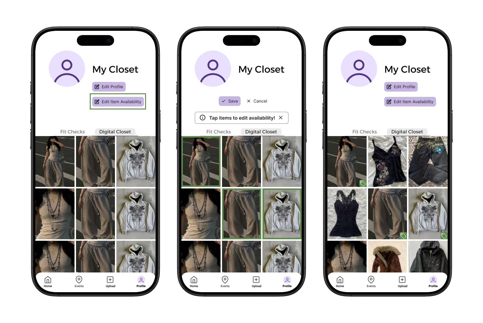
Ambiguity of Article Status
We received feedback that our initial indicator of item availability (a green lock) was too vague and/or was missing explanation/context that specified its purpose in our design. We also had confusion on whether our original lock design indicated an item being available, unavailable, or in need of selection. Based on this feedback, we chose to revise our design to a green dot and to add more states to the screen to indicate selection; however, after our usability testings, we received more insight on how users were still unclear about the green icon as well as system status. After our heuristic evaluations and usability testing, we understood the need to change the icon to a universally understandable icon (i.e. price tag) to convey availability while also adding clear confirmation messages and instructions on how to edit an item’s availability.
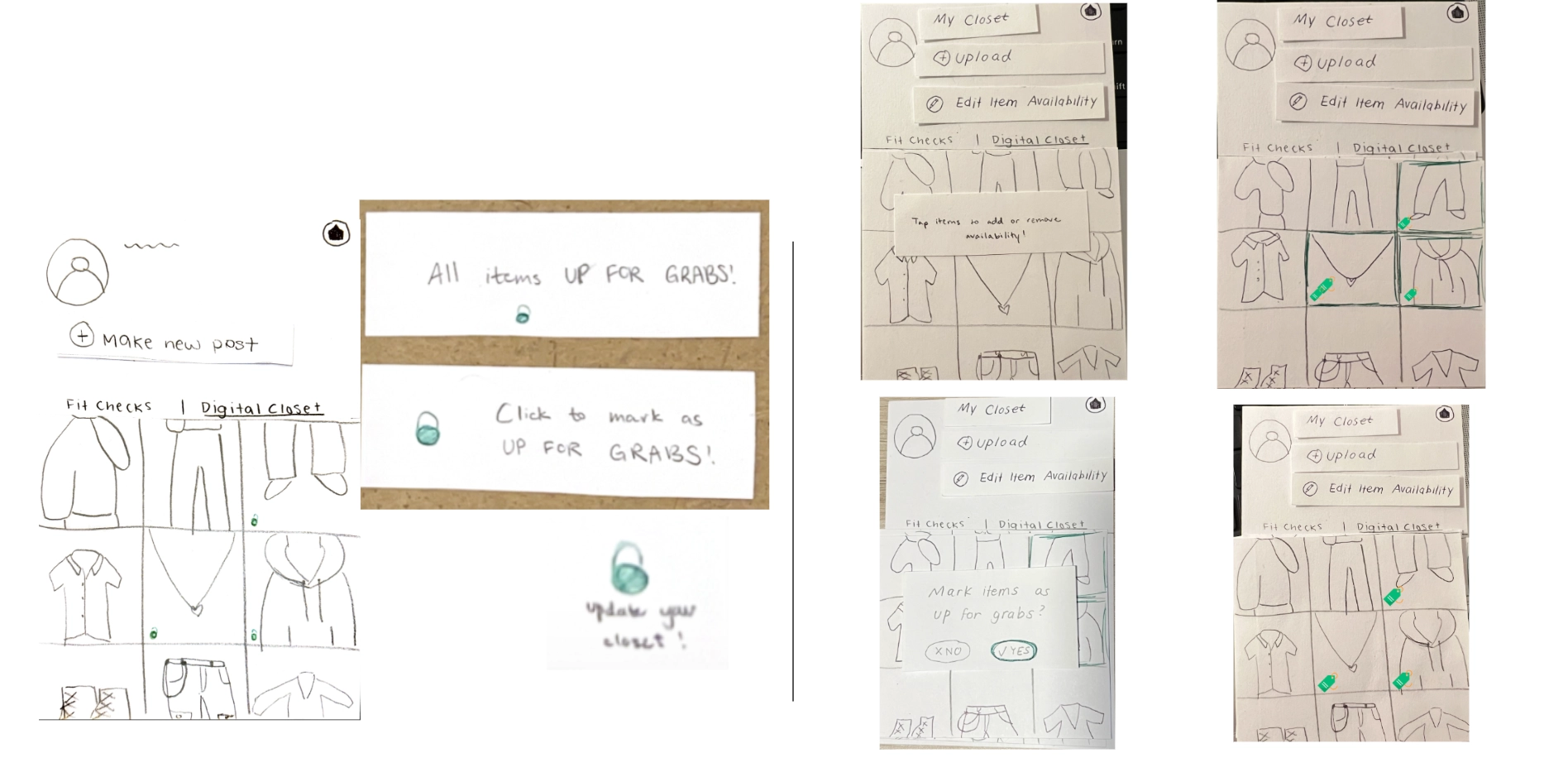
This shows the before and after of us applying the visual changes to indicate the availability of an item.
Consistency During Navigation
The navigation bar was something we had discussed near the end of our paper prototype. Initially, we just placed back/home buttons wherever we saw fit or when we thought navigation was needed - this was fine for a few screens but eventually it became disorganized, inconsistent, and occasionally even missing. This would often trap our usability testers in certain pages or cause confusion due to the inconsistent placing of back buttons and icons. We decided to switch to a standard navigation bar at the bottom of the screen so users would have an easier time navigating, while still having the capability to go back just one screen. This also allowed us to simplify navigation to events and to create posts, creating a centralized area for all main functions.
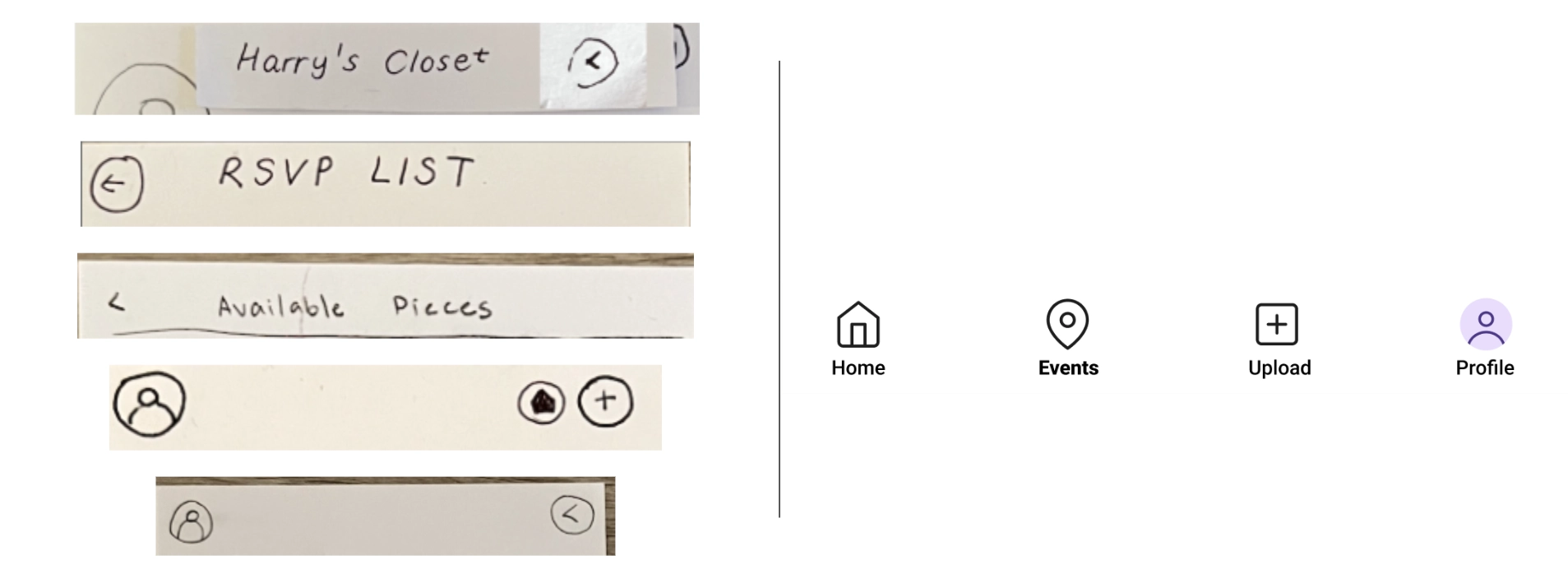
This shows the before and after of us applying a navigation bar in response to inconsistencies.