Abroad
Knowledge Travels
Team
she/her

he/him
he/him

she/her

he/him
Problem and Design Overview
Traveling alone to a foreign country for an extended period is difficult. Study abroad students from across America often enter these experiences with no connections and little knowledge of how to enrich their time outside of academics. While there are many travel and student apps for organization, language learning, cultural education, and transportation, none connect them with one of the most helpful data sources there is: Other travelers, past and present.
Abroad is an event-finding social app that uses this data to enrich the study abroad experience. With so many students traveling abroad every year but little communication or transfer of knowledge between them, a hub that connects current study abroad students with reviews and reflections from the past helps them better inform themselves before visiting destinations or attending events. Abroad allows any user to create events or discover others. From there, students can learn from past related events in the same location, meet other attendees in person, and create more informed discoveries for themselves.
Study abroad is almost always an enriching experience for college-age students, but making connections and discovering popular local events along the way makes it even better.
Design Walkthrough
After identifying relevant data sources— primarily other past and present study abroad students— we turned our focus toward providing usability in the areas that mattered most to our target audience: improving their experience by making connections with others and discovering more niche local events. These goals were straightforward at a high level, but challenging to translate into concrete interaction patterns and interface details. For example, social connections could simply be established through familiar patterns from standard social media apps, but doing so risked turning Abroad into just another feed and diluting what makes study abroad feel special and place-based. Similarly, we could have focused on displaying maps of “hot spot” local events (an early design direction we considered seriously), but that approach would have undermined the tangible, specific, and niche advice we aim to surface by leveraging past travelers as a data source. The following design walkthrough illustrates how we navigated these tensions— balancing familiarity with novelty— and how key screens and interactions support meaningful connections, localized discovery, and richer study abroad experiences.
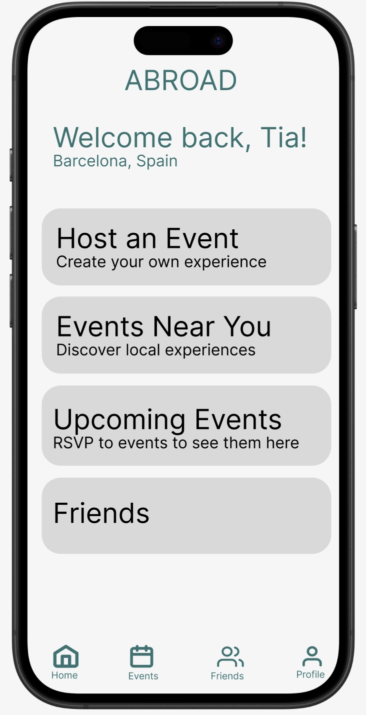
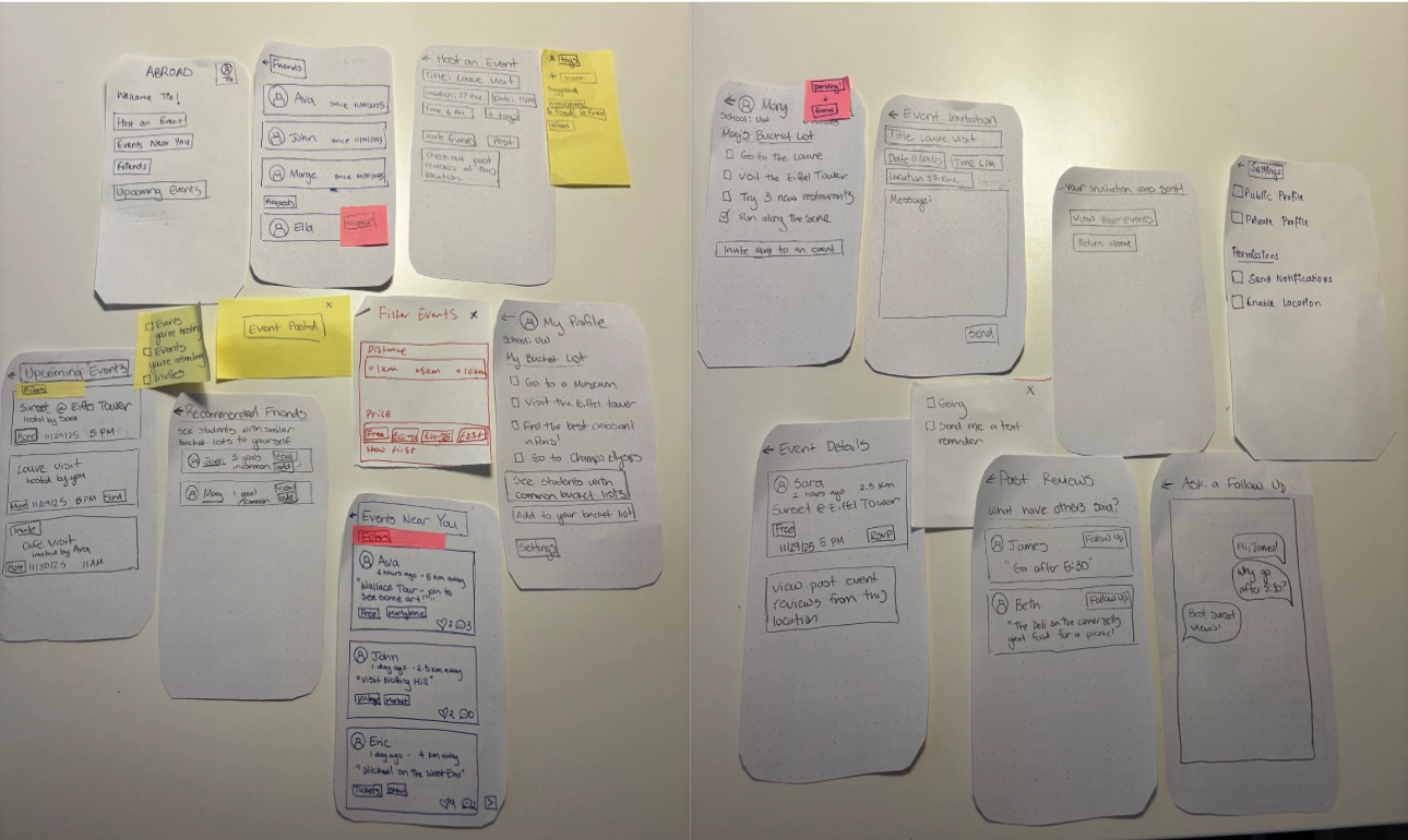
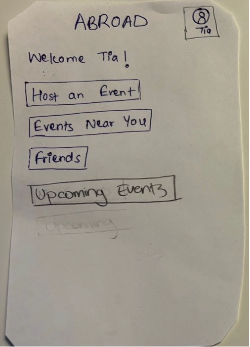
The initial screen can direct users to discover events near them. Users can additionally make thier own events for others to join.
Finding local events
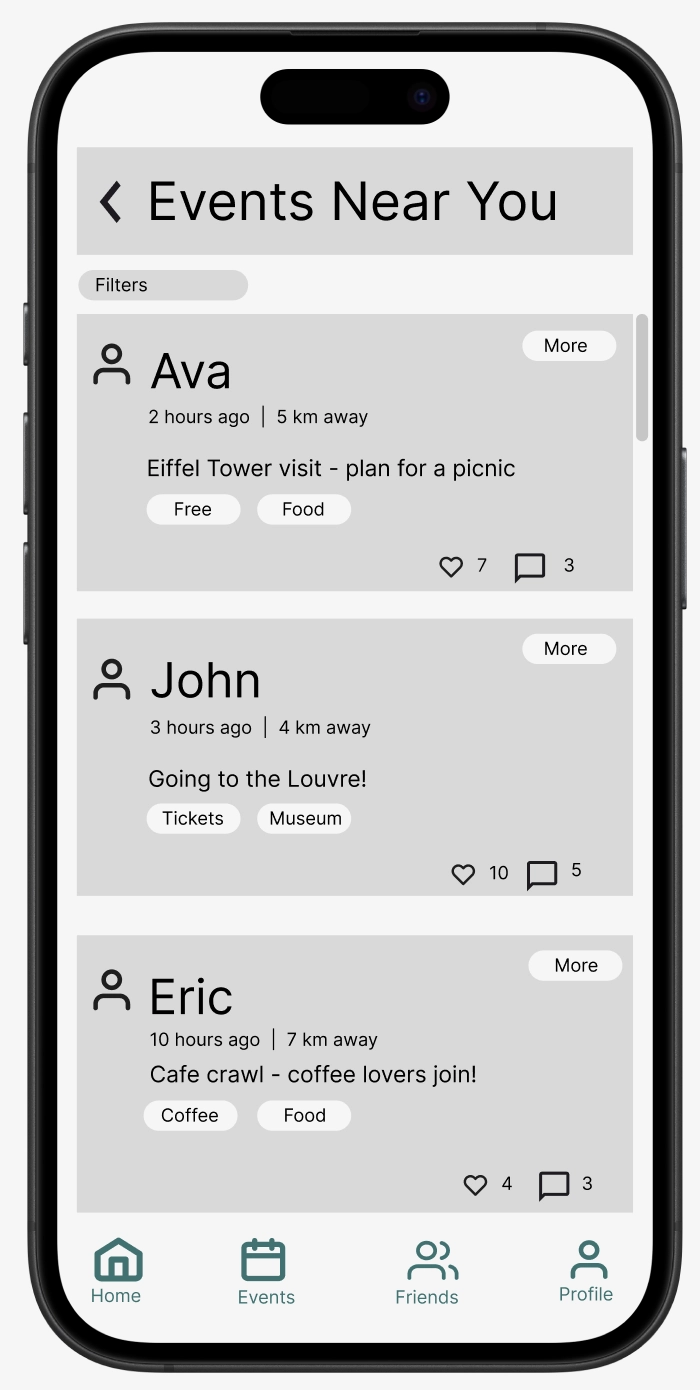
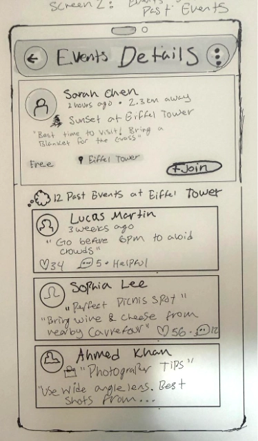
The core feature of the app revolves around 'events'. Any user can make an event, or discover other users' events. These are filtered by location, price to attend, date, number of people going, and how many 'friends' you have going. This makes it so that users can find events conducive to their school schedule and location, and can either opt to go to events with people they haven't met yet on the app, or go with friends. Importantly, by accessing the event details, users can see what others in the past have commented / reflected on about previous events in similar locations. For example, if user Ava is organizing a visit at a cafe near the Eiffel Tower, others who have visited will have their experiences show up in the event details: for instance, the app finds James' old comment about how 5:30 is the perfect time to go in fall, which may help Ava and her event attendees to refine their event. These recommendations / past reviews are organized by exact proximity (ones that are closest appear first), or when enough have been looked over, the number of upvotes they have. 'Events' can range from generic things like visiting the Eiffel Tower, to more small / niche meetups at little known cafes, all the way to day-long or one-time events that are planned in advance. Tags relating to these ("meetup", "landmark", "festival" may be a couple, for example) can also be established in making events and filtered by users searching for more events.
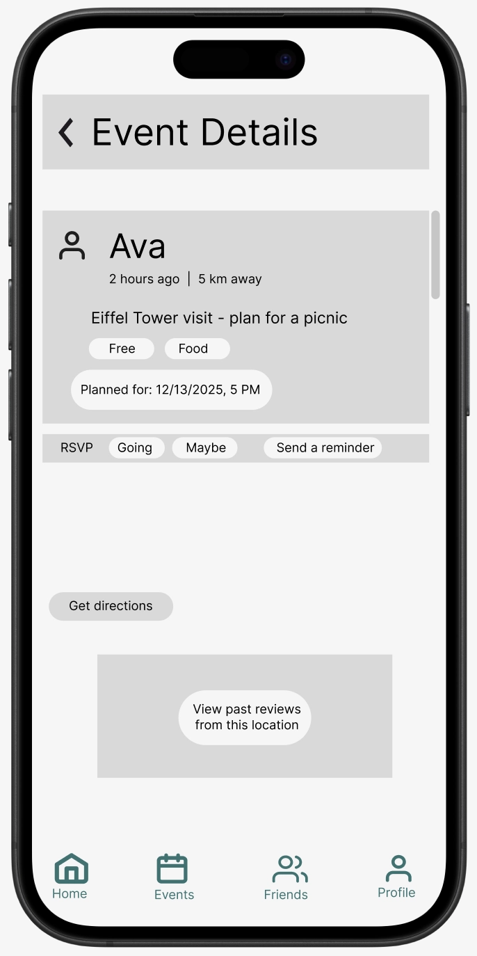
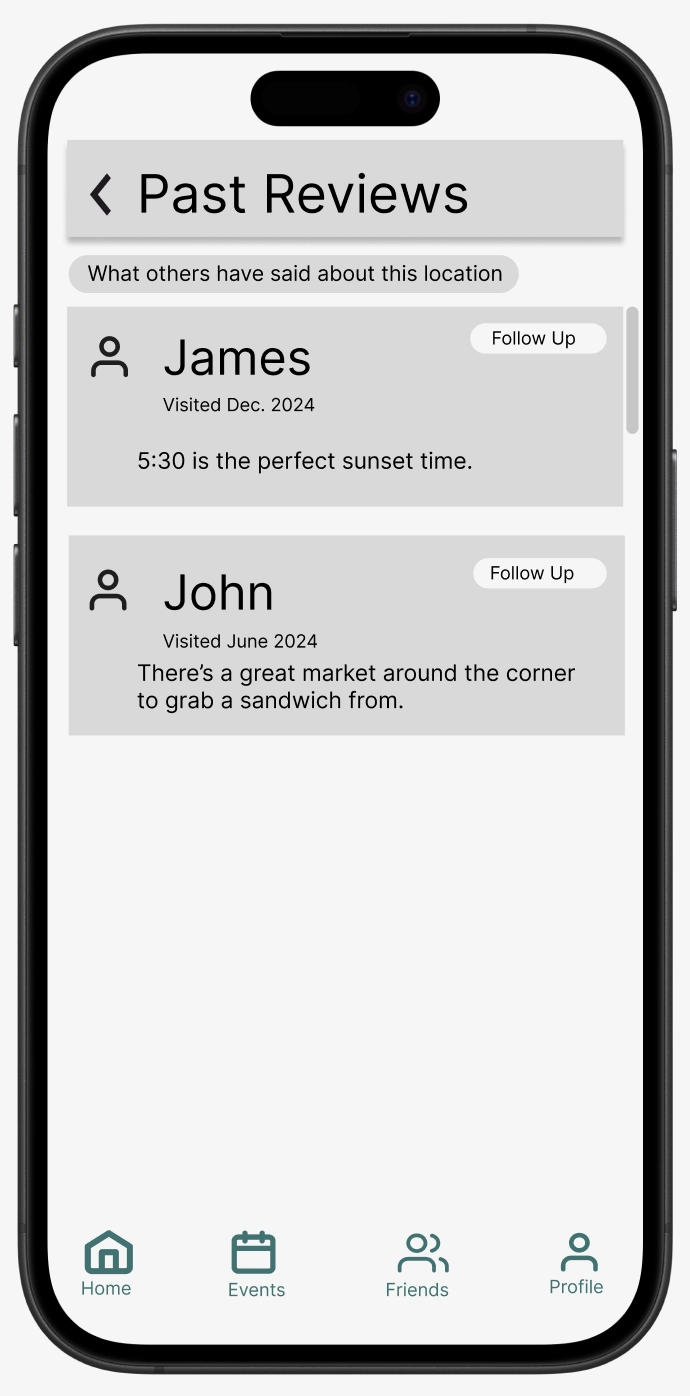
Users can investigate the event details (distance away, cost if any, date, etc). Past events hosted on 'Abroad' in nearby locations and their post-event reviews will come up to inform present ones.
Making connections with other study abroad students
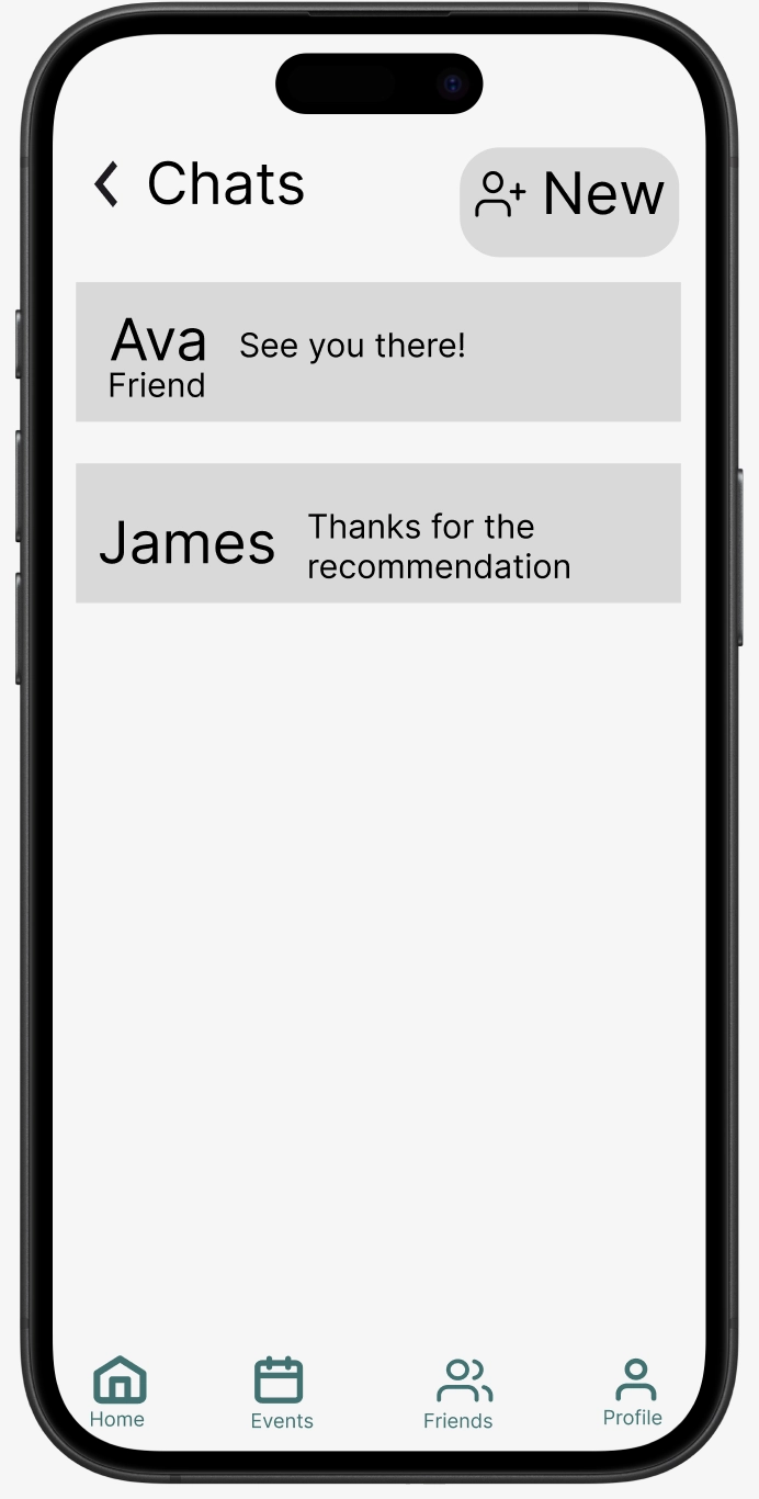
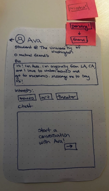
Building connections with other study abroad students creates a much more positive culture for several reasons: The stresses of planning everything aren't entirely individual, you can make lifelong friends, and discovering the places, people, and culture of a new place is always more fun with others. From the Abroad app, users can design profiles complete with their visiting country, school, major, year, and other typical info, but importantly include their 'Bucket List'. This will help to connect them with students not only nearby, but with similar interests and goals for their visit. Once students have been connected, they can chat with eachother or filter eachothers events to come up before other recommended ones.
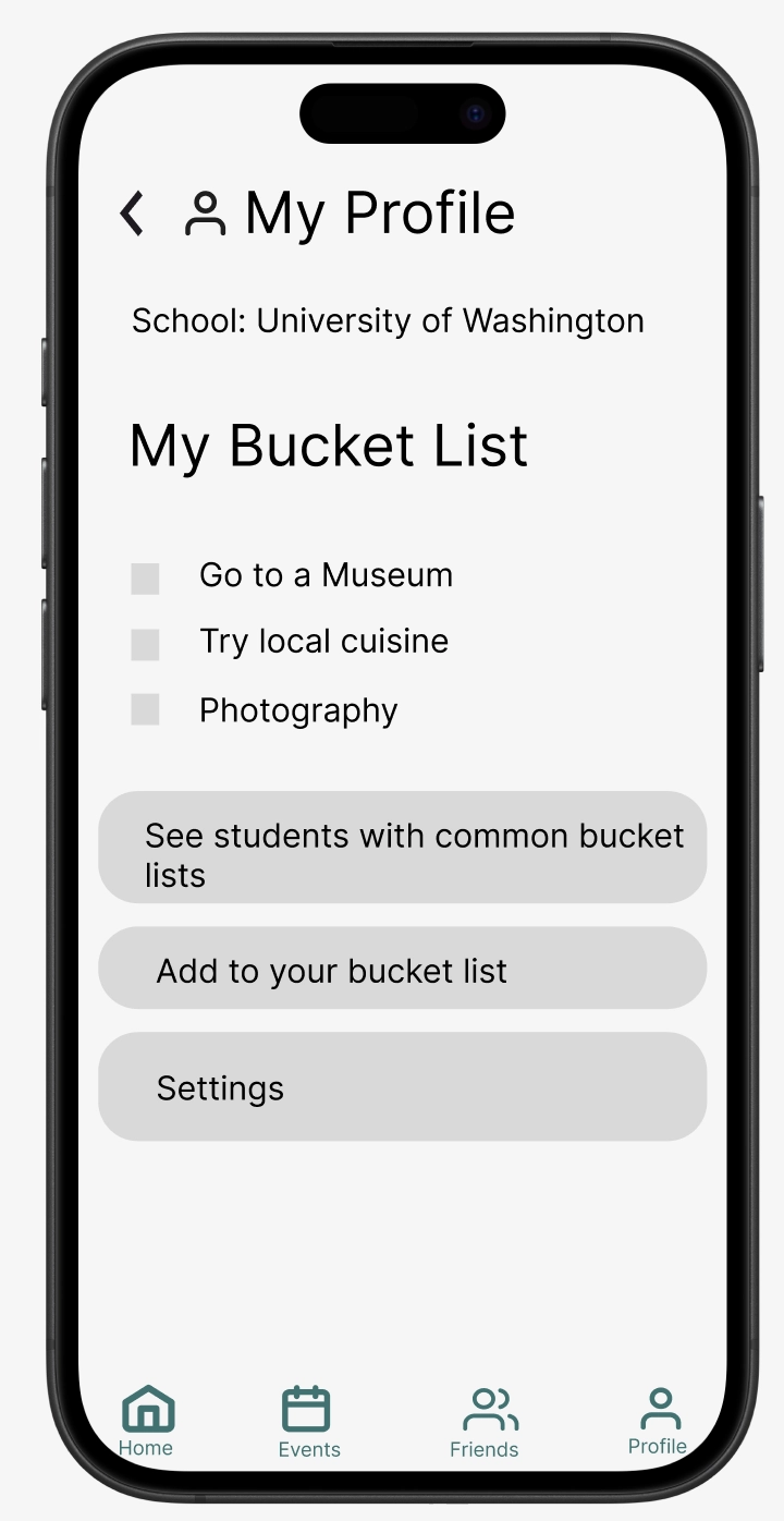
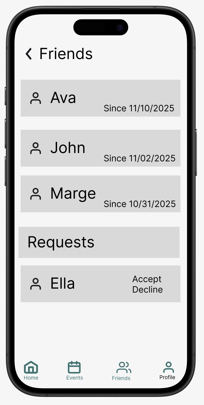
Users can make profiles, see friends, chat with friends, and discover friends with similar bucket lists.
Design Research and Key Insights
Abroad started off as more of a personal tracking app: users could personally review places they've visited and get new recommendations based on some intelligent data source and location. "Some intelligent data source" left a lot of thinking to be done -- eventually, on further iteration and determining what that magic data source might be, we discovered that the greatest and most untapped data source of all was other fellow travelers, past and present. This was largely informed through targeted research: interviews with students who had gone abroad themselves.
We conducted interviews lasting roughly 30 minutes, our interviews included 9 questions covering motivations, planning logistics, app usage, preparedness, daily routines, trusted resources, memorable experiences, and product preferences. These questions were structured to figure out emerging themes and for flexible follow-up questions. Our participants were students that recently returned from studying abroad. Each participant went to different locations for varying amounts of time ranging from 3 weeks to 3 months. These participants captured diverse experiences and this allowed us to identify patterns.
Student 1: Studied abroad in Granada, Spain for 3 months. They highlighted their positive memories in cultural immersion via local festivals and random discoveries, noting that they only found these through meeting other study abroad students in their building.
Student 2: Participated in two short-term study abroad programs, one to Tuscany, Italy and another to Jamaica. They noted the monumental difference between locations, being grateful for family friends who lived near Tuscany and wishing they had a similar human point of contact to guide them in Jamaica.
Student 3: Studied 3 months in Japan. This participant struggled to manage a detailed itinerary of what they wanted to do and where to go on top of school. They wished they had an easier time managing this through other connections in the area rather than attempting to take it all on alone.
Social connections were more valuable than convenience or time-management
While there were minor gripes about convenience in employing public transport, getting over the language barrier, and working around a student schedule, there was a strong common theme among all three inteviews we conducted: Their most memmorable experiences (and what they felt they missed out on more of) revolved around connections with others and local events. Whether time management was more difficult without being able to rely on anyone else to plan (student 3), or nearly all positive moments of discovery coming from the recommendations of others (student 1), people were always the common denominator in terms of making or breaking a study abroad experience. This opened the design task: how can we conveniently connect study abroad students and allow them to rely on each other's knowledge bases?
Travelers of the past are a massive data source
In our search for a 'magic data source' to solve of our recommendation-based design problems, interviews became extremely helpful and highlighted one we had not thought of before: travelers of the past. Student 1 was lucky enough to have had extended family who had been in the area before and give some guidance on places to visit and nuances that wouldn't be made clear on online apps or guides. Student 2 had two very short abroad experiences, and wished that they had an actual person to help guide them and offer insight rather than the often overly-general online advice.
Interviewees highlighted memorable experiences from spontaneous, free, local events

Disingenuous or overly general traveling knowledge online only leads to frustration or unmemorable experiences; human connection was far preferred.
Cultural immersion through spontaneous local events was more enriching than major attractions
Student 1 heavily praised free nearby events, and remembered these much more than the biggest and most famous ones recommended by online guides. Student 2 came into their experience heavily prepared, brining many luxury items. Throughout their stay they discovered that 'unpredictability' and unseen cultural differences bred the best stories and adventures more than the comforts of home. Student 3 highlighted that spontaneous experiences (especially social ones) led to the best memories and even long lasting connections with people they didn't know beforehand. While insight didn't directly inform one singular task, it heavily relates and helped to inform some of our initial designs and our two final tasks: making connections and discovering local social events.
Iterative Design and Key Insights
Our iterative design process for Abroad evolved significantly from the initial concept to the final digital mock up. Starting with our idealization of Abroad in Milestone 1 and 2, we quickly realized our early design lacked a focus and was turning into a kitchen sink design. In Milestone 3, we saw our designs lacked sufficient detail to support meaningful user interactions. The paper prototyping phase revealed fundamental issues with tasks flows. In particular, it became obvious that users felt overwhelmed and struggled to discover events and build connections.
We identified problems in our design through varying means: Initially, we draftied prototypes and sketches based on our own personal knowledge and of what we wanted the app to be; through design research we were able to narrow down and get new ideas on what actual users may be interested in, identifying designs which were unnecessary or unhelpful to a user. Through heuristic evaluation, we identified multiple problems, with the reviewers noting excessive text on the main event page, and how our layout wasn’t seamless and consistent. Usability testing revealed that participants couldn’t unfriend someone in the friends lists. This led to multiple redesigns including splitting event information from past reviews, introducing a bucket list feature, and adding a proper RSVP system with text reminders. Going from paper model to digital mockups forced us to properly implement details we glossed over in the paper prototype.
Our first full paper prototype design; this was more informed than initial sketches via design research methods, but still needed heavy modification following heuristic evaluation and usability testing.
Information overload obscured the core value of connecting students with past traveler experiences
During heuristic evaluation, multiple people commented that our events page was too cluttered and violated the Aesthetic and Minimalist Design heuristic by presenting too much information simultaneously. One evaluator noted “the events page having too many words for someone on a phone to reasonably read.” This criticism saw us revamp our entire events screen, opting to split it into multiple more readable screens.
The original design displayed event information (time, location, description) alongside a scrolling list of past attendees and reviews and tips. In practice, usability testers fixated on the event details and “rarely made it to the feature of interacting with past users who had also attended events” which was a key element in our design.
We fundamentally restructured the information architecture by separating these concerns. The revised design presents event details first on a cleaner, more minimal screen with a prominent “Events Near You” at the top. This then leads to a list of events that each had its main event details. Clicking on each one would then provide more information about the event and a button to show past travelers reviews and tips. This separation ensures users first understand what the event is, then can choose to see knowledge from previous travelers upon further investigation. Giving this core functionality it's own space not only helps users process information presented to them, but also allows for more of a focus on what makes our app unique.
The first iteration of the events page was too cluttered and suffered from information overload. We created a split design with cleaner events-near-you and reviews screens.
Social connection required concrete affordances, not just conceptual features
Usability testing revealed that “there's confusion by the friend requesting process, which can limit the potential networks formed.” Participants understood the concept of connecting with other students but found the route to engage with this was too convoluted, unclear, or not unique enough in design. One of the participants commented, “I want to meet people, but I don’t know where to start” while another asked, “How do I find students with similar interests?” The initial paper prototype just included a friends list and profiles but provided no mechanism for discovery or meaningful connections.
This insight extended beyond interface design, instead questioning how we were conceptualizing social features. We treated "making friends" as a single binary action (add friend: yes/no) rather than recognizing it as a process requiring scaffolding, context, and shared interest discovery. The original design showed a list of other students with a basic "Add Friend" button, but offered no information about why you might want to connect with any particular person or what you might do together.
Old 'friends page' -- no intuitive way add friends or to remove friends.
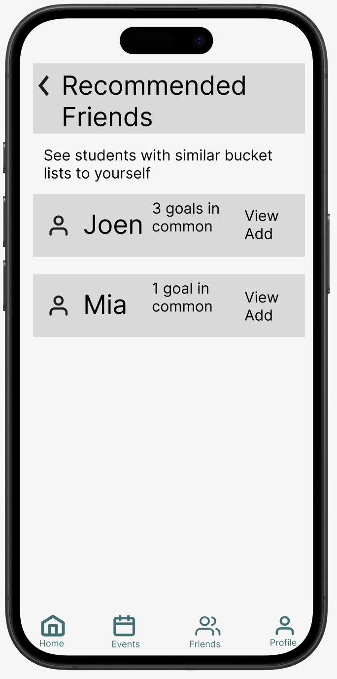
Our redesign introduced a "Bucket List" feature that transforms networking into concrete shared experiences. Users create lists of experiences they want to have like visiting the Eiffel Tower, trying ramen, or attending a sports match, and the system recommends other students with overlapping bucket list items. This provides natural conversation starters and activity partners rather than forcing cold networking. We also added event-based connection points: after attending an event, you can easily add other attendees as friends, creating connections from shared experiences. The revised friends interface shows not just names but common interests and upcoming plans, giving every connection concrete context and purpose.
A revamped friends page where you can add/remove friends and find new connections with similar interests.
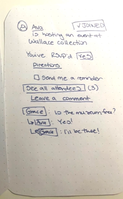
Event commitment needed trust-building mechanisms beyond a simple join button
Heuristic evaluation identified that our "Join" button violated the User Control and Freedom heuristic because users couldn't easily verify their commitment status or manage their attendance after clicking the “Join” button. Usability testing showed participants hesitated to commit to events because they lacked confidence about logistics and didn't trust they'd actually remember to attend. One participant said, "I'd join this, but I know I'll forget about it by next week." Another questioned, "Can I really get there? What if something comes up?" The original toggle between "Join" and "Joined" provided no sense of commitment, reminder system, or easy withdrawal. This insight revealed a gap between our technical model (binary event attendance: true/false) and users' needs around commitment.
Home screen showing you can host an event, see others' events near you, or see saved upcoming events.
The initial RSVP page -- no ability to unRSVP or change your status.
Students studying abroad face uncertainty: With unfamiliar transportation, unpredictable schedules, and social anxiety about attending events alone, we're faced with a complex problem in our design of social communication. A single new button couldn't address these complex concerns or build the trust needed for users to actually commit to and attend events -- thus we needed to rethink our approach.
We redesigned the entire RSVP flow into a deliberate, supportive process. The new "RSVP" button opens a modal with multiple affordances. Users can opt in for text reminders, view directions and transportation options, see who else is attending, and easily modify or cancel their RSVP status. We added an "Upcoming Events" dashboard widget that consolidates all events the user has RSVP'd to, with filters for "Events you're hosting," "Events you're attending," and "Events you've been invited to." This transformation of event commitment from a single click to a supported process directly addresses the practical barriers that kept participants from fully engaging with events in our testing sessions.
The welcome screen with small descriptions for each button for a better user experience.
New RSVP options with the ability to opt in for text reminders.