Pomopet
Team
Mitiku

Zeng

Gramelspacher

Huey

Kochhar

Problem and Design Overview
Being able to manage your time, study, and get work done is something that every student needs to do to be successful, but this can be difficult for a multitude of reasons. From structuring their schedules to effectively completing assignments, to lack of motivation, or feelings of isolation from tackling everything alone, all of these factors eventually lead to burnout and poor productivity.
Current platforms focus on only tracking individual productivity, but over-rely on self-accountability to consistently use the app and build and maintain long-term motivation, leading to an eventual return to poor productivity due to not feeling a need to get things done.
Pomopet combines a physical light-up companion that pairs with a social platform to encourage and motivate users to improve productivity through gamification and social accountability. Allowing friends to form groups to work alongside each other toward goals, unlocking collaborative rewards, gamifying productivity, and holding each other accountable to achieve their productivity goals.
Pomopet's mascot and your first productivity companion!
Design Walkthrough
While using Pomopet, users will need to know their priorities when it comes to their study sessions. What they want to focus on, how they want to complete it, and when they are most available, are all factors they need to take into consideration. Staying productive, whether by themselves or with other collaborators, is also something they need to be aware of, and know how it impacts their overall progress. That’s why our focus tasks revolve around helping users create a focused & informed plan to manage their goals, and collaborate with other users to stay productive.
Creating an Informed Plan to Manage Your Goals
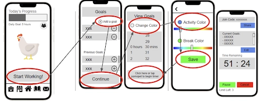
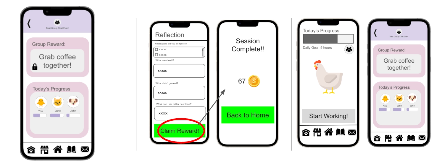
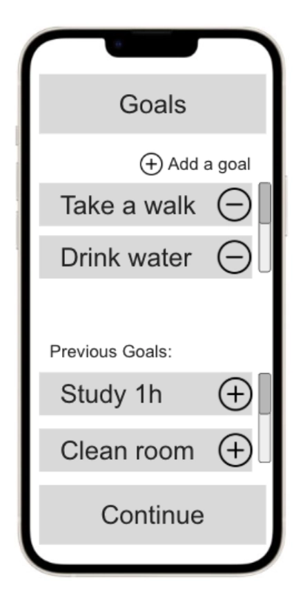
When first creating a plan, the user navigates from the home page to begin creating the goals they want to fulfill during their study session. They can adjust things like how many goals they want to set, how long their study session will be for, and what colors their Pomopet will change to during the session and breaks. After setting their preferences, they can save them, and are placed into the session.
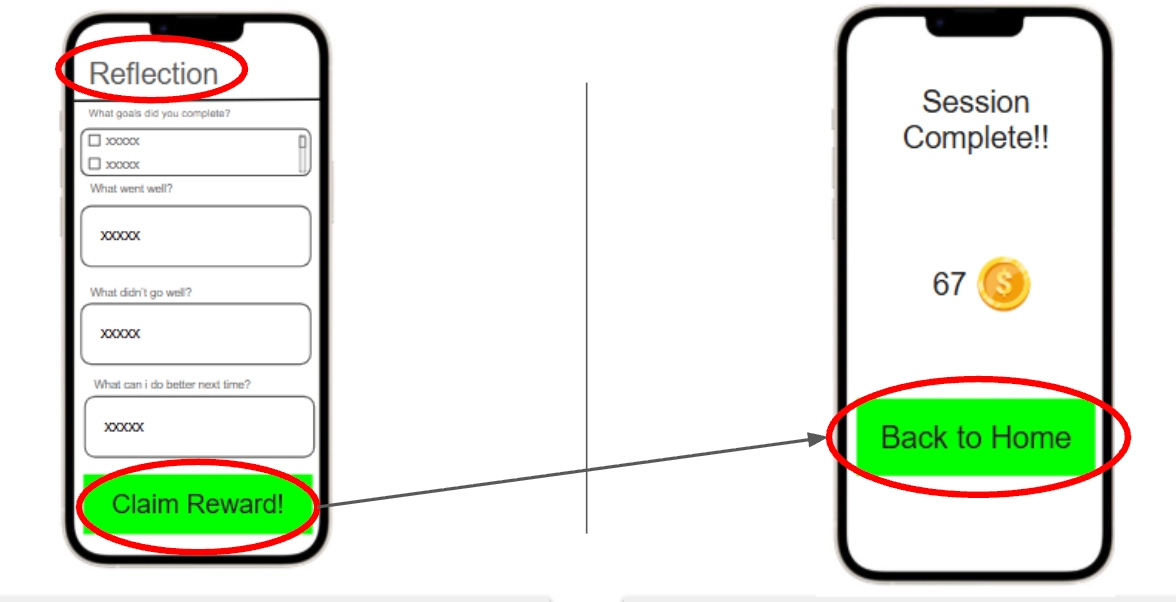
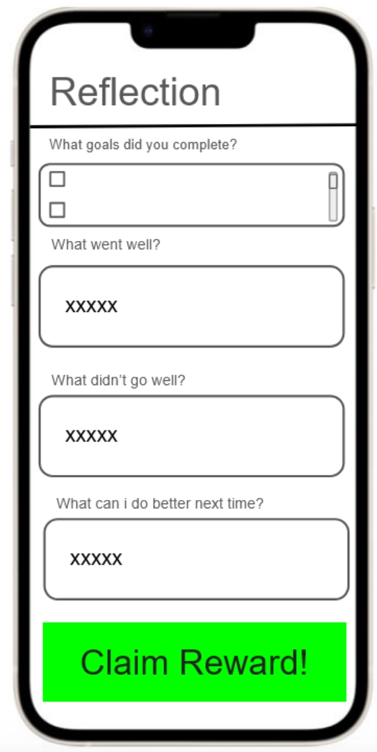
After completing their session, the user completes a reflection activity to see what goals they achieved, and input any feedback they had from their session. After completing the reflection, they can claim their session reward, and move back to the home page.
Collaborating with Other Users to Stay Productive
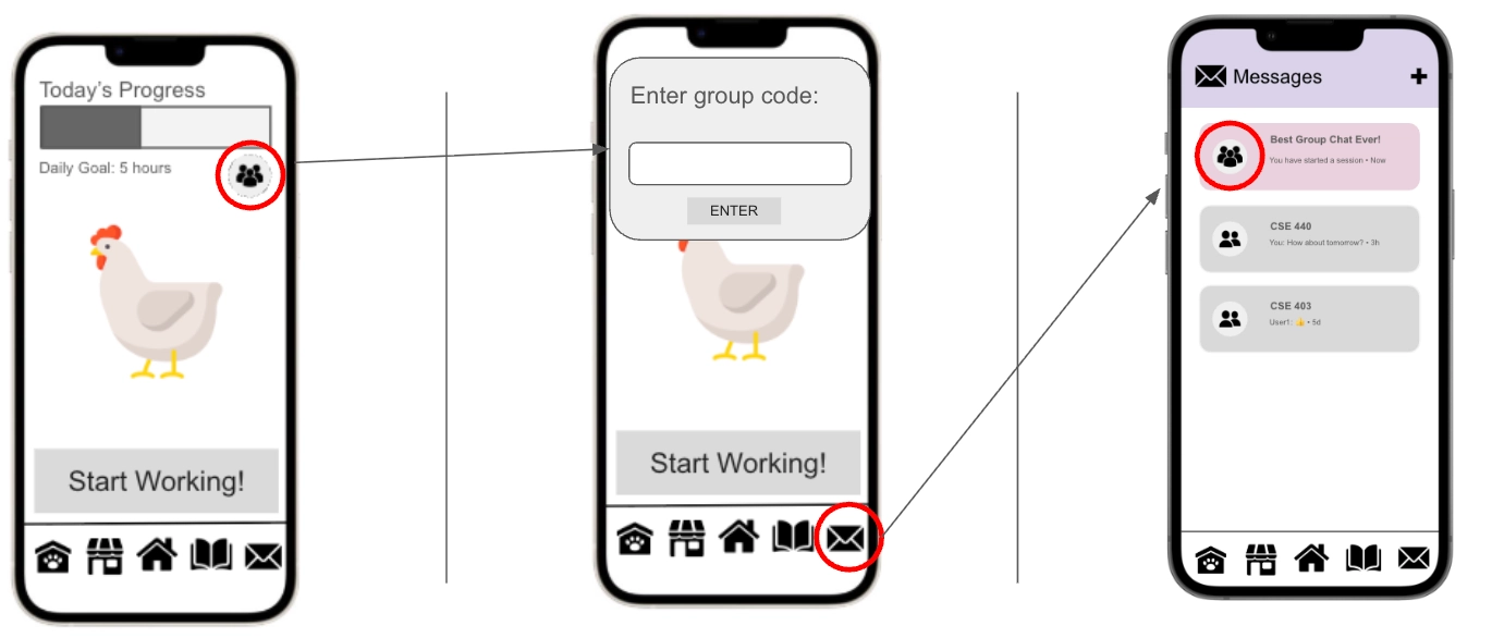
Users can access their group of friends, or join a group by using the group code provided, and communicate with them using messages. Past group chats of sections you've worked in are gray, while pink chats are ones associated with your current working section.
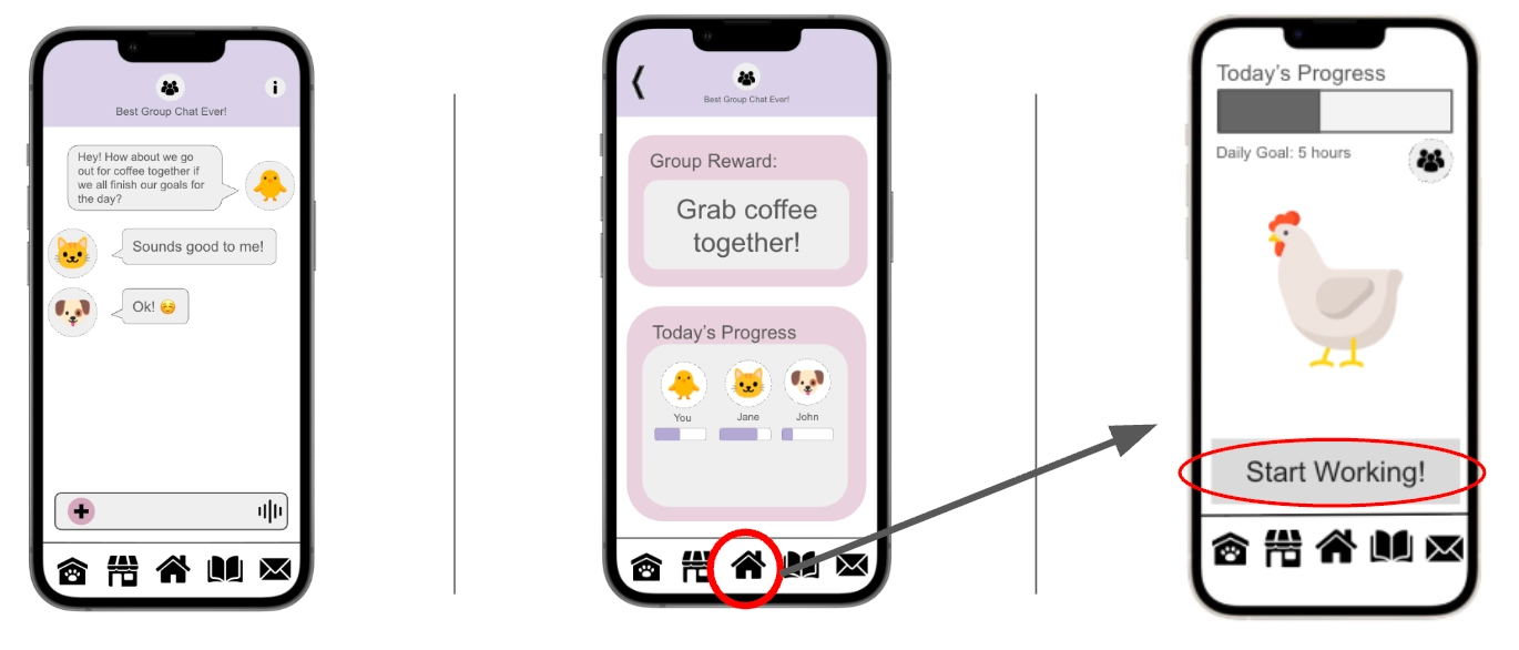
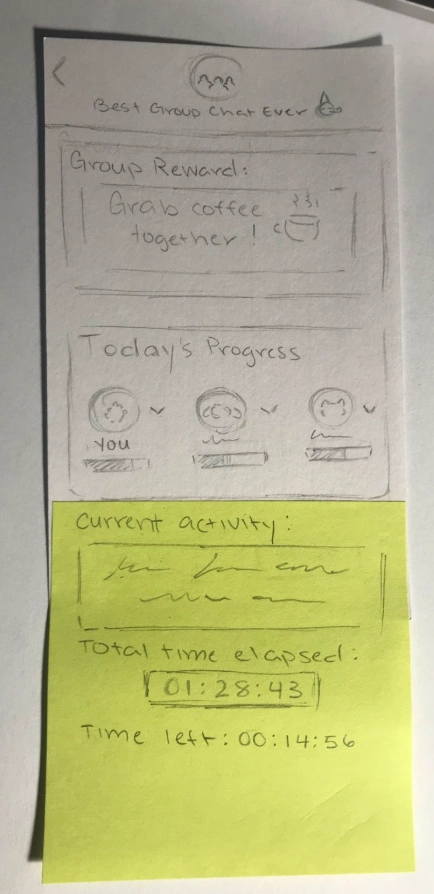
You and others in the group chat can decide what reward you want to set for completing a study session, and once decided, can navigate to the home page to start working in the session. Other group members can change the reward set up until the session begins. After the session starts, the users once again can set the goals they want to achieve during the session, the length of time they have, and the colors of their Pomopets, like in the first focus task.
After the session ends, the users fill out the reflection and claim their reward, while their group reward remains locked until the complete end of the session. When they navigate back to the home page, they receive their group reward.
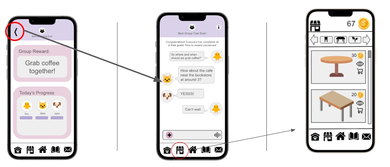
Users can talk about their group reward after receiving it, and can use the currency they claimed from the session to buy items to customize their pet's home with.
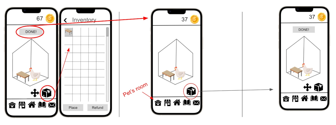
After purchasing, they can position & orient the furniture by accessing their inventory, and can later change it by editing the room.
Design Research and Key Insights
Our design research began with trying to understand why people would lose motivation and procrastinate on assignments and why they would leave things to do last minute. By doing so, we can reverse engineering ways to make the user more engaged with their work. We also wanted to know if certain motivation methods were popular or not, and if it would be a good consistent source of motivation. To conduct our research, we decided on doing 1:1 in person interviews with our participants. This allows for deep conversations and would allow us to deeply understand how people approach their work.The main demographic for our research are students at the UW who at least have been there for more than a year, as it would mean they had time to adjust to the high education environment, and would have had the opportunity to lose motivation and procrastinate.
Collaboration over Competition
From our design research, one key insight that came up was the preference of collaboration over competition when it came to a source of motivation. Although there was a general consensus that competition was a source of motivation, participants believed that it was not long term and could potentially become toxic. On the contrary, collaboration was much more preferred as the pressure from working with others is less emotionally taxing compared to competition, and can be a long term motivation. From this insight, we wanted to remove all forms of competition, and to find ways for users to collaborate with other users and friends. This resulted in users in Pomopet collaborating with others during study sessions.
From our design research, one key insight that came up was the preference of collaboration over competition when it came to a source of motivation. Although there was a general consensus that competition was a source of motivation, participants believed that it was not long term and could potentially become toxic. On the contrary, collaboration was much more preferred as the pressure from working with others is less emotionally taxing compared to competition, and can be a long term motivation. From this insight, we wanted to remove all forms of competition, and to find ways for users to collaborate with other users and friends. This resulted in users in Pomopet collaborating with others during study sessions.
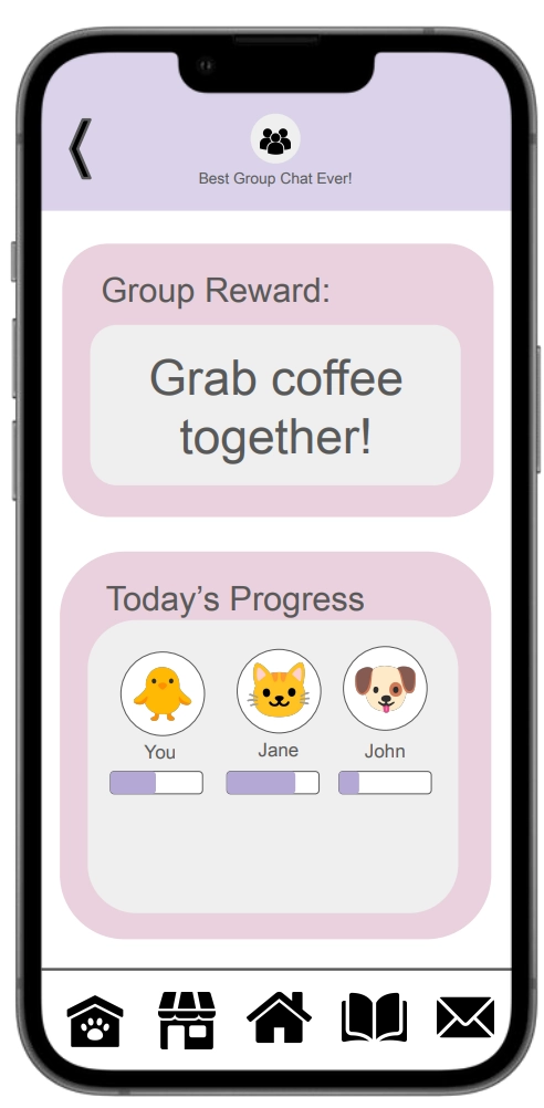
The group collaboration screen allows users to set shared rewards and track each other's progress, fostering teamwork over competition.
Value in Internal Motivation
One participant mentioned that they found value in self-growth and finding satisfaction in accomplishments. They believed that there is motivation in self improvements and bettering oneself. Another user found satisfaction in being able to see progression and accomplishments, similar to something like BeReal or Spotify Wrap. To respond to this, we added ways for users to reflect on their study sessions so they can understand how well they did and how much they accomplished. This is then recorded and users can look back on it.
The reflection screen encourages internal motivation by prompting users to assess their accomplishments and identify areas for growth after each study session.
Rewards to Encourage Task Completion
Participants generally viewed rewards as a good incentive to encourage task completion and as a sustainable form of motivation. Participants would usually set up rewards that they would treat themselves with after completing their tasks. Other participants also wanted to see something tangible as a result of their hard work after completing tasks. This encouraged us to implement a gamified reward system for completing tasks and also ways for groups to form rewards after completing tasks. This way users have ways to feel rewarded in both the app and in real life.
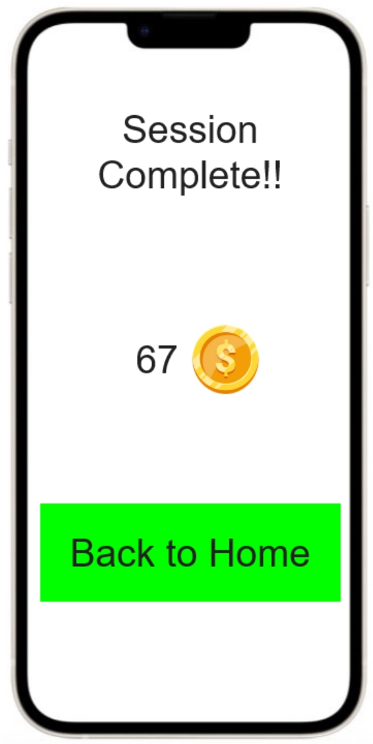
The session complete screen rewards users with in-app currency, providing tangible recognition for their productivity efforts.
Iterative Design and Key Insights
Our iterative design process began with creating low-fidelity paper prototypes to test the core interaction of physically "squishing" a toy to activate a digital timer. We refined these designs through a heuristic evaluation to address navigation consistency, followed by usability testing with target users to validate our task flows. These evaluations revealed a disconnect between our initial "strict" productivity philosophy and the realistic needs of students, prompting significant changes as we transitioned into our final high-fidelity digital mockup.
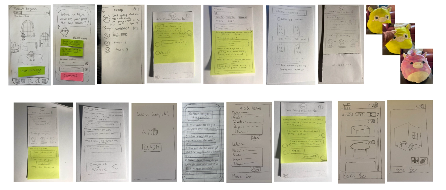
Our initial paper prototype explored the physical-to-digital interaction, using a plush toy to control the app's timer.
Information Over Aesthetic
In our initial paper prototype, we incorporated a large character avatar with dialogue bubbles on the goal-setting screen to add personality and guide the user. We thought this would make the app feel more friendly. However, during usability testing, we observed that these large aesthetic elements consumed valuable screen real estate, distracting participants from the primary task of setting their intentions for the session.
Users struggled to focus on their list management because the dialogue elements dominated the interface. In response to this feedback, we pivoted to a "function-first" layout in the digital mockup. We removed the character dialogue entirely from the setup phase, maximizing the screen space for goal management. This reduced friction during the setup phase, ensuring users could see and edit their list clearly before committing to a study session.
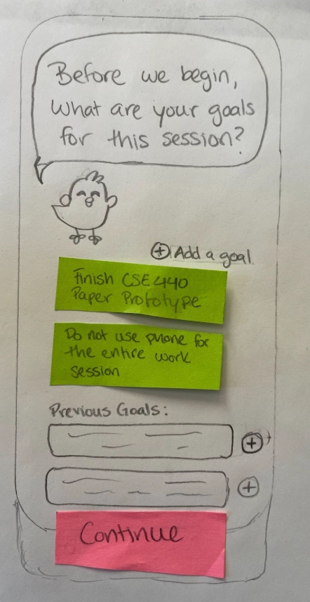
We removed the conversational avatar from the goal-setting screen to maximize space and reduce friction when inputting tasks.
Balancing Discipline with Flexibility
Our initial design philosophy was rigid as could not pause the timer, reinforcing the idea that the session was solely for productivity. We believed that allowing pauses would encourage procrastination. However, usability testing challenged this assumption when a participant noted that short-term, unavoidable distractions, like phone calls or restroom breaks, would currently force a user to terminate the session entirely, losing their progress.
We realized that our strict approach ignored the realities of a student's environment. We decided to compromise to accommodate real-life circumstances while maintaining our core philosophy. We introduced a "Pause" button but implemented a constraint: users have a limited number of pauses available (e.g., 3 remaining pauses displayed on screen). This provides necessary flexibility for emergencies without allowing the timer to become a tool for procrastination.
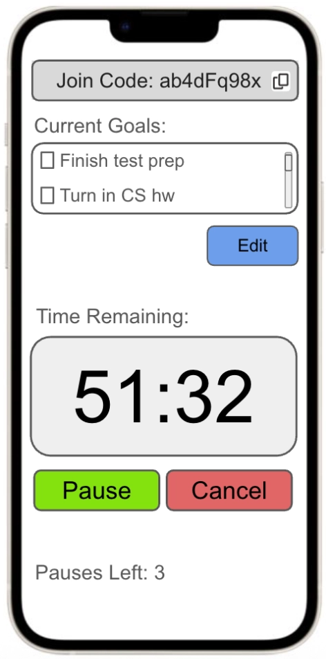
To accommodate interruptions without breaking the flow, we added a 'Pause' button with a strict usage limit.
Granular Goal Tracking for Reflection
In our early prototypes, the post-session reflection asked the question: "Did you complete your activity?" with simple Yes/No checkboxes. As we iterated, we realized this data was vague and insufficient for users trying to track productivity across sessions involving multiple tasks. There was no way for a user to specify which objectives were met if they had set multiple goals for a single session.
We overhauled the reflection flow in the final design to make the data more actionable. Instead of a single generic question, the app now presents the user's specific goals from that session as a checklist. Users can mark exactly which items were completed, providing granular data that helps them form more accurate study plans in the future.
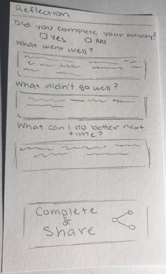
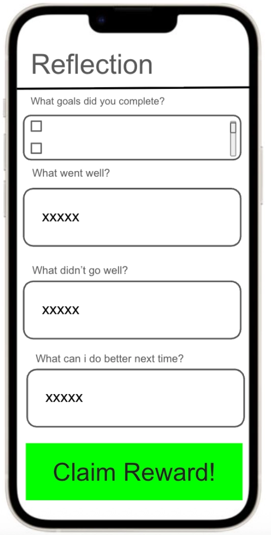
The reflection interface was updated from a generic Yes/No question to a specific checklist, allowing users to track exactly which goals were achieved.