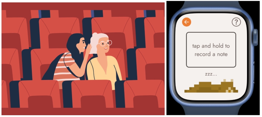
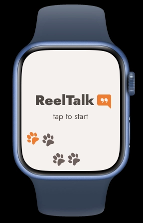
ReelTalk
Share the feels! Capture your movie musings in real-time and spark deep discussions with your friends.
Team
Mochizuki

Price

Rei Balinas

Siddiqui

Problem and Design Overview
Navigating diverse work schedules and lifestyles among friends/family, including students, full-time workers, parents, and those balancing multiple roles, poses a challenge in finding time to connect over movies. Despite the desire to share this experience, the limited time available often results in gaps in movie recall, prompting the need to spend valuable conversation time looking up details or feigning familiarity. To enhance the movie-discussion experience, there's a shared aspiration to streamline this process and create a space that accommodates diverse schedules, fostering meaningful connections without sacrificing the enjoyment of shared cinematic experiences.
Our innovative design seamlessly integrates smartphones and smartwatches, accommodating both home and theater environments. Users can record notes vocally, initiated by holding the screen on the watch, which are then transcribed and editable via a connected app, facilitating concise conversation references.
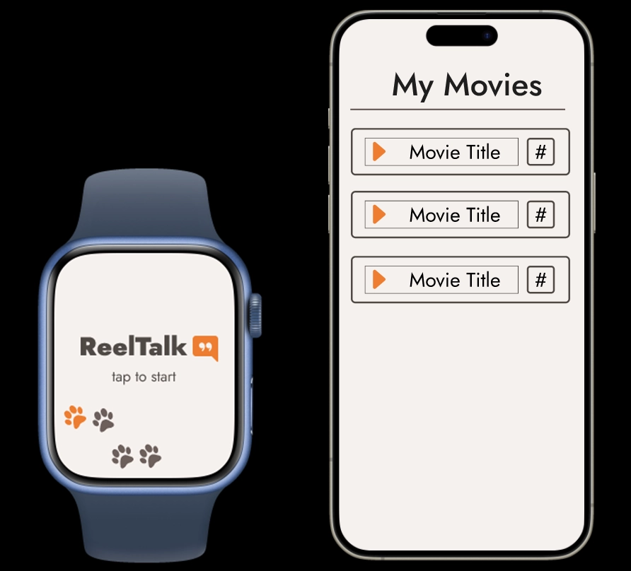
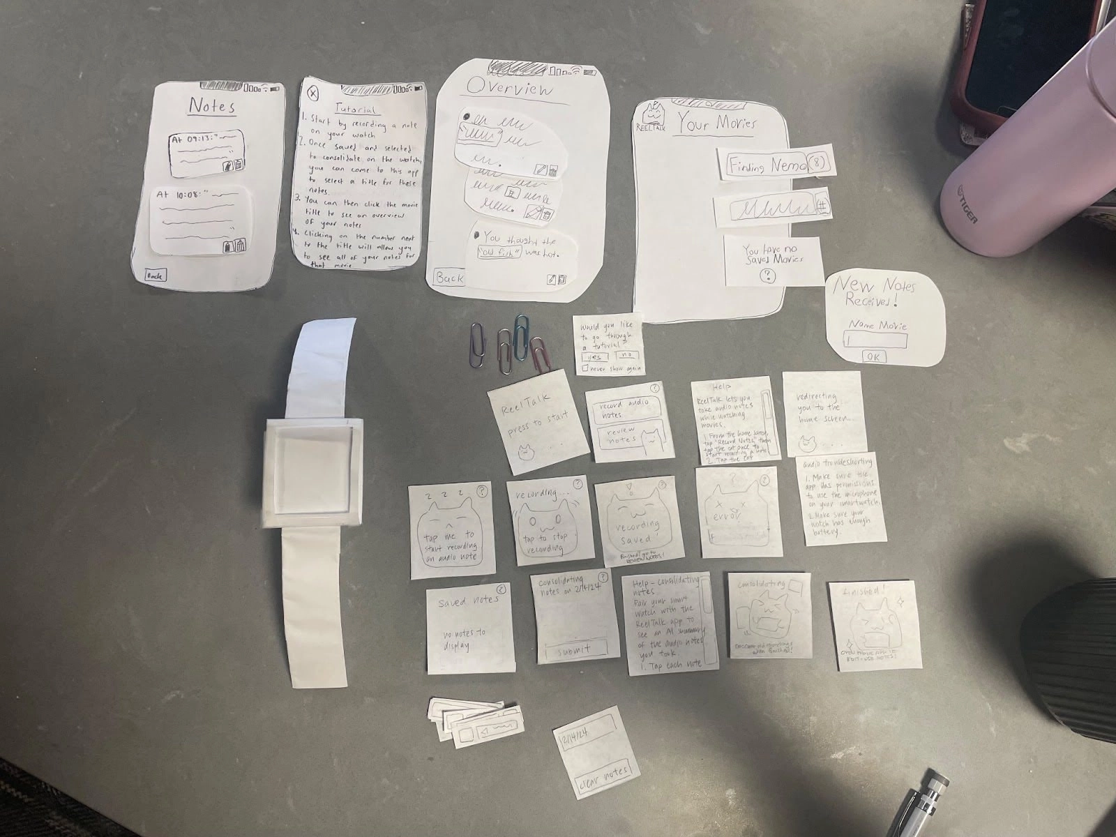
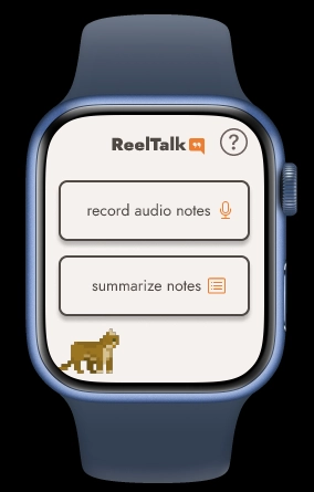
Inital screens from watch and phone prototypes.
Design Research Process and Key Insights
Our goal was to discover how individuals keep track of their thoughts during/after watching a film, as well as the resulting gaps that appear when two people try to connect asynchronously over movies afterwards. It was important to find which aspects of this process are actually difficult, and how users might realistically want to record their thoughts during a movie.
We performed our research by interviewing both avid and casual movie fans, as well as interviewing and conducting fly-on-the-wall observations with a couple in a long distance relationship that discussed a movie virtually after watching it asynchronously. We chose these participants to gain an understanding of common problems faced between avid and casual fans, and the couple to observe two people that regularly and asynchronously connect over media. The purpose of conducting a fly-on-the-wall observation for the couple was to allow us to directly observe behaviors they might not otherwise report in a Q&A interview giving us deeper insight into how they accomplished tasks.
Movie-Watchers Value Recall!
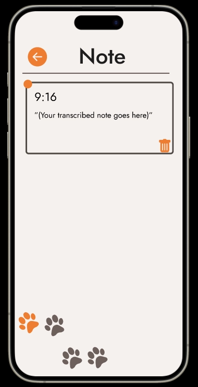
All participants ended up trying to remember how they felt during memorable moments in post-movie discussions. Specifically, this took the form of the participants in the couple creating statements like “When Barbie cried, I cried. Did you feel that?” Then the other participant would then respond with how they remembered that moment, or in this case more interestingly, “When was that again?” Or similarly, moments like “What was that song I liked again?” This often led to Googling, debate, or skipping over these moments in discussion entirely. This type of interaction gave us insight into the problem of needing a way to record your experiences and thoughts while you watch instead of afterwards, and inspired our design for directly transcribing your notes into the app for later use.
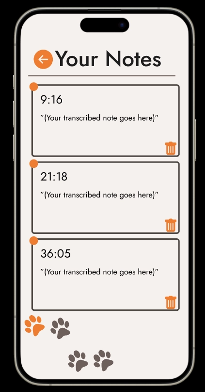
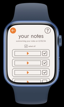
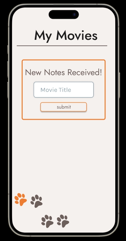
Screen from ReelTalk showing placeholders for notes transcribed.
There is a Movie Discussion Flow
One important insight we gained in our design research was the distinction in phases between how participants create their notes (either mentally or physically) , how they conceptualize and summarize the notes, and finally how they discuss them with others. This was a consistent pattern between all participants that emerged, and inspired our app flow of Record -> Summarize -> Review.
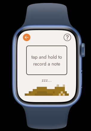
Record a note by tapping and holding the smartwatch.
Summarize the notes to send to your phone from your watch.
Receive the sent notes on your phone app.
Taking Notes is Awkward
From our interview results it quickly became clear that taking notes in a theater or at home with your phone, or writing down paper notes with friends around is uncommon and awkward especially if others are around. Additionally, the avid and casual movie viewers stated that looking down to take notes interrupts the experience of watching a movie, and can lead to missing what is currently happening. This insight helped us to decide on a smartwatch interface to deliver our note recording/summarizing functionality as seamlessly as possible. Specifically, this design is intended to be as if you are whispering your thoughts to a friend!
Don't be disruptive! Use ReelTalk!
Iterative Design Process and Key Insights
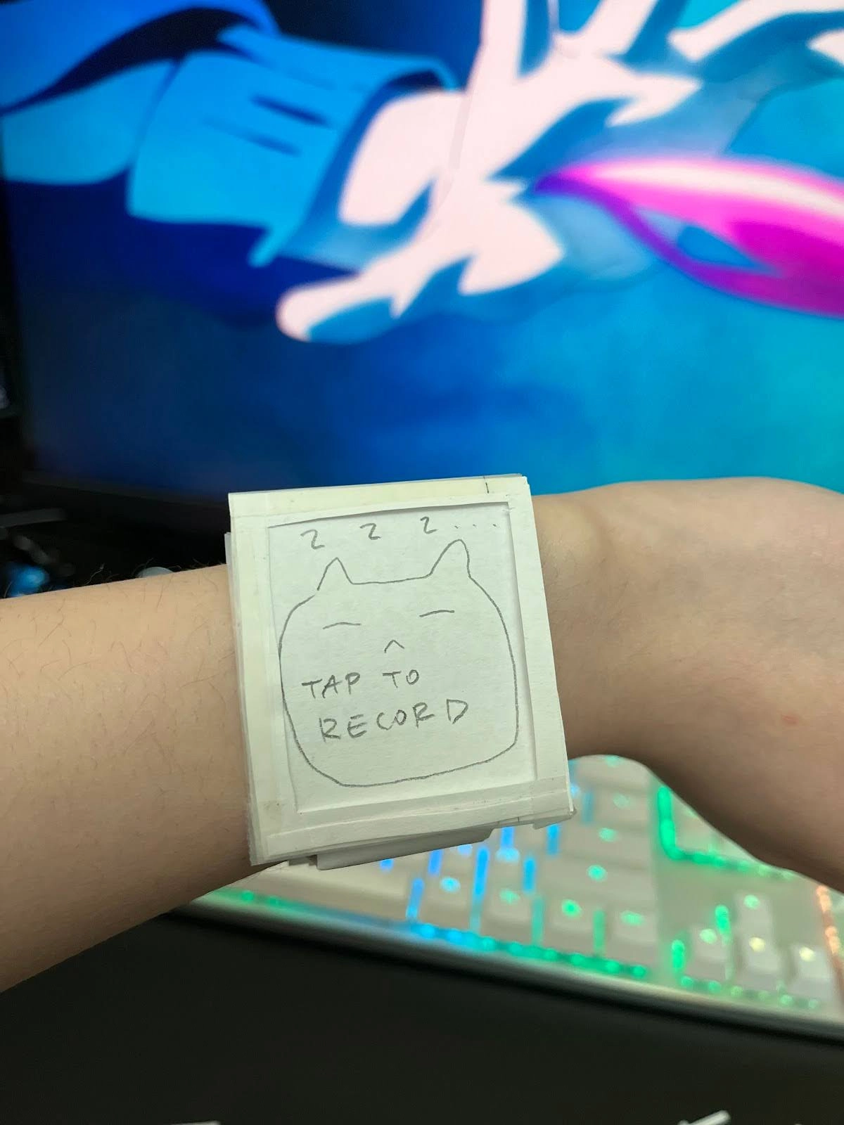
Our design focused on two tasks: highlighting key points of a movie during viewing and summarizing notes into an easily accessible guide for leading conversations about memorable movie moments. We created paper prototypes for a smartwatch application and a phone application, designed to work together. These prototypes underwent multiple rounds of inspection, heuristic evaluation, and usability testing with students in CSE 440, who were instructed to imagine themselves in a movie theater. We chose these participants because our initial research participants were unavailable, and students in CSE 440 were more accessible. We realize that this environment isn't completely accurate compared to that of an actual movie theater. However, they were not willing to commit time to go to a movie theater and watch an entire movie during testing, hence being asked to “imagine.” Also, our paper prototype compared to a digital smartwatch screen wouldn't be visible in a dark movie theater. Overall, our choice of participants and their environment was based on convenience within a limited time frame, but our process still provided valuable insights into user preferences and needs while addressing the challenge of participant availability.
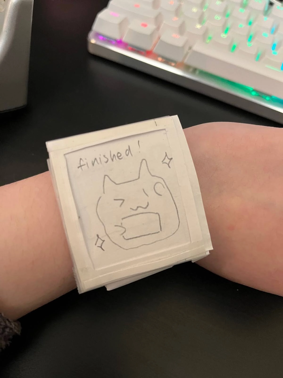
ReelTalk's paper prototype.
Adding Key Details for App Utilization
During user testing, it became evident that participants faced challenges in utilizing the app due to incomplete information, impeding their navigation and task completion. Users voiced confusion regarding certain features and their functionalities, prompting a need for clearer guidance. For example, one participant asked about what the purpose of saving notes was after recording an audio note. In response, we refined the design by integrating comprehensive context-based explanations and instructions across the interface, along with optional help buttons, aiming to equip users with the essential information needed for effective interaction. This iterative process, driven by user feedback, sought to bridge the information gap and enhance overall user experience by facilitating informed navigation and utilization of the app's features.
Initial: No prompts for help or instructions for new users.
Updated: Added a question mark (help) button in the top right corner of most screens so a user could quickly access context-based instructions if they were confused.
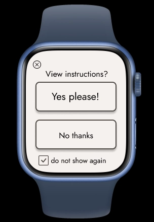
Updated: Added a popup to view instructions upon launching the app for first-time users, or anyone needing a refresher on how to use the app.
Enhancing Clarity and Learning
User testing unveiled significant navigation hurdles and unpredictable user behavior, revealing a mismatch between expected interaction flows and actual user experiences. Participants grappled with the absence of intuitive cues, such back buttons or help buttons, and expressed frustration with the linear design structure.
Consequently, we introduced these features to enhance clarity and alleviate the steep learning curve. Furthermore, we pivoted from a rigid, linear layout to a more adaptable framework to accommodate non-linear interactions, informed by specific participant feedback. These iterative adjustments aimed to align the design with user expectations, ensuring a smoother and more engaging user experience.
Initial: No back buttons.
Updated: Added back buttons so a user could choose to go back to their initial screen after navigating to a screen.
Fixing a Confusing User Flow Between SmartWatch and Phone
One unique challenge of our design was that it consists of two parts: the smartwatch app and the phone app. This meant that there needed to be clear indications on when to use each part of the design, and when to switch over between the two devices.
For our first usability test, we were so clear-set on a singular flow for our design that we gave only the smartwatch to the participant at first, then gave them the smartphone part of the prototype later. Even with this mistake, with no indications on when information got sent over from the smartwatch to the phone app, the participant told us that it was unclear when to use each part of the design, and expressed surprise that there was a phone app that goes with the smartwatch.
With that comment, we improved our usability testing structure and for future tests, we gave the participant both the smartwatch and the phone at the start. We were then able to improve upon which parts of the task in particular was difficult to understand from a user's perspective.
To improve our design, we made it clear that the phone wasn't supposed to be used at the start by including a screen for the base state. We also added system dialogue to clarify when information gets sent from the smartwatch to the phone app, and added popups on the phone app to indicate when it was time to switch to the phone app.
Initial: No prompts on when notes got sent over from the smartwatch to the phone app.
Updated: Added a popup so users know exactly when information got moved from the smartwatch to the phone.
Initial: No prompts on what to do after summarizing notes.
Updated: Added prompts so a user knows to go to the phone app after summarizing notes.
Resulting Design
The critical aspects of our design facilitate user ease in achieving our two primary tasks: highlighting key points of a movie during viewing and summarizing notes into an easily accessible guide for leading conversations about memorable movie moments.
To record an audio note:
1. Tap the screen to start.
2. Tap "no" to close the instructions prompt.
3. Tap "record audio notes."
4. Tap and hold the screen, then say your note.
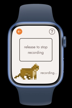
5. Release to end the recording.
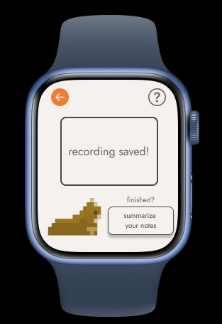
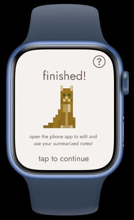
6. Your recording has been saved!
To summarize your audio notes to use in a conversation later:
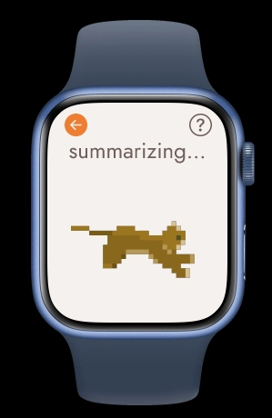
Part 1: The smartwatch app.
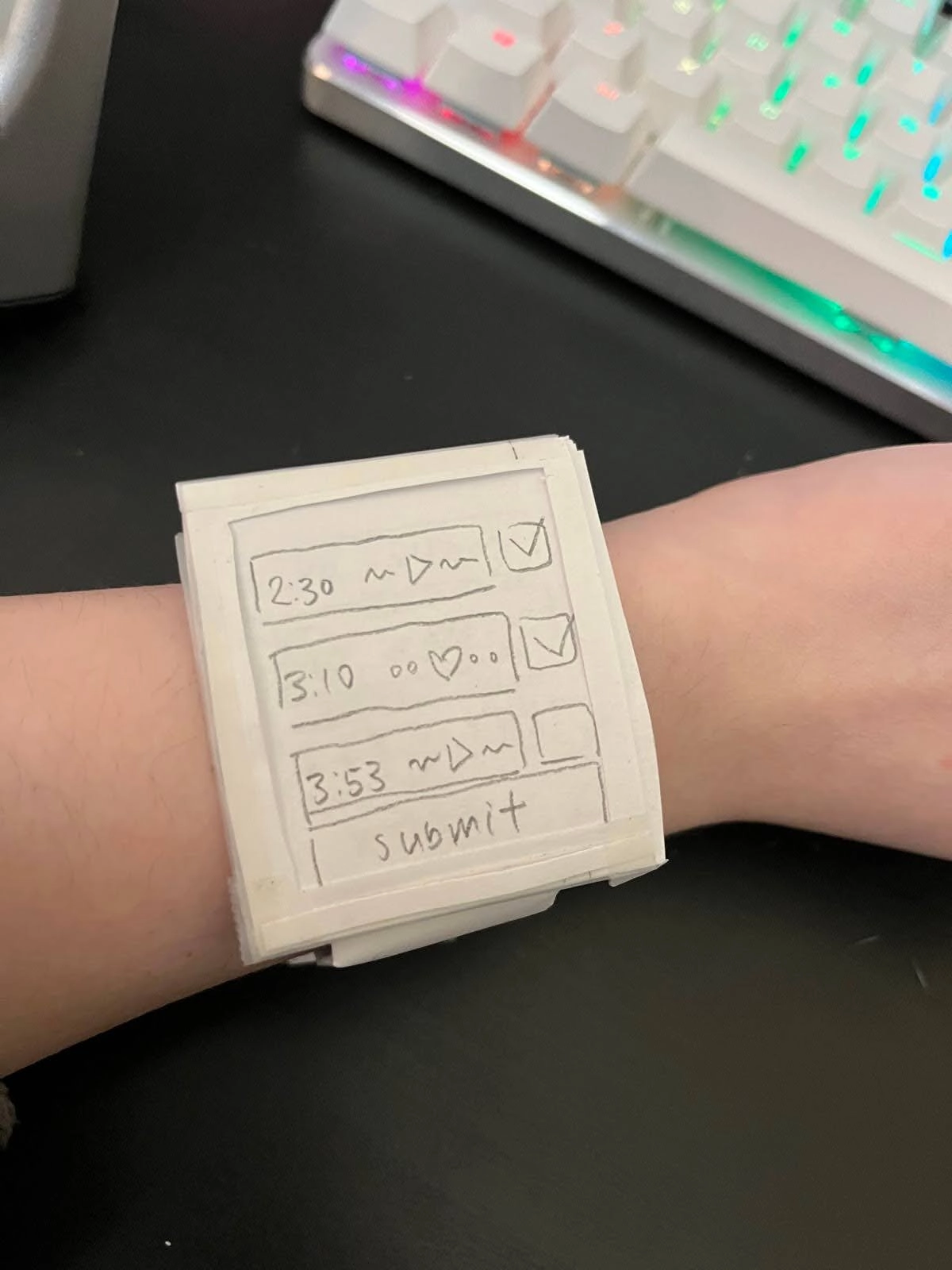
1. Tap "summarize notes."
2. Check the notes you want to summarize.
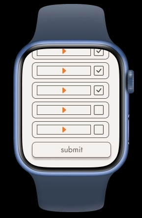
3. Tap "submit."
4. Wait for the watch to summarize the notes.
5. Your notes will get sent to your phone!
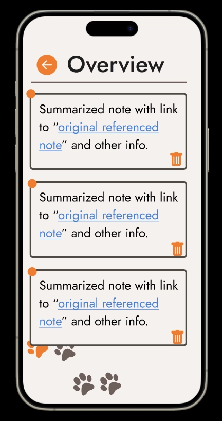
Part 2: The phone app.
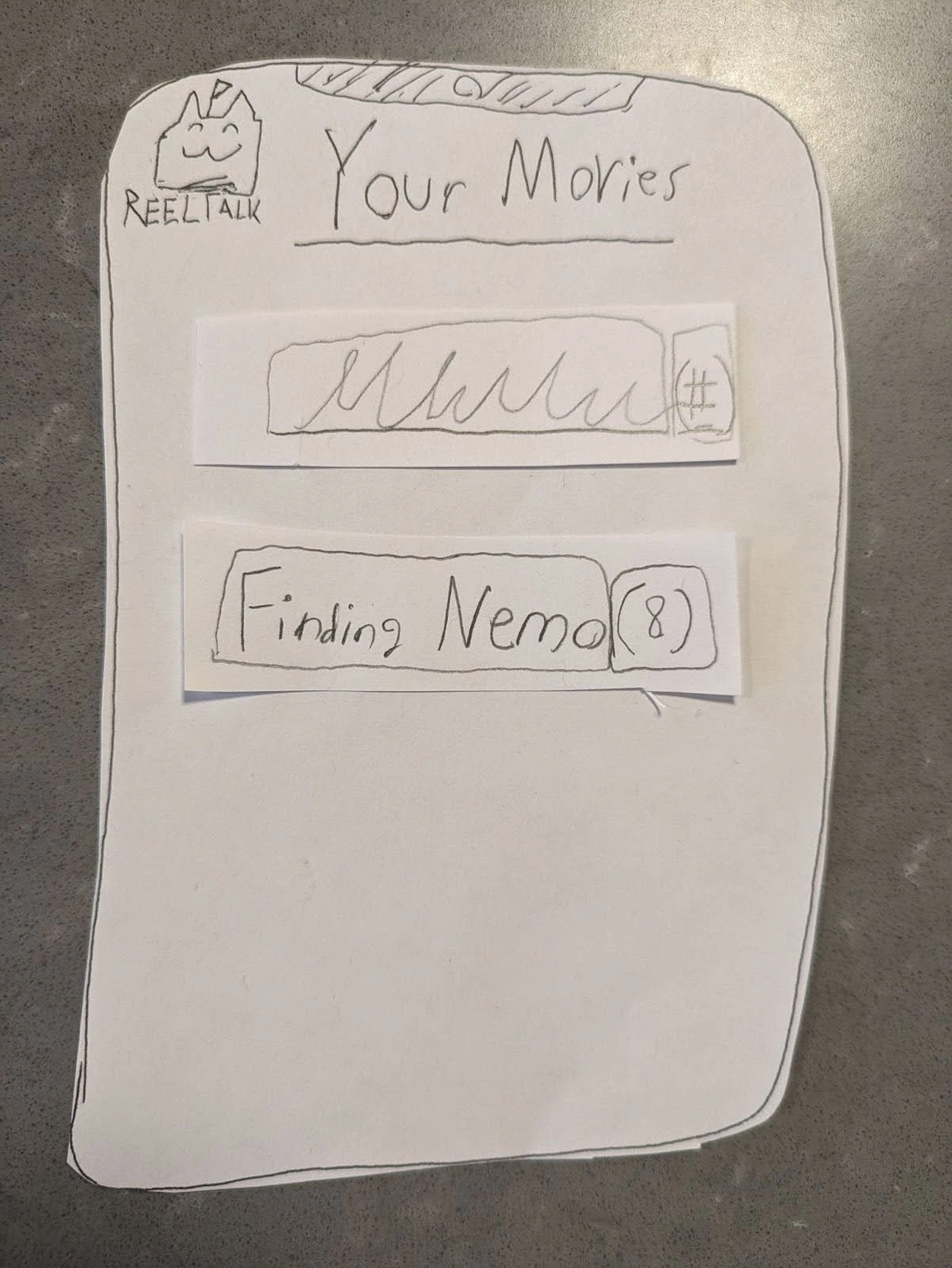
1. Open your phone app and type in the movie name.
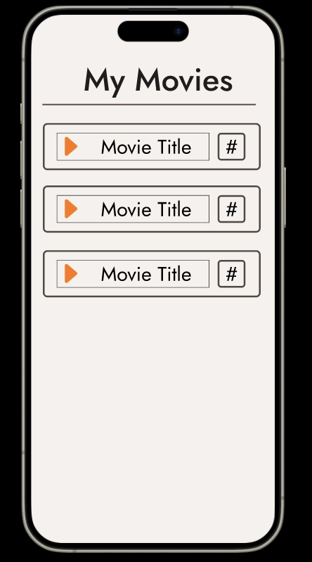
2. Tap the name of the movie.
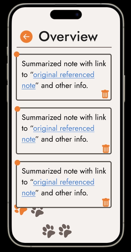
3. Tap a blue hyperlink.
4. You can view your original note here.