MindShift
Team


Problem and Design Overview
The ubiquity of smartphones in the United States has fundamentally changed the way that we interact with technology. Differences in these changes vary person to person, but the largest shift has been generational. Having a phone on hand is almost necessary to function in modern society as a young student or working professional. For those that grew up with ready access to smartphones, it’s almost impossible to avoid an overwhelming sense of reliance on phones. Simultaneously, content creators are more accurate than ever in targeting our attention once we pick up our phones. As a consequence, unwanted addictions to the content on these devices are on the rise. 1 in 2 adolescents today believe that they have a phone addiction, with unconscious pickups and “doomscrolling” on the rise.
Our design acknowledges that phones have become instrumental in our dopamine cycles - we look to them for mindless entertainment, relaxation in times of stress, and sources of connection. In order to reverse our gravitation towards these devices and begin to break the habit of constantly looking at them, we need intentional focus and a consistent plan. MindShift focuses on helping remind our generation when we lean on these ingrained habits. It’s designed to be a “second brain” as we journey towards breaking the unconscious ties to everyday living that our phones have.
Design Research Process and Key Insights
A vast amount of recent research has been performed confirming the problematic nature of phone usage in younger generations. Rather than seeking to confirm this, we looked to see what kinds of factors, algorithmic content, and lifestyles might be relevant to building healthy browsing habits. In general, our primary target stakeholders were those under the age of 30, those that would have grown up with ready access to a smartphone. As we explored, the guiding question was “what precipitates their unwanted phone usage?”. We recruited one participant over the age of 50 to compare and contrast our observations with to see if we were looking in the right direction. Our chosen method was a diary study interspersed with experience sampling, all topped off with an exit interview with our participants about the process. The diary study, which tracked overall phone pickups, screen time, and specific entries when usage was unsatisfactory, was the cornerstone due to the ability to collect details over longer periods of time, context necessary for such a holistic topic. To avoid possible participant-introduced sampling bias (as they decide what phone pickups to send), we also sent periodic prompts to our participants to diary no matter what. The exit interview proved high-yield as well, where we discussed the entries with the participant, compared the study period to their normal habits for context, and filled in the blanks that weren’t fully covered by our diary prompts and therefore didn’t get explicitly logged.
Usage Dissatisfaction
The most common negative sentiment uncovered in our research revolved around the idea of looking to social media and short-form video as a place to alleviate boredom and then putting their phone down dissatisfied. Within the diary entries one participant mentioned “flicking through 5 different apps to pass time and not finding [the happiness] that I wanted” and hopping between apps to “see if more messages/content to interact with had come in”. Exit interviews revealed that these usage pathways had provided happiness and excitement in the past; often though, picking up their phone to recreate these experiences led to dissatisfaction and a sense of futility. This insight was the main inspiration for our journey-driven app, which allows users to set specific goals such as reduce app screen time. They can set up a journey after a particularly unhappy session, so that in future sessions they are stopped from anxiously scrolling around.
Distraction While Focusing
Our diary questions asked participants to keep detailed track of when they opened their phone, and thus we discovered that many users reported using short-form entertainment (i.e. TikTok) as a “brain break” during intense focus periods while studying. This aligns with our expectations of usage, since it can easily be used to distract someone from a stressful situation, a category that studying falls into. Furthermore, we uncovered a trend that ~60% of all social media time occurred on campus despite only ~40% of student participant days being spent on campus. These findings were utilized in the creation of our geotracking features in the application, which allow users to keep track of the places they heavily use their phone and allow them to minimize their usage in locations that should not have heavy phone usage, such as studying
Sleep-Centric Usage
In addition to heavy phone usage corresponding to stressful situations such as studying, a great deal of phone usage corresponded with timing throughout the day. We noticed in our data that 5 participants out of the 9 had usage graphs that took on the shape of a bimodal bell curve with peaks of usage in the morning, slightly delayed after wake up and 7pm, post dinner. In our exit interviews, when asked about the following piece of data, most participants admitted that it’s a result mostly of habit rather than genuinely fun or productive usage. Participants mentioned that without interference it was super easy to fall into this pattern. Thus in our app we made sure to integrate a reminder feature that could disrupt social media usage at certain times to ensure that users couldn’t absentmindedly scroll through the morning.
Iterative Design Process and Key Insights
We focused on two primary tasks that were essential to our design. The first was “identifying phone usage patterns and tracking which are problematic”. The second was “Interrupting unproductive scrolling”. We focused on these specifically because they worked well together to first get an understanding of the problematic habits of the user, and then to help them reduce their phone usage through notifications. We created an initial paper prototype and then tested it with various participants, as well through 2 separate rounds of inspection. After another iteration of a paper prototype and one more round of user testing, we created a final digital mockup that improved upon all the previously discovered issues.
Clear and Concise Onboarding
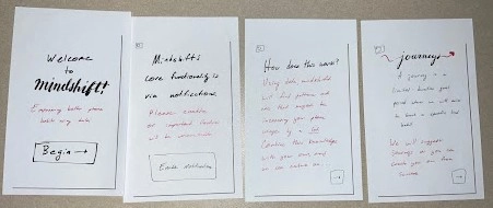
The first rendition of an onboarding session.
Multiple participants were initially confused by our cluttered 2-page onboarding processes that easily overwhelmed them and did not properly explain how to create and manage mindfulness journeys. Some of them tried to parse through it and failed; one participant said “I’m not reading this” and skipped right through. To fix the issue we broke down the process into a series of easily-digestible panels that use minimal text to ensure the user gets a basic understanding of the app even if they try to quickly flip through the introduction. Considering the slight complexity of our application, ensuring that the user is knowledgeable on how to navigate it is crucial to ensure that they are quickly able to start their first self-improvement journey. Introducing the core idea of journeys is accomplished via this step-by-steop introduction. These guide pages also persist as a "help page" for the user to access whenever.
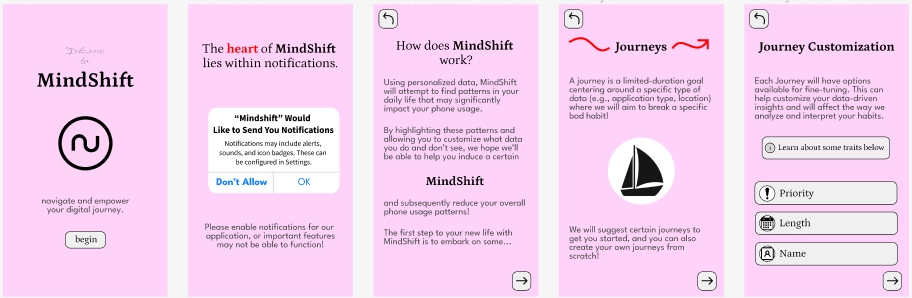
When a user first installs MindShift, they will be met with a series of onboarding screens that explain the rationale of the application and some of its main functionality. This page in particular explains how the app works as a whole. The final digital onboarding process, as lengthened and evolved via feedback from usability testing participants.
Simplifying Customization
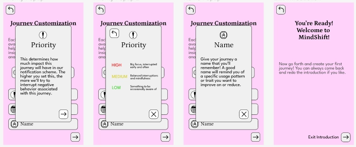
When exploring available journeys, participants understood most of the straightforward options such as “reducing pickups that lead to Instagram”, but showing them examples such as “reduce Instagram usage in a certain location” led to confusion on how the journeys are generated and what options for customization exist. Some participants glazed over the subject but it was clear they did not fully understand and confused so if pressed further. To fix this we introduced three discrete goals to focus on: pickup count, screen time, and specific app reduction. This change is conveyed in the onboarding and is made very clear when a user is creating a new journey. This is crucial as it eliminates most of the headache that people had trying to understand all the options and easily allows them to create familiar journeys.
When creating a Journey from scratch, the customization options were drafted to balance both flexibility and structure. There's enough options to allow true customization but not so many as to be inconsistent or confusing.
Optimize Notification Options
Initially, we faced two issues with the interruptive phase of our app design. One issue involved the form factor of the banner notifications - as a format that many are used to swiping away and ignoring, the notification did not serve as interruptive as intended. Additionally, our design had two options for when a notification popped up telling you have been scrolling for too long or too frequently: “work on this” and “this is okay”. Those two options were incredibly unclear on what they would do, and one of our participants was especially confused if he would be taken to the main app or would remain free to scroll instagram if he clicked either of these buttons. We changed the two options to be “Quit Instagram” and “snooze”, with the first button highlighted and the second dimmed. The choices here are far more clear and try to push the user towards quitting the negative task that they are currently doing, which is precisely our overarching goal. The "alert" nature of the notification was also selected to be entirely interruptive - you have to choose an option from the provided text and cannot simply swipe the notification away.
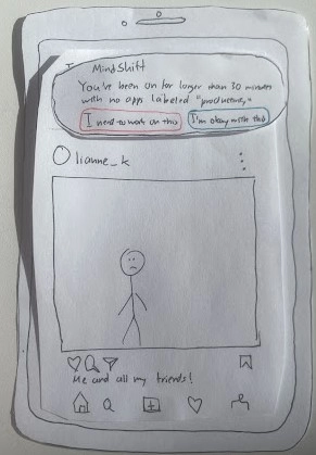
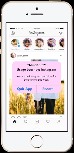
The importance of MindShift notifications lies in their interruptive nature. It should not be easy to ignore MindShift notifications, but it should also not be a chore to read and interpret them. Here's the first rendition and the final version.
Resulting Design
A user's journey in our app centers around two tasks: identifying a problematic behavior to improve on (a Journey), and actively breaking this habit when it comes up.
Task 1: Finding Journeys
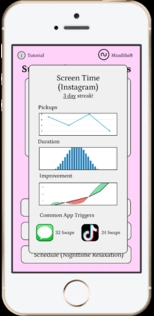
The user receives an array of potential journeys, as well as an array of current statistics about their phone usage. They have the option to create a new journey or to select a suggested on (as prompted by automated analysis of metadata). Within MindShift, the user can monitor and view their usage statistics and feedback on how much they’ve improved using the journey settings, which is focused on in Task 2.
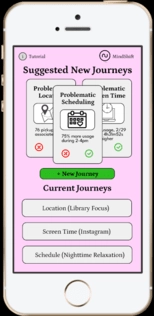
When a user is on the primary 'Homescreen' of MindShift, they can view existing journeys that they have already configured, browse suggestions of 'new' journeys based on their recent browsing activities and metadata, or create new journeys from scratch.
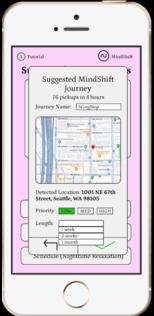
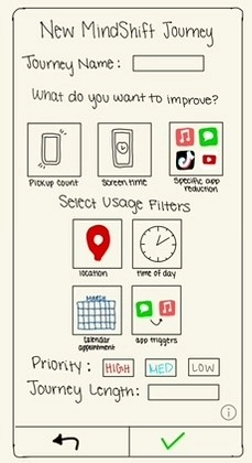
A user can create a journey out of anything, in this case a user is configuring a geographical location-based journey. They can give their journey a name, priority, and duration, among other customizable features.
Task 2: Interrupting Habits
The user is able to receive interruptive notifications that align with journeys they configured in the MindShift application. Depending on certain properties of the journeys themselves, users will receive notifications after displaying specific behaviors, such as spending a certain amount of time on the application or opening the application a certain number of times. To dismiss the notification, the user will have to make a mindful decision to snooze a pop-up alert, making it harder to subconsciously continue the harmful digital habit.
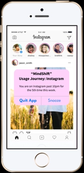
When a user is scrolling instagram, they get an alert based on the configurations they set within MindShift, which will interrupt their scrolling based on their usage pattern. They’re given a chance to quit the actual application.
After choosing to exit the usage pattern that was part of the journey, the user lands back at the Journey Dashboard, with the ability to see their recent stats (as in Task 1) as context.