Complexion Cupid
Introduction
Color matching can seem like a nightmare for anyone. Unfortunately, this task can be even more daunting for people with color blindness. Some services, like color matching, require an individual to visit a store physically. However, physically visiting a store is unattainable for several communities, including those living in rural communities and lacking stores with color-matching services, those with inaccessible public transportation to the stores, or even because traveling can be incredibly tiring. Recognizing these individuals’ unique challenges, we would like this program to simplify the color-matching process. Allowing individuals to upload an image of their skin, the program will provide users with a foundation match. Additionally, individuals can upload existing swatches on their skin and will be provided with filtered photos that better show the matching accuracy. With this information, we aim to make makeup an inclusive experience for all, regardless of experience level.
Related Work
Swatch Symphony
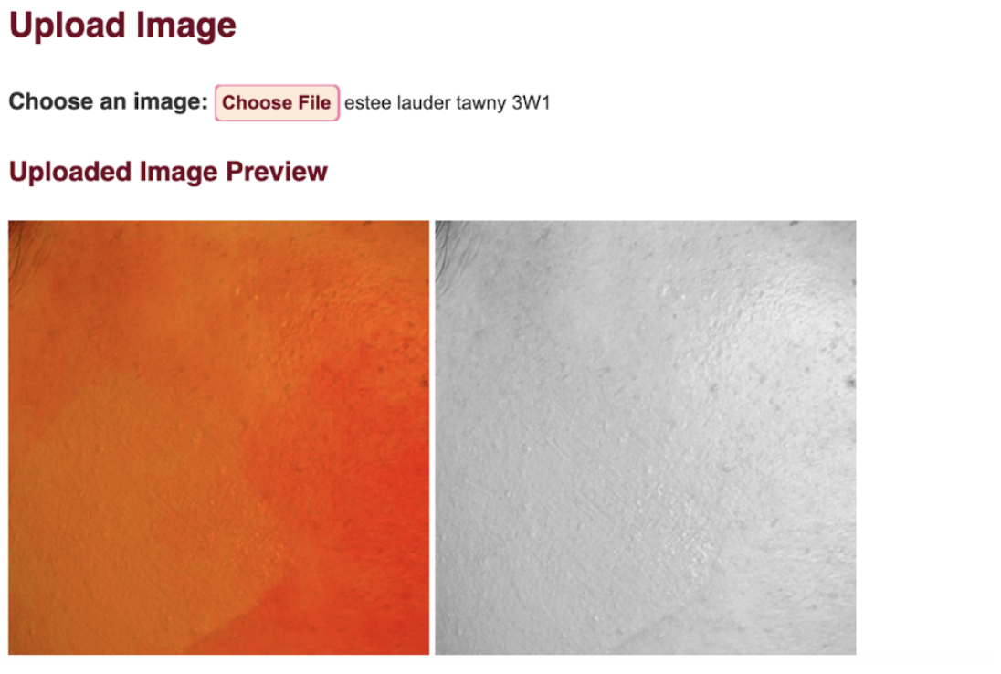
- As mentioned previously, our project contains two separate features. The first option requires an individual to own a foundation product already. Here, individuals can upload an image of their foundation swatched onto their cheek. As developers, we would take this input image and return two varying images to the individual: a black-and-white filtered image and a highly saturated image. While researching, we found that low-vision and colorblind individuals can utilize these filtered images to understand better and perceive their skin undertones and color depth. Overall, we did not find a makeup tool to make this process instant and seamless for an individual. Instead, these makeup artists would have to manually go through the process twice of turning their original image into the respective filtered images.
 Cupid’s Choice
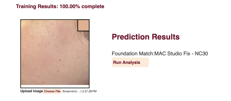
- Our second feature aims to match an individual to a foundation without already owning this product. This process primarily targets individuals new to makeup and are merely getting started with this creative outlet. After researching, we discovered an open-source project called “TensorShade” on GitHub. Overall, this project had functionality very similar to what we were aiming for, specifically in our second feature. For our second feature, we wanted the user to upload an image of their bare skin, where they could select a section on their face that they wanted us to evaluate and eventually return to them a foundation match based on their selection! However, our team noticed that the associated web app, “TensorShade,” had several accessibility issues, including a lack of color contrast and alternative image text. We also noticed that there were several issues that, from a user perspective, we did not understand. Such as the slightly too-pink hue from the user choosing a specific place on their face to “swatch.” Overall, “TensorShade” was a great starting point for us, but in the end, we took time to improve the functionality to our desired state.
Methodology
There were several aspects to our project, which we decided to split up into smaller subtasks to hit our set milestones and goals progressively. First, Catalina set up a Github Repository as a centralized and organized place for everyone to contribute to the project. From there, Nancy implemented the skeleton of our team website using HTML and VSCode. From there, Catalina, who previously worked on creating filters on images through the Computer Vision course offered at the Allen School, ensured our images utilized the correct filters for the foundation swatches. The filters were developed through Python. At this point in our project, our team felt we had made sufficient progress, so Nora and Nancy stepped in and began working on the CSS portion. They both added more functionality and, overall, ensured a cohesive feeling to the website.
We noticed several parts of our project were complete, but we couldn’t see them displayed on the front end, so Ruth stepped in! She connected the back-end portion (the filtered images) to the front end. As a result, we could see the two filtered images on our HTML skeleton. Next, Catalina took the lead on improving the machine learning model in “TensorShade.” This included having the machine learning model find much closer foundation matches than it previously found. Catalina also ensured that the CSS matched our current website theme since “TensorShade” originally had several contrast issues.
Last but not least, we had intended to test our project on color-blind individuals, but due to time constraints, we could not accomplish this task. However, we placed our images through an online color-blind simulator. Through this simulation, we analyzed how different types of color blindness will see our output-filtered images.
Disability Justice Perspective
- Shade-matching makeup can be complex, especially for color-blind individuals, since it is difficult to visually identify specific levels of contrast/matching. However, this barrier shouldn’t stop people from being able to use makeup.
- Intersectionality as a justice principle means understanding the experiences of a disabled person and how they interact with other parts of their identity like race, class, sexuality, age, religious background, geographical location, immigration status, and more. This project connects to this justice principle because makeup is a form of gender expression for many, and disabled people, specifically those who have color vision deficiencies, should be able to express their gender identity without structural barriers limiting their access to makeup.
- Recognizing wholeness as a justice principle means understanding that disabled people are whole people living their experiences with their thoughts, pleasures, emotions, etc. This relates to our project because people with color vision deficiencies should be able to express themselves with makeup. Color-blind individuals might face challenges perceiving makeup shades, but this doesn’t diminish their desire for self-expression or participation in activities like makeup artistry. By recognizing this, we can recognize their wholeness and desire to express themselves.
Learnings and Future Work
- We learned that a few options were available to color match that we were unaware of, but they do not directly include support for color-blind individuals. For example, Fenty Beauty offers an online color-matching consultation for free. One of the services we knew of was online shade matching; however, this online version required virtual makeup. Unfortunately, telling the difference between our skin and the virtual makeup was challenging. We were also aware of an online shade matcher that matches your current foundation to other matches. The main issue with this service is that it requires an individual to own a matching foundation. However, as we’ve mentioned before, this poses a barrier to individuals taking their first steps into the makeup world who may not have a matching foundation shade.
- One way this can be built on in the future is by having the program tell the user if the swatch they uploaded is a match by analyzing the foundation and the skin. Our current implementation of the swatch matching process requires users to visually notice if there is a difference in color with the filtered photos, which does not support blind individuals. If we were to add this feature, the result of whether the swatch matches or not could be directly told to the user rather than having to be visually cued.
How You Made Your App Accessible
We prioritized accessibility through automated testing using the WAVE extension, addressing issues like missing alt-text and labels. Manual testing involved navigating the website with a screen reader, ensuring a navigable and accessible interface. Aria-labels, alt-text, and specified hierarchy were added to enhance the user experience. We also confirmed that the website was navigable using only the keyboard. We also used a color-blind simulator to ensure that the filtered images were accessible to color-blind individuals. While a color-blind simulator is not a perfect representation of how a color-blind individual would see the images, it was a good starting point for us to ensure that the images were accessible to color-blind individuals. We also confirmed we were being inclusive by using a high-contrast color scheme and providing that the text was large enough to read and, if zoomed in, would not overflow.