Learning objective: Analyze and plot geospatial data to investigate food deserts in Washington.
You can find the starter code for this homework on JupyterHub.
hw5.pyis the file for you to put your implementations of the plotting functions and to call them inmain.hw5_writeup.mdis the file for your writeup. Instead of testing, this homework emphasizes reflection on our data analysis.expectedis a folder containing the expected output for the 5 plotting functions you’ll be writing. Don’t modify the contents or name of this folder.food_accessis a folder containing all relevant datasets to this homework.cse163_imgd.pyis a helper file that checks your plot outputs against expected output, and creates an image showing any pixel differences.Playground.ipynbis a Jupyter Notebook playground. Feel free to edit this Jupyter Notebook to prototype ideas and explore the data.
Context
“Food deserts” are neighborhoods where residents do not have nearby access to grocery stores offering affordable and nutritious food. In a June 2009 report to the US Congress, the US Department of Agriculture reports:
According to data from the latest census (2000), about 23.5 million people, or 8.4 percent of the U.S. population, live in low-income neighborhoods that are more than a mile from a supermarket. Low-income neighborhoods are areas where more than 40 percent of the population has income less than or equal to 200 percent of the Federal poverty threshold ($44,000 per year for a family of four in 2008).
In this homework, we’ll join 2010 US census data with food access data to investigate food deserts in Washington state. A census tract is defined as a food desert if enough people in the tract do not have nearby access to food sources.
In urban areas, “low access” is defined as 0.5 miles, which we’ve stored in the column
lapophalf.In rural areas, “low access” is defined as 10 miles, which we’ve stored in the column
lapop10.
The 2010 US census dataset is geospatial data in shapefile format. The only columns you need to understand are CTIDFP00, the census tract identifier, and geometry, the geometric shape of the tract.
The food access dataset is tabular data in CSV format. Each row in the dataset corresponds to a census tract for every state in the country. The data has many columns, but you only need to understand the following:
CensusTractis the census tract identifier.Stateis the state name for the census tract.Countyis the county name for the census tract.Urbanis a flag (0 or 1) that indicates if this census tract is an urban environment.Ruralis a flag that indicates if this census tract is a rural environment.LATracts_halfis a flag that indicates if this census tract is “low access” in a half mile radius.LATracts10is a flag that indicates if this census tract is “low access” in a 10 mile radius.POP2010is the number of people in this census tract according to the 2010 census.lapophalfis the number of people in this census tract considered having “low access” in a half mile radius.lapop10is the number of people in this census tract considered having “low access” in a 10 mile radius.lalowihalfis similar tolapophalfbut only counts people considered low access and low income.lalowi10is similar tolapop10but only counts people considered low access and low income.
If you are interested to get an idea of the types of data in each column, try using the print(DataFrame.info()) function (replacing DataFrame with the name of your data). If you want to see the unique values in a particular column, try print(Series.unique()) (replacing Series with the column name).
Note: Due to the large datasets, running either hw5.py or cse163_imgd.py can take a couple minutes to run.
Note: For all plotting functions, do not pass in any extra parameters to savefig (for example, do not include bbox_inches="tight").
Programming
load_in_data
Task: Write a function load_in_data that takes two parameters, the filename for the census dataset and the filename for the food access dataset. load_in_data should merge the two datasets on CTIDFP00 / CensusTract and return the result as a GeoDataFrame. Assume the census identifier column names exist, but don’t assume any other columns in the datasets. The resulting merged dataset might have missing data. For the provided datasets, the shape of the resulting GeoDataFrame is (1318, 30) rows by columns.
percentage_food_data
Task: Write a function percentage_food_data that takes the merged data and returns the percentage of census tracts in Washington for which we have food access data. The percentage should be a float between 0 and 100. Do not round the result.
plot_map
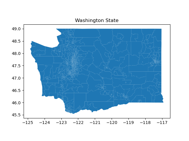
Task: Write a function plot_map that takes the merged data and plots the shapes of all the census tracts in Washington in a file map.png. Give the plot a title of “Washington State” with plt.title(). Do not customize this plot or overlay any data.
plot_population_map
Note: Layered plots can vary depending on the layering procedure, so it’s OK if your plots look as expected after checking the diff but match only 98 or 99%, or if they’re off by 1-2 pixels in either dimension.
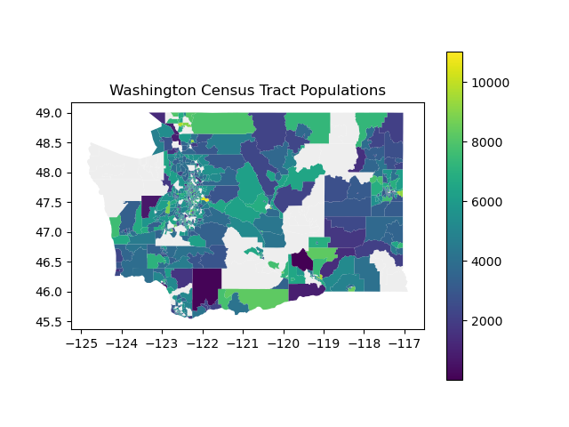
Task: Write a function plot_population_map that takes the merged data and plots the shapes of all the census tracts in Washington in a file population_map.png where each census tract is colored according to population. There will be some missing census tracts. Under the census tracts, plot the map of Washington in the background color #EEEEEE. Include a legend to indicate the meaning of each census tract color and give the plot a title of “Washington Census Tract Populations” with plt.title().
plot_population_county_map
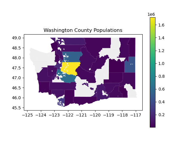
Task: Write a function plot_population_county_map that takes the merged data and plots the shapes of all the census tracts in Washington in a file county_population_map.png where each county is colored according to population. This will involve aggregating all the census tract data in each county, and there will be some missing counties. Under the census tracts, plot the map of Washington in the background color #EEEEEE. Include a legend to indicate the meaning of each census tract color and give the plot a title of “Washington County Populations” with plt.title().
Note: Remember when aggregating geospatial data, to only aggregate relevant columns! You should avoid any unnecessary computations.
plot_food_access_by_county
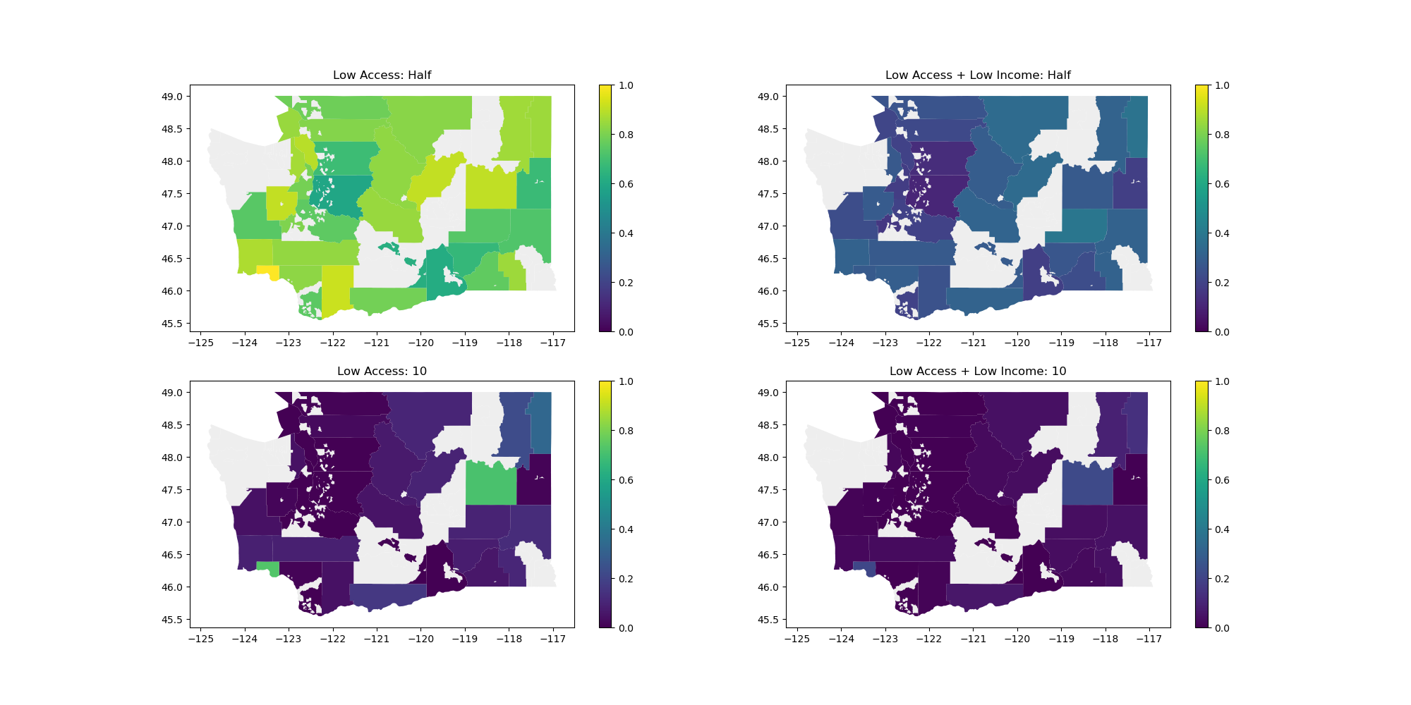
Task: Write a function plot_food_access_by_county that takes the merged data and produces 4 plots on the same figure showing information about food access across income level.
First, compute the ratio of people in each category.
Slice the dataframe to keep only the columns
County,geometry,POP2010,lapophalf,lapop10,lalowihalf,lalowi10.Aggregate this dataset by
County, summing up all the numeric columns.For each
County, compute the ratio of people in each category:lapophalf_ratio,lapop10_ratio,lalowihalf_ratio,lalowi10_ratio. Add these columns to the sliced copy of the dataset to simplify access in later steps.
Then, set up the figure using subplots.
fig, [[ax1, ax2], [ax3, ax4]] = plt.subplots(2, 2, figsize=(20, 10))Finally, plot the data on each ax1 ax2 ax3 ax4 subplot axis. For each subplot:
Plot the map of Washington in the background color
#EEEEEE.Call the
plotfunction on the appropriate column with the argumentsax(to specify the subplot axis) andvmin=0andvmax=1(so they all share the same scale). Include a legend.Set the titles for each axis to match the expected output picture, such as
ax1.set_title('Low Access: Half').
Save the figure to a file county_food_access.png.
plot_low_access_tracts
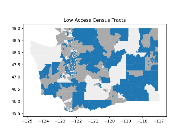
Task: Write a function plot_low_access_tracts that takes the merged data and plots all census tracts considered “low access” in a file low_access.png.
Note: For this problem, do not use the LATracts_half or LATracts10 columns in the GeoDataFrame. The intent of this problem is to have you practice the computation necessary to recreate those values. Note that the procedure described below won’t compute the exact same values, which is intended.
First, compute the above statistics for each census tract depending on its classification as Urban or Rural. Don’t use the LATracts_half or LATracts10 columns in the GeoDataFrame since this computation is slightly more subtle. The thresholds for urban tracts are considered differently from rural tracts.
Urban: If the census tract is “urban”, the distance of interest is half a mile from a food source. The threshold for low access in an urban census tract is at least 500 people or at least 33% of the people in the census tract being more than half a mile from a food source. An urban census tract that satisfies either of these conditions is considered low access.
Rural (i.e. non-urban): If the census tract is “rural”, the distance of interest is 10 miles from a food source. The threshold for low access in a rural census tract is at least 500 people or at least 33% of the people in the census tract being more than 10 miles from a food source. A rural census tract that satisfies either of these conditions is considered low access.
Then, produce a layered plot (all on the same axes) to highlight low access census tracts. Each plot will draw on top of the previous plot.
Plot the map of Washington in the background with color
#EEEEEE.Plot all the census tracts for which we have food access data in the color
#AAAAAA.Plot all the census tracts considered low access in the default color, blue.
Give it a title of “Low Access Census Tracts” with plt.title().
Writeup
Task: In hw5_writeup.md, apply critical thinking to address the following questions about data collection and analysis. You could spend an entire course talking about any of these topics, but we’re looking for at least 2 to 4 sentences on each question.
Is the plot produced by
plot_food_access_by_countyan effective visualization? Why or why not?Is the plot produced by
plot_low_access_tractsan effective visualization? Why or why not?What is one way that government officials could use
plot_food_access_by_countyorplot_low_access_tractsto shape public policy on how to improve food access?What is a limitation or concern with using the plots in this way? What information might be missing from these plots?
Quality
Homework submissions should pass these checks: flake8 and code quality guidelines. The code quality guidelines are very thorough. For this homework, the most relevant rules can be found in these sections:
Submission
Submit your work by uploading the following files to Gradescope:
hw5.pyhw5_writeup.mdmap.pngpopulation_map.pngcounty_population_map.pngcounty_food_access.pnglow_access.png
Please make sure you are familiar with the resources and policies outlined in the syllabus.