Learning objective: Apply pandas and seaborn to process, visualize, and predict outcomes about data.
You can find the starter code for this homework on JupyterHub.
nces-ed-attainment.csvis a CSV file that contains the education dataset for this assignment.hw3.pyis the file for you to put your implementations.hw3_writeup.mdis the file for your writeup. Instead of testing, this homework emphasizes reflection on our data analysis.cse163_imgd.pyis a helper file that checks your plot outputs against expected output, and creates an image showing any pixel differences. You can run this file to check the output ofhw3.pyagainst the expected images, using the commandpython cse163_imgd.pyin the terminal.expectedis a folder containing the expected output forline_plot_min_degreeandbar_plot_high_school. Don’t modify the contents of this folder.
Info: Running your files works a bit differently in this homework than previous ones since you do not need to write your own tests. Once you’ve implemented plotting functions in hw3.py with calls to plt.savefig(), you’ll see that running cse163_imgd.py generates some images showing the pixel differences between your plot and the expected plot highlighted in red. If the image is blank, then all the pixels match. A summary of the percentage of pixels that match will appear in the console.
Context
The National Center for Education Statistics is a U.S. federal government agency for collecting and analyzing data related to education. We have downloaded and cleaned one of their datasets: Percentage of persons 25 to 29 years old with selected levels of educational attainment, by race/ethnicity and sex: Selected years, 1920 through 2018. The nces-ed-attainment.csv file has columns for Year, Sex, Min degree, and race/ethnicity categories. Note the missing data: not all columns have data starting from 1920!
| Year | Sex | Min degree | Total | White | Black | Hispanic | Asian | Pacific Islander | American Indian/Alaska Native | Two or more races |
|---|---|---|---|---|---|---|---|---|---|---|
| 1920 | A | high school | --- | 22.0 | 6.3 | --- | --- | --- | --- | --- |
| 1940 | A | high school | 38.1 | 41.2 | 12.3 | --- | --- | --- | --- | --- |
| ⋮ | ⋮ | ⋮ | ⋮ | ⋮ | ⋮ | ⋮ | ⋮ | ⋮ | ⋮ | ⋮ |
| 2018 | F | master's | 10.7 | 12.6 | 6.2 | 3.8 | 29.9 | --- | --- | --- |
Our main method provides a line of code to read nces-ed-attainment.csv and replaces all occurrences of the str "---" with pandas NaN to help with later data processing steps. The data is represented as a pandas DataFrame with the following MultiIndex:
Yearis the first level of theMultiIndexwith values ranging from 1920 to 2018.Sexis the second level of theMultiIndexwith the following values:Ffor female,Mfor male, orAfor all students.Min degreethe third level of theMultiIndexwith values referring to the minimum degree of educational attainment:high school,associate's,bachelor's, ormaster's.
and columns:
Totalis the overall percentage of people of theSexin theYearwith at least theMin degreeof educational attainment.White,Black,Hispanic,Asian,Pacific Islander,American Indian/Alaska Native,Two or more racesis the percentage of students of the specified race (and of theSexin theYear) with at least theMin degreeof educational attainment.
Any missing data is denoted by NaN (not a number).
We have provided some starter code in main to read in the CSV. You should not modify this code. By defining a MultiIndex on the columns Year, Sex, and Min degree, we can answer questions like “What is the overall percentage of those who have at least a high school degree in the year 2018?” with the following df.loc[index, columns] expression.
data.loc[(2018, "A", "high school"), "Total"]Programming
Do not use any loops, list comprehensions, or dictionary comprehensions. The goal of this homework is to apply data science libraries to answer questions.
Be sure to call all of the functions you write inside your main method!
Unlike HW2, function headers and type annotations are not provided. You’ll need to write them yourself!
Instead of writing test cases, we’ll only be working with the educational attainment dataset described above. We have provided a file, cse163_imgd.py, that can be used to verify correctness of the plots we ask you to create. Instead of writing tests cases, you’ll be asked to write and reason about the quality of work demonstrated in each task.
Pandas: compare_bachelors_year
What were the percentages for women vs. men having earned a Bachelor’s Degree in a given year?
Task: Write a function compare_bachelors_year that takes the educational attainment data and a year and returns a two-row Series that indicates the percentages of persons with listed sex "M" or "F" who achieved at least a bachelor's degree in the given year. Here is an example of the output for the year 1980. (The ... will be replaced with the actual percentages.)
| Year | Sex | Min degree | |
|---|---|---|---|
| 1980 | M | bachelor's | ... |
| F | bachelor's | ... |
Pandas: mean_min_degrees
What were the 2 most commonly-awarded levels of educational attainment awarded between 2000--2010 (inclusive) for a given sex?
Task: Write a function mean_min_degrees that takes the educational attainment data, a start_year (default None), an end_year (default None), a string category (default "Total") and returns a Series indicating, for each Min degree within the given years, the average percentage of educational attainment for people of the given category between the start_year and the end_year for the sex A. When start_year or end_year is None, consider all rows from either the beginning or end of the dataset (respectively)
Seaborn: line_plot_min_degree
Note: For line_plot_min_degree and bar_plot_high_school, be sure to use the respective generic seaborn functions. Instead of barplot(), you should use catplot(), and instead of lineplot(), you should use relplot().
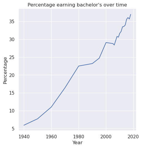
Task: Write a function line_plot_min_degree that takes the educational attainment data and a min degree, and plots a line plot of the Total percentage for Sex A with the specified Min degree over each year in the dataset. Label the x-axis Year, the y-axis Percentage, and title the plot Percentage earning [min degree] over time, where [min degree] is replaced with the specified degree.
For example, if the specified degree was "bachelor's", then the title of the plot should be “Percentage earning bachelor’s over time”. The particular line plot for the "bachelor's" degree looks like this:
Save the plot as line_plot_min_degree.png with parameter bbox_inches='tight'.
plt.savefig('line_plot_min_degree.png', bbox_inches='tight')For this assignment, you do not need to save the files with any prefix. We give you the line of code you should use to save the output above.
Seaborn: bar_plot_high_school
Note: For line_plot_min_degree and bar_plot_high_school, be sure to use the respective generic seaborn functions. Instead of barplot(), you should use catplot(), and instead of lineplot(), you should use relplot().
Task: Write a function bar_plot_high_school that takes the data and a year, then plots a bar plot comparing the total percentages of Sex F, M, and A with high school Min degree in given the Year. Label the x-axis Sex, the y-axis Percentage, and title the plot High school completion in [year], where [year] is replaced with the specified year.
For example, if the specified year was 2009, then the title of the plot should be “High school completion in 2009”. The particular bar plot for 2009 looks like this:
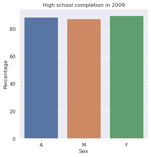
Is this visualization effective? You will be asked to consider this in the last section of the assignment.
Save the plot as bar_plot_high_school.png with parameter bbox_inches='tight'.
plt.savefig('bar_plot_high_school.png', bbox_inches='tight')main
Write a main method in hw3.py that loads in the dataset provided and calls all of the functions you wrote. For all of the method calls, you should rely on any default parameters we specified unless the problem statement or motivating question included other specific inputs.
Writeup
Task: In hw3_writeup.md, apply critical thinking to address the following questions about data visualization, data ethics and justice, and our data analysis methods. You could spend an entire course talking about any of these topics, but we’re just looking for 2 to 4 sentences on each question.
md is the file extension for Markdown, the text formatting language used in Jupyter Notebooks. This webpage is also represented by a Markdown file! Markdown offers a natural-looking way to define headings, lists, and links using special characters like #. But you don’t actually need to learn anything to start writing Markdown---you can just write plaintext under each heading in hw3_writeup.md.
Debugging NaN Values
While writing test cases, one of your coworkers noticed that some calls to mean_min_degrees produce NaN values and wanted your opinion on whether or not this is a bug with the function. Here is the code she used:
mean_min_degrees(data, category="Pacific Islander")Fortunately, you have a link to the original data source.
Task: In the first writeup question in hw3_writeup.md, explain why a NaN value appears in the result of your coworker’s code cell.
Bar vs. Scatter Plot
For this writeup, we will focus on Section 1.6: Problems of honesty and good judgment from the first chapter of Kieran Healy’s Data Visualization: A practical introduction.
A scatter plot for the same task as bar_plot_high_school is shown below:
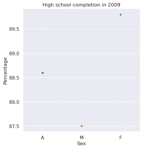
Task: In the second question of hw3_writeup.md, answer which plot you prefer (between the scatter and bar plot) and explain why. Include at least one reference to the reading in your answer.
Bias
Datasets can biased. Bias in data means it might be skewed away from or portray an incorrect picture of reality. For example, the data might contain inaccuracies or the methods used to collect the data may have been flawed.
Task: In the third question of hw3_writeup.md, describe a possible bias present in this dataset and why it might have occurred.
Quality
Homework submissions should pass these checks: flake8 and code quality guidelines. The code quality guidelines are very thorough. For this homework, the most relevant rules can be found in these sections (new sections bolded):
Boolean Zen
Loop Zen
Factoring
Unnecessary Cases
Avoid Looping with Pandas
Submission
Submit your work by uploading the following files to Gradescope:
hw3.pyhw3_writeup.mdline_plot_min_degree.pngbar_plot_high_school.png
Submit as often as you want until the deadline for the initial submission. Note that we will only grade your most recent submission.
Please make sure you are familiar with the resources and policies outlined in the syllabus.