Skip to main content
Link
Menu
Expand
(external link)
Document
Search
Copy
Copied
# Assessment Part 3 Strategies for assessing user needs and access cse482a: Fall 2026; Jennifer Mankoff (Last Edited: 2026-10-26). <a href="/courses/cse482a/26au/slides/assessment3.html">Live View: /slides/assessment3.html</a> Important Reminder: check zoom & captioning <a href="/courses/cse482a/26au/slides/assessment3.html"><img src="https://api.qrserver.com/v1/create-qr-code/?data=/slides/assessment3.html&size=100x100" alt="QR for /courses/cse482a/26au/slides/assessment3.html" title="" /></a> --- <div class="slide-outline" style="margin: 1em 0; padding: 1em; background: #f5f5f5; border-radius: 5px;"> <h2 style="margin-top: 0;"> Outline </h2> <ul style="list-style-type: none; padding-left: 0;"> <li><a href="#3">(P)OUR: Perceivable</a> (Slide 3)</li> <li><a href="#15">P(O)UR: Operable</a> (Slide 15)</li> <li><a href="#41">PO(U)R: Understandable</a> (Slide 41)</li> <li><a href="#56">POU(R): Robust</a> (Slide 56)</li> </ul> </div> --- class: center, middle, inverse # (P)OUR: Perceivable (Guidelines 1.2-1.4) --- ## Reminder: Guideline 1.1: Text alternatives ALT text, etc --- ## Guideline 1.2: Time-based media - Perceivable for disability x media (audio-only; video-only; audio-video; audio and/or video combined with interaction) - Best practices vary depending on whether it is recorded or live, and the type of media, and include: - Video Description - Captions - Transcripts - ASL interpretation ??? Kind of in 1.1 but also complicated so it gets its own guideline. --- ## Finding Guideline 1.2 Violations Probably best tested manually... --- ## Video/Animation/Audio Accessibility Relevant for slides; web; anywhere Understandable live & recorded video for people who are not able to hear audio Understandable live & recorded video for people who are not able to see the screen Other factors such as avoiding seizures & so on ??? delete avoiding seizures next year --- ## Captioning Videos - Auto captioning getting better, but still makes many errors - Does not easily support multilingual settings - Errors for people with accents - Errors for proper nouns and names - Best practice is manual captioning and/or ASL live, or pre-recorded - Easy to apply and then correct auto captioning with existing tools (e.g. YouTube has an interface) --- ## Audio Describing Videos May require pausing video More commonly available today than ever You can try it: [YouDescribe](https://youdescribe.org/); If you want to know more: [describing educational videos](https://dcmp.org/learn/descriptionkey) ??? ([post a link to your video](https://edstem.org/us/courses/107577/discussion//5427230)) --- ## Guideline 1.3: Adaptable (1/2) - Ensure that all information is available in a form that can be perceived by accessibility tools (and thus spoken aloud, simplified, etc) - This includes information that is not encoded in text such as - page organization - relationships - cross-site or cross-app organization - other structural information ??? Example: spoken aloud, or presented in a simpler visual --- ## Guideline 1.3: Adaptable (2/2) Requires structure and info can be programmatically determined by assistive technology - Section headings are used to organize the content - Styling is handled through CSS, not heading level ??? Structure and information should be able to be programmatically determined by assistive technology, so it can be rendered in other formats as needed by the user. --- ## Finding Guideline 1.3 Violations - Let's check sequencing: [motherjones webaim](https://wave.webaim.org/report#/https://motherjones.com) - Examples/subcategories of guideline: - Can user get information about relationships, footnotes, etc in multiple modalities - **Sequence things correctly** - Make sure instructions rely on multiple senses - Support multiple display sizes and orientations - **Clearly identify input and field purposes in forms** ??? Sequence e.g. linear reading order is meaningful in a multi-column document Multiple senses: (i.e. not just color, size, location, etc) Also in 1.1 but complicated enough to get it's own guideline Many of these should/can be supported programmatically --- ## Guideline 1.4 Distinguishable (1/2) - Make the default presentation as easy to perceive as possible to people with disabilities. - Example: separate visual foreground information from the background - color contrast - volume contrast --- ## Guideline 1.4: Distinguishable (2/2) - Audio longer than 3s can be stopped; low or no background audio - Support text resizing (AAA) - Support a 1 column view of content - Avoid tooltips and popups - Meet color contrast expectations Note: If popups exist, must be: dismissable; hoverable; and persistent ??? Text resizing = no images of text; allows for changing color etc popups, --- class: center, middle, inverse # P(O)UR: Operable --- ## Guid. 2.1 (1/5): Keyboard Accessible - Keyboards are uniquely flexible & pretty universal - Keyboards are operable by people with most disabilities - Examples of who benefits - screen reader users (e.g. blind users, reading disabilities) - speech input users - switch input users --- ## Guid. 2.1 (2/5): Keyboard Accessible - But we need to think about keyboard accessibility when using all apps - Drawing program - Drag and Drop - Drone control - Game play - Website navigation - ... --- ## Guid. 2.1 (3/5): Keyboard Accessible - Some common pitfalls: - Keyboard Traps. This is a common problem when multiple formats are combined within a page and rendered using plug-ins or embedded applications. -- - Invisible Content. Some parts of a web page can never be reached -- - Lack of Control. Users should be able to reconfigure or remove shortcuts ??? Note: Not in guidelines (that I know of) but a "reverse trap" is whether you can reach text that *doesn't* have links or headers when using switch input. How would you do this? Character key shortcuts work well for many keyboard users, but are inappropriate and frustrating for speech input users — whose means of input is strings of letters — and for keyboard users who are prone to accidentally hit keys. To rectify this issue, authors need to allow users to turn off or reconfigure shortcuts that are made up of only character keys. --- ## Guid. 2.2 (1/2): Enough Time - Timed content includes rotating content; timeouts; etc - Many users who have disabilities may need more time to complete tasks - To physically respond - To read things - To find things (e.g. due to low vision) - To accessing content through an assistive technology (e.g. single switch) --- ## Guideline 2.2 (1/2): Enough Time - Make timelines adjustable if necessary - Able to resume after timeout without data loss - Warn users about time limits - Provide controls (Pause, Stop & Hide) for blinking text and animations - Let users postpone or suppress interruptions - Interruptions involving an emergency still appear (AAA) --- exclude: true # POUR: Operable: Guidelines 2.1-2.5 .left-column[ ## Guideline 2.3 (1/2) Seizures and Physical Reactions ] .right-column[ In 1997, a cartoon on television in Japan sent over 700 children to the hospital, including about 500 who had seizures. - Most people are unaware that they are triggered until it strikes. - Warnings do not work well because they are often missed, especially by children who may in fact not be able to read them. ] ??? It is possible to avoid these types of flashes and still create appealing apps/websites --- exclude: true ## Guideline 2.3 (1/2): Seizures and Physical Reactions In 1997, a cartoon on television in Japan sent over 700 children to the hospital, including about 500 who had seizures. - Most people are unaware that they are triggered until it strikes. - Warnings do not work well because they are often missed, especially by children who may in fact not be able to read them. ??? It is possible to avoid these types of flashes and still create appealing apps/websites --- exclude: true ## Guideline 2.3 (2/2): Seizures and Physical Reactions - Web pages do not contain anything that flashes more than three times in any one second period - Motion animation triggered by interaction can be disabled, unless the animation is essential to the functionality or the information being conveyed (AAA) --- ## Guideline 2.4 (1/5): Navigable Can the user - Orient themselves within the overall app - Find the content they need - Go somewhere they want to go? - Keep track of their location? Connections: Guideline 1.3 (Structure can be perceived); 1.3.1 (Use headings) --- ## Guideline 2.4 (2/5): Navigable - Can orient oneself & find content - Can jump over uninteresting content ??? examples: Navigation (that is the same on every page on a site); Anything that is not the news article (on a news site); Advertisements; etc. --- ## Guideline 2.4 (3/5): Navigable - Can orient oneself & find content - Can jump over uninteresting content - Titles, links & headings descriptive - Each page has descriptive title - Links have informative link text - Headings and labels are descriptive, hierarchical, and used for content not styling --- ## Guideline 2.4 (4/5): Navigable - Can orient oneself & find content - Can jump over uninteresting content - Titles, links & headings descriptive - Focus is usable - Focus order makes sense. - Requires special support when navigating trees and tables. - Focus is visible (A); perceivable (AA) & obscured by other content (A) --- ## Key Navigation Concept - Reaching times: How long does it take to get somewhere - Information you need to collect to assess this: - You need to know the linear order of a webpage or app. - You need to know about any hierarchy that is programmatically available (e.g. headers) - No way to automatically assess this! Hard to assess well without knowing best tricks for navigation that disabled people use. --- ## A page with layout .left-column60[ (table but imagine it was CSS) <style type="text/css"> .tg {border-collapse:collapse;border-spacing:0;} .tg td{border-color:black;border-style:solid;border-width:1px;font-family:Arial, sans-serif;font-size:14px; overflow:hidden;padding:10px 5px;word-break:normal;} .tg th{border-color:black;border-style:solid;border-width:1px;font-family:Arial, sans-serif;font-size:14px; font-weight:normal;overflow:hidden;padding:10px 5px;word-break:normal;} .tg .tg-w747{background-color:#dae8fc;text-align:left;vertical-align:top} .tg .tg-kftd{background-color:#efefef;text-align:left;vertical-align:top} .tg .tg-ltxa{background-color:#ffccc9;text-align:left;vertical-align:top} .tg .tg-0lax{text-align:left;vertical-align:top} </style> <div class="table-wrapper"><table class="tg"> <thead> <tr> <th class="tg-kftd" colspan="3"><span style="color:#333;background-color:#FFF">Title spanning whole width of table</span></th> </tr> </thead> <tbody> <tr> <td class="tg-w747" rowspan="3">Navigation 1<br>Navigation 2<br>Navigation 3<br>Navigation 4</td> <td class="tg-ltxa">Banner Ad</td> <td class="tg-w747" rowspan="3">Right Nav 1<br>Right Nav 2<br>Right Nav 3</td> </tr> <tr> <td class="tg-0lax" rowspan="2">Main content area with lots of text and stories <br>filling the center part of the window</td> </tr> <tr> </tr> </tbody> </table></div> ] .right-column40[ - What focus order makes sense for this page? - Does this match the actual focus order? - When might you need to skip things? ] --- ## Linear Order with no CSS - Depends on how the page was designed. One possibility - Title - Right Nav 1 - Right Nav 2 - Right Nav 3 - Navigation 1 - ... - Navigation 4 - Banner ad - Main content area --- ## Swipe order? (bad) .left-column60[ | Cell | Nefarious order | |--------------|-----------------| | Title | 1 | | Right Nav 1 | 8 | | Right Nav 2 | 9 | | Right Nav 3 | 10 | | Banner ad | 3 | | Navigation 1 | 4 | | Navigation 2 | 5 | | Navigation 3 | 6 | | Navigation 4 | 7 | | Content | 11 | ] .right-column40[ <style type="text/css"> .tg {border-collapse:collapse;border-spacing:0;} .tg td{border-color:black;border-style:solid;border-width:1px;font-family:Arial, sans-serif;font-size:14px; overflow:hidden;padding:10px 5px;word-break:normal;} .tg th{border-color:black;border-style:solid;border-width:1px;font-family:Arial, sans-serif;font-size:14px; font-weight:normal;overflow:hidden;padding:10px 5px;word-break:normal;} .tg .tg-w747{background-color:#dae8fc;text-align:left;vertical-align:top} .tg .tg-kftd{background-color:#efefef;text-align:left;vertical-align:top} .tg .tg-ltxa{background-color:#ffccc9;text-align:left;vertical-align:top} .tg .tg-0lax{text-align:left;vertical-align:top} </style> <div class="table-wrapper"><table class="tg"> <thead> <tr> <th class="tg-kftd" colspan="3"><span style="color:#333;background-color:#FFF">Title spanning whole width of table</span></th> </tr> </thead> <tbody> <tr> <td class="tg-w747" rowspan="3">Nav 1<br>Nav 2<br>Nav 3<br>Nav 4</td> <td class="tg-ltxa">Banner Ad</td> <td class="tg-w747" rowspan="3">Right Nav 1<br>Right Nav 2<br>Right Nav 3</td> </tr> <tr> <td class="tg-0lax" rowspan="2">Main content area with lots of text and stories filling the center part of the window</td> </tr> <tr> </tr> </tbody> </table></div> ] --- ## Swipe order? (better) .left-column60[ | Cell | Well designed order | |--------------|---------------------| | Title | 1 | | [skip cell] | 2 | | Right Nav 1 | 3a | | Right Nav 2 | 3b | | Right Nav 3 | 3c | | Banner ad | 3e | | Navigation 1 | 3a | | Navigation 2 | 3b | | Navigation 3 | 3c | | Navigation 4 | 3d | | Content | 3 | ] .right-column40[ <style type="text/css"> .tg {border-collapse:collapse;border-spacing:0;} .tg td{border-color:black;border-style:solid;border-width:1px;font-family:Arial, sans-serif;font-size:14px; overflow:hidden;padding:10px 5px;word-break:normal;} .tg th{border-color:black;border-style:solid;border-width:1px;font-family:Arial, sans-serif;font-size:14px; font-weight:normal;overflow:hidden;padding:10px 5px;word-break:normal;} .tg .tg-w747{background-color:#dae8fc;text-align:left;vertical-align:top} .tg .tg-kftd{background-color:#efefef;text-align:left;vertical-align:top} .tg .tg-ltxa{background-color:#ffccc9;text-align:left;vertical-align:top} .tg .tg-0lax{text-align:left;vertical-align:top} </style> <div class="table-wrapper"><table class="tg"> <thead> <tr> <th class="tg-kftd" colspan="3"><span style="color:#333;background-color:#FFF">Title spanning whole width of table</span></th> </tr> </thead> <tbody> <tr> <td class="tg-w747" rowspan="3">Nav 1<br>Nav 2<br>Nav 3<br>Nav 4</td> <td class="tg-ltxa">Banner Ad</td> <td class="tg-w747" rowspan="3">Right Nav 1<br>Right Nav 2<br>Right Nav 3</td> </tr> <tr> <td class="tg-0lax" rowspan="2">Main content area with lots of text and stories filling the center part of the window</td> </tr> <tr> </tr> </tbody> </table></div> Hidden skip Link to content ] --- ## Swipe order? (best) .left-column60[ | Cell | Chunked order | |-------------|---------------------| | Title | 1 | | [skip cell] | 2 | | Nav Area | 3 | | Right Nav | 3a | | Right Nav 1 | 3a.1 | | Right Nav 2 | 3a.2 | | Right Nav 3 | 3a.3 | | Left Nav | 3b | | Navigation 1 | 3b.1 | | Navigation 2 | 3b.2 | | Navigation 3 | 3b.3 | | Navigation 4 | 3b.4 | | Banner ad | 3c | | Content | 4 | ] .right-column40[ <style type="text/css"> .tg {border-collapse:collapse;border-spacing:0;} .tg td{border-color:black;border-style:solid;border-width:1px;font-family:Arial, sans-serif;font-size:14px; overflow:hidden;padding:10px 5px;word-break:normal;} .tg th{border-color:black;border-style:solid;border-width:1px;font-family:Arial, sans-serif;font-size:14px; font-weight:normal;overflow:hidden;padding:10px 5px;word-break:normal;} .tg .tg-w747{background-color:#dae8fc;text-align:left;vertical-align:top} .tg .tg-kftd{background-color:#efefef;text-align:left;vertical-align:top} .tg .tg-ltxa{background-color:#ffccc9;text-align:left;vertical-align:top} .tg .tg-0lax{text-align:left;vertical-align:top} </style> <div class="table-wrapper"><table class="tg"> <thead> <tr> <th class="tg-kftd" colspan="3"><span style="color:#333;background-color:#FFF">Title spanning whole width of table</span></th> </tr> </thead> <tbody> <tr> <td class="tg-w747" rowspan="3">Nav 1<br>Nav 2<br>Nav 3<br>Nav 4</td> <td class="tg-ltxa">Banner Ad</td> <td class="tg-w747" rowspan="3">Right Nav 1<br>Right Nav 2<br>Right Nav 3</td> </tr> <tr> <td class="tg-0lax" rowspan="2">Main content area with lots of text and stories filling the center part of the window</td> </tr> <tr> </tr> </tbody> </table></div> chunks group meaningful info ] ??? - User can double tap to drill down into chunk (e.g. navigate to the “like” button by drilling down into an individual post). --- ## More Navigation Concepts Forms and inputs have issues with *order* and *labels*. This is fixed different ways on different platforms, but all major UI dev tools have APIs for accessibility. Make sure you use them *and* test them. - Web [advice](http://webaim.org/techniques/forms/controls) and [advanced advice](http://webaim.org/techniques/forms/advanced) on this. Look for similar documentation for android/iOS. Tables are not ideal, but *best* when headers are labeled. Again, check the API for your interface dev platform. --- ## Guideline 2.5 (1/5): Pointers for access - Support a variety of input options - avoid path based gestures when possible; - offer alternatives to path based gestures or multi-finger gestures - provide programmatic alternatives to shaking or tilting or dragging based interaction - **overall goal**: allow users to use multiple possible types of input (keyboard, pointer, on-screen keyboard, stylus, et --- ## Guideline 2.5 (2/5): Pointers for access - Support a variety of input options - Don't require timed or complex gestures. Examples - drag-and-drop gestures and on touch screens - swiping gestures - split taps - long presses - multi-finger gestures - tilting based interactions --- ## Guideline 2.5 (3/5): Pointers for access - Support a variety of input options - Don't require timed or complex gestures. - Don't require selecting small targets, or high precision (i.e. due to tremor) - 24x24 CSS Pixels (AA) - 44x44 CSS Pixels (AAA) - 48x48 (Mobile) --- ## More on Size .left-column40[ Especially hard on mobile devices 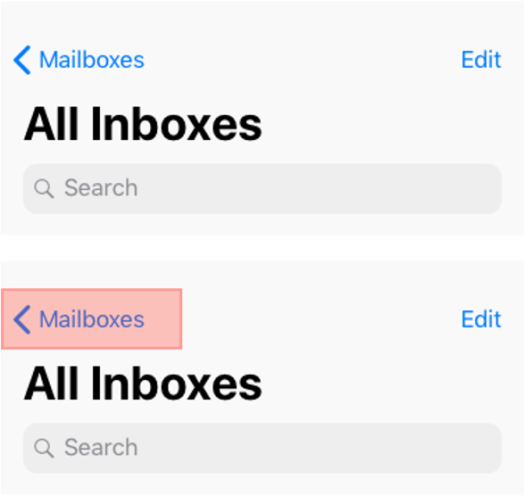 ] .right-column60[ Can make targets larger than their visual error - Reduces errors - Still intuitive - White space around targets also helps ] ??? Solve for one, extend to many Trying to hit a small button with one hand while standing on a moving, crowded bus --- ## Guideline 2.5 (4/5): Pointers for access - Support a variety of input options - Don't require timed or complex gestures. - Don't require selecting small targets, or high precision (i.e. due to tremor) - Trigger content only on *up* events (after a complete click) --- ## Guideline 2.5 (5/5): Pointers for access - Support a variety of input options - Don't require timed or complex gestures. - Don't require selecting small targets, or high precision (i.e. due to tremor) - Trigger content only on *up* events (after a complete click) - Match the **accessible name** and **visual name** of components - better supports programmatic access provided by accessibility tools. --- # Finding 2.1-2.5 Violations - 2.1 Keyboard Accessible - 2.2 Enough Time - 2.4 Navigable - 2.5 Pointers alone should be able to access everything How would you check each of these in WebAIM? Using Accessibility Technology? ([post](https://edstem.org/us/courses/107577/discussion/)) --- class: center, middle, inverse # PO(U)R: Understandable --- ## Guideline 3.1 (1/4): Readable - Support all reading disabilities/reading modality preferences - Access tools can access all text content --- ## Guideline 3.1 (2/4): Readable - Support all reading disabilities/reading modality preferences - Provide meta data on language - Including parts of a page if the language switches). - Also provide pronunciation information when needed to read aloud properly --- ## Guideline 3.1 (3/4): Readable - Support all reading disabilities/reading modality preferences - Provide meta data on language - Provide a dictionary - Easy to find & well organized - Include jargon, abbreviations, and other unusual words --- ## Guideline 3.1 (4/4): Readable - Support all reading disabilities/reading modality preferences - Provide meta data on language - Provide a dictionary - Aim for clarity & simplicity - Clear and simple language; appropriate reading level - Or... clear and simple summaries. - If possible, provide audio or ASL --- ## Guideline 3.2 (1/4): Predictable - Present content in a predictable order that is consistent across an app or website. - Can help screen reader users - Can help people with cognitive impairments - Can help people who use magnification and can only see part of a layout --- ## Guideline 3.2 (2/4): Predictable - Present content in a predictable order that is consistent across an app or website. - Focus alone shouldn't trigger events - e.g. submit a form; launch a dialog; change layout - instead provide a button (e.g. "update now"; "submit") - same for page elements or inputs. - Describe what will happen before a change to a form control. --- ## Guideline 3.2 (3/4): Predictable - Present content in a predictable order that is consistent across an app or website. - Focus alone shouldn't trigger events - Locate repeating elements consistently throughout site - navigation menus, search fields, skip to navigation links; help and so on - same 2D position - same logical linear ordering --- ## Guideline 3.2 (4/4): Predictable - Present content in a predictable order that is consistent across an app or website. - Focus alone shouldn't trigger events - Locate repeating elements consistently throughout site - Use familiar names and icons for things. - Within your site/app - As much as possible be consistent with global standards --- ## Guideline 3.3 (1/5):Input Assistance - Some people with disabilities may have trouble with input - creating error-free input - detecting input errors Try to reduce the number of serious or irreversible errors that are made --- ## Guideline 3.3 (2/5): Input Assistance - Some people with disabilities may have trouble with input - Support form validation - Support error identification - Provide specific and easily found text error descriptions - Provide suggestions for correcting errors --- ## Guideline 3.3 (3/5): Input Assistance - Reduce serious or irreversible consequences - Support form validation - Make forms clear - Instructions and labels for form inputs - Context-sensitive help --- ## Guideline 3.3 (4/5): Input Assistance - Reduce serious or irreversible consequences - Support form validation - Make forms clear - Support review - Before final purchase or form submission - Especially when the consequences may be serious or hard to undo --- ## Guideline 3.3 (5/5): Input Assistance - Reduce serious or irreversible consequences - Support form validation - Make forms clear - Support review - Simplify authentication - Automate entry of redundant information - Are authentication techniques accessible? --- ## Finding Guideline 3.1-3.3 Violations Definitely a combination of manual and automated testing here. - 3.1 Readable - 3.2 Predictable - 3.3 Input Assistance --- class: center, middle, inverse # POU(R): Robust --- ## Guideline 4.1 (1/2): Compatible Don't break user accessibility technologies (AT) with things like poorly formed markup Don't circumvent AT with unconventional markup/code Expose information in standard ways Follow conventions and be compatible with APIs as much as possible ??? This was already a running theme but let's make it explicit --- ## Guideline 4.1 (2/2): Compatible - Use standard and complete start and end tags on web pages - Use standard types of status messages to announce changes that are not user initiated - e.g. "18 results returned" from an asynchronous search task - Provide name, role, and value custom controls
