Skip to main content
Link
Menu
Expand
(external link)
Document
Search
Copy
Copied
# Assessment (Section Slides) Practice assessing user needs and access cse443: Winter 2026; Jennifer Mankoff (Last Edited: 2026-01-12). <a href="/courses/cse443/26wi/slides/section-assessment.html">Live View: /slides/section-assessment.html</a> Important Reminder: check zoom & captioning <a href="/courses/cse443/26wi/slides/section-assessment.html"><img src="https://api.qrserver.com/v1/create-qr-code/?data=/slides/section-assessment.html&size=100x100" alt="QR for /courses/cse443/26wi/slides/section-assessment.html" title="" /></a> --- <div class="slide-outline" style="margin: 1em 0; padding: 1em; background: #f5f5f5; border-radius: 5px;"> <h2 style="margin-top: 0;"> Outline </h2> <ul style="list-style-type: none; padding-left: 0;"> <li><a href="#3">Auditing for Accessibility</a> (Slide 3)</li> </ul> </div> --- class: center, middle, inverse # Auditing for Accessibility --- ## Audit "Problem Reports" - Name/Brief Description - Brief and Specific (Unique) - Testing Method - What tools found this problem (screen reader? manual? etc) - Evidence - WCAG guideline violated; screenshot with evidence of the violation. - Explanation - Explain the issue and possible causes. - Severity & Justification (next slide) - Possible solution --- ## Severity Severity - Rank severity 1-4 1. Cosmetic 2. Minor: Low Priority 3. Major: High Priority 4. Catastrophe --- ## Severity Justification Justify your ranking in terms of frequency, impact and persistence. - Frequency - Is the problem common or rare? - Impact - Is it hard or easy to overcome this? - Persistence - Is there a way to work around this problem? - Possible Solution - Explain a potential solution to improving the accessibility. --- ## Example  .footnote[Example borrowed from CSE340] --- ## Header (bad) - Description: Color Contrast Issue - Testing Method: WebAim Contrast Checker - Evidence: Violated Guideline .footnote[Example borrowed from CSE340] --- ## Header (good) - Description: Very Low Color Contrast for Text - Testing Method: WebAim Contrast Checker - Evidence: Guideline violated: 1.4.3 Contrast (Minimum) --- ## Example 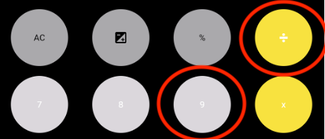 Provides specific guideline .footnote[Example borrowed from CSE340] --- ## Example Explanation (bad) Explanation: There is bad contrast between the elements in the text for the given application. This will make it hard for people to use the app. This doesn't specify *what* has bad contrast. It doesn't explain *how* it will be hard or *who* might be impacted or .footnote[Example borrowed from CSE340] --- ## Example Explanation (good) Explanation: This accessibility issue violates success criterion 1.4.3 Contrast as the color contrast between the text and color of the buttons does not meet the required contrast ratio making the text not easily distinguishable. This could create a challenge for users with low vision or other vision impairments because of the inadequate contrast of colors in the application. As a result, some users may not be able to fully engage with the functionalities of this application and this could even cause users to experience additional negative consequences while trying to navigate this issue. .footnote[Example borrowed from CSE340] --- ## Example Severity (bad) Severity Rating: 3 Justification: The application will make it hard for users who do not have good vision since they will not be able to see the text on the buttons. Which will make it hard for the person to use the app. Does not explain the frequency of the issue. Does not talk about the impact of this violation or if it could be avoided. .footnote[Example borrowed from CSE340] --- ## Example Severity (good) Severity Rating: 3 Justification: Frequency is high on this app because there is more than one color contrast error on this page. Impact is high since this is an issue that disrupts the main functionality of the app, making it hard to overcome. This in return impacts the user’s ability to interact with the rest of the content on this app. Persistence is high as this accessibility issue cannot be avoided due to it being one of the main features of the app. .footnote[Example borrowed from CSE340] --- ## Example Solution (bad) Possible Solution: Change the buttons colors to something that makes the contrast better Not specific enough .footnote[Example borrowed from CSE340] --- ## Example Solution (good) Possible Solution: To improve this, the developer should increase the contrast ratio by either 1. making the color of the text darker (e.g., black text against the light gray button) or 2. making the color of the buttons darker (e.g., dark gray button against with white text). .footnote[Example borrowed from CSE340]
