Link
Menu
Expand
(external link)
Document
Search
Copy
Copied
# Assessment Strategies for assessing user needs and access CSE443: Winter 2026; Jennifer Mankoff (Last Edited: 2026-01-03).
Live View: /slides/assessment.html
Important Reminder: check zoom & captioning
--- class: center, middle, inverse # Announcements -- ## [No Announcements Today] --- class: center, middle, inverse # Assesssment --- # Learning Goals for Today - **What are the current accessibility standards** (1 and 2) - How to make media accessible (Diagrams; GUIs; videos) - How do we use automated tools --- ## Introduction to Accessibility Standards In this class we will structure our learning around the Web Accessibility Initiative ([WAI](http://www.w3.org/wai/)), a service of the World Wide Web Consortium (W3C) - Makes recommendations for Web authors, browsers and servers: **Web Content Accessibility Guidelines (WCAG)** - WCAG is an ongoing project - There is no *official* equivalent for non-web programming,
but WCAG can easily be applied to apps as well - Lots of ways to learn WCAG
(e.g. this [certificate program](https://de.torontomu.ca/wa/); this [textbook](https://pressbooks.library.torontomu.ca/pwaa/); and [WebAIM](https://webaim.org)) ??? We could spend a whole quarter on this... but we're going to limit it to one or two weeks "live" (regularly being worked on and updated, with input from the disability community). --- ## The [POUR](https://webaim.org/articles/pour/) standard - Perceivable: Web content is made available to the senses - sight, hearing, and/or touch - Operable: Interface forms, controls, and navigation are operable - Understandable: Information and the operation of user interface must be understandable. - Robust: Content must be robust enough that it can be interpreted by a wide variety of user agents, including assistive technologies .footnote[Note: There is a 5th thing, Conformance, which we are not covering] ??? This is appropriate for *all* disabilities -- don't think access is only an issue for blind and low vision (BLV) people Obviously there is some overlap between these, and they build on each other --- ## Three levels of compliance *Some* users with disabilities can access and use web content (A) *Removal of significant barriers* overall to accessing content (AA) *Enhancements to web accessibility* for more users with disabilities (AAA) Most apps and websites today only meet *part* of (A) level compliance! --- class: center, middle, inverse # Perceivable (Guidelines 1.1-1.4) --- ## Guideline 1.1 Text Alternatives: Provide *electronic text* alternatives for any non-text content. .left-column50[ - [Decorative and branding](https://dl.acm.org/doi/pdf/10.1145/3308558.3313605) - Formatting and text styling - Images as links - [Diagrams](https://ieeexplore.ieee.org/stamp/stamp.jsp?arnumber=9028522&casa_token=zZw_rYBgu1AAAAAA:eozpbJ-vvMZjQNt8p6WU91X4uFumPs-yVuMn4PTPRjyMhtsVrprdIEe1JfYOCUdv8SFP_TGd9s965Q&tag=1) - [Visualizations](https://ieeexplore.ieee.org/stamp/stamp.jsp?tp=&arnumber=9555469) - [Memes](https://dl.acm.org/doi/10.1145/3308561.3353792) - [GUIS](https://dl.acm.org/doi/10.1145/3411764.3445040) ] .right-column50[ - Animations/Videos (we'll talk more about this later today) - AR/VR ([Accessibility, Disabilities, and VR](https://educatorsinvr.com/2019/05/31/accessibility-disabilities-and-virtual-reality-solutions/)) - [Comparison of IoS and Android Rich Interactions](https://dl.acm.org/doi/pdf/10.1145/2851613.2851680?casa_token=dOz4huS0TUkAAAAA:zv0PjZk3-T8Bb4X2SfNpdZFuqO2u9v1jpWn5fq0hKZ0se6t5g0oMKLfrAmhlyufcw_3AuJ-ABZ2yWQ) - CAPTCHAS (will discuss later) - ... ] ??? Why non text? - Can be rendered visually, auditorially, tactilely, or by any combination. - Can also be easily enlarged All of these require different strategies to describe them well. Read up on some of these links when you are faced with specific description needs --- ## Small Group Activity Break into small groups and take turns. - Find inaccessible non-photograph you posted on Ed but don't show it. - **Read** the group your description. - Then look at it. What did you learn from this? [post](https://edstem.org/us/courses/90089/discussion//5427179) --- ## Diagrams (1 of 2) .left-column40[  
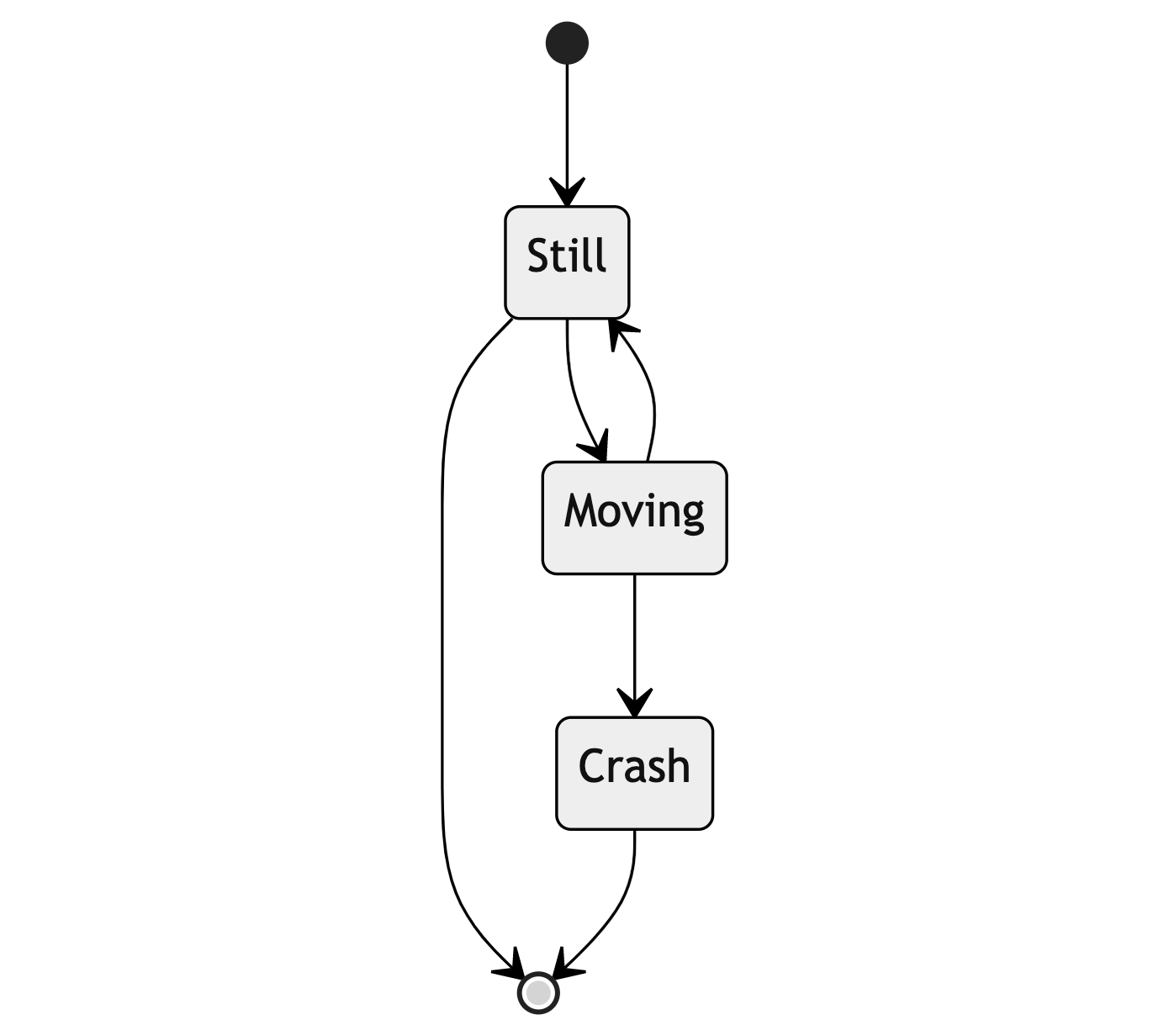
] .right-column60[ When direct exploration isn't possible, consider descriptions that are *language based* ] --- ## Diagrams (2 of 2)
stateDiagram-v2
[*] --> Still
Still --> [*]
Still --> Moving
Moving --> Still
Moving --> Crash
Crash --> [*]
--- ## MathML standard for accessibility Math has a hierarchy just like other systems (i.e. fractions, parentheses) Can support with MathML Can generate MathML using pandoc; MS Word; etc Capturing an image of an equation and describing it much worse for screen reader users --- ## What about GUIs? How do BLV technology users understand and access visual semantics?  .footnote[[Investigating Visual Semantic Understanding of Blind and Low-Vision Technology Users](https://dl.acm.org/doi/abs/10.1145/3411764.3445040)] ??? Interviews; Screen reader tasks; Reconstruction --- ## Results (1/2) Participants were aware of the overall structure of *phone apps* - They developed this understanding using screen readers - Associated size and location and function - Layouts were understood in terms of absolute, relative, and corner positions --- ## Results (2/2)
.quote[ The way I think about this is on the top is my email, to the right is my phone number. Below that [is] essentially a 2 by 2 kind of thing, which has my social profile. ] --- ## Image Description: GUIs .left-column40[  
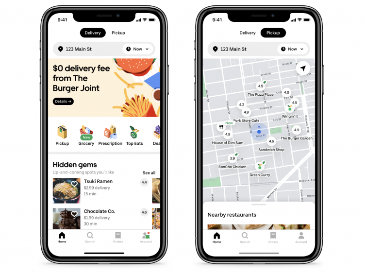
] .right-column60[ - **DO** describe visual attributes / semantics (aesthetics and usability) - **DO NOT** repeat screen readers (control) ] --- ## My description of the leftmost GUI .left-column[  
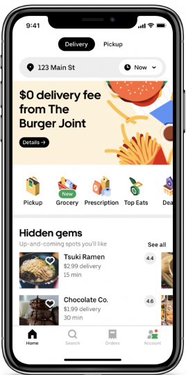
] -- .right-column[ - App has two tabs at top center: Delivery and Pickup. - Below is a search bar with address and time menu and an advertisement for The Burger Joint (25% of screen) with a details button - Next is a scrolling set of tabs for Pickup; Grocery; Prescription; Top Sites; the rest is not visible off screen - The bottom 30% of the screen shows the title Hidden Gems (Up and coming spots you'd like) with a list of restaurants. Each row in the list shows an image, restaurant name, rating, and more. The list requires 2D scrolling to see everything. The top two are visible: Tsuki Ramen and Chocolate Co. ] ??? This is very hard to describe without knowing what is accessible; and whether the user is more interested in content or layout. --- ## Describing GUIs is rarely necessary GUI description best supported dynamically through exploration. Critical needs for this - Accessibility information available for interface - Touch screen phone interaction techniques Don't describe GUIs, explore them. --- .left-column40[  
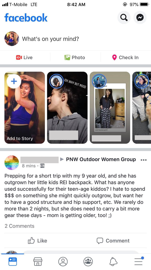
] .right-column60[ ### Developer Responsibility Expose GUI structure Provide good ALT text - What is a good name for the "Like" Button? - Enable the user to understand the name of the control they have navigated to, what type of control it is, what value it has, what state it has. ] --- .left-column40[  ] .right-column60[ ## Proper ALT text Screen reader will read out name, role, and state. Don't repeat these. Good alt text: Name ("Like") API knows: Role ("Button") API knows: State ("Not selected") ] --- .left-column40[  ] .right-column60[ ## Exception: Your UARs Focus on the relevant stuff Example: alt text for the like button A picture of Facebook with a like button visible at bottom left (a thumbs up followed by the word like) ] ??? (assuming it's the subject of my UAR, slide or etc) --- ## Guideline 1.1 is not just about images - Controls, Input - Time-Based Media - Visual Test or Exercise - Sensory Experience - CAPTCHA Make this ignorable - Decoration, Formatting, Invisible --- # ARIA [ARIA](https://developer.mozilla.org/en-US/docs/Web/Accessibility/ARIA) is a key standard used to do this for **A**ccessible **R**ich **I**nternet **A**pplications - Read up on it if you are trying to build an accessible website - You'll see it in WAVE results --- # QUICK BREAK Good time to stand and stretch --- # POUR: Perceivable: Guidelines 1.1-1.4 .left-column[ ## Guideline 1.2 Provide perceivable alternatives for time-based media ] .right-column[ Includes: audio-only; video-only; audio-video; audio and/or video combined with interaction Best practices vary depending on whether it is recorded or live, and the type of media, and include: - Video Description - Captions - Transcripts - ASL interpretation ] ??? Kind of in 1.1 but also complicated so it gets its own guideline. --- # Finding Guideline 1.2 Violations Probably best tested manually... --- # Video/Animation/Audio Accessibility Relevant for slides; web; anywhere Understandable live & recorded video for people who are not able to hear audio Understandable live & recorded video for people who are not able to see the screen Other factors such as avoiding seizures & so on ??? delete avoiding seizures next year --- # Captioning Videos Auto captioning getting better, but still makes many errors - Does not easily support multilingual settings - Errors for people with accents - Errors for proper nouns and names Best practice is manual captioning and/or ASL live, or pre-recorded Easy to apply and then correct auto captioning with existing tools (e.g. YouTube has an interface) --- # Audio Describing Videos May require pausing video More commonly available today than ever You can try it: [YouDescribe](https://youdescribe.org/); If you want to know more: [describing educational videos](https://dcmp.org/learn/descriptionkey) ??? ([post a link to your video](https://edstem.org/us/courses/90089/discussion//5427230)) --- # POUR: Perceivable: Guidelines 1.1-1.4 .left-column[ ## Guideline 1.3 Adaptable ] .right-column[ Ensure that all information is available in a form that can be perceived by accessibility tools (and thus spoken aloud, simplified, etc) This includes information that is not encoded in text such as - page organization - relationships - cross-site or cross-app organization - other structural information ] ??? Example: spoken aloud, or presented in a simpler visual --- # Guideline 1.3: Adaptable Requires structure and info can be programmatically determined by assistive technology - Section headings are used to organize the content - Styling is handled through CSS, not heading level ??? Structure and information should be able to be programmatically determined by assistive technology, so it can be rendered in other formats as needed by the user. --- # Finding Guideline 1.3 Violations .left-column[ ## Guideline 1.3 Let's check sequencing: [Cnn.com on webaim](https://wave.webaim.org/report#/https://www.cnn.com/) ] .right-column[ Examples/subcategories of guideline: - Can user get information about relationships, footnotes, etc in multiple modalities - Sequence things correctly - Make sure instructions rely on multiple senses - Support multiple display sizes and orientations - Clearly identify input and field purposes in forms ] ??? Sequence e.g. linear reading order is meaningful in a multi-column document Multiple senses: (i.e. not just color, size, location, etc) Also in 1.1 but complicated enough to get it's own guideline Many of these should/can be supported programmatically --- # POUR: Perceivable: Guidelines 1.1-1.4 .left-column[ ## Guideline 1.4 Distinguishable ] .right-column[ - Make the default presentation as easy to perceive as possible to people with disabilities. - Example: separate visual foreground information from the background - color contrast - volume contrast ] --- # POUR: Perceivable: Guidelines 1.1-1.4 .left-column[ ## Guideline 1.4 Distinguishable ] .right-column[ - Audio longer than 3s can be stopped; low or no background audio - Support text resizing (AAA) - Support a 1 column view of content - Avoid tooltips and popups - Meet color contrast expectations Note: If popups exist, must be: dismissable; hoverable; and persistent ] ??? Text resizing = no images of text; allows for changing color etc popups, --- # More on Color contrast Choose colors that provide enough contrast between content and the background so that anyone with low-vision impairments and color deficiencies can perceive the content. .left-column50[ WCAG Level AAA requires a contrast ratio of at least - .contrast71[7:1 for normal text] - .contrast41[4.5:1 for large text (14t pt bold or larger)] - .badcontrast[Avoid anything else!] ] .right-column50[ - [Colorzilla](https://chrome.google.com/webstore/detail/colorzilla/bhlhnicpbhignbdhedgjhgdocnmhomnp?hl=en) is an excellent tool for extracting the color value from any page element; - WebAIM has a [contrast checker](https://webaim.org/resources/contrastchecker/#:~:text=WCAG%20Level%20AAA%20requires%20a,value%20from%20any%20page%20element) ] --- # Small Group Activity Try finding violations yourself [WebAIM for Seattle Public Schools](https://wave.webaim.org/report#/https://www.seattleschools.org/) The task you are evaluating is whether a disabled family can "Report a Concern" about how accessible the website is How did this differ from testing with a magnifier/switch last class? [Post your UAR on Ed](https://edstem.org/us/courses/31170/discussion/5427256) --- class: center, middle, inverse # Announcments (1/3) --- # Announcements - Ed posts getting lost: - We'll try to use pinning more! - Also, quick tour of how we organized [Ed](https://edstem.org/us/courses/90089/discussion/). -- - Contrast: Thank you Kirsten! Fixed (I hope!). - Maybe we can add the class website to next year's assignment :). --- # Announcements (2/3) - Presentations as an assignment: We received feedback that this is very stressful. This is an important concern to unpack. - Would be happy to talk about this more 1:1 with anyone - Have started an [Ed discussion on ideas around presenting](https://edstem.org/us/courses/90089/discussion//458634}}) for those interested. --- # Announcements (3/3) - Could there be a ed post each week of a summary of assignments that are due that week? - Let's try, please let us know if it is helpful. - Also, [Canvas]({{site.canvas}}) has assignments with due dates for everything due each week: Reading questions, assignment, and weekly participation survey. --- [//]: # (Outline Slide) # Learning Goals for Today - **What are the current accessibility standards (2 and 3 and 4)** --- # POUR: Operable: Guidelines 2.1-2.5 .left-column[ ## Guideline 2.1 (1/5) Keyboard Accessible ] .right-column[ No other form of input (besides keyboards) has this flexibility or is universally supported and operable by people with different disabilities, as long as the keyboard input is not time-dependent. Examples of who benefits - screen reader users (e.g. blind users, reading disabilities) - speech input users - switch input users ] --- # POUR: Operable: Guidelines 2.1-2.5 .left-column[ ## Guideline 2.1 (2/5) Keyboard Accessible ] .right-column[ - Drawing program - Drag and Drop - Drone control - Game play - Website navigation - ... ] --- # POUR: Operable: Guidelines 2.1-2.5 .left-column[ ## Guideline 2.1 (3/5) Keyboard Accessible ] .right-column[ Some common pitfalls: - Keyboard Traps. Content should not "trap" keyboard focus within subsections of content on a Web page. This is a common problem when multiple formats are combined within a page and rendered using plug-ins or embedded applications. ] --- # POUR: Operable: Guidelines 2.1-2.5 .left-column[ ## Guideline 2.1 (4/5) Keyboard Accessible ] .right-column[ Some common pitfalls: - Keyboard Traps. - Invisible Content. Some parts of a web page can never be reached ] --- # POUR: Operable: Guidelines 2.1-2.5 .left-column[ ## Guideline 2.1 (5/5) Keyboard Accessible ] .right-column[ Some common pitfalls: - Keyboard Traps. - Invisible Content. Some parts of a web page can never be reached - Lack of Control. Users should be able to reconfigure or remove shortcuts ] Notes: Note: Not in guidelines (that I know of) but a "reverse trap" is whether you can reach text that *doesn't* have links or headers when using switch input. How would you do this? Character key shortcuts work well for many keyboard users, but are inappropriate and frustrating for speech input users — whose means of input is strings of letters — and for keyboard users who are prone to accidentally hit keys. To rectify this issue, authors need to allow users to turn off or reconfigure shortcuts that are made up of only character keys. --- # POUR: Operable: Guidelines 2.1-2.5 .left-column[ ## Guideline 2.2 (1/2) Enough Time ] .right-column[ Many users who have disabilities need more time to complete tasks than the majority of users: - may take longer to physically respond - may take longer to read things - may have low vision and take longer to find things or to read them - may be accessing content through an assistive technology that requires more time. ] --- # POUR: Operable: Guidelines 2.1-2.5 .left-column[ ## Guideline 2.2 (2/2) Enough Time ] .right-column[ - Timelines are adjustable (e.g. rotating content; timeouts; etc), and minimized when not necessary - If a timeout does necessarily occur, users should be able to resume without loss of data after re-authenticating - If data loss will occur, users are warned about the timeout limits - Pause, Stop & Hide all possible for all blinking text, animations and so on - Interruptions can be postponed or suppressed by the user, except interruptions involving an emergency (AAA) ] --- # POUR: Operable: Guidelines 2.1-2.5 .left-column[ ## Guideline 2.3 (1/2) Seizures and Physical Reactions ] .right-column[ In 1997, a cartoon on television in Japan sent over 700 children to the hospital, including about 500 who had seizures. - Most people are unaware that they are triggered until it strikes. - Warnings do not work well because they are often missed, especially by children who may in fact not be able to read them. ] Notes: It is possible to avoid these types of flashes and still create appealing apps/websites --- # POUR: Operable: Guidelines 2.1-2.5 .left-column[ ## Guideline 2.3 (2/2) Seizures and Physical Reactions ] .right-column[ - Web pages do not contain anything that flashes more than three times in any one second period - Motion animation triggered by interaction can be disabled, unless the animation is essential to the functionality or the information being conveyed (AAA) ] --- # POUR: Operable: Guidelines 2.1-2.5 .left-column[ ## Guideline 2.4 (1/5) Navigable ] .right-column[ - Can users find the content they need / go somewhere they want to go? - Can users keep track of their location? - Can users orient themselves within a website or app? Connections: Guideline 1.3 (any structure in the content can be perceived). Headings (1.3.1) are an important example of structure that supports navigation and orientation. ] --- # POUR: Operable: Guidelines 2.1-2.5 .left-column[ ## Guideline 2.4 (2/5) Navigable ] .right-column[ - Can jump over uninteresting content ] Notes: examples: Navigation (that is the same on every page on a site); Anything that is not the news article (on a news site); Advertisements; etc. --- # POUR: Operable: Guidelines 2.1-2.5 .left-column[ ## Guideline 2.4 (3/5) Navigable ] .right-column[ - Can jump over uninteresting content - Each web page has a descriptive title; Links have link text that is clear about their purpose; Headings and labels describe topic and purpose ] --- # POUR: Operable: Guidelines 2.1-2.5 .left-column[ ## Guideline 2.4 (4/5) Navigable ] .right-column[ - Can jump over uninteresting content - Titles; Links; and Headings are clear and descriptive - Focus order makes sense. This can be problematic in any web page, and is requires special support when navigating trees and tables. - Focus is visible (A) and perceivable (AA) and not obscured by other content (A) ] --- # POUR: Operable: Guidelines 2.1-2.5 .left-column[ ## Guideline 2.4 (4/5) Navigable ] .right-column[ - Can jump over uninteresting content - Titles; Links; and Headings are clear and descriptive - Focus order makes sense and focus is visible and perceivable - Users should be able to locate a web page, and orient themselves, within a website - Section headings are used to organize the content, styling is handled through CSS, not heading level ] --- # POUR: Operable: Guidelines 2.1-2.5 .left-column[ ## Guideline 2.5 (1/5) Pointers, just like Keyboards, should be able to access everything ] .right-column[ - All functionality should be accessible via pointer input devices. - People operating pointer input devices may not be able to carry out timed or complex gestures. Examples - drag-and-drop gestures and on touch screens - swiping gestures - split taps - long presses. - They may also have trouble selecting small targets, or with precision (i.e. due to tremor) ] --- # POUR: Operable: Guidelines 2.1-2.5 .left-column[ ## Guideline 2.5 (2/5) Pointers, just like Keyboards, should be able to access everything ] .right-column[ - Support a variety of input options including a single pointer; offer alternatives to gestures and other physical actions - avoid path based gestures when possible; - offer alternatives to path based gestures or multi-finger gestures - provide programmatic alternatives to shaking or tilting or dragging based interaction - **overall goal**: allow users to use multiple possible types of input (keyboard, pointer, on-screen keyboard, stylus, etc) ] --- # POUR: Operable: Guidelines 2.1-2.5 .left-column[ ## Guideline 2.5 (3/5) Pointers, just like Keyboards, should be able to access everything ] .right-column[ - Support a variety of input options; a single pointer; offer alternatives to gestures and other physical actions - Trigger content only on *up* events (after a complete click) ] --- # POUR: Operable: Guidelines 2.1-2.5 .left-column[ ## Guideline 2.5 (4/5) Pointers, just like Keyboards, should be able to access everything ] .right-column[ - Support a variety of input options; a single pointer; offer alternatives to gestures - Trigger content only on *up* events - Make the *accessible name* and visual name for components match - better supports programmatic access provided by accessibility tools. ] --- # POUR: Operable: Guidelines 2.1-2.5 .left-column[ ## Guideline 2.5 (5/5) Pointers, just like Keyboards, should be able to access everything ] .right-column[ - Support a variety of input options; a single pointer; offer alternatives to gestures - Trigger content only on *up* events - Make the *accessible name* and visual name for components match - Targets of: 24x24 CSS Pixels (AA) or 44x44 CSS Pixels (AAA) make selection easier ] --- # More on Size .left-column40[ Especially hard on mobile devices  ] .right-column60[ Even if the user misses the Text Label on the screen, they will still be able to trigger the desired action because the touch target is larger than what appears, resulting in less user error. White space around targets also helps Minimum on mobile: 48x48 ] Notes: Solve for one, extend to many Trying to hit a small button with one hand while standing on a moving, crowded bus --- # POUR: Adaptable: Guidelines 3.1-3.3 .left-column[ ## Guideline 3.1 (1/4) Readable ] .right-column[ Readability mean supporting people with all sorts of reading disabilities/reading modality preferences - Some of this can be automated if tools can access text content & appropriate meta data is provided - Some has to do with understandability, use of jargon, etc ] --- # POUR: Adaptable: Guidelines 3.1-3.3 .left-column[ ## Guideline 3.1 (2/4) Readable ] .right-column[ Provide meta data language - Including parts of a page if the language switches). - Also provide pronunciation information when needed to read aloud properly ] --- # POUR: Adaptable: Guidelines 3.1-3.3 .left-column[ ## Guideline 3.1 (3/4) Readable ] .right-column[ Provide meta data language Provide a dictionary - easy to find & well organized - include jargon, abbreviations, and other unusual words ] --- # POUR: Adaptable: Guidelines 3.1-3.3 .left-column[ ## Guideline 3.1 (4/4) Readable ] .right-column[ Provide meta data language Provide a dictionary Aim for clarity & simplicity - Use clear and simple language at an appropriate reading level - If not possible, include clear and simple summaries. - If possible provide an audio or sign language version of content ] --- # POUR: Adaptable: Guidelines 3.1-3.3 .left-column[ ## Guideline 3.2 (1/4) Predictable ] .right-column[ Present content in a predictable order that is consistent across an app or website. - Can help screen reader users - Can help people with cognitive impairments - Can help people who use magnification and can only see part of a layout ] --- # POUR: Adaptable: Guidelines 3.1-3.3 .left-column[ ## Guideline 3.2 (2/4) Predictable ] .right-column[ - Focus alone shouldn't trigger events: provide control over content changes - don't submit a form; launch a dialog; change layout, etc on focus - instead provide an "update now" button; "submit" button; etc - same for page elements or inputs. - Describe what will happen before a change to a form control. ] --- # POUR: Adaptable: Guidelines 3.1-3.3 .left-column[ ## Guideline 3.2 (3/4) Predictable ] .right-column[ - Focus alone shouldn't trigger events: provide control over content changes - Locate repeating elements consistently throughout site - navigation menus, search fields, skip to navigation links; help and so on - same 2D position - same logical linear ordering ] --- # POUR: Adaptable: Guidelines 3.1-3.3 .left-column[ ## Guideline 3.2 (4/4) Predictable ] .right-column[ - Focus alone shouldn't trigger events: provide control over content changes - Locate repeating elements consistently throughout site - Use familiar names and icons for things. As much as possible be consistent with global standards, not just within the app/site. ] --- # POUR: Adaptable: Guidelines 3.1-3.3 .left-column[ ## Guideline 3.3 (1/5) Input Assistance ] .right-column[ Some people with disabilities may have trouble with input - creating error-free input - detecting input errors Try to reduce the number of serious or irreversible errors that are made ] --- # POUR: Adaptable: Guidelines 3.1-3.3 .left-column[ ## Guideline 3.3 (2/5) Input Assistance ] .right-column[ - Support form validation - forms should support error identification with specific and easily found text error descriptions - provide appropriate suggestions for correcting errors ] --- # POUR: Adaptable: Guidelines 3.1-3.3 .left-column[ ## Guideline 3.3 (3/5) Input Assistance ] .right-column[ - Support form validation - Make forms clear - Provide clear instructions and labels for form inputs - Provide context-sensitive help ] --- # POUR: Adaptable: Guidelines 3.1-3.3 .left-column[ ## Guideline 3.3 (4/5) Input Assistance ] .right-column[ - Support form validation - Make forms clear - Support review - Support review before final purchase or submission of information. - Especially when the consequences may be serious (such as an expensive purchase) or hard to undo ] --- # POUR: Adaptable: Guidelines 3.1-3.3 .left-column[ ## Guideline 3.3 (5/5) Input Assistance ] .right-column[ - Support form validation - Make forms clear - Support review - Simplify authentication - Don't require people to re-enter redundant information (automate instead) - Make sure authentication techniques are accessible ] --- # Aside: CAPTCHA Accessibility .left-column50[  ] .right-column50[ Commonly used security method - Designed to be hard for computers and easy for humans - Require vision No good accessible alternatives -- [audio CAPTCHA are easy to crack](https://arstechnica.com/information-technology/2008/12/computer-scientists-find-audio-captchas-easy-to-crack/) and hard to use ([video with more info](https://www.youtube.com/watch?v=raFXfU7_fkg)). ] Notes: Pointer to later 2nd wave accessibility topic: Accessibility and computer security --- # Audio CAPTCHA Accessibility .left-column50[  ] .right-column50[ Commonly used security method - Designed to be hard for computers and easy for humans - Require vision
Answer: ] --- # POUR: Robust: Guideline 4.1 .left-column[ ## Guideline 4.1 (1/3) Compatible ] .right-column[ Don't break user accessibility technologies (AT) with things like poorly formed markup Don't circumvent AT with unconventional markup/code Expose information in standard ways Follow conventions and be compatible with APIs as much as possible ] Notes: This was already a running theme but let's make it explicit --- # POUR: Robust: Guideline 4.1 .left-column[ ## Guideline 4.1 (2/3) Compatible ] .right-column[ - Use standard and complete start and end tags on web pages - Use standard types of status messages to announce changes in content that are not user initiated (e.g. "18 results returned" from an asynchronous search task) - Provide name, role, and value custom controls ] --- class: center, middle, inverse # Auditing for Accessibility --- ## Audit "Problem Reports" - Name/Brief Description - Brief and Specific (Unique) - Testing Method - What tools found this problem (screen reader? manual? etc) - Evidence - WCAG guideline violated; screenshot with evidence of the violation. - Explanation - Explain the issue and possible causes. - Severity & Justification (next slide) - Possible solution --- ## Severity Severity - Rank severity 1-4 1. Cosmetic 2. Minor: Low Priority 3. Major: High Priority 4. Catastrophe --- ## Severity Justification Justify your ranking in terms of frequency, impact and persistence. - Frequency - Is the problem common or rare? - Impact - Is it hard or easy to overcome this? - Persistence - Is there a way to work around this problem? - Possible Solution - Explain a potential solution to improving the accessibility. --- ## Example  .footnote[Example borrowed from CSE340] --- ## Header (bad) - Description: Color Contrast Issue - Testing Method: WebAim Contrast Checker - Evidence: Violated Guideline .footnote[Example borrowed from CSE340] --- ## Header (good) - Description: Very Low Color Contrast for Text - Testing Method: WebAim Contrast Checker - Evidence: Guideline violated: 1.4.3 Contrast (Minimum) --- ## Example  Provides specific guideline .footnote[Example borrowed from CSE340] --- ## Example Explanation (bad) Explanation: There is bad contrast between the elements in the text for the given application. This will make it hard for people to use the app. This doesn't specify *what* has bad contrast. It doesn't explain *how* it will be hard or *who* might be impacted or .footnote[Example borrowed from CSE340] --- ## Example Explanation (good) Explanation: This accessibility issue violates success criterion 1.4.3 Contrast as the color contrast between the text and color of the buttons does not meet the required contrast ratio making the text not easily distinguishable. This could create a challenge for users with low vision or other vision impairments because of the inadequate contrast of colors in the application. As a result, some users may not be able to fully engage with the functionalities of this application and this could even cause users to experience additional negative consequences while trying to navigate this issue. .footnote[Example borrowed from CSE340] --- ## Example Severity (bad) Severity Rating: 3 Justification: The application will make it hard for users who do not have good vision since they will not be able to see the text on the buttons. Which will make it hard for the person to use the app. Does not explain the frequency of the issue. Does not talk about the impact of this violation or if it could be avoided. .footnote[Example borrowed from CSE340] --- ## Example Severity (good) Severity Rating: 3 Justification: Frequency is high on this app because there is more than one color contrast error on this page. Impact is high since this is an issue that disrupts the main functionality of the app, making it hard to overcome. This in return impacts the user’s ability to interact with the rest of the content on this app. Persistence is high as this accessibility issue cannot be avoided due to it being one of the main features of the app. .footnote[Example borrowed from CSE340] --- ## Example Solution (bad) Possible Solution: Change the buttons colors to something that makes the contrast better Not specific enough .footnote[Example borrowed from CSE340] --- ## Example Solution (good) Possible Solution: To improve this, the developer should increase the contrast ratio by either 1. making the color of the text darker (e.g., black text against the light gray button) or 2. making the color of the buttons darker (e.g., dark gray button against with white text). .footnote[Example borrowed from CSE340] --- class: center, middle, inverse # Accessibility Implementation Assignment --- ## This week's assignment The goal of this homework is to make something more accessible (e.g. website, visualization, user interface, AR/VR, etc) that you’ve already made. Required learning goals: - Familiarity with a Range of Accessibility Technologies (discussed earlier today) ??? If you don't have an interface, come speak with us! --- ## Assignment steps 1. Pick something to assess 2. Select an accessibility technology and test your app with it 3. Repeat with a second accessibility technology 4. Fix at least two problems from at least two different areas of POUR 5. Write your reflections This is a two week assignment --- class: center, middle, inverse # In-class practice audit --- ## Scenario (for today): Load it up on any device! - [Accessible University](https://a11y-assessments.pages.oit.duke.edu/accessible-u/before_u.html) (not accessible) - [Accessible University](https://a11y-assessments.pages.oit.duke.edu/accessible-u/after_u.html) (accessible) - [Accessible University Source](https://a11y-assessments.pages.oit.duke.edu/accessible-u/) - [Information about Accessible University](https://www.washington.edu/accesscomputing/AU/info.html) [Originally developed](https://www.washington.edu/accesscomputing/AU/index.html) at UW by [AccessComputing](https://www.washington.edu/accesscomputing/) --- ## Break into pairs - One person load it on your laptop (use the *Safari* browser on os x) - One person load it on your phone - Start a google document to keep track of your findings. Break it into sections (one per problem or group of similar problems). Load [Accessible University](https://a11y-assessments.pages.oit.duke.edu/accessible-u/before_u.html) --- ## Follow the guide - Check for videos (no) - Check rotation (what do you notice?) - Check if the form is visually understandable (labels) --- ## What to do with that? Check the [WCAG beginner's guide](https://appt.org/en/guidelines/wcag-beginners-guide) to make sure it's a problem. In this case, it's bad UX but doesn't rise to "access problem" --- ## Text Resizing - Does text resize - Is it legible? --- ## What to do with that? Fill out all the parts of the problem report using [our form](https://docs.google.com/forms/d/e/1FAIpQLSepJusBexhY5yp6JGOYG83MPuDcmIOoywXKAPRIulYrB7YErQ/viewform?usp=sharing) - Name/Brief Description (Unique) - Testing Method: Visual Inspection - Evidence: Take a photo; add in the success criterion (1.4.4) --- ## Explanation - Explanation: This app issues violates success criterion 1.4.4 Resize Text, because text doesn't resize properly on an iPhone. This is challenging for user who cannot read small fonts easily. - Severity 3 --- ## Severity Justification - Justification: Frequency is high because it affects all text. Impact is medium because the reader can zoom in and out (they have to scroll a lot then though). Persistence is high because there isn't an easy work around Discuss difference between impact and persistence here --- ## Solution This one is actually quite hard to solve, but [Craig Hockenberry's blog post on dynamic type](https://furbo.org/2024/07/04/dynamic-type-on-the-web/) is both a demonstration of a working solution and an explanation of how to solve it. --- ## Color Contrast One easy way to check one the web is using WebAim's [Wave](https://wave.webaim.org/report#/https://a11y-assessments.pages.oit.duke.edu/accessible-u/before_u.html) This is much easier on a laptop! The link above loads our sample bad web page. Look at "contrast errors" *Note*: You can group these all into one problem report --- ## Screen Reader: Textual Alternatives Simplist to check with [Wave](https://wave.webaim.org/report#/https://a11y-assessments.pages.oit.duke.edu/accessible-u/before_u.html). Click on "details" and check them all. You'll see - 3 x missing alt text - 6 x linked image missing alt text - 2 x suspicious alt text (much further down) --- ## Screen Reader: Order of Elements Order of elements can be checked two ways 1. Tab through things (laptop only) 2. Click on "Order" in WAVE This can also be checked on a phone with an actual screen reader -- it will be your "swipe order" --- ## Turning on your screen reader iPhone: Can be done in settings -> accessibility -> voiceover OSX: Settings -> search for voiceover --- ## (On-desktop) screen reader interaction Three core interaction patterns: - Linear navigation through like objects - Hierarchical navigation through logically related objects - Switching between object types --- ## (On-phone) screen reader interaction .left-column[  ] .right-column[ Three core interaction patterns: - Swipe to navigate linearly - Touch to navigate spatially - The first “hit” of an interface element will focus, double tap to select/activate that interface element ] ??? Discuss similarities and differences from desktop --- ## ALT-Tab to safari
- Try it: Read the title; use VO (control-option) to move around - iPhone users try swiping (swipe up slowly until you hear 3 beeps to switch apps from settings) --- ## As you move around - Check ALT text - Check roles ("navigation"; "button"; etc) - Check headings - Try to operate the app (fill in the form) --- ## Some things I noticed - "required fields in blue" (not visible to screen reader user) - I couldn't complete the form. It didn't tell me where the error was - form labels read twice on laptop Other issues - Missing "skip link" - Heading level not consistent with semantics - Carousel not accessible [All 18 problems](https://a11y-assessments.pages.oit.duke.edu/accessible-u/issues.html) --- class: center, middle, inverse # More Assessment! --- [//]: # (Outline Slide) # Learning Goals for Today - Remainder of POUR: accessibility standards (2 and 3 and 4) - More on how to assess websites / implement changes --- # POUR: Operable: Guidelines 2.1-2.5 .left-column[ ## Guideline 2.1 (1/5) Keyboard Accessible ] .right-column[ Keyboards are uniquely flexible & pretty universal Keyboards are operable by people with most disabilities Examples of who benefits - screen reader users (e.g. blind users, reading disabilities) - speech input users - switch input users ] --- # POUR: Operable: Guidelines 2.1-2.5 .left-column[ ## Guideline 2.1 (2/5) Keyboard Accessible ] .right-column[ But we need to think about keyboard accessibility when using all apps - Drawing program - Drag and Drop - Drone control - Game play - Website navigation - ... ] --- # POUR: Operable: Guidelines 2.1-2.5 .left-column[ ## Guideline 2.1 (3/5) Keyboard Accessible ] .right-column[ Some common pitfalls: - Keyboard Traps. - "Trap" keyboard focus within areas of a page - Occurs when multiple formats are combined using plug-ins/embedded applications. ] ??? Problem if you are using tab to navigate (for example) --- # POUR: Operable: Guidelines 2.1-2.5 .left-column[ ## Guideline 2.1 (4/5) Keyboard Accessible ] .right-column[ Some common pitfalls: - Keyboard Traps. - Invisible Content. Some parts of a web page can never be reached ] --- # POUR: Operable: Guidelines 2.1-2.5 .left-column[ ## Guideline 2.1 (5/5) Keyboard Accessible ] .right-column[ Some common pitfalls: - Keyboard Traps. - Invisible Content. Some parts of a web page can never be reached - Lack of Control. Users should be able to reconfigure or remove shortcuts ] ??? Note: Not in guidelines (that I know of) but a "reverse trap" is whether you can reach text that *doesn't* have links or headers when using switch input. How would you do this? Character key shortcuts work well for many keyboard users, but are inappropriate and frustrating for speech input users — whose means of input is strings of letters — and for keyboard users who are prone to accidentally hit keys. To rectify this issue, authors need to allow users to turn off or reconfigure shortcuts that are made up of only character keys. --- # POUR: Operable: Guidelines 2.1-2.5 .left-column[ ## Guideline 2.2 (1/2) Enough Time ] .right-column[ Timed content includes rotating content; timeouts; etc Many users who have disabilities may need more time to complete tasks - To physically respond - To read things - To find things (e.g. due to low vision) - To accessing content through an assistive technology (e.g. single switch) ] --- # POUR: Operable: Guidelines 2.1-2.5 .left-column[ ## Guideline 2.2 (2/2) Enough Time ] .right-column[ - Make timelines adjustable if necessary - Able to resume after timeout without data loss - Warn users about time limits - Provide controls (Pause, Stop & Hide) for blinking text and animations - Let users postpone or suppress interruptions - Interruptions involving an emergency still appear (AAA) ] --- exclude: true # POUR: Operable: Guidelines 2.1-2.5 .left-column[ ## Guideline 2.3 (1/2) Seizures and Physical Reactions ] .right-column[ In 1997, a cartoon on television in Japan sent over 700 children to the hospital, including about 500 who had seizures. - Most people are unaware that they are triggered until it strikes. - Warnings do not work well because they are often missed, especially by children who may in fact not be able to read them. ] ??? It is possible to avoid these types of flashes and still create appealing apps/websites --- exclude: true # POUR: Operable: Guidelines 2.1-2.5 .left-column[ ## Guideline 2.3 (2/2) Seizures and Physical Reactions ] .right-column[ - Web pages do not contain anything that flashes more than three times in any one second period - Motion animation triggered by interaction can be disabled, unless the animation is essential to the functionality or the information being conveyed (AAA) ] --- # POUR: Operable: Guidelines 2.1-2.5 .left-column[ ## Guideline 2.4 (1/5) Navigable ] .right-column[ Can the user - Orient themselves within the overall app - Find the content they need - Go somewhere they want to go? - Keep track of their location? Connections: Guideline 1.3 (Structure can be perceived); 1.3.1 (Use headings) ] --- # POUR: Operable: Guidelines 2.1-2.5 .left-column[ ## Guideline 2.4 (2/5) Navigable ] .right-column[ - Can orient oneself & find content - Can jump over uninteresting content ] ??? examples: Navigation (that is the same on every page on a site); Anything that is not the news article (on a news site); Advertisements; etc. --- # POUR: Operable: Guidelines 2.1-2.5 .left-column[ ## Guideline 2.4 (3/5) Navigable ] .right-column[ - Can orient oneself & find content - Can jump over uninteresting content - Titles, links & headings descriptive - Each page has descriptive title - Links have informative link text - Headings and labels - Describe topic and purpose - Have meaningful heading levels - Are not used solely for styling (styling is handled through CSS) ] --- # POUR: Operable: Guidelines 2.1-2.5 .left-column[ ## Guideline 2.4 (4/5) Navigable ] .right-column[ - Can orient oneself & find content - Can jump over uninteresting content - Titles, links & Headings descriptive - Focus is usable - Focus order makes sense. - This can be problematic in any web page - Requires special support when navigating trees and tables. - Focus is visible (A); perceivable (AA) & obscured by other content (A) ] --- # POUR: Operable: Guidelines 2.1-2.5 .left-column[ ## Guideline 2.5 (1/5) Pointers alone should be able to access everything ] .right-column[ - All functionality should be accessible via pointers - Don't require timed or complex gestures. Examples - drag-and-drop gestures and on touch screens - swiping gestures - split taps - long presses - multi-finger gestures - tilting based interactions ] --- # POUR: Operable: Guidelines 2.1-2.5 .left-column[ ## Guideline 2.5 (1/5) Pointers alone should be able to access everything ] .right-column[ - All functionality should be accessible via pointers - Don't require timed or complex gestures. Examples - Don't require selecting small targets, or high precision (i.e. due to tremor) - 24x24 CSS Pixels (AA) - 44x44 CSS Pixels (AAA) - 48x48 (Mobile) ] --- # More on Size .left-column40[ Especially hard on mobile devices  ] .right-column60[ Can make targets larger than their visual error - Reduces errors - Still intuitive - White space around targets also helps ] ??? Solve for one, extend to many Trying to hit a small button with one hand while standing on a moving, crowded bus --- exclude: true # POUR: Operable: Guidelines 2.1-2.5 .left-column[ ## Guideline 2.5 (2/5) Pointers alone able to access everything ] .right-column[ - Support a variety of input options - avoid path based gestures when possible; - offer alternatives to path based gestures or multi-finger gestures - provide programmatic alternatives to shaking or tilting or dragging based interaction - **overall goal**: allow users to use multiple possible types of input (keyboard, pointer, on-screen keyboard, stylus, etc) ] ??? including a single pointer; offer alternatives to gestures and other physical actions --- # POUR: Operable: Guidelines 2.1-2.5 .left-column[ ## Guideline 2.5 (3/5) Pointers alone should be able to access everything ] .right-column[ - All functionality should be accessible via pointers - Don't require timed or complex gestures - Trigger content only on *up* events (after a complete click) ] --- # POUR: Operable: Guidelines 2.1-2.5 .left-column[ ## Guideline 2.5 (4/5) Pointers alone should be able to access everything ] .right-column[ - All functionality should be accessible via pointers - Don't require timed or complex gestures - Trigger content only on *up* events (after a complete click) - Match the **accessible name** and **visual name** of components - better supports programmatic access provided by accessibility tools. ] --- # Finding 2.1-2.5 Violations - 2.1 Keyboard Accessible - 2.2 Enough Time - 2.4 Navigable - 2.5 Pointers alone should be able to access everything How would you check each of these in WebAIM? Using Accessibility Technology? ([post](https://edstem.org/us/courses/90089/discussion//5428437)) --- # QUICK BREAK Good time to stand and stretch --- # POUR: Adaptable: Guidelines 3.1-3.3 .left-column[ ## Guideline 3.1 (1/4) Readable ] .right-column[ Support all reading disabilities/reading modality preferences - Access tools can access all text content ] --- # POUR: Adaptable: Guidelines 3.1-3.3 .left-column[ ## Guideline 3.1 (2/4) Readable ] .right-column[ - Access tools can access all text content - Provide meta data on language - Including parts of a page if the language switches). - Also provide pronunciation information when needed to read aloud properly ] --- # POUR: Adaptable: Guidelines 3.1-3.3 .left-column[ ## Guideline 3.1 (3/4) Readable ] .right-column[ - Access tools can access all text content - Provide meta data language - Provide a dictionary - Easy to find & well organized - Include jargon, abbreviations, and other unusual words ] --- # POUR: Adaptable: Guidelines 3.1-3.3 .left-column[ ## Guideline 3.1 (4/4) Readable ] .right-column[ - Access tools can access all text content - Provide meta data language - Provide a dictionary - Aim for clarity & simplicity - Use clear and simple language at an appropriate reading level - If not possible, include clear and simple summaries. - If possible provide an audio or sign language version of content ] --- # POUR: Adaptable: Guidelines 3.1-3.3 .left-column[ ## Guideline 3.2 (1/4) Predictable ] .right-column[ Present content in a predictable and consistent order - Can help screen reader users - Can help people with cognitive impairments - Can help people who use magnification and can only see part of a layout ] --- # POUR: Adaptable: Guidelines 3.1-3.3 .left-column[ ## Guideline 3.2 (2/4) Predictable ] .right-column[ - Present content in a predictable and consistent order - Focus alone shouldn't trigger events - e.g. submit a form; launch a dialog; change layout - instead provide a button (e.g. "update now"; "submit") - same for page elements or inputs. - Describe what will happen before a change to a form control. ] ??? In other words provide control over content changes --- # POUR: Adaptable: Guidelines 3.1-3.3 .left-column[ ## Guideline 3.2 (3/4) Predictable ] .right-column[ - Present content in a predictable and consistent order - Focus alone shouldn't trigger events: provide control over content changes - Locate repeating elements consistently throughout site - navigation menus, search fields, skip to navigation links; help and so on - same 2D position - same logical linear ordering ] --- # POUR: Adaptable: Guidelines 3.1-3.3 .left-column[ ## Guideline 3.2 (4/4) Predictable ] .right-column[ - Present content in a predictable and consistent order - Focus alone shouldn't trigger events: provide control over content changes - Locate repeating elements consistently throughout site - Use familiar names and icons for things. - Within your site/app - As much as possible be consistent with global standards ] --- # POUR: Adaptable: Guidelines 3.1-3.3 .left-column[ ## Guideline 3.3 (1/5) Input Assistance ] .right-column[ Some people with disabilities may have trouble with input - creating error-free input - detecting input errors Try to reduce the number of serious or irreversible errors that are made ] --- # POUR: Adaptable: Guidelines 3.1-3.3 .left-column[ ## Guideline 3.3 (2/5) Input Assistance ] .right-column[ - Reduce serious or irreversible consequences - Support form validation - Support error identification - Provide specific and easily found text error descriptions - Provide suggestions for correcting errors ] --- # POUR: Adaptable: Guidelines 3.1-3.3 .left-column[ ## Guideline 3.3 (3/5) Input Assistance ] .right-column[ - Reduce serious or irreversible consequences - Support form validation - Make forms clear - Instructions and labels for form inputs - Context-sensitive help ] --- # POUR: Adaptable: Guidelines 3.1-3.3 .left-column[ ## Guideline 3.3 (4/5) Input Assistance ] .right-column[ - Reduce serious or irreversible consequences - Support form validation - Make forms clear - Support review - Before final purchase or form submission - Especially when the consequences may be serious or hard to undo ] ??? (such as an expensive purchase) --- # POUR: Adaptable: Guidelines 3.1-3.3 .left-column[ ## Guideline 3.3 (5/5) Input Assistance ] .right-column[ - Reduce serious or irreversible consequences - Support form validation - Make forms clear - Support review - Simplify authentication - Automate entry of redundant information - Are authentication techniques accessible? ] --- # Aside: CAPTCHA Accessibility .left-column50[  ] .right-column50[ Commonly used security method - Designed to be hard for computers and easy for humans - Require vision No good accessible alternatives -- [audio CAPTCHA are easy to crack](https://arstechnica.com/information-technology/2008/12/computer-scientists-find-audio-captchas-easy-to-crack/) and hard to use ([video with more info](https://www.youtube.com/watch?v=raFXfU7_fkg)). ] ??? Pointer to later 2nd wave accessibility topic: Accessibility and computer security --- # Audio CAPTCHA Accessibility .left-column50[  ] .right-column50[ Commonly used security method - Designed to be hard for computers and easy for humans - Require vision
Answer: ] --- # Finding Guideline 3.1-3.3 Violations Definitely a combination of manual and automated testing here. - 3.1 Readable - 3.2 Predictable - 3.3 Input Assistance --- # POUR: Robust: Guideline 4.1 .left-column[ ## Guideline 4.1 (1/3) Compatible ] .right-column[ Don't break user accessibility technologies (AT) with things like poorly formed markup Don't circumvent AT with unconventional markup/code Expose information in standard ways Follow conventions and be compatible with APIs as much as possible ] ??? This was already a running theme but let's make it explicit --- # POUR: Robust: Guideline 4.1 .left-column[ ## Implementing Guideline 4.1 (2/3) Compatible ] .right-column[ - Use standard and complete start and end tags on web pages - Use standard types of status messages to announce changes that are not user initiated - e.g. "18 results returned" from an asynchronous search task - Provide name, role, and value custom controls ] --- class: center, middle, inverse # Accessible Evaluation --- # Learning Goals for Today - How to build inclusive experiment designs - Running an inclusive summative study - How to assess whether a technology is accessible; and whether an accessibility technology is useful and usable, in an inclusive fashion. - Beyond automated assessment: Accessible Studies --- # Summative User Testing So you have an app and you think it's accessible. How do you check that? .quote[...getting the big picture and assessing the overall experience of a finished product...] - Nielsen Norman Group Lots of variables here, but - typically checks that an app works as expected on standard tasks when used by the target population - may compare features or apps quantitatively - may involve think aloud or other qualitative data --- # Why not Start with Formative User Testing? - Many of the apps we deploy are designed for people in general - Disabled people need to be able to use those apps too - Summative testing is the gold standard in assessing accessibility Of course the entire design process *should not just include majority class people* and much of this presentation applies to formative testing took We'll also cover that later this week when we talk about designing apps *for* and *with* people with disabilities --- # *Accessible* Summative User Testing - Accessibility doesn't come by accident when planning studies - All research should be accessible research (regardless of if it is accessibility research) - You have to make your system accessible (using inspection techniques) *before* doing this - We will discuss accessibility *for evaluators* and *for participants* today Best guidance: [Nielsen-Norman Group](http://www.nngroup.com/reports/accessibility/testing/); [Anticipate and Adjust](https://a11ykelly.medium.com/anticipate-and-adjust-cultivating-access-in-human-centered-methods-1e46c6845e34) --- # Accessible Study Planning Workflow
%%{init: {'theme':'base', 'themeVariables': { 'primaryColor': '#4CAF50', 'tertiaryColor': '#009688', 'fontSize': '16px', 'textMargin': '0px', 'text-align': 'left' }}%% flowchart LR A(Identify stakeholders) B(Identify tasks) A <--> C B <--> C C <--> D D <--> E subgraph Assign tasks C(Access needs Effects of familiarity Personal preferences Institutional constraints) end subgraph Plan Accomm. D(Communication Materials Time Space) end subgraph Reflect E(Access Synergies Access conflicts Power Dynamics) end classDef default fill:#009688,stroke:#333,stroke-width:2px, color:white; classDef reflect fill:#4CAF50,stroke:#333,stroke-width:2px, color:white; class A,B,C,D default class A,B,C,D,E reflect linkStyle default stroke: black,stroke-width:8px
--- # An Example Supposed you are hired to perform usability testing of new food-delivery app with people with sensory disabilities. --- # Identify Stakeholders .left-column[you are hired to perform usability testing of new food-delivery app with people with sensory disabilities.] .right-column[ Who are the stakeholders who you need to take into account for this study? - Disabled participants (BVI, DHH) - Research team - Lua -- lead researcher, has dyslexia - Jay -- project team member, Deaf person who uses sign language. - El -- project team member, non-disabled ] --- # Design Study .left-column[you are hired to perform usability testing of new food-delivery app with people with sensory disabilities.] .right-column[ - Who are the stakeholders who you need to take into account for this study? - What is the right structure for the study? ] --- # Design Study (1 of 5) This is a usability study, so it should include the same tasks as tested for users without disabilities Metrics should be similar as well -- for example the [System Usability Scale](https://www.usability.gov/how-to-and-tools/methods/system-usability-scale.html) might be useful at the end --- # Design Study (2 of 5) This is also a study of accessibility, with disabled users. The study design needs to consider - Choice of method - e.g. think aloud may be more difficult for a nonspeaking individual, or someone with fatigue - Check in on study measures and statistical design. Does user heterogeneity impact this? --- # Design Study (3 of 5) This is also a study of accessibility, with disabled users. The study design needs to consider - Ensure that participants' hardware/software also addresses study needs (e.g. do participants have a working monitor?) - Study length (estimate before and after piloting) - Study length may increase for some disabled participants - Study length may negatively impact participants with fatigue-related concerns --- # Design Study (4 of 5) Study metrics may also need revision. .left-column50[ Consider adding - Click errors - Success criteria & ratings - Accessibility errors ] .left-column50[ Consider changing - Any metrics that include ableist assumptions - Approach to time based measurements ] --- # Design Study (5 of 5) It is also important to consider ethical issues - What responsibility do you have to participants in terms of providing skills and help in & out of study? - What responsibility do you have to give participants a participatory role in design? - How do you ensure the integrity of your record of their experience? - Are you compensating them appropriately and addressing costly transportation needs? ??? These changes may in turn impact - Expense - Scalability --- # Plan Study Tasks Supposed you are hired to perform usability testing of new food-delivery app with people with sensory disabilities. - Who are the stakeholders who you need to take into account for this study? - What is the right structure for the study? - What study tasks should this team prepare for? --- # Tasks List To perform standard usability testing on the app based on disabilities represented in sample 1. Assign Tasks 2. Train study team 3. Handle recruitment 4. Pilot with people with disabilities 5. Run the Study 6. Analyze the data --- --- # 1. Assign Tasks - Consider: - access needs - effects of familiarity with the task - personal preferences - other institutional constraints - For this scenario: - Lua has significant experience running studies; Lua needs a study script in large print with a specific font - El wants to gain more experience running studies - Jay has significant experience with ASL and Deaf Space; Jay prefers to have interpreters --- # Task Assignment List 1. ~~Assign Tasks~~ 2. **Lua**: Train study team 3. **Jay**: Handle recruitment 4. **Jay**: Pilot with people with disabilities 5. **Lua**: Run the Study - **Lua**: Prepare study materials (e.g., print out protocols) - **Jay**: Hire access support staff - **Participants**: Participate in the study - **El**: Compensate participants 6. **All**: Analyze the data --- # 2. Train study team (1 of 2) As study lead, and a person with both disability and study related experience, Lua will train the study team. Her goal is to ensure that El and Jay are aware of best practices and considerations that might impact study design before they begin interacting with participants. --- # 2. Train study team (2 of 2) Some things they might discuss include - Ensuring that they address access needs and communication support from recruitment onward - Providing basic DEIA training as needed so that all those with participant contact know basics. - Don’t be overly sensitive (don’t overcompensate) - Don’t rely on useless cues (audio/visual) to convey encouragement - Monitor participant fatigue carefully - When to help and when to end a task if participants have trouble --- # 3. Handle Recruitment (1/2) As a person already connected to the disability community, the team determines that Jay will be most likely to be trusted, and to identify opportunities to build trust throughout the recruitment process. Recruitment raises a number of access issues - Are your recruitment materials accessible - How will you find participants (next slide) - How will you compensate participants? --- # 3. Handle Recruitment (2/2) Finding participants may require careful work - How much do you know about the group your are targeting and what to expect from/of them? - Will they see you as trustworthy? - Are you giving them enough agency in the study process? - Maybe start with gatekeepers - Negotiating access often requires working with gatekeepers - Participants may see researchers as “just another professional, conducting professional surveillance” --- # 4. Pilot study First, revisit accommodations plan .left-column50[ Consider: - Communication - Materials - Time - Space ] -- .right-column50[ Prepare: - Hire interpreters (at least 2 weeks in advance) - Print out accessible study materials, consent form, etc - Set up the room - Have compensation ready ] --- # Reflect - Lua gets tired from reading overtime - Jay knows ASL and Deaf norms - Study length was problematic for one Blind participant who also had a chronic illness - Sometimes sightlines made it hard for Jay to see the interpreter --- # Update Study Design Based on Reflection - Institute a protocol for monitoring fatigue - Add a cutoff for tasks that take a long time - Rearrange the room to better support communication with interpreters - ... --- # Update Tasks List Based on Reflection 1. ~~Assign Tasks~~ 2. ~~Lua: Train study team~~ (done) 3. **Jay**: Handle recruitment (ongoing) 4. ~~Jay: Pilot with people with disabilities~~ (done) 5. ~~Lua~~ **Jay & El**: Run the Study - **Lua**: Prepare study materials (e.g., print out protocols) - **Jay**: Hire access support staff - **Participants**: Participate in the study - **El**: Compensate participants 6. **All**: Analyze the data --- # 5. Run the Study At this point the team should be well prepared. However, it is still important to monitor both the team's and the participants' needs and adjust as accessibility concerns arise. Similar to piloting a study --- # 6. Analyze the Data This is another area where access concerns may come up. - Data analysis tools may not be accessible - Team members may have different needs with respect to written versus audio transcripts -
Member Checking
--- # (If time) Try it You read about Alexa's use by people with disabilities in class. Form small groups - Identify potential tasks to test - Write down a sampling goal (who is included) - Write down a list of accessibility assessment goals (metrics) - Identify potential accessibility concerns --- class: center, middle, inverse # Testing for Accessibility --- [//]: # (Outline Slide) # Learning Goals for Today - How can we use accessibility technology to assess accessibility - How do we use automated tools to assess accessibility - Get comfortable using existing freely available accessibility technology to manually support assessment - Some basic interaction modes for screen readers --- # How might access impact interfaces? Web browsing involves - Color - Text (shape and size) - Content (images, words, sounds, animation) - Typing (e.g. input to forms) - Mousing (e.g. clicking on links for navigation) - Comprehension (e.g. reading level) --- # How might access impact interfaces? Therefore… - Visual impairments - Differences understanding content - Differences hearing - Differences manipulating mouse or keyboard ....and more all affect accessibility --- # What is the goal? All users interact with the *same* website or app as anyone else Users may use browser features or a specialized accessibility tool to customize their experience -- **This is Key** Website or app designer **must provide the right structure and information** to support user tools --- # Most UIs are not Accessible - Over 60% of Android apps missing at least one button label (out of 5721 apps tested) ([Ross... 2020](https://dl.acm.org/doi/pdf/10.1145/3348797)) - Over 80% of Fortune 500 websites not accessible ([Loiacono... 2009](https://dl.acm.org/doi/pdf/10.1145/1562164.1562197)) - University websites partly to mostly inaccessible ([Campoverde-Molina.., 2021](https://link.springer.com/content/pdf/10.1007/s10209-021-00825-z.pdf)) - Less than 1% of Twitter images had ALT text in 2019 ([Gleason et al, 2019](https://dl.acm.org/doi/pdf/10.1145/3308558.3313605)) --- # Is this changing? Progress here is slow. - Only about 50% of universities in the US teach accessibility at all ([Shinohara... 2018](https://dl.acm.org/doi/pdf/10.1145/3159450.3159484)). - You all will be among the most well trained soon! - Recent DOJ rule caused UW to hire a team of CSE undergrads to help remediate! --- # First step: Assess Automated Tools ([Review of many options](https://medium.com/@OPTASY.com/what-are-some-of-the-best-web-accessibility-testing-tools-to-evaluate-your-website-with-69def25a386)) - Web: WebAIM's [WAVE](https://wave.webaim.org/); - Browser Extensions ([Comparison Article](https://medium.com/@OPTASY.com/what-are-some-of-the-best-web-accessibility-testing-tools-to-evaluate-your-website-with-69def25a386)): [WAVE](https://chrome.google.com/webstore/detail/wave-evaluation-tool/jbbplnpkjmmeebjpijfedlgcdilocofh?hl=en-US); [Axe](https://chrome.google.com/webstore/detail/axe-devtools-web-accessib/lhdoppojpmngadmnindnejefpokejbdd?hl=en-US); [Lighthouse](https://developer.chrome.com/docs/lighthouse/overview/); [Siteimprove](https://chrome.google.com/webstore/detail/siteimprove-accessibility/efcfolpjihicnikpmhnmphjhhpiclljc/related); & other browser extensions Phone scanners - [Google Accessibility Scanner](https://support.google.com/accessibility/android/answer/6376570?hl=en&ref_topic=6376582) - [iOS](https://developer.apple.com/library/archive/documentation/Accessibility/Conceptual/AccessibilityMacOSX/OSXAXTestingApps.html) requires source code! --- # Other assessment methods Proprietary: - [Evinced](https://www.evinced.com/) does iOS, web and more. - [Grackle](https://www.grackledocs.com/en/) does google docs - Lots of pay for help shops Design Guidelines (i.e. know WCAG and apply it heuristically) Simulation (Try it yourself using accessibility technologies or simulators such as [aDesigner](https://www.eclipse.org/actf/downloads/tools/aDesigner/)) User Testing --- # Simulation -- Next Assignment In this assignment we will use off-the-shelf, freely available accessibility technology for simulation - Screen Readers - Switch Control - Magnification - Anything else you want to try --- # .red[Simulation Warning] Simulation tends to cause people to underestimate what is possible .right-column[ ![:youtube Apple advertisement titled The Greatest,8sX9IEHWRJ8] ] ??? Don't fall into the trap of assuming that your ineptitude is the standard disability experience] --- # Wednesday's [Assessment Homework](/courses/cse443/26wi/assignments/website.html) Identify 3 tasks (Install and) run an automated Accessibility Checker Also test it yourself with **two** accessibility technologies Capture problems using a Usability Assessment Report --- # Field Trip Try out [WebAIM for the UW Library](https://wave.webaim.org/report#/https://www.lib.washington.edu/) ??? Talk about how the type of errors found relates to the concepts we've discussed so far --- # Usability Assessment Report You may be familiar with this concept. Also called - Usability Problem Report (UIM Ch11) - Usability Aspect Report (CMU) - Bug/Issue Report (Bugzilla, JIRA, Rational) Audience: primarily developers Content should be - Specific and convincing - Accessible --- # Example from the UW Library - **Name** as "Missing Image ALT Text"; - **Evidence** Guideline violated: 1.1 ([Text Alternatives](https://www.w3.org/WAI/WCAG22/Understanding/text-alternatives)); - **Screen Shot** as the image and URL ([lib.washington.edu](https://www.lib.washington.edu/));  --- # Example from the UW Library - **Name** as "Missing Image ALT Text"; - **Evidence** Guideline violated: 1.1 ([Text Alternatives](https://www.w3.org/WAI/WCAG22/Understanding/text-alternatives)); - **Explanation** None of these images have ALT text -- - **Severity** Justify severity in terms of - *Frequency* Is Problem common or rare? For which types of users? - *Impact* Is it hard or easy to overcome this? - *Persistence* Is there a way to avoid this problem? What do you think? Discuss with your neighbor and post [on Ed](https://edstem.org/us/courses/90089/discussion//5426947) ??? - The frequency with which the problem occurs: Is it common or rare? - The impact of the problem if it occurs: Will it be easy or difficult for the users to overcome? - The persistence of the problem: Is it a one-time problem that users can overcome once they know about it or will users repeatedly be bothered by the problem? This is debatable, but frequency is low (it only occurs once on this site. If you are writing up all missing image alt text as a group, you might increase your estimate of frequency, but this site doesn't appear to have a lot of undescribed images); impact is low (it is possible to determine the purpose of this image by either clicking on it to see what it links to, or inferring some things from the external link and image file name (both unpleasant alternatives for a screen reader user); and persistence is high (it's not going to go away). --- # Example from the UW Library - **Name** as "Missing Image ALT Text"; - **Evidence** Guideline violated: 1.1 ([Text Alternatives](https://www.w3.org/WAI/WCAG22/Understanding/text-alternatives)); - **Explanation** A screen reader won't be able to describe this image - **Severity** 2. High persistence, middling frequency, impact is low (you can click through to learn more) - **Possible Solution** Add ALT text and improve practices to add better alt text consistently. A good example of correct ALT text for this would be something like "pictures of #vote buttons in the background fading to the text '2024 Election Guide'" - **Relationship to other problems** (TBD, probably other images with similar issues) --- # WebAIM is really about WCAG We'll be covering that in the next two classes It can be hard to understand the interface if you don't understand WCAG --- # QUICK BREAK Good time to stand and stretch --- # (On-desktop) screen reader interaction Three core interaction patterns: - Linear navigation through like objects - Hierarchical navigation through logically related objects - Switching between object types --- # (On-phone) screen reader interaction .left-column[  ] .right-column[ Three core interaction patterns: - Swipe to navigate linearly - Touch to navigate spatially - The first “hit” of an interface element will focus, double tap to select/activate that interface element ] --- # Now let's test with a screen reader We'll test the ["Give to UW" page for the library site](https://www.washington.edu/giving/make-a-gift/?source_typ=3&source=LBCOPA%20,LIBDIS,%20LSEEND#main_content) 1. First I'll tab through the page to check some basics 2. Next I'll turn on my screen reader. I'm in "quicknav" mode which lets me flip through headings. 3. Next we'll click on "add" and see what happens --- # Screen Readers: Other Typical Bugs .left-column40[  ] ??? - Reads the words on the screen - Keystroke to move to next area - Screen reader users, turn this on on your phone --- # Your turn Decide who will - use switch control - We'll simulate this today with tabs - use magnification - We'll simulate this with command-plus to 200% You should use the OS feature for both in your assignment Open your phone's web browser and load [seattleschools.org](https://www.seattleschools.org/) --- # In your groups Visit [Seattle Public Schools](https://www.seattleschools.org/) The tasks you are evaluating is 1. Whether a student can easily learn about Seattle Public Schools 2. Whether a student can "Report a Concern" about how accessible the website is What are some problems you found? Try to separate out what is difficult for you as a beginner from what is a flaw in the website itself. Post on [Ed](https://edstem.org/us/courses/90089/discussion//5427025)