Summary
Trackscription combines a medication management app and a smart pill capsule
to store and manage medication information. Both the app and the capsule give reminders and alerts
to help you keep track of your medication intake, and respond appropriately whenever you miss or take the
wrong dose of a prescription medication.
For more information and the full results of our Contextual Inquiries,
click here for the report.
Contextual Inquiries
At the start of our project, we had a wide range of issues we wanted to address.
At this point we were considering not only tracking medication and intake, and giving assitance, but also
preventing dnagerous drug interactions, helping family memebers or caretakers track multiple people's
medicines, and more. We met with potenial users of our app and medical industry professsionals to
get their insight, and learned people often stuggled with these core issues:
- Deciding what to do after missed medication
- Tracking their medication or a family memeber's
- Remembering medical history
- Avoiding dangerous drug interactions
Out of all the issues we set out to consider, we found these to be the most common concerns.
We decided to focus on the core issues of tracking medicine and assiting people when they took a wrong dosage
because almost every individual expressed difficulty
keeping track of when and which pills to take. Futhremore, the pharmicist we interviewed said their office got multiple
calls a week of people asking about what to do.
For more information and the full results of our Contextual Inquiries,
click here for the report.
Paper Prototype
While our first paper prototype largely resembles our current design, there were few major differences.
One such point was how users added pills into the smart capsule; This involved a process
of syncing, by hitting buttons both on the phone and the capsule at specific times. To add medicine, they
would have to go the home screen and hit 'Meds', scan a QR code, hit the syncing buttons, and lastly pour the
pills in. Finally they would get a detailed screen explaining the medicine that they successfully added.
This process was changed after iterations of user testing. Another difference was that reminder
notifications were much more simple, only containing a 'snooze' button. They also contained
less data in their headers. Futhermore, many pages had different wording and placement for confirmation buttons,
success screens, menu options and more. Generally, this design was more minimalistic and simplistic,
which we hoped users would be able to navigate simply. Little did we know...
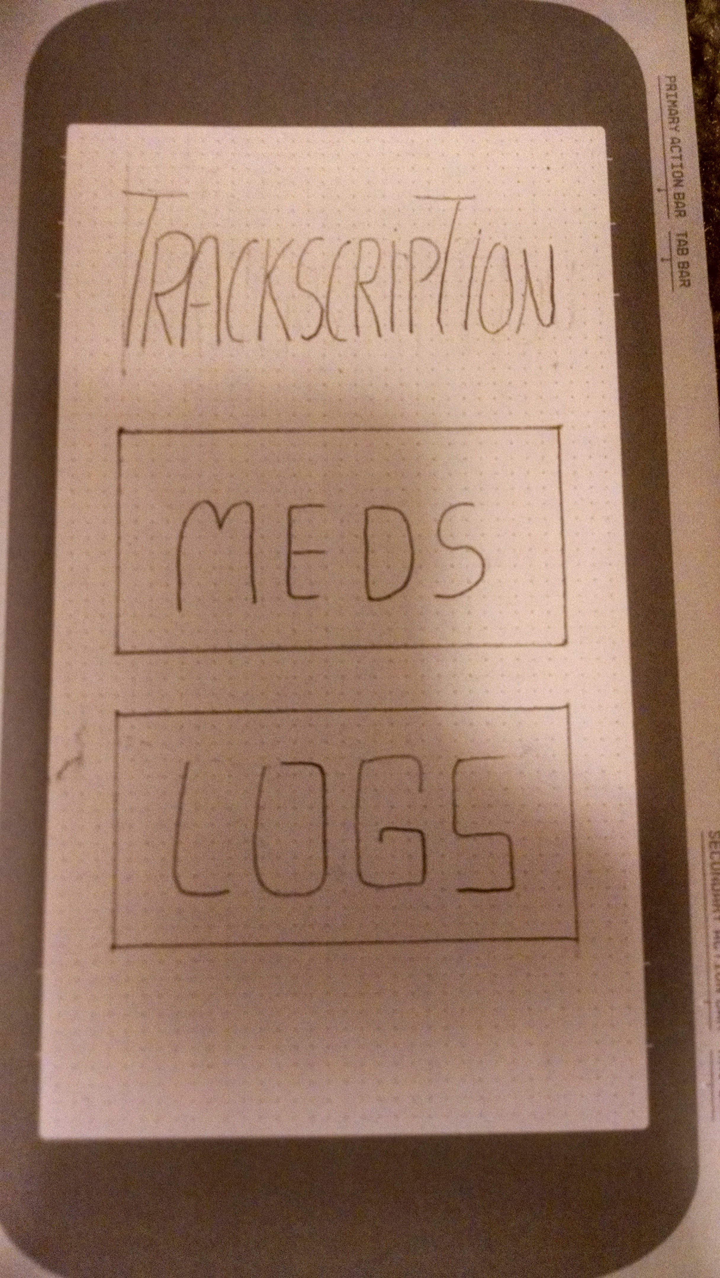
Home Screen
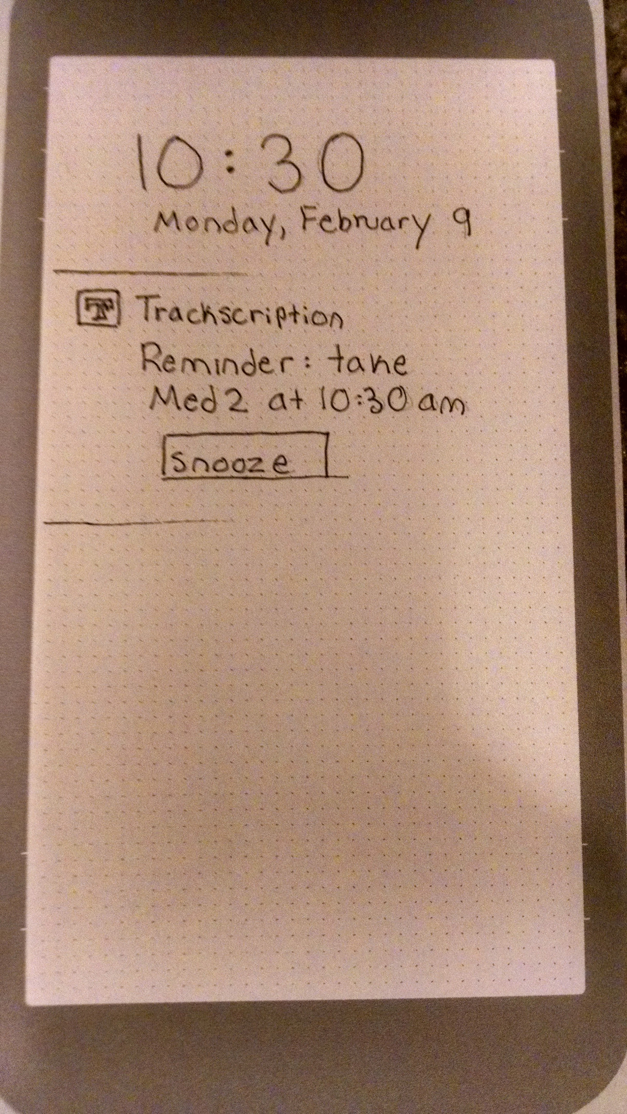
Notifications
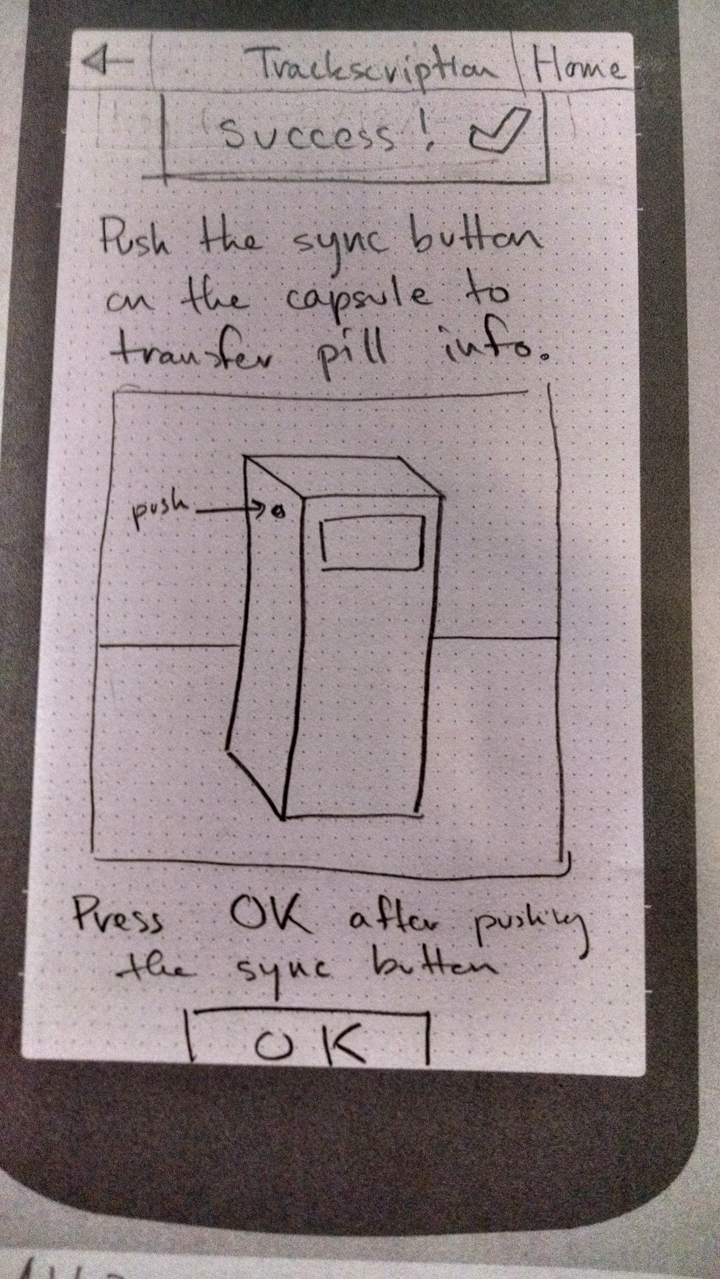
Syncing Process
User Testing
Testing Overview
In order to improve our design we followed an iterative testing process that involved two major phases. A first phase where we conducted two heuristic evaluations of our paper prototype, and a second phase where we conducted three usability tests. Our heuristic evaluations were done during the CSE 440 regular lecture. Our initial inspection based method and usability test provided useful information regarding the design of our prototype. Our users were college students very familiar with new technologies and smart phones .The users were able to present problems navigating through our design, and features that could be improved to ease the navigation. While this feedback was helpful, it was given by casual users of our design who are not likely to truly require a medication management tool to handle multiple prescriptions.
Testing Results
There were 4 major changes and revisions to our design, product of the inspection, critique, and posterior user tests. These changes are grouped into 4 categories that identify the core design concept being changed. Each of these changes also prompted further minor changes in our design. Below are the 4 core modifications to our paper prototype.
- Smart Pill Box
- Home Screen
- Synching
- Visual Notifications
Digital Mockup
Mockup Overview
Our digital mock up focused a lot on not logic based changes but more aesthetic changes and terminology used in the designed solution. The biggest change we had to focus on when going from paper to our digital mock up was making the final decision on what platform it was designed for and then following through with that design language through our mock up. On our first critique that was really obvious that we need work on typography and color choices. By focusing more on the design language set out by Android Lollipop and Material Design we were able to focus our design more and give it more consistency for the final solution.
Mockup Tasks
- Remembering to take medicine
Remembering to take medicine
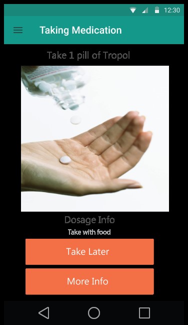
Remembering to take medicine
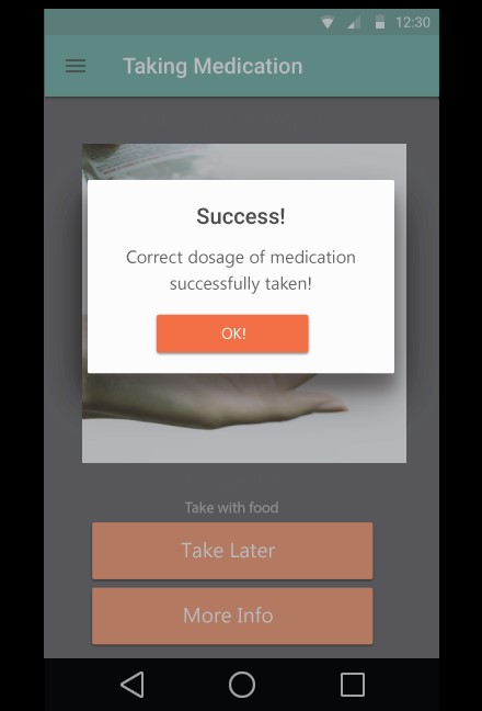
Remembering to take medicine
- Assisting in the case of missed medication or overdose
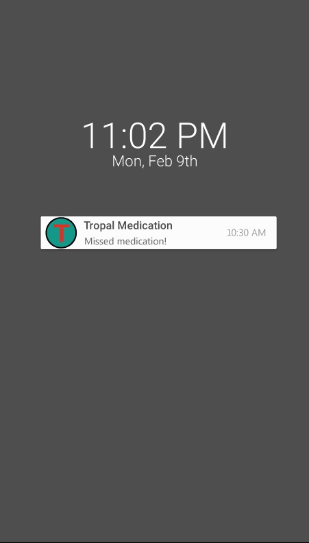
Assisting with missing medications

Assisting with missing medications
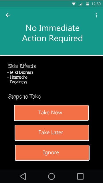
Assisting with missing medications
About Us

David William Phillips III
4th year Info major

Jorge Coira Fernandez
4th year CS, Bioe major, Math Minor
Svetlana Grabar
3rd year CS major, Math Minor

Zoe Brants
4th year CS major, Korean Language minor