background-image: url(img/people.png) .left-column50[ # Week 2: Assessment CSEP 590b, Winter 2023 ] --- name: normal layout: true class: --- # Important Reminder ## This is an important reminder ## Make sure zoom is running and recording!!! --- [//]: # (Outline Slide) # Learning Goals for Today - **What are the current accessibility standards** (1 and 2) - How do we use automated tools? - What are the current accessibility standards (3 and 4) - Get comfortable using existing freely available accessibility technology to manually support assessment - **How to make media accessible** (**images**; GUIs; videos) --- # Introduction to Assessing Accessibility In this class we will structure our work around the Web Accessibility Initiative ([WAI](http://www.w3.org/wai/)), a service of the World Wide Web Consortium (W3) - WAI sets worldwide recommendations for Web authors, browsers and servers: Web Content Accessibility Guidelines (WCAG) - WCAG is "live" (regularly being worked on and updated, with input from the disability community). - There is no equivalent for non-web programming, but even though it is web focused, it can easily be applied to apps as well - Lots of great info available about how to use WCAG (e.g. this [certificate program](https://de.torontomu.ca/wa/); this [textbook](https://pressbooks.library.torontomu.ca/pwaa/); and [WebAIM](webaim.org) ??? We could spend a whole quarter on this... but we're going to limit it to one or two weeks --- # The [POUR](https://webaim.org/articles/pour/) standard Perceivable: Web content is made available to the senses - sight, hearing, and/or touch Operable: Interface forms, controls, and navigation are operable Understandable: Information and the operation of user interface must be understandable. Robust: Content must be robust enough that it can be interpreted by a wide variety of user agents, including assistive technologies This is appropriate for *all* disabilities -- don't think access is only an issue for blind and low vision (BLV) people .footnote[Note: There is a 5th thing, Conformance, which we are not covering today] ??? Obviously there is some overlap between these, and they build on each other --- # Example Disabilities To Consider .left-column50[ Web browsing involves - Color - Text of different shapes and sizes - Content (images, words, sounds, animat.) - Typing (e.g. input to forms) - Mousing (e.g. clicking on links for navigation) - Comprehension (e.g. reading level) ] .right-column50[ Therefore… - Visual impairments - Difficulty understanding content - Difficulty hearing - Difficulty manipulating mouse our keyboard all affect accessibility ] --- # What is the goal? End users interact with the *same* website or app as anyone else End users may use browser features or a specialist accessibility tool to customize their experience **This is Key** Website or app designer provides the right structure and information to support this --- background-image: url(img/assessment/gmail.png) <audio controls="controls"><source src="img/assessment/gmail-normal.wav" type="audio/x-wav"></source></audio> ??? But, lets back up a little to see why the web can be difficult for blind people to use. To interact with their computers, blind people use software programs called screen readers. Here’s a screen reader reading the GMail inbox. --- background-image: url(img/assessment/gmail-blackedout.png) ??? Although it may have felt longer, that was only 20 seconds. In 20 seconds, most of us would have found the message we wanted, and many of us not only would have found that message, but also read it and, possibly replied At this point, a blind user new to this site still has no idea that an inbox even exists. --- # But it gets much better Accessibly design pages, combined with user expertise, work very well 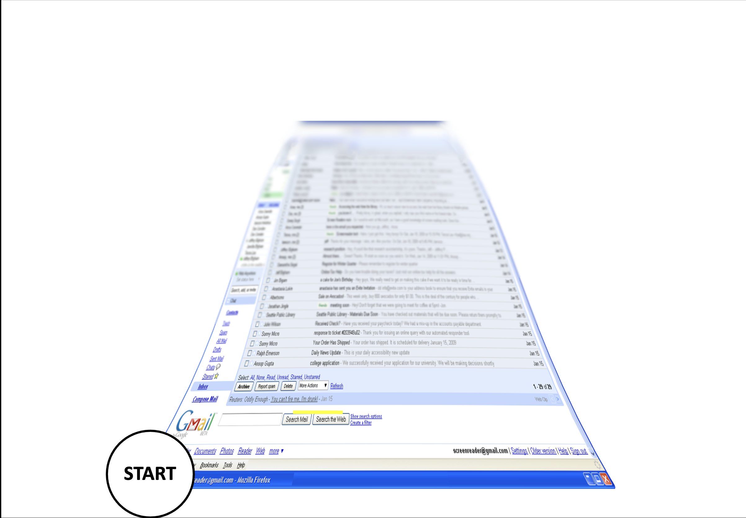 --- # But it gets much better Accessibly design pages, combined with user expertise, work very well 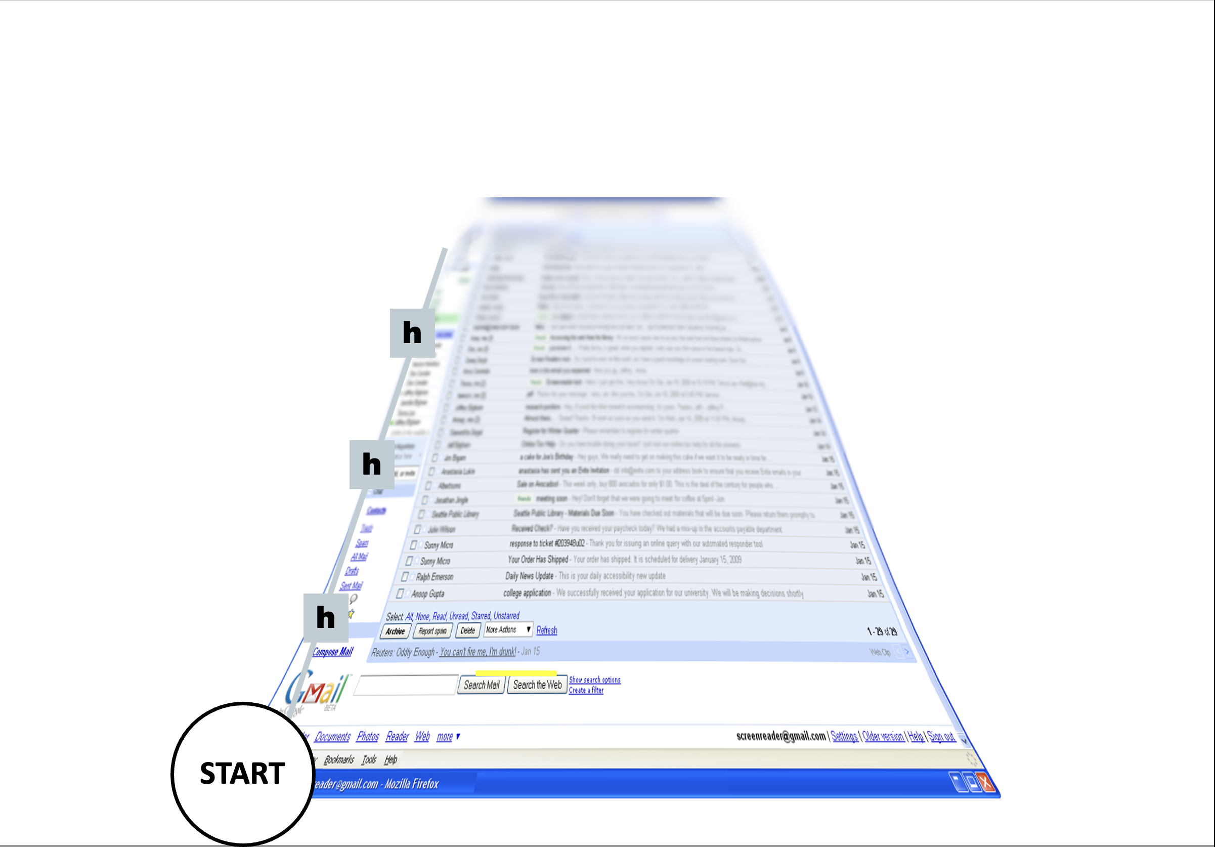 --- # But it gets much better Accessibly design pages, combined with user expertise, work very well 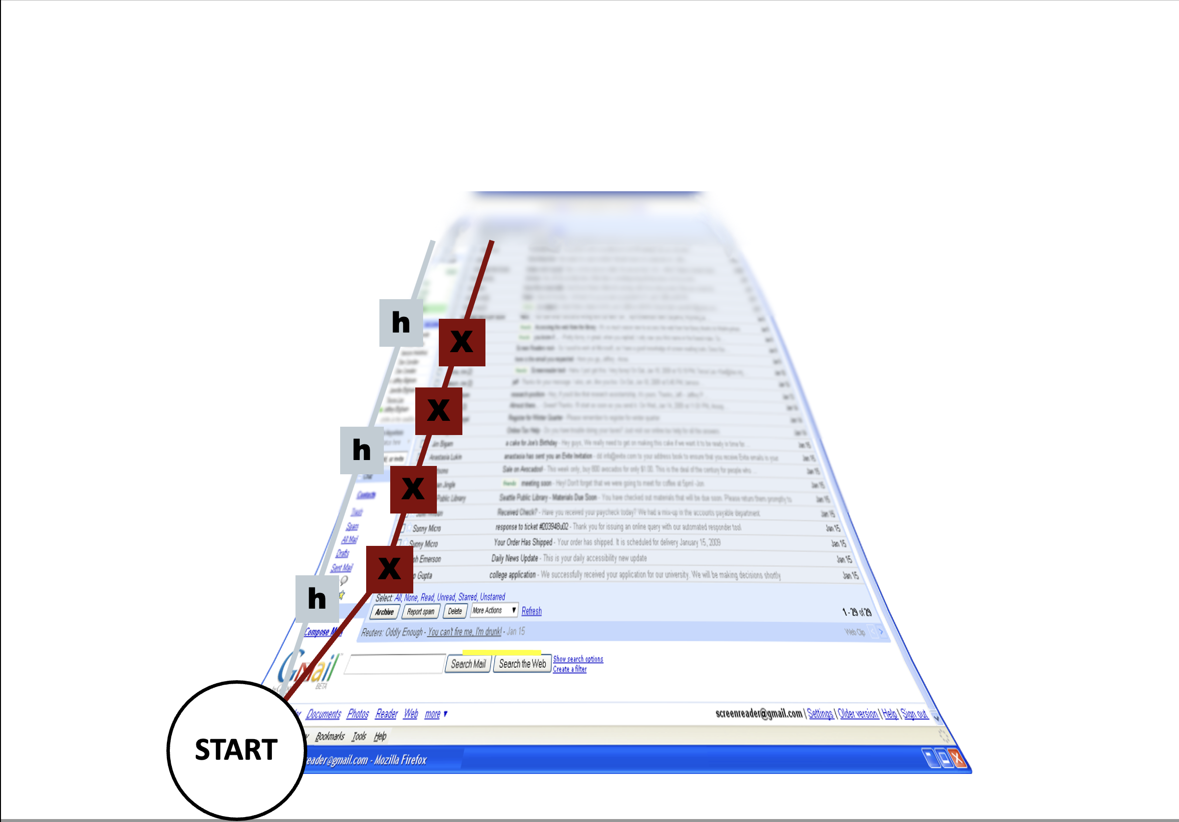 --- # But it gets much better Accessibly design pages, combined with user expertise, work very well 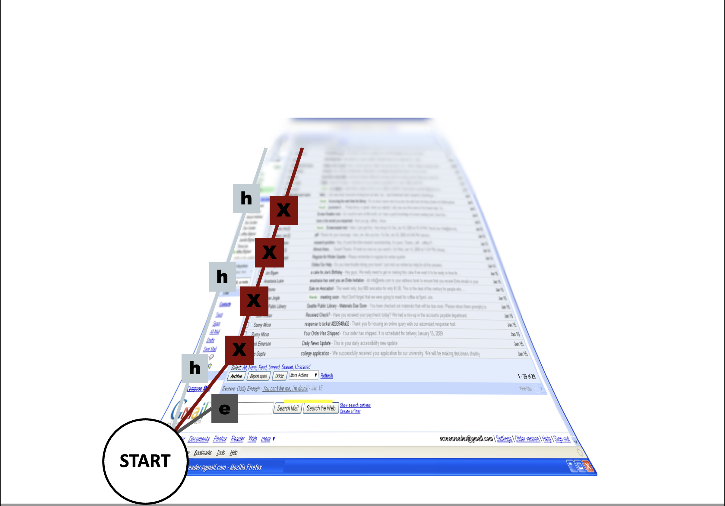 --- # But it gets much better Accessibly design pages, combined with user expertise, work very well  --- # Most Websites and Apps not Accessible - Over 60% of Android apps missing at least one label on a clickable element (out of 5721 apps tested) ([Ross et al, 2020](https://dl.acm.org/doi/pdf/10.1145/3348797)) - Over 80% of fortune 500 websites not accessible ([Loiacono et al, 2009](https://dl.acm.org/doi/pdf/10.1145/1562164.1562197)) - University websites are also partly to mostly inaccessible ([Campoverde-Molina et al, 2021](https://link.springer.com/content/pdf/10.1007/s10209-021-00825-z.pdf)) - Less than 1% of Twitter images had ALT text in 2019 ([Gleason et al, 2019](https://dl.acm.org/doi/pdf/10.1145/3308558.3313605)) More study is needed, but overall, progress here is slow. Perhaps this is not surprising since only about 50% of universities in the US teach accessibility at all ([Shinohara et al, 2018](https://dl.acm.org/doi/pdf/10.1145/3159450.3159484)). --- # Three levels of compliance Some users with disabilities to be able to access and use web content (A) Overall accessibility and removal of significant barriers to accessing content (AA) Improvements and enhancements to web accessibility for more users with disabilities (AAA) The studies just cited were assessing whether things achieved *part* of (A) level compliance! --- # POUR: Perceivable: Guidelines 1.1-1.4 .left-column[ ## Guideline 1.1 Text Alternatives: Provide *electronic text* alternatives for any non-text content ] .right-column[ <iframe src="https://embed.polleverywhere.com/free_text_polls/PE5HizRh83pYpOuS73jfR?controls=none&short_poll=true" width="800px" height="600px"></iframe> ] ??? Why non text? - Can be rendered visually, auditorially, tactilely, or by any combination. - Can also be easily enlarged --- # POUR: Perceivable: Guidelines 1.1-1.4 .left-column[ ## Guideline 1.1 Text Alternatives: Provide *electronic text* alternatives for any non-text content ] .right-column[ Make these perceivable - Image - Controls, Input - Time-Based Media - Visual Test or Exercise - Sensory Experience - CAPTCHA Make this ignorable - Decoration, Formatting, Invisible ] --- # POUR: Perceivable: Guidelines 1.1-1.4 .left-column50[ Make these perceivable - Controls, Input - Time-Based Media - Visual Test or Exercise - Sensory Experience - CAPTCHA ] .right-column50[ Example Best Practices: - Alternative Text for Images that Convey Content - Visible Text labels *associated with* Form inputs - Proper titles for Frames and iFrames - Captions, Transcripts, and Descriptions of media - Don't use color alone for information (e.g. an error) ] --- # Alternative (ALT) Text for Images Best Practices Short description overviews image Long description more complete Not redundant with what access tools (e.g. screen reader) already tell the user (i.e. the type of an element such as "button" or "image" is not useful to include in ALT text) --- # Different Types of Images <iframe src="https://embed.polleverywhere.com/free_text_polls/AP4v3Tt0aTSduMm2p2V9L?controls=none&short_poll=true" width="800px" height="600px"></iframe> --- # Different Types of Images - [Decorative and branding](https://dl.acm.org/doi/pdf/10.1145/3308558.3313605) -- draw attention; recog. - Formatting and text styling - Images as links - [Diagrams]([Torres & Barwaldt, 2019](https://ieeexplore.ieee.org/stamp/stamp.jsp?arnumber=9028522&casa_token=zZw_rYBgu1AAAAAA:eozpbJ-vvMZjQNt8p6WU91X4uFumPs-yVuMn4PTPRjyMhtsVrprdIEe1JfYOCUdv8SFP_TGd9s965Q&tag=1)) - [Visualizations](https://ieeexplore.ieee.org/stamp/stamp.jsp?tp=&arnumber=9555469) - [Memes](https://dl.acm.org/doi/10.1145/3308561.3353792) - [GUIS](https://dl.acm.org/doi/10.1145/3411764.3445040) - ... All of these require different strategies to describe them well. You'll want to read up on some of these links when you are faced with specific description needs in your assignments and projects. Today we'll cover photographs and people. --- # Describing photographs - Automated tools are not enough.    Is this meant to represent a maple leaf? or Canada? How would you describe the differences between these images if all are present? Only one? ??? Although technology is getting better at recognizing what an image depicts, algorithms alone cannot understand what an image means within the context of the overall page. A maple leaf might represent Canada, or it might just illustrate the leaf of a tree. Web page authors must provide alternative text that represents the content and function of their images. --- # Describing Photographs - Depends on setting. [Stangl et al, 2020](https://dl.acm.org/doi/pdf/10.1145/3308558.3313605) asked BLV people about News; SNS; eCommerce; Employment; Dating; Productivity and E-Publication). Includes a table of what to include when - Always include whether people are present; any text; names of objects present - Usually include activity; building features (if present); landmarks - Context matters, as covered in depth by [WebAim](https://webaim.org/) article on [ALT text](techniques/alttext/) --- # Describing Photographs - Depends on setting. [Stangl et al, 2020](https://dl.acm.org/doi/pdf/10.1145/3308558.3313605). - Context matters, as covered in depth by [WebAim](https://webaim.org/) article on [ALT text](techniques/alttext/) - Pay attention to identity of people. [Bennett et al](https://dl.acm.org/doi/10.1145/3411764.3445498) interviewed BIPOC, Non-Binary and/or Transgender Blind people. --- # Context .left-column[  ] .right-column[ The Society for Disability Studies is pleased to announce that Dr. Lezlie Frye has won the Irving K. Zola Award for Emerging Scholars in Disability Studies for her paper: Cripping the “Crack Baby” Epidemic: A Feminist Genealogy. Dr. Frye is an Assistant Professor of Gender Studies and Disability Studies at the University of Utah in the Division of Gender Studies. ] --- # ALT text .left-column[  ] .right-column[ "Lezlie, a white woman, looks at us full front with curls down one size of her head and her long sleeve rolled up just on that side of a cowl neck wild abstract print shirt. Her smiling cheeks greet us." ] --- # ALT Text with Identity Markers? .left-column40[ [](https://kccnceu2021.sched.com/speaker/ian420) ] .right-column60[ <iframe src="https://embed.polleverywhere.com/free_text_polls/RnV5XziPoLsApagm1MssR?controls=none&short_poll=true" width="800px" height="600px"></iframe> ] --- # Small Group Activity Break into small groups and show each other the inaccessible images you found. Pick one and work on a description for it. Do more if you have time [post on Ed](https://edstem.org/us/courses/31170/discussion/2347293) --- # POUR: Perceivable: Guidelines 1.1-1.4 .left-column[ ## Guideline 1.2 Provide perceivable alternatives for time-based media ] .right-column[ Includes: audio-only; video-only; audio-video; audio and/or video combined with interaction Best practices vary depending on whether it is recorded or live, and the type of media, and include: - Video Description - Captions - Transcripts - ASL interpretation ] ??? Kind of in 1.1 but also complicated so it gets its own guideline. --- # POUR: Perceivable: Guidelines 1.1-1.4 .left-column[ ## Guideline 1.3 Adaptable ] .right-column[ Ensure that all information is available in a form that can be perceived by accessibility tools (and thus spoken aloud, simplified, etc) This includes information that is not encoded in text such - page organization - relationships - cross-site or cross-app organization - other structural information ] ??? Example: spoken aloud, or presented in a simpler visual Structure and information should be able to be programmatically determined by assistive technology, so it can be rendered in other formats as needed by the user. --- # POUR: Perceivable: Guidelines 1.1-1.4 .left-column[ ## Guideline 1.3 Adaptable ] .right-column[ Examples/subcategories of guideline: - Make it possible to get information about relationships, footnotes, etc in multiple modalities - Sequence things correctly (e.g. linear reading order is meaningful in a multi-column document) - Make sure instructions rely on multiple senses (i.e. not just color, size, location, etc) - Support multiple display sizes and orientations - Clearly identify input and field purposes in forms ] ??? Also in 1.1 but complicated enough to get it's own guideline Many of these should/can be supported programmatically --- # POUR: Perceivable: Guidelines 1.1-1.4 .left-column[ ## Guideline 1.4 Distinguishable ] .right-column[ - Make the default presentation as easy to perceive as possible to people with disabilities. - Example: separate visual foreground information from the background - color contrast - volume contrast ] --- # POUR: Perceivable: Guidelines 1.1-1.4 .left-column[ ## Guideline 1.4 Distinguishable ] .right-column[ - Use of color is not the only way information is conveyed - Don't force screen reader users to listen to audio longer than 3s without providing easily found controls; ideally use low or no background audio - Support text resizing (& therefore don't use images of text). Ideally (AAA) also support selection of color; justification, spacing, etc - Support users who need a 1 column view of content (AAA) - If you must have tooltips and popups, make sure they are: dismissable; hoverable; and persistent - Make sure you meet contrast expectations (minimum 4.5:1, ideally 7:1) in color (e.g. text and background; diagrams; controls; etc) ] --- # More on Color contrast Choose colors that provide enough contrast between content and the background so that anyone with low-vision impairments and color deficiencies can perceive the content. .left-column50[ WCAG Level AAA requires a contrast ratio of at least - .contrast71[7:1 for normal text] - .contrast41[4.5:1 for large text (14t pt bold or larger)] - .badcontrast[Avoid anything else!] ] .right-column50[ - [Colorzilla](https://chrome.google.com/webstore/detail/colorzilla/bhlhnicpbhignbdhedgjhgdocnmhomnp?hl=en) is an excellent tool for extracting the color value from any page element; - WebAIM has a [contrast checker](https://webaim.org/resources/contrastchecker/#:~:text=WCAG%20Level%20AAA%20requires%20a,value%20from%20any%20page%20element) ] --- # POUR: Operable: Guidelines 2.1-2.5 .left-column[ ## Guideline 2.1 Keyboard Accessible ] .right-column[ No other input form has this flexibility or is universally supported and operable by people with different disabilities, as long as the keyboard input is not time-dependent. Examples of who benefits - screen reader users - blind users - reading disabilities - ... - speech input users - switch input users ] --- # POUR: Operable: Guidelines 2.1-2.5 .left-column[ ## Guideline 2.1 Keyboard Accessible Discuss with your neighbor and post ] .right-column[ <iframe src="https://embed.polleverywhere.com/free_text_polls/zXxJ9XBdJQPaUsFM1ie5J?controls=none&short_poll=true" width="800px" height="600px"></iframe> ] --- # POUR: Operable: Guidelines 2.1-2.5 .left-column[ ## Guideline 2.1 Keyboard Accessible ] .right-column[ - Drawing program - Drag and Drop - Drone control - Game play - Website navigation - ... ] --- # POUR: Operable: Guidelines 2.1-2.5 .left-column[ ## Guideline 2.1 Keyboard Accessible ] .right-column[ Some common pitfalls: - Keyboard Traps. Content should not "trap" keyboard focus within subsections of content on a Web page. This is a common problem when multiple formats are combined within a page and rendered using plug-ins or embedded applications. - Invisible Content. Some parts of a web page can never be reached - Lack of Control. Users should be able to reconfigure or remove shortcuts Note: Not in guidelines (that I know of) but a "reverse trap" is whether you can reach text that *doesn't* have links or headers when using switch input. How would you do this? ] ??? Character key shortcuts work well for many keyboard users, but are inappropriate and frustrating for speech input users — whose means of input is strings of letters — and for keyboard users who are prone to accidentally hit keys. To rectify this issue, authors need to allow users to turn off or reconfigure shortcuts that are made up of only character keys. --- # POUR: Operable: Guidelines 2.1-2.5 .left-column[ ## Guideline 2.2 Enough Time ] .right-column[ Many users who have disabilities need more time to complete tasks than the majority of users: - may take longer to physically respond - may take longer to read things - may have low vision and take longer to find things or to read them - may be accessing content through an assistive technology that requires more time. ] --- # POUR: Operable: Guidelines 2.1-2.5 .left-column[ ## Guideline 2.2 Enough Time ] .right-column[ - Timelines are adjustable (e.g. rotating content; timeouts; etc), and minimized when not necessary - If a timeout does necessarily occur, users should be able to resume without loss of data after re-authenticating - If data loss will occur, users are warned about the timeout limits - Pause, Stop & Hide all possible for all blinking text, animations and so on - Interruptions can be postponed or suppressed by the user, except interruptions involving an emergency (AAA) ] --- # POUR: Operable: Guidelines 2.1-2.5 .left-column[ ## Guideline 2.3 Seizures and Physical Reactions ] .right-column[ Some people with seizure disorders can have a seizure triggered by flashing visual content, even for a second or two. - Most people are unaware that they have this disorder until it strikes. - Warnings do not work well because they are often missed, especially by children who may in fact not be able to read them. It is possible to avoid these types of flashes and still create appealing apps/websites ] ??? In 1997, a cartoon on television in Japan sent over 700 children to the hospital, including about 500 who had seizures. --- # POUR: Operable: Guidelines 2.1-2.5 .left-column[ ## Guideline 2.3 Seizures and Physical Reactions ] .right-column[ - Web pages do not contain anything that flashes more than three times in any one second period - Motion animation triggered by interaction can be disabled, unless the animation is essential to the functionality or the information being conveyed (AAA) ] --- # POUR: Operable: Guidelines 2.1-2.5 .left-column[ ## Guideline 2.4 Navigable ] .right-column[ This guideline ensure that users can: - Find the content they need / go somewhere they want to go - Keep track of their location. - Orient themselves within a website or app This guideline works closely with Guideline 1.3, which ensures that any structure in the content can be perceived, a key to navigation as well. Headings (1.3.1) are particularly important mechanisms for helping users orient themselves within content and navigate through it. ] --- # POUR: Operable: Guidelines 2.1-2.5 .left-column[ ## Guideline 2.4 Navigable ] .right-column[ - Can jump over uninteresting content ] ??? examples: Navigation (that is the same on every page on a site); Anything that is not the news article (on a news site); Advertisements; etc. --- # POUR: Operable: Guidelines 2.1-2.5 .left-column[ ## Guideline 2.4 Navigable ] .right-column[ - Can jump over uninteresting content - Each web page has a descriptive title; Links have link text that is clear about their purpose; Headings and labels describe topic and purpose - Focus order makes sense. This can be problematic in any web page, and is requires special support when navigating trees and tables. - Focus is visible (A) and perceivable (AA) and not obscured by other content (A) - Users should be able to locate a web page, and orient themselves, within a website - Section headings are used to organize the content, styling is handled through CSS not heading level ] --- # POUR: Operable: Guidelines 2.1-2.5 .left-column[ ## Guideline 2.5 Pointers, just like Keyboards, should be able to access everything ] .right-column[ All functionality should be accessible via pointer input devices. People operating pointer input devices may not be able to carry out timed or complex gestures. Examples - drag-and-drop gestures and on touch screens - swiping gestures - split taps - long presses. They may also have trouble selecting small targets, or with precision (i.e. due to tremor) ] --- # POUR: Operable: Guidelines 2.1-2.5 .left-column[ ## Guideline 2.5 Pointers, just like Keyboards, should be able to access everything ] .right-column[ - Support a single pointer without path based gestures when possible; When not, offer alternatives to path based gestures or multi-finger gestures - Ideally trigger content only on *up* events - Make sure that the *accessible name* for a component matches the visual one to better support programmatic access provided by accessibility tools. - Provide programmatic alternatives to shaking or tilting or dragging based interaction - Make targets at least 24x24 CSS Pixels (AA) or 44x44 CSS Pixels (AAA) to make selection easier - Allow users to use multiple possible types of input (keyboard, pointer, on-screen keyboard, stylus, etc) ] --- # More on Size Especially hard on mobile devices .left-column40[  ] .right-column60[ Even if the user misses the Text Label on the screen, they will still be able to trigger the desired action because the touch target is larger than what appears, resulting in less user error. White space around targets also helps Minimum on mobile: 48x48 ] ??? Solve for one, extend to many Trying to hit a small button with one hand while standing on a moving, crowded bus --- [//]: # (Outline Slide) # Learning Goals for Today - What are the current accessibility standards (1 and 2) - **How do we use automated tools?** - What are the current accessibility standards (3 and 4) - Get comfortable using existing freely available accessibility technology to manually support assessment - How to make media accessible (images; GUIs; videos) --- # Field Trip Try out [WebAIM for the UW Library](https://wave.webaim.org/report#/https://www.lib.washington.edu/) ??? Talk about how the type of errors found relates to the concepts we've discussed so far --- # [Website/App Accessibility Report Homework](assignments/website.html) Pick a website/app (we have some community submitted ones) (Install and) run an Accessibility Checker Test it yourself (we'll talk more about this) Capture problems using a Usability Assessment Report --- # Usability Assessment Report You may be familiar with this concept. Also called - Usability Problem Report (UIM Ch11) - Usability Aspect Report (CMU) - Bug/Issue Report (Bugzilla, JIRA, Rational) Audience: primarily developers Content should be - Specific and convincing --- # Example from the UW Library - **Name** as "Missing Image ALT Text"; - **Evidence** Guideline violated: 1.1 ([Text Alternatives](https://www.w3.org/WAI/WCAG22/Understanding/text-alternatives)); - **Screen Shot** as the image and URL ([lib.washington.edu](https://www.lib.washington.edu/));  --- # Example from the UW Library - **Name** as "Missing Image ALT Text"; - **Evidence** Guideline violated: 1.1 ([Text Alternatives](https://www.w3.org/WAI/WCAG22/Understanding/text-alternatives)); - **Explanation** A screen reader won't be able to describe this image - **Severity** 2. Justification in terms of *Frequency*, *Impact* and *Persistence* - **Possible Solution** Add ALT text: "December Update in a white circle surrounded by wintry trees. Around it are the words 'Hours Update', 'New Exhibits', 'Workshops' and 'Finals Help'" - **Relationship to other problems** (TBD) ??? This is debatable, but frequency is low (it only occurs once on this site. If you are writing up all missing image alt text as a group, you might increase your estimate of frequency, but this site doesn't appear to have a lot of undescribed images); impact is low (it is possible to determine the purpose of this image by either clicking on it to see what it links to, or inferring some things from the external link and image file name (both unpleasant alternatives for a screen reader user); and persistence is high (it's not going to go away). --- # Small Group Activity Try it yourself [WebAIM for Seattle Public Schools](https://wave.webaim.org/report#/https://www.seattleschools.org/) The task you are evaluating is whether a disabled family can "Report a Concern" about how accessible the website is [Post your UAR on Ed](https://edstem.org/us/courses/31170/discussion/2349808) --- [//]: # (Outline Slide) # Learning Goals for Today - What are the current accessibility standards (1 and 2) - How do we use automated tools? - **What are the current accessibility standards (3 and 4)** - Get comfortable using existing freely available accessibility technology to manually support assessment - How to make media accessible (images; GUIs; videos) --- # POUR: Adaptable: Guidelines 3.1-3.3 .left-column[ ## Guideline 3.1 Readable ] .right-column[ Readability mean supporting people with all sorts of reading disabilities/reading modality preferences - Some of this can be automated if tools can access text content & appropriate meta data is provided - Some has to do with understandability, use of jargon, etc ] --- # POUR: Adaptable: Guidelines 3.1-3.3 .left-column[ ## Guideline 3.1 Readable ] .right-column[ Provide meta data about the language of a page (or parts of a page if the language switches). Also provide pronunciation information when needed to read aloud properly Provide a well organized, easy to find glossary or dictionary for jargon, abbreviations, and other unusual words Use clear and simple language at an appropriate reading level for the audience whenever possible; when not include clear and simple summaries. Possibly provide an audio or sign language version of content ] --- # POUR: Adaptable: Guidelines 3.1-3.3 .left-column[ ## Guideline 3.2 Predictable ] .right-column[ Present content in a predictable order that is consistent across an app or website. - Can help screen reader users - Can help people with cognitive impairments - Can help people who use magnification and can only see part of a layout ] --- # POUR: Adaptable: Guidelines 3.1-3.3 .left-column[ ## Guideline 3.2 Predictable ] .right-column[ - Don't trigger events that change context *just due to focus* (e.g. don't submit a form; launch a dialog; etc on focus), whether on page elements or inputs. Describe what will happen before a change to a form control. - Locate navigation menus, search fields, skip to navigation links and so on in the same 2D onscreen position and logical (linear ordering) position throughout a site. - Use familiar names and icons for things. As much as possible be consistent with global standards, not just within the app/site. - Provide control over content changes (e.g. an "update now" button; "submit" button) - Provide consistent access to help ] --- # POUR: Adaptable: Guidelines 3.1-3.3 .left-column[ ## Guideline 3.3 Input Assistance ] .right-column[ Some people with disabilities may have trouble with input - creating error-free input - detecting input errors Try to reduce the number of serious or irreversible errors that are made ] --- # POUR: Adaptable: Guidelines 3.1-3.3 .left-column[ ## Guideline 3.3 Input Assistance ] .right-column[ - Forms should support error identification with specific and easily found text error descriptions that provide appropriate suggestions for correcting errors. - Provide clear instructions and labels for form inputs, along with context-sensitive help - Provide an ability to review information before final purchase or submission of information. This is especially important when the consequences may be serious (such as an expensive purchase) - Don't require people to re-enter redundant information (automate instead) - Make sure authentication techniques are accessible ] --- # Aside: CAPTCHA Accessibility .left-column50[  ] .right-column50[ Commonly used security method - Designed to be hard for computers and easy for humans - Require vision ] --- # Audio CAPTCHA Accessibility .left-column50[ 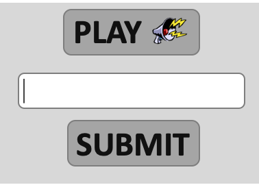 ] .right-column50[ Commonly used security method - Designed to be hard for computers and easy for humans - Require vision <audio controls="controls"><source src="img/assessment/captcha.wav" type="audio/x-wav"></source></audio> Answer: ] --- # Audio CAPTCHA Accessibility No good accessible alternatives -- [audio CAPTCHA are easy to crack](https://arstechnica.com/information-technology/2008/12/computer-scientists-find-audio-captchas-easy-to-crack/) -- ...and hard to use: ![:youtube Example impossible audio CAPTCHA, raFXfU7_fkg] ??? Pointer to later 2nd wave accessibility topic: Accessibility and computer security --- # POUR: Robust: Guideline 4.1 .left-column[ ## Guideline 4.1 Compatible ] .right-column[ This was already a running theme but let's make it explicit: Don't break user accessibility technologies (AT) with things like poorly formed markup Don't circumvent AT with unconventional markup/code Expose information in standard ways Follow conventions and be compatible with APIs as much as possible ] --- # POUR: Robust: Guideline 4.1 .left-column[ ## Guideline 4.1 Compatible ] .right-column[ Example strategies to do this - Use standard and complete start and end tags on web pages - Use standard types of status messages to announce changes in content that are not user initiated (e.g. "18 results returned" from an asynchronous search task) - Provide name, role, and value custom controls [ARIA](https://developer.mozilla.org/en-US/docs/Web/Accessibility/ARIA) is a key standard used to do this for **A**ccessible **R**ich **I**nternet **A**pplications, read up on it if you are trying to build an accessible website ] --- [//]: # (Outline Slide) # Learning Goals for Today - What are the current accessibility standards (1 and 2) - How do we use automated tools? - What are the current accessibility standards (3 and 4) - **Get comfortable using existing freely available accessibility technology to manually support assessment** - How to make media accessible (images; GUIs; videos) --- # Best Practices for Accessibility Assessment? .left-column50[ Automated Tools - [Review of many options](https://medium.com/@OPTASY.com/what-are-some-of-the-best-web-accessibility-testing-tools-to-evaluate-your-website-with-69def25a386) - Web: WebAIM's [WAVE](https://wave.webaim.org/); - Browser Extensions ([Comparison Article](https://medium.com/@OPTASY.com/what-are-some-of-the-best-web-accessibility-testing-tools-to-evaluate-your-website-with-69def25a386)): [WAVE](https://chrome.google.com/webstore/detail/wave-evaluation-tool/jbbplnpkjmmeebjpijfedlgcdilocofh?hl=en-US); [Axe](https://chrome.google.com/webstore/detail/axe-devtools-web-accessib/lhdoppojpmngadmnindnejefpokejbdd?hl=en-US); [Lighthouse](https://developer.chrome.com/docs/lighthouse/overview/); [Siteimprove](https://chrome.google.com/webstore/detail/siteimprove-accessibility/efcfolpjihicnikpmhnmphjhhpiclljc/related); & other browser extensions - Phone apps: [Google Accessibility Scanner](https://support.google.com/accessibility/android/answer/6376570?hl=en&ref_topic=6376582) and [iOS.](https://developer.apple.com/library/archive/documentation/Accessibility/Conceptual/AccessibilityMacOSX/OSXAXTestingApps.html) ] .right-column50[ Design Guidelines (i.e. know them and apply them heuristically) Simulation (Try it yourself using accessibility technologies or simulators such as [aDesigner](https://www.eclipse.org/actf/downloads/tools/aDesigner/)) User Testing ] --- # Simulation In this assignment we will use off-the-shelf, freely available accessibility technology for simulation - Screen Readers - Switch Control - Magnification - Anything else you want to try --- # Screen Readers: Typical Bugs .left-column40[ 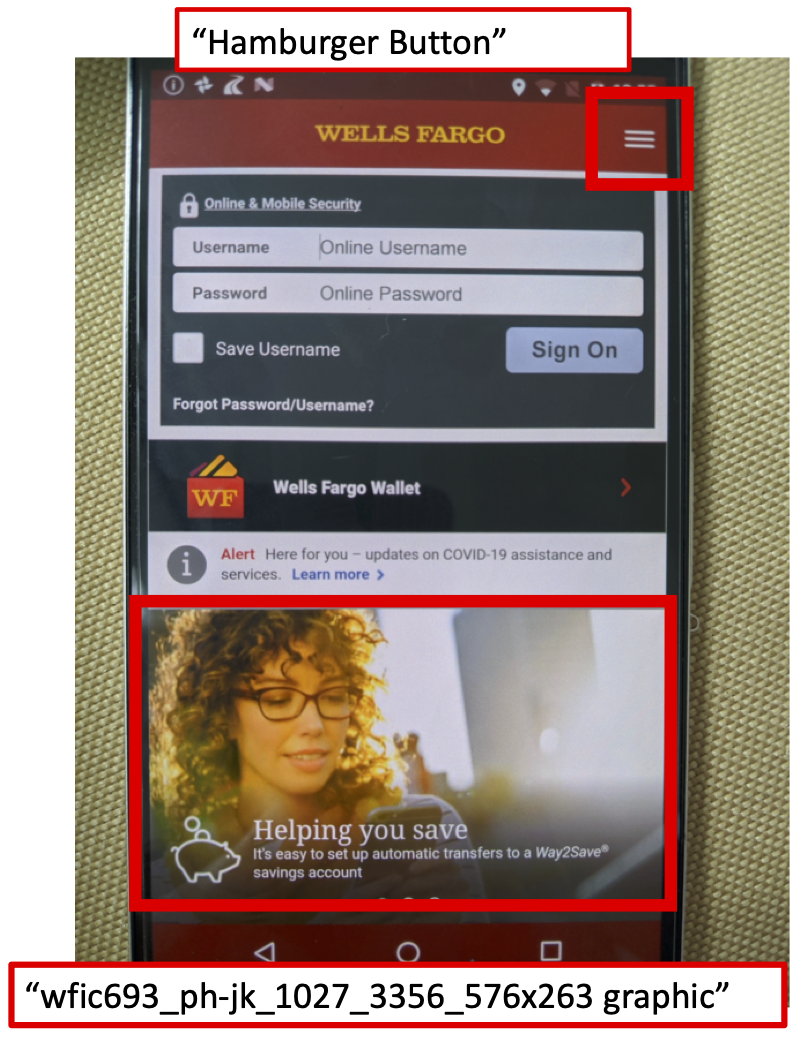 ] .right-column60[ <br> ![:youtube Banking failure, b-R5r_aKmKo] ] ??? - Reads the words on the screen - Keystroke to move to next area - Screen reader users, turn this on on your phone --- # Introduction to Screen Readers ![:youtube Screen Reader Demo, dEbl5jvLKGQ] ??? Demo also shows an example of a screen reader finding a problem such as lack of alt text or a badly labeled table --- # Switch Control ![:youtube Explanation of how to set up switch control, GQKEE9nI1lk] ??? - Switch users, turn this on, on your phone --- # Simulation Warning .left-column[ Simulation tends to cause people to underestimate what is possible ] .right-column[ ![:youtube One thumb to rule them all: video of gaming with switch control,2BhHwk9qSvI] ] ??? Remind them about drone video Don't fall into the trap of assuming that your ineptitude is the standard disability experience] --- # Magnification ![:youtube How to magnify your phone's screen, yHqJOSZN1zA] ??? - Magnification users, turn this on, on your phone --- # Break up into groups Decide who will - use a screen reader - use switch control - use magnification Open your phone's web browser and load [seattleschools.org](https://www.seattleschools.org/) [next slide] --- # In your groups Revisit [Seattle Public Schools](https://www.seattleschools.org/) The task you are evaluating is whether a disabled family can "Report a Concern" about how accessible the website is Generate UARs for your accessibility technology [Post your UAR on Ed](https://edstem.org/us/courses/31170/discussion/2349808) ---