background-image: url(img/people.png) .left-column50[ # Week 6: Accessible Data Visualizations CSEP 590b, Winter 2023 ] --- name: normal layout: true class: --- # Important Reminder ## This is an important reminder ## Make sure zoom is running and recording!!! ## Make sure captioning is turned on --- # COVID-19 Visualizations 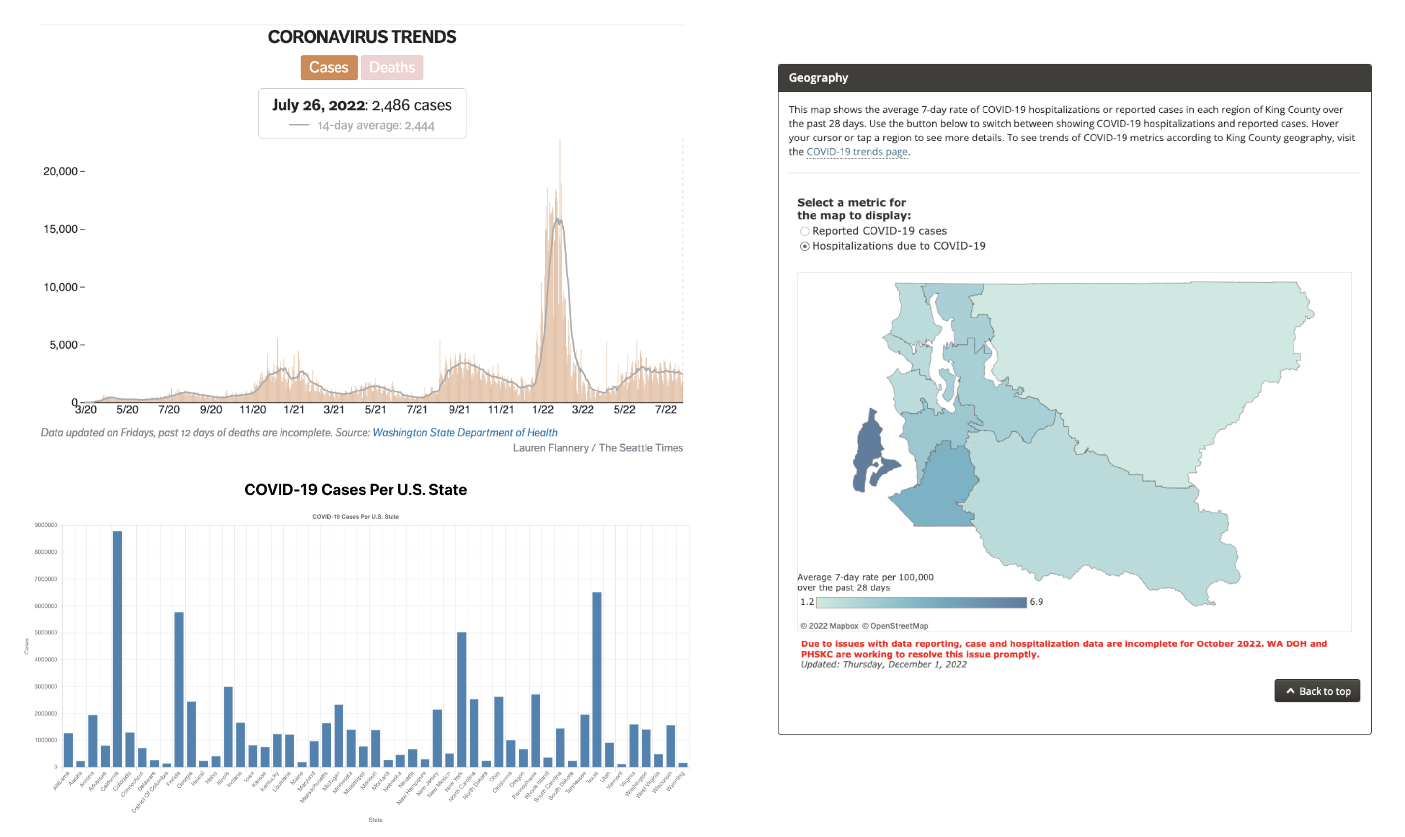 --- [//]: # (Outline Slide) # Some questions to consider about information access Who can access visualizations that other people have created? Who can create accessible information? How do we support the full data science lifecycle? --- # Who can Access Visualizations? Due to the inaccessibility of online data visualizations, screen-reader users answered questions **62%** less accurately and spent **211%** more time than non-screen-reader users *(Sharif, 2021)*. 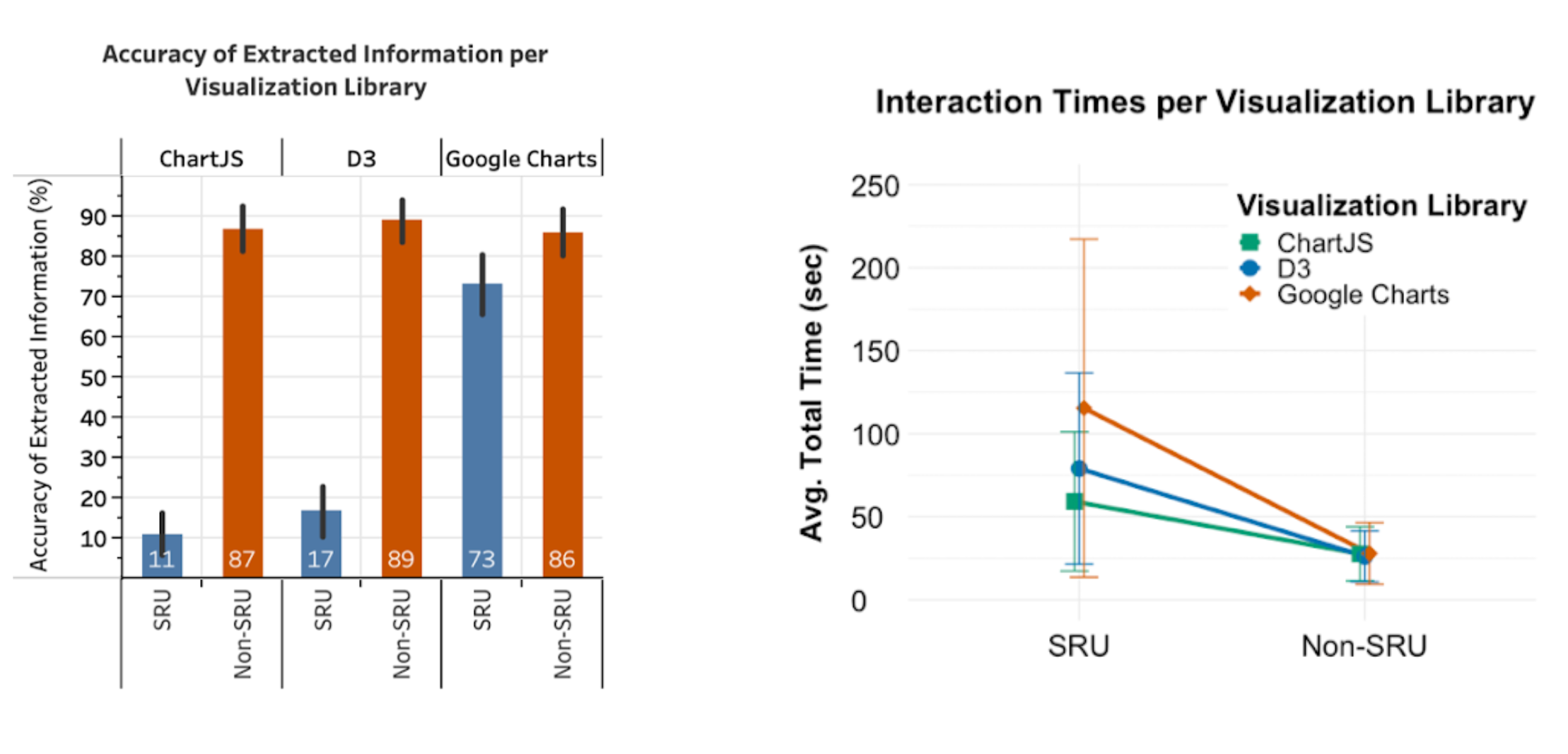 --- # How Can We Make These Visualization Accessible? - What strategies and techniques **do** you use to make these visualizations accessible to screen-reader users? - What strategies and techniques **could** you use to make these visualizations accessible to screen-reader users? --- # Commonly-Used Techniques Summary ("Alt-Text") Sonification (Audio Graphs) Tables Braille Prinouts/3-D Printing --- # Summary ("Alt-Text") Alt-text is an HTML attribute that can provide a summary of the visualization and the information it contains. **Benefits** - Most commonly-used strategy - Easy to integrate into web elements --- # Sonification (Audio Graphs) Sonification (or audio graphs) enable listeners to interpret data trends by mapping data to a musical scale. .left-column40[ **Benefits** - Can help users to understand overall trends - Already integrated into commerical products (e.g., Apple) ] .right-column60[ ![:youtube Video of a graph being sonified, gssjuSnMR60] ] --- # Tables Tables are HTML elements that can be used to convey data to users. **Benefits** - Provide users access to raw data - Already integrated into Google Charts --- # Tactile Graphics/3-D Printing Tactile graphics and 3-D printed graphs are raised surfaces that enable blind and low vision individuals to interpret data by feeling the graphs. **Benefits** - Can assist users in developing a mental model of the visualization - Enables users to interact with the visualization without using a screen reader --- # Holistic vs. Drilled-Down Exploration Screen-reader users perform a holistic exploration first and then drill-down into the data *(Sharif, 2021)*. .left-column50[ - Summary ("Alt-Text") - Sonification (Audio Graphs) - Tables - Braille Prinouts/3-D Printing ] .right-column50[ - Which of these techniques enable **holistic** exploration? - Which of these techniques enable **drilled-down** exploration? ] --- # Supporting Interaction Highly relevant even when just *using* a visulazation - When interacting with static visualizations, sighted people intuitively construct complex visual queries [Ware, 2019]. - Interactive charts afford selection, filtering & more [Yi, IEEE TOVCG, ’07] Supporting this requires going past verbal descriptions and tactile graphics --- # [VoxLens](https://github.com/athersharif/voxlens). [VoxLens](https://github.com/athersharif/voxlens) is an open-source JavaScript plug-in that improves the accessibility of online data visualizations for screen-reader users using a multi-modal approach, requiring only a single line of code for integration into online data visualizations. VoxLens offers three modes: - **Question-and-Answer mode** - **Summary mode** - **Sonification mode** .center[https://github.com/athersharif/voxlens] --- # VoxLens 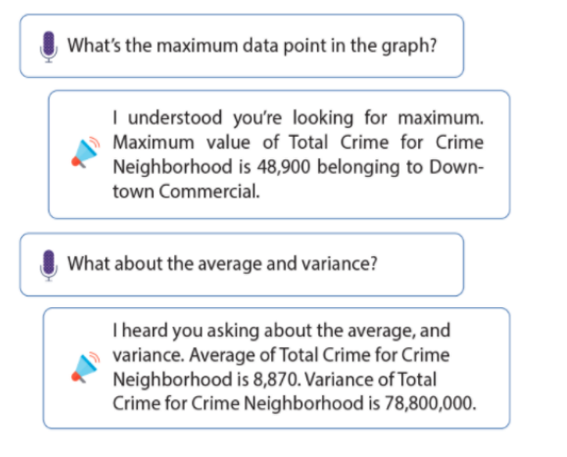 --- # Evaluation of VoxLens VoxLens improved the accuracy of screen-reader users by **122%** and interaction times of screen-reader users by **36%**. 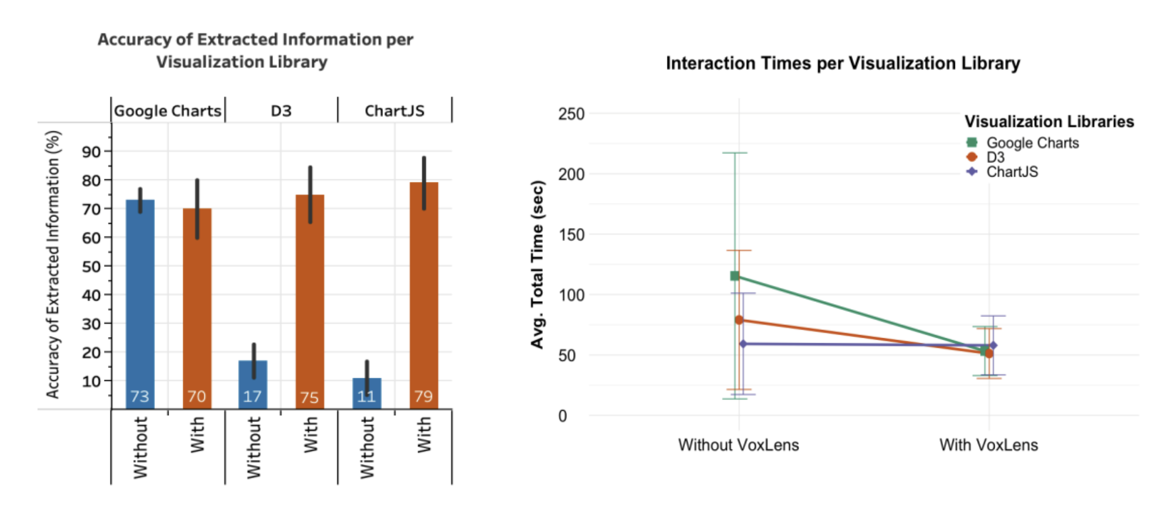 --- [//]: # (Outline Slide) # Some questions to consider about information access Who can access visualizations that other people have created? **Who can create accessible information?** How do we support the full data science lifecycle? --- # *Who* Can Creating Accessible Visualizations Can BLV people create new information - Are they included in the employment opportunities and learnings associated with data science? - Can they access information when someone didn’t already decide it needs to be accessible - Maps and other individualized needs - Live data exploration --- # Non Programmers .left-column40[ ## Maptimizer  (Hofmann, CHI 2022) ] .right-column60[ ## Generative Design *Generative design* is a common approach to support end users (used a lot for fabrication) Lets each user specify their information priorities and preferred representations in familiar terms through a simple GUI ] --- # What About Direct Authoring? We should also support more advanced creation - In Kim et al.’s survey of 56 accessible visualization papers published between 1999 and 2020 only two papers supported interactive authoring of charts by BVI users [Kim, CGF ‘21] Equivalent experiences is an important access goal - Same information conveyed - Same *interactive experience* --- # PSST Based on RxJS: everything is a stream .left-column40[ <div class="mermaid"> graph TD LS[Sensor] --> DS[DataSink] OE[OutputEngine] --> DS DS -->|Sensor values| NH[Handler] NH -->|converts sensor values to appropriate format| O[Output] </div> ] --- # PSST Example Sonifying a light sensor .left-column40[ <div class="mermaid"> graph TD LS[Light Sensor] --> DS[DataSink] OE[OutputEngine] --> DS DS -->|Light sensor values| NH[NoteHandler] NH -->|converted light sensor values to audible range| O[NoteOutput] </div> ] .right-column60[ ![:youtube A sound can be heard with the pitch rising and lowering as a light moves closer and further from the circuit board, aSe-QkSl12c] ] <!-- --- --> <!-- # PSST --> <!-- PSST allows BVI developers to make their own data visualizations --> <!-- <div class="mermaid"> --> <!-- sequenceDiagram --> <!-- Lightsensor->>+DataSink: New Value as Datum --> <!-- OutputEngine->>+DataSink: Status is "Playing" --> <!-- DataSink-\->>+NoteHandler: Status, Datum --> <!-- NoteHandler->>+NoteOutput: Status, Datum adjusted using Mel Scale --> <!-- NoteOutput->>+User: Plays note if status is "Playing" --> <!-- </div> --> --- # Code or GUI Configuration .column[ GUI automatically created from spec User can select, parameterize and attach outputs to streaming data ] .column[ ![:youtube A user configuring a sonification using the accessible PSST GUI while a screenreader plays a description, xl70zqfW2H0] ] -- .column[ .quote[I’ve seen these sonifications for decades . . . but I’ve never seen anything nice in a dashboard like this that lets you add and remove multiple ones and tweak the parameters of each.] ] --- [//]: # (Outline Slide) # Some questions to consider about information access Who can access visualizations that other people have created? Who can create accessible information? **How do we support the full data science lifecycle?** - Data collection - Data cleaning - Modeling and Analysis - Representation --- # Data Science Accessibility Very much still a wide open area, at least for BLV people - Data collection -- not particularly supported (even coding tools very inaccessible) - Data cleaning -- not studied to my knowledge - Modeling and Analysis -- Common tools like Jupyter Notebooks wholly inaccessible. Venkatesh (first author of PSST) is starting to work on this - Representation -- Accessible visualization & Data physicalization are the big opportunities --- # One last PSST Video ... and then on to our guest! ![:youtube A user turns a handle on a music box. A laser cut strip containing data moves through producing notes, EKaaP0TKQog]