Exercise: Driving Shifts Into Reverse
In this exercise, you will transform a static chart into an interactive graphic. Our starting point is Hannah Fairfield’s “Driving Shifts Into Reverse”, published in the New York Times in 2010. The chart shows how miles driven and the cost of gasoline have changed over the years. The graphic is an example of a connected scatterplot, in which uses the x and y channels for variables that might move freely along the dimensions over time.
Dataset
The dataset consists of the average miles driven per person and the cost of gas ($ per gallon) in each year, ranging from 1956 to 2010.
const driving = FileAttachment('../data/driving.csv').csv({ typed: true });
In addition, the d3.extent() function has been used to precompute [min, max] arrays for each of these variables:
const milesExtent = d3.extent(driving, d => d.miles);
const gasExtent = d3.extent(driving, d => d.gas);
const yearExtent = d3.extent(driving, d => d.year);
Task 1: Use Reactive Updates
Below we’ve already created a Vega-Lite version of the “Driving Shifts Into Reverse” graphic. Your task is to make the chart interactive, using an external slider to filter the number of years shown. Dragging the slider back and forth should cause only those years with values less than or equal to the slider to be visible.
At first we will use Observable’s reactive runtime to drive the interaction. We’ve included a slider component for you below. Add a filter transform to the Vega-Lite chart to performs the desired filtering.
Once you’ve set up the filter, do you notice anything wrong? If you’ve made no other changes, you’ll see that as we filter the data, the axis scale domains also change. The chart in unstable, hampering comparison across updates. Interaction often forces us to think along additional design dimensions!
Update your code to make the x and y channels stable across updates. You may want to use the extents we precomputed earlier. Note: properly modifying the first layer (line mark) should be sufficient, as other layers will inherit settings.
Task 2: Use a Vega-Lite Param
Our example above works well for small data, but is inefficient. The Observable runtime tracks changes to the slider, and with each change completely re-evaluates dependent code blocks such as our chart. That means on every slider update we are recomputing the Vega-Lite chart from scratch. We’d like to take advantage of Vega-Lite’s interaction and efficient re-rendering mechanisms.
For this task, you should rewrite the interactive Vega-Lite chart in a completely standalone fashion. You should start by copying your code from above. Next, you should add a new param to your Vega-Lite code, bind it to a “range” (slider) input, and update the filter transform to use that param.
Task 3: Add Tooltips
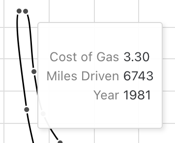
You’ve turned a static chart interactive, but we’re not done yet! It’s often helpful to provide details-on-demand when selecting an item in a chart. So let’s show an informative tooltip when a user hovers their pointer over a data point.

First copy your code from Task 2 above. Then use the tooltip channel to create a custom tooltip message. Your tooltips should match the image above, with custom names and formatting for the fields: format miles as an integer, and format gas with 2 decimal places.
Don’t forget to add, commit, and push your exercises to your GitLab repo!