Exercise: Hours of Sunshine
The climate of a place can have a tremendous impact on people’s lived experience, ranging from personal moods to how an entire region defines itself. Here, we’ve collected a set of monthly climate measurements for six major U.S. cities, roughly covering the edges of the continental United States.
In this exercise, your task is to create and then customize a basic visualization plotting the hours of sunshine across the year. You may work in groups of 1-3 people.
Data
The data comes from https://www.usclimatedata.com/, which uses measurements averaged over the years 1981-2010.
The data table consists of the following columns:
city: The name of the city.month: The measured month, as a string (“Jan”, “Feb”, …).month_num: The measured month, as a zero-based integer (0, 1, …).temp_low: The lowest recorded temperature, in degrees Fahrenheit.temp_high: The highest recorded temperature, in degrees Fahrenheit.precip_days: The number of days that had precipitation.precip_inches: The precipitation in inches per month.sunshine_hours: The hours of sunshine per month.lat: The latitude of the city.lon: The longitude of the city.
The table contains 72 rows, one for each city and month:
Task 1: Visualize Sunshine Hours by City
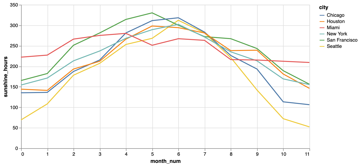
Your first task is to create a line chart that (as best you can) matches the image below. You must provide visual encodings for three data fields: the city, the month number, and the hours of sunshine.

The source code for this page includes some helpful scaffolding: it loads the dataset, imports a render method to render Vega-Lite JSON specifications, and includes an (incomplete) code block for you to fill in.
Task 2: Further Customize Your Chart
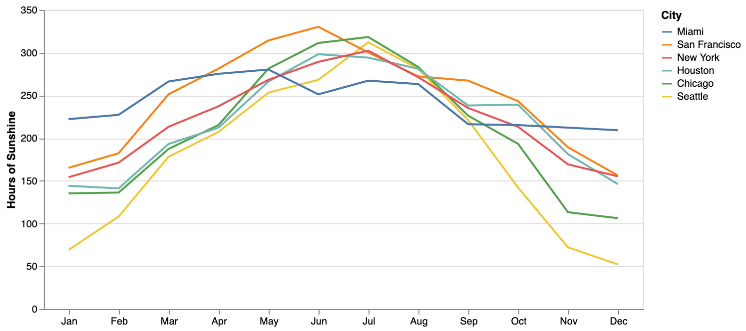
Your next task is to modify and stylize your chart to (again, as best you can) match the image below. First, carefully note the differences between this chart and the previous one and list them below (we’ve included one entry one for you).

Differences between Charts:
- Encode abbreviated month names (not month numbers) on the x-axis
- …
- …
- …
Second, fill out the code block in the source code of this document to create a chart matching the image above. Some links you might find helpful include the Vega-Lite encoding field, sort, and axis documentation.
Don’t forget to add, commit, and push your exercises to your GitLab repo!