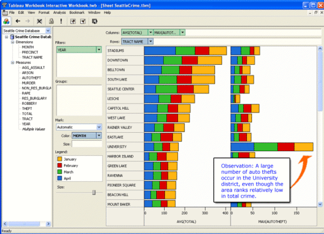

A wide variety of digital tools have been designed to help users visually explore data sets and answer questions about the data. The task in this assignment is to use an existing visualization tool to formulate and answer a specific question about the data. After answering the question you should create a final visualization that is designed to present the answer to your question to others. You should maintain a web notebook that documents all the steps you performed from start to finish. The goal of this assignment is not to develop a new visualization tool, but to understand better the process of creating the visualization.
Here is one way to start.
Step 1. Pick a domain that you are interested in.
Some good possibilities
might be the physical properties of chemical elements, the types
of stars, or the human genome. Feel free to use an example from your own
research, but do NOT pick an example that you regularly already do.
Step 2. Pose a question that you would like to answer.
For example: Is there a relationship between
melting point and atomic number? Are the brightness and color of stars
correlated? Are there different patterns of nucleotides in different regions in
human DNA?
Step 3. Find a database that has the data you need to answer your question.
Look for databases in convenient formats such as Excel or a CSV file. The
web contains a lot of raw data. In some cases you will need to convert the data
to a format you can use. Format conversion is part of visualization research. Here are some pointers to datasets:
After you have a question and a dataset, construct a visualization that provides a answer to your question. As you construct the visualization you may find that your question evolves - often it will become more specific. Once you have answered the question to your satisfaction, think of a way to present the answer as clearly as possible. In this assignment, you should use existing visualization tools.
I highly recommend using the Tableau Visual Spreadsheet because it supports many different ways to interact with the data. Tableau has given us licenses so that you can install the software on your own computer. Send me email if you'd like to install the Tableau software. Tableau provides a nice set of tutorials (they go quickly) to get you started with the software.
Other visualization software options include: charting in Excel; plotting using Matlab; or Photoshop's image processing. If you need access to this software, let me know and I'll try to arrange it. Consider a secondary goal of this assignment to learn and evaluate a new visualization tool.
Before starting, write down the question clearly. And, as you go, maintain a web notebook of what you had to do to construct the visualization. Include in the notebook where you got the data, and documentation about the format of the dataset. Describe any transformations or rearrangements of the dataset that you needed to perform; in particular, describe how you got the data into the format needed by the visualization system. Keep copies of any intermediate visualizations that helped you refine your question. After you have constructed the final visualization for presenting your answer, write a caption and a paragraph describing the visualization, and how it answers the question you posed. Think of the figure, the caption and the text as material you might include in a research paper.
Send me (maneesh at cs.washington.edu) the URL of your page before class on February 3, 2005.
Examples from Pat Hanrahan's class at Stanford. (Note that not all of the links on this page still work).