background-image: url(img/people.png) .left-column50[ # Week 3: Building For Accessibility CSE513, Spring 2024 ] --- name: normal layout: true class: --- # Important Reminder ## This is an important reminder ## Make sure zoom is running and recording!!! --- # Announcements (1/2) 1. Your implementation assignment grades will be slightly delayed because Aashaka is traveling, we hope to still get them back to you next week - videos must be on youtube if you choose that route - showing in office hours requires signing up; this is not considered a presentation opportunity - all repeat competencies. Any additions, check with us --- # Announcements (2/2) 2. Project proposals due on Friday the 26th 3pm instead of Wednesday because of the ASSETS deadline, we hope to provide feedback by Monday 3. To facilitate project team formation, please post your preliminary ideas and reactions on Ed today, on Wednesday we'll reserve class time for groups to talk for 10 minutes. Also: no office hours for Jen next Wednesday --- # Most WWW and Apps not Accessible - Over 60% of Android apps missing at least one label on a clickable element (out of 5721 apps tested) ([Ross, 2020](https://dl.acm.org/doi/pdf/10.1145/3348797)) - Over 80% of fortune 500 websites not accessible ([Loiacono, 2009](https://dl.acm.org/doi/pdf/10.1145/1562164.1562197)) - University websites are also partly to mostly inaccessible ([Campoverde-Molina, 2021](https://link.springer.com/content/pdf/10.1007/s10209-021-00825-z.pdf)) - Less than 1% of Twitter images had ALT text in 2019 ([Gleason, 2019](https://dl.acm.org/doi/pdf/10.1145/3308558.3313605)) - Only about 50% of universities in the US teach accessibility at all ([Shinohara, 2018](https://dl.acm.org/doi/pdf/10.1145/3159450.3159484)). ??? More study is needed, but overall, progress here is slow. This last point relates to our discussion of software engineers and accessibility in a week -- we are simply not training people to do this (or AI!) --- # What is the goal? All users interact with the *same* website or app as anyone else Users may use browser features or a specialized accessibility tool to customize their experience -- **This is Key** Website or app designer provides the right structure and information to support this --- # Testing For Accessibility? Automated Tools Design Guidelines (i.e. know them and apply them heuristically) Simulation (Try it yourself using accessibility technologies or simulators such as [aDesigner](https://www.eclipse.org/actf/downloads/tools/aDesigner/)) User Testing --- [//]: # (Outline Slide) # Learning Goals for Today - **Manual Accessibility Testing** - We will focus on screen readers - And understanding structure in interactive apps - And how this impacts user agents (such as screen readers) - Building for Accessibility - Assignment - [if time] Get comfortable using existing freely available accessibility technology to manually support assessment <!-- [//]: # TODO expand this slide deck? IT's short and could cover more. Also discuss how this should impact the report --> --- # Manual Assessment Warning Simulation tends to cause people to underestimate what is possible Helps to learn *how* to use things but never assume you are proficient We'll touch on screen readers, magnifiers & so on today <!-- .right-column[ --> <!-- ![:youtube One thumb to rule them all: video of gaming with switch control,2BhHwk9qSvI] --> ] ??? Remind them about drone video Don't fall into the trap of assuming that your ineptitude is the standard disability experience] --- # Switch Control ![:youtube Explanation of how to set up switch control, GQKEE9nI1lk] ??? - Switch users, turn this on, on your phone --- # Magnification ![:youtube How to magnify your windows desktop, PMihdIZUh7Y?feature=shared&t=81] ??? - Magnification users, turn this on, on your phone --- # Browser Settings - Change font size - Change color contrast - Change from light to dark mode ??? --- # Screen Readers .left-column-half[ Different types of screen readers. - JAWS for Windows - Nonvisual Desktop Access - VoiceOver - TalkBack - ChromeVox ] .right-column-half[   *Where can you find one?* Different devices used to interact with screen readers. ] --- # Screen Readers: Typical Bugs .left-column40[  ] .right-column60[ ![:youtube Banking failure, b-R5r_aKmKo] ] ??? - Reads the words on the screen - Keystroke to move to next area - Screen reader users, turn this on on your phone --- [//]: # (Outline Slide) # Learning Goals for Today - Manual Accessibility Testing - **Building for Accessibility** - We will focus on screen readers - And understanding structure in interactive apps - And how this impacts user agents (such as screen readers) - Assignment - [if time] Get comfortable using existing freely available accessibility technology to manually support assessment --- # (On-desktop) screen reader interaction Three core interaction patterns: - Linear navigation through like objects - Hierarchical navigation through logically related objects - Switching between object types --- # (On-phone) screen reader interaction .left-column[  ] .right-column[ Three core interaction patterns: - Swipe to navigate linearly - Touch to navigate spatially - The first “hit” of an interface element will focus, double tap to select/activate that interface element ] ??? Discuss similarities and differences from desktop --- # Structure of a Web Page | Content | Structure | Style | Behavior | | :--: | :--: | :--: | :--: | || | Words and Images | HTML | CSS | JavaScript | --- # Structure of a Web Page | Content | Structure | Style | Behavior | | :--: | :--: | :--: | :--: | ||| | Words and Images | HTML | CSS | JavaScript | --- # Structure of a Web Page | Content | Structure | Style | Behavior | | :--: | :--: | :--: | :--: | |||| | Words and Images | HTML | CSS | JavaScript | --- # Structure of a Web Page | Content | Structure | Style | Behavior | | :--: | :--: | :--: | :--: | ||||| | Words and Images | HTML | CSS | JavaScript | --- # Lifecycle of a browser loading a page .left-column40[ 1. Fetch the page 2. Parse the page 3. Build up an internal representation of the web page [structure] 4. Display the page [style] 5. Handle interaction [behavior] ] .right-column60[  ] --- # Parse and Display the Page .left-column[ 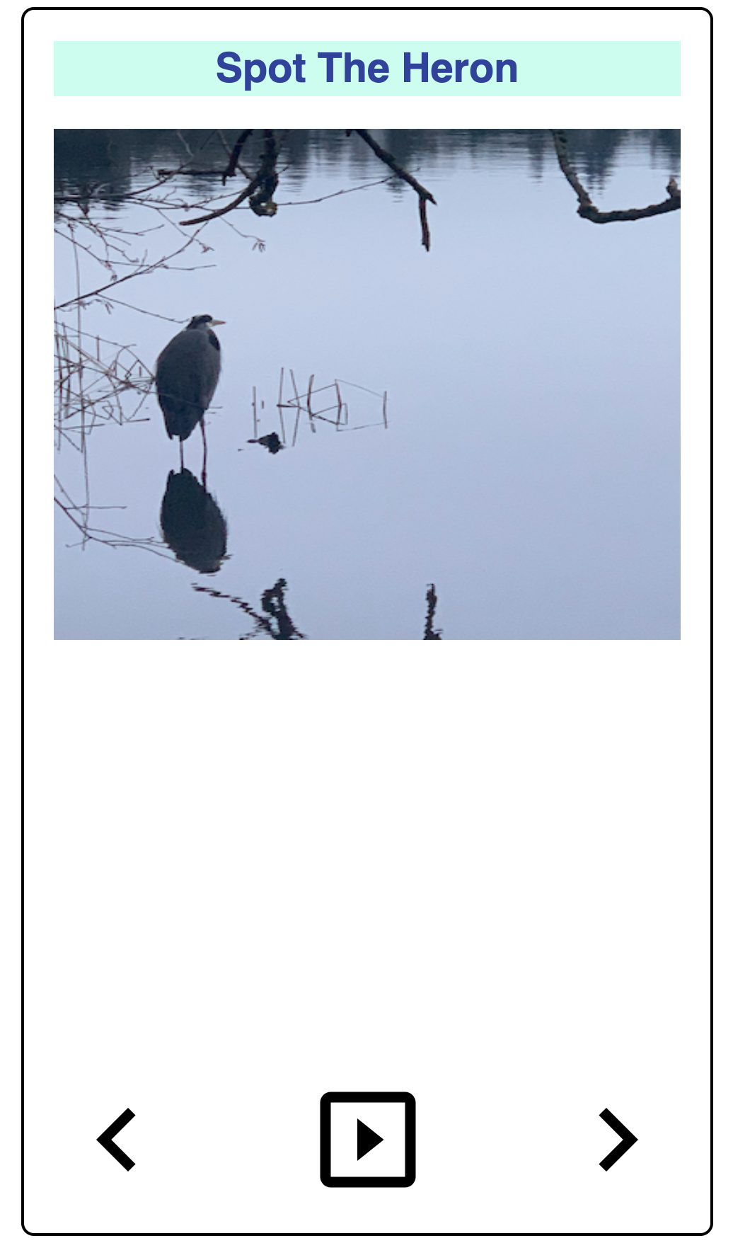 ] .right-column[ 1. First line: - Ok: need to build an internal representation of the page 2. Line-by-line, go through the HTML - If one of the tags links to a cascading style sheet (CSS) file, load and parse it - If one of the tags links to JavaScript (JS) for behavior, load and parse it 3. FINALLY display the page… ] --- # Understanding content - There are 100s of possible HTML tags! See [Mozilla Developer Network](https://developer.mozilla.org/en-US/docs/Web/HTML/Element)! - Some simple tags - Title `<title></title>` (which nests inside your ``) - Headings `<h1></h1>` .. `<h6></h6>` - Paragraphs `<p>` - Ordered or unordered lists: `</p> <ol></ol>`, `<ul></ul>`, with list elements `<li>` - Horizontal rules `<hr>` - Strong `<strong></strong>` which defaults to a bold style and emphasis `<em></em>` which defaults to italicized in most browsers. --- # Adding content - There are 100s of tags! See [Mozilla Developer Network](https://developer.mozilla.org/en-US/docs/Web/HTML/Element)! - Some simple tags - Some tags add semantic context - `<header></header>`: The header or banner that displays the title of the page - `<main></main>`: The bulk of the content of the page - `<footer></footer>`: The footer is optional but you can put contact info and copyright date in there. --- # Adding content - There are 100s of tags! See [Mozilla Developer Network](https://developer.mozilla.org/en-US/docs/Web/HTML/Element)! - Some simple tags - Some tags add semantic context - Some tags need additional information, added to a tag with attributes - Links to other pages `<a href="filename"></a>` - Links to images `<img src="img.jpg" alt="Description!">` --- # Adding content - There are 100s of tags! See [Mozilla Developer Network](https://developer.mozilla.org/en-US/docs/Web/HTML/Element)! - Some simple tags - Some tags add semantic context - Some tags need additional information, added to a tag with attributes - Some tags (comments) are important for documentation `<!-- -->` --- # Cascading Style Sheets (CSS) - Allows us to change the look and feel of the content on the page - Style is separated into a .css file - Makes styling multiple pages easier - Allows changing multiple pages easier - Style sheets must be linked to an html page in the for the styles to work `<link href="%E2%80%9Cstyle.css%E2%80%9D" rel="“stylesheet”">` - Great example is [CSS Zen Garden](http://www.csszengarden.com/) --- # Document Object Model (DOM) (1/3) .left-column[  ] .right-column[ - We must build up a hierarchy of document elements (the **Document Object Model**) - The structure of this depends on our HTML (or the toolkit that generates your HTML or App) - The structure of this influences layout ] --- # Document Object Model (DOM) (2/3) .left-column[  ] .right-column[ What does this hierarchy look like? ] --- # Document Object Model (DOM) (3/3) .left-column[  ] .right-column[ <div class="mermaid"> flowchart TD A(Main Window) B(Vertical Layout) C("Spot the Heron" Label) D(Picture of a heron in water with some reeds) E(Horizontal Layout: Controls) F(Left arrow) G(Play) H(Right arrow) A --> B B --> C B --> D B --> E E --> F E --> G E --> H classDef default fill:#009688,stroke:#333,stroke-width:2px, color:white; classDef reflect fill:#4CAF50,stroke:#333,stroke-width:2px, color:white; class A,B,C default class A,B,C,D,E reflect linkStyle default stroke: black,stroke-width:8px </div> ] --- # Let's compare that to an app .left-column50[ Components: *library elements* (e.g. buttons and labels) combined according to *toolkit rules* 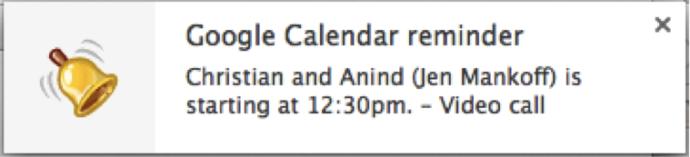 ] .right-column50[ - What are the "components" in this image? - What does the "interactor hierarchy" look like for this image ] ??? discuss with your neighbor - what to draw; where to draw it --- # Let's compare that to an app (Answer) .left-column50[ Components: *library elements* (e.g. buttons and labels) combined according to *toolkit rules*  ] .right-column50[ <div class="mermaid"> graph TD W(Window) --> H[Horizontal layout] H --> I1[fa:fa-bell Bell ] H --> V[Vertical Layout] V --> I2[Title: Google Calendar reminder] V --> I3[Text: Christian and Anind --Jen Mankoff-- is starting at 12:30pm. - Video call] classDef default fill:#009688,stroke:#333,stroke-width:2px, color:white; classDef reflect fill:#4CAF50,stroke:#333,stroke-width:2px, color:white; class H,V default class I1,I2,I3 reflect linkStyle default stroke: black,stroke-width:8px </div> ] --- # How do we make it more interactive? How about we add a button? -- count: false Wait? When you hear the word "button" in the context of a graphical user interface (GUI), what do you think of? --- # What should it do? What do we tell the toolkit about the button? - Where to place it - How it should react to user input (from which device?) --- # Screen Reader Information Flow (1/2) What happens when the user is exploring/navigating? <div class="mermaid"> graph LR SR[fa:fa-volume-up <br> Screenreader<br>]:::bluelarge -->|Asks for next object in DOM| API(fa:fa-codepen<br> Accessibility API<br>):::bluelarge API -->|Passes along request| ATK[<br> Toolkit<br>]:::bluelarge ATK -->|Checks Details| App[fa:fa-mobile <br>App<br>]:::bluelarge App -->|Name: Foo| ATK ATK -->|Name, Role: Button| API API -->|Name, Role| SR Speak(fa:fa-volume-up Button, Foo ):::bluelarge </div> -- ... (repeat for each swipe / component) --- # Screen Reader Information Flow (2/2) What happens when the user double taps to invoke? <div class="mermaid"> graph LR SR[fa:fa-volume-up <br> Screenreader<br>]:::bluelarge -->|Invokes object| API(fa:fa-codepen<br> Accessibility API<br>):::bluelarge API -->|Passes along request| ATK[<br> Toolkit/<br>Browser]:::bluelarge ATK -->|Invokes Callback| App[fa:fa-mobile <br>App<br>]:::bluelarge App -->|Updates Interface<br>Announces Changes| ATK ATK -->|Passes along information| API API -->|Deleted text| SR Speak(fa:fa-volume-up Deleted Text ):::bluelarge </div> --- # Different types of interfaces are similar | Does What? | Android | Web | |--- | --- | --- | | Content| Java | HTML/CSS/JS | | Style | Layout | CSS | | Structure | Interactor Hierarchy | Document Object Model (DOM) | | Content | Components | DIVS | | Style | Paint objects on a canvas | CSS | | Behavior | Event Handling | Event Handling/JS | --- # Which of these Impacts Accessibility? | Does What? | Android | Web | Accessibility (Examples) | |-- |--------------------------------|---------------------------------------------------|--------------------------------------| | Content | Java | HTML/CSS/JS | Does the toolkit support access? | |Style | Layouts | CSS | Comprehension/Magnification | | Structure | Interactor Hierarchy | Document Object Model (DOM) | Navigation | | Content | Components | DIVS | Alternative text (toolkit dependent) | | Style | Paint objects on a canvas | CSS | Color choices | | Behavior | Event Handling ` | Event Handling/JS | Proper Interaction with access API? | --- # Building for Accessibility <div class="mermaid"> graph LR SR[fa:fa-volume-up <br> Screenreader<br>]:::bluelarge -->|Asks for next object in DOM| API(fa:fa-codepen<br> Accessibility API<br>):::bluelarge API -->|Passes along request| ATK[<br> Toolkit<br>]:::bluelarge ATK -->|Checks Details| App[fa:fa-mobile <br>App<br>]:::bluelarge App -->|Name: Foo| ATK ATK -->|Name, Role: Button| API API -->|Name, Role| SR </div> - This information must be provided by the developer (and in some cases, parts of the info provided by toolkit library) - Accessibility APIs provide the information to a screen reader. - Screen readers provide this information visually, through audio or in Braille to users. ??? As an example, we'll focus on screen readers Screen readers get underlying information about controls from operating systems. --- # Example: Accessible Button (1/4) Minimum needed for screen reader access - **Location** (for Navigation) ??? Naturally exists in the interactor hierarchy/DOM, but is it in an intuitive place for navigation? --- # Key Navigation Concept Reaching times: How long does it take to get somewhere Information you need to collect to assess this: - You need to know the linear order of a webpage or app. - You need to know about any hierarchy that is programmatically available (e.g. headers) No way to automatically assess this! Hard to assess well without knowing best tricks for navigation that disabled people use. --- # A page with layout .left-column60[ (table but imagine it was CSS) <style type="text/css"> .tg {border-collapse:collapse;border-spacing:0;} .tg td{border-color:black;border-style:solid;border-width:1px;font-family:Arial, sans-serif;font-size:14px; overflow:hidden;padding:10px 5px;word-break:normal;} .tg th{border-color:black;border-style:solid;border-width:1px;font-family:Arial, sans-serif;font-size:14px; font-weight:normal;overflow:hidden;padding:10px 5px;word-break:normal;} .tg .tg-w747{background-color:#dae8fc;text-align:left;vertical-align:top} .tg .tg-kftd{background-color:#efefef;text-align:left;vertical-align:top} .tg .tg-ltxa{background-color:#ffccc9;text-align:left;vertical-align:top} .tg .tg-0lax{text-align:left;vertical-align:top} </style> <table class="tg"> <thead> <tr> <th class="tg-kftd" colspan="3"><span style="color:#333;background-color:#FFF">Title spanning whole width of table</span></th> </tr> </thead> <tbody> <tr> <td class="tg-w747" rowspan="3">Navigation 1<br>Navigation 2<br>Navigation 3<br>Navigation 4</td> <td class="tg-ltxa">Banner Ad</td> <td class="tg-w747" rowspan="3">Right Nav 1<br>Right Nav 2<br>Right Nav 3</td> </tr> <tr> <td class="tg-0lax" rowspan="2">Main content area with lots of text and stories <br>filling the center part of the window</td> </tr> <tr> </tr> </tbody> </table> ] .right-column40[ What focus order makes sense for the Facebook newsfeed? Does this match the actual focus order? When might you need to skip things? ] --- # Linear Order with no CSS Depends on how the page was designed. One possibility - Title - Right Nav 1 - Right Nav 2 - Right Nav 3 - Navigation 1 - Navigation 2 - Navigation 3 - Navigation 4 - Banner ad - Main content area --- # Swipe order? (bad) .left-column60[ | Cell | Nefarious order | |--------------|-----------------| | Title | 1 | | Right Nav 1 | 8 | | Right Nav 2 | 9 | | Right Nav 3 | 10 | | Banner ad | 3 | | Navigation 1 | 4 | | Navigation 2 | 5 | | Navigation 3 | 6 | | Navigation 4 | 7 | | Content | 11 | ] .right-column40[ <style type="text/css"> .tg {border-collapse:collapse;border-spacing:0;} .tg td{border-color:black;border-style:solid;border-width:1px;font-family:Arial, sans-serif;font-size:14px; overflow:hidden;padding:10px 5px;word-break:normal;} .tg th{border-color:black;border-style:solid;border-width:1px;font-family:Arial, sans-serif;font-size:14px; font-weight:normal;overflow:hidden;padding:10px 5px;word-break:normal;} .tg .tg-w747{background-color:#dae8fc;text-align:left;vertical-align:top} .tg .tg-kftd{background-color:#efefef;text-align:left;vertical-align:top} .tg .tg-ltxa{background-color:#ffccc9;text-align:left;vertical-align:top} .tg .tg-0lax{text-align:left;vertical-align:top} </style> <table class="tg"> <thead> <tr> <th class="tg-kftd" colspan="3"><span style="color:#333;background-color:#FFF">Title spanning whole width of table</span></th> </tr> </thead> <tbody> <tr> <td class="tg-w747" rowspan="3">Nav 1<br>Nav 2<br>Nav 3<br>Nav 4</td> <td class="tg-ltxa">Banner Ad</td> <td class="tg-w747" rowspan="3">Right Nav 1<br>Right Nav 2<br>Right Nav 3</td> </tr> <tr> <td class="tg-0lax" rowspan="2">Main content area with lots of text and stories filling the center part of the window</td> </tr> <tr> </tr> </tbody> </table> ] --- # Swipe order? (better) .left-column60[ | Cell | Well designed order | |--------------|---------------------| | Title | 1 | | [skip cell] | 2 | | Right Nav 1 | 3a | | Right Nav 2 | 3b | | Right Nav 3 | 3c | | Banner ad | 3e | | Navigation 1 | 3a | | Navigation 2 | 3b | | Navigation 3 | 3c | | Navigation 4 | 3d | | Content | 3 | ] .right-column40[ <style type="text/css"> .tg {border-collapse:collapse;border-spacing:0;} .tg td{border-color:black;border-style:solid;border-width:1px;font-family:Arial, sans-serif;font-size:14px; overflow:hidden;padding:10px 5px;word-break:normal;} .tg th{border-color:black;border-style:solid;border-width:1px;font-family:Arial, sans-serif;font-size:14px; font-weight:normal;overflow:hidden;padding:10px 5px;word-break:normal;} .tg .tg-w747{background-color:#dae8fc;text-align:left;vertical-align:top} .tg .tg-kftd{background-color:#efefef;text-align:left;vertical-align:top} .tg .tg-ltxa{background-color:#ffccc9;text-align:left;vertical-align:top} .tg .tg-0lax{text-align:left;vertical-align:top} </style> <table class="tg"> <thead> <tr> <th class="tg-kftd" colspan="3"><span style="color:#333;background-color:#FFF">Title spanning whole width of table</span></th> </tr> </thead> <tbody> <tr> <td class="tg-w747" rowspan="3">Nav 1<br>Nav 2<br>Nav 3<br>Nav 4</td> <td class="tg-ltxa">Banner Ad</td> <td class="tg-w747" rowspan="3">Right Nav 1<br>Right Nav 2<br>Right Nav 3</td> </tr> <tr> <td class="tg-0lax" rowspan="2">Main content area with lots of text and stories filling the center part of the window</td> </tr> <tr> </tr> </tbody> </table> Hidden skip Link to get to main content ] --- # Swipe order? (best) .left-column60[ | Cell | Chunked order | |-------------|---------------------| | Title | 1 | | [skip cell] | 2 | | Nav Area | 3 | | Right Nav | 3a | | Right Nav 1 | 3a.1 | | Right Nav 2 | 3a.2 | | Right Nav 3 | 3a.3 | | Left Nav | 3b | | Navigation 1 | 3b.1 | | ... | | | Banner ad | 3c | | Content | 4 | ] .right-column40[ <style type="text/css"> .tg {border-collapse:collapse;border-spacing:0;} .tg td{border-color:black;border-style:solid;border-width:1px;font-family:Arial, sans-serif;font-size:14px; overflow:hidden;padding:10px 5px;word-break:normal;} .tg th{border-color:black;border-style:solid;border-width:1px;font-family:Arial, sans-serif;font-size:14px; font-weight:normal;overflow:hidden;padding:10px 5px;word-break:normal;} .tg .tg-w747{background-color:#dae8fc;text-align:left;vertical-align:top} .tg .tg-kftd{background-color:#efefef;text-align:left;vertical-align:top} .tg .tg-ltxa{background-color:#ffccc9;text-align:left;vertical-align:top} .tg .tg-0lax{text-align:left;vertical-align:top} </style> <table class="tg"> <thead> <tr> <th class="tg-kftd" colspan="3"><span style="color:#333;background-color:#FFF">Title spanning whole width of table</span></th> </tr> </thead> <tbody> <tr> <td class="tg-w747" rowspan="3">Nav 1<br>Nav 2<br>Nav 3<br>Nav 4</td> <td class="tg-ltxa">Banner Ad</td> <td class="tg-w747" rowspan="3">Right Nav 1<br>Right Nav 2<br>Right Nav 3</td> </tr> <tr> <td class="tg-0lax" rowspan="2">Main content area with lots of text and stories filling the center part of the window</td> </tr> <tr> </tr> </tbody> </table> Use chunks to group meaningful info and reduce number of navigation steps. ] ??? - User can double tap to drill down into chunk (e.g. navigate to the “like” button by drilling down into an individual post). --- # More Navigation Concepts Forms and inputs have issues with *order* and *labels*. This is fixed different ways on different platforms, but all major UI dev tools have APIs for accessibility. Make sure you use them *and* testing. - Web [advice](http://webaim.org/techniques/forms/controls) and [advanced advice](http://webaim.org/techniques/forms/advanced) on this. Look for similar documentation for android/iOS. Tables are not ideal, but *best* when headers are labeled. Again, check the API for your interface dev platform. --- # Example: Accessible Button (2/4) Minimum needed for screen reader access - Location (for Navigation) - **Does it have proper labeling/ALT text?** - Did you use a library element or ensure that events are properly announced - State changes - Invocation - Can it be triggered through the keyboard or API? ??? --- # Interactive Component ALT text - What is a good name for a "Like" Button? - Enable the user to understand the name of the control they have navigated to, what type of control it is, what value it has, what state it has. --- # Proper ALT text Screen reader will read out name, role, and state. Don't repeat these. Good alt text: Name ("Like") API knows: Role ("Button") API knows: State ("Not selected") --- # Example: Accessible Button (2/4) Minimum needed for screen reader access - Location (for Navigation) - Does it have proper labeling/ALT text? - Did you use a library element or ensure that **events are properly announced** - State changes - Invocation ??? --- .column[ 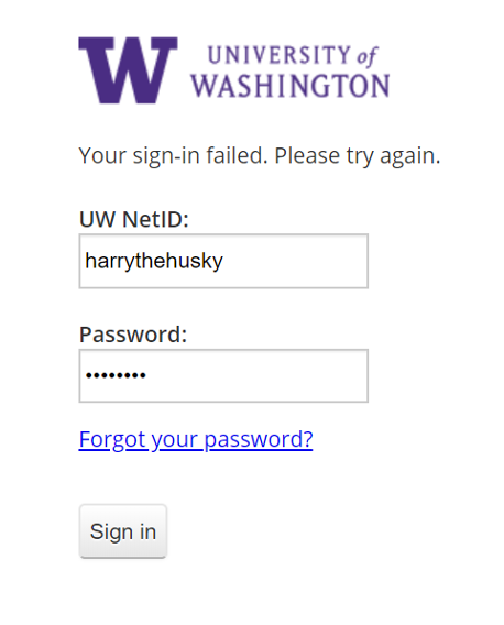 ] .column[ ## Announce UI changes If you can't see the UI, you have no idea if login succeeded Requires *programmatically* calling an API to announce the change ] -- .column[ ## Common places this happens Dialog boxes Success notifications Errors ] --- # Example: Accessible Button (2/4) Minimum needed for screen reader access - Location (for Navigation) - Does it have proper labeling/ALT text? - Did you use a library element or ensure that events are properly announced - State changes - Invocation - **Can it be triggered through the keyboard or API?** ??? --- # Other API specific issues Impact Access You always must to understand your accessibility API in depth to make an app accessible For example, when [Ross et al, 2017](https://dl.acm.org/doi/10.1145/3132525.3132547) studied 1000s of android apps. Some common errors came up which aren't in guidelines because they are either tool specific or straight up UX errors: [next slide] --- # Errors that require manual inspection | | Description| |--| |<i class="darklight fa fa-strikethrough fa-2x"></i> | TextView has a content description. This might interfere with a screen reader’s ability to read the content of the text field | | <i class="darklight fa fa-angle-double-right fa-2x"></i> | Overlapping clickable items | |<i class="darklight fa fa-link fa-2x"></i> | URL in link may be invalid | --- # Summary of Common Problems Common Problems To Remember (from [Ross et al, 2017](https://dl.acm.org/doi/10.1145/3132525.3132547) study of 1000s of android apps) .left-column50[ | |Description | |--|----------------------| |<i class="darklight fa fa-times-circle fa-2x"></i> | Missing element label || |<i class="darklight fa fa-retweet fa-2x"></i> | Item label ends with type, e.g., “Play Button.” TalkBack automatically announces item type, so information is redundant | |<i class="darklight fa fa-eye-slash fa-2x"></i> | UI Change not announced | |<i class="darklight fa fa-server fa-2x"></i> | Navigation lacks hierarchy; or makes no sense | ] .right-column50[ | |Description | |--|----------------------| |<i class="darklight fa fa-search-minus fa-2x"></i> | Item is too small| |<i class="greylight fa fa-adjust fa-2x"></i> | Low contrast in image or icon | |<i class="greylight fa fa-quote-left fa-2x"></i> | Low text contrast between foreground and background | |<i class="darklight fa fa-retweet fa-2x"></i> | Item's role identical with alt text| ] --- # Key Take Home Message IF you take one thing away from this whole discussion, it should be: *YOU* decide who is disabled with respect to the technology you create --- [//]: # (Outline Slide) # Learning Goals for Today - Manual Accessibility Testing - We will focus on screen readers - And understanding structure in interactive apps - And how this impacts user agents (such as screen readers) - Building for Accessibility - **Assignment** - [if time] Get comfortable using existing freely available accessibility technology to manually support assessment <!-- [//]: # TODO expand this slide deck? IT's short and could cover more. Also discuss how this should impact the report --> --- # This week's assignment The goal of this homework is to make something more accessible (e.g. website, visualization, user interface, AR/VR, etc) that you’ve already made. Required learning goals: - Accessible Document Creation - Familiarity with a Range of Accessibility Technologies - Image Description ??? If you don't have an interface, come speak with us! --- [//]: # (Outline Slide) # Learning Goals for Today - Manual Accessibility Testing - We will focus on screen readers - And understanding structure in interactive apps - And how this impacts user agents (such as screen readers) - Building for Accessibility - Assignment - [if time] **Get comfortable using existing freely available accessibility technology** to manually support assessment <!-- [//]: # TODO expand this slide deck? IT's short and could cover more. Also discuss how this should impact the report --> --- # Break up into groups Decide who will - use switch control - use magnification - browser settings Open your phone's web browser and load [seattleschools.org](https://www.seattleschools.org/) Share on the [class discussion](https://edstem.org/us/courses/56844/discussion/4677684) --- # In your groups Visit or [UW Libraries](https://www.lib.washington.edu/). Evaluate 1. Whether a student can easily learn about Seattle Public Schools or UW Libraries 2. Whether a student can "Report a Concern" about how accessible the website is. What are some problems you found? Try to separate out what is difficult for you as a beginner from what is a flaw in the website itself.
