Recently, my girlfriend and I stopped by her bank so she could make an ATM withdrawal. (Remember, it's my girlfriend. I don't routinely observe strangers' interactions with ATMs. This was a special opportunity for observation, for this reason.)
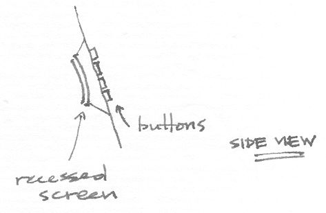
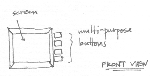
Like many ATM machines, in addition to a numeric keypad, there is a set of four or five physically unlabelled buttons arranged in a column along the right side of a small computer screen. These buttons do not always have a function. During certain steps in an ATM session, some or all of the buttons are assigned functions, and the display shows their labels on the right side of the screen, aligned with the buttons.
|
|
|
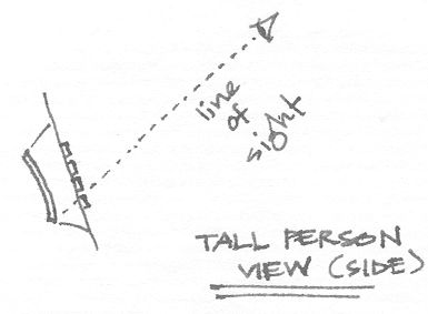
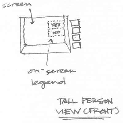
When she reattempted the transaction, I noticed her stooping down slightly to look at the screen and multi-purpose buttons when she needed to use them, taking more time to ensure she was pressing the button corresponding to the account she wanted.
|
|
Using multi-purpose buttons such as these seems more reasonable than having an alphanumeric keyboard or many more special function keys, which might result in a cluttered interface. It is also less expensive than using a touch-screen, which would eliminate the ambiguity described above but would require visual and/or auditory feedback to acknowledge button presses. Orienting them vertically also seems reasonable, since the on-screen labels would be difficult to read if their text had to be oriented vertically for a horizontal row of buttons instead. The problem is obviously the result of having the screen at a different depth than the buttons, making the user's angle of view a critical factor in proper interpretation of the on-screen labels.
some unanswered design questions: