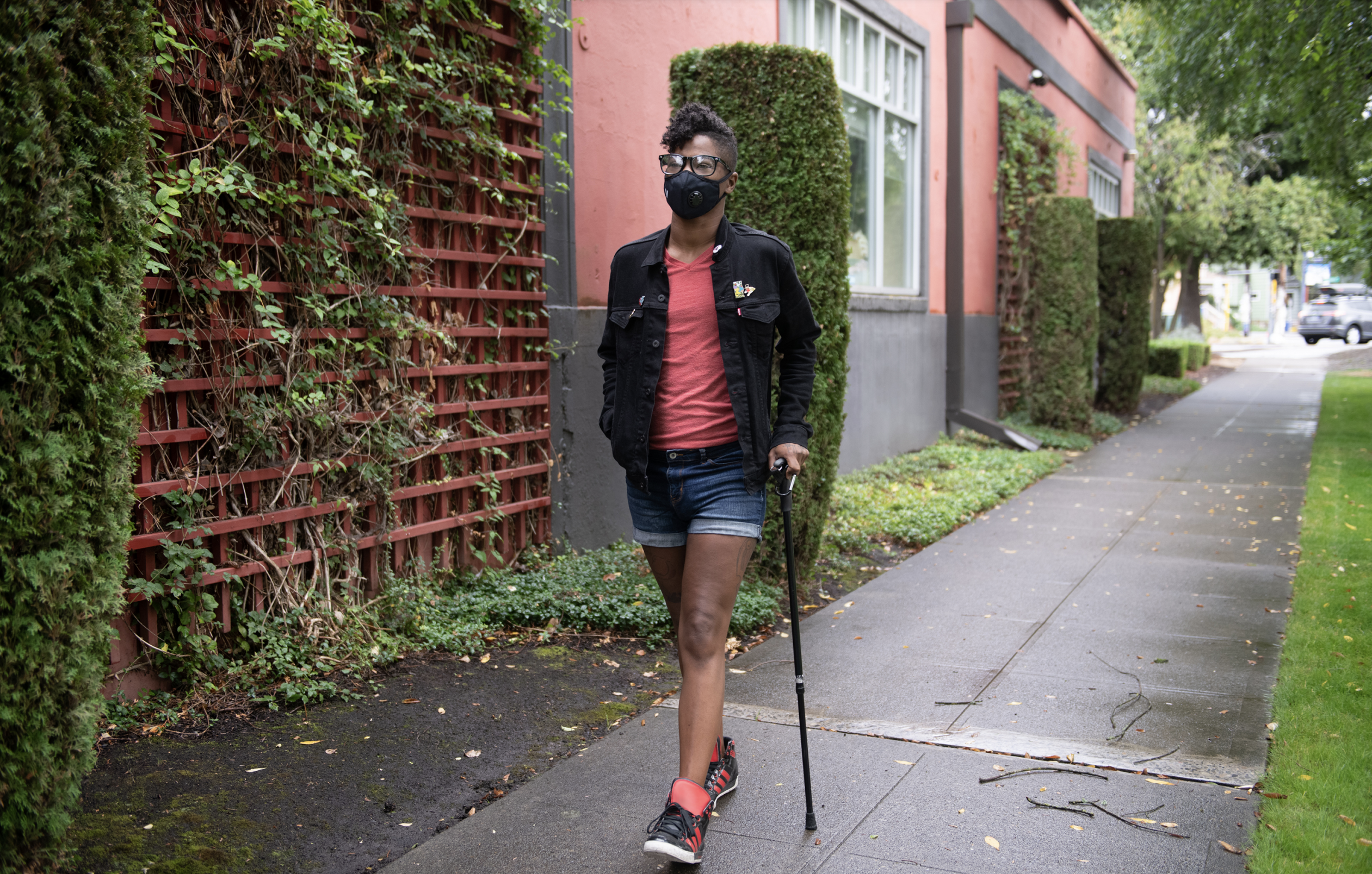
background-image: url(img/people.png) .left-column50[ # Welcome to the Future of Access Technologies Week 2, Presenting Accessibly CSE493e, Fall 2023 ] --- name: normal layout: true class: --- # Important Reminder ## This is an important reminder ## Make sure zoom is running and recording!!! ## Make sure captioning is turned on --- [//]: # (Outline Slide) # Learning Goals for this slide deck - Presenting Accessibly --- # Presenting Accessibly - First, make your slides accessible - Also share them at least 24 hrs ahead of the presentation (required to pass this competency, built into the assignment this week) --- # When presenting - Speak slowly and clearly - Read entire quotes - Describe images and videos - Non-verbal content should be described (in the video, or by you) Today: Pay attention and raise your hand when I fail to do this! If you catch me, you get a surprise :). --- # Slide Show Basics (1/9) Image Descriptions - Short description overviews image - Long description more complete - Not redundant with what access tools (e.g. screen reader) already tell the user (i.e. the type of an element such as "button" or "image" is not useful to include in ALT text) We'll talk about this a lot this quarter because images, diagrams, videos, charts, and GUIs all require different types of descriptions. Today we will focus on photographs, because you will probably have them in your decks --- # Describing photographs (1/2) - Automated tools are not enough.    Is this meant to represent a maple leaf? or Canada? How would you describe the differences between these images if all are present? Only one? ??? Although technology is getting better at recognizing what an image depicts, algorithms alone cannot understand what an image means within the context of the overall page. A maple leaf might represent Canada, or it might just illustrate the leaf of a tree. Web page authors must provide alternative text that represents the content and function of their images. --- # Describing photographs (2/2) - Automated tools are not enough. - Depends on setting. [Stangl et al, 2020](https://dl.acm.org/doi/pdf/10.1145/3308558.3313605) asked BLV people about News; SNS; eCommerce; Employment; Dating; Productivity and E-Publication). Includes a table of what to include when - Always include whether people are present; any text; names of objects present - Usually include activity; building features (if present); landmarks .left-column50[  ] .right-column50[ .quote[A realistic image of a canadian flag with a red maple leaf on a white background. Shadows and curves suggest it is blowing in the wind. Nothing other than the flag is visible]] --- # When to Describe Identity [Bennett et al](https://dl.acm.org/doi/10.1145/3411764.3445498) interviewed BIPOC, Non-Binary and/or Transgender Blind people. .left-column60[ ![:youtube a video describing the results of a study with people with disabilities with intersectional identities about their preferences for how to describe diverse people in image descriptions,By6nzFefcxs] ] .right-column40[ - Meeting new people - Identity is the topic of discussion - Seeking specific first person perspectives - Want/need to understand representation in the media - Need to "read" a room, for example to decide whether to code switch ] --- # How to Describe Identity .left-column40[  ] .right-column60[ - Ok to mention race, gender, and disability status in that case - Otherwise use appearance (skin color, "person" instead of gender, AT use but not disability status) .quote[Lezlie, a white woman, looks at us full front with curls down one size of her head and her long sleeve rolled up just on that side of a cowl neck wild abstract print shirt. Her smiling cheeks greet us.] ] Original announcement: Dr. Lezlie Frye has won [an award] for .red[her] paper; alt text (probably) written with her input. --- # ALT Text with Identity Markers? .left-column40[ ] .right-column60[ <iframe src="https://embed.polleverywhere.com/free_text_polls/dVkKqIvPJ2rYY6uRZP1Ip?controls=none&short_poll=true" width="800px" height="600px"></iframe> ] --- # Bennet et al's description: .left-column40[ ] .right-column60[ .quote[A Black; disabled; non-binary person with a face mask walks down a neighborhood street with one hand in their pocket and the other hand on their cane. They have a short mohawk and are wearing a jacket; shorts; tennis shoes; and glasses] ] --- # When presenting How much to describe images Can a BVI person follow your presentation and get the same information as someone without any visual impairment? --- # Slideshow Basics (2/9) - Image descriptions - Use structure - Use header styles to correctly label things; update styles to make them look good - Don't skip header levels - Use unique slide titles - makes navigation easier - put (x of y) in the title if repeating - Check slide order (like DOM order) --- # Slideshow Basics (3/9) - Image descriptions - Use headers & styles - Color contrast - We'll talk about this more, but you can use [a color contrast checker](https://webaim.org/resources/contrastchecker/) to make sure that people with color blindness or other color-related accessibility needs can read your slides --- # Slideshow Basics (4/9) <style>.times {font-family:Times !important;}</style> - Image descriptions - Use headers & styles - Color contrast - San serif fonts - This is a san serif font - .times[This is a serif font] San serif is considered easier on the eyes for screen presentations --- # Slideshow Basics (5/9) - Image descriptions - Use headers & styles - Color contrast - San serif fonts - Simplify language - Simplify your slide - Embellish when you speak - Avoid clutter --- # What is clutter? Please, for the love of all that is good on this fine planet we call home, do not do this to your poor audience members They don’t deserve this! What did they do to you? They probably flew hundreds of miles and of all talks and things to do in this new place came to YOUR presentation. And what do you do? You greet them with this GIANT wall of text! How rude. It’s ugly to look at. It’s hard to read. It’s annoying as heck for me to type out this thing just to make a point! So please, don’t do this to your audience members. Be a responsible presenter. Practice your talks so you don’t have to read off the slide (or use speaker notes! also okay!). Break up your content so looking at your slides isn’t like getting smacked in the face with a wall of text. **But there are exceptions! (e.g., if you have a thick accent)** --- # Slideshow Basics (6/9) - Image descriptions - Use structure - Color contrast - San serif fonts - Simplify language - Don't use color to convey meaning --- # Slideshow Basics (7/9) - Image descriptions - Use structure - Color contrast - San serif fonts - Simplify language - Don't use color to convey meaning - 9/10, you don’t need sound effects or visual effects --- # Slideshow Basics (8/9) - Image descriptions - Use structure - Color contrast - San serif fonts - Simplify language - Don't use color to convey meaning - 9/10, you don’t need sound effects or visual effects - Make sure videos are accessible - Videos should be captioned (at a minimum) - Videos should be audio described (ideally) --- # Slideshow Basics (9/9) - Image descriptions - Use structure - Color contrast - San serif fonts - Simplify language - Don't use color to convey meaning - 9/10, you don’t need sound effects or visual effects - Make sure videos are accessible - Leave space for captions