background-image: url(img/people.png) .left-column50[ # Welcome to the Future of Access Technologies Aria & Accessibility Trees: More on how Accessibility is Implemented CSE493e, Fall 2023 ] --- name: normal layout: true class: --- # Important Reminder ## This is an important reminder ## Make sure zoom is running and recording!!! ## Make sure captioning is turned on --- # Announcements UARS: How many -- one per tech minimum; give an example of a success if you find no problems. Reminder: what to do if you miss a class Reminder: regrades Summary: We'll keep doing it and add some moer details to it as requested Visual calendar: We've heard this a few times. But I'm not sure where to put it or why canvas doesn't work. Can someone who's asking for this help us out with some user-centered desgin after class? :) --- [//]: # (Outline Slide) # Learning Goals for today - Description of this week's assignment - More on how accessibility is implemented --- # First, Introducing your Website Report We modified the assignment a bit - It's now two weeks long - It's optionally a group assignment (with others who reviewed the same website) --- # Introduction - What is the site or app for - How did you assess it (what accessibility tool did you use) - What task did you assess? - Overview table | Type (Web/Mobile/etc) | Testing Method | UARS found | Who Contributed | |-----------------------|----------------|--------------|-----------------| | ... | ... | ... | | |-----------------------|----------------|--------------|-----------------| --- # Executive Summary Summarize biggest problems (1-2 paragraphs) | WCAG | Severe problems | Moderate problems | Minor problems | |------|-----------------|-------------------|----------------| | ... | ... | ... | ... | |------|-----------------|-------------------|----------------| --- # Details More detail on what needs to be done sorted by WCAG # Include both problems and remedies Easy to split this up among a group --- # Make the report accessible - Use headers - Use proper color contrast - Write alt text for photos - Use meaningful hyperlinsk - Turn in a word or google doc on Canvas --- [//]: # (Outline Slide) # Learning Goals for today - Description of this week's assignment - More on how accessibility is implemented --- # What is a web page really? | Content | Structure | Style | Behavior | | :--: | :--: | :--: | :--: | || | Words and Images | HTML | CSS | JavaScript | --- # What is a web page really? | Content | Structure | Style | Behavior | | :--: | :--: | :--: | :--: | ||| | Words and Images | HTML | CSS | JavaScript | --- # What is a web page really? | Content | Structure | Style | Behavior | | :--: | :--: | :--: | :--: | |||| | Words and Images | HTML | CSS | JavaScript | --- # What is a web page really? | Content | Structure | Style | Behavior | | :--: | :--: | :--: | :--: | ||||| | Words and Images | HTML | CSS | JavaScript | --- # Lifecycle of a browser* loading a page .left-column40[ 1. Fetch the page 2. Parse the page 3. Build up an internal representation of the web page 4. Display the page ] .right-column60[  ] .footnote[*: As seen by Chrome] --- # Parse and Display the Page .left-column[ 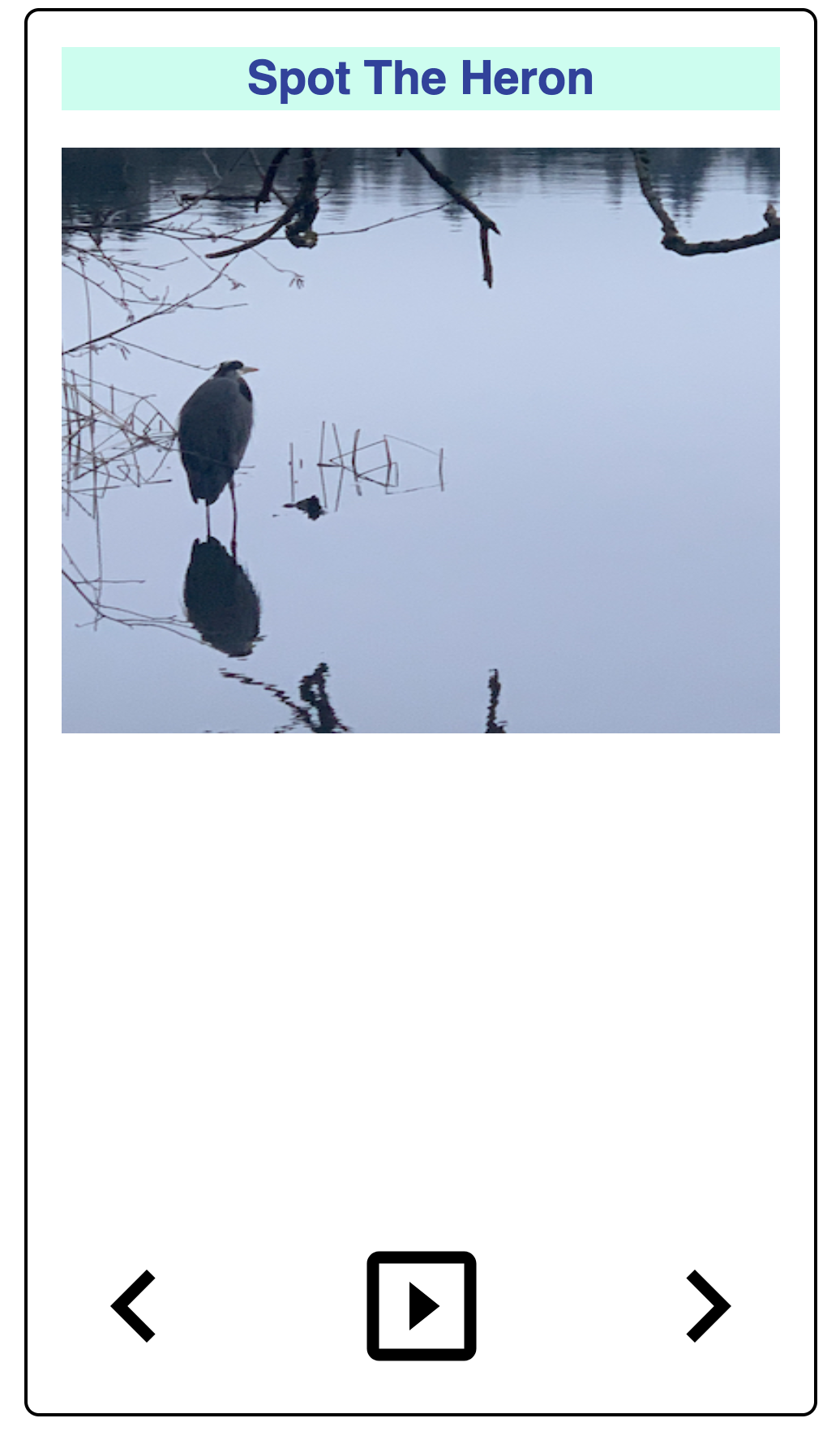 ] .right-column[ 1. First line: - Ok: need to build an internal representation of the page 2. Line-by-line, go through the HTML - If one of the tags links to a cascading style sheet (CSS) file, load and parse it - If one of the tags links to Javascript (JS) for behavior, load and parse it 3. FINALLY display the page… ] --- # Understanding content - There are 100s of tags! See [Mozilla Developer Network](https://developer.mozilla.org/en-US/docs/Web/HTML/Element)! - Some simple tags - Title `<title></title>` (which nests inside your ``) - Headings `<h1></h1>` .. `<h6></h6>` - Paragraphs `<p>` - Ordered or unordered lists: `</p> <ol></ol>`, `<ul></ul>`, with list elements `<li>` - Horizontal rules `<hr>` - Strong `<strong></strong>` which defaults to a bold style and emphasis `<em></em>` which defaults to italicized in most browsers. --- # Adding content - There are 100s of tags! See [Mozilla Developer Network](https://developer.mozilla.org/en-US/docs/Web/HTML/Element)! - Some simple tags - Some tags add semantic context - `<header></header>`: The header or banner that displays the title of the page - `<main></main>`: The bulk of the content of the page - `<footer></footer>`: The footer is optional but you can put contact info and copyright date in there. --- # Adding content - There are 100s of tags! See [Mozilla Developer Network](https://developer.mozilla.org/en-US/docs/Web/HTML/Element)! - Some simple tags - Some tags add semantic context - Some tags need additional information, added to a tag with attributes - Links to other pages `<a href="filename"></a>` - Links to images `<img src="img.jpg" alt="Description!">` --- # Adding content - There are 100s of tags! See [Mozilla Developer Network](https://developer.mozilla.org/en-US/docs/Web/HTML/Element)! - Some simple tags - Some tags add semantic context - Some tags need additional information, added to a tag with attributes - Some tags (comments) are important for documentation `<!-- -->` --- # Cascading Style Sheets (CSS) - Allows us to change the look and feel of the content on the page - Style is separated into a .css file - Makes styling multiple pages easier - Allows changing multiple pages easier - Style sheets must be linked to an html page in the for the styles to work `<link href="%E2%80%9Cstyle.css%E2%80%9D" rel="“stylesheet”">` - Great example is [CSS Zen Garden](http://www.csszengarden.com/) --- # Layout in CSS Layout can be [complicated](https://www.amazon.com/CSS-Awesome-Mug-Programmer-Developer/dp/B06Y13QC8N), fortunately there is CSS [Flexbox](https://courses.cs.washington.edu/courses/cse154/flexboxducky/) or [Grid](https://cssgridgarden.com/)!! 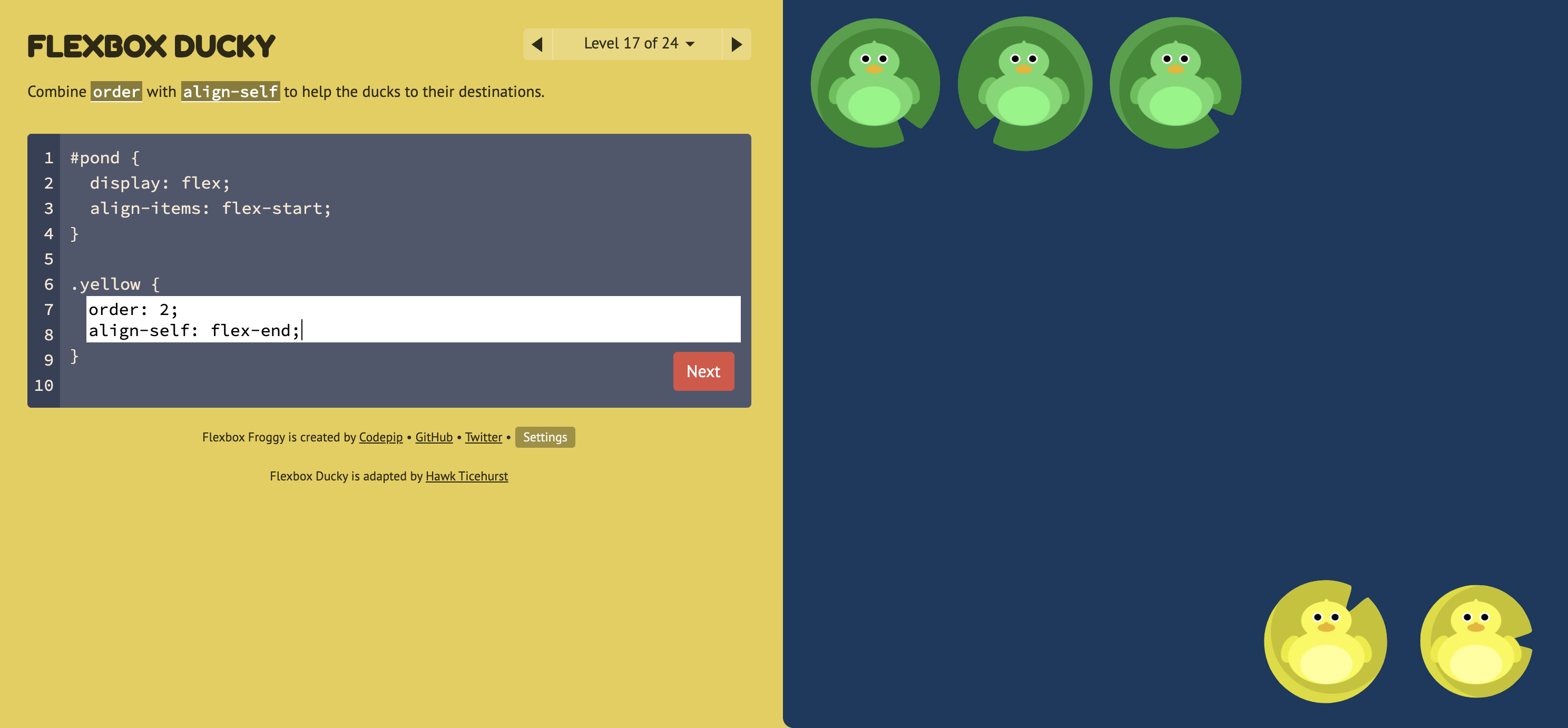 --- # Document Object Model (DOM) (1/3) .left-column[  ] .right-column[ - This builds a hierarchy of document elements in what we call the **Document Object Model** - The structure of this depends on our HTML (or the toolkit that generates your HTML) - The structure of this influences layout ] --- # Document Object Model (DOM) (2/3) .left-column[  ] .right-column[ What does this hierarchy look like? ] --- # Document Object Model (DOM) (3/3) .left-column[  ] .right-column[ <div class="mermaid"> flowchart TD A(Main Window) B(Vertical Layout) C("Spot the Heron" Label) D(Picture of a heron in water with some reeds) E(Horizontal Layout: Controls) F(Left arrow) G(Play) H(Right arrow) A --> B B --> C B --> D B --> E E --> F E --> G E --> H classDef default fill:#009688,stroke:#333,stroke-width:2px, color:white; classDef reflect fill:#4CAF50,stroke:#333,stroke-width:2px, color:white; class A,B,C default class A,B,C,D,E reflect linkStyle default stroke: black,stroke-width:8px </div> ] --- # Let's compare that to an app .left-column50[ **Interface Programmers** combine *library elements* (e.g. buttons and labels) according to *toolkit rules* & constraints of *toolkit architecture* (common to all UI toolkits). Example: let's list all the components of this image:  ] .right-column50[ Discussion (post on [Ed](https://edstem.org/us/courses/41400/discussion/3666535)) - What are the "components" in this image? - What does the "interactor hierarchy" look like for this image ] ??? discuss with your neighbor - what to draw; where to draw it --- # Let's compare that to an app (Answer) .left-column50[ **Interface Programmers** combine *library elements* (e.g. buttons and labels) according to *toolkit rules* & constraints of *toolkit architecture* (common to all UI toolkits). Example: let's list all the components of this image:  ] .right-column50[ <div class="mermaid"> graph TD W(Window) --> H[Horizontal layout] H --> I1[fa:fa-bell Bell ] H --> V[Vertical Layout] V --> I2[Title: Google Calendar reminder] V --> I3[Text: Christian and Anind --Jen Mankoff-- is starting at 12:30pm. - Video call] classDef default fill:#009688,stroke:#333,stroke-width:2px, color:white; classDef reflect fill:#4CAF50,stroke:#333,stroke-width:2px, color:white; class H,V default class I1,I2,I3 reflect linkStyle default stroke: black,stroke-width:8px </div> ] --- # How do we make it more interactive? How about we add a button? -- count: false Wait? When you hear the word "button" in the context of a graphical user interface (GUI), what do you think of? -- count: false How to tell a button where to place itself on the screen? --- # Placment (layout) What position do we use? What coordinate system do we use? - An absolute position relative to the whole phone? - A position relative to the whole app, but doesn't include the OS features (like status bars)? - A position relative to the direct parent of the button, maybe a window *in* the app -- Or should we let the toolkit decide what's best? --- # Where should it go? .left-column50[ Have to set up the layout first so we can see what we've added This is a "Layout" problem - all UI toolkits have to support layout. Layout is complicated because we want layout to handle things like resizing or changing from portrait to landscape mode well. ] -- .right-column50[ Specified using a <br> component hierarchy (a tree) <div class="mermaid"> graph TD W(ConstraintLayout) --> V[Ab TextView--Hello World!] W --> V1[fa:fa-square Button--Next ] class W darkblue class V1,V blue </div> Android's rendering of the same:  ] --- # What should it do? What do we tell the toolkit about the button? -- We need to know when the user *interacts* with it - This is called *Event Handling* Example: ```java Button button = (Button) findViewById(R.id.button); button.setOnClickListener(new View.OnClickListener() { @Override public void onClick(View view) { // display a pop up with some text Toast.makeText(getApplicationContext(), "Hello!", Toast.LENGTH_LONG).show(); } }); ``` --- # Structure of a toolkit Structure of a Toolkit - Library of components - Architecture Note: these definitions have morphed over time, particularly as things have shifted to cross platform development. [Here's](https://stackoverflow.com/questions/3057526/framework-vs-toolkit-vs-library/19790148#19790148) a reasonable set of definitions. ??? --- # Some Comparisons | Android | Web | | --- | --- | | Java | HTML/CSS/JS | | Layouts | CSS Flexbox or Grid | | Interactor Hierarchy | Document Object Model (DOM) | | Components | DIVS | | Paint objects on a canvas | CSS | | `onCreate` | `window.addEventListener("load", init);` | | `View.OnClickListener#onClick` | `domElement.addEventListener("click", callback);` | --- # Which of these Impacts Accessibility? | Android | Web | Accessibility (eg s) | |--------------------------------|---------------------------------------------------|--------------------------------------| | Java | HTML/CSS/JS | Does the toolkit support access? | | Layouts | CSS Flexbox or Grid | Comprehension/Magnification | | Interactor Hierarchy | Document Object Model (DOM) | Navigation | | Components | DIVS | Alternative text (toolkit dependent) | | Paint objects on a canvas | CSS | Color choices | | `onCreate` | `window.addEventListener("load", init);` | Proper Interaction with access API? | | `View.OnClickListener#onClick` | `domElement.addEventListener("click", callback);` | See above | --- # End of Deck