Tactus (Tactile Art Team)
Online Deployment
Our website, hosted on GitHub Pages
Introduction
The Problem
For blind and visually impaired (BLV) individuals, experiencing art is often limited to verbal descriptions that may not fully capture their preferred sensory modalities or cultural perspectives. Unlike spoken or written language, there is no established method for translating visual art into tactile formats—no direct, one-to-one mapping from two-dimensional imagery to touch-based interpretation. Additionally, artistic expression is deeply personal, and there is no single “correct” way to represent an artwork tactically. A centralized, accessible resource that allows users to explore art through multimodal, culturally influenced interpretations can help make artistic experiences more inclusive and meaningful.
What Our Application Does
Our solution is a discovery-based application that fosters a community where users can explore artworks, materials, textures, and colors in a digital space. Recognizing that artistic interpretations are shaped by culture, senses, and lived experiences, our tool provides a platform for sharing diverse perspectives that resonate with multiple identities. We prioritize centralized information, screen reader compatibility, enriched alt-text, and intuitive navigation, ensuring accessibility while allowing flexible engagement based on cognitive, cultural, and sensory preferences. To counteract the biases of rigid, Western-centric interpretations, our open-ended system encourages multiple exploration methods and community contributions. Users can browse artworks, provide suggestions, save to favorites, use image tagging to segment different compositions of art pieces, and add comments, transforming the platform into a collaborative space where those interested in tactile art can gather inspiration before beginning their creative process.
Client Input
We had three clients:
- Accessibility Art Museum Manager
- Blind since birth
- Based in the USA, originally from India
- Blind since birth
- Tactile Artist
- Acquired Blindness
- Based in India
- Acquired Blindness
- Tactile Interaction Designer
- Sighted
- Based in the USA
- Sighted
We met with our clients twice online through Zoom, and we had one session with Accessibility Art Museum Manager in-person for the first meeting. First meeting we conducted an interview with two stages of questions and a story-telling activity. Second meeting we conducted an usability test with our prototype.
To meet their access needs, we ensure that the activities could be conducted online and our prototype is accessible regardless of their background. As a result, certain activities like workshops were not an option, and we found that our LoFi prototype must be developed through HTML, JavaScript, and CSS, and not Figma for proper screen-reader support for all our clients to use as intended. We initially used Figma for prototyping since it does support screen-readers, however, found that when an unexpected screen-reader interaction occurs, recovery is very difficult without manual intervention. Lastly, we directly asked our clients for their access needs and adjusted accordingly if they stated anything.
Each of them provided unique insights into how they experience, interpret, and create tactile art. Their perspectives reflected a range of identities, cultural backgrounds, and engagement styles with art. Through our conversations, we learned about the accessibility barriers they face, including the lack of centralized resources for exploring art through a tactile or multimodal lens. Some clients were new to tactile art and discovered it as a way to connect with culture, while others had dedicated years to developing accessibility solutions in art spaces. They emphasized the importance of independent exploration, contextual familiarity, and community-driven contributions to make art more meaningful and engaging.
One key takeaway was that there is no single “correct” way to translate visual art into tactile formats—interpretations vary widely based on personal experiences, cultural backgrounds, and sensory preferences. Our clients emphasized the need for flexible, user-driven exploration rather than a prescriptive system.
Key Quotes:
A blind art museum manager shared that tactile art became an essential part of his engagement with culture during COVID-19, particularly in India, where museums are often inaccessible. He highlighted the importance of immersive, unrushed exploration:
> “If it [a tactile piece] just enhances my learning, in my experience, then that is successful. It doesn’t matter what you do.”A blind tactile artist explained how her creative process is shaped by everyday materials, such as aluminum foil and paper, and how her sighted friends help her with her translation process of tactile art through touch. She shared the profound impact of losing her vision on her connection to art: > “Once I lost my eyesight… I completely gave up art. In India, art is just sidelined, I mean there’s no resources that teaches alternate forms of art.”
A tactile interaction designer stressed the importance of iterative testing with both blind and sighted users to ensure accessibility and effectiveness. She noted that balancing cost, scalability, and personalization is crucial when designing tactile resources for a broad audience.
Feedback and Improvements
Feedback from our BLV clients revealed key areas for improvement in our prototype’s usability:
Affordances Need Explicit Labels: Common UI elements like image buttons were not immediately clear unless explicitly described in the alt text. Keeping labels concise while maintaining clarity was essential.
Improved Navigation Flow: Many users highlighted the need for a back button that functions contextually, returning to the previous page rather than the homepage. They also suggested making navigation bidirectional, allowing users to move freely between related pages.
ARIA Popups for Keyboard Navigation: Our mentors suggested using ARIA popups instead of full-page switches, as popups can be easier to navigate with a keyboard and screen reader.
Collaborative Space for User Contributions: Instead of relying on designer-defined suggestions, clients and mentors pushed us to create a space where they could share their own interpretations. This led to the creation of a “Community Suggestions” section, where users can submit feedback and tag artworks with their cultural and sensory insights.
Lofi Prototype
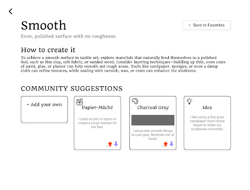
This is the design for the material detail page. The page is dedicated to the concept of ‘Smooth’ surfaces, describing its qualities, and has a ‘How to create it’ section with material and technique recommendations. Users can learn how to achieve a polished texture using layering techniques, refining tools, and sealing methods. A ‘Community Suggestions’ section allows users to contribute ideas and vote on them. Suggestions include Papier-Mâché as a material, Charcoal Gray as a color association, and an Idea about using sandpaper for smoothing sculptures. An ‘Add your own’ button invites users to share their insights. The design is clean and structured, making the information easily accessible for artists exploring tactile textures.
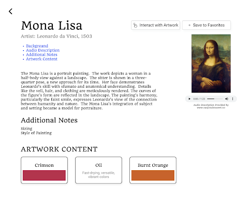
This is the design for the artwork detail page, which features Leonardo da Vinci’s Mona Lisa along with a description of the painting and an audio playback option for accessibility. The page is structured to offer multiple ways to engage with the artwork, including an audio description, written analysis, and interactive content. The painting is displayed on the right side alongside an audio player, allowing users to listen to a description provided by an external museum source. The left side contains structured text that introduces the painting, offers background information, and provides additional insights into its composition and technique.
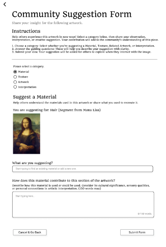
This is the design for the community suggestion form, where users can contribute observations about an artwork. The form allows selection from four categories—Material, Texture, Artwork, and Interpretation—to provide insights. In this instance, the user is suggesting a Material for Mona Lisa’s hair, with an input field to specify the material and a text box to explain its artistic or sensory significance. A small thumbnail of the Mona Lisa helps indicate the relevant section of the painting. At the bottom, users can either cancel or submit their suggestions. The interface is clean and structured, designed to encourage thoughtful engagement with the artwork.
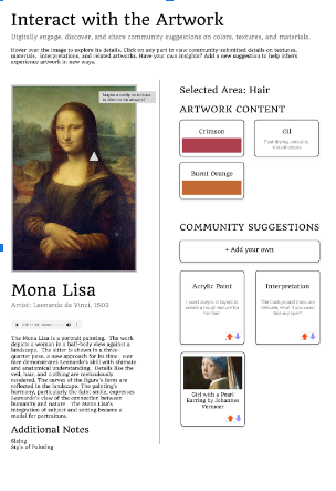
This is the design for interact with artwork page that lets users interact with the Mona Lisa by exploring details and community insights. Clicking on different areas reveals material, color, and artistic interpretations. The selected area is her hair, with suggestions about materials like acrylic paint and artistic techniques. Users can view related artworks, contribute ideas, and vote on community submissions. The design is clean and interactive, making art exploration more engaging.
Final Concept
Design and Technical Concept
This project embraces intersectionality by recognizing that artistic interpretation is shaped by diverse cultural, sensory, and lived experiences. By curating a culturally inclusive annotated database of materials, textures, colors, and artworks, we enable users from various backgrounds to find meaningful artistic inspiration that resonates with their identity and experiences. Our tool also provides a space to share these culturally influenced perspectives so that the process of creating art can be supported by a collective effort.
From a technical perspective, to support this tool’s objective, the tool is a website written in HTML, CSS, JavaScript, with all the user submitted data and artwork stored in Google Firebase using Firestore. We went with a website due to it being easy to access for all users and provides a customizable interface for all clients to interact with tools effectively.
Intersectionality
Understanding the accessibility needs of blind and visually impaired individuals in art motivated our project. We prioritized screen-reader compatibility, intuitive keyboard navigation, and enriched alt-text descriptions to provide flexible engagement with visual elements. Additionally, by offering multiple ways to explore and source inspiration through our features: search, filter and browse, favorites, and community suggestions. Through this, we aim to empower users to navigate art in ways that align with their cognitive, cultural, and sensory preferences, to provide an experience that focuses on equity for artists and users.
Potential Risks, How We Minimized Them, The Innovation
Western-centric interpretations, rigid descriptions, and misrepresentation of ideas or culture were key concerns we encountered when designing our tool. To counteract these biases, we designed an open-ended system where users shape their artistic journey through customizable inspiration boards, non-linear browsing, and community-driven contributions. This encourages greater agency and cultural representation.
Tactile art remains an underexplored space with few accessible solutions. Art is a fundamental part of human expression and should be available to all. Our tool is a major step toward bridging this gap by embracing the diversity of artistic interpretation and creation in the digital era. Through our research, we found that blind and low-vision artists often rely on their communities to create, as there is no universal solution. In addition, current similar solutions such as image-search engines lack the in-depth alt-text and context that sighted artists rely on for inspiration and collaboration, resulting in our BLV clients we interviewed stating they do not use these tools. Therefore, we reflect this sentiment through a community-focused design that fosters accessible collaboration and knowledge sharing. is what would help artists the most. Our tool strengthens the bond between every artwork and user, making artistic exploration more inclusive and meaningful.
Prototype Overview
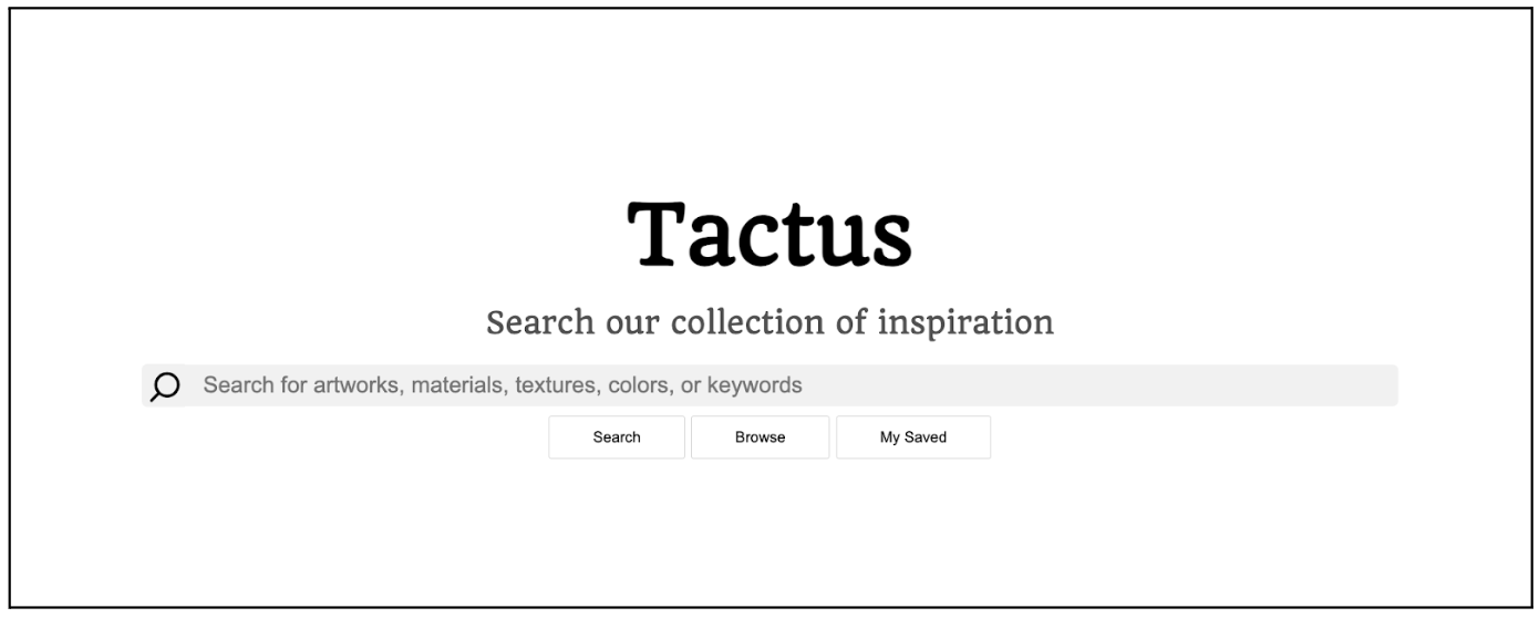 This is the homepage of Tactus. It features a minimalist design that highlights the core functionalities: searching by keyword, browsing the gallery of items, and viewing saved inspiration.
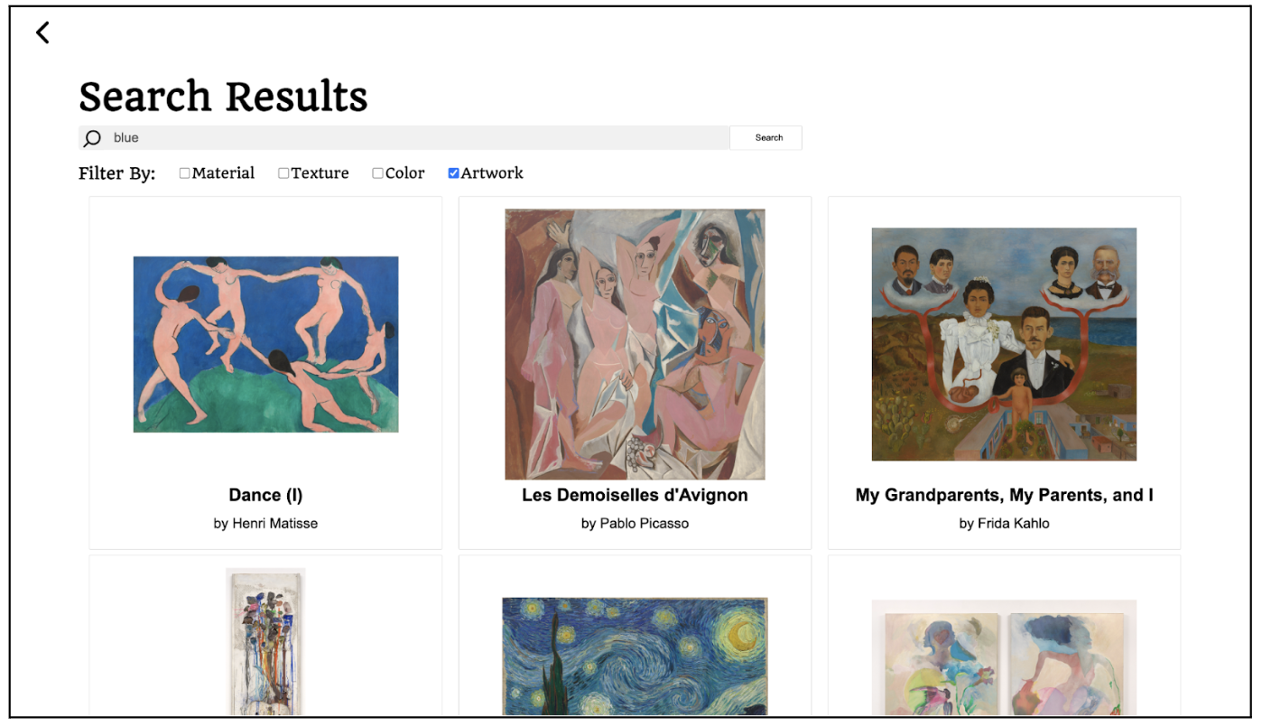 When searching by keyword, users are directed to a results page displaying all related categories. They can further refine their search by filtering materials, textures, colors, or artworks.
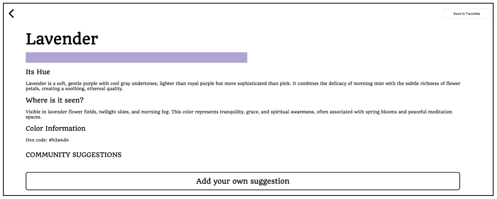
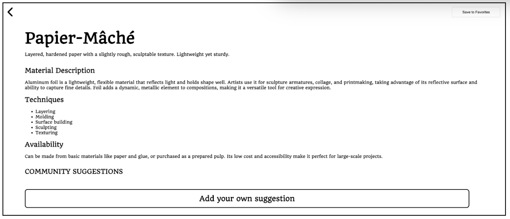

Clicking on an entry within a category takes users to its dedicated information page, where they can explore detailed descriptions. Our tool goes beyond standard descriptions to provide a richer, more sensory-based understanding.
For colors, we offer more than just a swatch or hex code. We include sensory descriptions and common associations, helping blind and low-vision users form a deeper understanding. For materials, we detail their qualities, artistic applications, and availability to ensure accessibility for artists across different socioeconomic backgrounds. For textures, we describe their sensory characteristics and provide guidance on tools and techniques to recreate them.
Each category emphasizes sensory descriptions since many blind and low-vision artists rely on tactile and auditory elements to navigate and experience art meaningfully. Below this contextual information is the Community Suggestions section, where users can contribute their own interpretations and insights related to the selected entry.
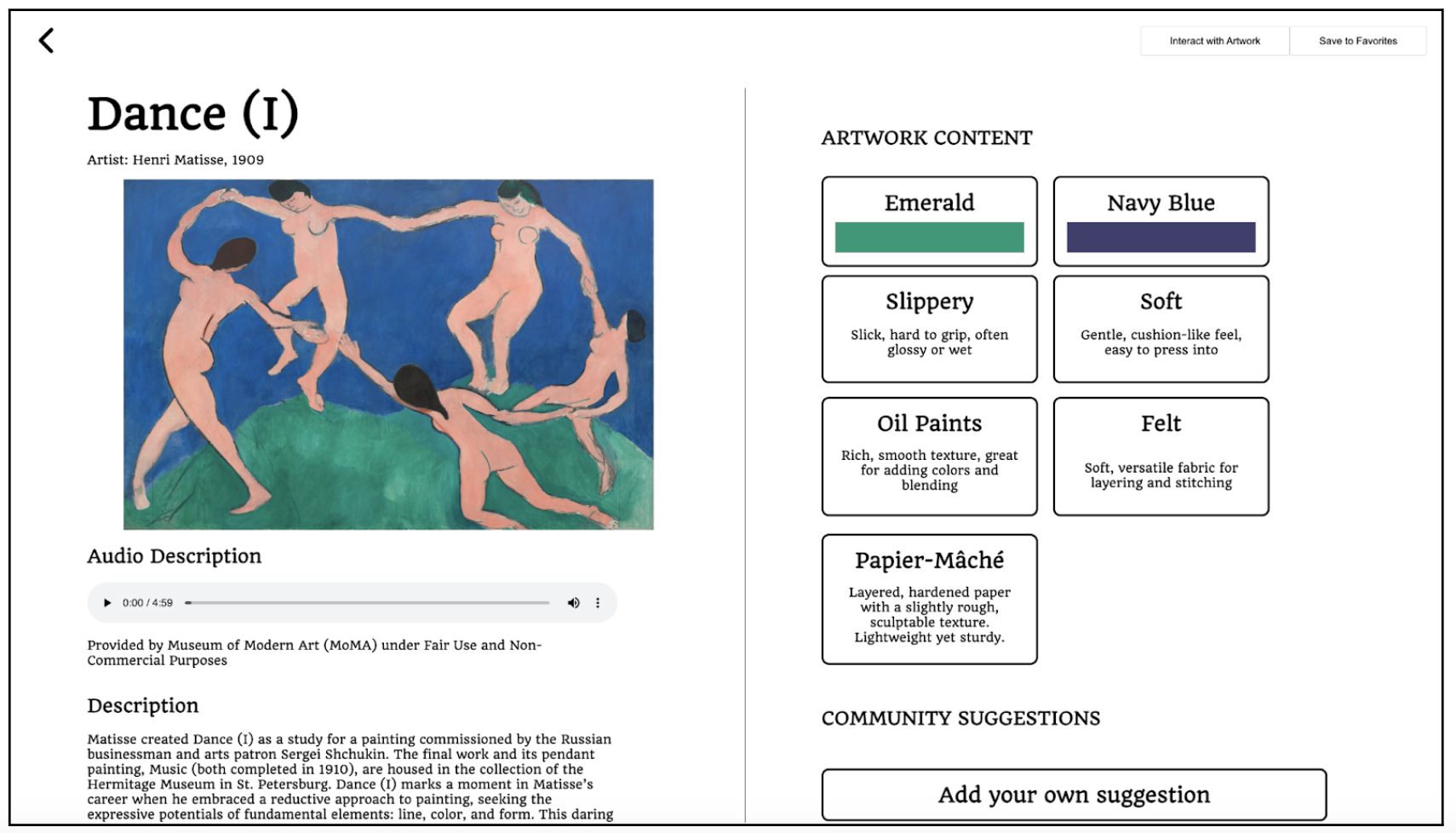 For artworks, we provide both context and interactive elements to enhance user understanding. Users can access both audio and text descriptions, allowing them to choose how they engage with the information. Additionally, we enrich each artwork by populating it with related materials, textures, and colors from our database, connecting its visual and tactile qualities.
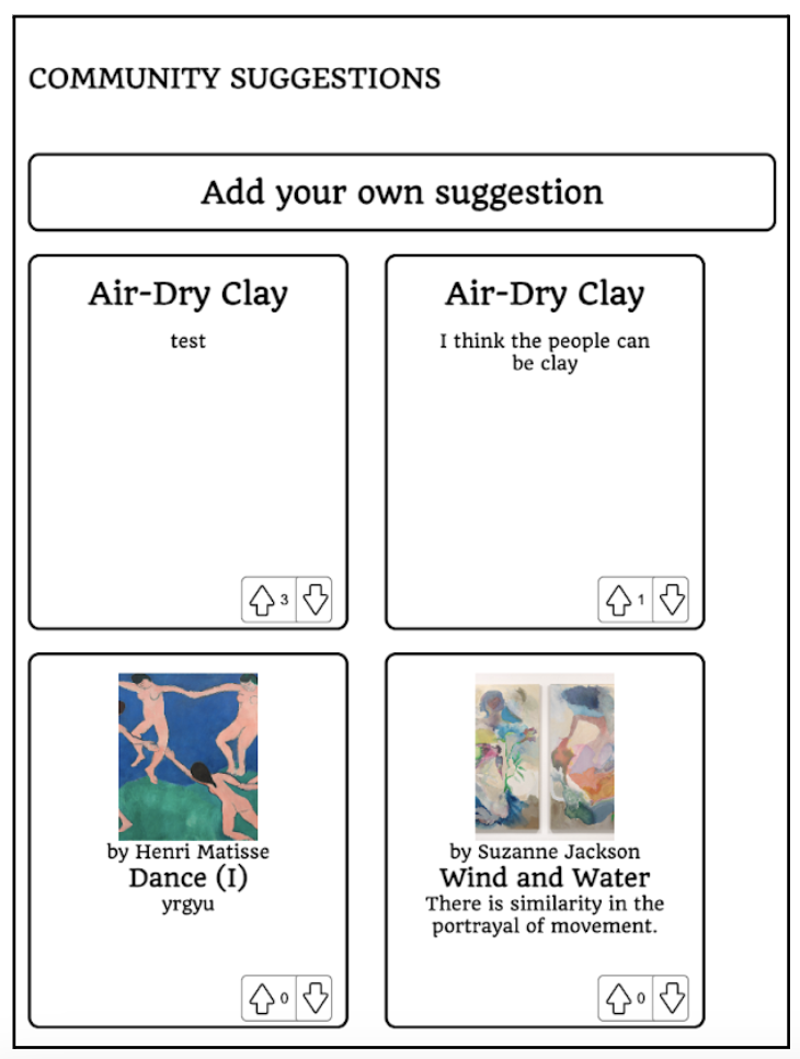
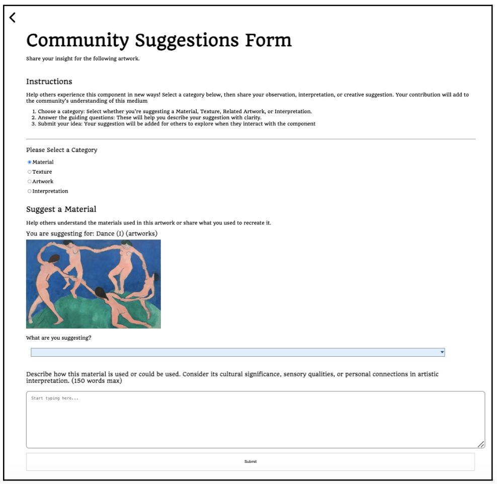 The Community Suggestions page offers a space for users to share their personal interpretations and connections to the artwork. To contribute, users fill out a form describing the material, texture, artwork, or interpretation they associate with the piece. The form includes guided prompts that encourage them to reflect on cultural significance, sensory qualities, and personal connections, fostering a more inclusive and intersectional artistic dialogue.
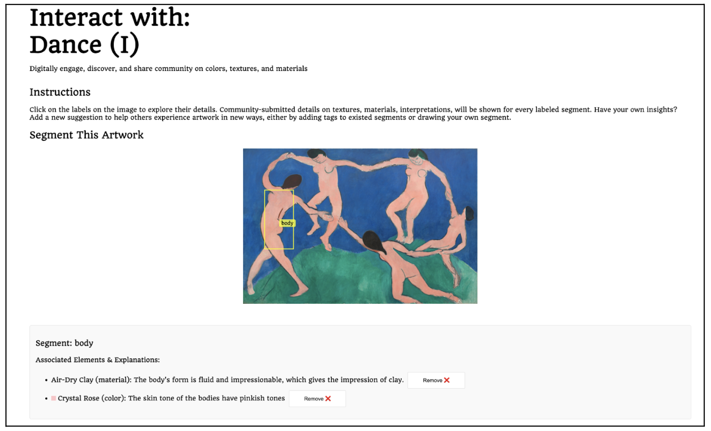 The Artwork Page also features interactive image segmentation, allowing users to engage more deeply with the artwork. Through this interface, users can select and tag specific segments of the image, associating them with relevant materials, textures, or colors, and providing explanations for their choices.
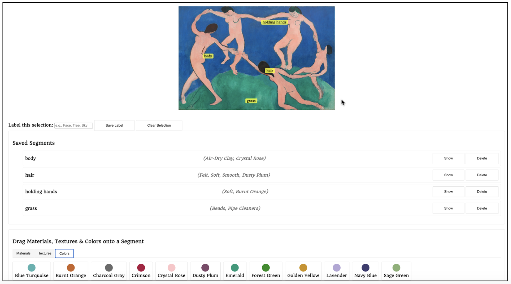 Additionally, users can view and explore tags created by others. This fosters a sense of community and collaboration. This feature allows users to gain insight into different artistic interpretations while contributing their own, creating a shared space for inspiration and discovery.
Accessibility Audit
| Criteria | Conformance Level | Brief Explanation |
|---|---|---|
| 1.4.4 (Resize Text) | Supports | All text fonts use rem, root em, or unit within the CSS, meaning that it will default to the user’s set font-size and adjust accordingly when rem is increased. This can be manually tested by changing the webpage’s font size. |
| 1.4.10 (Reflow) | Supports | Enabling the largest font size, all content remains accessible without requiring horizontal scrolling. |
| 2.4.3 (Focus Order) | Supports | We ensured assistive technologies follow a logical focus order, mirroring natural reading patterns. Key elements are sequentially arranged with ARIA landmarks for smooth, accessible navigation. |
| 4.1.2 (Name, Role, Value) | Supports | All elements used the intended semantic HTML elements, or have given the correct role through aria-role. |
| 1.4.11 (Non-textual contrast) | Slightly Supports | Most elements in our Black and White UI meet the 3:1 contrast ratio, ensuring accessibility. However, certain artworks and lighter colors featured do not pass, requiring adjustments for better visibility. |
| 1.3.1 (Info and Relationships) | Supports | The webpage’s HTML is programmatically determined and does not depend on visual cues to determine structure through proper headings, lists, and forms. |
| 1.1.1 (Non-text Content) | Supports | We ensured all non-text content includes alternative text for accessibility, with rich alt-text descriptions for artwork pictures. |
| 1.3.4 (Orientation) | Does Not Support | The content rotates, but in vertical orientation, text overlaps, negatively affecting readability. |
| 4.1.3 (Status messages) | Does not Support | When page transitions occur and information from the database is being fetched, there is no indicator that it is being fetched and processed, until completed. |
| 1.4.3 (Contrast (Minimum)) | Supports | The black text on a white background of the UI supports this. Search fields with grey backgrounds are bolded to maintain contrast. |