Inclusive Resume Assistant
Introduction
Report suggests that automated resume screening tools are employed by 99% of Fortune 500 companies 1, yet these systems often exhibit bias against disabled job seekers from underrepresented backgrounds. Many are left unsure how to present aspects of their identities—such as whether to abbreviate an organization name related to disability advocacy or rephrase a disability justice award.
Our AI-powered Inclusive Resume Assistant provides tailored feedback on resumes based on user preferences, ensuring job seekers have the guidance they need while maintaining control over how they represent themselves. By prioritizing transparency and respecting individual choice, our tool supports a wide range of user preferences and empowers disabled candidates to navigate the hiring process with confidence.
Client Input
Our clients are job seekers with disabilities and diverse identities. Through our engagement with them, we have learned that many feel compelled to remove aspects of their identities from their resumes due to concerns about AI-driven screening systems potentially discriminating against them. One client shared, “Literally no one I have talked to has suggested that I retain my identities (on my resume) and this including queer and disabled people.” This quote highlights how problematic and opaque the job screening process appears to them. The lack of transparency and feedback in hiring processes exacerbates these concerns, leaving candidates uncertain about how to best align their resumes with the positions they seek while staying true to their identities.
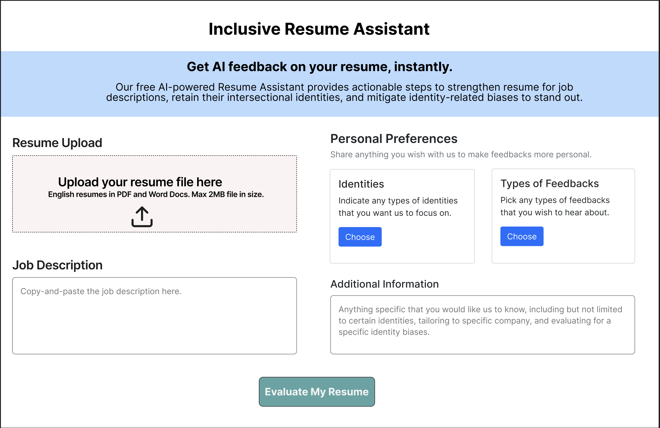
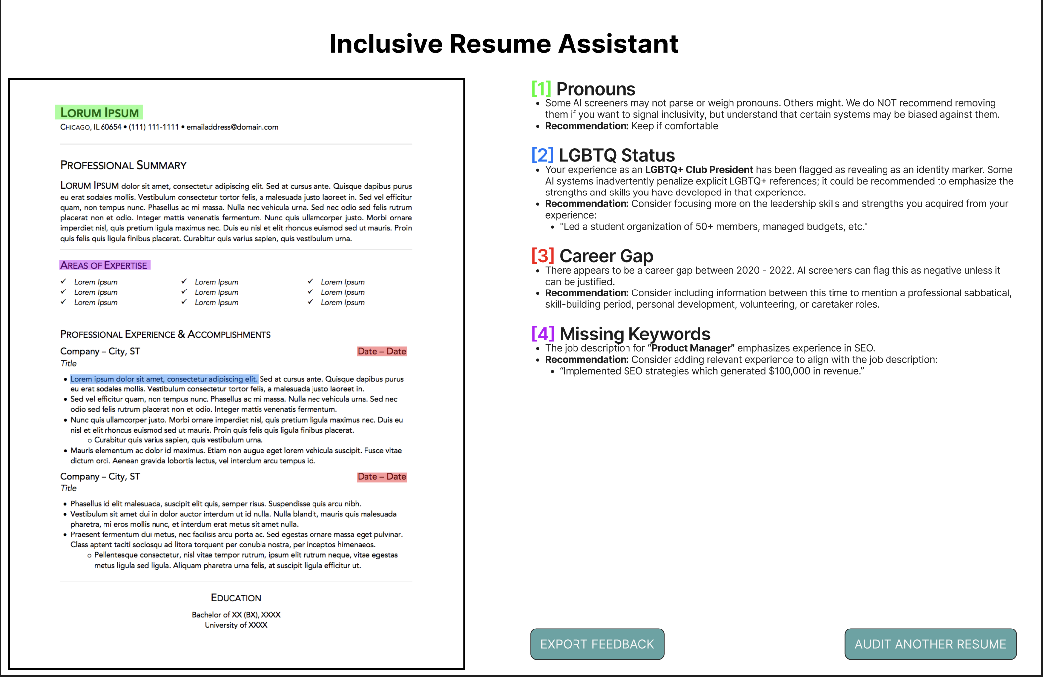
Our LOFI prototype, the Inclusive Resume Assistant, is designed to help job seekers navigate AI-driven hiring processes while retaining their identities. The interface allows users to upload their resumes, enter a job description, and select personal preferences regarding the identities and types of feedback they want to receive. Once submitted, the tool provides AI-generated feedback, highlighting potential issues such as pronoun usage, LGBTQ status, career gaps, and missing keywords. Each feedback category includes recommendations to help users optimize their resumes while considering identity-related biases in hiring. With options to export feedback or audit another resume, the tool ensures an iterative and inclusive approach, empowering job seekers to refine their applications with confidence.
 |
|---|
| Lofi Prototype: Front Page |
 |
|---|
| Lofi Prototype: Feedback Page |
Through our prototype audit with clients, we uncovered several key insights. Agency over identity was a major priority, with clients valuing control over how they present their identities and appreciating the option to hide or disclose them. However, the UI’s complexity posed challenges, particularly for clients with hyperlexia, who found the interface overwhelming and difficult to navigate. Regarding identity disclosure, many clients believed that openly sharing their identities could strengthen their candidacy and make them stand out positively. Additionally, lack of transparency in job screenings emerged as a major concern, as clients felt frustrated by automated rejections without feedback and wanted more insight into how their resumes were being evaluated. These insights guided our design improvements to ensure a more inclusive and user-friendly experience.
Final Concept
Description
Design Perspective
The user lands on a Welcome Page which introduces the Inclusive Resume Assistant emphasizing bias mitigation. This page also clarifies that the application does not guarantee job placement and does not have screen reader support. From here, the user can click “Get Started” to go to the next page.
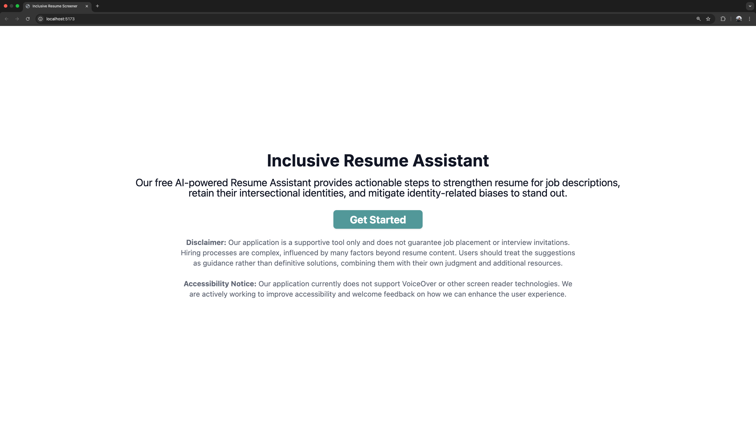
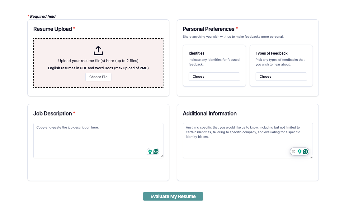
The next page is the Upload Page where users can upload up to two resumes. On this page, the user will out 4 fields:
- The first field is the resume upload (top-left). If the user uploads one resume, they will be provided feedback for that single resume. If the user uploads two resumes, they will be provided feedback and their resumes will be compared to see which resume aligns best with the job description.
- The second field is the identities & feedback selection (top-right). First, the user specifies which identities (e.g. LGBTQIA+, race, gender) they would like to focus their feedback on. Next, the user specifies the type of feedback they would like such as highlighting, minimizing, or rephrasing their selected identities. Users can also indicate any additional feedback such as strengthening technical and interpersonal skills.
- The third field is the job description (bottom-left). Here, the user pastes the relevant job description they are interested in applying for.
- The fourth field is additional information (bottom-right). This text box is optional and will allow the user to provide additional context such as the company they are applying for, more background on their identities, and any other relevant information in their job search experience.
Once users have filled out the arguments from the Upload Page, they can click the “Evaluate my Resume” which will send all of the arguments from these page to the backend for LLM prompting and processing.
On the backend, the uploaded resume is parsed and the parameters which the users have selected (identity selection, feedback type, job description, additional information) are all sent to the OpenAI API to prompt the GPT-4o model. Once the OpenAI API is finished with processing the request, the backend processes the response to check for potential inappropriate responses received by the LLM. If the response appears appropriate, it is formatted and then sent to the next page to be displayed.
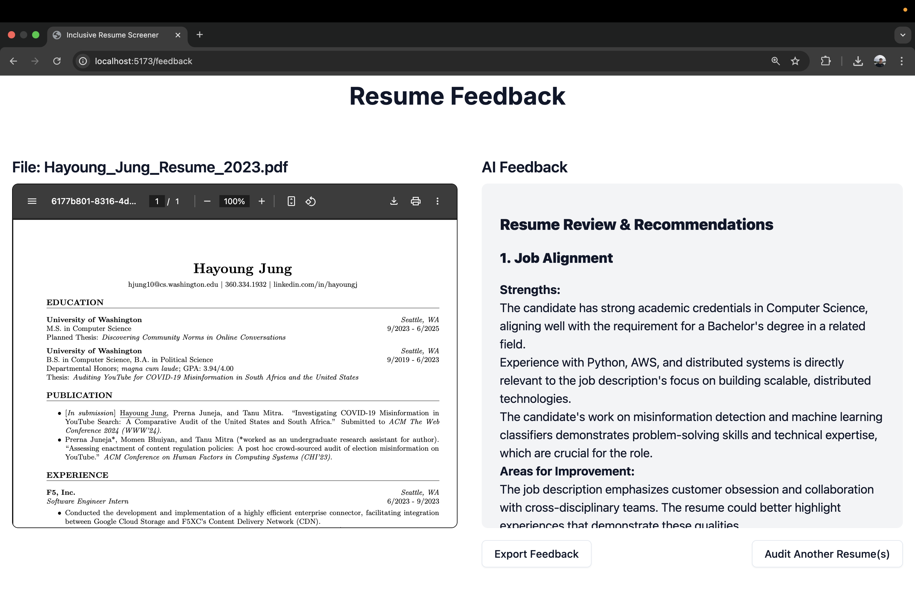
The next page is the Feedback Page which will display the uploaded resume(s) on the left hand side and the AI-generated feedback on the right hand side. If the user only uploaded a single resume, they will see a single resume and the resume feedback:
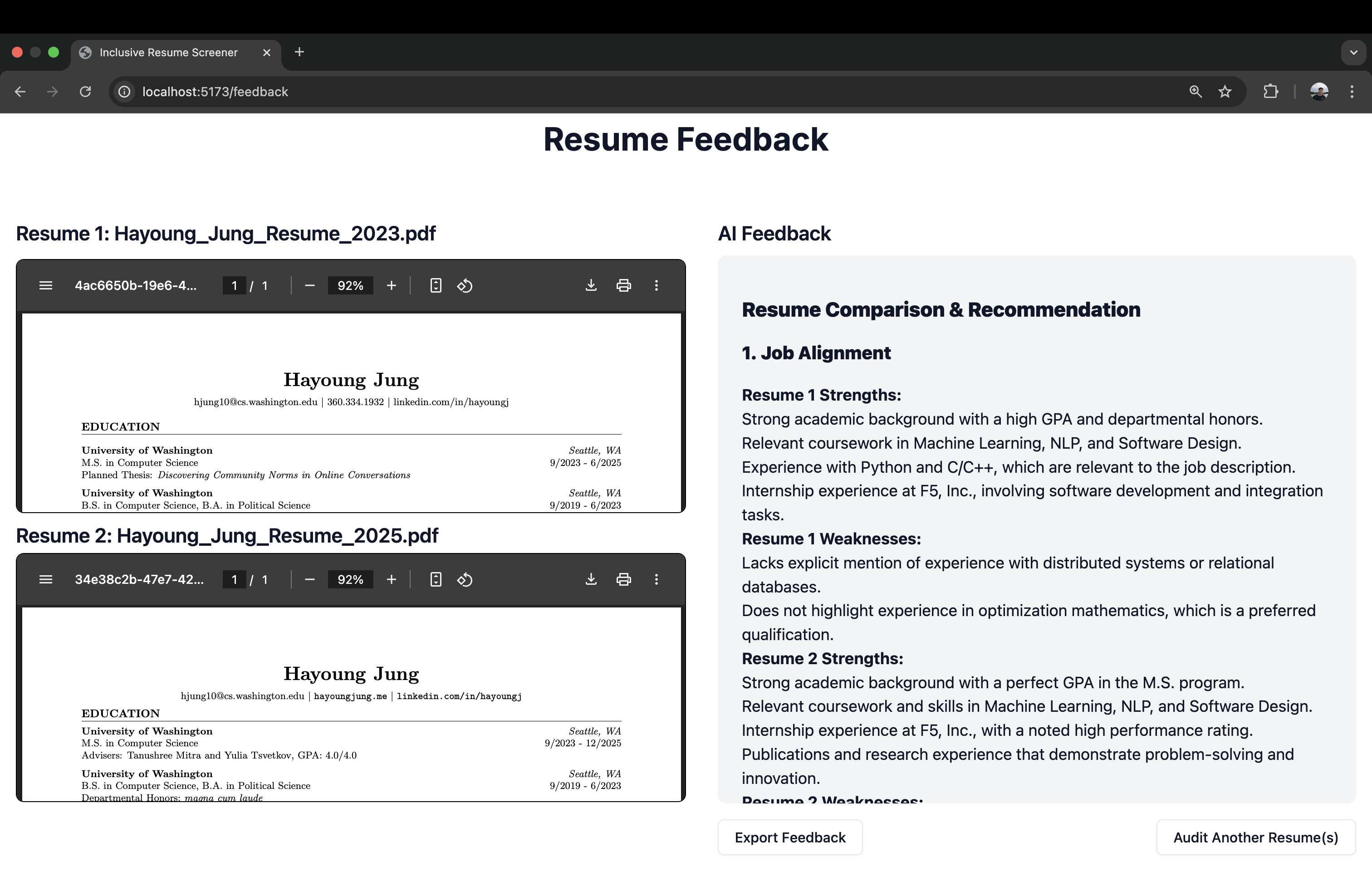
If the user uploaded two resumes, they will see two resumes and the resume feedback will compare the two resumes to determine which one aligns more with the job description and the user’s preferred feedback:
At the bottom of the page, the user can export the feedback which saves the feedback to the user’s device. The user can also audit another resume which will take them back to the Upload Page and go back to step 2.
Technical Perspective
Frontend
The user interface is built with React (JavaScript), featuring distinct pages (WelcomePage.jsx,LandingPage.jsx, GenerationPage.jsx) managed with React Router. Custom components handle multi-select forms (IdentitiesMultiSelect.jsx, FeedbackMultiSelect.jsx) and preview logic. The final feedback is rendered using ReactMarkdown.
Backend
Text Extraction:
FileParser.pychecks file type (.pdf or .docx) and extracts text (using PyPDF2 for PDFs, python-docx for Word).Storage: Resumes are uploaded via the frontend to the
client-inputsfolder for local use only.Prompt Engineering: Defined in
prompts.py, the backend uses a prompt which has been fine tuned to guide the LLM to focus on job relevance, bias mitigation, and user-chosen identity representation.Flask API: To send the data to a GPT based model, the backend uses a Flask server (
flask-api.py) which exposes REST endpoints:/api/upload: Accepts file uploads, storing them locally./api/feedback: Generates feedback for a single resume./api/comparison: Creates a direct comparison between two resumes.
Response Processing: The backend checks for sentiment outliers using VADER (
GPTHelper.py) and regenerates responses if negativity is too high, then returns the final text to the frontend.
Below is a bird’s eye of the overall architectural design: 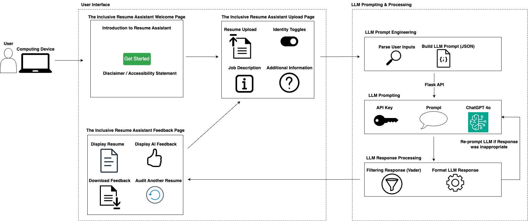
How does this address intersectional needs of our client population and emphasize justice centered approaches?
Our web application is built on the understanding that disabled job seekers with diverse and intersecting identities face unique barriers in recruitment. By allowing users to specify multiple identity categories (LGBTQIA+, race, gender, neurodivergent, physical disability) and choose how they want each aspect presented, we acknowledge that an individual’s identities do not exist in isolation but intersect to shape their entire hiring experience. This intersectional approach helps individuals determine whether to highlight certain identity-based achievements or strategically minimize references that may trigger unconscious bias. At the same time, we see this technology as a way to empower disabled job seekers by shining a light on the opaque processes behind AI-driven resume filtering, rather than leaving them to grapple with a “black box.” While we cannot directly control hiring practices, we can equip disabled job seekers with deeper knowledge of how automated filters work, enabling them to adapt their resume more confidently. Our commitment to justice-centered design is also evident in how we prioritize user autonomy: disabled job seekers can tailor the extent to which they leverage identity-specific leadership roles or community awards without erasing or undermining their experiences. The tool’s feedback explicitly addresses potential hiring inequities, suggesting how certain keywords or achievements might inadvertently invite bias.
Potential Risks & Harms / What we did to minimize them
- Reinforcing Bias
- Potential Risk: The underlying AI model might produce suggestions that inadvertently reinforce stereotypes, or push candidates to hide core parts of their identity when they’d prefer to showcase them.
- Mitigation: Our prompts are tightly structured and designed to prioritize the user autonomy. Candidates can explicitly select whether they wish to highlight or minimize identity-based experiences. Additionally, the prompt is fine-tuned to rely on fact-based feedback rather than purely risk-averse suggestions.
- Potential Risk: The underlying AI model might produce suggestions that inadvertently reinforce stereotypes, or push candidates to hide core parts of their identity when they’d prefer to showcase them.
- Misunderstanding of AI Feedback
- Potential Risk & Harm: Job seekers may believe that using this app guarantees success or that it fully beats AI screening systems. In reality, no tool can ensure success in a complex hiring landscape.
- Mitigation: We make it clear through disclaimers that we cannot control hiring processes. The app is a support tool which is meant to surface potential biases so users can make informed choices. That transparency helps set realistic expectations.
- Potential Risk & Harm: Job seekers may believe that using this app guarantees success or that it fully beats AI screening systems. In reality, no tool can ensure success in a complex hiring landscape.
- Tokenizing Identities
- Potential Risk & Harms: The app’s focus on identity-related resume elements could inadvertently risk tokenizing users if they believe they must emphasize certain identity markers purely to stand out, rather than showcasing them genuinely.
- Mitigation: Our prompts clarify that any edits should remain authentic to the candidate’s lived experience. We explicitly remind users that highlighting or minimizing identity details is a personal choice, guided by their comfort level and strategic needs, not a mandated tactic for success.
What can be doned with the finished artifact that wasn’t possible before?
With the finished artifact, disabled job-seekers with intersectionally in other marginalized identities can now explore a level of tailored resume feedback that was not previously available from standard tools. Instead of simply receiving generic advice, they are empowered to highlight or minimize specific identity-based experiences, gaining nuanced insight into how AI systems might screen their resumes. Additionally, the ability to compare two versions of a resume side-by-side in a single interface provides a clear way for users to see which approach better fits a particular job description or bias-mitigation strategy. By demystifying how AI filters interpret resume content, including keyword usage and identity markers, the artifact allows disabled job candidates in making informed changes while maintaining their agency.
Final Accessibility Audit
In this section, we outline the Voluntary Product Accessibility Template (VPAT) Table to audit and report how well our web application conforms to accessibility standards. As discussed with Professor Mankoff, we prioritize the ten criterias in the WCAG Beginners’ Guide [LINK] to audit our web application and document such results.
What is accessible and what is not accessible about your application?
To summarize, our web application meets several accessibility standards, including text resizing, reflow, logical focus order, alternative text for non-text content, screen orientation support, and status message announcements. However, it only partially supports conveying interactive elements’ name, role, and value, as some buttons lack value information. Additionally, certain buttons and text elements do not meet minimum contrast requirements, impacting visibility for visually impaired users. A major gap is the failure to communicate structural relationships, such as headers and disclaimers, to screen readers. However, our web application provides transparency by indicating a clear disclaimer that the application does not support VoiceOver or other screen reader technologies. Despite this, providing complete support for screen reader technologies would enhance accessibility for users relying on such tools. Please refer to our VPAT Table for an in-depth audit across various WCAG criterias.
VPAT Table
Below, we outline the VPAT Table, which documents the audit of our web application.
| Criteria: Conformance Level | Brief Explanation |
|---|---|
| 1.4.4 (Resize Text): Supports | Our web application successfully displays a larger text when setting a larger font size preference within the system. This was tested by iteratively setting larger font size in the system settings. When setting a larger font size in the system settings, our text scales accordingly without truncating, overlapping with other texts, or becoming unreachable. Our web application supports resizing of the text on all pages. |
| 1.4.10 (Reflow): Supports | Our web application supports reflow, ensuring all content on the page can be reached without scrolling in two directions at the same time. This was tested visually by enabling the largest font size. We found all content and elements to stay within the screen, which can all be reached by simply scrolling vertically. Given that all information is retained and content can be clearly followed, our web application supports the 1.4.10 (Reflow) criteria. |
| 2.4.3 (Focus Order): Supports | Our web application supports criteria 2.4.3 (Focus Order) as it ensures that assistive technologies like screen readers use a logical focus order when navigating. This was extensively tested using a screen reader on all the web pages in the application. The order of the navigating the screen follows from left to right, from top to bottom, using an equivalent focus order. Given that our screen reader can follow the web application in a logical focus order that makes sense, our web application supports the focus order. |
| 4.1.2 (name, role, value): Partially Suppports | Our web application does not ensure correct name, role, and value for all interactive elements. We extensively tested whether our web application states the name, role, and value clearly for all interactive elements using the screen reader. In some cases, our web application clearly states the name, role, and value for the checkbox where users can indicate their personal preferences in what identities they would like tailored feedback on. In particular, the screen reader correctly reads “Strengthen Technical Skills (e.g., name), checkbox (e.g., role), checked (e.g., properties/value).” However, in some interactive elements like the “Evaluate My Resume” button, the screen reader only gets the name and role information (e.g., “Evaluate My Resume, button”), neglecting the value information. This pattern of missing the value occurs for many interactive elements in our web application, thus we evaluated the conformance for this criteria as “Partially Supports.” This missing value can prevent the users from knowing whether the interactive element is on or off. By not ensuring a correct name, role, and value for all interactive elements, we prevent our users from being informed clearly as they use screen readers to navigate our web application. |
| 1.3.1 (Info and Relationship): Does Not Support | The current web application does not convey the information and relationship on the screen to assistive technologies, including the screen reader. The criteria was tested using a screen reader. None of the disclaimer messages, header information, and bolded texts are conveyed to the screen reader. Thus, relationships on the screen are not indicated to the screen reader. Thus, this can impact users of assistive technologies from understanding the information, relationship, and overall structure of the screener conveyed within the web application. |
| 1.1.1 (Non-text Content): Supports | Our web application contains alternative text for all non-text content. The primary non-text content in our web application is the client’s uploaded resume, which we describe using alternative text indicating that the content is the client’s uploaded resume. Thus, we ensure that people with visual impairment can use their screen reader to read and understand what is being shown (e.g., their resume). Since the alternative text is available for all non-text content, we evaluated the conformance level to “Supports.” |
| 1.3.4 (Orientation): Supports | Our web application supports orientation. The content on the web application rotates with the orientation of the device, ensuring its usability in all orientation. This was tested visually by manually changing the orientation of the screen and seeing whether the content also rotates accordingly. When using horizontal orientation, the content of the web application also rotated to match the horizontal orientation. |
| 4.1.3 (Status messages): Supports | Our web application ensures that status messages are immediately communicated through assistive technologies. We tested this criteria using a screen reader. For example, if the user using a screen reader clicked the “Evaluate my Resume” button without filling out all required fields, the web application will throw an error status message to warn the user to fill out all the required fields. This status message is also passed to the assistive technologies, like the screen reader, and will read out the status message to the user. A blind or visually impaired user can be notified about this new information via status message read by the screen reader. Thus, we evaluated this criteria 4.1.3 (status messages) as “Supports” since changes on the screeners are indicated and read by the assistive technologies. |
| 1.4.11 (Non-textual contrast): Partially Supports | Our web application contains two cyan button and a pink upload button with a white-colored background. For each color, we extracted the color hex value, employed the WebAIM Contrast Checker, and computed the Contrast Ratio using the Foreground (e.g. cyan, pink) to the White background. While many other contents have a contrast ratio beyond 3:1, we found that the cyan button has a color contrast of 2.87:1 and the pink upload button has a color contrast of 1.1:1. Given that such content and functionality in the product does not meet the required content contrast of at least 3:1, I indicated the conformance level to “Partially Supports.” This can impact visually impaired and color blind users who need to be able to distinguish content and having a better contrast ratio can make the application easier to use for everyone. To improve on this accessibility issue, we can make the pink and cyan even darker to increase the contrast to the white background. |
| 1.4.3 (Contrast - Minimum): Partially Supports | Our web application contains cyan buttons with bolded white texts inside. This creates a contrast ratio of 2.81:1, which falls behind the required contrast ratio of 3:1 for bolded and large texts, thus violating the criteria 1.4.3. However, the same pink upload button has a black normal text, which creates a contrast ratio of 19.08:1. Thus, we rated the conformance level as “Partially Supports” as some contrast ratio between the text color and background color does not meet the required 4.5:1. This impacts visually impaired and color blind users who may not be able to read the text well. By increasing the darkness of the cyan, we can increase the contrast between the darker cyan background to the white bolded text inside, ensuring that our web application can have sufficient contrast and making it easier for everyone to read the texts. |
Overall Results of our Accessibility Audit
The audit was conducted at 5 PM PST on Wednesday, March 19th, 2025, in the BS/MS Research Workspace at the Bill & Melinda Gates Center for Computer Science & Engineering (CSE2). To facilitate the audit, I used an Apple MacBook laptop, which hosted the alt-text extension locally via Chrome browser, along with Apple’s voiceover feature on the MacBook, to test the accessibility of the extension. The accessibility audit revealed that while the web application supports several key accessibility features, our web application has rooms for improvement. Please refer to the VPAT table above for an overview of both the successes and failures in the web application’s accessibility. Below, I detail four issues found within the web application, along with how these could be addressed and improved.
Accessibility Issue #1
- Description: Missing value information for interactive elements – Some interactive elements in the web application do not provide complete name, role, and value information to screen readers, particularly omitting value information in cases like the “Evaluate My Resume” button.
- Testing Method: Screen reader tool (e.g., VoiceOver)
- Evidence: Guideline violated: 4.1.2 (Name, Role, Value)

- Explanation: This accessibility issue violates WCAG success criterion 4.1.2, which requires all interactive elements to provide programmatically determinable name, role, and value properties. While some checkboxes in the web application correctly provide all three components (e.g., ‘Strengthen Technical Skills, checkbox, checked’), others, like the ‘Evaluate My Resume’ button, only provide name and role information (e.g., ‘Evaluate My Resume, button’), failing to convey the value. This pattern of missing value information is present across many interactive elements. Without the value information, users relying on screen readers may not know the current state of an element, such as whether a setting is active or inactive. This omission can hinder the user experience, especially for individuals with visual impairments who rely on screen readers for navigation and interaction with the application.
- Severity: 3
- Justification: The frequency of this issue is high because multiple interactive elements across the web application are affected. The impact is significant, as users with screen readers may not have complete awareness of an element’s state, potentially leading to confusion or incorrect interactions with key functionalities. The persistence of this issue is high because there is no way for users to work around missing value information through alternative navigation methods or assistive technology settings. Since this issue affects core features of the application, it can diminish accessibility and usability for screen reader users.
- Possible Solution: Developers should ensure that all interactive elements in the web application correctly provide name, role, and value properties. This can be achieved by verifying the use of appropriate ARIA attributes (e.g., aria-checked for checkboxes, aria-pressed for toggle buttons) and ensuring that HTML elements are structured properly to convey value information to assistive technologies. In addition, given that much of the front-end is developed using React Native, the developers can use accessibilityRole, accessibilityState, and,most importantly, accessibilityValue objects to set the accessibility role, state, and value of elements.
Accessibility Issue #2
- Description: Lack of proper structure for screen readers – The web application does not correctly convey information and relationships to assistive technologies, making it difficult for screen reader users to understand the content structure.
- Testing Method: Screen reader tool (e.g., VoiceOver)
- Evidence: Guideline violated: 1.3.1 (Info and Relationships)
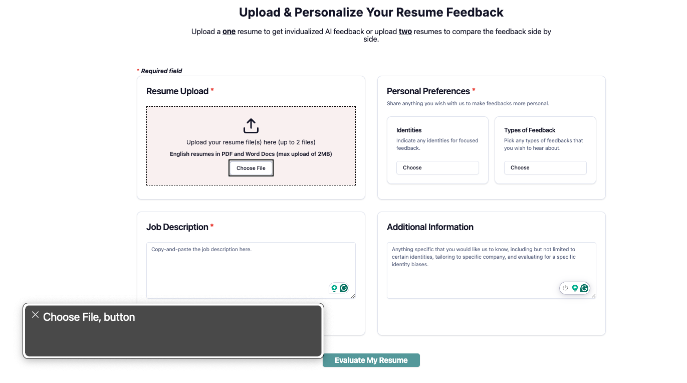
- Explanation: This accessibility issue violates WCAG success criterion 1.3.1, which requires that information and relationships on a webpage be programmatically available to assistive technologies. The current web application does not convey important structural elements, such as disclaimer messages, headers, and bolded text, to screen readers. For instance, the screen reader fails to recognize headers correctly, preventing users from understanding the hierarchy of information on the page. Similarly, disclaimer messages that provide crucial context are not detected, leading to potential confusion for users with visual impairments. This issue results from improper HTML semantics, such as missing
tags for headings, lack of aria-labelledby attributes, and failure to use proper landmark roles. Without these elements, users who rely on assistive technologies may struggle to navigate and comprehend the structure of the content, leading to a poor user experience. - Severity: 4
- Justification: The frequency of this issue is high because multiple areas (or nearly all) of the web application are affected, including headers, bolded text, and disclaimer messages. The impact is severe, as users with screen readers rely on structural information to navigate content efficiently. Without proper structuring conveyed to clients, they may find it difficult to access critical information. The persistence of this issue is also high because users cannot work around missing structural elements—without programmatic markup, the screen reader simply does not interpret the relationships correctly. Since this issue affects the fundamental accessibility of the application, it significantly hinders usability for individuals relying on assistive technologies.
- Possible Solution: Given that developers used React Native for the web application development, the developers should can use accessibilityViewIsModal to mark an accessibility modal, group elements together using the accessible prop, and set the accessibilityLabel for grouped elements. In addition, the developers should aim to properly use HTML semantic elements, such as headings, section/articles for content segmentation, and HTML strong tags for emphasized text. Lastly, ARIA attributes (e.g., aria-labelledby and aria-describedby) can be used to improve screen reader compatiability. All of these techniques can be utilized to ensure that the proper information and relationships are conveyed to screen readers, creating a more accessible experience for clients who rely on screen readers.
Accessibility Issue #3
- Description: Insufficient color contrast for interactive elements between the colors of the buttons against the white background – The cyan button and pink upload button do not meet the minimum contrast ratio requirement, making it difficult for low-vision users to distinguish these elements.
- Testing Method: WebAIM Contrast Checker
- Evidence: Guideline violated: 1.4.11 (Non-text Contrast)
- Explanation: This accessibility issue violates WCAG success criterion 1.4.11, which requires that non-text elements such as buttons and interactive controls maintain a contrast ratio of at least 3:1 against their background to be easily distinguishable. The cyan button has a contrast ratio of 2.87:1, and the pink upload button has a contrast ratio of 1.1:1 against the white background. These values fall below the required threshold, making the buttons less perceivable to users with low vision or other vision impairments because of the inadequate contrast of colors in the application. This can negatively impact navigation and usability, as users may struggle to locate and interact with essential functions within the web application, thus potentially preventing their ability to engage with the functionality of this application.
- Severity: 3
- Justification: The frequency of this issue is moderate, as it affects some key interactive elements within the application. The impact is significant because buttons are essential components of user interaction, and insufficient contrast can prevent some users from effectively engaging with the application’s features, such as uploading and evaluating their resume. The persistence is high, as users with visual impairments cannot compensate for low contrast without external tools or settings.
- Possible Solution: The developers should increase the contrast ratio of at least 3:1 against the white background by making the colors of the cyan and pink buttons darker (e.g., darker cyan/pink against the white background) or creating a very high-contrast border around the buttons (e.g., thick black border surrounding the button to better contrast with the white background).
Accessibility Issue #4
- Description: Insufficient text contrast for cyan buttons – The white bolded text on cyan buttons does not meet the minimum contrast ratio requirement, making it difficult for low-vision users to read the button labels.
- Testing Method: WebAIM Contrast Checker
- Evidence: Guideline violated: 1.4.3 (Contrast - Minimum)

- Explanation: This accessibility issue violates WCAG success criterion 1.4.3, which requires that text and images of text must have a contrast ratio of at least 4.5:1 for normal text and 3:1 for large or bold text against their background color to be readable by users who are low-vision. The white bolded text on the cyan buttons has a contrast ratio of 2.81:1, which does not meet the required threshold of 3:1, making the white bolded text harder to read to users with low vision or other vision impairments because of inadequate contrast between the white bolded text against the cyan background. However, the pink upload button with black text has a contrast ratio of 19.08:1, which exceeds the requirement. The insufficient contrast on the cyan buttons makes it harder for users with low vision or color blindness to read and interact with the button labels, negatively affecting usability and accessibility. This can negatively impact navigation and usability, as users may struggle to locate and interact with essential functions within the web application, thus potentially preventing their ability to engage with the functionality of this application.
- Severity: 3
- Justification: The frequency of this issue is low, as it affects only two button within the application. The impact is significant because these buttons contain important text labels that users rely on to navigate and interact with the application, particularly in submitting the resume for evaluation by AI. Users with visual impairments may struggle to perceive the button text, making it difficult for them to use the application effectively. The persistence is high, as users cannot adjust the contrast themselves without assistive tools.
- Possible Solution: The developers should increase the contrast ratio of at least 3:1 against the cyan background by 1) making the color of the text darker (e.g., changing the text color from white to black or a dark gray) or 2) adjusting the background color to a darker cyan.