Colleges for All
Introduction
Undergoing the process of searching for an accessible, safe, and inclusive college is challenging for many disabled students. While databases and books exist, they are often outdated or lack the depth needed to assess key factors like accommodations reliability, LGBTQ+ safety, or cultural fit. Many students are left relying on word-of-mouth, calling disability services offices, or physically visiting campuses just to determine whether a school fits their needs. This puts additional stress on students who may already struggle with navigating ableist systems.
Our project, Colleges for All, aims to challenge this gap by providing a tool that centralizes student experiences and accessibility and inclusivity-related information. Our platform allows users to search for colleges based on accommodations, inclusivity, and identity-based factors. With features like student-driven ratings, identity-based filters, and clear explanations of available accommodations, this tool assists future students by making informed choices without the uncertainty of outdated or incomplete information.
Client Input
Our clients were DO-IT staff members and college students with disabilities who had recently gone through the search process. From our discussions, we learned that existing tools are often insufficient for accessibility-related decision-making. Students mentioned that the lack of thorough resources propels them to rely on informal recommendations, which can be unreliable or lack the details they need. Some students also noted that policies around accommodations often do not align with actual experiences. Services might be available but can be difficult to access due to long wait times, unresponsive faculty, or unclear processes.
One student expressed frustration with having to constantly reaffirm their need for accommodations, stating:
“It’s really interesting that you have to, like, say, ‘Nope, I still do need this accommodation for this class.’ It feels like something that shouldn’t be a thing. I’m not going to magically be better.”
Another emphasized the importance of checking in with disability services before committing to a school:
“I don’t have time to teach my professors to make things accessible.”
We also learned that accessibility is not just about disability accommodations. It extends to factors like cultural and LGBTQ+ inclusivity. A participant shared how they loved a school’s accessibility but ultimately found it unsafe due to their transgender identity:
“Even though the accessibility and academics were perfect, the cultural fit wasn’t safe.”
This reinforced our decision to design a tool that allows students to search for schools not only based on disability accommodations but also on broader inclusivity factors.
From our low-fidelity prototype, clients provided valuable feedback that helped clarify our approach. They highlighted the importance of clearly explaining rating systems to prevent confusion and suggested filtering for broader categories like reliability and timeliness of accommodations instead of listing every individual service. Many also emphasized that students tend to rely on shared experiences rather than official documentation, so making student feedback a core part of the tool was essential.
Lofi prototype images
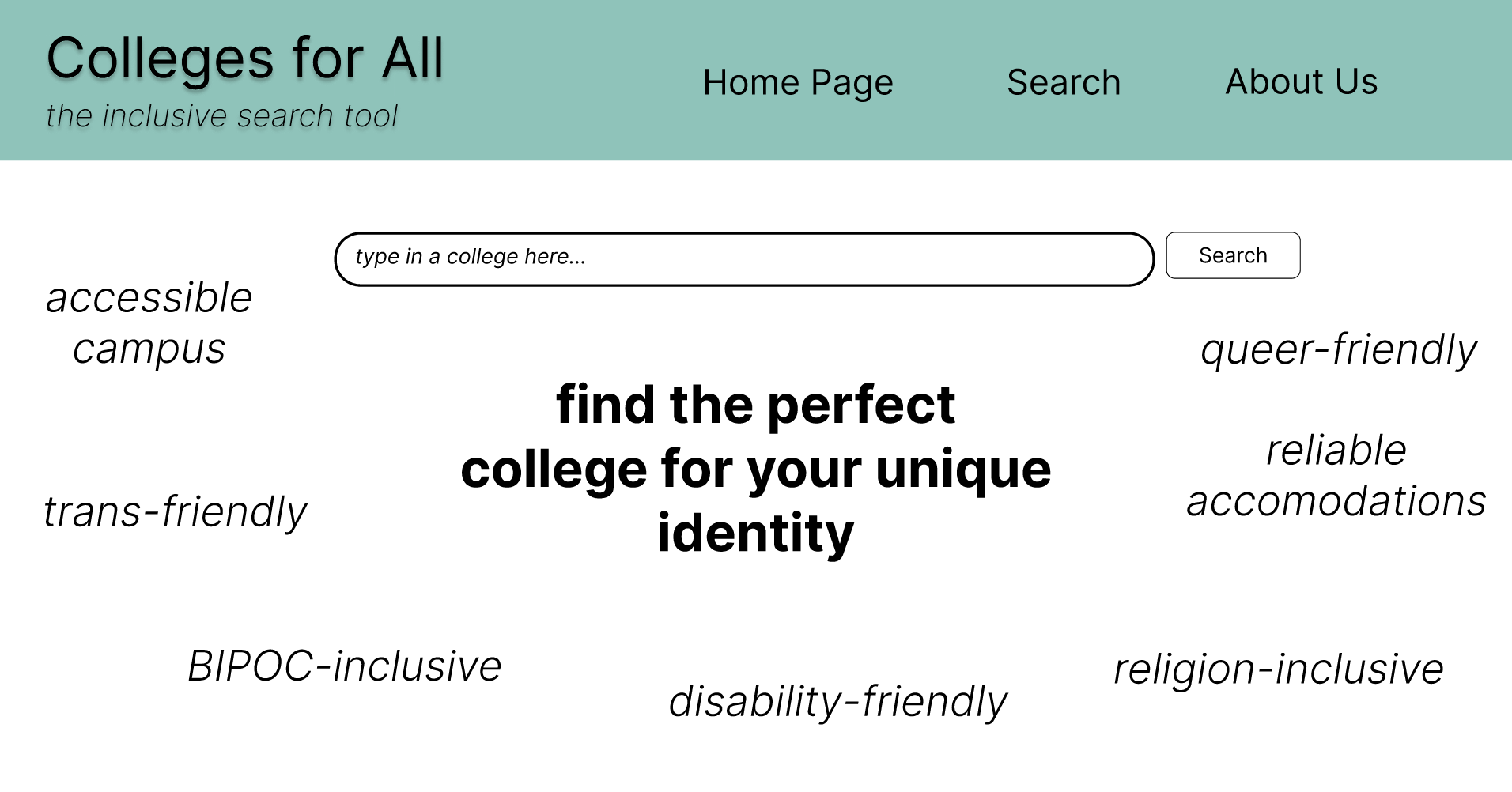
Home page of lofi prototype.
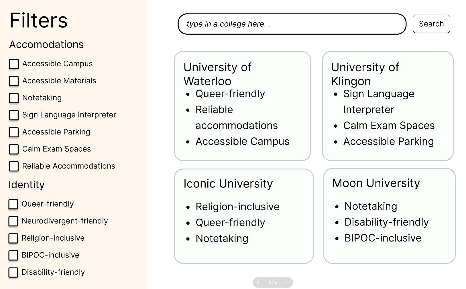
Filter page of lofi prototype.
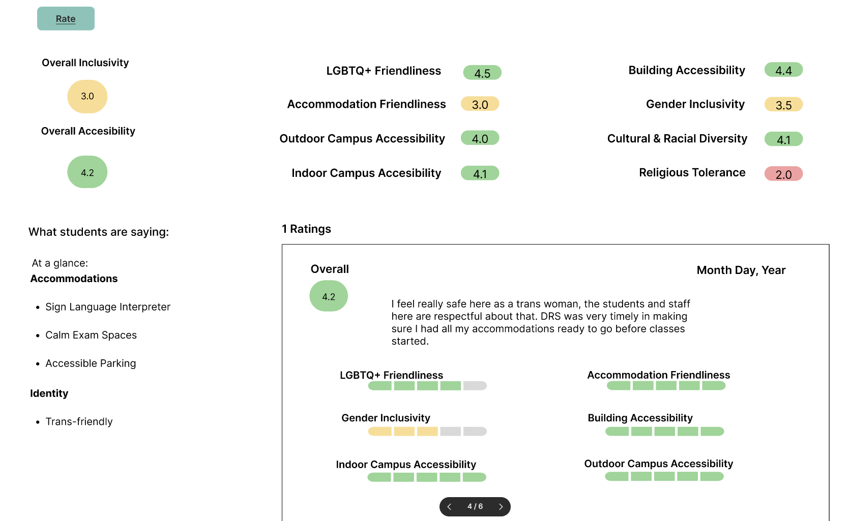
College page of lofi prototype.
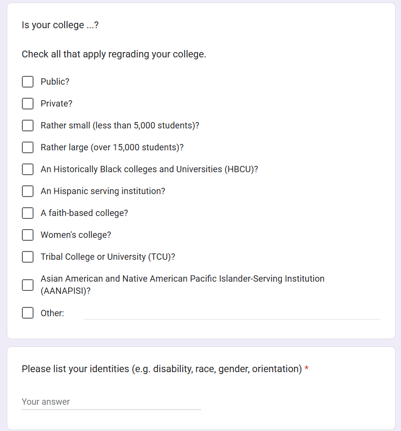
Survey page of lofi prototype.
Final Concept
Our final prototype, Colleges for All, is a web-based tool built using HTML, CSS, JavaScript, Express.js, and MySQL. We used Figma for prototyping, VS Code for development, and Google Docs to manage tasks. The project was executed through team effort, strong collaboration, and ensuring accessibility and inclusivity was prioritized throughout development.
The tool includes:
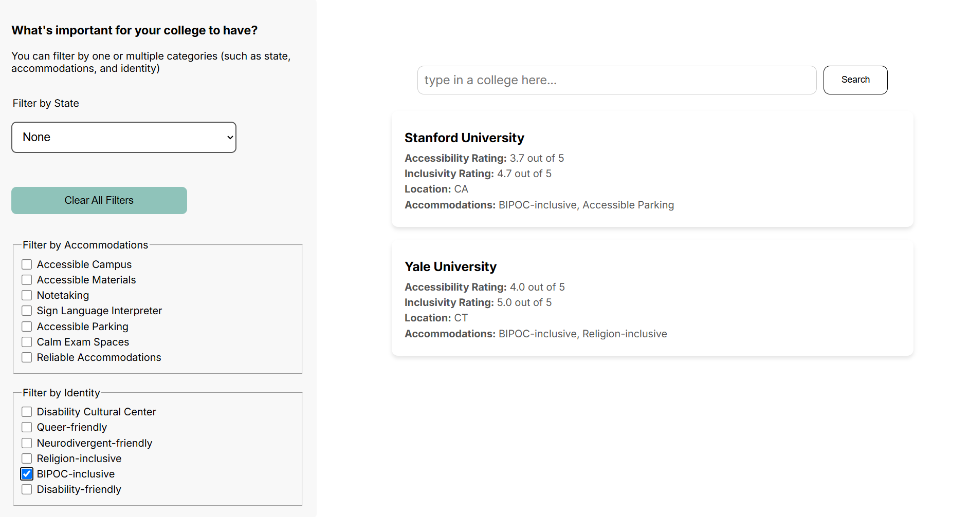
- A searchable database where students can filter colleges based on identity, accommodations, and cultural fit.
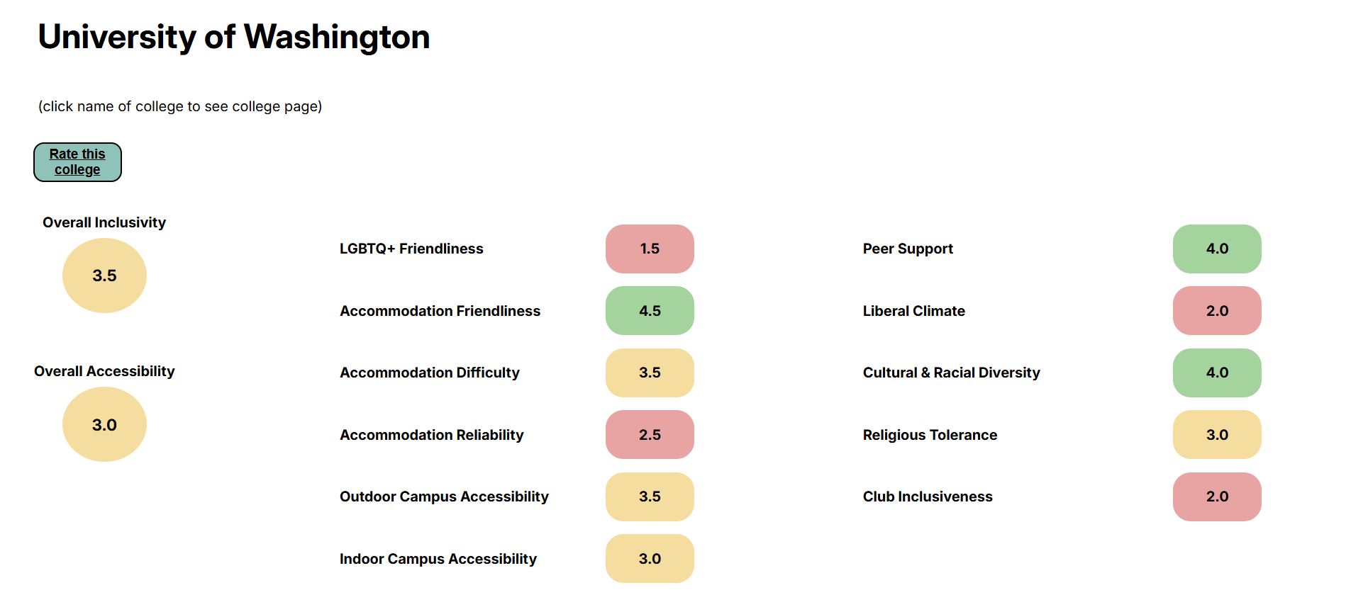
- A review system where students can share and read firsthand experiences regarding accessibility and inclusivity.
- Clear navigation and screen reader compatibility to ensure that the tool itself is accessible to all users.
Images of Final Prototype
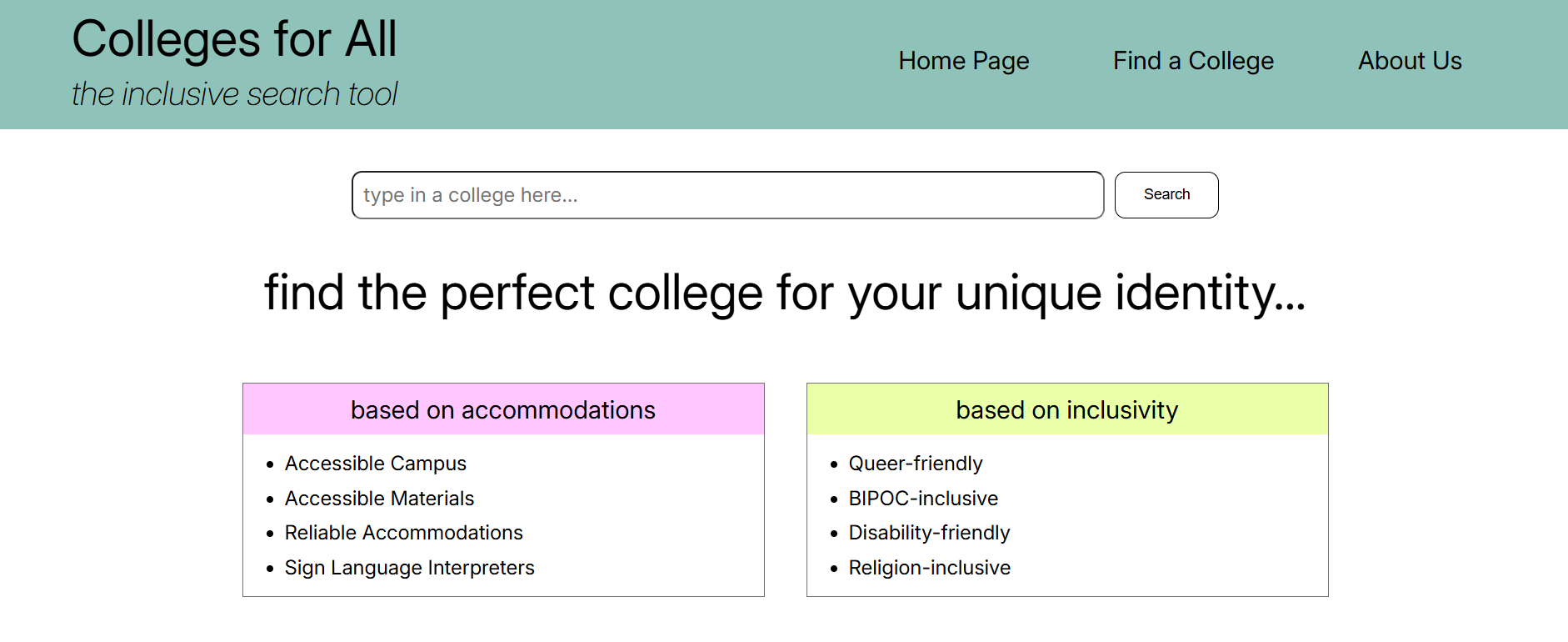
Home page of final prototype.
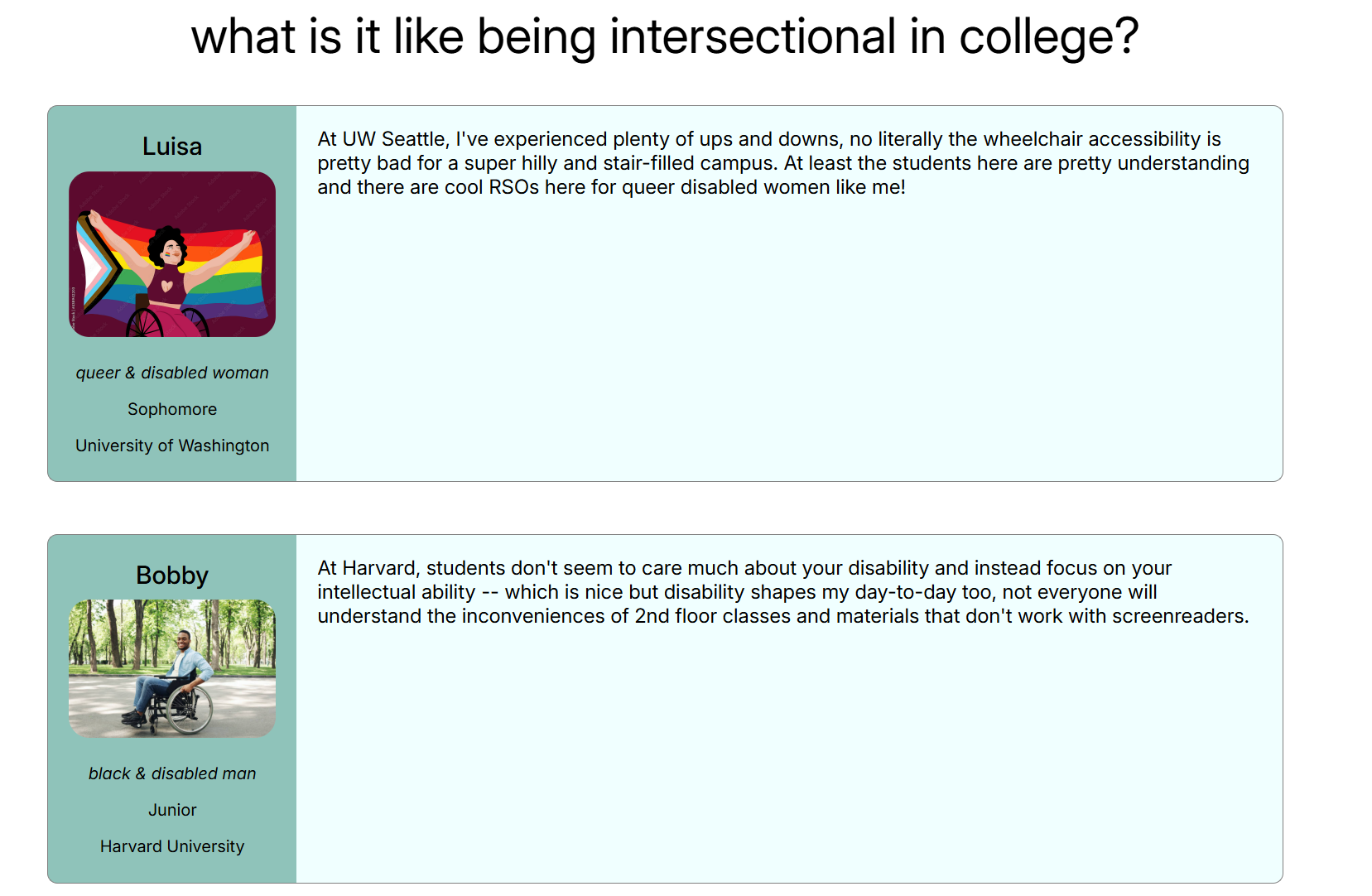
 (continued)
Filter page of final prototype.
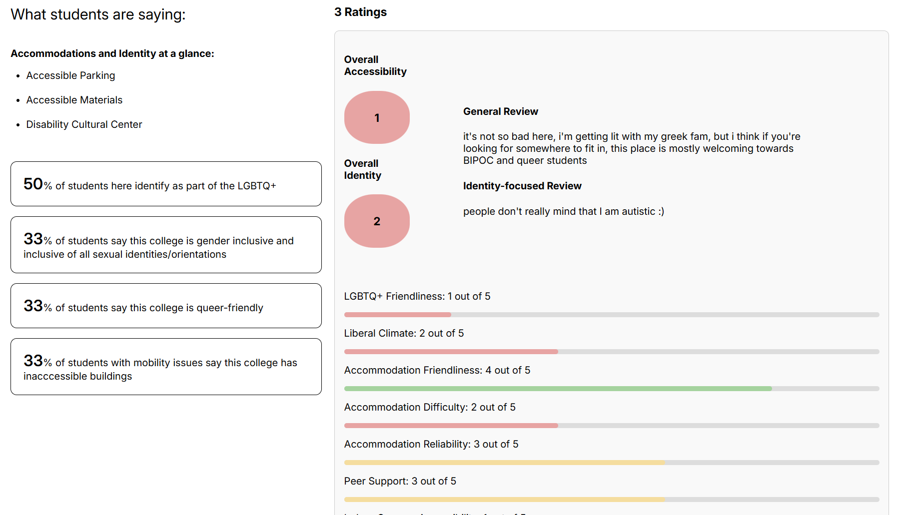
College page of final prototype.
 (continued)
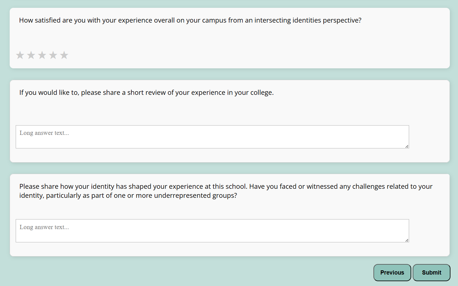
Survey page of final prototype.
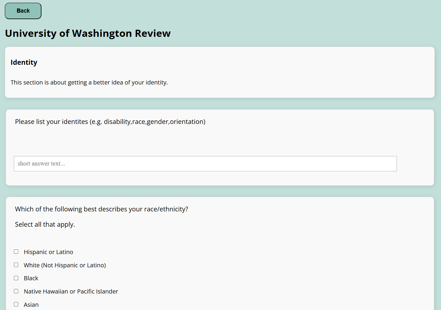 (continued)
Final Concept Continued
This project was designed with intersectionality in mind. We recognize that students’ experiences are not only influenced by their disabilities but also by factors such as race, gender, and queerness. Our design ensures that users can filter and compare schools based on multiple identity-based needs.
In addition for intersectionality, our home page is designed to be particularly welcoming towards intersectional folks by highlighting intersectional student experiences. And in our review/feedback system for colleges, we take identity into careful consideration by asking users to reflect on their identity in college.
We also considered potential harms that might arise from our filtering system. By allowing users to search based on accessibility and inclusivity, some schools may become more diverse while others may lose representation. Additionally, there is always a risk that some accommodations or inclusivity needs may not be fully represented. To minimize these harms, we:
- Prioritized client feedback from disabled students and staff to ensure the tool met real-world needs.
- Emphasized intersectionality, making sure that the platform highlights the importance of cultural fit alongside accessibility.
- Used inclusive language throughout, making sure that the tool was welcoming and accessible to a wide range of users.
Overall, we learned that finding reliable accessibility information is difficult. There is no centralized database to seek this kind of information, and many colleges do not make their accessibility policies easy to find. We also discovered that designing an inclusive tool is not just about functionality. It is about creating a space where users feel seen, heard, and supported.
For information on what IS and IS NOT acccessible, please scroll below to header “VPAT (accessibility audit)”
Our tool provides a new way for students to evaluate colleges that focuses on lived experiences instead of rigid databases. By highlighting the voices of disabled students, Colleges for All offers a more complete and personalized approach to navigating the college search process, while inviting communities of students to share and reflect on their uniquely intersectional college experiences!
VPAT (accessibility audit)
What is accessible
- Text resizing up to 200% works well, as well as with largest fonts.
- Screen reader order is correct.
- Color contrast is excellent in terms of both text and non-text elements
- Most elements like bullet points, paragraphs, and headings have their structural information conveyed
What is NOT accessible
- Some elements, such as the state filter drop-down and the survey form, are not correctly informing the user of what to expect on screen readers
- On a mobile device, both vertical and horizontal orientations display the full site, however text is so small that it is unreadable
- Error messages are not passed to screen readers or assistive technologies
VPAT Table
| Criteria | Conformance Level | Brief Explanation |
|---|---|---|
| 1.4.4 - Resize Text | Supports | All pages of the website support the text size changing |
| 1.4.10 - Reflow | Supports | Content on all pages of the website remains readable even with the largest font. |
| 2.4.3 - Focus Order | Supports | Focus order is logical when using assistive technologies on all pages. |
| 4.1.2 - Name, Role, Value | Partially Supports | The state filter drop-down is not labeled and the survey form does not inform which tab it is currently on. All other elements properly inform users of what to expect |
| 1.4.11 - Non textual contrast | Supports | All content on the screen satisfies a contrast of at least 3:1 with the surrounding color. |
| 1.3.1 - Info and Relationships | Partially Supports | The structure and relationships between elements are clear and assistive technologies can navigate them. However, a few headings are undefined/ incorrect (2 on the filter page and the navigation bar’s subtitle) and some “break lines” are marked. |
| 1.1.1 - Non-text Content | Supports | All alt-text has been and clearly depicts the non-text content. |
| 1.3.4 - Orientation | Supports | When the (Android) phone rotates, the website and its content rotates as well. |
| 4.1.3 - Status messages | Supports | Changes on the web page are indicated by assistive technologies. |
| 1.4.3 - Contrast (minimum) | Supports | All contrast is above 4.5:1 for normal text and above 3:1 for bold and large text. |
The Full Accessibility Audit of 4 Items (2 good, 2 not so good)
Work Audited
Colleges For All
Time and Place of Audit
Seattle, WA at undisclosed locations and times. (Privacy!)
Device & Device Setting Used
LG Gram (Windows Laptop) with screen reader (Narrator) enabled.
What This App Does Well
Accessibility Win #1: Text Contrast
Description
All text has sufficient contrast against the background.
Testing Method
This was manually tested – I observed and interacted the app on Chrome running on a Windows laptop, with screen reader (Narrator) enabled.
Evidence
Guideline Followed: WCAG 1.4.3 - Contrast (minimum)

Explanation
WCAG 1.4.3 requires all contrast is above 4.5:1 for normal text and above 3:1 for bold and large text.
We meet this requirement as text is clearly black against white.
For low vision users, having good text contrast is important for them to read and use the website.
Severity Rating: N/A
Justification (Justify your ranking in terms of frequency, impact and persistence)
N/A
Possible Solution
N/A
Accessibility Win #2: Text Resize
Description
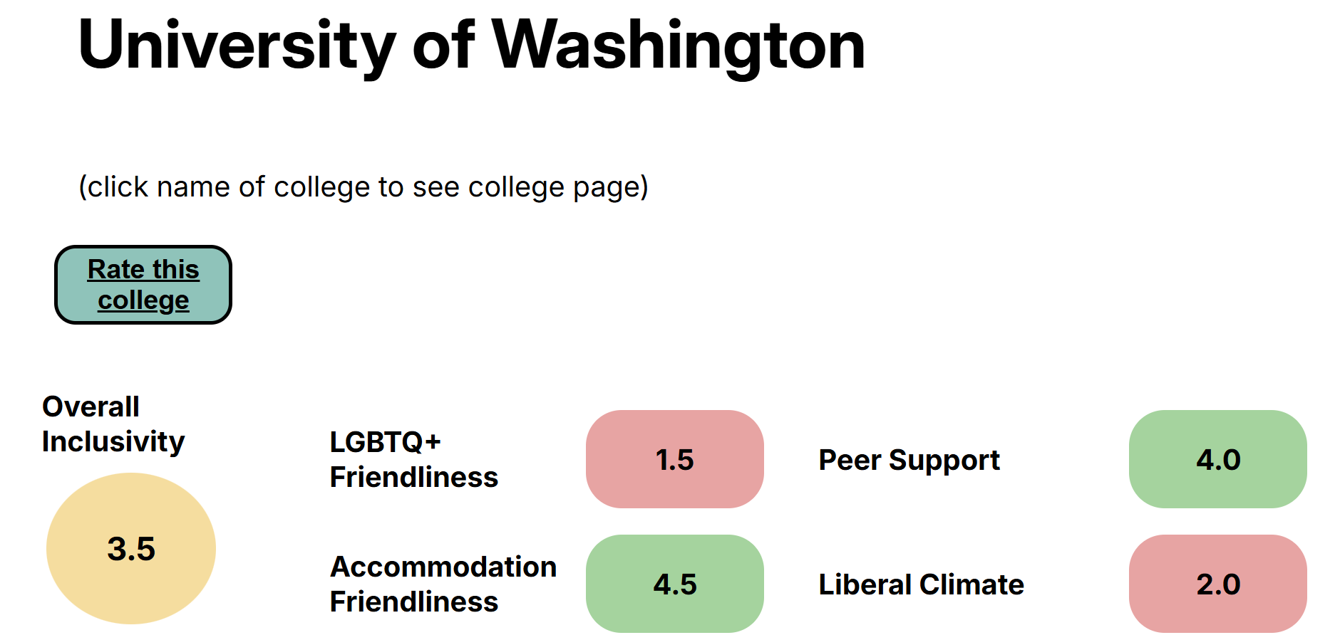
At 200% zoom, all text is clearly visible.
Testing Method
This was manually tested – I observed and interacted the app on Chrome running on a Windows laptop, with screen reader (Narrator) enabled.
Evidence
Guideline Followed: WCAG 1.4.4 - Resize Text
Explanation
Since all text is clearly visible at 200%, WCAG 1.4.4 - Resize Text is followed as it requires text be resizable or scalable without losing (truncating) information.
For low vision users, this is super important because being able to scale text to higher sizes allows them to actually read and use the website (i.e. without eye strain or needing a magnifying glass).
Severity Rating: N/A
Justification (Justify your ranking in terms of frequency, impact and persistence)
N/A
Possible Solution
N/A
What this app does poorly (and ideas for improvement)
Accessibility Issue #1: Unclear Structure
Description
Some headings are undefined / incorrect, and some newlines are marked.
Testing Method
This was manually tested – I observed and interacted the app on Chrome running on a Windows laptop, with screen reader (Narrator) enabled.
Evidence
Guideline Violated: WCAG 1.3.1 - Info and Relationships

Explanation
A few headings are undefined/ incorrect (2 on the filter page and the navigation bar’s subtitle) and some “break lines” are marked.
This violates WCAG 1.3.1 - Info and Relationships which requires the structure and relationships between elements are clear and assistive technologies can navigate them.
For blind or low vision users, this harms their user experience since for some pages, the structure of the page may be unclear, making the usage of the website confusing.
Severity Rating: 2
Justification (Justify your ranking in terms of frequency, impact and persistence)
This has a severity of 2 because the core functionality of the website can be inferred by most other text in the website.
This has low frequency since this affects a very small portion of the website, medium impact since although the structure may be unclear, the filter instructions and other text help hint at structure, and high persistance because there is no clear way to get the headings read.
Possible Solution
Edit the relevant headings and break lines so that assistive technlogies can announce them.
This may involve correcting the HTML to use meaningful tags, or having tabindex specified.
Accessibility Issue #2: Missing Self-Describing Meaning
Description
The drop-down and survey form are partially missing labels that describe what they are.
Testing Method
This was manually tested – I observed and interacted the app on Chrome running on a Windows laptop, with screen reader (Narrator) enabled.
Evidence
Guideline Violated: WCAG 4.1.2 (Name, Role, Value)


Explanation
The state filter drop-down is not labeled and the survey form does not inform which tab it is currently on.
This violates WCAG 4.1.2 (Name, Role, Value) since this guideline expects that all elements informs assistive technologies of what they are, like a drop-down menu being described as a drop-down menu.
For blind or low vision users, this may provide a confusing experience where they’re unsure what structure we are listing 50 U.S. states, or feel unsure which part of the survey they are on.
Severity Rating: 2
Justification (Justify your ranking in terms of frequency, impact and persistence)
This has a severity rating of 2 since most of the website’s functionality is intact (users can still filter by state since these are announced as selectible items, and still complete the survey), but some may feel a little confused navigating.
This has low frequency since this issue affects a very small portion of the website, medium impact since users can still use the website as intended (with confusion), and high persistance since there is no easy workaound for the user to bypass this issue.
Possible Solution
Edit the state filters and survey tabs so that assistive technlogies can announce them correctly.
This may involve correcting the HTML to use meaningful tags, or having tabindex specified.