CoPal - Self-Regulation Support
Introduction
Mental disability is extremely prevalent globally, with 1 in every 8 people living with a mental disorder (WHO). Despite its prevalence, mental health is undertreated, mistreated and debilitating, especially for people of color who experience mental disabilities disproportionately (RTOR). Of attempts to address mental health in these disproportionately impacted communities, invasive deficit approaches are common, which perpetuate medecines history of colonialism and white supremacy (NIH). In summary, mental health is a signficiant, widely occuring, and intersectional issue, for which there is yet to exist an effective and robust treatment.
CoPal provides an asset-based and identity-driven approach to emotional regulation. It emphasizes existing user regulation techniques through a resource bank, providing a dialectical approach between learning new tools and leveraging existing ones. It incorporates user identity in suggestions, which strays from sterility and neutrality of existing medical approaches. It minimizes judgement upon the user, instead focusing on agency and control over how the app is used. In this way, it provides an alternative from current approaches to mental health treatment which are invasive, deficit-based, and implicitly built around white and non-disabled users.
Client Experience
Clients
“Kyle” (anonimized) is a masc-identifying African-American grad student who grew up Methodist in the Midwest and has AuDHD (Autism and ADHD).
“Jay” (anonimized) is a masc-identifying black biracial undergrad in Saskatchewan who was physically disabled in the past and currently has a learning disability.
Access Needs
While this project only had access to two clients for interviews and lo-fi prototype testing, each client provided distinctly different strategies for self-regulation, which led to our emphasis on flexibility and agency, in addition to providing a solid foundation for similarities. In terms of access needs, our clients highlighted the breadth of what access can look like. For example, for Jay, one of the ways that access was important was in terms of the invasiveness of the app. Most of the negative experience that he had with regulation technologies in the past came from unsolicited information in the form of push notifications. These often activated Jay and caused him to disconnect from the technology. On the other hand, Kyle needed these types of notifications for access. He highlighted forgetfulness as a common barrier to self-regulation, and push notifications helped keep him on track or remind him of what he needed to do. Between these two differing access needs, user agency and control over app invasiveness is the only solution that can cater to both Kyle and Jay’s needs.
Quotes
“… Granted not everyone in the same demographic group is the same … But I do really like the idea of targeted resources as those resources would further aid in the intersectionality of individuals using the app.” -Kyle
“… You could have a fifth [option] that says not applicable, or something, just so they don’t feel like they need to answer it” -Jay
Lo-fi Prototype
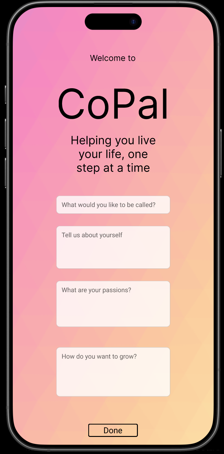
The lo-fi prototyping process uncovered more of our client’s access needs, as well as general guidelines for building and designing CoPal. First of all, in the same vein of push notifications, level of user input also became an important area for access. In our lo-fi prototype, the app began with a questionnaire for the clients, asking about name, identity, and existing regulation techniques. For Kyle, this questionnaire was a great start, but lacked the depth that he wanted to go to if he were to use the app; if the app were to get to know him, it would need a lot of information. However, Jay felt that even the existing questions were too much, and prefered to skip them to get into the functionality of the app. Again, user agency in answering the questions, and non-judgement from the app in return, are essential to be able to hold space for these differing needs. Additionally, during the lo-fi prototype, I realized that there exists an implicit language of app usage. For example, when a pop up notification comes up on your phone, there is an expectation that it can be dismissed with a swipe down. In a collection of items, there is an expectation that swiping horizontally on an item offers a deletion option. And the list goes on. Accounting for these expectations can increase the ease of the app, and subsequently its accessibility.

Final Concept
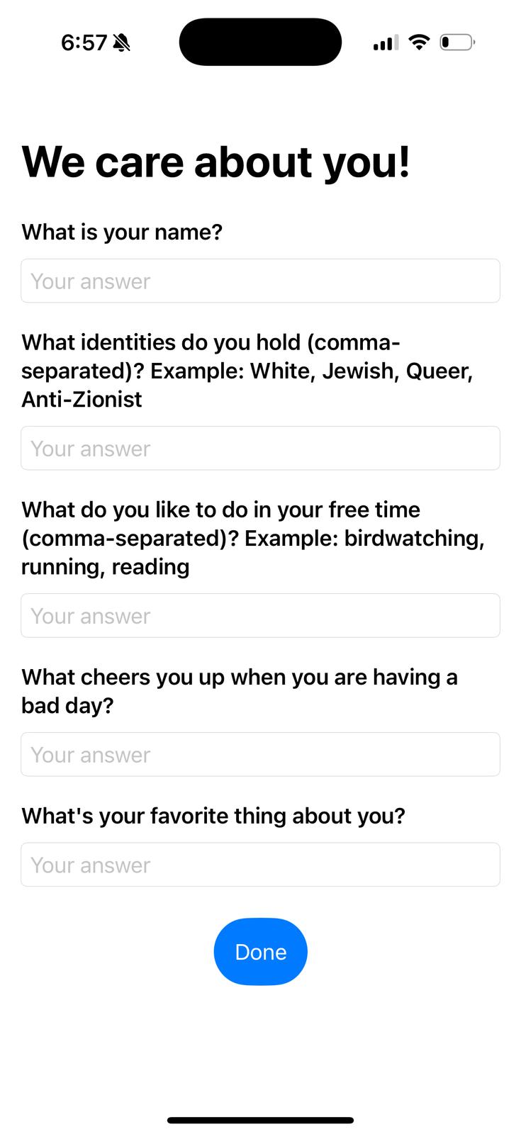
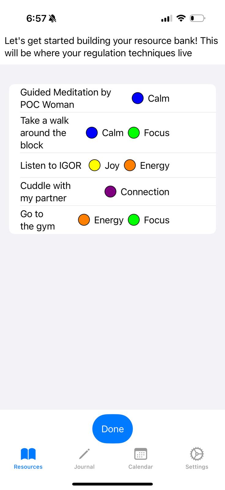
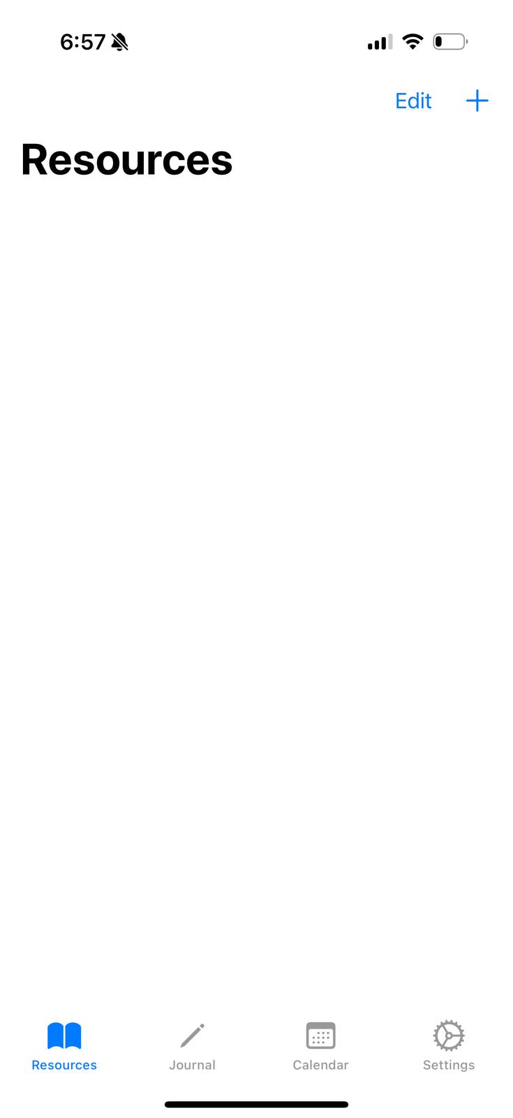
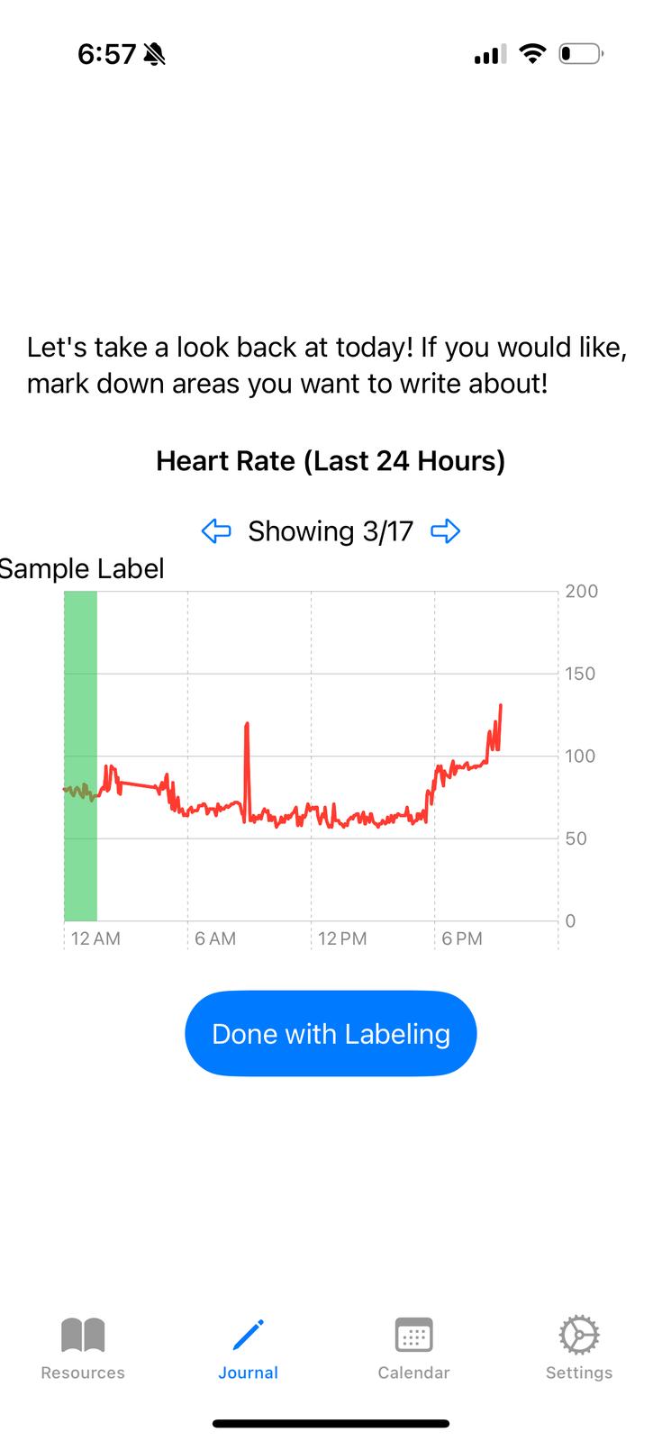
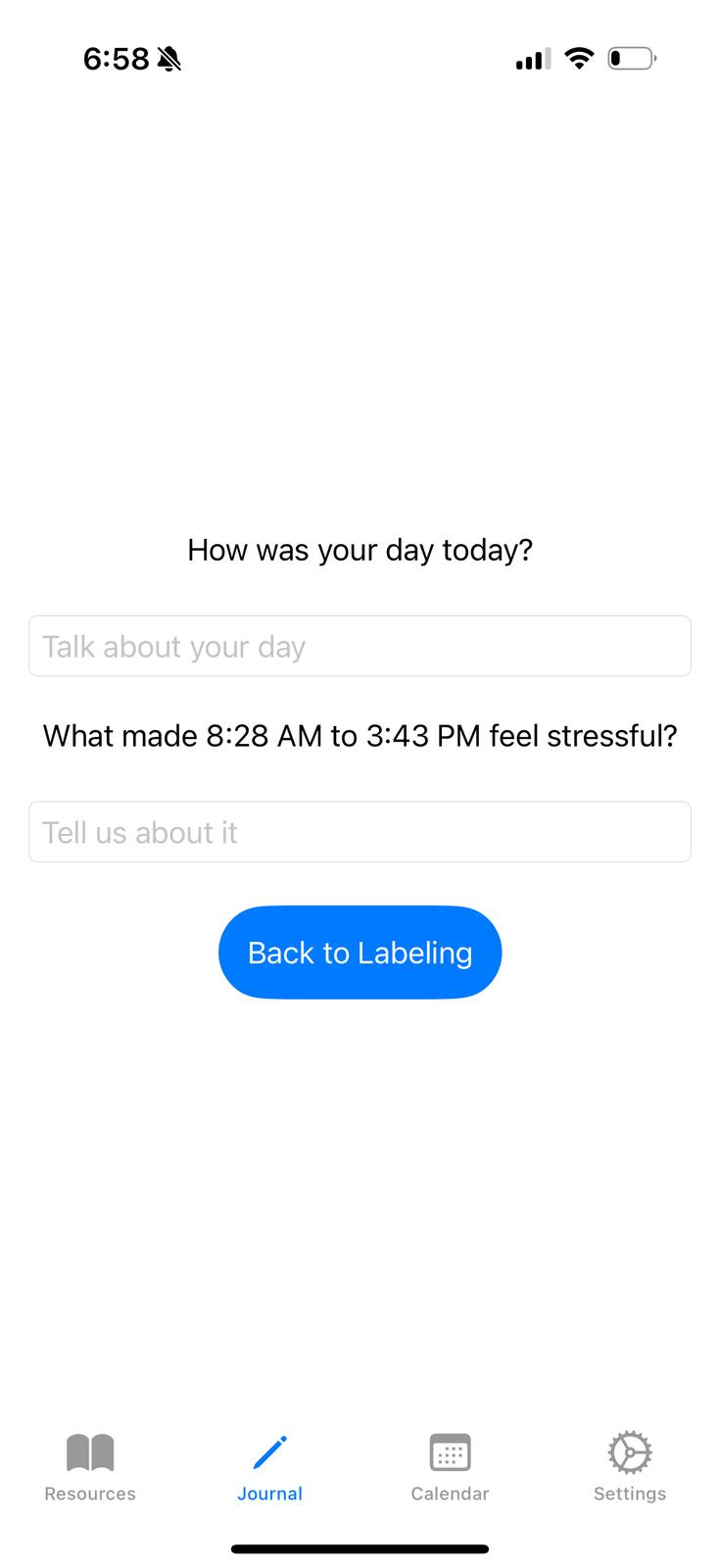
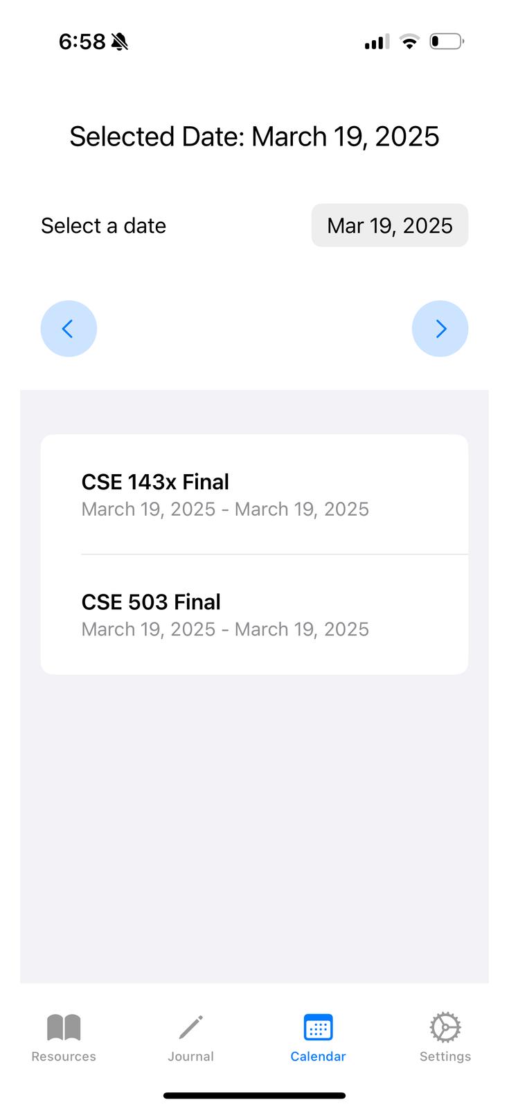
CoPal is an iOS app coded natively using SwiftUI. After opening the app for the first time, users are greeted with a questionnaire which takes in identity and regulation information. In its current version, CoPal does not use this information, though our design intends for it be used for resource and journal recommendations. After answering (or not answering) these questions, users are taken to the main navigation screen, which contains options for Resources, Journal, Calendar, and Settings. The resources page prompts users to pick out of some default resources, and then takes them to the resource bank, where they may add and edit their current self-regulation techniques. The journal page allows users to view and annotate their past heart rate data, and then provides them with self-reflection prompts based on those labels (as well as a general reflection question). The calendar page shows the user upcoming calendar events, and allows them to assign these events with labels and resources (labels coming from the calendar page, and resources coming from the resource bank). The Settings page is currently used for debugging, but is intended to have notification settings that the user can manipulate. User data is stored natively via SwiftData, which is implemented with SQLite. Heart rate data is retrieved natively through Swift’s HealthKit, and calendar data is retrieved natively through Swift’s EventKit. For both heart rate and calendar data, the user is prompted with an access request, handled natively through iOS.
Intersectionality
A project centered around mental health and disability is inherently intersectional. There is no single correct way to cope or heal. Our clients regulate in a variety of different ways: going out with friends or cuddling with their partners or taking an ‘edible.’ CoPal uses an asset-centered (as opposed to deficiency-centered) lens to leverage the regulation strategies that users already use. The app also becomes explicitly intersectional with the combination of flexibility and directness: users can self-select their identities on the app, and get suggestions (in terms of resources or journaling prompts) that align with these identities.
Harm and Risk Reduction
Mental health treatment has a history (and present) of substantial harm, particularly (but not exclusively) on disabled people of color. This harm is rooted in invasiveness (ex. institutionalization) and the exploitation of system of medicine (ex. misdiagnosis). CoPal minimizes this harm by reducing invasiveness through flexibility and using user-submitted labels and annotations. The agency and control of users within the app also reduces harms that users are aware of. For example, if I know that content around my Jewish identity can be triggering, I do not need to report it to the app, or I can disable notifications for content related to that.
Advertisement
Everybody regulates. Self-regulation can look like so many different things: starting your day with a cup of coffee; calling your loved ones once a week; going on a walk after dinner. CoPal gets rid of the obstacles that prevent you from using self-regulation in your day-to-day life, and helps you find patterns in your behavior to better leverage your self-regulation. Without CoPal, I would not have known that my heart rate goes up around before and during social events. Now I can do my favorite breathing exercise before I meet with my friends to lower my stress and enjoy their company!
Accessibility
VPAT Table
| Criteria | Conformance Level | Explanation |
|---|---|---|
| 4.1.2 Name, Role, Value | Supports | In Swift, every non-text item has a built in role, and takes in a parameter for label. Having given every non-text item an appropriate label, this application supports this criteria. |
| 1.3.1 - Info and Relationships | Supports | Since our app uses native built-in accessibility technology, all tables and other structures display headers, titles, and other information appropriately. |
| 2.4.3 - Focus Order | Supports | Due to the top down structure of Swift, this app reads in top down order, which is the correct order in every interface |
| 1.1.1 - Non-text Content | Does not support | I have not yet implemented alternative text for the images of the app, since they are mostly decorative. |
| 1.4.10 - Reflow | Supports | As a native iOS app, CoPal scales with the preset text size of the user, and no text or feature is blocked in the process |
| 1.3.4 - Orientation | Supports | For the same reason as 1.4.10 |
| 1.4.4 - Resize Text | Supports | For the same reason as 1.4.10 |
| 4.1.3 - Status messages | Supports | The only status messages and pop ups currently are ‘screens’ in Swift, which are supported by the screen reader |
| 1.4.11 - Non textual contrast | Partially Supports | Depending on the users choices for tag color, some of the icons may not have appropriate contrast. |
| 1.4.3 - Contrast (Minimum) | Does not support | Some text boxes, especially in dark mode, fail the expected contrast ratio |
Accessibility Audit for CoPal
Issue #1: Non-Descriptive Alt-Text
Description: the image in the app, the logo shown upon opening the app, has an alt text of “Wally,” which does not actually describe the actual image of the bird
Testing Method: manual testing with apple VoiceOver
Evidence: violates WCAG 1.1.1 - Non-text Content
Explanation: the image has an alternative text of “Wally”
Severity Rating: 2
Justification: while not understanding the logo does take away from the apps aesthetic and design, it does not reduce the functionality of the app’s tools. Frequency: once per interaction, when opening the app. Impact: does not interfere with functionality. Persistence: no workaround.
Solution: add alternative text to the image, like “A cartoon bird with a white chest, green head, purple and blue wings and back, perched on a log”
Issue #2: Low-Contrast
Description: the text fields in the app are low contrast and their inner text has low contrast
Testing Method: manual testing
Evidence: violates WCAG 1.4.3 - Contrast (Minimum) and WCAG 1.4.11 - Non textual contrast. See screenshots above
Explanation: the rectangular text fields, and the initial descriptive text that they enclose, is light gray on a white background, or in dark mode, dark grey on a black background.
Severity Rating: 5
Justification: for low-vision users of the app, it may be difficult to fill in the text boxes for questions, resources, and journal entries, which are the main purposes of the app. Frequency: every text field on the app (there is at least one text field in every part of the app). Impact: cannot fill intake questions, add resources, journal labels, or reflection questions. Persistence: only workaround is to use a screen reader (VoiceOver for iOS)
Solution: make all text boxes higher contrast, with higher contrast text on the inside