ChatSLP - Image Prompt Generator
Online Deployment
ChatSLP website
Introduction
Speech Language Pathologists (SLPs) work to address language disorders with interventive materials including images. The current visual materials lack representation and inclusivity. With that, it can make it difficult for clients to see themselves in the images used in therapy, which can impact their progress. Our project addresses this by providing SLPs with a tool ‘ChatSLP’, a chatbot-style prompt generator. With the given prompt, they are able to paste in the prompt in AI models or image generators to create images that reflect their clients’ speech therapy needs and unique identity. This gives a tool for SLPs to use in order to ensure representation in therapy materials so it can foster an environment of inclusivity.
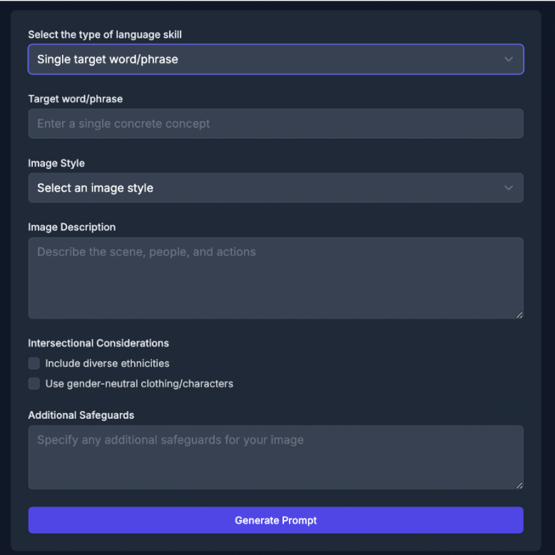
Our application, ChatSLP, is a website designed to assist SLPs in generating prompts for speech therapy images. Users are able to select specific language skills, such as final consonant deletion, gliding, cluster reduction, or fronting. Our tool also offers multiple image styles, whether it’s what it includes or the format of the image, as each lesson requires different forms of images. It is still possible that the images generated are not satisfactory, the user is able to give feedback to regenerate the prompt. ChatSLP helps bridge the gap by providing SLPs with customizable and inclusive therapy materials in order to have more engaging and effective speech therapy.
Client Input
Our clients were Speech Language Pathologists (SLPs) who work with individuals of all ages and identities who have speech, language, voice, and fluency disorders. In talking with SLPs, we learned that their access needs go beyond just having therapy materials. They need images that are tailored to each client’s background, communication goals, and identity. Without the ability to customize images, therapy sessions can lack representation, which can affect how well a client connects with the material. One SLP shared, “Pictures are the easiest and biggest way for people to catch on and understand.” Another pointed out, “There’s limitations when generating an image for a family with not many skin tones represented.” These quotes helped us realize how important it is for therapy visuals to reflect the lived experiences of the clients being supported.
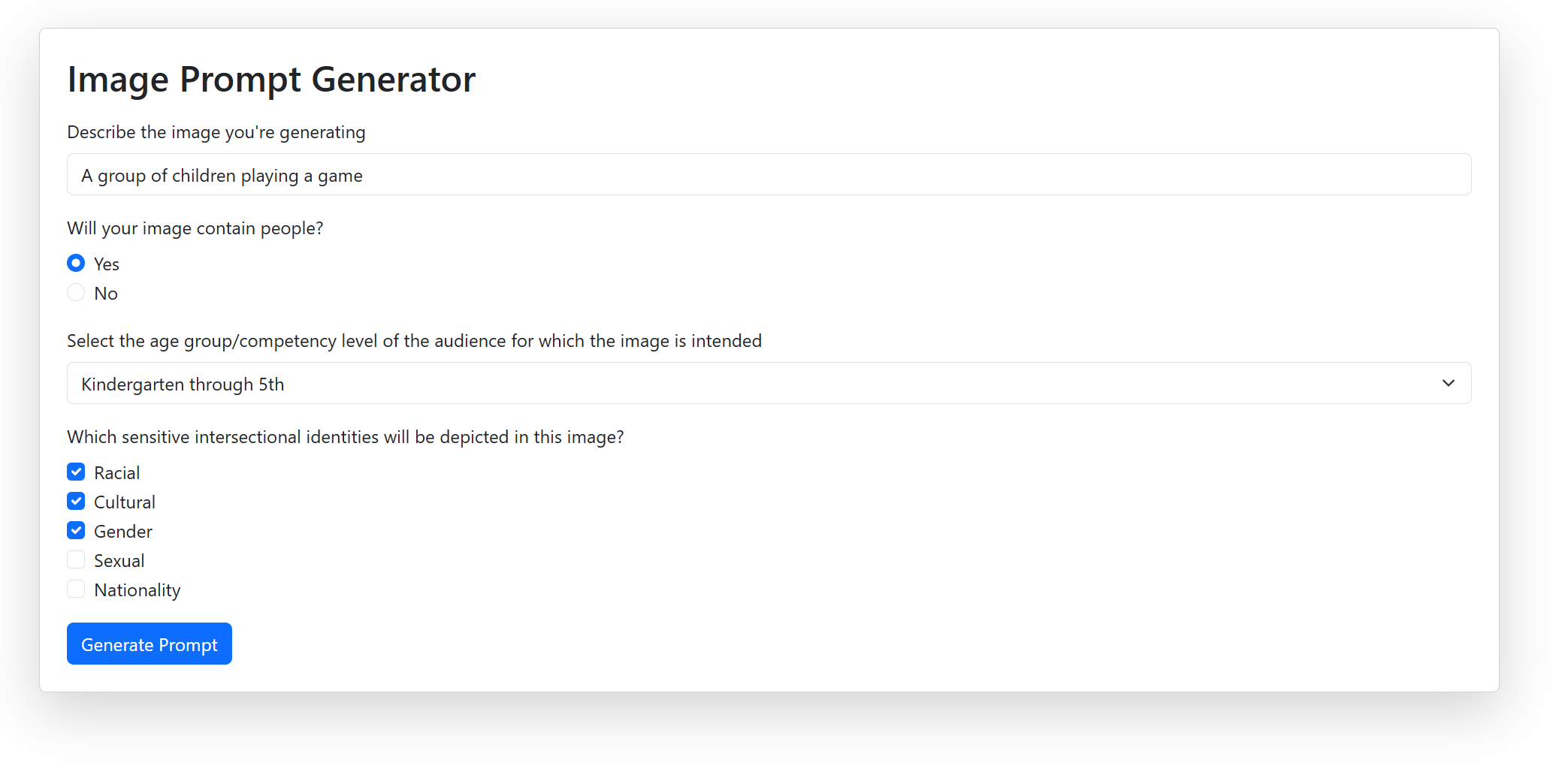
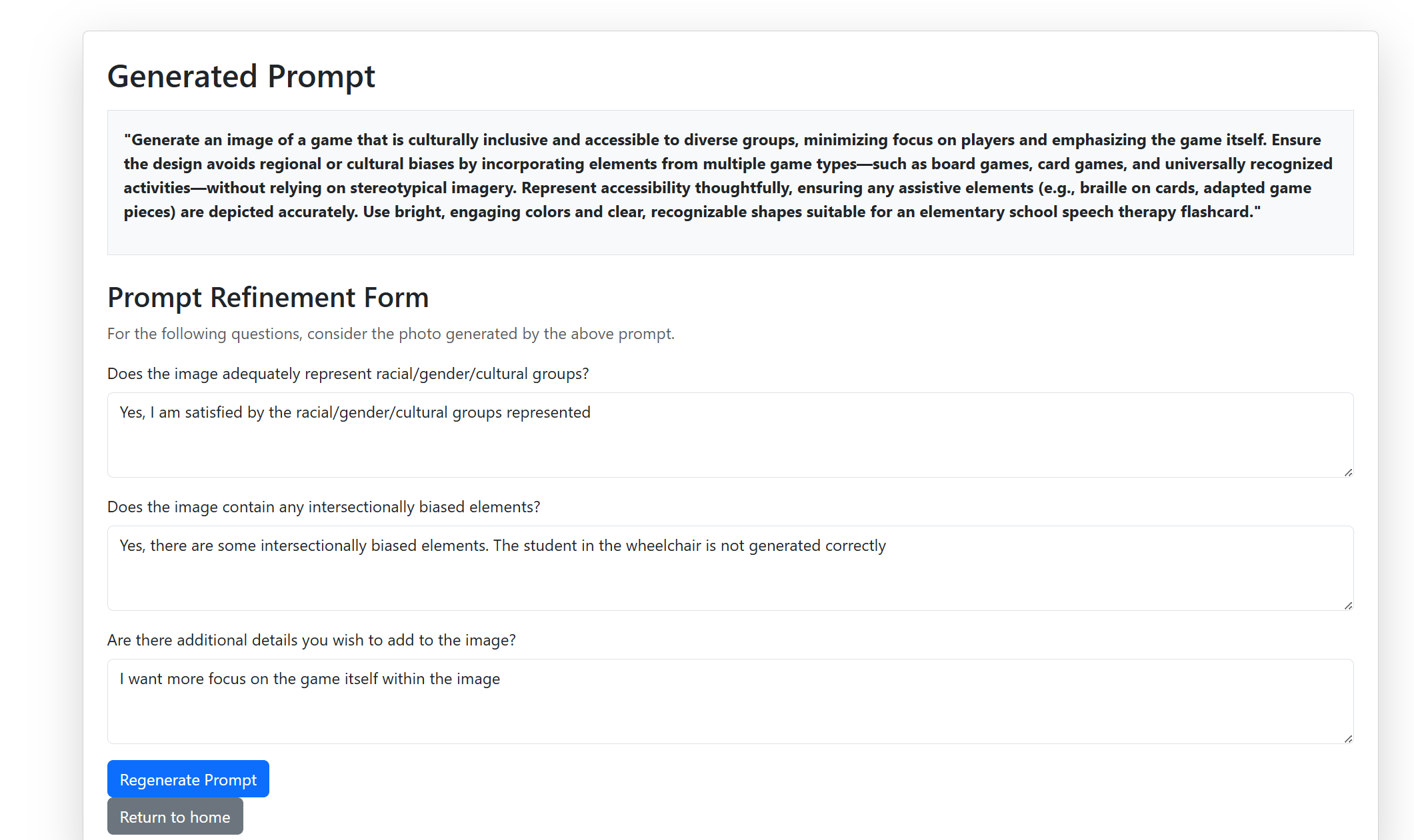
To better understand how we could address these needs, we shared a lo-fi prototype of our prompt generation tool. The prototype included options to customize for culture, race, gender, nationality, and other identity factors. SLPs could also choose different language goals and image styles to match what their session called for. From their feedback, we learned that the customizable fields were helpful, especially when it came to making images more relevant to individual clients. They also liked the ability to give feedback and regenerate prompts. At the same time, they asked for more clarity around how identity categories were labeled and suggested adding image previews to help visualize what the prompt might produce. Their input helped us make our tool more user-friendly, inclusive, and aligned with the needs of both SLPs and their clients.
Lo-fi Prototype Screenshots:
Final Concept
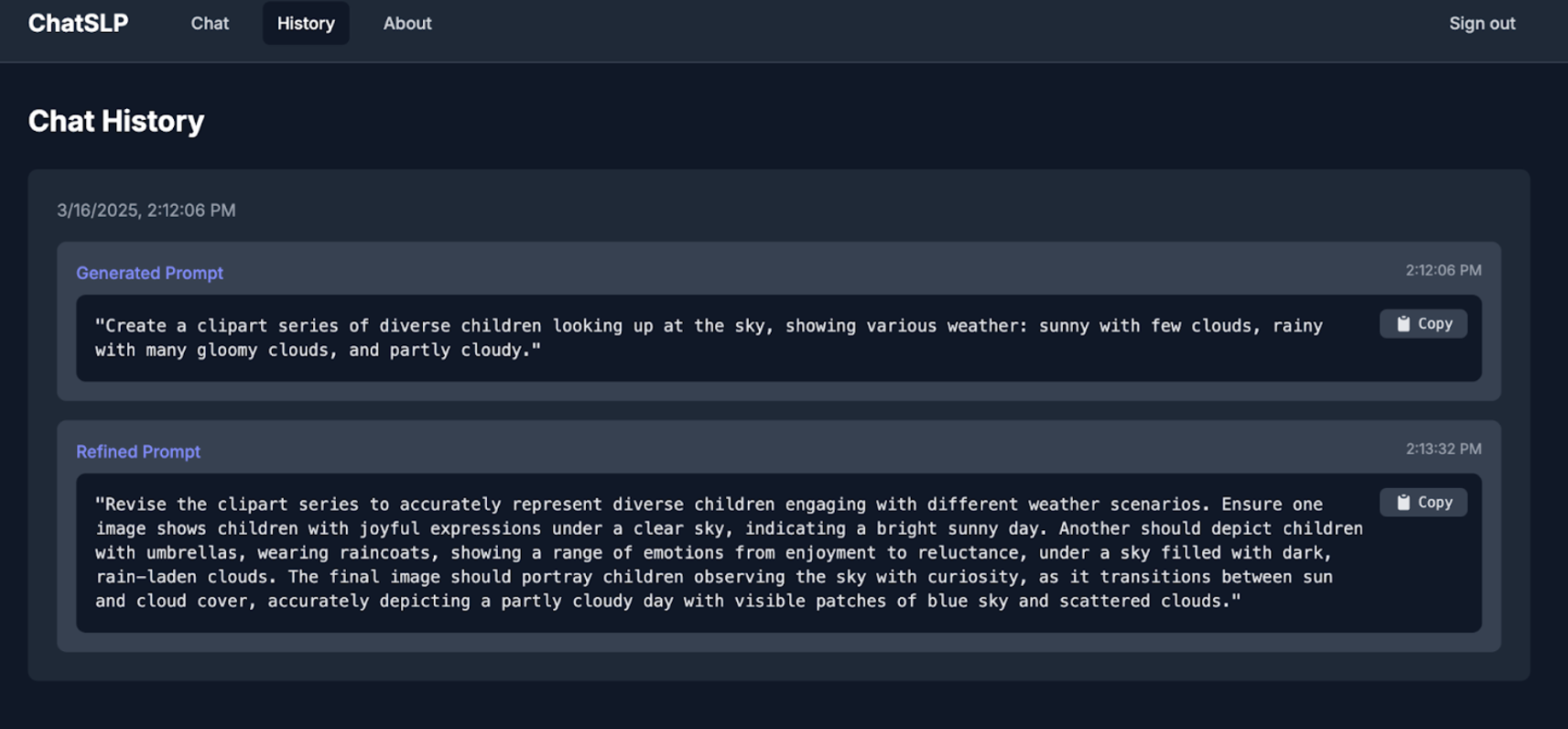
From a design perspective, we wanted to create an application that was straightforward, interactive, and easy to use in order for SLPs to navigate efficiently. We made sure to include a chat history in an organized format where they are able to review past prompts and easily access previous prompts. Overall, our goal was to create a user-friendly experience that streamlines the workflow for SLPs, making it easier to generate prompts and utilize our tool.
As for a technical perspective, ChatSLP is a chatbot-style prompt generator. For the backend, the tool is hosted on Vercel, a Software Development Kit (SDK) for OpenAI integration. At no extra cost, we have access to serverless APIs in order to use throughout our code. This was important as we needed to efficiently handle prompt generation and image requests without managing complex server infrastructure. With Vercel we also had access to PostgreSQL via Neon, where it stores user information and chat history. For the frontend, the application uses React with TypeScript and customizable reusable components used throughout the code. Lastly, in order to generate the prompts, our tool uses minimal pairs to address phonological challenges. The best format was by first generating minimal pairs of nouns, then creating a prompt to include all those nouns in a themed image.
ChatSLP ensures inclusivity by allowing SLPs to generate prompts that can be used to create diverse and intersectional identity images. The justice-centered approach was to create prompts that reflect layered identities like race, culture, and gender. ChatSLP offers a simple, customizable interface to enhance productivity with AI tools. Furthermore, we incorporated feedback and regeneration features to reduce bias and create better prompts that reflect their clients’ needs and background.
A potential risk of ChatSLP is the generation of biased or inaccurate images that misrepresent diverse identities. To minimize this, we implemented a feedback and regeneration feature, which allows users to refine their prompts if they have any issues with the image it generated. We also prioritized user control and customization to ensure that SLPs can adjust outputs and inputs to best reflect their client’s needs.
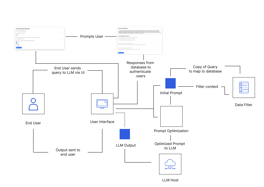
Accessibility and Implementation
Our application was built with accessibility in mind, and one strength it has is the use of a dark mode interface. The contrast between the dark background and light text reduces visual strain for our users, making it easier for them to engage with the tool for longer periods. The form layout is clean and easy to follow with clear labels and input areas that help guide users through each step of generating and refining a prompt. Buttons like “Generate Prompt” and “Refine Prompt” are large and easy to click which helps users with disabilities. Dropdown menus and checkboxes offer ways to input information without requiring too much typing and placeholder text inside fields helps guide what kind of input is expected.
But, at the same time there are still areas where we can address more accessibility needs. Although we have various elements in our website (i.e dropdown), some fields rely heavily on placeholder text rather than visible labels. This makes it harder for users to navigate our website with assistive technologies as they are unable to fully understand the purpose of each field. Also, our feedback form can have better instructions so it helps users who are unfamiliar with the terminology around image generation or intersectional biases. These improvements would help make the tool even more intuitive and supportive for a broader range of users.
ChatSLP gives Speech Language Pathologists a new and powerful way to create visuals for therapy that are both inclusive and specific to the needs of their clients. Before this tool, SLPs often had to settle for image banks that were not representative or had to search through countless online resources that lacked cultural or identity-based relevance. Now they can generate prompts that match not just language goals, but also identity factors like race, ability, gender expression, and more. This makes it easier for clients to see themselves in the therapy materials being used, which helps build connection, confidence, and understanding.
What makes ChatSLP different is how interactive and customizable it is. After generating a prompt, users can review the output and give feedback on anything that feels off or misrepresented. For example, if a generated image includes something like clocks when none were mentioned, the user can point that out and instantly refine the prompt. There is also a dropdown to select the image style, allowing users to choose from different art formats depending on what best fits their speech therapy session.
Overall, ChatSLP empowers Speech Language Pathologists to create more accurate, inclusive, and client-centered visuals efficiently and responsively to their needs.
Final Accessibility Audit
Accesibility Issue #1
Brief Description: Screen readers do not properly identify interactive elements such as buttons and form fields due to missing or incorrect programmatic names, roles, and values.
Testing Method: I tested this using a screen reader and found that certain interactive elements, such as form fields and buttons, were either missing labels or had incorrect roles, making them difficult to identify and use.
Evidence (Picture & WCAG number): Guideline Violated:Success Criterion 4.1.2 - Name, Role, Value 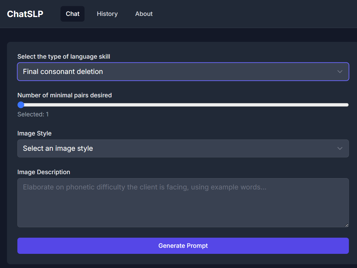 {fig-alt=” The picture above is a computer screen that showcases a page where the label is unrecongnized by the screen reader.”}
Explanation: This accessibility issue violates Success Criterion 4.1.2 because assistive technologies rely on programmatic names, roles, and values to correctly interpret and communicate interactive elements to users. When these attributes are missing or improperly assigned, users navigating via screen readers may not know the function of a button or form field. For instance, if a submit button does not have an accessible name, a screen reader may announce it generically as “button” instead of “Submit” or “Send Form.” Similarly, if a checkbox lacks an appropriate role and value, users will not be able to determine whether it is checked or unchecked. This creates usability barriers, particularly for individuals who rely on screen readers to complete forms or interact with dynamic content.
Severity (1-4) & Justification(Justify your ranking in terms of frequency, impact and persistence)
Severity: 3
Frequency: High—any interface that includes buttons, form fields, checkboxes, or other interactive elements could potentially exhibit this issue.
Impact: High—users may not be able to submit forms, activate buttons, or interact with essential features, making it difficult to complete tasks.
Persistence: High—if programmatic labels, roles, and values are not properly set, screen readers will consistently misinterpret or fail to announce these elements, rendering them inaccessible.
Possible Solution: It would be useful to help reorder the order of which text is being read through the screen reader. I think a solution would be to ensure that all interactive elements have proper labels to provide accesibile names for the buttons and form fields. Also, assigning the correct roles of the to reflect the current state. This could look like defining the roles within the code and ensuring that the label is associated with the correct item.
Accesibility Issue #2
Brief Description: Images and non-text content lack alternative text (alt text), preventing screen readers from conveying their meaning to visually impaired users.
Testing Method: I tested this using a screen reader and found that images, icons, and graphical elements were either missing alternative text or had insufficient descriptions, making it difficult for users to understand their purpose.
Evidence (Picture & WCAG number): Guideline Violated:Success Criterion 1.1.1 - Non-text Content 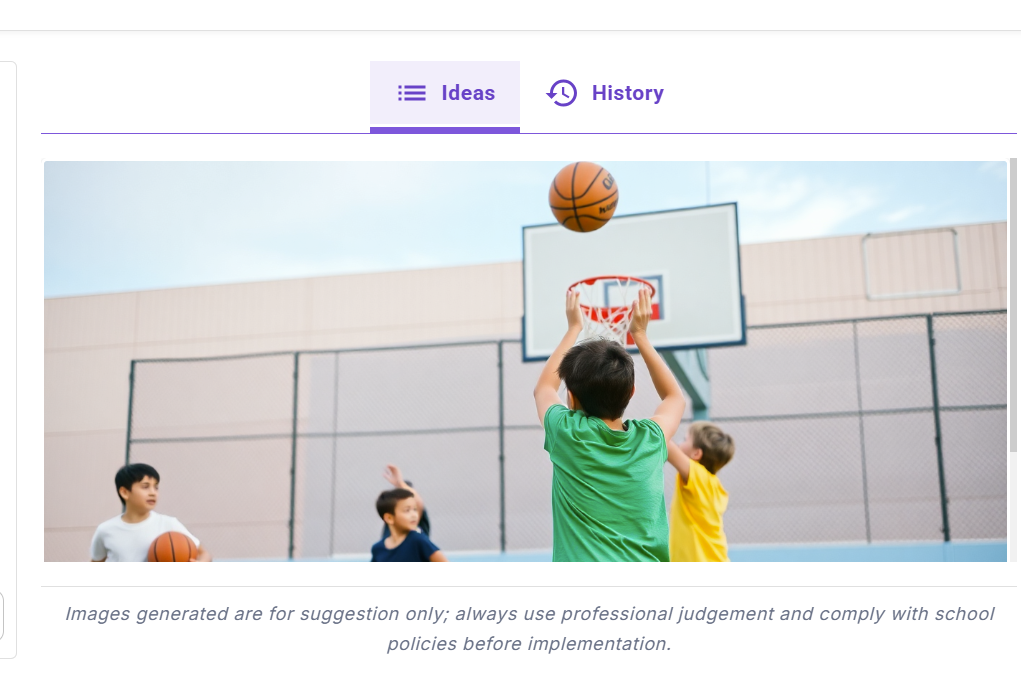
Explanation: This accessibility issue violates Success Criterion 1.1.1 because assistive technology users rely on alternative text to understand visual content. Without meaningful alt text, screen readers may ignore images or read unhelpful labels such as “image” or “unlabeled graphic.” For example, a product image in an online store without alt text means a visually impaired user cannot know what the product looks like.
Severity (1-4) & Justification:(Justify your ranking in terms of frequency, impact and persistence)
Severity: 4 Frequency: High—the website fails to provide proper alternative text for all non-text content, especially dynamically loaded images or decorative graphics. Impact: High—users who rely on screen readers cannot access essential information, making navigation and interaction difficult. Persistence: High—unless developers specifically add alternative text, this issue will persist and significantly hinder usability.
Possible Solution: It would be useful to ensure that all alt text is used for images that are generated. This is important because of the secondary source that we use for our product to be able to provide said images. Despite our tool not including the said images, it is still important to the process of ensuring that image generation is accesibile. For our next steps, we should include an option that the image generated would have alt text with it.
Accesibility Issue #3
Brief Description: Status messages (e.g., form submission confirmations, error messages, loading indicators) are not announced to screen reader users, making it difficult for them to perceive dynamic updates on the page.
Testing Method: I tested this using a screen reader and found that when submitting a form, receiving an error, or when a page dynamically updates, the screen reader did not announce these changes unless I manually navigated to find them.
Evidence (Picture & WCAG number): Guideline Violated:Success Criterion 4.1.3 - Status Messages 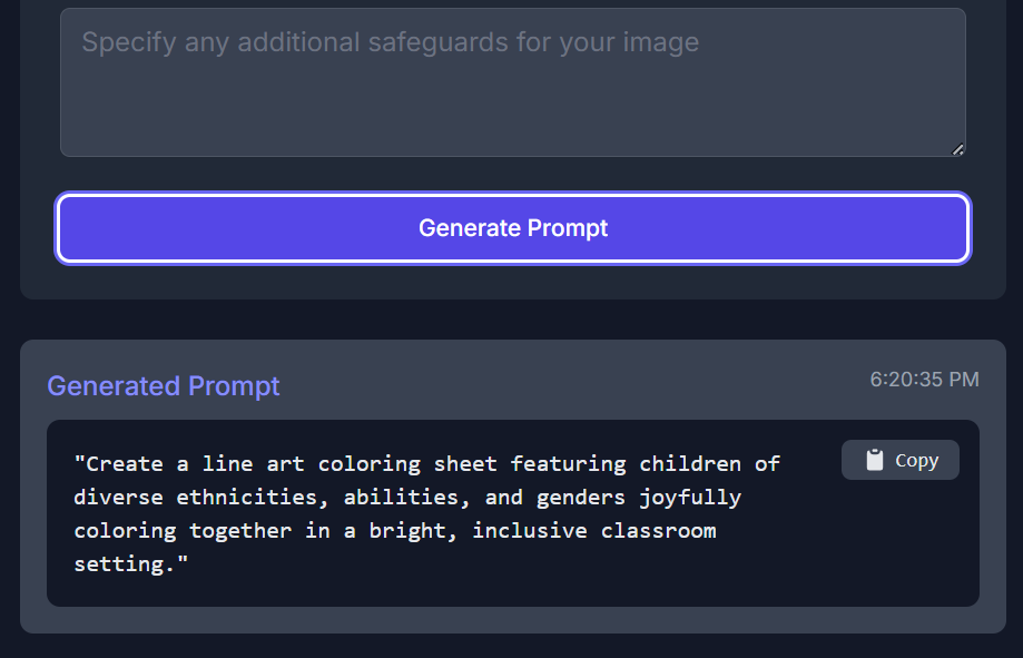
Explanation: This accessibility issue violates Success Criterion 4.1.3 because status messages provide critical feedback (such as success confirmations, errors, or updates) that users need to navigate and complete tasks effectively. When the user is finished with the prompt, there is no additional message that confirms that the generated prompt is completed.
Severity (1-4) & Justification (Justify your ranking in terms of frequency, impact and persistence) Severity: 3 Frequency: High—status messages appear frequently in interactive web applications (e.g., e-commerce sites, online forms, chat applications). Impact: High—users may miss important feedback, such as form submission errors or success confirmations, making navigation and interaction frustrating. Persistence: High—unless explicitly coded for accessibility, status messages will not be recognized by screen readers.
Possible Solution: To resolve this issue, we can incorporate in our code using ARIA live regions to announce the status messages to announce that the generated prompt is completed. Also, we can include error messages associated with the form fields. This ensures that users are able to understand why the generated prompt is unable to compete or not.
Accesibility Issue #4
Brief Description: Insufficient color contrast between text and background makes it difficult for users with visual impairments to read content.
Testing Method: I tested this by using a color contrast analyzer tool and found that certain text elements, such as placeholder text in form fields and button labels, did not meet the minimum contrast ratio requirement.
Evidence (Picture & WCAG number): Guideline Violated:Success Criterion 1.4.3 - Contrast (Minimum)  {fig-alt=” Image of an app screen illustrating the light grey text against the dark blue background.”}
Explanation: This accessibility issue violates Success Criterion 1.4.3 because text must have sufficient contrast against its background to be readable by users with low vision, color blindness, or other visual impairments. The light grey text makes it difficult to see against the the dark blue background and does not meet the contrast requirements.
Severity (1-4) & Justification: (Justify your ranking in terms of frequency, impact and persistence) Severity: 3 Frequency: High—many websites use low-contrast text for stylistic purposes (e.g., light gray text on a white background, pastel-colored buttons). Impact: High—users with vision impairments may be unable to read critical information, making navigation and form completion difficult. Persistence: High—unless designers specifically test and adjust contrast ratios, this issue remains present across the site.
Possible Solution To resolve this issue, we can change the color of the text to be a white color instead of the grey text. This would meet the color contrast of the WCAG requirements. It is important that we use high contrast colors for important elements to ensure that these form labels are able to be seen and help users navigate through our website.We can also try to include a setting in which users are able to adjust the contrast setting to enhance readability.
VPAT Table
| Criteria | Conformance Level | Brief Explanation |
|---|---|---|
| 1.4.4 Resize Text | Supports | Text resizes well in browser zoom without loss of readability or function. |
| 1.4.10 Reflow | Supports | Content adjusts well to screen size changes; no horizontal scrolling is needed. |
| 2.4.3 Focus Order | Supports | Tabbing through the form fields follows a logical, top-to-bottom order. |
| 4.1.2 Name, Role, Value | Partially Supports | Buttons and dropdowns are labeled visually, but some fields lack explicit labels for screen readers. |
| 1.4.11 Non-text Contrast | Supports | Icons and interface elements have sufficient contrast against the dark background. |
| 1.3.1 Info and Relationships | Supports | Visual structure is clear and organized; fields and sections are grouped logically. |
| 1.1.1 Non-text Content | Partially Supports | Some icons and generated prompts may not have alt text or ARIA descriptions. |
| 1.3.4 Orientation | Supports | Content remains accessible in both landscape and portrait views. |
| 4.1.3 Status Messages | Does Not Support | System does not announce prompt generation errors or success messages to assistive tech. |
| 1.4.3 Contrast (Minimum) | Partially Supports | Text has a contrast ratio above 4.5:1 on the dark background however not in certain form fields. |
VoiceOver-Specific Issues
| Criteria | Conformance Level | Brief Explanation |
|---|---|---|
| WCAG 2.1.1 Keyboard Accessibility | Does Not Support | The dropdown menu does not allow users to hear options until they click, making it difficult for keyboard and screen reader users to navigate. |
| WCAG 4.1.2 Name, Role, Value | Does Not Support | The dropdown menu options are not properly labeled, preventing screen readers from announcing them correctly before selection. |
| WCAG 1.3.1 Info and Relationships | Partially Supports | The section content is not grouped in a way that allows VoiceOver to read it all at once, requiring users to click each part individually. |
| WCAG 2.4.3 Focus Order | Does Not Support | When generating a prompt, focus remains on the “Generate Prompt” button instead of shifting to the new content, making it difficult for screen reader users to follow. |
| WCAG 3.3.2 Labels or Instructions | Does Not Support | Placeholder text disappears when users start typing, which can cause confusion as there is no persistent label. |