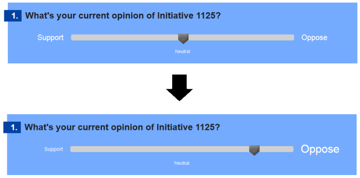
Figure 1: ConsiderIt Opinion Slider
ConsiderIt is a deliberation platform that currently lacks accessibility features and does not support screen readers. In this paper, we describe our approaches to creating an accessible version of considerate, primarily for blind users, and the methods we used to ensure screen-reader compatibility. We also describe our development process and the results of launching the Metro Proposal Guide powered by our accessible version of ConsiderIt.
H5.2. User Interfaces: Interaction styles, User-centered design
H5.3. Group and Organization Interfaces: Computer-supported cooperative work, Web-based interaction
Design
VoiceOver, API, Accessibility, Living Voter’s Guide (LVG), Metro Proposal Guide (MPG)
Disabled users and accessibility features are often not a consideration when developers design user interfaces. In view of the fact that around 16% of the US population from ages 15 to 64 are disabled, this excludes a nontrivial amount of people from accessing a large number of useful applications [1]. Companies such as Apple have made efforts to remedy this with the VoiceOver feature in their iOS platform. At the same time, in other cases such as Skype, companies have begun development of accessible applications but have over time phased out accessibility support in favor of more non-accessible features. Thus, it has become a common trend that disabled users are all too often unable to use an application due to its lack of accessibility features.
An example of such an application is ConsiderIt, a platform that helps users form their own opinions on a variety of issues. Our goal for this project was to create a screen-reader friendly, accessible version of ConsiderIt. By doing so, we hope to open the tool for use by blind users and encourage active participation from the blind community.
ConsiderI was developed at the University of Washington and is an effort to integrate differing viewpoints of many into a tangible form and allow users to consider tradeoffs with an intuitive interface [2]. A typical interaction in ConsiderIt goes as follows: first, user selects an issue and reads a description of the issue; second, they select their initial opinion of the issue on a scale of strongly support to strongly disagree; third, they create a list of pros and cons for that issue, potentially drawing from a list of pro and con points created by other users; fourth and finally, users update their opinion after having considered the tradeoffs of pros and cons.
ConsiderIt has previously been deployed as the Living Voter’s Guide (LVG), a website for Washington citizens to deliberate on the merits of various 2010 ballot initiatives. This was a major success, attracting an average of 1000 page views a day and having over 600 registered users during its run.
The interface of ConsiderIt is clearly designed for sighted users in mind, employing a number of mouse motion related interaction techniques that are difficult for blind users to perform. In the LVG, the wide, horizontal layout of the site is well-spaced and intuitive for sighted users. However, the same horizontal layout presents many challenges for blind users and is very suboptimal for screen readers, like the commonly used iOS VoiceOver. Thus, blind users are impeded from using the application. Since there are many potential users in the local blind community who would love to take part in such discussions, our goal was to address these issues.
Figure 1: ConsiderIt Opinion Slider
One such technique that is difficult for blind users to follow is the slider bar. ConsiderIt uses this slider to let users pick where they stand on an issue and is typically set on a scale from strongly support to strongly disagree. The slider pointer by default starts in the middle “Undecided” position. To adjust, users will click on the slider handle, drag the handle to their desired position, and release. For blind users, this is a very difficult task to complete because the handle is neither an image nor a piece of static html content. Not only is it difficult to find the slider handle using a screen reader, it is also difficult to know how far they need to move the handle to select their desired opinion. In most cases, we also found that such techniques were incompatible with mobile touch screens since there is no notion of a mouse to click and drag with.
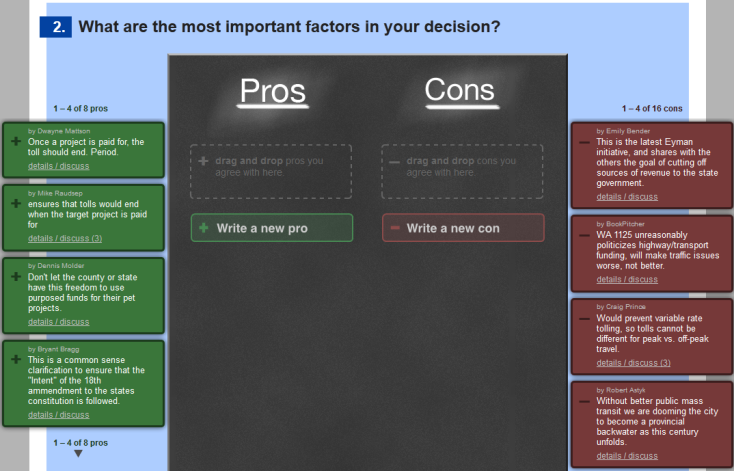
Figure 2: ConsiderIt Point Deliberation
Another interaction technique inaccessible for blind users is the drag-and-drop interface used in the point deliberation interface. Here, users are able to view pro and con points that other users have written. Each point is represented as a box listed on the sides, with the boxes on the left side representing pro points in green and the boxes on the right side representing con points in red. To add a point to their person list, users must drag and drop a box into the central black area. Again, this presents a difficult drag-and-drop motion that is difficult for blind users to complete and for screen readers to properly convey.
Beyond the listed problem points, Javascript is used liberally throughout the site to dynamically hide and reveal content without refreshing the page. These changes are rarely detected by screen readers, which lead to issues where a blind user performs an action on the site but receives no feedback. Therefore, they are unaware of any change and may become lost or confused by the changing page layout.
Finally, all main content (including the issue description, the slider bar, and point deliberation) are displayed on a single page. Although this style lends itself well to giving sighted users a quick, accessible overview of all content, this creates a lot of clutter and noise when a blind user tries to navigate through the page on a screen reader.
To place ConsiderIt into better perspective, the following is an example of a typical use case with the Living Voter’s Guide. As we worked towards our accessible solution, we made sure that blind users were able to complete this use case just as easily as sighted users:
Anne has a discussion with a colleague at work over the merits of a recent ballot measure. It wasn’t clear to her where she stood on the issue. Upon arriving home, she logs on to the internet and decides to access the Living Voter’s Guide to see if it can help her decide on an opinion. At the LVG homepage, she browses a list of ballot measures and finds the one that her colleague was talking about. Not wanting to read through a wall of text, she skips reading the long description and skims the short description, then moves on to selecting her initial opinion. At this point, Anne is still undecided, so she selects the “Undecided” position and moves on to pro/con list creation. She first browses a list of pro points that other users have written. She finds two that she agrees with, and adds them to her own list. Next, she browses a list of con points that other users have written. She immediately notices a certain con point that she does not agree with, and adds a quick comment under the con point to share her opinion. Seeing no other con points that particularly attracted her, she decides to write her own con point, adding a website link to it to provide evidence for her thoughts. Looking at her updated pro/con list again, she realizes that she is now more inclined to support the ballot measure. Anne then updates her opinion to the “Moderate support” position and walks away more informed about the measure.
The UW DO-IT program lists a number of guidelines for designing accessible websites that we felt was relevant to our project [3]. For instance, we closely followed the design guideline of maintaining a simple, consistent page layout throughout the site and provided audio feedback where appropriate. Other guidelines listed were less relevant to our project, but in general our work is in line with the focus on accessibility referenced above.
Beyond this, there has been research detailing new multi-touch mobile touch screen interaction techniques for blind people [4]. However, because we felt that these techniques were more suitable for mobile apps and not for our goal of a web app designed for screen reader compatibility, we decided not to pursue implementing them and instead follow the more traditional interaction style with websites.
Our solution to making an accessible version of ConsiderIt was to make a mobile website that could be used with the VoiceOver tool on an iPhone or iPad. In our process of designing the website, we ensured that our approach was also accessible for common screen readers on a desktop as well as a mobile device.
When deciding how to make an accessible version of ConsiderIt, we chose between two approaches. The first approach was to make a Web Service API and develop a mobile application for either an Android device or the iPhone. The second approach was to make the website. We eventually decided to make the mobile website because it would be easier to access the website from any device connected to the internet. In contrast, the application would require all potential users to first download and install the application before they can use it. This extra obstacle, we believed, would lose potential users. Also, since a mobile website would be compatible with screen readers on desktop devices, we could reach more users than just those with smart phones.
When initially designing our website, we used the same approach of website development as any other site. That is, we included JavaScript to dynamically update the page, we split the page up in multiple dimensions so that we could utilize as much space as possible, and we specified font sizes using pt instead of em. We immediately found through user testing that this approach was completely wrong.
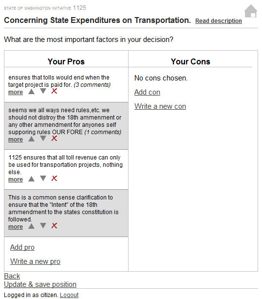
Figure 3: Initial Website Design - view your pro and con list
The first issue with this design that we discovered was that common users could not find content on the page. When using the website with our iPod Touch, they searched the page by moving their finger up and down the left side of the page and therefore could not find the Your Cons section to click on anything. In the same respect, they were unable to find the arrow or delete buttons that would move or delete the point in their list. We decided that the best approach to fix this was to put everything in one column and keep it vertically aligned on the left side of the page. This way, when the user searched up and down, they would encounter each element on the page.
We also found that we needed to fix our wording for links and other parts of the page because the users were not always familiar with the purpose of each element. For example, the “Back” link at the bottom of the page could easily be mistaken for the back button in the browser on the mobile device, especially since some mobile devices put the back button at the bottom of the screen. We decided to change the wording on this link to be more intuitive. In our above case, we updated the link to read “Previous” followed by the name of the page the previous link would go to. We found that this helped a lot for the users to understand what their actions would do and improved the overall usability of the website.
Another issue that we discovered was that dynamically updating pages using JavaScript was not intuitive or recognizable to users. When we added or removed parts to the page, the screen reader did not always update with the page and the user would suddenly be lost and would search through the page again trying to make sure everything was how they wanted it to be. We decided that this was both inconvenient and a waste of time, so we made the pages as simple as possible. We had one form for each action and split up the pages where necessary so that the user would just click on a link to view the details of a pro or con instead of modifying the existing page to show all of the details. After we made the above changes, we came up with our new and final design.
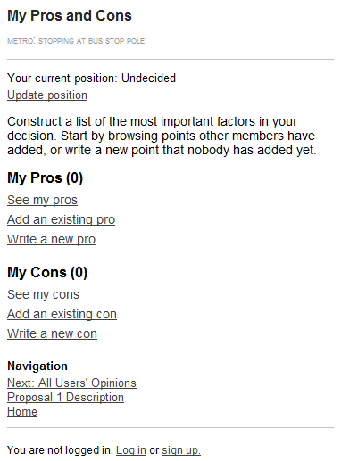
Figure 4: Final Design - view your pro and con overview
Figure 5: Final Design - review a list of existing pros
Among the features of our final design was the inclusion of gathering study data about the website, both with Google Analytics and the internal data that the original ConsiderIt implementation included. This way, we would be able to gather the same information that the existing site had such as how often users changed their position on a subject, whether they looked at the details of a pro before adding it to their list, and other similar information.
After iterating through our design and implementing all of the features in the mobile website, we decided to try the site out on a larger group of blind and low-vision users. Therefore, we created the Metro Proposal Guide (MPG), an implementation of our platform that uses hypothetical proposals from the King County Metro Transit organization. We believed that this topic would attract users and allow us to get more feedback on how the public would use our site. In the MPG, we introduced two different proposals for how Metro Transit might consider improving their system to support blind and low-vision users. We hoped that these proposals would promote discussion among the blind community and provide date metrics for our website and how usable it was. We found that from the two weeks that we had advertised the website, we had fewer than ten new users visit the site and that none of them had discussed the issues further than creating their own lists with existing items. That is, no users made new pros or cons or discussed existing points. We believe that this was because we did not advertise the product enough. We then sent another email to potential users and provided more incentive to participate actively and promote discussion. Since then, we have had more participation, but we were unable to gather enough data information to use in this report.
This project could proceed past this capstone through more user studies and learning how real users use the site. We attempted to do this with the Metro Proposal Guide, but we did not have enough time during the quarter to gather enough user feedback. If this project is continued, we think that it would be useful to learn how popular this online deliberation tool is among blind users and how they would interact with the site compared to users on the main ConsiderIt website.
We had also talked for some time about continuing this research and eventually writing an assets paper, although were unable to reach a conclusion on whether we would be available to continue with the project. If we were to proceed with this research, we would definitely have more user studies and develop the website further so that it integrates more smoothly with the existing ConsiderIt framework. One possible development we foresee would be to develop a way to distinguish whether the user wants to use the accessible version of the site or the original site and automatically redirect users to their preferred version, like many mobile websites do now.