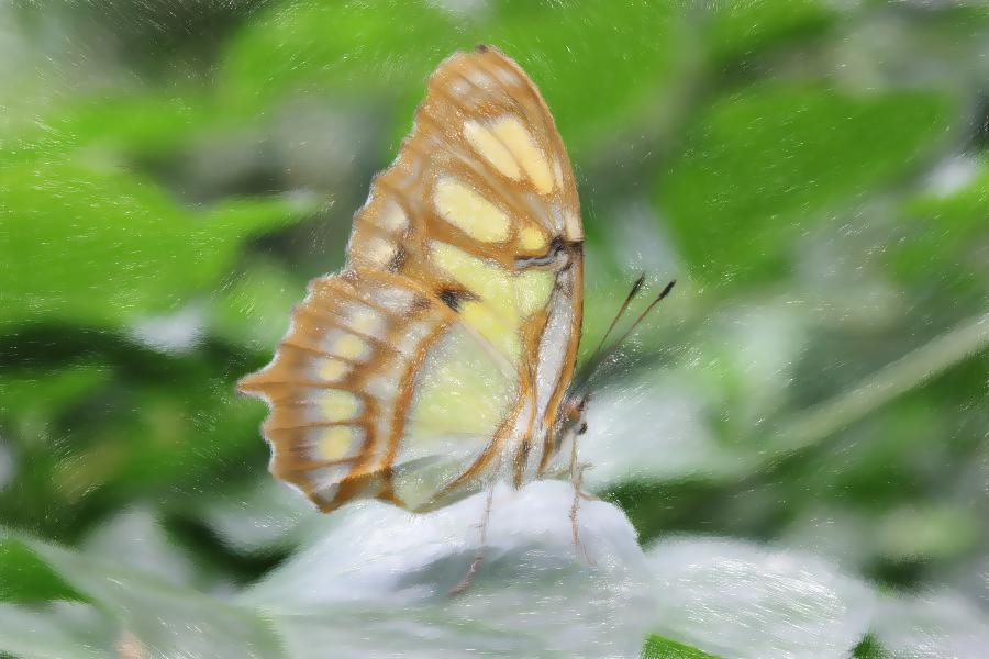
Impressionized Image
Click the image to see the original version.
Comments
I started with a blank canvas and started drawing with the scattered line brush with a fairly large radius and size. I set it to follow cursor movement and to an opacity of 25. This gave an effect that looked like it was actually brushed on, because details were kind of "pulled" along with the stroke. I used this to outline all of the major edges and partially fill in. Then, I reduced the radius and size of the brush to define the edges a little more tightly and continue to fill in areas. For strong edges, I did a very small brush size and radius, along with a very high density. Then I would carefully draw along the edge with cursor movement angles. For high detail areas, I would do a small radius, high density, lines a couple pixels long, and gradient angles. I found that for the majority of the painting, gradient angles would look strange when drawn in areas without a clearly defined edge. It was really just useful for high detail edges. After I finished drawing the image, I did a bilateral mean filter to smooth it out a little.