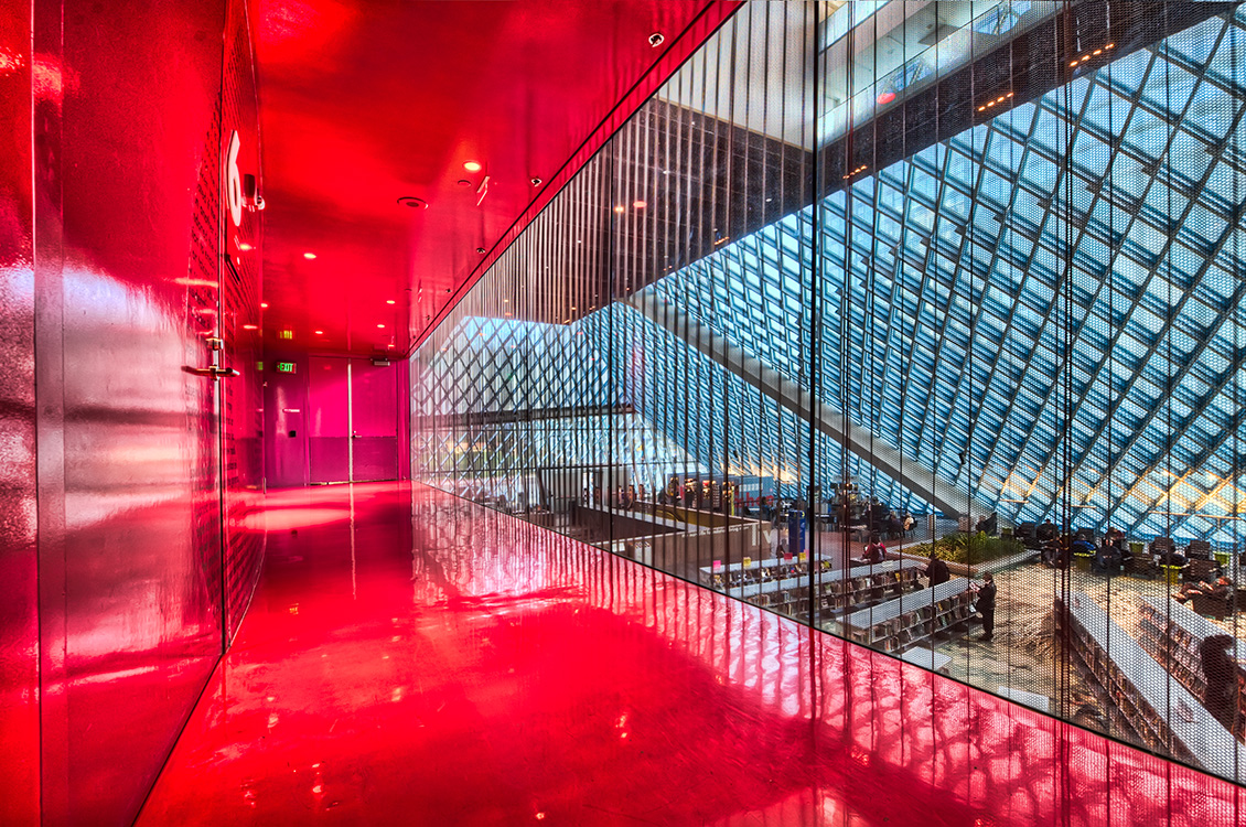
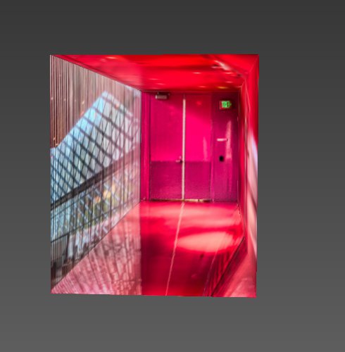
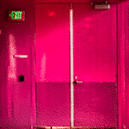
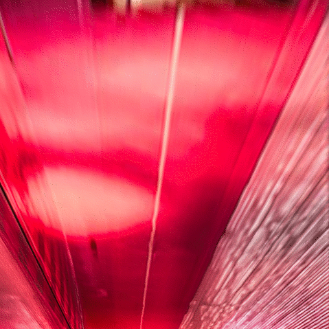
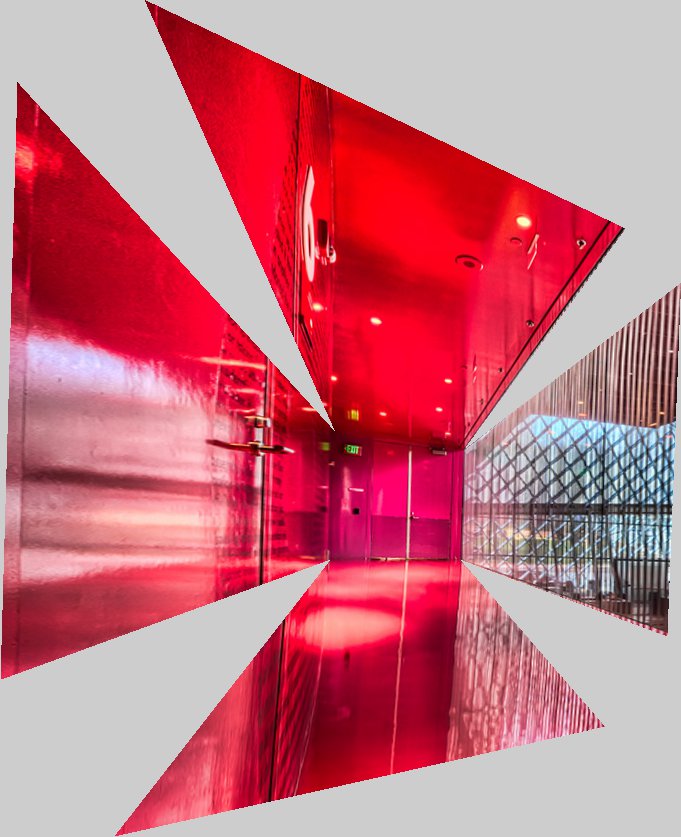
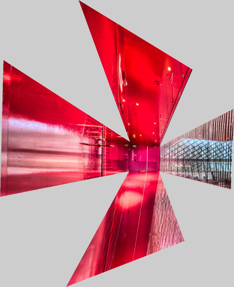
Neither of the images we chose had quite the Patrick Hughes-esque requirements (namely, boxy shapes) required for a successful inversion. We decided to follow the Seattle Public Library theme that our real-life photo established and chose this stunning photo of one of the red halways at the library:
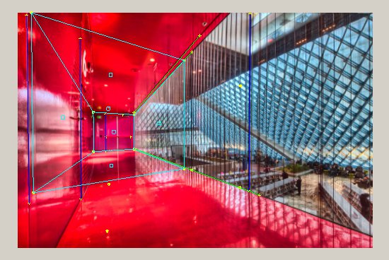
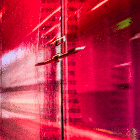
The 3d model was very simple: we just extracted a rectangle. We didn't want to go crazy with the scissors and tape for the real model, and the hallway didn't have any other features, so we went with it. The resulting image is shown in the next section.
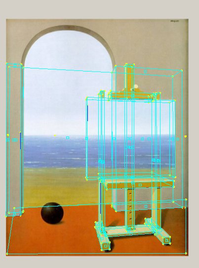
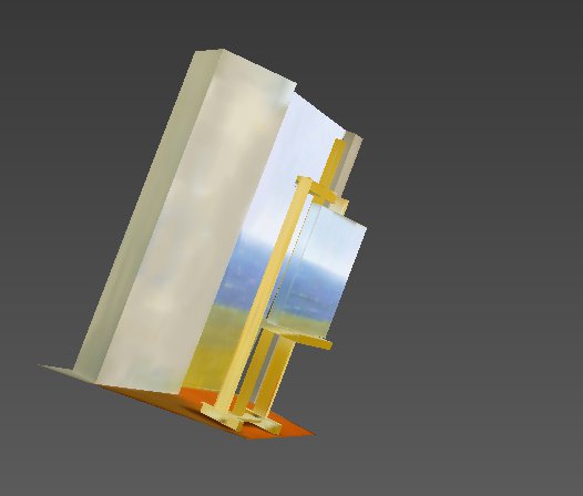
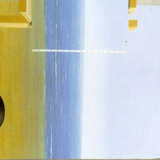
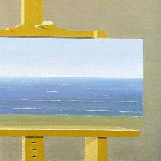
For our painting, we opted for something different than the usual perspective recreation. We took Rene Magritte's The Human Condition (1935 version) and decided to deconstruct his basic exploitation of perspective. Given Magritte's tongue-in-cheek representations of art as a medium (see also: The Treachery of Images, known by its caption "Ceci n'est pas une pipe"), playing homage by this our blatant mockery of his careful use of perspective seemed appropriate.
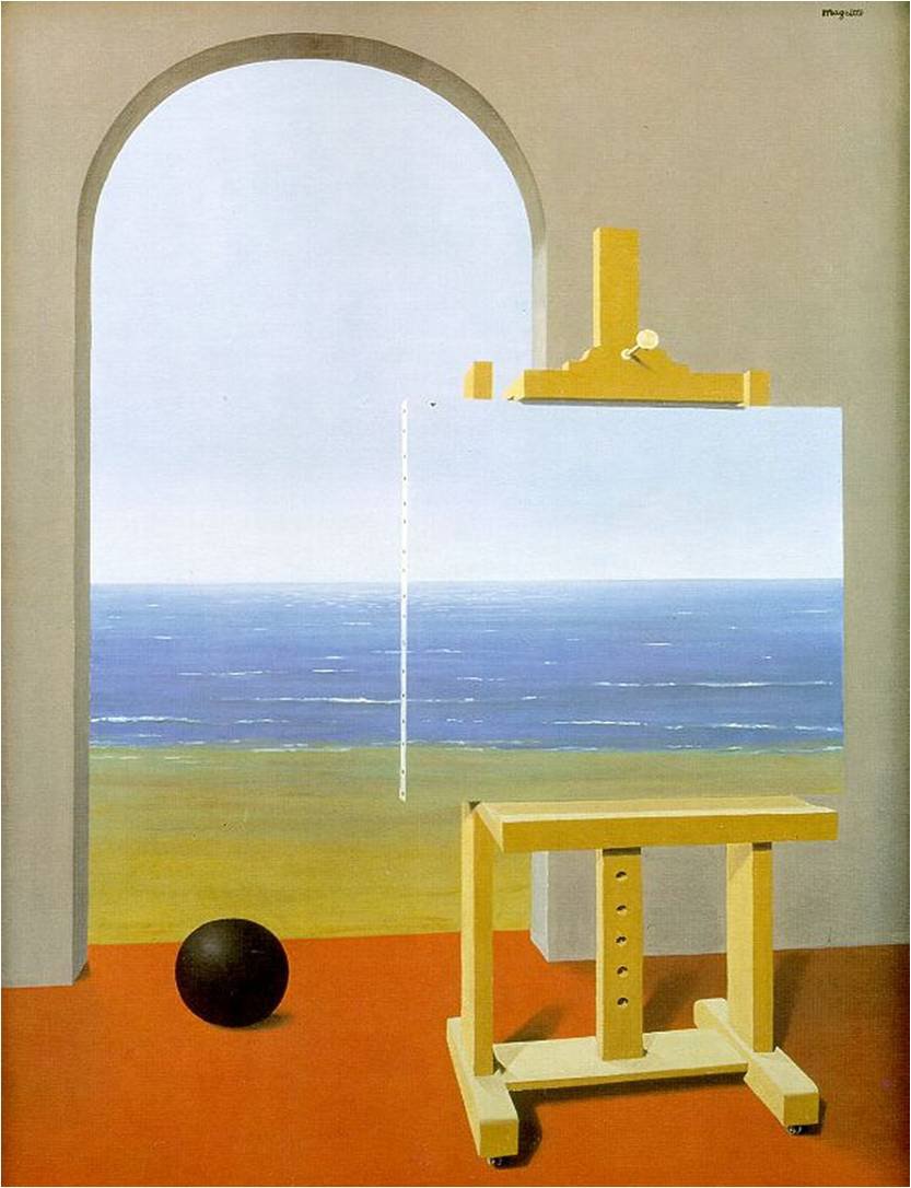
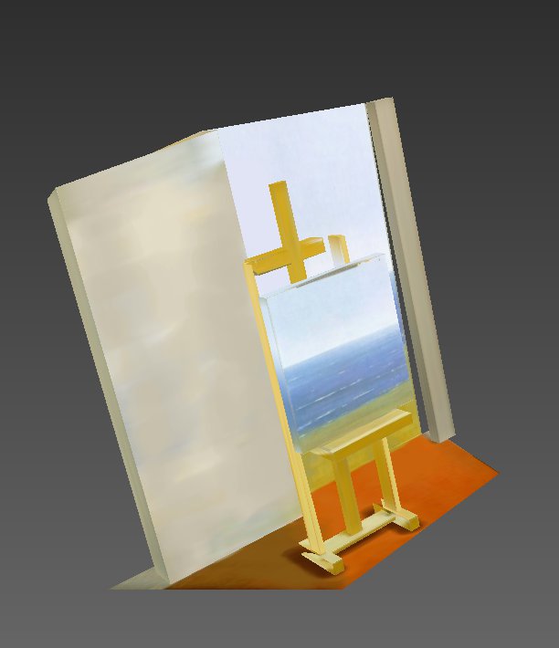
However, it was immediately evident that the artist had cheated! The easel and walls maintained strong lines that would suggest a use of perspective, with vanishing points at the horizon -- but the y-vanishing point occurs somewhere in the surf. Hence, treating the entire beach as the floor turned out to be a veritable disaster for the model -- the horizon to the beach mapped to negative 3d coordinates, as it was past this vanishing point. We thus opted to treat the archway as a window of sorts -- to pretend the beach scene was actually vertical, like a tapestry or poster.
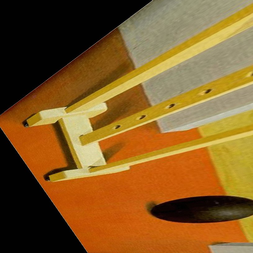
Below are some texture maps for the SPL:
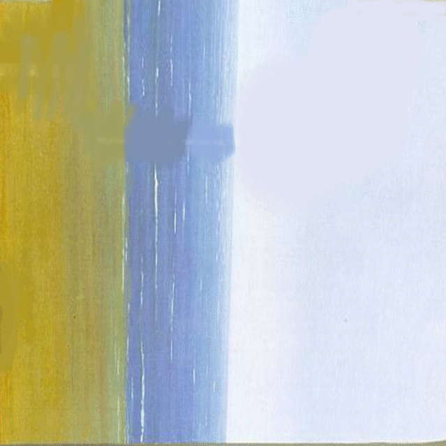
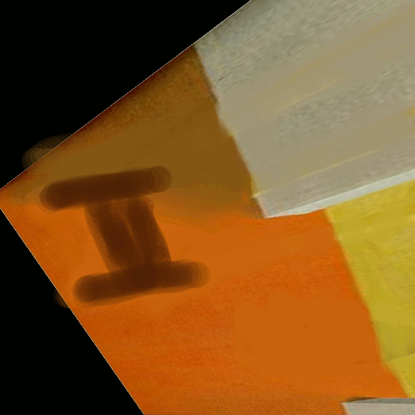
Some textures had to be heavily modified. The big black ball, while ostensibly doing wonders for the balance of the scene, could not be recreated in the 3d. The painting itself was projected onto all of the other surfaces. Hence, the floor and walls had to be changed:
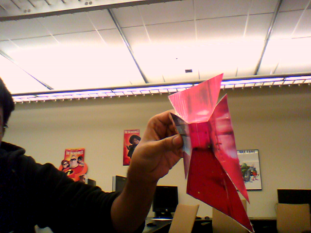
To invert the scene, we tried several z-scale factors: 1, 2, and 3, displayed in order below. We found that 1, while sufficient, was not creating a dramatic enough look, while 3 distorted the scene too much. We decided to go with a z-scale factor of 2.
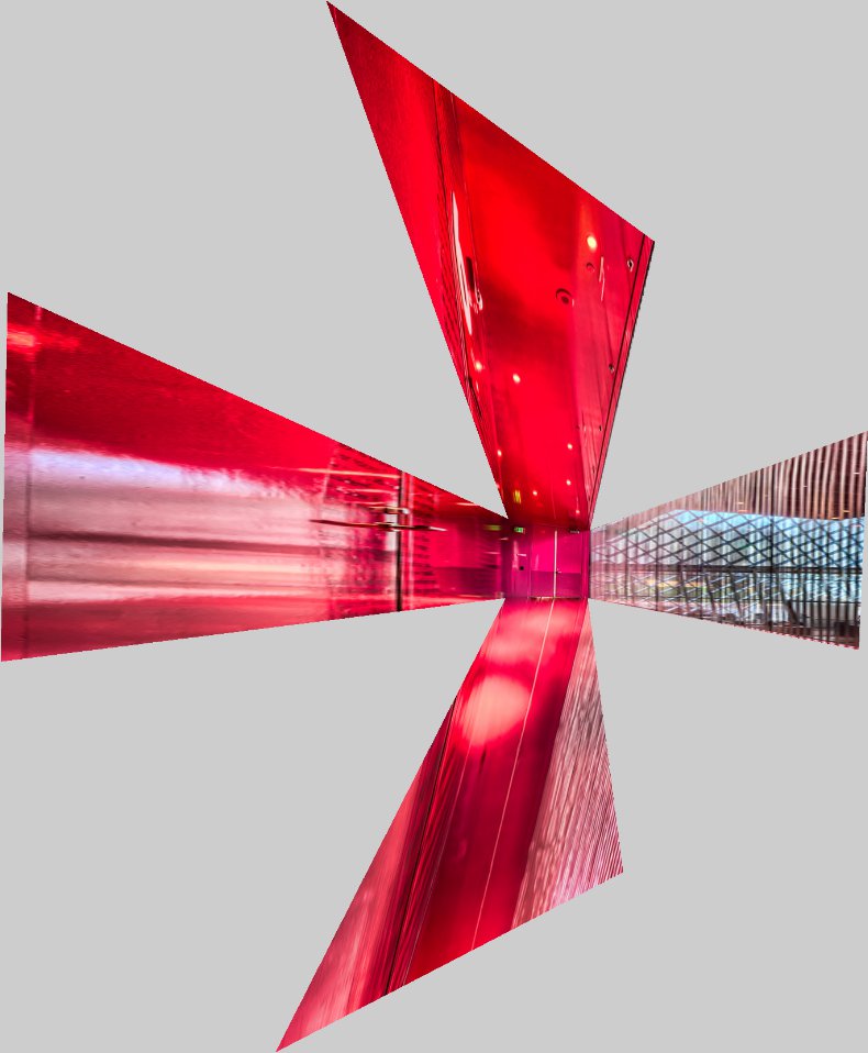
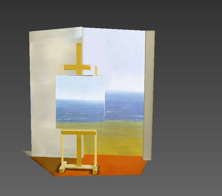
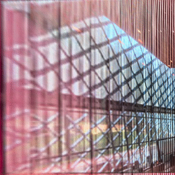
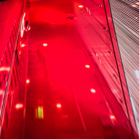
Once pasted together, the scene looks like this: