low-stim-extension
Our Google Doc with all of the information below and more about this project!
Abstract
Many people experience sensory overload when using the modern web. Autistic users, people with ADHD, individuals with migraines, and those with vestibular disorders often encounter websites filled with autoplay videos, flashing ads, and animated transitions that increase stress and cognitive load. We propose a low-stimulation Chrome browser extension that reduces motion, visual clutter, and dynamic distractions. The extension will disable non-essential animations, pause autoplay media, simplify layouts, and allow users to toggle sensory-reduction levels. The goal is to create a “browser layer” that supports sensory regulation and sustained focus, giving users control over their digital environment rather than forcing them to adapt to overstimulating design.
Project Details
Motivation
The motivation for this project stems from first-person accounts of Sensory Processing Disorder (SPD), particularly those of Amythest Schaber. Schaber explains that sensory triggers throughout the day drain “brain energy” that would otherwise go toward learning or socializing. Negative sensory stimuli are not just annoying but can feel physically painful, and without accommodations, this overload can lead to meltdowns, exhaustion, and difficulty communicating. Our project assumes the responsibility of adjusting the environment to the person, recognizing that overstimulation is a neurological reality rather than a personal failure.
Disability Analysis
Disability Justice Principle 1
Leadership of the Most Impacted - It is critical to center our work around the perspectives of those who live at the intersection of various systems of oppression. We must value lived experience over the “expertise” of academics or outside observers to find real-world strategies for resistance. When it comes to the disabled community, it means prioritizing and understanding the perspectives of disabled individuals.
Our project aims to be informed by and centered around disabled perspectives through first person accounts, including Amythest’s account of Sensory Processing Disorder. However, we acknowledge that relying solely on individual accounts can lead to gaps. By focusing on a single or small number of accounts, we may oversimplify neurodivergent disabilities with our project. Thus, we want to prioritize customizability and flexibility as key aspects of our project so that users are able to create custom configurations that meet their needs best. Another gap can occur due to a lack of neurodivergent user testing and input throughout the development process. Furthermore, we must consider screen reader users and their user experiences and perspectives, as changing a website’s layout could break the navigational flow.
Disability Justice Principle 2
Collective Access - We must move beyond non-disabled standards of operating. Access is not a shameful individual burden but rather a collective responsibility where needs are met flexibly and creatively.
Our project meets this principle by creating an AT that exists as a “browser layer” that allows users to toggle sensory-reduction features. Instead of forcing individuals to adapt to overstimulating design, the project assumes the responsibility of adjusting the environment to the person. The project challenges the ableist assumption that neurodivergent individuals should just “push through” sensory-rich environments by recognizing that overstimulation is a reality rather than a personal failure. To make the web more accessible as a whole, we must ensure that users of all backgrounds and abilities are able to navigate the web without significant cognitive barriers.
Background Research (to be added to)
Research on sensory processing shows that many digital environments can be overwhelming for neurodivergent users. People with autism, ADHD, migraines, and other sensory processing differences often describe the world as feeling “too loud, too fast, and too bright.” Motion, flashing visuals, background noise, and cluttered layouts can make it harder to process information and stay focused. While people often use low-tech tools like earplugs, sunglasses, or other items in a sensory kit to manage physical environments, similar support is rarely available in digital spaces. This suggests there is a clear opportunity for tools that help users reduce stimulation while browsing the web.
First-person accounts from neurodivergent creators show how common web design features can create accessibility barriers. In a talk about neurodivergent-inclusive web design, Owen Niblock explains that animated GIFs, autoplay media, and constantly moving carousels can make it difficult to concentrate or complete tasks online. When motion cannot be paused or controlled, it can cause sensory overload and force users to leave a website altogether. Research and interviews with people with ADHD also show that highly stimulating digital environments can increase distraction and reduce productivity, especially when users are surrounded by notifications, multiple tabs, and social media feeds.
Other first-person accounts highlight how sensory overload can affect concentration and well-being. Advocates such as Ben Lesh and Lyric Rivera describe the modern web as filled with constant stimulus that can increase stress and make it difficult to focus. As stimulation builds, users may struggle to concentrate or process information. Together, these accounts suggest that providing users with more control over motion, audio, and visual clutter could make online spaces more accessible. A low-stimulation browser extension that reduces animations, pauses autoplay media, and simplifies layouts could help users create a calmer and more manageable browsing experience.
Project Storyboard (based on your proposal storyboard, must include images, ALT text, and brief explanation of each storyboard)
Frame 1
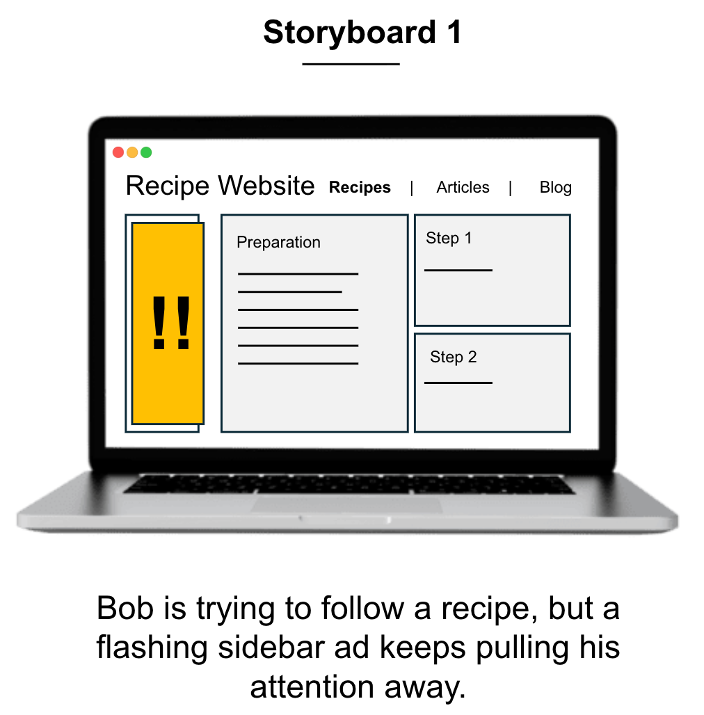
Brief explanation: The user, Bob, is trying to follow a recipe, but a flashing sidebar ad keeps pulling his attention away.
Frame 2
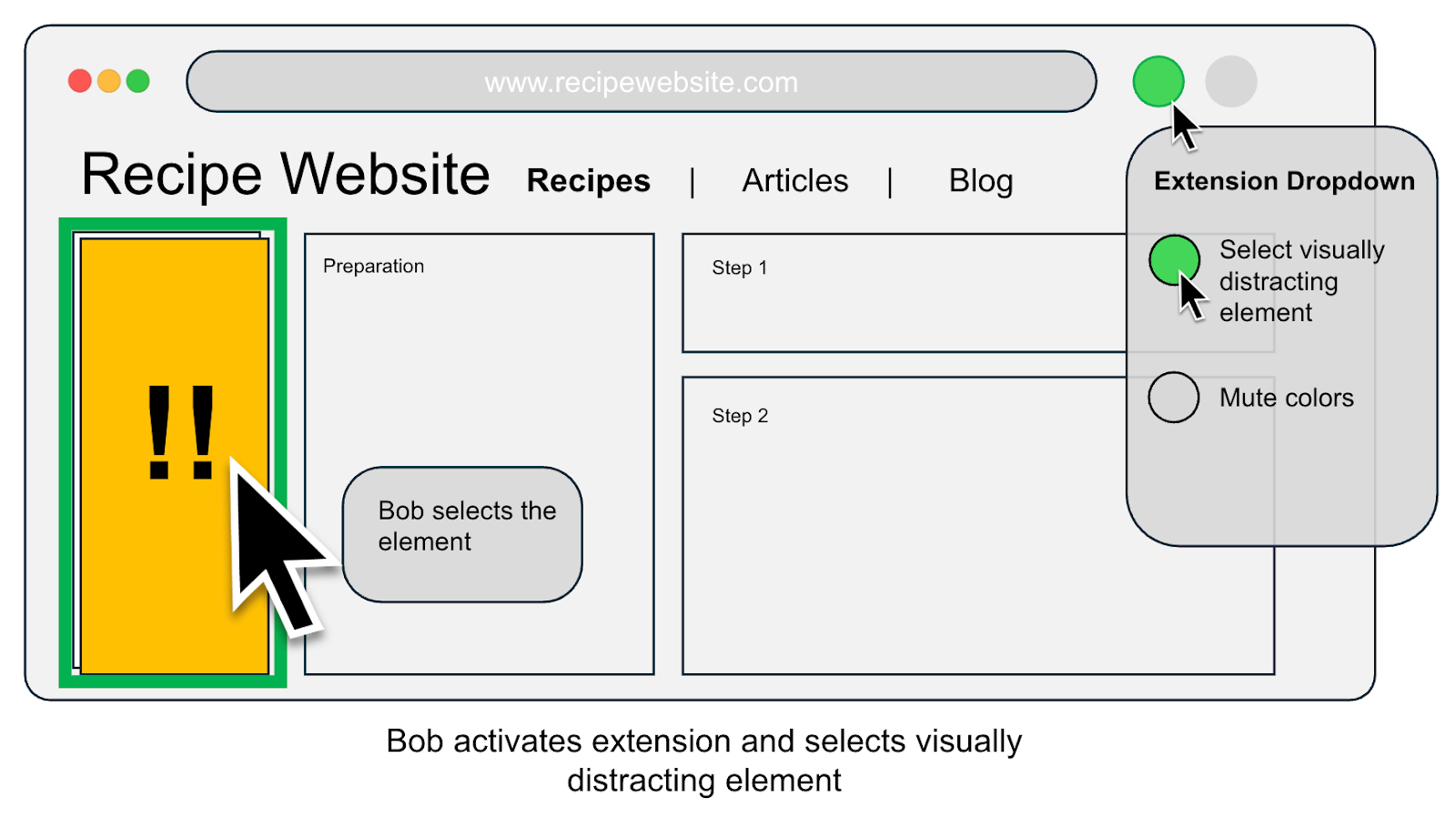
Brief explanation: Bob activates the extension and selects the specific element causing the distraction.
Frame 3
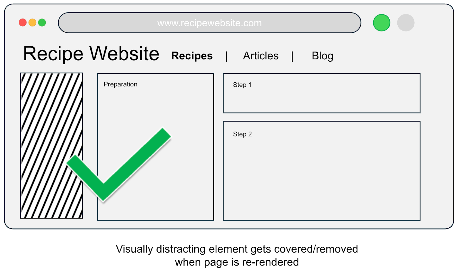
Brief explanation: The visually distracting element is covered or removed, allowing the page to re-render in a simplified, low-stim state.
Frame 4
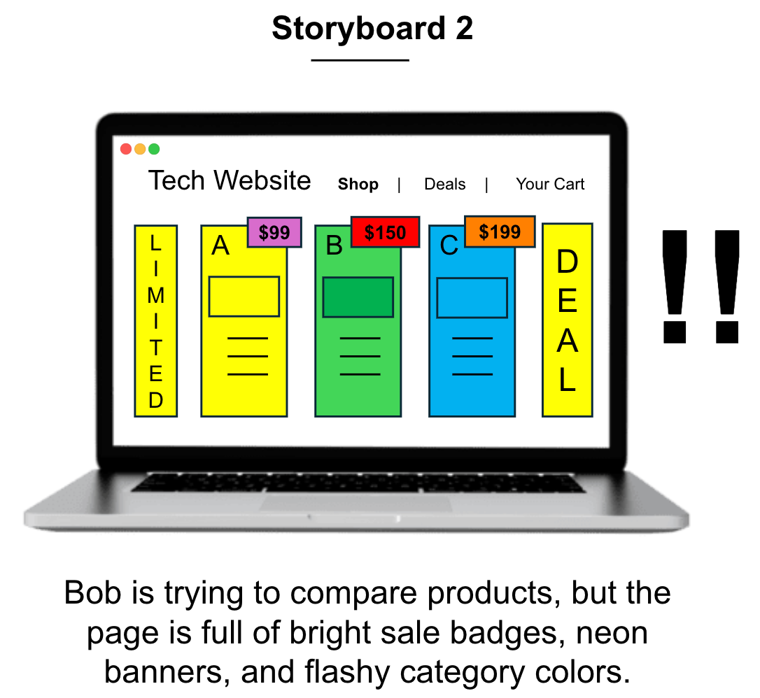
Brief explanation: Bob is trying to compare product specs, but the page is full of bright sale badges and neon banners that cause visual intensity.
Frame 5
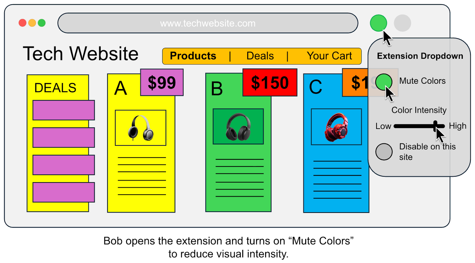
Brief explanation: Bob opens the extension and turns on the “Mute Colors” feature to lower the visual intensity of the site.
Frame 6
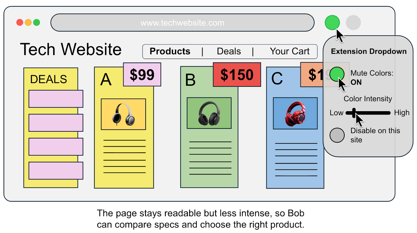
Brief explanation: The page remains fully functional and readable but becomes less intense, enabling Bob to focus on comparing specs.