Oasis
Simplfying your Journey through Therapy

Team


Problem and Design Overview
From balancing classes, student organizations, part-time jobs, career preparation, and social obligations, college students have a ton on their plate and very limited time to care for their personal well being.

With this never ending list of responsibilities, data compiled across 373 campuses nationwide, during the 2020-2021 school year, displayed that more than 60% of college students met the criteria for at least one mental health problem. Therefore, on top of all their other obligations, they would also need to navigate our country’s complex healthcare system and countless mental health resources to get the support they need. To address this serious need for mental health support among college students, we created Oasis. Oasis simplifies the process of finding and sticking with a therapist through personal recommendations, one-on-one chat abilities, and easy-to-use post-session reflection resources. All these features are available in one application, right at each student's fingertips.
Design Research Process and Key Insights
To better understand the challenges college students face when seeking mental health support, we conducted three 30-minute individual interviews in a private setting with people who had experience finding a therapist and starting therapy while in college. The participants were all people we knew personally, so we could count on their authenticity and openness. We chose interviews for their flexibility, allowing us to tailor questions and discussions to each participant's comfort level, social cues, and responses. This approach enabled participants to openly share their thoughts and feelings without the fear of deviating from a strict structure or flow.
Key Insights
Minimizing Emotional Toll and Discouragement
This insight was discovered through interviews we had with potential users and people who have been students recently or are students and have gone through the process of finding therapy. When speaking with all of our interviewees, it was very obvious that the whole process of finding a therapist was difficult and caused an emotional toll. They were all looking for an easier way to find one, and hence, it was critical for us to find a process to minimize the emotional toll and discouragement to finding future therapy that comes from the current process. For instance, one of our interviewees tried many different routes to finding therapy, such as a doctor, through UW, and through websites such as Psychology Today, and ended up giving up on finding one after many unsuccessful tries. They were extremely “overwhelmed, daunted, and frustrated” as she said. Hence, the insight we got from our interviews (especially this one) was that we need the process of finding a therapist to be simple in order to reduce the emotional toll and reduce discouragement on finding a therapist.
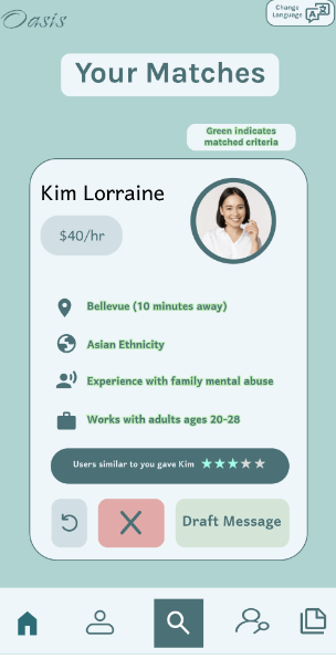
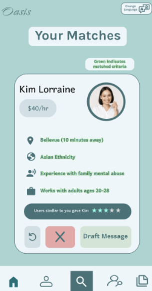
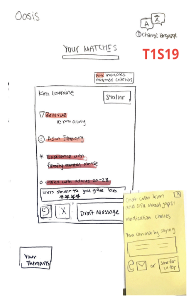
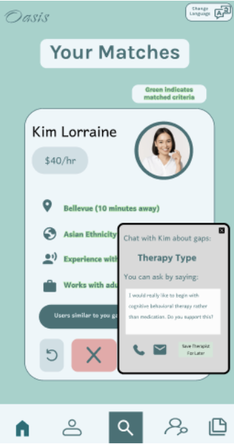
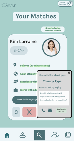
Overall, our entire design focuses on doing this, through multiple different routes, such as adding in simple preference filters, helping a user understand how the therapy session went, allowing a new therapy user to chat with a bot to understand information about therapy, and more. One big feature we added was the card swiping format, where a user can see a therapist at a time. This was important as viewing multiple therapists at the same time is overwhelming, and through this, we eased the process of going through each therapist. We even highlighted in green the parts of the therapist that match the needs of the user, to minimize the effort and frustration a user might have when understanding if the therapist is a good match.
Here is the card swiping format + the green highlighting:
Building a Bond
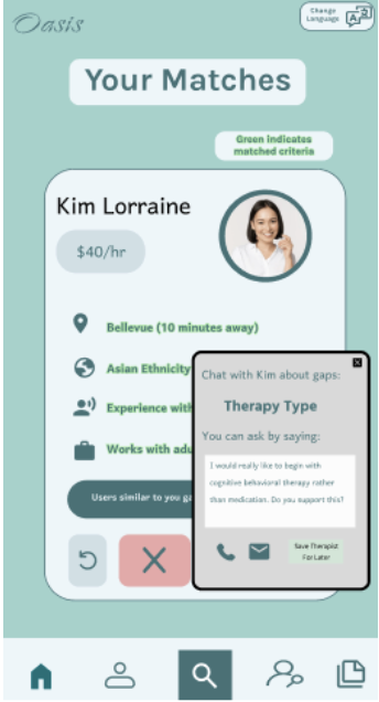
Another insight that we discovered was that it is really important to build a bond between the patient and a therapist prior to attending their first session, either through text or call. A bond does not need to mean a deep friendship (and does not mean this, in most scenarios), but rather, just a level of comfort and trust so that the first session can be productive. We discovered this mainly through one of our interviews, where the interviewee spoke a lot about how they found it absolutely necessary to speak with their therapist on call beforehand. By doing this, they were able to confirm that the necessities they needed in therapy were met (like the type of therapy and medication) along with the fact that they would be comfortable talking about themselves to this person. They said that when doing this, they “felt like [they] were talking to one of their best friends, and it brought out warmth and comfort” which heavily improved their therapy experience. To focus on this insight in our design, we built a feature where we provide pre-built message templates to send to the therapist that a person may want to consider (to reduce the anxiety of reaching out to a therapist), and provide easy contact information. Through this, we are encouraging the user to reach out to the therapist beforehand to build trust and confirm matching. As seen in the below image, we are providing the message templates when the user indicates that they like the therapist:
Simplifying Preference Matching
Another insight we discovered through our interviews was that most users really value that their certain preferences/characteristic needs were met in their therapist. For some, this is race or gender, while for others, it is logistical items such as the type of medication the therapist recommends. All 3 of our interviewees highlighted this, and in fact, one of them clearly stated that they would “only find a therapist who is Asian and younger so that they could relate to the issues” the user was having. Another stated that they went to someone who was White for a while and eventually switched to a South Asian one because of their culture, and immediately felt like they were having more progress and growth. Hence, we found that the preference matching was really important and we wanted to ensure that this process is made easier and quick. We did this by allowing the user to speak to a bot to understand the preferences they have. By doing this, the user does not have to rely on themselves to know the different facets and aspects of therapy, but instead, can chat with the bot to know more about what their preferences may look like and discover what they might want. Then, instead of needing the user to have to enter these preferences each time, we build them a profile that saves their needs, and brings therapists to them in a card swiping format, instead of making them search for the therapist. Within the card format, we found that it is important to have users visually see how this therapist matches with them, and hence, added in highlighting to showcase matched features.
Iterative Design Process and Key Insights
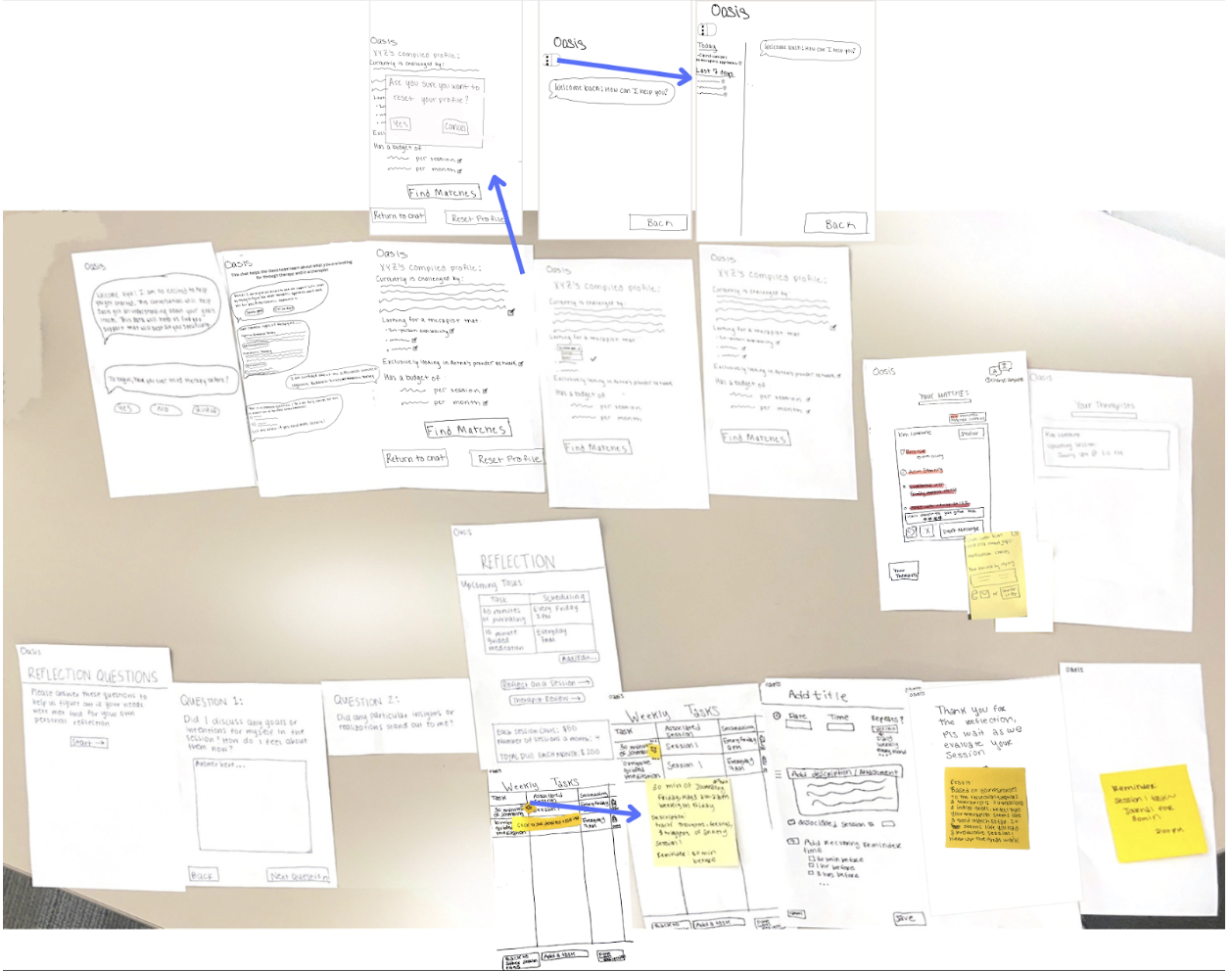
Our iterative design process centered on addressing two key tasks: enabling users to easily discover a therapist who matches their needs, and providing a platform for users to reflect on session productivity and assess compatibility with a specific therapist. To address these tasks, we employed an iterative approach. We began with paper prototyping, crafting a tangible interface for early exploration and refinement. Afterward, we iteratively conducted heuristic evaluations to increase the effectiveness of our design, and usability testing to enhance the functionality of our design and address any usability issues. With each round of testing and iterative adjustments, we made continuous improvements. After completing three iterations, we created a digital mockup.
Paper Prototype Overview:
Key Insights
Enhancing User Control and Freedom
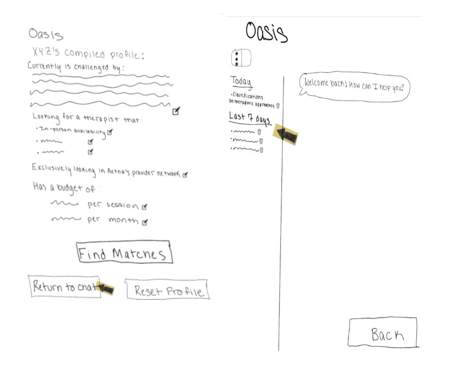
One of our most significant revisions centered around enhancing user control and freedom. In our original prototype, users could only chat with the bot once, which restricted the learning opportunities to the initial onboarding. This limitation was problematic as users might make mistakes or forget to ask important questions during their first chat. During usability testing, one participant asked if they could chat with the bot again because they had a question that came up after the profile creation process. Additionally, multiple participants expressed the desire to access old chats, as these conversations often contained valuable information about their personal experiences or insights shared by the bot about therapy. To address these concerns, we implemented the ability for users to revisit and continue conversations with the bot. This change not only allowed users to correct mistakes and ask follow-up questions but also enabled them to review past conversations for important information, enhancing the overall usability and user experience of the app.
Increasing Navigation
Adding a Menu Bar
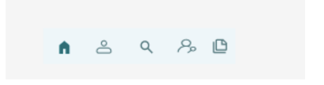
Initially, our paper prototype did not include a menu bar, making it difficult for users to navigate through different sections of the app. During the second usability test, participants struggled to figure out how to navigate the app and locate various components. This confusion highlighted the need for a more intuitive navigation system. To address this, we added a menu bar at the bottom of all screens. This menu bar provides easy access to all sections of the app, significantly improving user experience by allowing users to quickly and efficiently find what they need. You can now see this new menu bar at the bottom of each screen, ensuring consistent and straightforward navigation throughout the app.
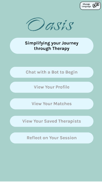
Introducing a Home Page
Initially, our paper prototype did not include a home page, which led to confusion regarding the app's overall structure and use. Without a central starting point, a participant in our third usability test was unsure how to access key features and information. To fix this, we added a home page that serves as a clear starting point and central hub for users. This home page helps users immediately access important features and information upon opening the app, providing a better understanding of the app's structure and increasing the navigability of the app.
Adding Color for Visual Cues
Our original design was in black and white, which made it difficult for users to quickly understand the interactive elements and their functions. During all usability tests, we noticed that it took users a while to figure out what the buttons did, leading to slower use times and confusion. To address this, we introduced color coding: red for negative actions (e.g., declining a therapist card) and green for positive actions (e.g., saving a therapist card, drafting a message, matching preferences). This visual differentiation provided clear cues that enhanced user understanding and interaction. Adding color was necessary to improve both the visual appeal and usability of the app, making it more intuitive and engaging for users.
Before:
 After:
Resulting Design
Task 1: Wants to easily find a therapist that would be a good fit
Our design addresses the need to easily find a therapist who is a good fit for the user. This is achieved through bot-compiled profiles and presenting therapists in a straightforward card format. Through our research, we found that the process of finding a therapist is often difficult and stressful. To alleviate some of this stress, we focused on presenting matching therapists to the user based on their unique profiles.
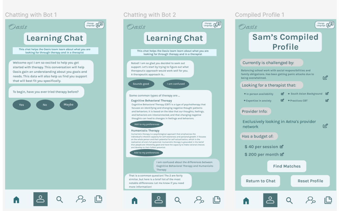
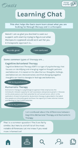
Learning Chat
A key element of our design is the “Learning Chat” with a bot. This interaction aims to curate a personalized profile for the user based on their responses. The bot asks questions to necessary gather information, ensuring that the user’s preference and needs are clearly understood. Additionally, users can ask about any therapy-related topics, allowing for clarification and deeper understanding.
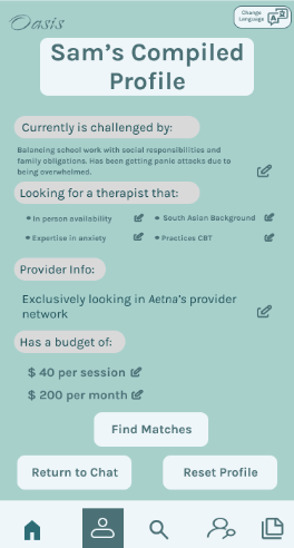
Profile
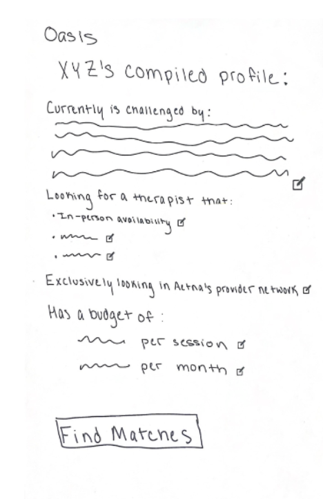
The second key element is the “Compiled Profile” created by the bot. This profile is made of the user’s needs and preferences, which can be reviewed and adjusted by the user to ensure accuracy.
Matching
The final key element of Task 1 is “Your Matches.” The therapists are displayed to the user in an easy-to-navigate card format. The therapists’ information that aligns with the user’s profile is highlighted, making it straightforward for the user to identify potential matches. If the user finds a therapist they would like to contact, they can click “Draft Message” to access a message template and the therapist’s contact information. This is designed to ease the initial contact process, reducing the stress associated with reaching out to a therapist for the first time.
Task 2: Needs a way to reflect on a session to see whether they want to stick with a certain therapist
Task 2 is focused on enhancing the user’s post-session experience by providing tools for reflection and task management. This process is designed to help users evaluate whether their sessions and therapist are meeting their needs. Given that therapy involves investment of time, money, and emotional effort, our goal is to maximize the benefits users get from their sessions.
Reflection Questions
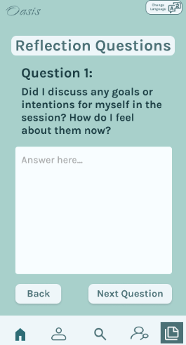
A central key of this task is the “Reflection Questions” feature. After each session, users are presented with a series of questions designed to help them assess whether their goals for the session were achieved. This guided reflection aims to provide clarity on the effectiveness of the session. Additionally, the bot analyzes the user’s responses, offering suggestions on the session’s productivity based on the user’s profile and answers.
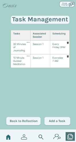
Task Management
The “Task Management” feature is another key element of our design. It allows users to easily add tasks assigned by their therapists and set up notification schedules for these tasks. By tracking and reminding users of their tasks, this feature helps users to apply the advice and exercises provided during the session. Effective task management can be beneficial for making the most out of therapy.