Wishbone
I've got a bone to pick with you
Team



Problem and Design Overview
Conflict is an inevitable element of interpersonal relationships, and unhealthy handling often produces harmful and unwanted behaviors. Many conflicts are brushed aside, and resolved only at a surface level, leading to recurring and worsening conflicts. Conflict is often something that requires time and sustained effort to settle, and without proper management and self-awareness meaningful resolution is hard to achieve.
Maintaining a healthy relationship in spite of these conflicts requires both parties being mindful of their own feelings as well as their counterpart’s feelings. Wishbone conducts meaningful resolution by providing a mobile application interface that facilitates a blend of personal and cooperative reflection through guided writing prompts, ultimately leading both parties to identify and agree upon action points that effectively address the needs of the other. A recorded history log allows individuals to remember and reflect upon their previous conflicts and action points, encouraging continued steps towards true resolution.
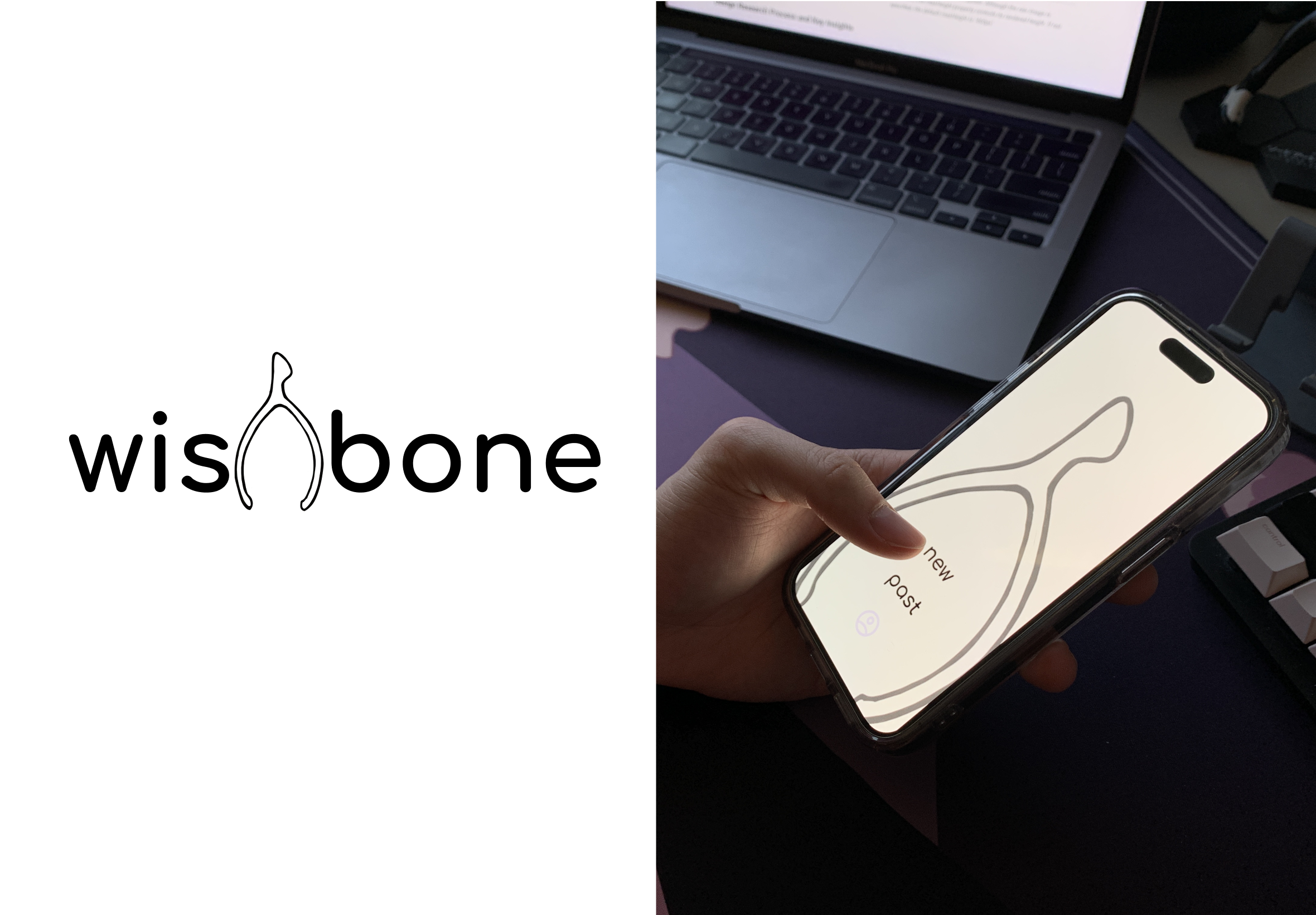
Logo (left) and Wishbone's home page (right)
Design Research Process and Key Insights
Understanding is the first key step in building a viable and focused design solution for any problem. To that effect, we had these goals in mind while conducting the relevant research: understanding the contexts in which conflicts arise and understanding the ways different people tackle conflict. From those goals, we also had some subgoals of identifying common patterns between our participants and gauging reception towards technology-assisted solutions.
We sought participants who could provide insight and allow us to achieve the above goals. So, we conducted interviews with four participants across different age groups, profession, and relationship statuses: a couples counselor, a Doctorate student, and two undergraduate students. We chose interviews in order to collect qualitative data in a space where the interviewee can feel empowered to share as much or as little as they like and can talk about their conflict experiences in a setting temporally and spatially removed.
Communication and Acknowledgement of Feelings is Vital
Communication surfaced as a common theme among our three non-professional participants; they all discussed that some form of communication is vital to how they approach and deal with conflict. Our Doctorate-pursuing participant remarked that they would communicate to their partner when they are in a heated situation, “I really need some space. Can you give me some space for a bit?” Another one of our participants said that regardless of how much the truth of the conflict hurts, they would always go for a face-to-face meeting to talk things out. Our last non-professional participant talked about how any communication is better than no communication. Following from this, communication became a key aspect of our solution, which our initial storyboard demonstrates.
Self Awareness is the First Step to Healthy Conflict Management
Our professional interviewee, Mark (a pseudonym), remarked how root emotions that are the source of the conflict are often not shared, understood, or acknowledged by either party; we could clearly see how in the conflict experiences of our other participants self awareness comes into play, asking questions like “Why did I even get mad in the first place?” or realizing that their own pride is what drove the conflict. Realizing these underlying emotions paves the way for more options and possibilities in relationships, as well as inviting the other party into your life in mutually satisfying ways, says Mark. To reflect this idea, our design ideas from the beginning were focused on self-identifying emotions and exploring why one felt that way. Here is one of our first designs that focused heavily on self awareness:

Communication and self awareness in our chosen design's storyboard

Written reflection in sketch for one of our initial design ideas
Time for Processing is Needed
Our third key insight to managing conflict healthily was that time helps…a lot. Again, this was a sentiment shared by all our participants in which taking time away from the other party and physically distancing helped as it gave time for people to think and process if needed (instead of rushing into things). The digital mockup of our final design has a section where we incorporated that same sense of space and time in a manner that fit the solution we came up with; this took the form of a “breather” screen between one’s own reflection and reading the other party’s reflection.
Iterative Design Process and Key Insights
We constructed our design to support the completion of these two tasks: 1. Articulating Feelings and Receiving Validation 2. Remembering Action Points and Takeaways. With these tasks in mind, our first step was creating a paper prototype which provided the foundation and framework for the functionality of our design. This paper prototype was then deployed through a series of tests that included 2 heuristic evaluations, and 3 usability tests. These tests helped us identify a series of issues that led us to iteratively revising our paper prototype into a final version that we were confident meaningfully and functionally supported our tasks. We finally transitioned the framework of our final paper prototype into a digital mockup where we incorporated design elements to complement the prototype’s functionality.
Incorporating Consistency Between Interactive Components
Our initial paper prototype was created with the primary focus being to support the two tasks that we had outlined. In order to navigate around our interface, we created icons for buttons that did not always follow the same structure or aesthetic. Thus, during our first heuristic evaluation our inspector noted confusion regarding the functionality of certain buttons icons. The lack of consistency from screen to screen of the appearance of buttons that should have the same functionality caused unnecessary work for our inspectors to guess what each button will do. This led us to be mindful in all future iterations of our prototypes and design to maintain internal consistency among all of our interactive icons. One key example of this change is documented below with the simplification and standardization of our “next” button that takes the individual to the next screen in the task.

Before consistency change to "next" button

After consistency change to "next" button
Ensuring Intuitive Core Functionality
While providing functionality for completing our tasks was at the forefront of our goals with creating our initial paper prototype, there were many key components missing that disallowed for an individual to smoothly complete our tasks. These issues were by far our most severe and important aspects that we aimed to revise. They were brought to light through our usability tests, where there would be incidents in which our participants found themselves stuck on a screen in our prototype where they were unable to proceed. This indicated to us to ensure each portion of our design has a clear way of advancing and escaping the current screen. For all future iterations of our design, we incorporated this functionality, with a key example of this revision shown to the right.

Before functionality change to navigation

After functionality change to navigation
Removing Assumptions
When designing our initial paper prototype, one critical mistake that we made was making improper assumptions about the individuals who would be using our design. We primarily designed from the perspective of our own knowledge and capabilities, but failed to recognize the potential variability in that of our participants. During our usability testing, we encountered incidents where our participants were either surprised or confused about certain aspects of our design that we did not originally identify ourselves because we incorrectly assumed that participants would have the same understanding of how our interface works as we do. This led us to make revisions while being mindful to not make assumptions about those who will use the design. An example of this is displayed in which we assume that an individual would know that the “personal reflection” responses are something that will be shared, when in reality there is no indication for someone using the design for the first time, and this was pointed out to us by our participant in the usability test. An assumption that we made that revolved around accessibility and inclusivity was one in which we assumed audio calling capabilities of those using our design, and we also made revisions to have more inclusive wording and options.

Before assumption change

After assumption change
Resulting Design
Our resulting design from a quarter of iterating revolves around key features including individual processing of thoughts and emotions through personal reflection, acknowledgement of both party’s feelings through shared responses and co-edited situation writing, and intentional retention and execution of resolution through saved action points. These elements are encompassed within the completion of two tasks: (1) articulating feelings and receiving validation (2) remembering action points and takeaways.
Articulating Feelings and Receiving Validation
To articulate one’s feelings, an individual can create a new wishbone from the homescreen, choose their contact of interest, and begin recording their emotions then their thoughts and feelings.
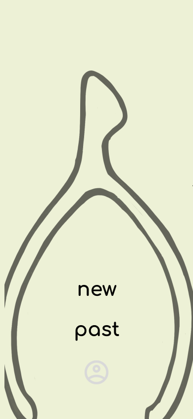

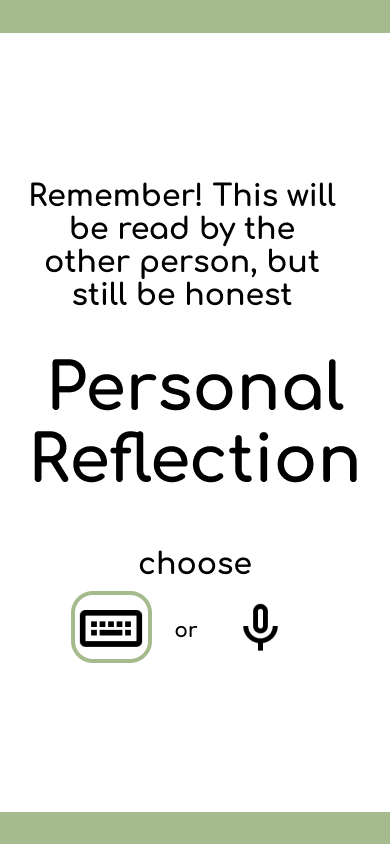

Creating wishbone, inviting, and inputting personal components
Once both parties have completed the personal reflection process, they can exchange their entries, optionally utilize another form of communication, then begin working on co-editing a collaborative version of the situation at hand. Once the situation has been agreed upon, individuals are prompted to write their own action points on what they can do to help resolve the conflict.


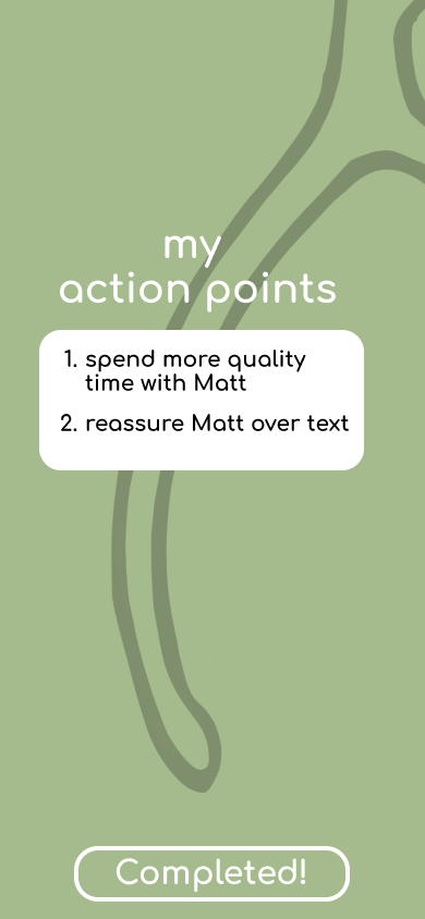
Collaborative process of receiving other’s reflection and writing together
Remembering Action Points & Takeaways
To go back and remember one’s action points or revisit the previous situations and reflections, an individual can view “past” from the homepage and view a log of their previously created wishbones.

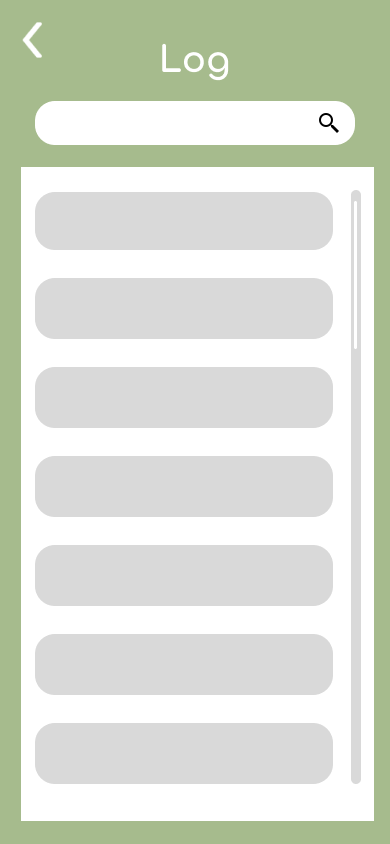
Navigating to history log
Once selected, the individual can view the situation and both people’s reflections and action points.


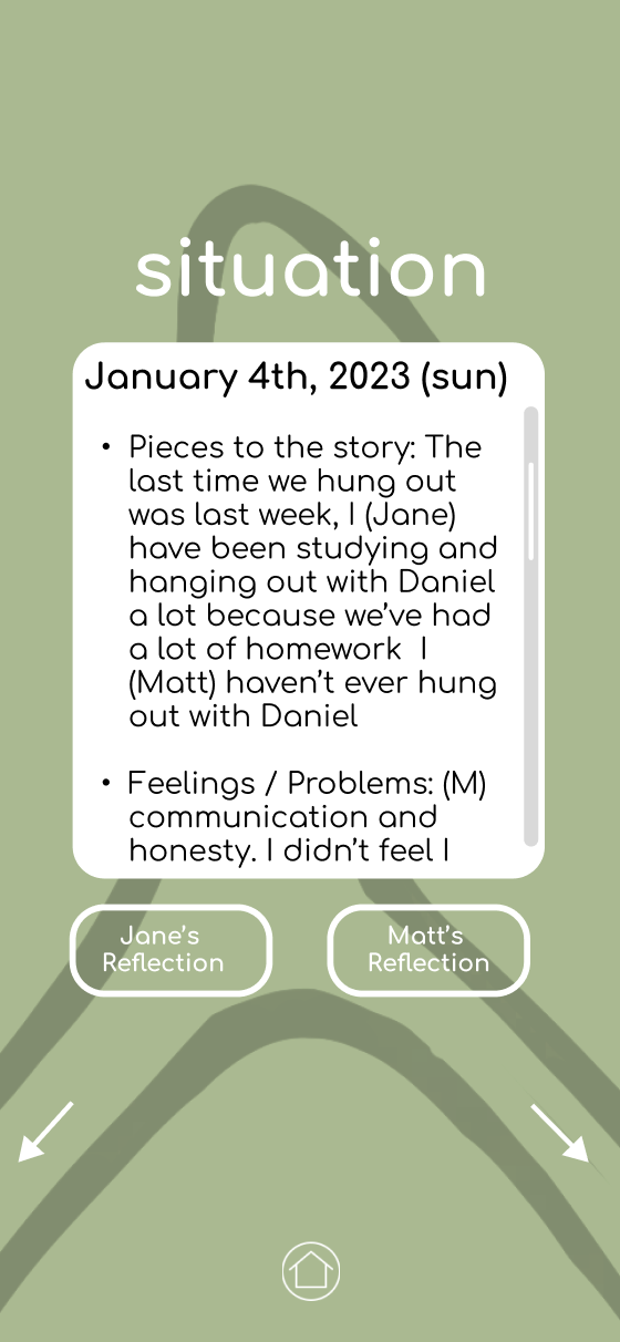
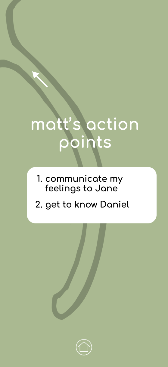
Navigating a previous Wishbone's situation & action points