Tracne
Promoting healthy skincare habits
Team




Problem and Design Overview
According to Yale Medicine, 85% of people face acne through adolescence (ages 12 to 24) and into adulthood. Acne has both physical and emotional effects: it causes pain and infections while making people insecure about their appearance. Everyone’s skin reacts differently to treatments, so treating acne can be challenging. Even if a strict treatment routine is followed, it may require an extended time frame to see results, which can discourage people.
Our design is a smart mirror with a corresponding mobile app, which will help people build consistency with their acne treatment routine and understand what might be causing changes in their acne. The mirror provides a well-lit space for the person to complete their skincare routine, and it has a built-in camera to take progress photos of their face. A built-in screen on the mirror has the same functionalities as the mobile app. These features include a place for the person to record their routine components and consistency, log aspects of their lifestyle that may affect acne, view their gallery of progress photos, and receive reminders to complete their routine.

Prototype of the smart mirror, the primary component in our design.

Prototype of the home page on the mobile app.
Design Research Process and Key Insights
While we have all experienced acne before, we did not know everything we needed to know about the topic. From the perspective of someone struggling with acne, we wanted to learn what people’s routines looked like, what may impact their motivation to stick to a routine, how they determine what treatments to use, and how acne affects them (physically or mentally). From a dermatologist's perspective, we aimed to understand the patient’s skin better, precisely through how one’s skin is evaluated, how treatments are developed, what misconceptions exist about treating acne, other factors that impact acne, and what kinds of technology would be feasible to assist with the acne treatment process.
We conducted interviews with three dermatologists at the UW Clinic and four separate UW students treating acne (two have seen a dermatologist before, and two have not). We initially tried incorporating a diary study into our process. However, we quickly realized that the project timeline constrained the useful information we could receive from a diary study of 3-4 days, especially since acne is frequently more of a long-term journey.
In order to create a design that was well-informed about different acne experiences and contained useful tracking information, we wanted to understand the topic both from the perspective of those who have acne, and from professionals who help them treat their acne. This is why we conducted two types of interviews, one with each group of interest. After trying other methods like the diary study, we realized that interviews were the best way to obtain a large amount of information in a short amount of time.

Initial sketch of our design.

Storyboard showing how a person might use our design.
Motivation Through Visual Results
People are motivated to stay consistent with their acne treatment routine because of the visual results. The familiar saying “out of sight, out of mind” also applies when we take its opposite: people are more likely to have something on their mind when something is in sight. Visible results during participants’ acne journey keep it at the forefront of their minds. When we interviewed people currently undergoing acne treatment, most of the interviewees noted how they are encouraged to continue with their routine when they start visually seeing results. Additionally, when we were interviewing dermatologists, one obstacle to acne treatment that they all mentioned was how dermatologists can prescribe medications and topical creams, but it will not do anything if the patients do not consistently follow the treatment.
One Size Does Not Fit All
There is not a single set of triggers or “one size fits all” to everyone’s acne. By hearing people’s stories through our design research, we learned that there’s not a single set of factors that affect acne. For example, one person said that the climate they’re in has a significant impact on their acne, while another person explained how stress and lifestyle factors (e.g. washing their pillowcase) is the main thing that triggers their acne. Additionally, people have different skin tendencies and other skin conditions, so there is not a single set of treatments for a particular kind of acne that will work for everyone.
Misinformation On Social Media
Social media and online forums are commonly-used platforms to learn about acne treatment but can spread misinformation. Another common theme that emerged through our design research was the impact social media can have on how people choose to treat their acne. Many of the people we interviewed mentioned how information they consumed on social media (e.g. TikTok) impacted their skincare habits and changed the products they use. At the same time, some of the people and dermatologists we spoke with mentioned how much misinformation has spread about skincare and products on social media, such as the notion that products need to be harsh to be effective. They emphasized the importance of looking at the product’s active ingredients instead of the branding. One of our initial designs aimed to tackle this by having an online browser extension that detected potential misinformation or factors to be cautious about when browsing skincare and makeup products. Ultimately, after critique and discussion, we realized that it would be difficult to ensure that our design would also not be an additional source of misinformation.
Iterative Design Process and Key Insights
Narrowing down our different design ideas, we found that a more individual-focused design would be better for helping people with their acne journey. From this, we decided to hone in on two tasks for our iterative design: (1) stay consistent with your acne treatment routine, and (2) determine what specific factors may be causing changes in your skin, and track the progress over time.
After developing the initial paper prototype, we ran an inspection-based heuristic test where we laid out all the frames of the prototype and asked peers in class to identify violations of Nielsen's 10 heuristics. We improved on the initial paper prototype to address immediate concerns, such as lack of navigation between app screens. Then, we ran three usability tests, where we improved the prototype between tests. For the usability test, we laid out all frames of the paper prototype and made sure the participant could visibly see all images. We then asked the participant to perform the two tasks and kept the instructions general. However, this approach led us to determine that laying out all the app frames side by side did not work since it was overwhelming for the participant to see all the screens. For future usability tests, we stacked related frames on top of each other so the participant could focus on one app screen at a time and then the “human computer” would switch to the next screen once “clicked on.” After making finishing touches to the paper prototype, we crafted our digital mockup in Figma, with different pages for the mobile app, mirror screen displays, and the mirror itself.

Overview of paper prototype with the different frames laid out.
Improving Navigation
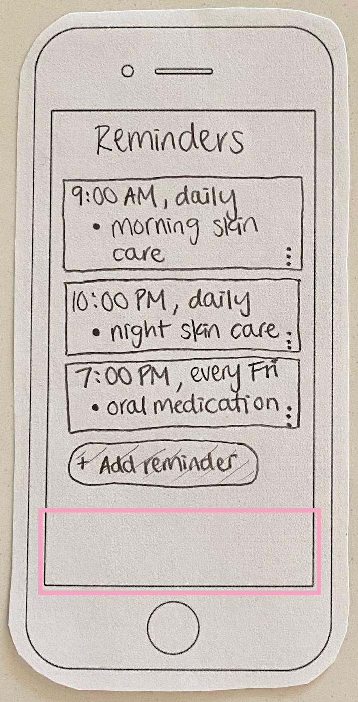
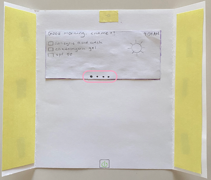
In the inspection-based heuristic test, the participant noted that the mobile app and mirror screen did not have clear ways to navigate between different displays. To address this significant problem, we created tabs for the main categories of displays and put a constant navigation bar at the bottom of the app. We added dot navigation indicators at the bottom of the mirror screen to indicate that the person can swipe left and right to switch between displays.
Before

After
Beyond simple navigation, one participant noted that it was a lot to monitor the Routine Tracker and Lifestyle Log on different tabs, and it would be helpful to view them side-by-side. This was a great point, since acne is the result of a combination of factors, including someone’s routine consistency and lifestyle habits/occurrences. Because of this, we decided to combine the Routine Tracker and Lifestyle Log into one tab, generalized to Tracker. This would allow the person to view potentially correlated information in one place.

Before
After
Taking Progress Photos
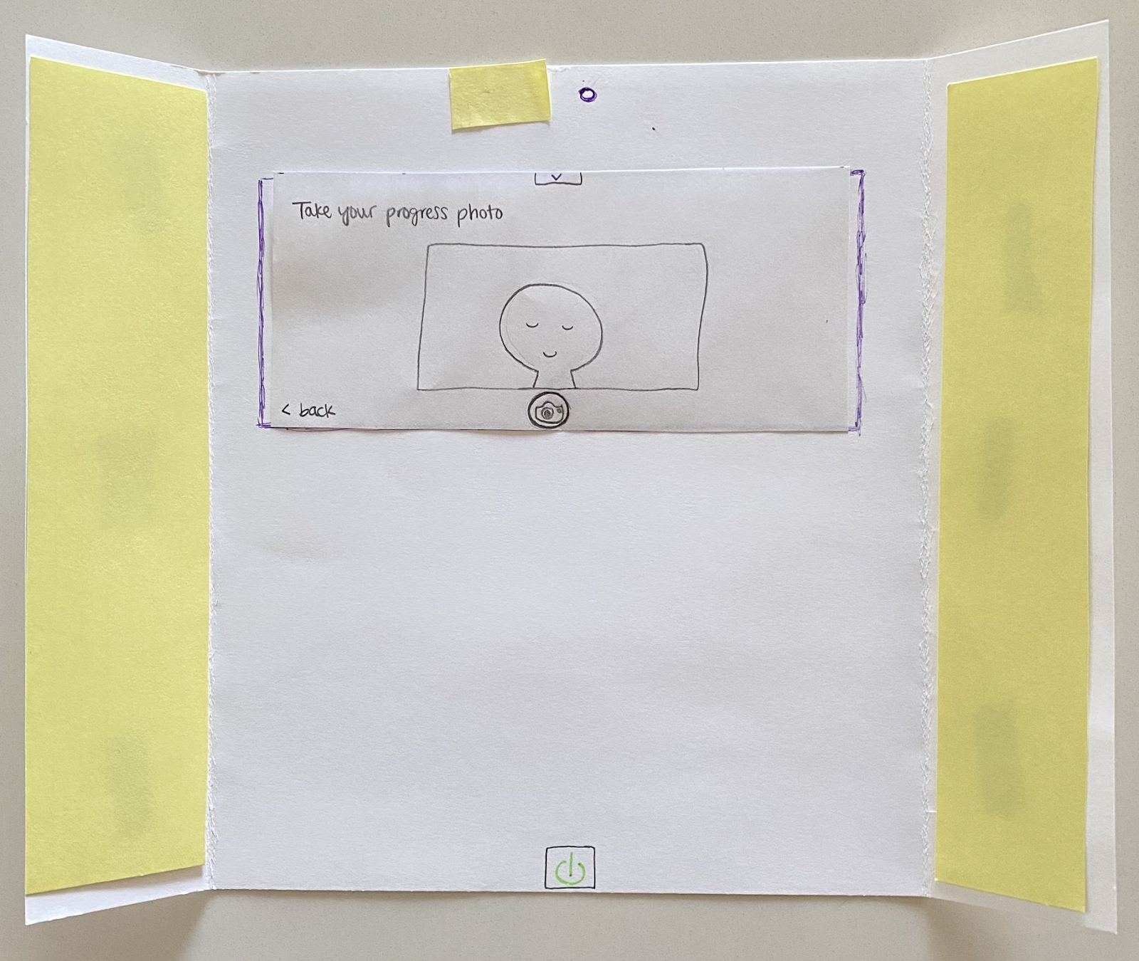
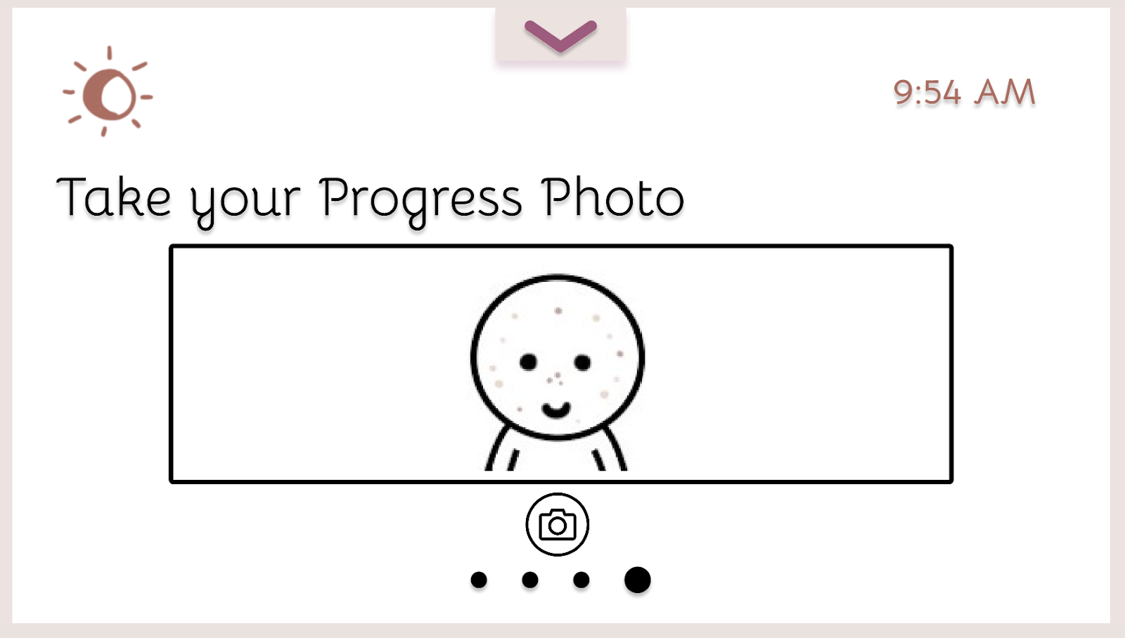
In the usability tests, when the participant was asked to take a progress photo on the mirror, they were unsure how to take the photo and if the photo was even taken. Our original idea was that the photo would be automatically taken once the person positioned themselves correctly, but this may present itself as a hidden affordance. As a result, we added a progress photo button on the mirror screen to capture the photo and also added a screen to confirm that the photo was successfully saved.

Before
After
Reducing Confusion and Discouragement
On the homepage of the mobile app, we initially had a graph on acne frequency and metrics about both acne and routine consistency. During the usability tests, we found that multiple participants were unsure about what the graph was about and why it mattered. People were also confused about what the metrics meant, such as acne going down by 80%. Since it’s difficult to quantify increases or decreases in acne and we also do not want to discourage people when their acne gets worse due to factors that they cannot control, we took out the miscellaneous metrics and switched the graph to be about routine consistency (with clearer labels).
We also initially had a streak for how many days people had fully completed their routine, and it would be reset whenever people stopped their routine for a day. Taking feedback from class staff and participants, we realized that this streak could actually discourage people from building habit consistency. So, we switched the streak to a count that keeps track of how many total days a person has completed their routine to encourage them to keep going. The maximum streak count only goes up, so people are encouraged to use the app.

Before

After
Resulting Design
Home Screen and Settings
Our final design consists of two main components. The smart mirror takes progress photos and allows someone to easily complete and view their routine. The corresponding mobile app is mainly for logging factors and routine completion, and finding connections between changes in one’s skin.
The remote button on the settings page and the home page allows people to control things on the smart mirror (e.g., power on/ off, taking a photo) from the app. This is intended to make our design more accessible to people who may not be able to reach/press the physical buttons.


Home screen and settings pages on the mobile app.
Mirror Menu
This is the drop-down menu on the screen on the mirror. From left to right, the logos represent: pairing to a mobile device via bluetooth, connecting the mirror to wifi, decreasing the brightness of the mirror (on a scale of 1-10), increasing the brightness of the mirror, and a help option for further information.
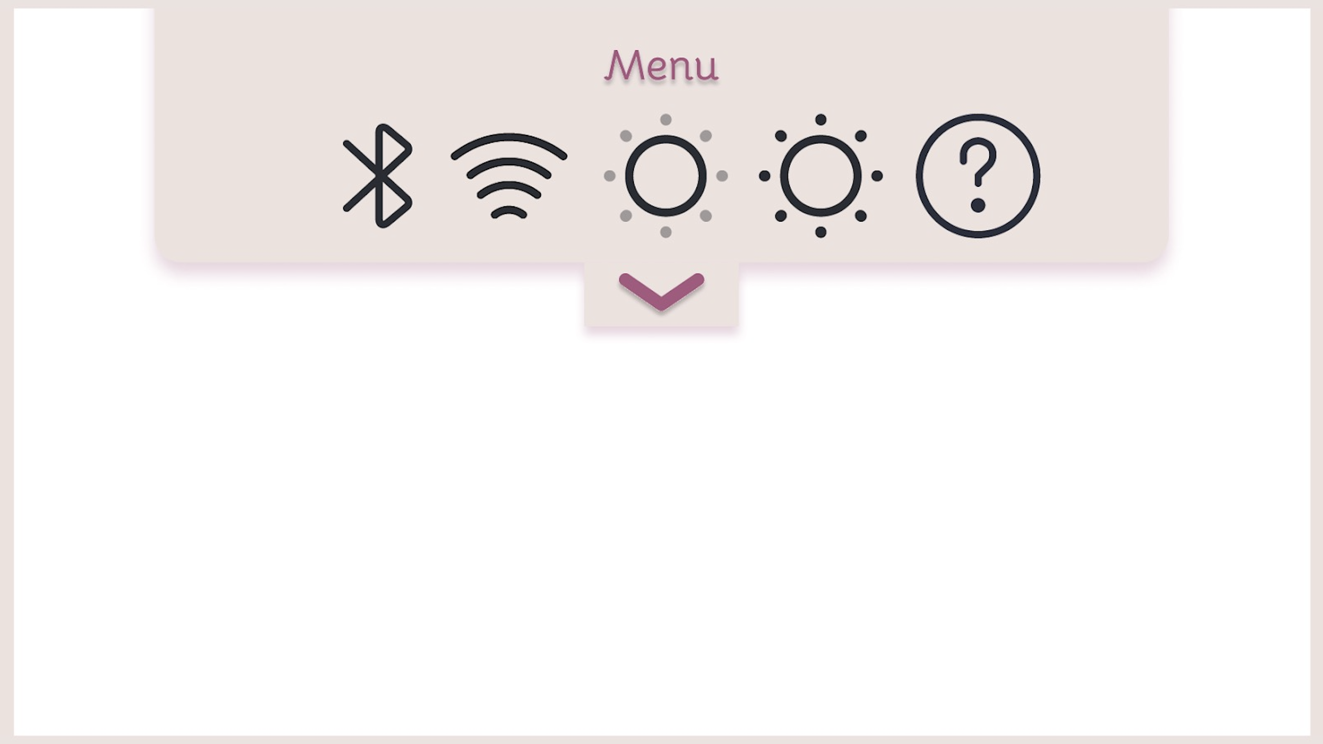
Menu on the smart mirror.
Task 1: Stay consistent with your acne treatment routine.
People can add custom reminders that will nudge them at specified times to complete their routine. This will help them stay on top of their treatments in case they forget. These notifications can be seen on both people’s phones and the smart mirror display.
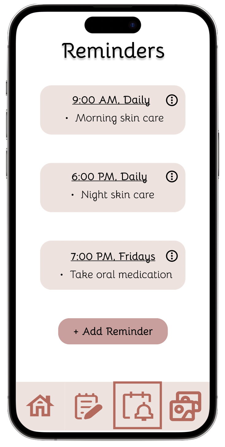

Screens on the mobile app for addings and modifying reminders.
To help with staying consistent with one's routine, people can track the completion of their skincare routine(s) on the tracker page of the mobile app, where the routine for the current day can be viewed and marked as complete, and additional routines can be added/modified. Routine completion from previous days of the month can also be viewed.


Frames showing the routine part of the tracker page on the mobile app.
The reminders to complete the skincare routine(s), and steps for the upcoming routine is also shown on the mirror screen.
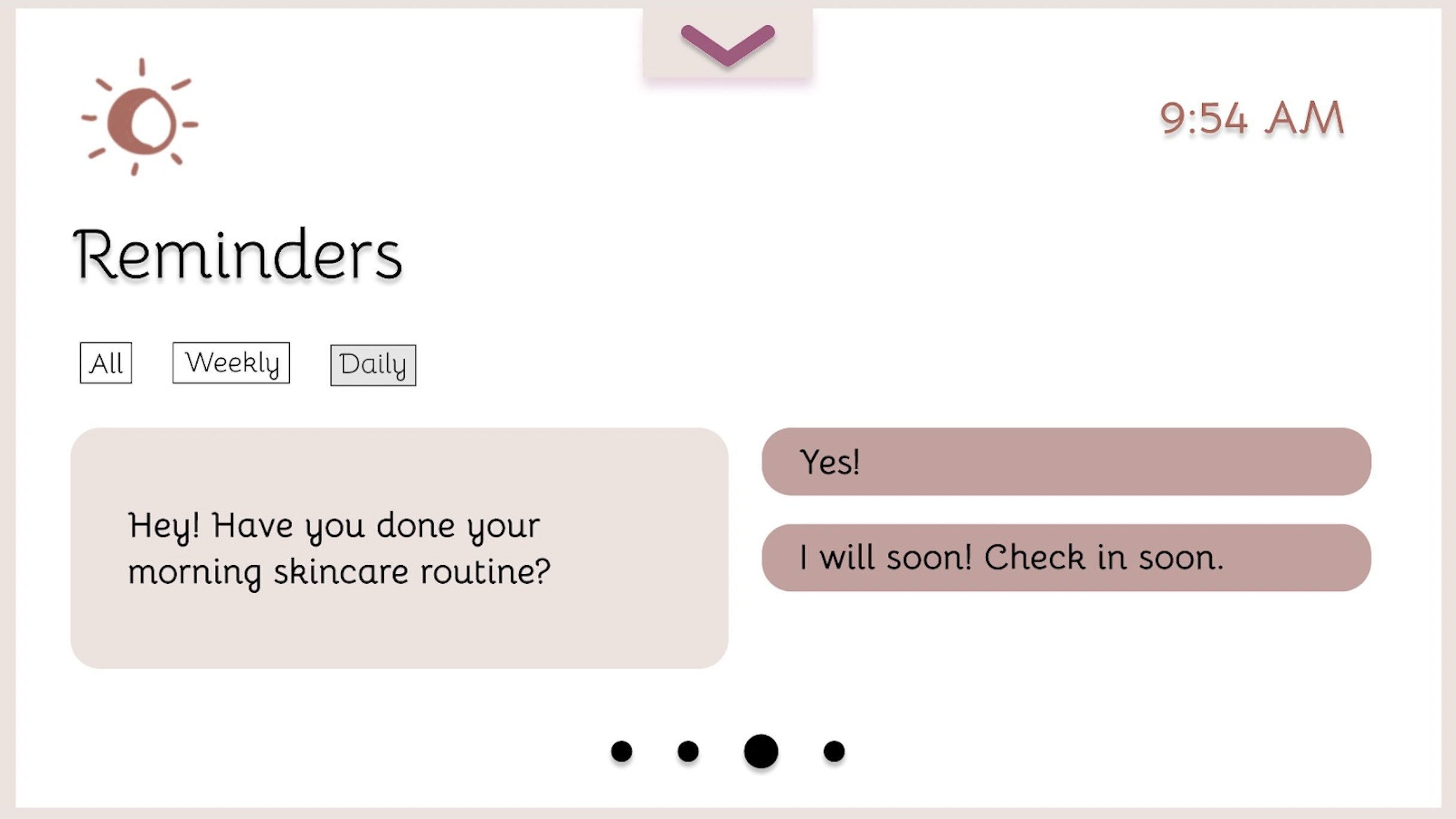

Frames showing the reminders on the screen on the mirror.
Task 2: Determine what specific factors may be causing changes in your skin, and track the progress over time.
In order to determine factors affecting one's skin, people can log lifestyle factors of their choice in the tracker page, and monitor them by either answering the same question(s) about it at a set frequency, or they can add their own notes about it.

Frames on the mobile app for the lifestyle log.
The gallery of progress photos can be viewed on the mobile app. Preferences for how often to remind to take progress photos can also be changed. The corresponding trackers for the past week can also be viewed in the photos to more easily correlate routine completion and lifestyle factors with changes to one's skin.


Frames showing the gallery page on the mobile app.
We added a toggle for viewing the photos in the gallery with and without the toggle, and added a help button in case people are confused about what the model means. One can also hover over acne on their skin and see information about what that might mean.
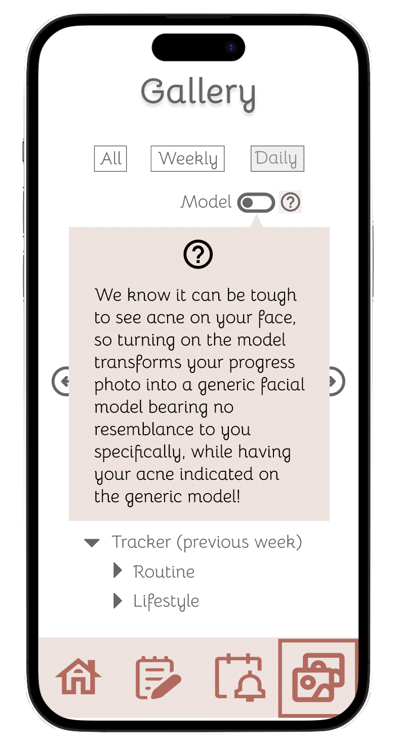

Frames showing the toggle for viewing gallery photos with and without the model.
The mirror screen can display the person’s gallery of past acne. People can also toggle between actual photos of their face and the generic facial model with acne indicated on it.
When the person is taking the photo on the mirror, they can click the camera button to take a photo. This screen can be accessed through either a notification or from the menu at the top of the screen.

Frames showing the gallery on the mirror screen.