The Kiddie Table
Meal times just got that much more exciting for your little ones!
Team



Problem and Design Overview
The ages of 2-7 are a crucial stage of development for children. During this age range, a child needs to receive a balanced diet as what they consume will ultimately affect their health and growth. Additionally, it is also during the ages of 2-7 where a child’s diet requirement undergoes many changes, so it is important for caretakers to adapt to these changes. As such, caretakers should be able to effectively track their child’s diet. However, there are not many effective solutions offered currently and the solutions that offer diet tracking are not targeted towards children. While some meal trackers for adults can be modified for children, they do not have features that specifically help the child interact with the design.
Our solution is The Kiddie Table which is a smart table that simplifies meal tracking and planning for caretakers. By providing insightful analytics about a child’s nutritional information over time and utilizing an organized calendar system, caretakers can track and plan a child’s meal with very little hassle. Kids can interact with the table too through the use of avatars, customizations, and a rewards system. While interacting with the table, kids grow to develop healthy relationships with food in a fun yet educational way.
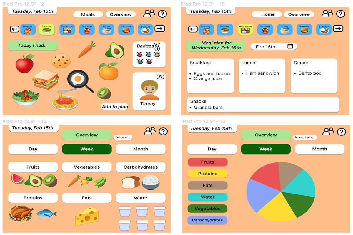
The Kiddie Table application overview.
Design Research Process and Key Insights
For our design research, it was imperative to get the perspective of those we have more experience with children since our group is not well-versed in this area. Since the target audience of this project are caretakers, we sought to hear from those who are currently raising children aged 2-7. To ensure that the information we acquired was varied since there are so many different kinds of caretakers, we looked to interview caretakers of different numbers of children and also caretakers of different experience levels (first-time parents, experienced parents, etc.). Caretakers of multiple children often have to deal with different issues than those of caretakers who only have a single child, so it was important to acquire both of these perspectives since our design will be used by both. Additionally, first-time caretakers often have a different approach to meal planning/tracking than those of experienced caretakers because they are relatively new to that, so it was also important for us to learn about these differences to incorporate these process changes into the design. To gain an informed medical perspective on children, we also sought to hear from medical professionals. This is so we could understand the dietary habits of children aged 2-7 and the effect it has on their growth. After considering multiple design research methods such as a diary card or a contextual inquiry, we decided on using an interview. This is because given the time constraints and the specific information we sought to obtain, interviews would be the easiest to conduct and most convenient as they can be conducted virtually. For the caretaker interviews, we interviewed a first time father of a 18-month-old, a first time mother of a 9-month-old and the mother of 4 children aged 0-6 years. For the healthcare professionals interviews, we interviewed a current pediatrician and a former gynecologist.
Most caretakers track their children's diets mentally and don’t have a well-formed system
During our research study, we learned that caretakers tend to not formally track their children's diet. Instead of utilizing an explicit system, all the caretakers which includes first time parents and parents of multiple children tend to use mental tracking as their primary method. However, there are multiple problems presented by mental tracking. The first of these issues is that mental tracking does not allow for the analysis or summarizing of a kid’s dietary habits since it is solely based on remembering short-term information. One of our participants noted, “We try to remember everything that our kid has consumed but it’s often tough to summarize the week.” Mental tracking is not a reliable method because it relies on the caretaker accurately remembering what they fed the children and many times this can be forgotten or not remembered properly. Another salient issue presented by mental tracking is that it does not encourage collaboration between caretakers. One of our participants who is in a family where both caretakers work noted that there have been times where they accidentally fed the children the same meal twice or missed an important meal item due to miscommunication. Mental tracking can become even more particularly challenging when a caretaker cares for multiple children because we learned from our interview with the mother of 4 that every child eats different amounts of food and they sometimes even trade their food among themselves.
Children are really good at intuitive eating
Given that children often express their opinions on food clearly and will eat intuitively based on those opinions, we furthermore learned that caretakers will encourage their children to explore different food options instead of restricting them to a single food. This way the child can intuitively decide what they like from a wide array of options. In one interview with an experienced caretaker of multiple children, we learned that she often provides a variety of meals to the children which offer pairings of different food groups. In another interview with a first-time caretaker, we learned that he will offer many alternatives for a single food item in case the child does not enjoy the first option presented. From hearing this and learning about how giving a child a “varied, colorful diet” versus a “bland diet” is always the best thing to do from the pediatrician, we learned that children develop intuitive eating habits by choosing what they like from the options that the caretaker provides.

Storyboarding showing children's intuitive eating
From our interview with a pediatrician, we learned that at the ages of 2-7 children will make it very obvious when they dislike a food or like a food. This point is further reinforced by our interviews with caretakers. In our interview with a first-time caretaker, we learned that when the child enjoys the food she leans towards it as it is being prepared and when she doesn’t enjoy the food she makes a face, cries, and doesn’t eat it. In another interview with a first-time caretaker, we learned that a child will flat out refuse to eat a food if they dislike it and will be very excited to eat a food they enjoy. Thus, from the interviews and information gathered above, we learned that children start to form their own opinions on food at a young age and also begin to intuitively express those opinions.
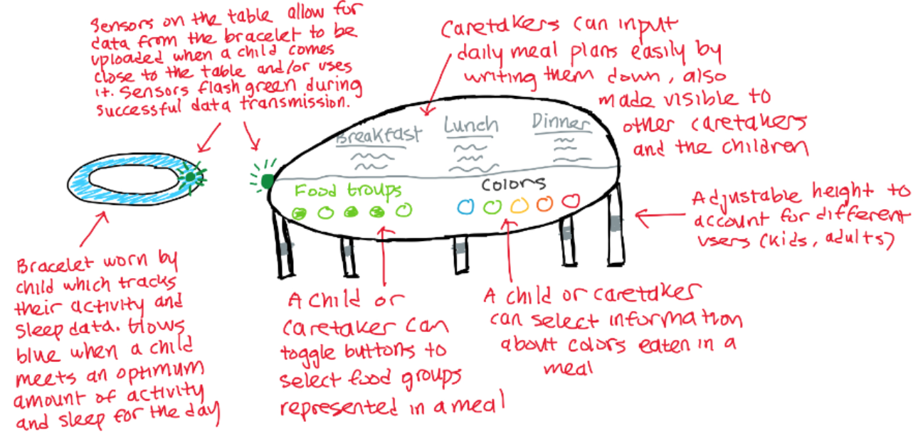
The Kiddie Table sketch.
Reliance on friends and doctors
All of the first time caretakers we interviewed did not have much experience with children prior to their first child. Due to this, all of the first time caretakers mentioned that they frequently relied on the advice of family, friends and doctors in many aspects of their child's life including feeding. Unlike first time caretakers, caretakers of multiple children and experienced caretakers tend to have more personal experiences so they are less likely to need frequent advice from family, friends and doctors. Nonetheless, from the interviews we conducted with experienced caretakers, we learned that they will still reach out to their personal circle and doctors to gain advice and wisdom on areas they feel they are lacking information on. Overall this suggests that for all caretakers and not just first time caretakers, there is a social aspect to feeding children which they significantly rely on.
Iterative Design Process and Key Insights
After our research, we determined the two tasks that we wanted to center our design on were tracking meals of a child and developing healthy eating.
We developed our initial paper prototype, and conducted two usability tests to better help us understand the strengths and weaknesses of our design. From those usability tests, we learned that our design was not very appealing to children, and the language being used was confusing for our participants (e.g. the use of the words “add to log” vs “add to plan”).
For our final design, we incorporated feedback received from our usability tests and made changes to our design accordingly. We changed the design of buttons across the design and changed the language to something more clear and intuitive for our participants. In addition to that, we introduced a gamified design that would allow children to help their parents track meals in a fun and interactive way by feeding customizable avatar and gaining points.
It was because of these changes that our original tasks were intertwined. The tracking of the meals with our design would as a result fulfill the developing healthy eating task. We finally defined the following tasks for our project:
Tracking the meals of a child: We chose this task because we wanted to see how intuitive our design was. We needed to make sure that the user is able to navigate our screens in order to accomplish this major task. This task was important because we wanted to make sure that our key functionality of being able to track what a child was eating was simple and straightforward.
Planning the meals of a child: This task was needed to look more into what our planning section would look like. We wanted to make sure that there weren’t any barriers keeping the user from planning days ahead. It can be hard to keep track of what is eaten, and sometimes it is easier to plan ahead if there is already a schedule wanting to be followed. This was important so that the user had an easier time using our product.
Positive Engagement
While we were working on our design, our primary focus was on what the parent was going to be able to do with their child and kind of wandered away from the idea of child engagement. We had users asking what aspects of the design would be accessible to a child. We wanted to make sure that there were positive interactions between the different components of the table and the younger users as well.
We worked toward thinking more about components that would excite a child and give them a positive outlook on healthy eating habits and what moderation can be. We took the general idea of making the table more interactive with the child by giving them customizable avatars that as the day goes on, the kid can feed their avatar.

Paper prototype of our Home page.

Final version of our Home Page.
Clearer Language
In our original design, we were using the words “log” and “plan” inconsistently. This was confusing to the participants of our usability tests since log refers to the past while plan refers to the future. This caused our participants to get confused about what task they were performing. For example, they were not sure if they were logging what a child had just eaten, or if they were adding a meal to the plan for the future.
Our initial design lacked a clear separation between these two tasks. To resolve this, we went back to our original design and made sure that we were using the language in a consistent manner. We also redesigned buttons to ensure that there was a clear distinction of tasks while maintaining internal consistency. We made these changes throughout the entire design as well. We wanted our use of language to be clear and concise while reducing room for misinterpretation.

Paper prototype of our logging food page.
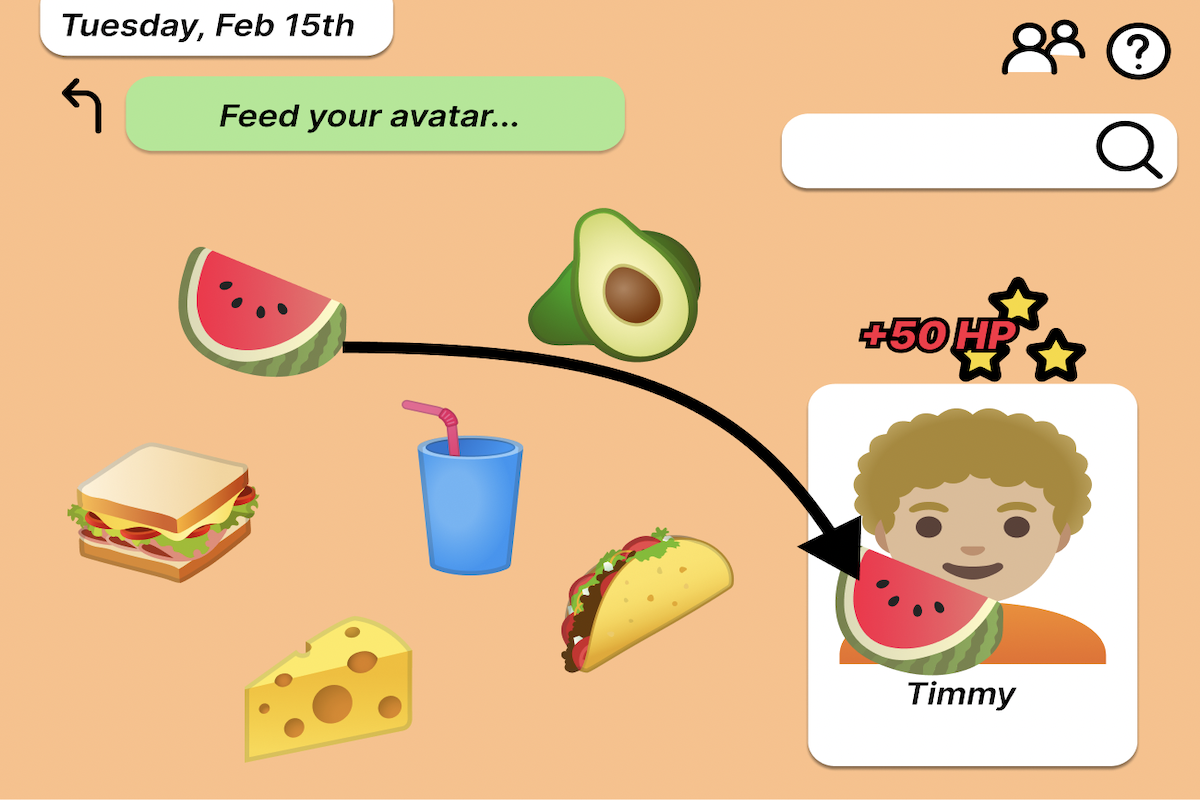
Final version of our logging food page.
Overview Page
We understand the importance of drawing meaning from the data that is collected. This is why we wanted to include in our design a way for caretakers to see the metrics and patterns in their children’s eating habits. We were looking into the different ways of being able to present the processed data in an accessible and easy to understand format.
In our overview page, we wanted to emphasize the greater food groups that have the most impact on health. The main focus of our design has been to help children develop healthy eating habits, so it is important for us to focus on them approaching eating with a focus on variety and nutritional value rather than focusing on calorie counting.
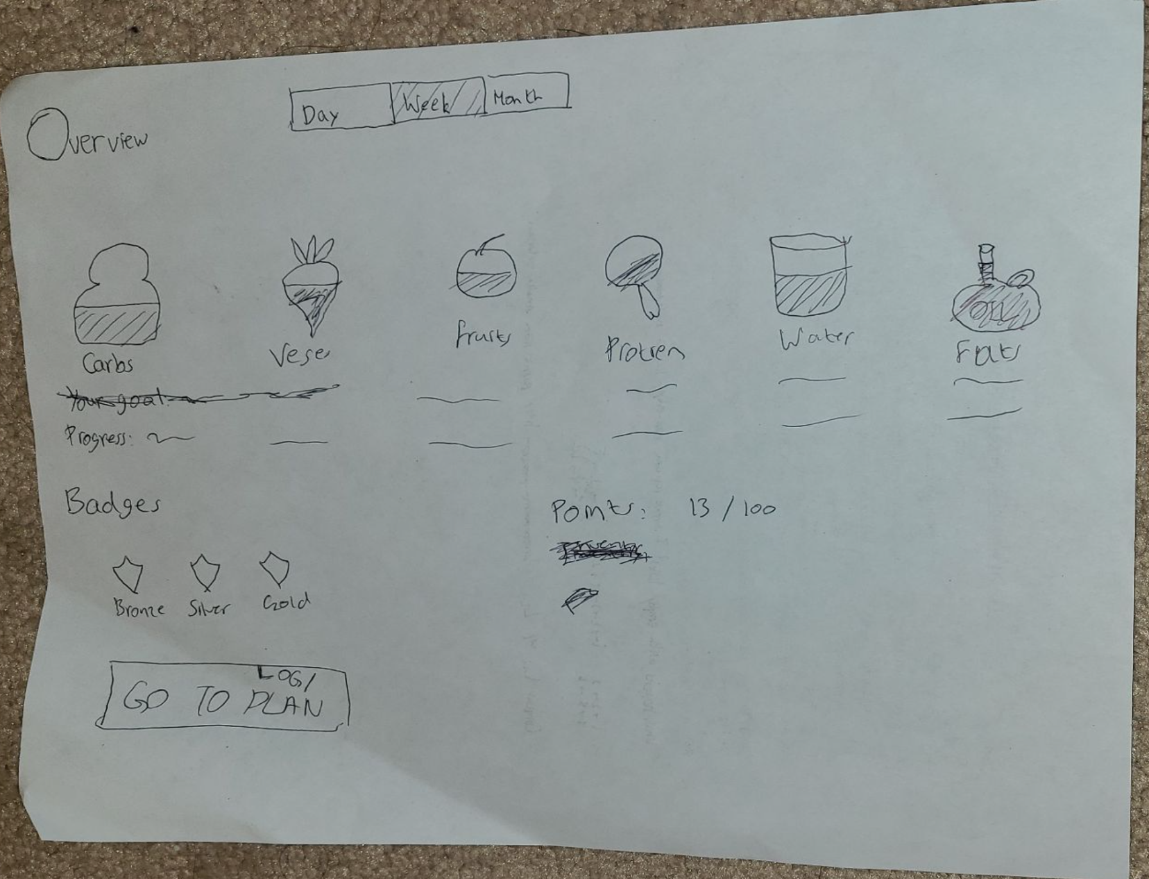
Paper prototype of our Overview page.

Final version of our Overview page.
Resulting Design
Through the different testing methods, we have been able to make changes that would best fit the user. We made sure that the user was getting a clear experience, with minimal confusion. To accomplish this, we made sure that all of our language used in our design was clear and concise. Additionally, we made sure that the user had more options to view their data. It was important that the users were able to have a general overview of what has been consumed as well as a more detailed view. We made sure that we looked into presenting the more core food groups so that the user was understanding of the foods they were consuming. We wanted to make more points of interest for a child as well. The child interaction side of the table had a few things missing and we wanted to ensure that the child would have things to interact with. With this idea, we followed through in making a section dedicated to the child customizing a character which they can also feed.
Task 1: Tracking the meals of a child
In this interaction, the child records that they ate a watermelon today and drags a watermelon over into the avatar's mouth. By doing this, the Kiddie Table will track that a watermelon was consumed by the child today.

Task 1: Tracking the meals of a child.
Task 2: Planning the meals of a child The action of editing a future days’ plan is shown here. We select the day we want to plan for. Then we select the meal we want to add to. Finally, we type in what we plan to eat and click “submit plan”. In this example, Wednesday, Feb 16th is considered a day in the future.

Task 2: Planning the meals of a child