STRELMO
The Stress Less Mouse
Team


Problem and Design Overview
The design problem we sought to solve was that of workplace stress. In the United States, 52% of employees feel burnout, with work being the #1 stressor for a quarter of workers. It seems pretty obvious that more stress leads to workers feeling less engaged at work, which is a big problem. While there is a large market for stress management apps, we feel as though current stress-managing solutions are self-directed, don't have insights into stress levels, and aren't data-driven in identifying and reacting to stress levels as they peak.
Thus, we designed STRELMO, a mouse and corresponding computer app that workers could use at their desk jobs. The mouse would have a sensor developed by researchers at UCLA in the palm that measures cortisol, the key hormone regulating stress, through sweat. The mouse would then send information to the computer app, where users could track their stress levels through time and maintain a stress management routine.

Our computer app's home page from our digital mockup.
Design Research Process and Key Insights
We changed our focus of our problem a bit late in the process, so for our design research, we did not focus on US workers, and instead focused on UW students to understand stressors, current solutions, and their effectiveness. We changed our focus because originally, we thought about using a cortisol sensor in a watch, but this was essentially was the UCLA created, so we did not feel as though our original design was ours. We eventually ended up with idea of a mouse and computer app. A few of us in our group use apps like Headspace, but we wanted more information from more participants to see what others thought. To accomplish these goals, we did four 30 minute semi-structured interviews where we had a set of questions to ask, but we allowed for opportunities to ask follow-up questions and let the conversation to flow. By doing this, we believe it made the participants more comfortable, as stress and mental health can be a tough thing to talk about. Our participants all were UW students who were taking a rigorous course schedule and had extra-curricular obligations. Our participants all dealt with stress and had differing approaches to managing their stress.
Stressors are Diverse, Solutions Must be as Well
This insight emerged not in one place, but over the course of our design research. None of the people we talked to had the same stressors nor did they have the same ways of dealing with their stress. A concrete example of this was that a few of our participants used mindfulness apps and felt that they were useful, while one participant did not believe that technology such as apps or a smartwatch was helpful and preferred the professional therapy that they go to. There were several examples like this that led us to the insight that since stressors are diverse, the solutions must be as well.
Understanding Patterns of Stress is Important
Again, this insight emerged throughout our design research. All of our participants noted that to better understand their stress, they wanted to know trends and patterns. They figured that knowing these would better help them to manage their stress. One participant was explicit in talking about this, as they discussed how they note exactly what they were doing at a time of high stress so they can hopefully avoid it in the future. They even tracked it down to times of the day on their calendar and looking at what calendar events were causing them stress. This allowed them to better understand their patterns of stress and help them manage it.

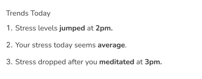
Someone using our design to uncover patterns in their stress after seeing it go jump and then doing something about it.
Desire for a Routine
This insight emerged early in our first semi-structured interview. Our participant said that right when they get home from work, they have a routine where they use the calm app to unwind and destress after a long day's work. This insight was solidified further in the subsequent interviews. Another interviewee enjoyed listening to meditation podcasts before going to sleep. This was very interesting and revealing to us, and it guided us to create a reminders tab in our design.

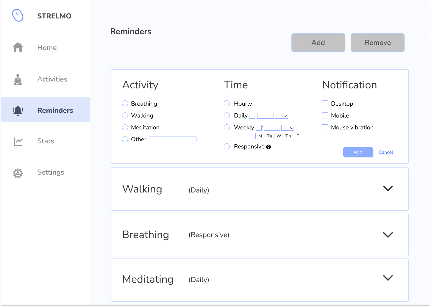
Our reminders tab in our design.
Iterative Design Process and Key Insights
Our design focus and iterative process were centered around our tasks:
Tracking Stress Levels Over Time
Maintaining Stress Management Routine.
To get a sense of what our app would look like in a quick and easy way, we created paper prototypes of our app and its various interactions, using iterative methods such as heuristic evaluations and usability testing to gather and implement feedback. Through these processes, we wanted to ensure that the tasks were intuitive and clearly communicated in our designs. As the designs were on paper, it was easy to share them with classmates and change aspects of it from feedback. The heuristic evaluation inspection method allowed us to gather quick usability-based problems within our designs and we conducted them with those within and outside of our class for a diversity of perspectives. The usability testing allowed us to see how others would interpret and interact with different parts of our app and was great for catching discrepancies and hearing others’ expectations for our design.
After gathering feedback and iterating on our designs, we created the digital mockup of our app, taking into account the different visual, interactional, and functional changes that we have made in our app, STRELMO.
Making Mouse Notifications More Accessible
During our last usability test, one participant in a usability test mentioned that they did not notice the lights on the mouse. This led to a conversation with the user about adding other forms of notifications, which is when we realized that the design was not inclusive. So, we chose to add other forms of notifications like vibration from the mouse and added the ability to change the app and mouse light colors to low visibility-friendly palettes.
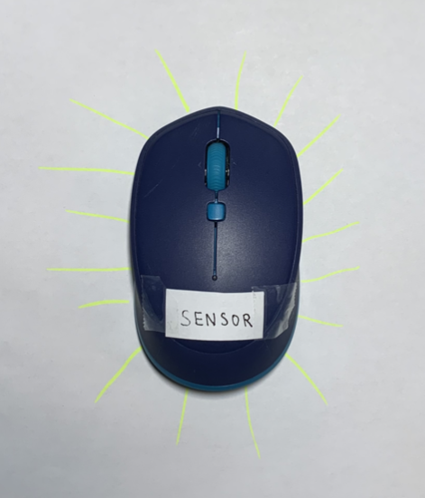
Prototype of our mouse.
Improving Clarity of the Stats Tab
A few participants in our usability tests mentioned that the initial Stats tab was missing a lot of key elements, leading to a lack of clarity when trying to display stress levels. A few changes we made were:
- Added informational tooltips to indicate meanings and usage of certain aspects of the stats panel to mitigate confusion
- Provided summarizing trends for each breakdown (day, week, month, year) to make the graph and insights easier to understand for users
- Included the ability to hover over the graph for details on specific datapoints (peak, avg, low)
- Added a y-axis unit of measure (cortisol levels)
- Added legends to the graphs, making it more clear that the bars (for week, month, year views) represented the range of stress levels
- Incorporated circles to the bar graphs to indicate the average stress levels for the day
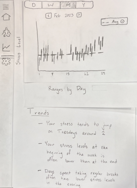
Initial paper prototype of our stats page.
Splitting Unclear Resources Tab into Two Pages
Participants in our usability tests were confused about the intent of our Resources page that we had in our initial design. In it, we tried to incorporate reminders to do activities, the activities themselves, and articles on managing stress.
This insight was interesting for us as we initially assumed that reminders would belong in the activities section, being that setting reminders and doing activities seemed like related actions. However, this felt too broad and users did not know how to approach the page initially. We decided to split the Resources page into two separate pages: Reminders and Activities. This updated design made it clear where users were to go in order to maintain a stress management routine. The Reminders page was where users were to go to create notifications and the Activities page is where they were to go upon receiving the notifications.

Initial paper prototype of our confusing Resource page.
Resulting Design
When a user first opens up STRELMO, they will be on the home page. They will see their current stress level, with information telling them what range their stress level is in. After this, a user can navigate to many tabs of the app, but to accomplish task 1, which is tracking stress levels through time, a user will click on the Stats page.


Users can navigate to the Stats page to track their stress levels over time.
In the stats page, users have the option to look at graphs of their cortisol levels from the mouse through different sets of time. They have day, week, month, and year to pick between for different insights.


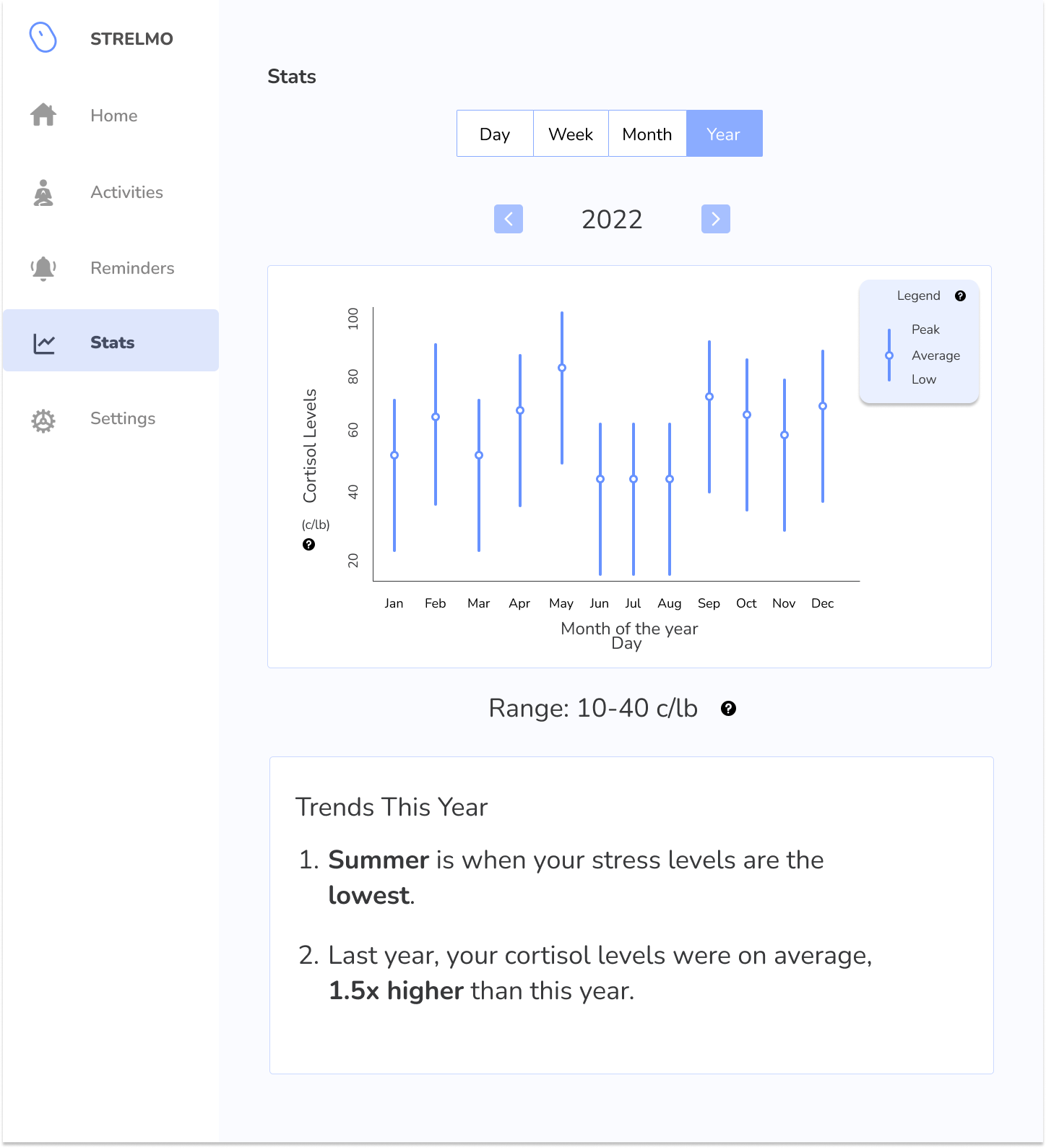
Autogenerated trends can assist the user in gaining insights into their stress levels to help them find unhelpful patterns that lead to high stress. They can also hover over the graphs for detailed information in word form rather than looking at the graph. Using all this, a user can accomplish the task of tracking stress levels through time.

Back at the home page now, when a user attempts to accomplish task 2 of maintaining their stress management routine through the app, they could click to Reminders page.


On the Reminders page, users can add activities to do and set notifications to remind them to complete them. They can customize how often they get the notifications and where they receive them. This can really help a user to maintain a stress management routine.

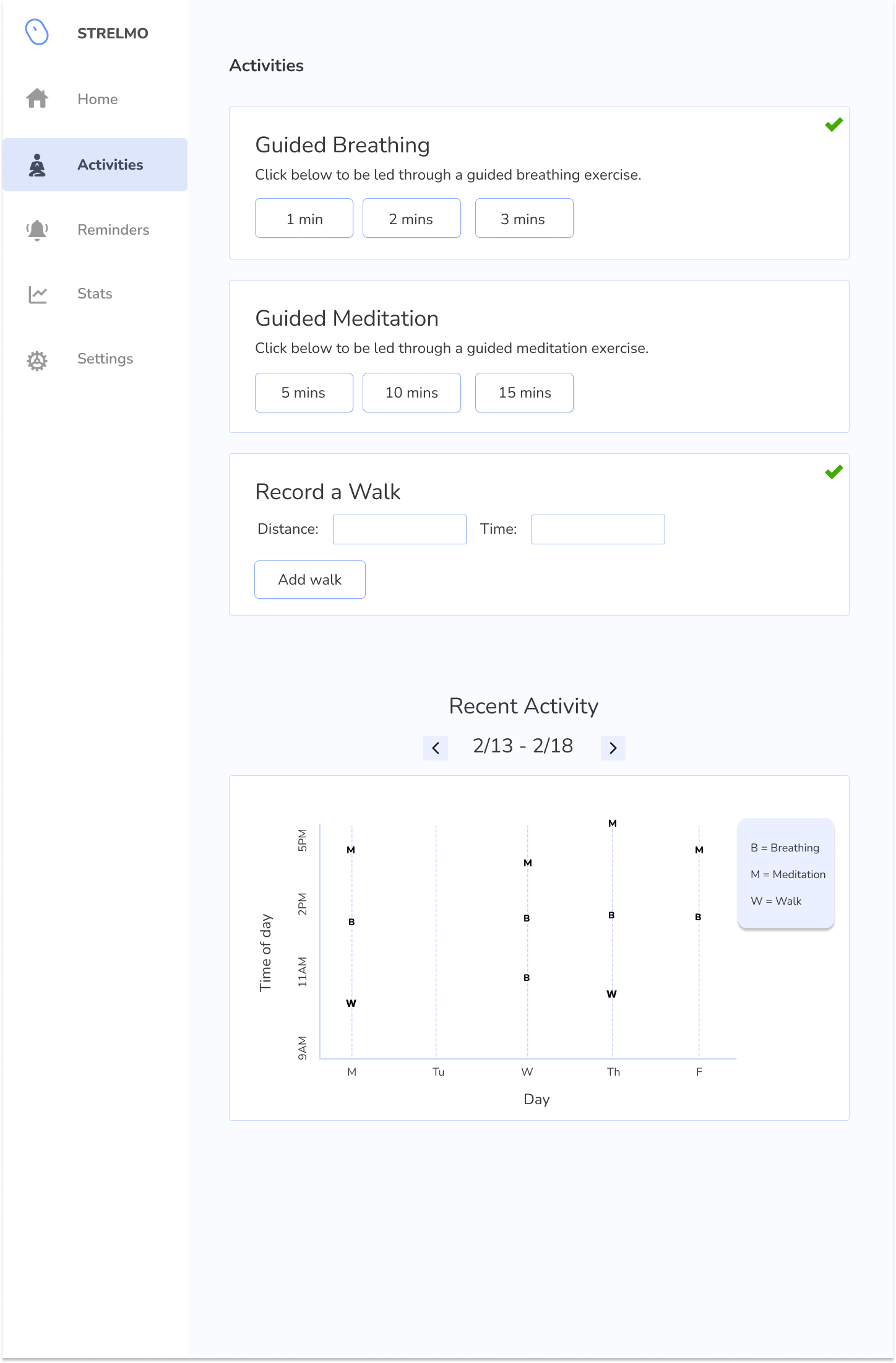
But maybe a user is feeling stressed and wants to just complete an activity and not wait for a notification to tell them to complete one. They can navigate to the Activities page on the left. Here, they can see a number of activities that they can do, some guided through the app, with some being ones a user would do on their own and then log into the app. Then at the bottom, a user could see a graph of when they have been doing activities. When a user chooses a guided activity such as breathing, it will take them to the page below on the right, taking the user through breathing and counting down for their time.
