An Automated Boxer Training Solution
Team


Problem and Design Overview
There are many quantitative self-tracking technologies available that can help boxers measure various statistics such as speed, power, and endurance, but proper form and technique is often overlooked despite being an essential aspect of boxing practice. Additionally, boxing is a highly social activity, with many boxers relying on their communities as a source of morale support and instruction. Most automated training technologies on the market today are isolated training tools and might even detract from the benefits of the sport as a social activity. We asked ourselves, how can we automate form tracking for boxers while giving them new avenues to connect and interact with their fellow boxers?
The Skiá project icon
Through integration with a multi-camera and/or stereodepth camera setup, a mobile application could potentially track the movement and relative positions of each of a boxer’s joints during training sessions, opening up the opportunity for automated analysis and feedback on the observed form and technique of the boxer. We propose a solution that combines this novel sensory system and mobile device application to provide real-time form feedback to boxers, track their statistics, and establish a platform where they can engage with an online community through their practice.

Functionality
Design Research Process and Key Insights
In order to gain a better understanding of the domain of boxing and boxers’ needs, we chose to conduct some design research. Specifically, in our research, we wanted to answer what boxers of all skill levels would envision a boxing-centered to look like. We were seeking advice and insights on both the functions such a technology would support, as well as what form it would take on. We chose to conduct semi-structured interviews in which we would start out with some extremely open-ended questions and let the participants take it from there. We chose this method in order to have some sort of insight into what our participants really needed without constraining them into what we thought they wanted. We also wanted to interview people of all experience levels, because we suspected that the needs of a novice may be very different from the needs of an experienced veteran. For this reason, we conducted four interviews — one with a boxer who has 20+ years of experience, one with a college-aged amateur level boxer, one with a minor who has some martial arts experience, and one with a dancer who was looking to maybe pick up boxing.
Feedback has many different forms
Through our interviews, we learned that people often expect or want their training feedback in many different ways. For example, people who are training often expect both immediate or live feedback as well as post-session or post-spar feedback. Any design that we build should be able to deliver both. There is also a large range when it comes to how people expect feedback to be delivered. While some may favor video feedback, others may favor live audio cues. Others may want something completely different (we received an “avatar” suggestion for feedback). When designing, we should consider how we want to deliver feedback once we have feedback to deliver. Finally, the tone of the feedback is extremely important for motivational purposes. Our design should deliver constructive criticism with a positive tone, so that it feels like an encouraging trainer. It should also deliver positive feedback so trainees know what they are doing well in addition to what they need to work on.
“It is easy to forget to keep your hands up and instructors are not always around to remind you.” -Alvin
"I appreciate receiving encouragement from instructors alongside critical feedback." -Violet
Boxing is extremely social
With all of our participants’ first dive into boxing coming through someone close to them, we saw that boxing is an extremely community-focused sport. There are also “reputations” in the boxing community that people may want to build or uphold. People love to train in groups or classes even though it may not be the most effective way of training simply because of the social aspect. In any design we create, we need to take into account this social aspect. In fact, it may even be worth it to design completely around this social aspect. There is also the sparring aspect of boxing, which in itself is social as you need to find people to spar. People also seem to often have a close relationship with their personal trainer, which is perhaps something that we should aim to replicate in our design.
"It is the community and the friends I have made that makes all the training worth it." -Phil
"In every activity I have done, I have always benefited from doing it with friends." -Violet
Boxing is not environment specific
Our participants who are currently training all train in at last two environments – either different gyms or their gym and their home. We need to decide if our solution should be specialized for one environment that is common (boxing gym, home, etc.) or whether it should be versatile and work in many different environments. This would also greatly influence the physical design. There may be certain designs that people would be comfortable using at home that they may not be comfortable using in a more public environment like a gym. Designs like physical trackers may be awkward to put on in public but not as awkward at home. We also need to make sure that the feedback given takes the environment into consideration (maybe some home equipment is not as sophisticated as equipment in a gym).
“If there was tech at house that gave good feedback, I would box more because I don’t have to go all the way to the gym to find someone for feedback.” -Bobby
"I want to be able to train wherever is most easily accessible to me and mix it up, too." -Alvin
Iterative Design Process and Key Insights
For our iterative design process, we wanted to focus on the two tasks of our design that we felt were the most important. Namely, these were getting feedback during/after a training session that you started, and interacting with the boxing community by viewing others’ workouts/posting your own. To test how well our design could handle these tasks, we came up with an initial paper prototype and conducted both inspection-based evaluation and usability tests. For our heuristic evaluation, we asked other students in our CSE440 class to inspect our prototype and look for violations with regards to Nielsen’s heuristics. This helped us find more obvious errors that we simply overlooked when constructing the initial prototype. After this, we moved onto usability testing in order to identify less obvious but still critical issues. For our usability tests, we again wanted to cast a wide net on the type of participants that we had. We had four participants — one amateur boxer (target audience), two HCI classmates (help with design specific design pointers), and one non-boxer UW student (help with flow and feel of the application). Finally, using our results, we constructed a final paper prototype and eventually turned that into a digital mockup. We also made some slight changes when transitioning our final paper prototype to a digital mockup (adding color, making some fonts bigger/bolder).
Consistency in Navigation
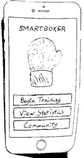
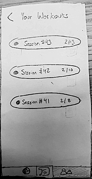
One of the most important findings we had was that our navigation flow was initially extremely inconsistent. There were three main examples in which this was clear. Firstly, some non-main screen pages had back buttons. While others didn’t. We found in our usability testing that this made it extremely confusing for our participants to try to navigate from one task to the other. We aimed to improve this by adding a back button to every non-main page. Another example was that there was no way to get back to the “connect a device” screen after you get to your dashboard. This was a huge issue, because the situation where someone would want to change their connected device seemed extremely common. We alleviated this by making the connect a device option available anytime a workout is started. Finally, the profile button was initially only on the community tab, which made the flow of getting to your profile a bit cumbersome. We fixed this by simply adding the profile button to the other main-page screens as well. A key element of our final design is that the home screen contents (after first opening the app and having logged in), have changed from the “connect a device” screen to a landing page where you can go to the three different sections of the app (training, statistics, and community).

Before

After

Before

After
Privacy Settings
We realized our initial design did not really account for the privacy of the boxer as much as it should have. This was a huge issue that we overlooked, but was quickly pointed out by our participants. To better accommodate privacy, we added two features. Firstly, we added the ability to delete previous workouts, as this was not a functionality that we had before. We added this because it was pointed out that a situation may arise in which someone accidentally records something that they would want to delete later on, but our initial design would not let them do that. This also just allows for easy deletion if someone accidentally starts a workout when they do not mean to. The second privacy accommodation is adding a private/public option when sharing a post, because we realized through our usability testing that some people may only want to share their workouts with their friends while others would want to share their workouts publicly.

Before

After

Before

After
Making Locating Content Easier
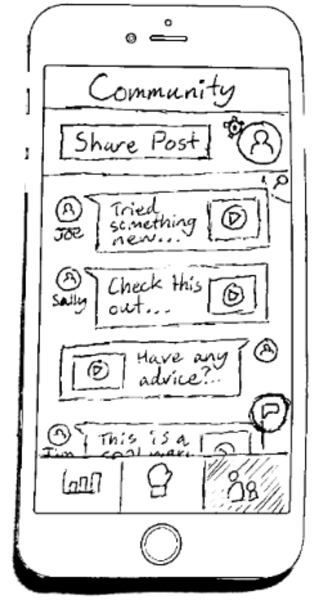
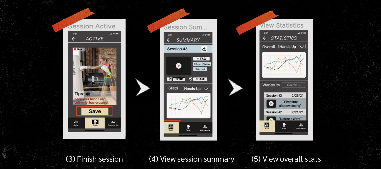
One last issue that we identified with our initial prototype was that it would be hard to locate certain content, especially with regards to the community page. Namely, searching for specific posts was extremely difficult to do, as the community tab in our initial design was simply a chronological feed with no real search or filtering options. In our final design, we added tags when posting a session and more filtering options when navigating around the community tab. These filtering options would include a search bar, which would support being able to search for specific users, captions, or tags. This would allow for more streamlined navigation when looking for posts of a specific type or from a specific user, which would make the community experience better as a whole. This shows up in our final design in the ability to find and post content in the community portion of the app. Now, we have included the option to search for specific posts in the main page, by text as well as by tags. Tagging is a feature that we’ve included that enables users to better label the content they are sharing on the app for others to locate through the search bar. For better privacy we have also included the choice of whether or not to post content for friends only or for the public on the post sharing screen. For better efficiency we now enable users to be able to trim their session recording as well to cut out the unimportant sections for their own records or if they want to post. The statistics page has also drastically changed since the first prototype, which originally had a form score button that could be clicked to expand on a more detailed page of stats. Instead, we removed that button entirely and instead displayed graphs of stats tracked by the app that can be filtered through a drop down by category (hands up, body positioning, etc). The main stats page also has the list of previous workout sessions which the user can click on in order to view stats specific to that recording.

Before

After
Resulting Design
You can explore the prototype on Figma following this link: Skiá Digital Prototype

Digital prototype as hosted on Figma


Task 1: Starting a session and receiving instruction


Task 2: Reviewing a friend’s session and posting your own
Live Feedback Proof of Concept
While we spent the majority of our time this quarter on designing the mobile application, we have also explored developing the algorithm for detecting a boxer's form in real time and sharing audible instructions and encouragement for the benefit of the participant.

Screenshot of hands down

Screenshot of corrected form

Screenshot of elbow floating out

Screenshot of corrected form