PenPal
The ultimate handwriting coach for fun, easy, and effective practice
Team


Problem and Design Overview
Did you know that 45% of Americans struggle to read their own handwriting? Everybody wants to get nice handwriting, but how do you acquire it? With so many resources available online, it can feel overwhelming to sift through your options (Youtube videos, online worksheets, etc.) and find something that is the right fit for you. At best, practicing handwriting can be repetitive, boring, and feel a little bit childish. Not to mention if you work or go to school, it can be hard to find time in your busy schedule to commit yourself and dedicate time to work on improving your handwriting.
PenPal removes the hassle of using traditional handwriting improvement methods, and instead creates a platform that is encouraging, easy to use, and personalized directly to your goals and time committment. PenPal does this through gamifying practice, delivering real-time personalized feedback, and offers a variety of tools that make it easy to track your handwriting progress.
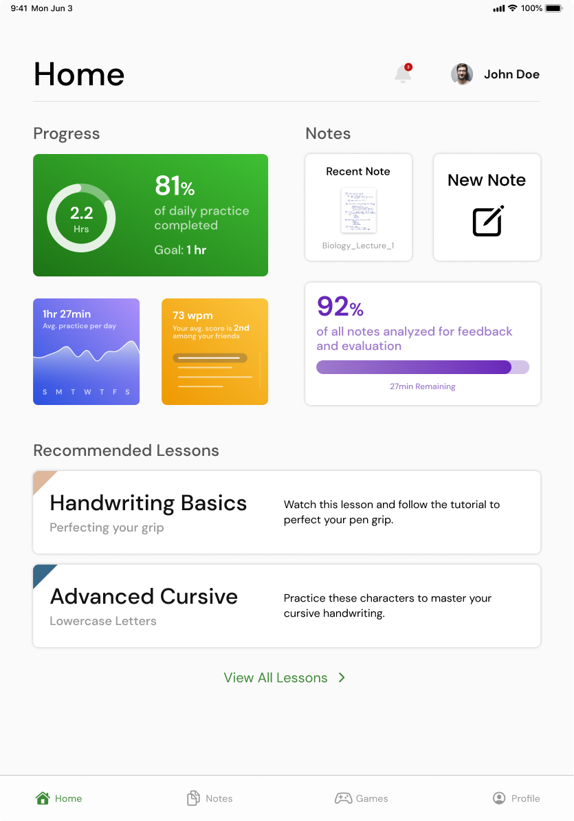
PenPal's Homepage allows the user to take notes, play a writing exercise game, or view their profile for personalized data and tips
Design Research Process and Key Insights
To support our design research, we interviewed three different individuals to learn more about their handwriting goals and the obstacles they are currently facing that prevent them from accomplishing their handwriting goals. We employed semi-structured interviews conducted in person, which allowed us to explore ideas that arose from the conversations that surfaced with participants. Our participants were one UW student, one elderly person, and one local handwriting coach. We chose these participants because they represented a diverse group of varying age, handwriting ability, and goals for improvement. Collectively, interviewing these participants helped us better understand and support the aspirations of someone who wants to improve their handwriting.
Lack of time and of perceived necessity to improve are the main reasons why people don't prioritize handwriting improvement.
Despite all participants acknowledging their interest in improving their handwriting, none of the participants were currently working to improve their handwriting. Across our interviews, two common themes emerged as to why people aren't currently working on improving their handwriting. Participants disclosed that they did not feel they had the time to set aside in their schedules to work on practicing in any capacity. Additionally, this lack of time coupled with the lack of perceived importance to improve their handwriting resulted in participants not actively working on their handwriting. These findings motivated our team to design a solution that both encourages the user to stick to a schedule, works with their commitments to find a time to practice that does not feel invasive, and help the user clearly define their goals and what they want to work towards while improving their handwriting.
People would be more motivated to use the app and work on improving their handwriting if the process is individualized and tailored to the user.
From our conversations with participants, another common theme that emerged is participants wanting a platform to improve their handwriting that not only allowed them to input their specific goals for improving their handwriting, but also choose the way in which their handwriting is analyzed. By this, participants desired for the app to analyze their handwriting in a way that aligned with their particular ability level. From our research, we learned that participants have different starting points in their handwriting journey, and if the app was too critical of someone with a varying experience level, that could deter them from further practice.
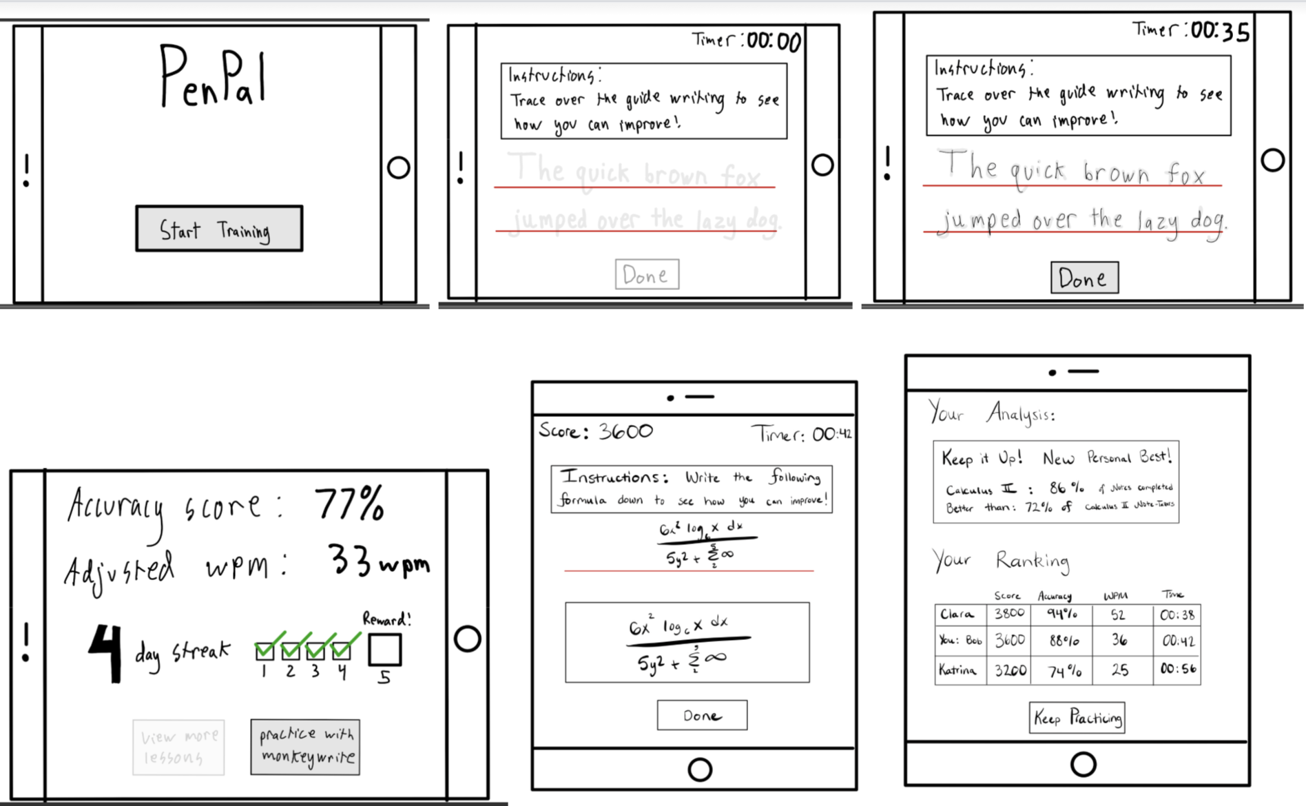
PenPal paper prototype, including the ability to practice handwriting through timed exercises and taking notes
Resources that make practice easier through encouragement and connection to the user, such as gamification, awards, connecting with friends and progress monitoring, would be of interest.
Many participants shared they felt their connection and motivation to return to the app would be a central part of their handwriting improvement process. Furthermore, they disclosed one key element that would encourage them to return to their practice would be gamifying practice through the ability to track their progress, earning awards as well as streaks for consistent use, as well as the optional ability to compete against other people or themselves for score in timed-exercises. These features would allow practice to feel more natural and allow people to connect with others or compete against themselves to stay motivated while reminding them of their good practice habits. Additionally, participants informed our team that if they could add friends to their profile, and encourage them to practice together through sending invites to play that would help keep them engaged as it would hold them mutually accountable to practice.
Iterative Design Process and Key Insights
Following our design research process, our team focused our tasks on the user taking notes, and playing the handwriting game feature. Both of these tasks center around the user receiving personalized feedback and data on their progress following completion of the tasks. We felt that these were critical aspects of our design so ensuring they were intuitive, usable, and desirable to the user was important. Our process included both heuristic evaluation and usability testing. We first conducted heuristic testing to determine any quick changes we could make to our prototype that would involve Jakob’s Law. Then we conducted usability testing via our paper prototype on various participants to elicit a genuine response of a user first encountering the app. After both the evaluation and test, we followed up with a set of qualitative questions to help us understand what was challenging to navigate, what features they would have liked to see and additional questions to help us measure our prototyping goals. The paper prototype usability testing proved to be a valuable component in our design process, as they help us resolve aesthetic and structural flaws in our design. The following three insights reflect key issues that the paper prototype usability testing unveiled to us, which have since been resolved in our final product.
Confusing icons and placements
During user testing, we observed that many users struggled to understand the purpose of various icons due to the non-intuitive design and placement of icons. Users found it difficult to identify which action each button would perform, leading to confusion and frustration. This insight highlights the need for a more intuitive and user-friendly interface design that clearly communicates the function of each button to improve overall user experience. To fix this we started using icon designs that are similar to other familiar and established platforms, and we talked with users about the best placement for these buttons to ensure the user-flow was as smooth as possible.

Icon layout and structure is intuitive and familiar to users
User navigation was unclear resulting in users feeling stuck
During our user testing, we noticed that many users were getting stuck on certain screens without a clear way to exit, leading to frustration and disengagement. Through continued testing and user feedback, we strategically placed buttons in areas that users naturally gravitated towards, allowing for a smoother and more intuitive navigation experience that encouraged users to explore and engage with the product.

The addition of the navigation bar at the bottom of the screen as well as other features supports user navigation
Feedback across modes should be consistent and scalable
From our user testing, we noticed that users were receiving different levels of feedback and personalized statistics depending on whether they had just completed a timed writing exercise, or the note taking feature of the app. Users reported that the variance in feedback between these modes resulted in a non-uniform user experience and was confusing to the users. To address this, our team standardized the feedback metrics and statistics shown to users following completion of the notes or writing exercise modes, and also allowed for the user to be able to customize the quantity and type of data they wish to be displayed as a part of the feedback page.
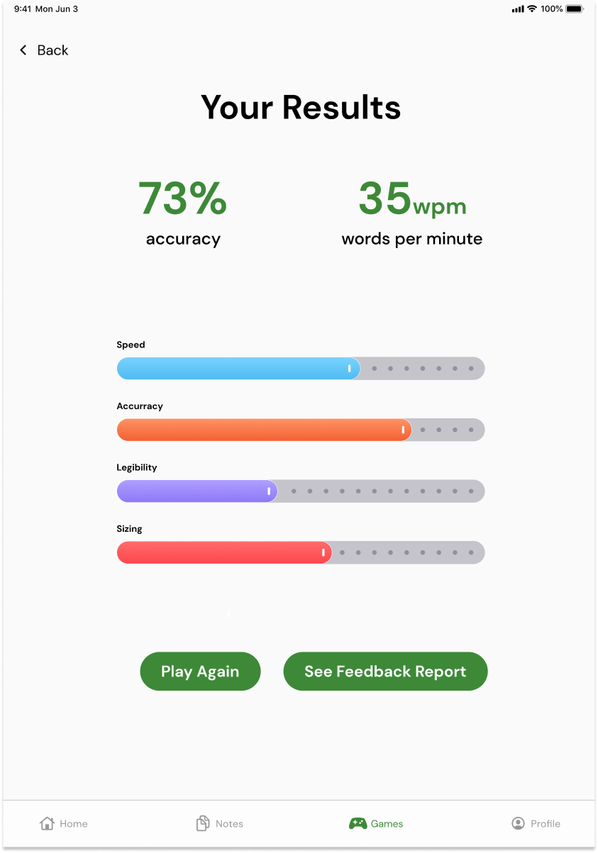
Feedback displays the same metrics across both modes, and allows the user to configure further in the settings portion of the profile
Resulting Design
From launch...
Upon launching the app, the user lands on the dashboard, which serves as the home screen. On the dashboard they can access four main features. First is the notification center where they can find alerts about friend requests, game invites, system info, and more high priority items. The second feature is various charts and data about their handwriting performance and how they compare to their friends within the app. The third feature is quick access to their most recent note, starting a new note, and an indicator as to how many of their notes have been analyzed for feedback and evaluation. The fourth feature is their recommended lessons, as well as a button to view all lessons.
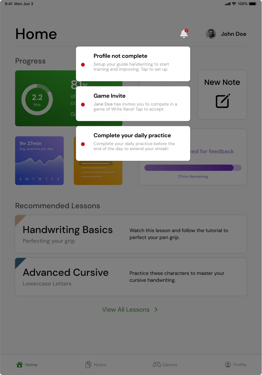
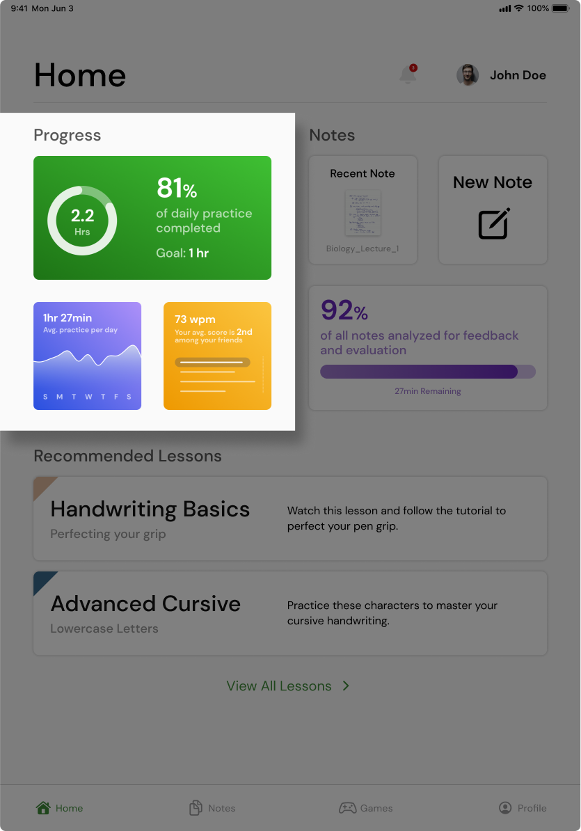
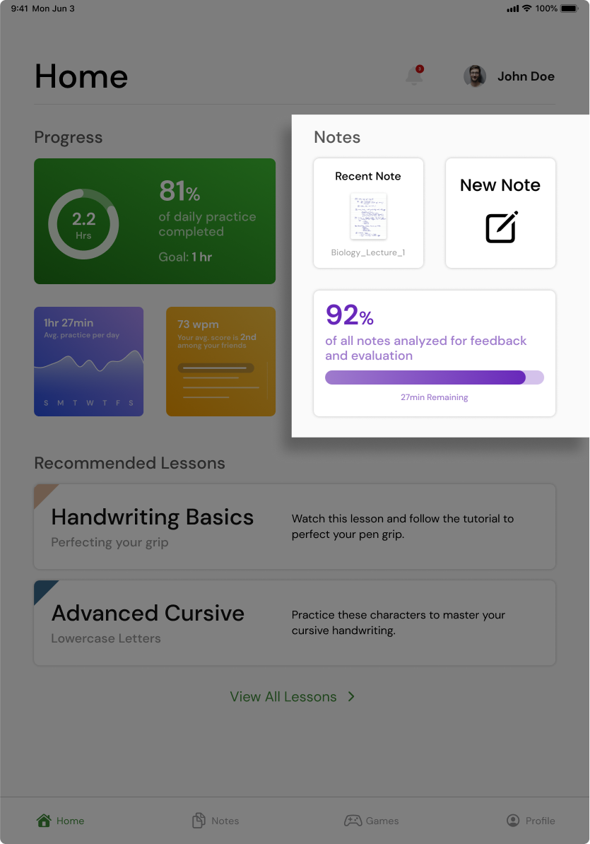
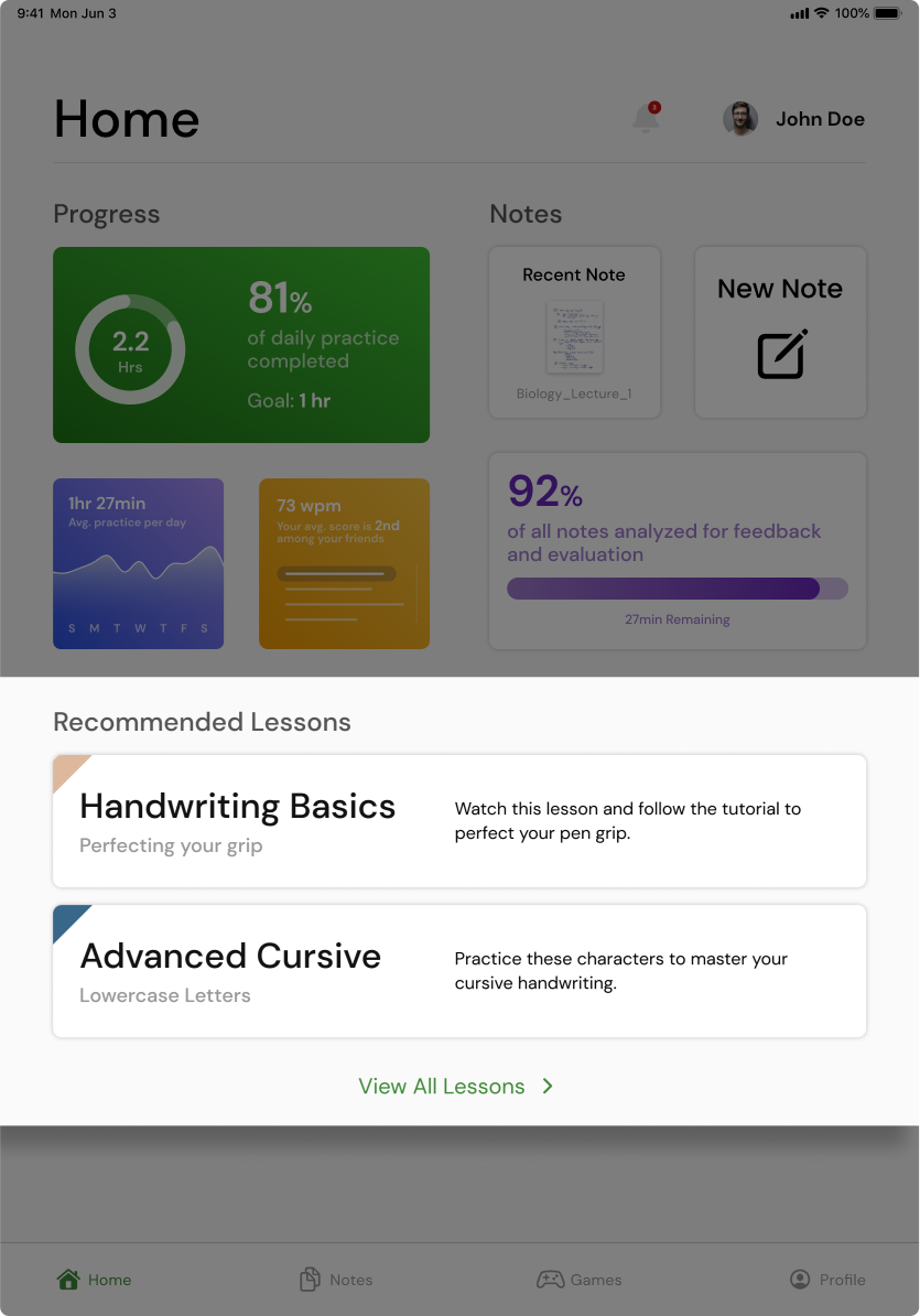
Different portions of the dashboard
Take notes and receive feedback
This is the file organizer in the notes section. The user can either open an existing note or create a new one. Once they are in a notebook they have access to typical note taking controls found in other apps, like eraser, undo/redo, pen customization, and more. Once they are done taking notes they can either exit out of the note, or press “Get Feedback” to see a detailed report on their handwriting. Our feedback report is a powerful tool that showcases a user's handwriting progress over time, highlighting specific areas that require improvement. It provides detailed insights on individual characters, kerning, line spacing, and more. In addition, users are prompted to engage in tutorials specifically designed to help them target those areas and enhance their handwriting skills.
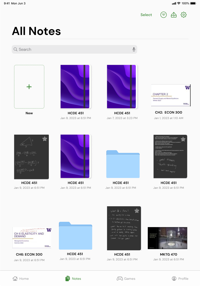
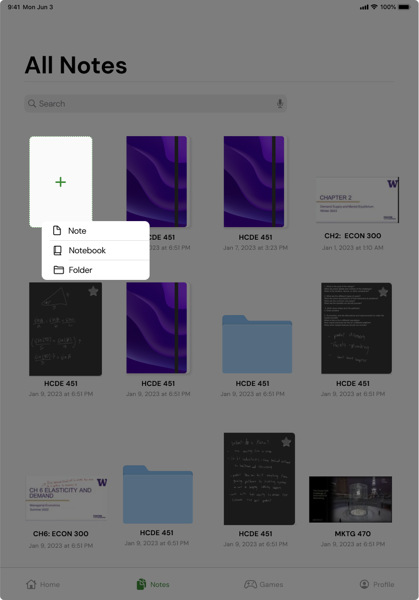
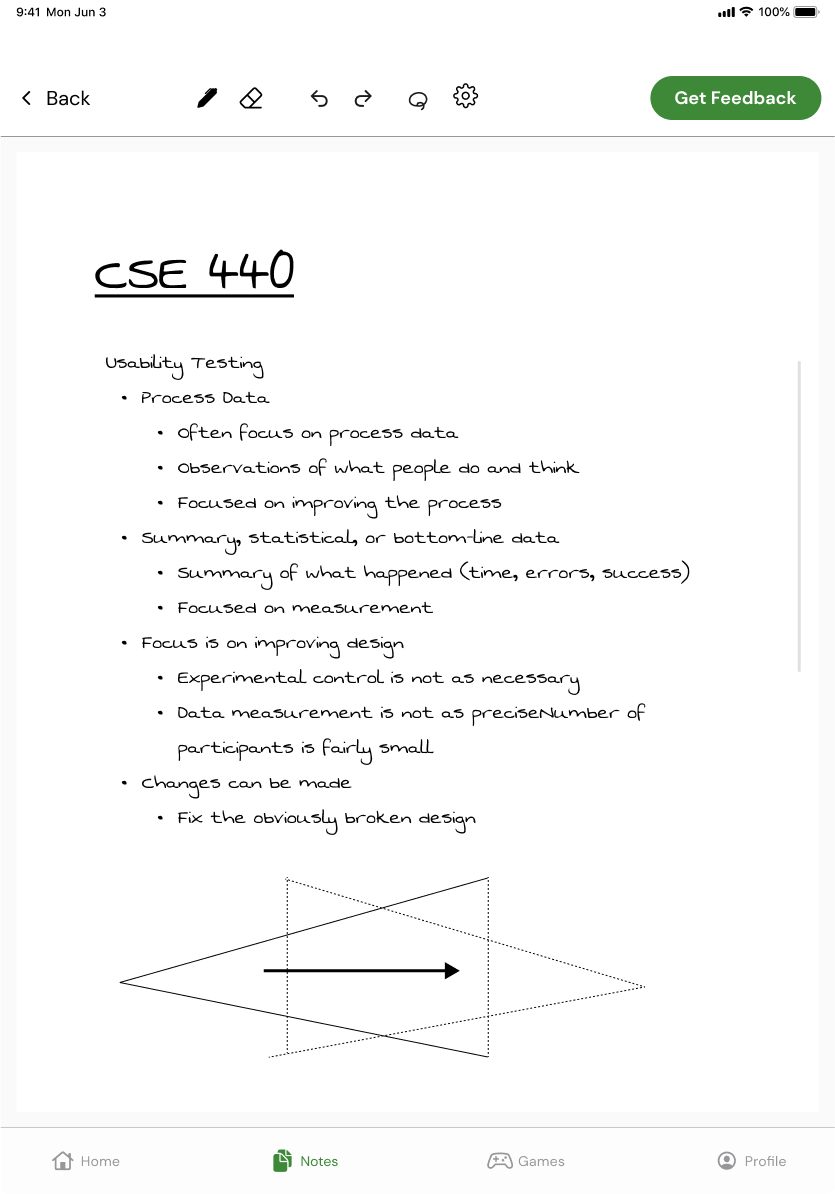
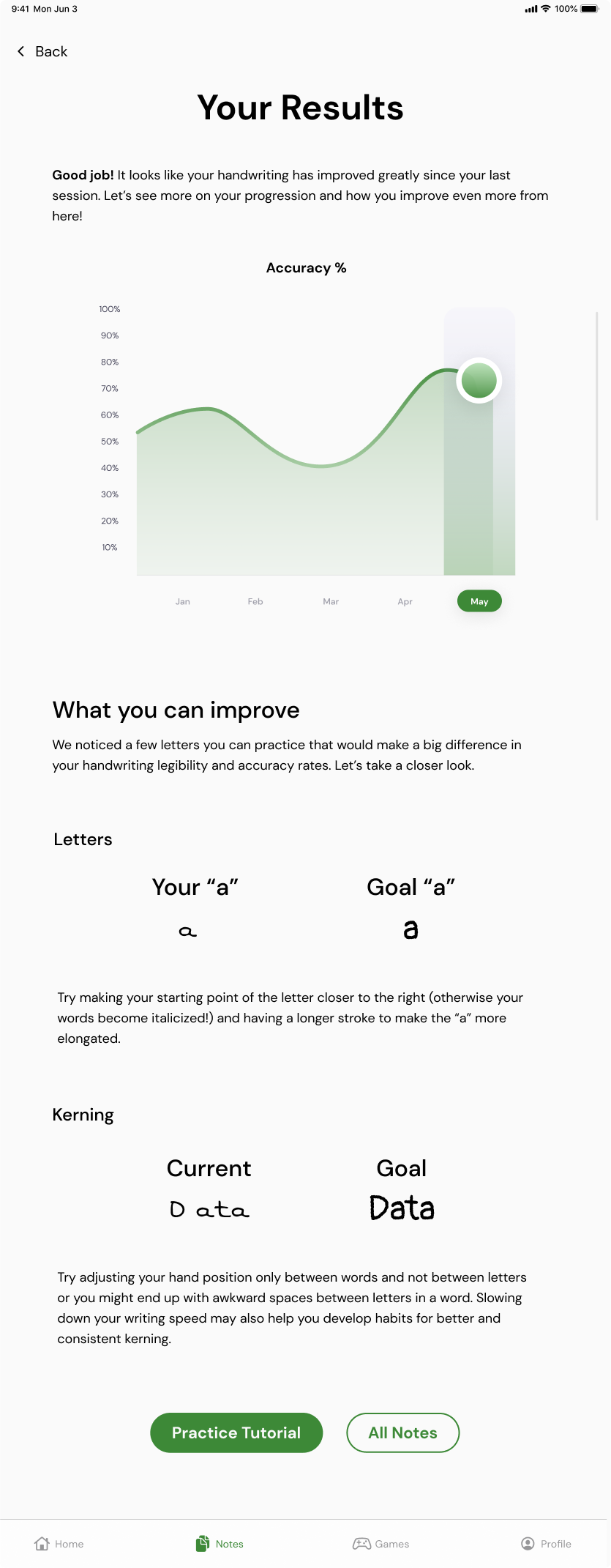
Selecting a note, writing, and receiving feedback
Practice handwriting via gamification and personalization
The first time a user launches the game WriteRace, a modal pops up telling them how to play. They are then presented with an outline of the sentence they will be writing. This outline can be toggled on or off. In the game’s settings they can customize the type of writing they will be doing, the time interval, the types of words they are willing to write, and the language. After writing over the guide text and completing the round, they press the done button to receive their score and results. The results show them various feedback metrics and scores. If they want to see a more detailed report they can by pressing the “See Feedback Report” button.
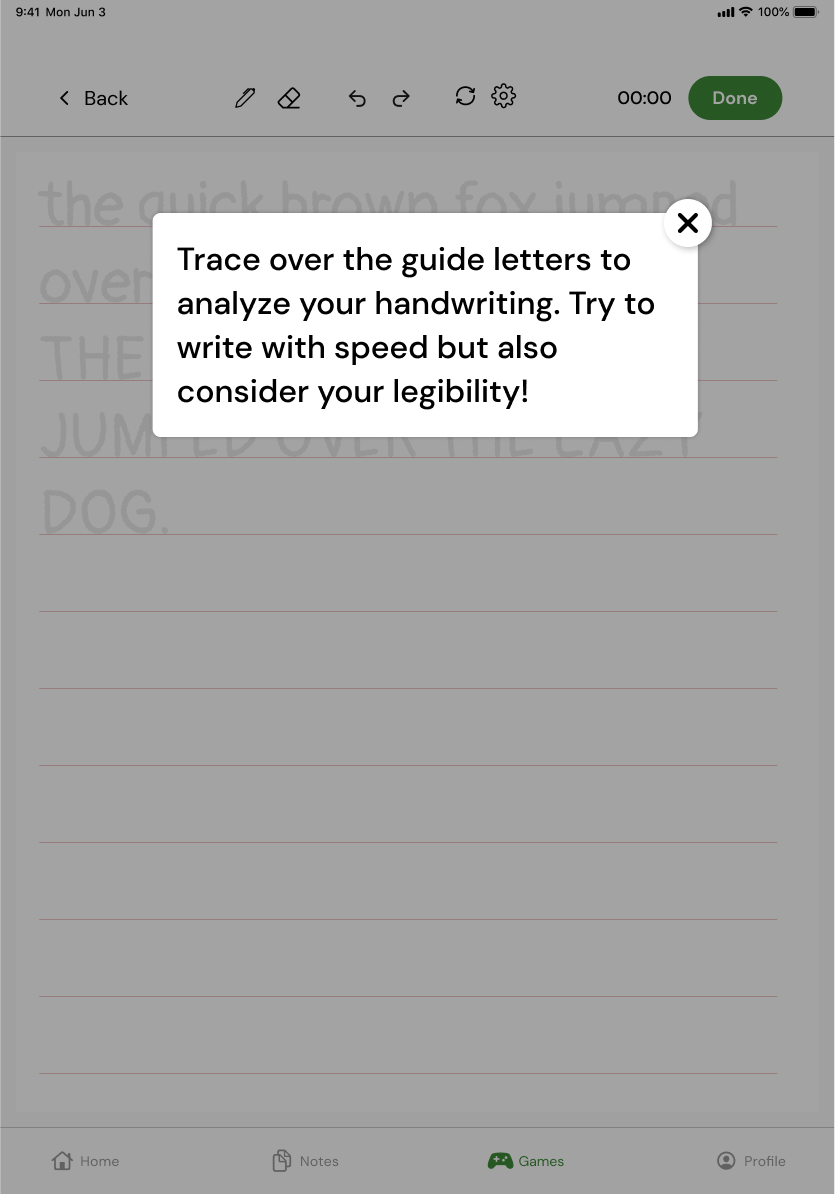
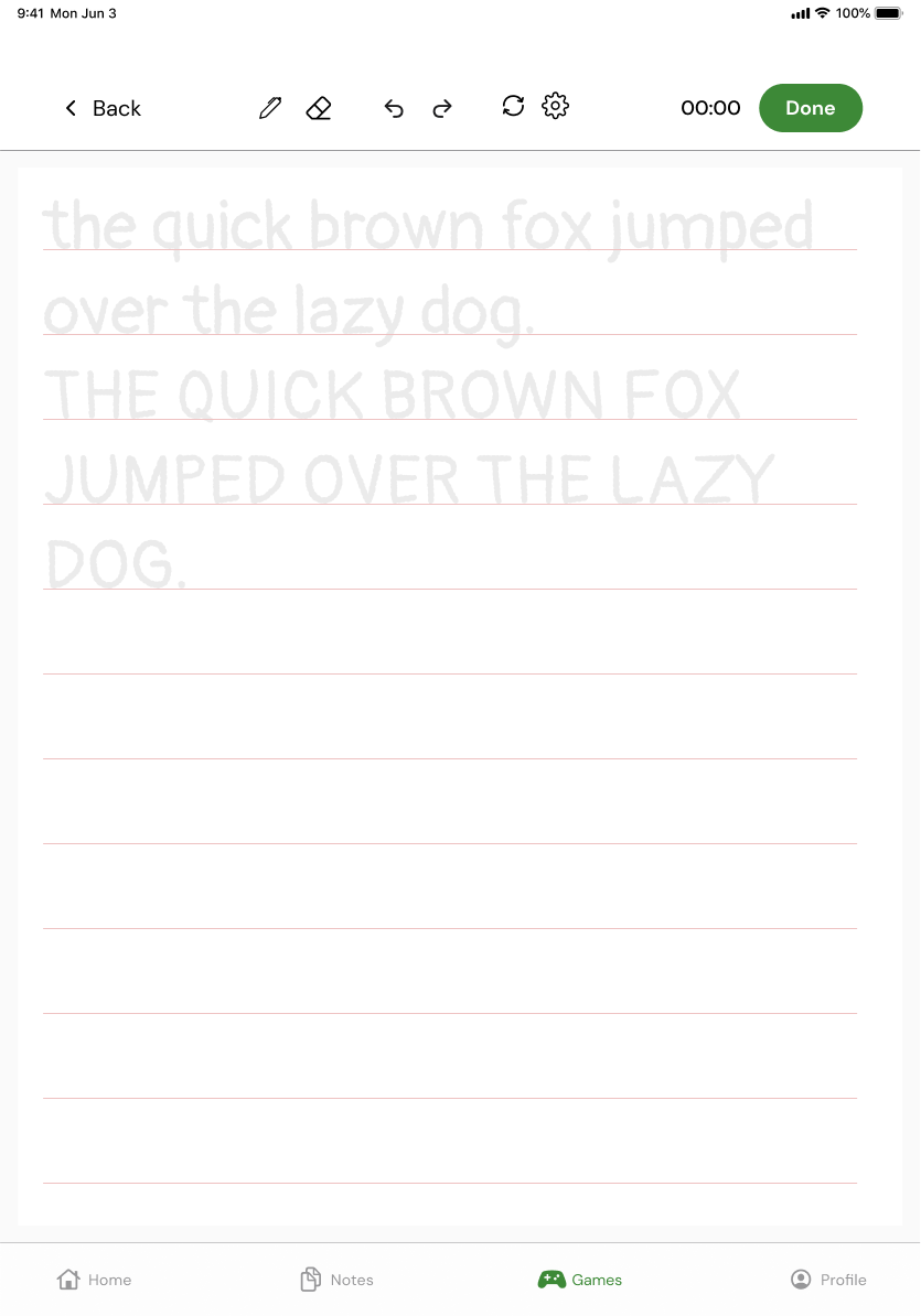
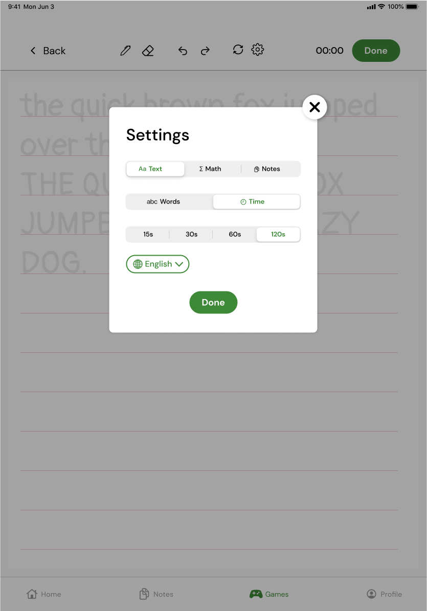
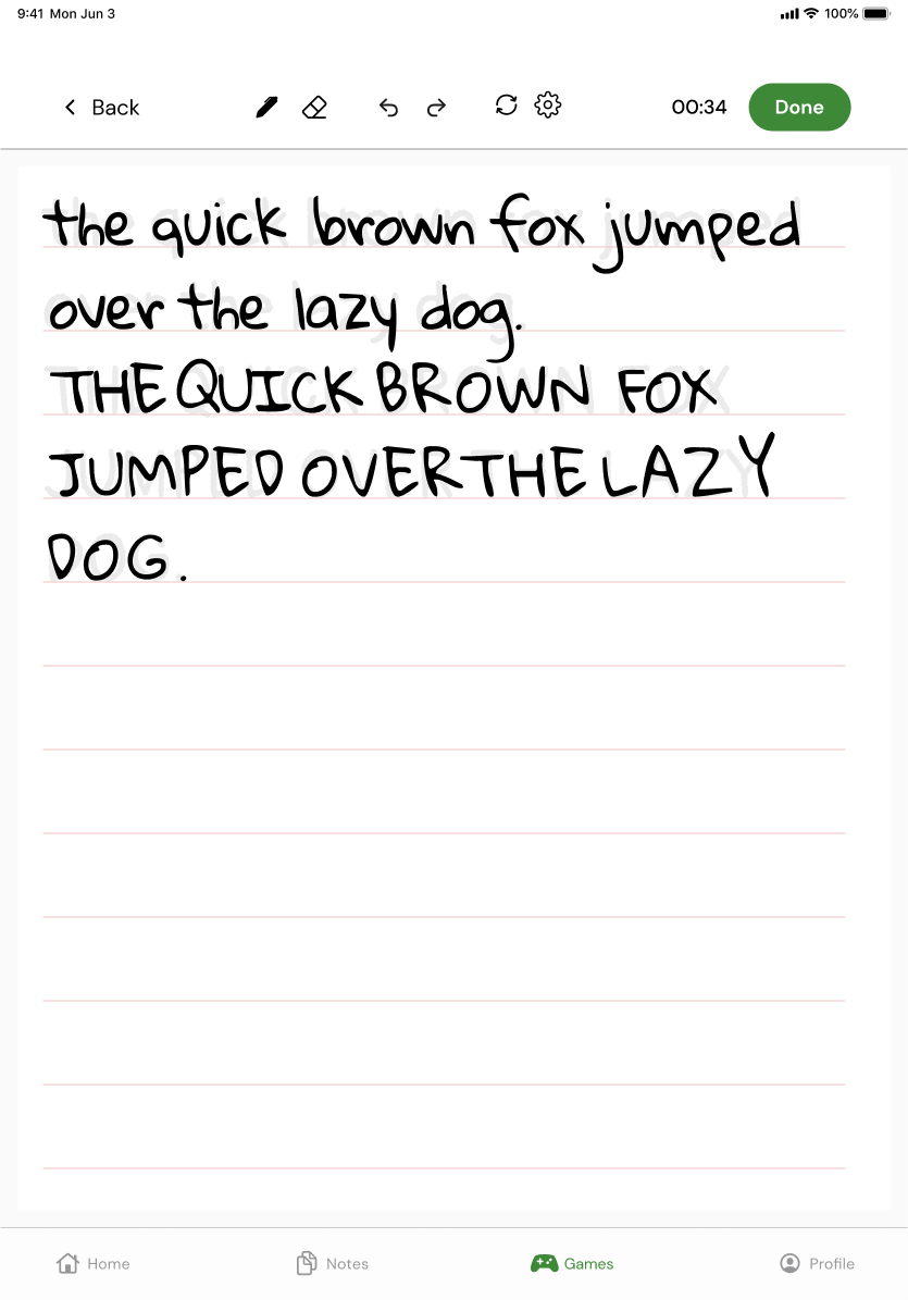

Completing the timed WriteRace exercise and receiving feedback