NomNom
Inclusive restaurant tracking and discovery for groups and individuals
Team


Problem and Design Overview
NomNom is an app that helps you find restaurants for yourself or a group, while taking into account your dietary restrictions and preferences.
Dietary restrictions are common in the US. More than half of Americans report some form of dietary restrictions, whether due to allergies, religious or cultural practices, or personal preference. But people can be hesitant to ask for accommodations or assert what they actually want to eat in a group setting. We are dedicated to the proposition that your dietary needs do not have to either be deadly or written off as an afterthought.
NomNom's design attempts to simplify the process of documenting dietary restrictions, while facilitating the discovery of new restaurants that meet these requirements. In a group setting, we also want to make it easy for your group to find food that meets everybody's needs. Either way, your own voice and experiences should always be valued and respected.
NomNom shows you user-contributed data, but it also has features that make sure your own experiences count.
Design Research Process and Key Insights
People with different dietary restrictions can have different relationships with food. Depending on how well they are accommodated, they might also navigate the restaurant selection process differently. Because there are so many kinds of dietary restrictions, our design research needs to account for this diversity. Then, by learning about our participants' most pressing needs, we can determine what priorities require our attention.
We conducted semi-structured qualitative interviews to understand how our participants select restaurants, how they navigate group dining if they have dietary restrictions, and how they accommodate other people with these restrictions. The semi-structured format allowed our participants to tell us what they feel is notable and allowed us to follow-up with questions about their decision-making process. Afterwards, we performed coding for common experiences, and those codes became our research insights.
We interviewed four people who we know are food lovers, but they have different dietary restrictions and follow those restrictions with varying strictness. Our participants vary in stages of life and restaurant dining frequencies. They also cover all of the types of dietary restrictions we know of—diagnosed allergies, religious practices, adopted diets, and no dietary restrictions at all—and and we wanted to be intentional about diversifying our participant pool in this respect.
Eating with a group is the most pressing, unresolved problem
Usually, we are brainstorming places as a group that might fit my food needs. Then I have the final say as to whether or not they will work out.
—Participant 5, Assignment 2d
We wouldn't go to somewhere that's great, like a Korean place... it makes it less likely for us to go there [because of what people perceive of the entire cuisine].
—Participant 4, Assignment 2d
Our research shows that dining with a group is often the most challenging and unresolved issue for our participants.
This is a complex process, from each person having to share their dietary restrictions, to people suffering from indecision or just hating to be the person to decide for a group. As the number of group members increases, this frustration also grows exponentially.
Restaurant discovery should be a first-class task
I use DoorDash exclusively, because it has my top restaurants [...] and I like it creates an algorithm for me.
—Participant 1, Assignment 2c
We found that people are in fact eager to explore and share new restaurants, even if they do not consistently have the opportunity to do so.
Our participants shared that they all maintain a list of “safe restaurants” that they frequently revisit if they do not know where to eat. However, they also all expressed a desire to try new places, as long as that process feels safe and not exhausting.
In our paper and digital prototypes, the Food Party feature was designed in response to our participants' frustrations in group settings.
The ability to self-track-and-report matters, because third-party data alone can not be trusted
I prefer not to eat meat at all, unless it comes from a restaurant that I know cooks their meat completely through.
—Participant 1, Assignment 2c
We found that being able to self-track and report dietary restrictions and restaurant experiences is an important need.
Even if a restaurant claims to be accommodating to a specific dietary restriction, there may still be cross-contamination issues in the kitchen. And many issues such as poor service or bad communication cannot be predicted by third-party data sources and require “actual suffering”.
Relying solely on business-provided data alone, as modern map apps typically do, is not enough to keep people safe. Our product must allow users to track their own experiences in some way. Even at the prototype stage, it is just inconceivable that there is a perfect external data source that we can 100% rely on without the chance for user input.
Iterative Design Process and Key Insights
After creating tasks based on our design research and finalizing the mobile app format to design for, we narrowed our scenarios down to:
- Finding a restaurant for everyone when you dine with a group for the first time.
- “Red-flagging” a restaurant after having a disappointing experience.
Our design process began with creating an initial paper prototype. For that, we included the necessary features for our tasks. We then conducted heuristic evaluations and usability testing on the paper prototype:
- First, we invited two other groups in CSE 440 to give us feedback on the design based on Jakob Nielsen's usability heuristics.
- Then, we invited four additional participants, who are not in this class, to participate in a usability study.
After each round of feedback, we made revisions to improve the design, and those revisions would flow downstream to our digital prototype.
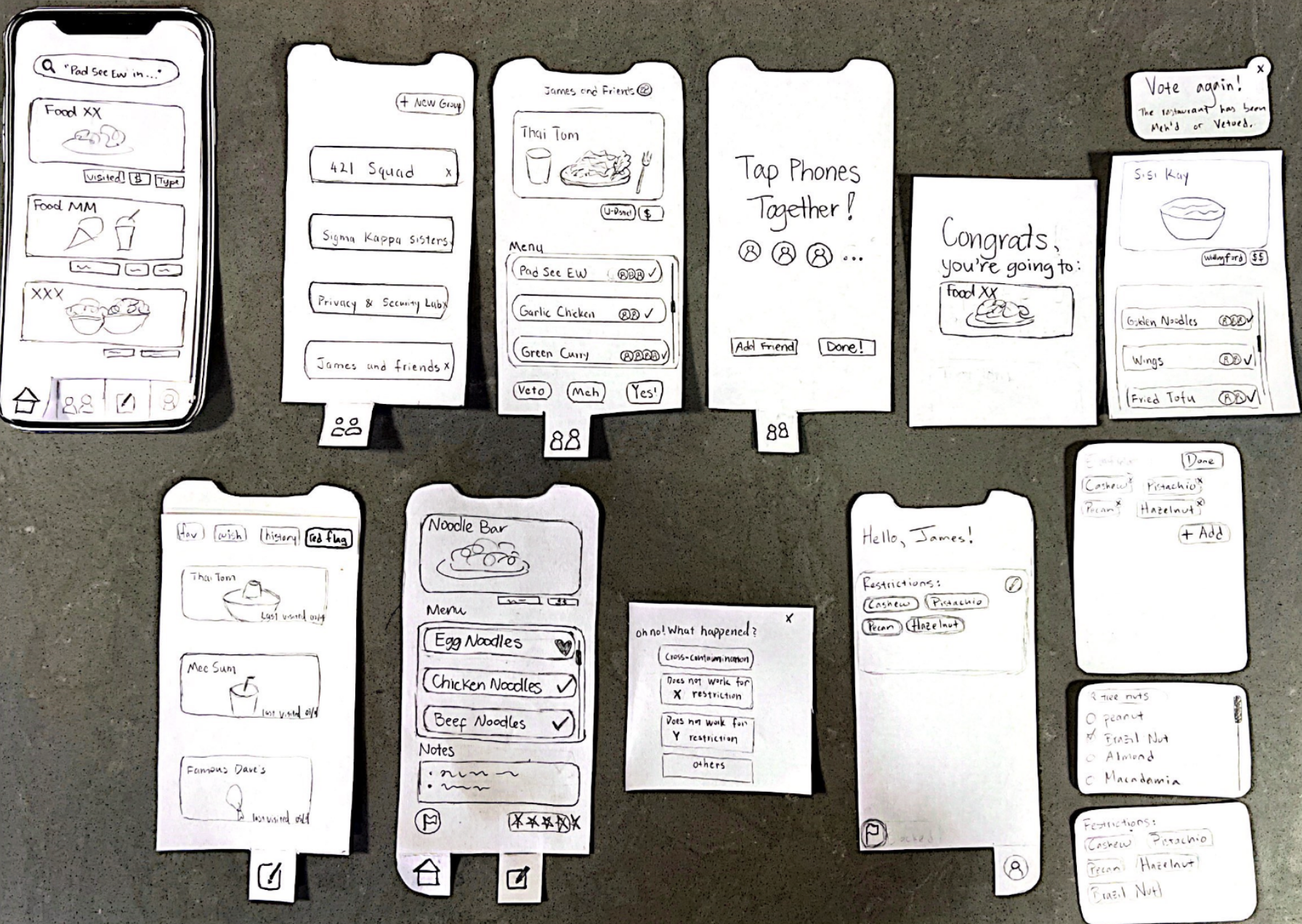
Our initial paper prototype consists of phone-sized paper cutouts.
Designing against the abusive ex-partner
Designing for vulnerable populations should not be an afterthought, but when creating our initial prototype, we did not account for potential issues related to online safety. In our usability testing, some participants tried to look for escape hatches but could not find them.
For example, in our group Food Party feature, once a user gets invited by somebody, they would be forced to finish the entire restaurant selection workflow—which requires everybody else's consensus—and had no easy way to leave the process early. For one participant, the lack of an escape feature was noticeable and almost seemed confusing. For this particular case, we added a way to leave a group, among other similar features (such as being able to remove someone from a group).
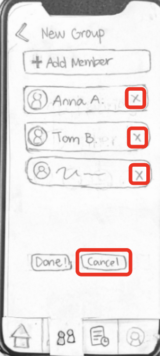
We retroactively added features to kick out a member and to leave a group in a Food Party.
Internal state changes are not obvious to everyone
During our design process, we made an unintentional assumption that all users would be familiar with the concept of our "History" tab, and that they would understand how a restaurant might end up there. This tab displays both red flagged and visited restaurants, including restaurants selected from the group Food Party feature.
During usability testing, however, it became apparent people can have different degrees of understanding depending on their prior background with technology. To partially address this issue, we began adding help text that describes changes in internal state (e.g., “we also added this restaurant to your history!”).
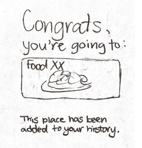
Messages like this one explicitly describe changes in internal state.
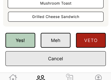
When we invent word usages, we have to define them
We received a lot of positive feedback about the voting process designed for the group Food Party feature. However, some participants did not find the option names (“Yes!”, “Meh”, and “Veto”) to be immediately intuitive. We soon realized that their understanding of the features depended on the order with which we prescribed our tasks in usability testing.
We cannot expect that our users would use our app in some specific order, so it is our job to make sure our design allows anyone to understand our app, no matter their background. We created an overall onboarding page that explains the features of the app before the sign-in screen. If it is the first time that someone votes, we will also explicitly explain how the restaurants were selected for this process and what their voting options would do.
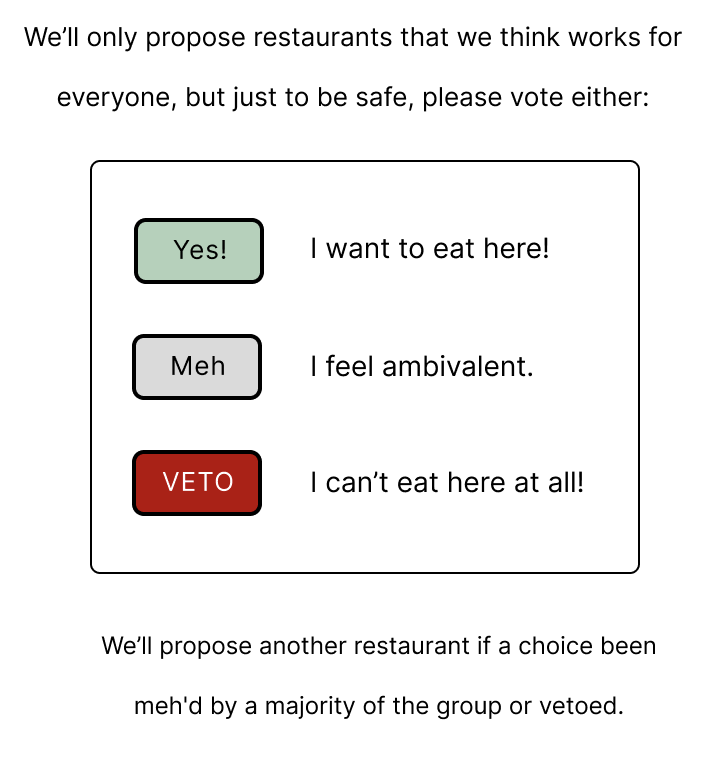
We added explanations for our terms, especially if a feature is used for the first time.
Resulting Design
After completing our usability testing process and drafting revisions on our paper prototype, we created a high-fidelity digital mockup using Figma.
- You can create a group with your friends.
- You and your group can decide on a restaurant to go to through the process of voting.
- You can document your dietary restrictions and preferences.
- You can record, rate, or flag restaurants you have previously visited.
Onboarding
You will see an onboarding screen the first time that use this app. Instead of our default landing page, you will also be directed to Profile tab to set your dietary restrictions.
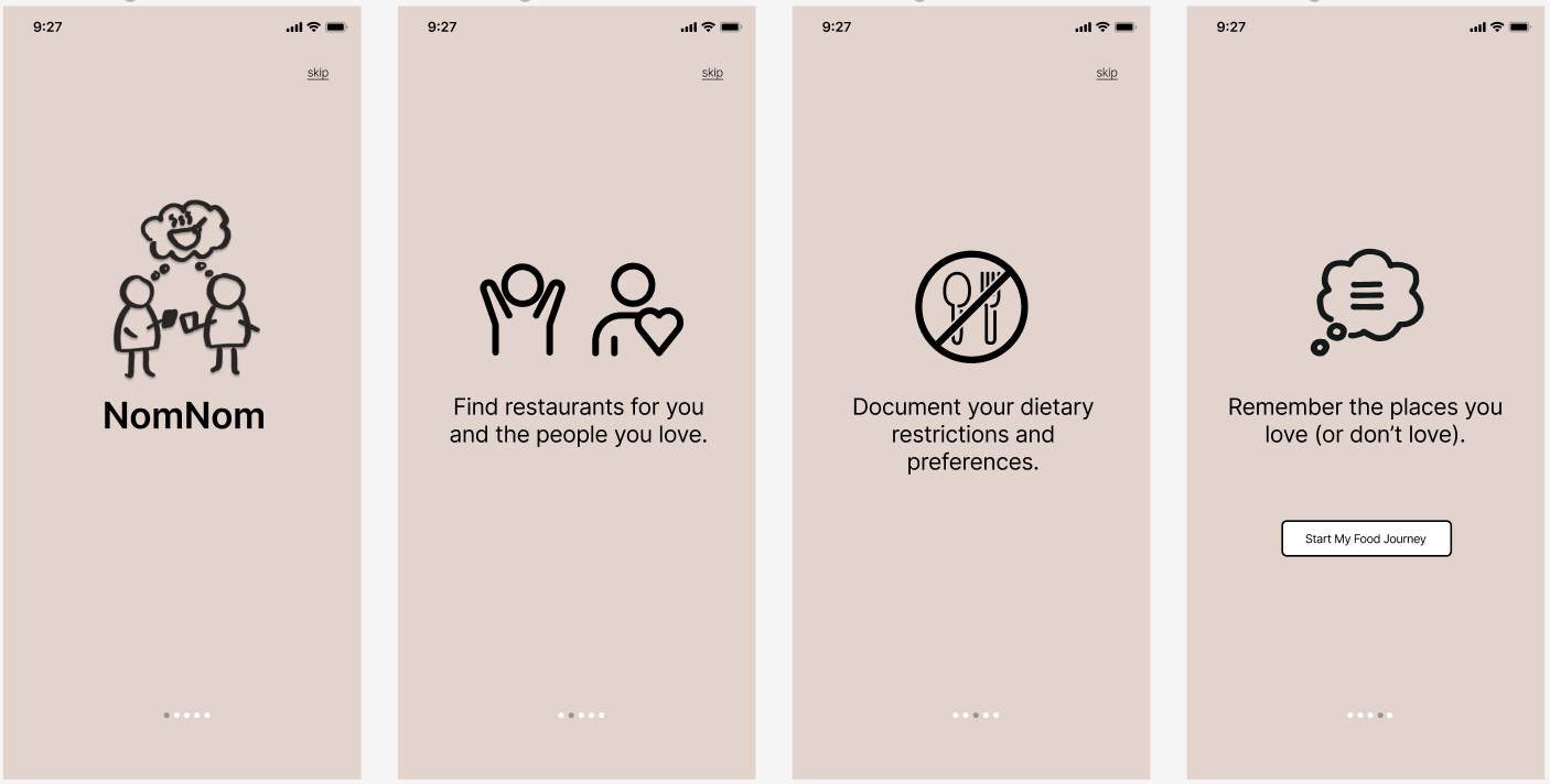
The onboarding screen is displayed before the user enters their credentials or creates an account.
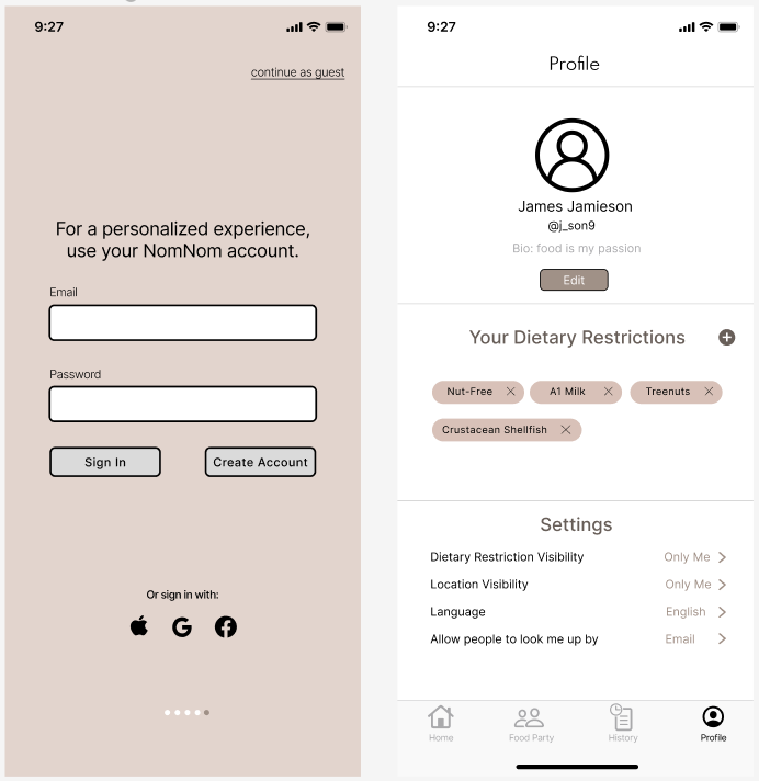
After creating your account, you will also be asked to select your initial dietary restrictions. You can always come back and edit this.
Restaurant information and red flagging
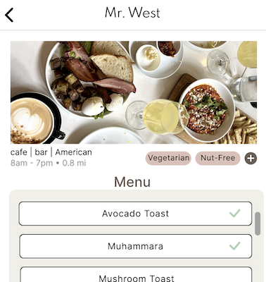
Our default landing page is a listing of the restaurants that meet your dietary restrictions. You can click on an entry to find out more about their menu.
On the restaurant's own information page, you can also record other structured information, such as tags for yourself or to “red flag” the business—one of our major tasks.
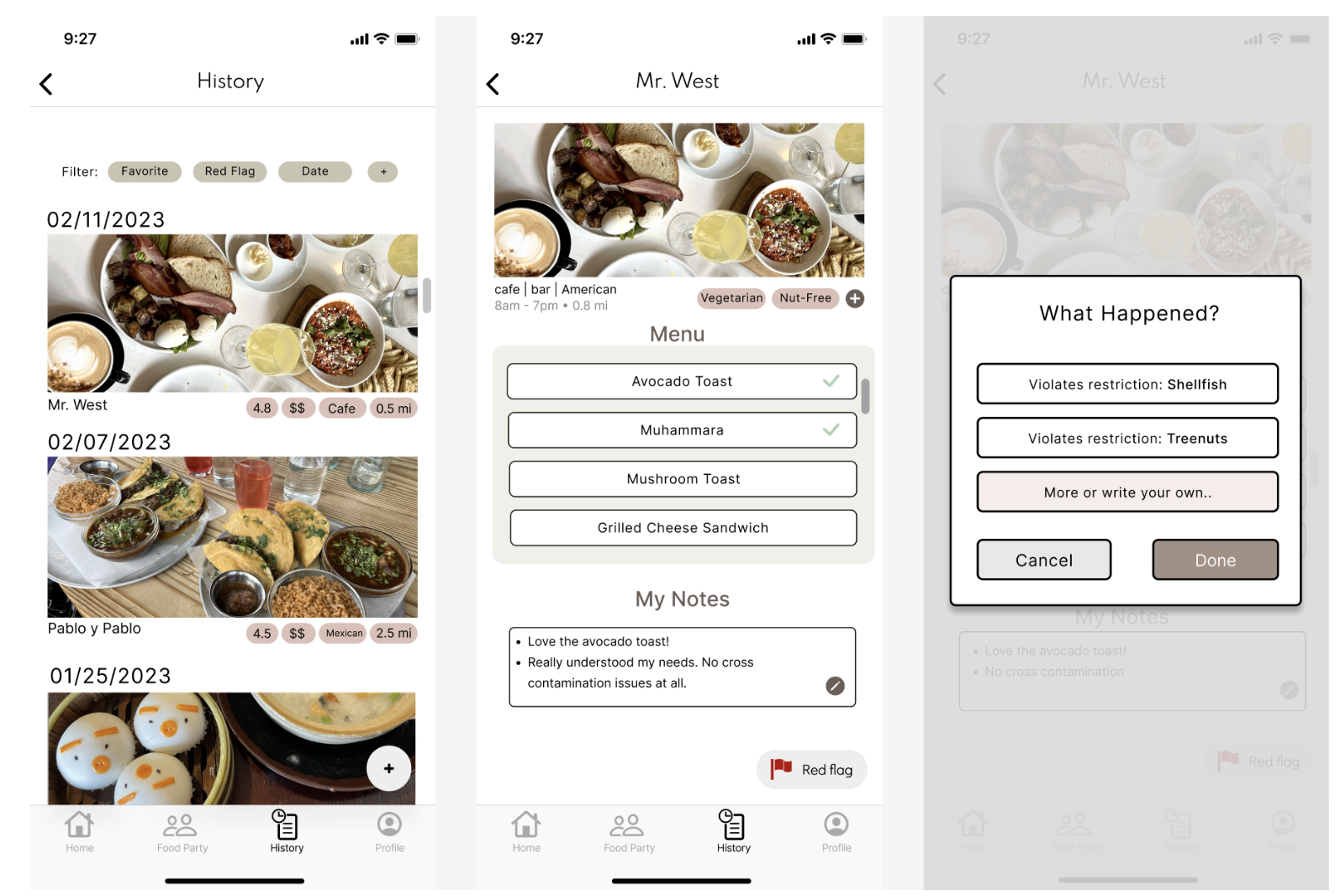
On a restaurant's information page, you can find menu items that work for you. You can also record a bad experience with that restaurant by “red flagging” it.
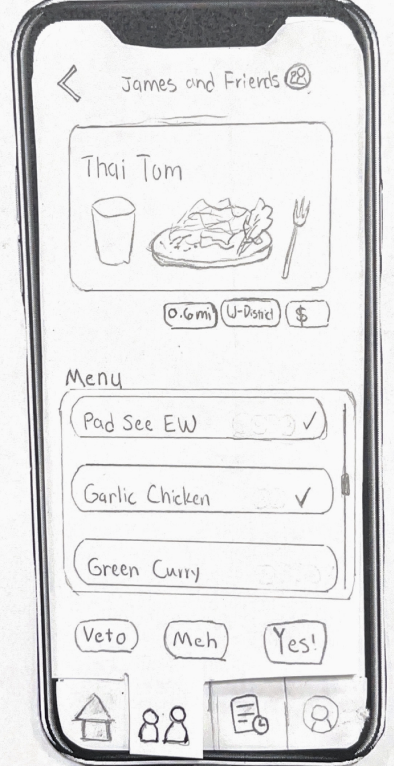
Food Party
One of our main tasks involves eating out with a group and making sure that the restaurant selected would work for everybody. The Food Party is a major feature in our app that is designed for that task.
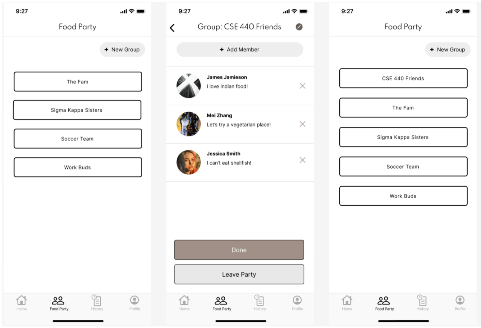
To begin, you would create a new group and start a food party with them.
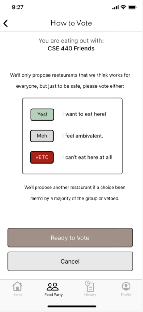
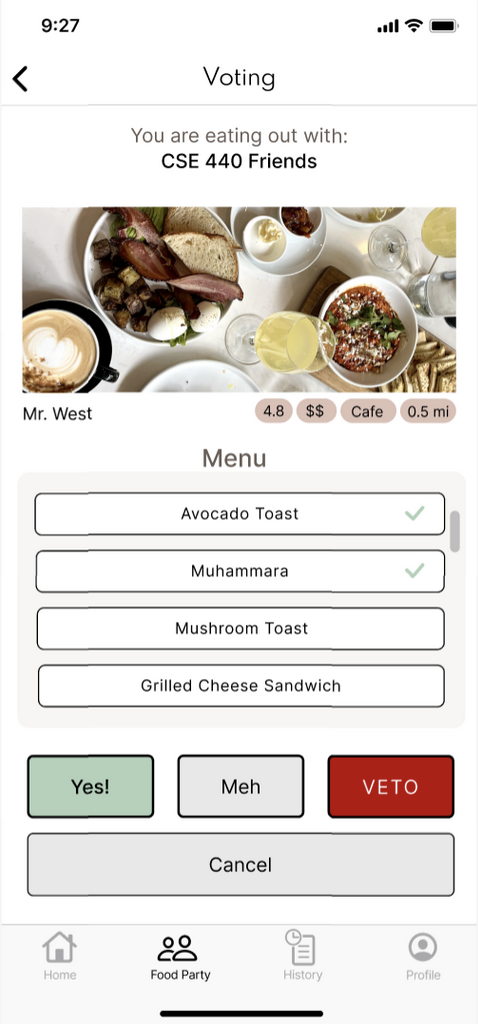
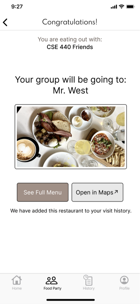
In this case, your might have voted 'Yes' or 'Meh'. Your group was still able to reach consensus with only one round.
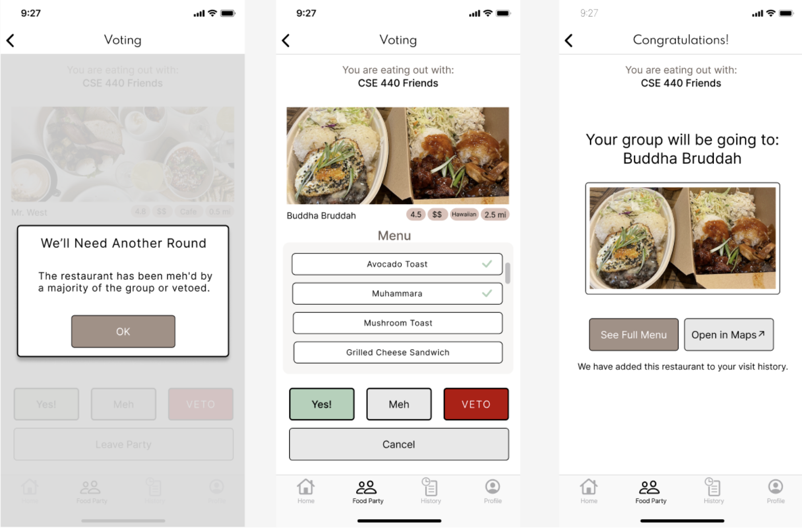
But a few rounds of voting may be needed to complete the restaurant selection, which can happen if someone needs to 'Veto' a choice altogether. The app lets you know if that needs to happen.