Medi-Symp
Medication Adherence and Symptom Tracking
Team


Problem and Design Overview
Medication management and adherence can be a struggle for patients, particularly for individuals with chronic illness. The burden of logistics to manage their medication is on the shoulders of patients, and it’s not always easy – 50% of patients with chronic illnesses don’t take their medication properly, usually because they forget to. Compounding this is the infrequently asked, yet critical, inquiry from their physicians about the effectiveness of their medications, an issue tackled best by symptom tracking over time. Medi-Symp is a mobile app with watch integration, aiming to challenge these challenging barriers to patient health and wellness.
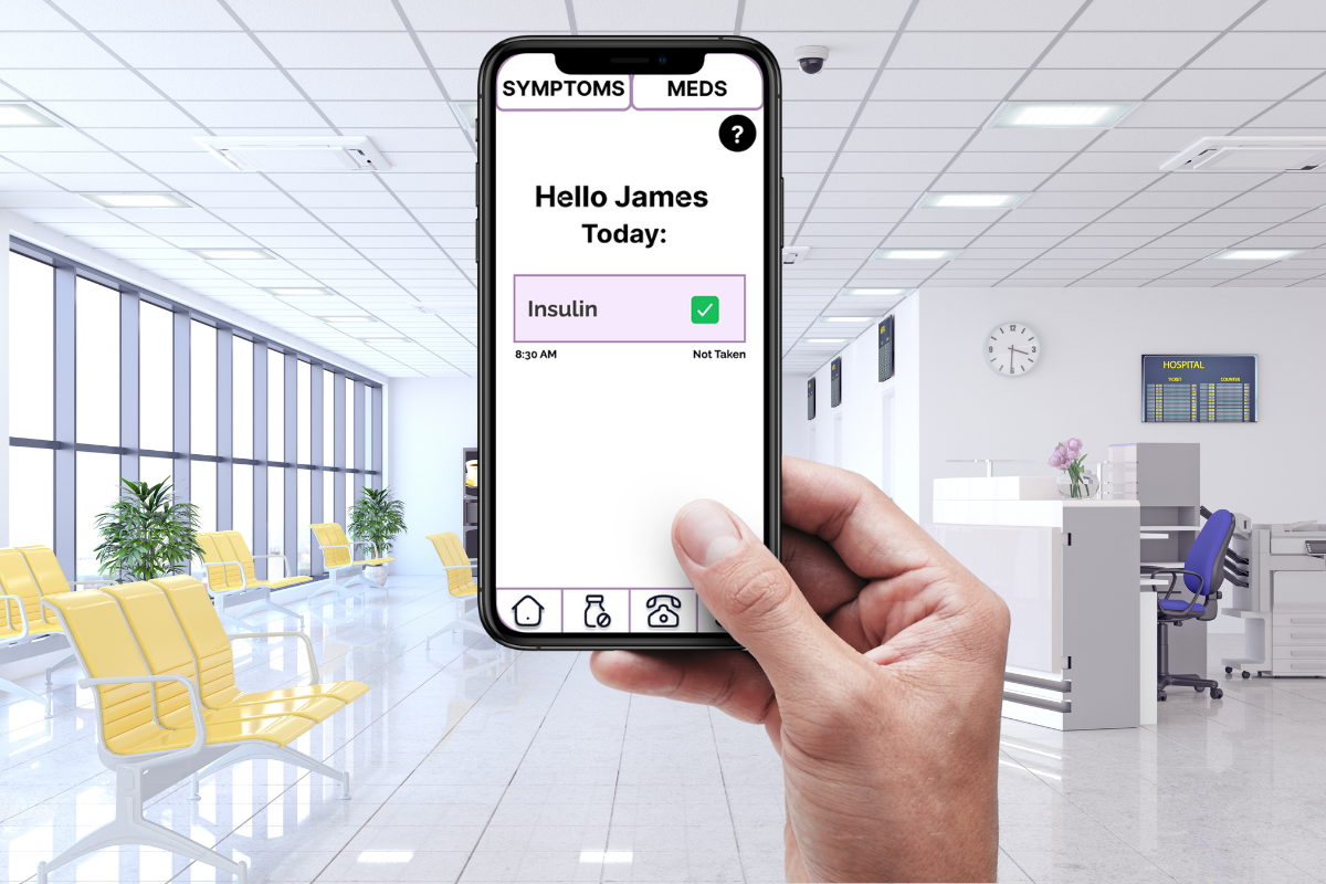
Medi-Symp allows for on-the-go medication reminders through a mobile application with watch integration.
Design Research Process and Key Insights
Design Research Overview
The focus of our design research was to establish an informed, evidence-based understanding of the tasks our target group seek to accomplish and the current barriers they face in that process. This was necessary in order to understand the scope of the problem we are trying to solve, including its consequences. We also specifically sought to understand obstacles in patient-doctor communication. We set out to accomplish these goals through three research methods. The first is three semi-structured interviews with a pharmacist, nurse, and physician, to gain second-hand real-world experience with these issues. Speaking with a physician, nurse, and pharmacist benefitted us because we were able to gain the perspective of a doctor writing prescriptions and also discussing symptomology with patients, the perspective of a pharmacist who deals with prescription medicine more closely, as well as the nurse's perspective of administering medication. We also conducted a diary study for a priority stakeholder that envisions a lot of what we’re aiming for in the patient part of this design. Finally, we performed a literature review about medication adherence and its management as we are designing for a space that has been researched for a long period of time and there is a relevant history we can use in our design process.
Design Focus:
- Remembering to take daily medication
- Journaling Symptomology for medical evaluation
Our iterative design process aimed to refine our chosen design, a mobile application with watch integration, in order to best accomplish the tasks As part of our iterative design process, we initially brainstormed as well as sketched different ideas. These ideas include a smart pill box, a phone app paired with a clicker, and a phone app synced with smart watch integration. After brainstorming, we agreed on the phone application with the smartwatch app where a person can set up their medication and symptomatology alerts in the phone app and be notified on both devices. The tracking of symptoms can also be done via phone or watch.
Key Insights
Personalization and customization of key
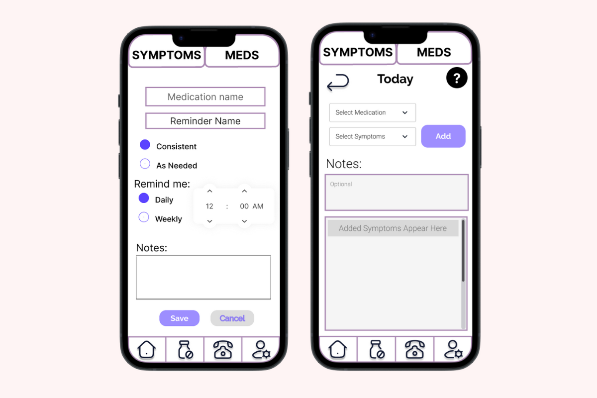
Through our initial design research early on, we discovered that any attempt at generalization or an impersonal approach to our design would be unsuccessful. Specifically, the pharmacist interviewed emphasized this by saying “Remember: every patient is different, and every aspect varies from person to person”. Our literature review further demonstrated this because it indicated that each individual has different reasons for taking (or not taking) their medications. Some patients may need alerts temporarily, such as for a short-term medication, while others require permanent alerts. A one-size-fits-all approach is not the best approach. Initially, we wanted to have a quick and simple questionnaire to be filled out when recording symptoms, but we were reminded that having the same couple of questions for everyone would lower the benefit for everyone by adding unnecessary symptom questions for people that never had those issues. We also realized that there will inevitably be symptoms or unique reactions that people desire to track but we will not know about because everybody’s medical situation is unique. For this reason we added a free entry textbox, allowing for additional notes to be entered and tracked.

The symptom entry page with ‘Notes’, an optional free text box.Right: The medication scheduling page with customizable settings.
Portability is a necessity
Through critique received during studio time with the course staff, we arrived at the realization that our design, no matter the form, needed to be portable in order to deliver medication reminders at the appropriate time. The point of the research process where this occurred was after we came up with three designs. In presenting our three designs the course staff asked “What happens if they aren’t home when the alert arrives?” – admittedly, we hadn’t considered what would happen in that scenario! This critique made it abundantly clear that mobile integration would be a best fit for actually conquering the problem of medication reminders because we improperly made the assumption that patients would be home for these reminders, clearly an incorrect choice. Following this feedback session we narrowed our focus to designing for either an exclusively-mobile design or a physical design with necessary mobile integration of sorts.
Accessibility through external devices
From our design research, we discovered that we needed to make our design more accessible. Specifically, allowing the symptomology recording to be done in a more quick and simple way. This critique came up through our diary study when our participant explained the lack of accommodations for those who have high-accessibility needs. “If I could pre-write common occurrences that happen in severe attacks and then have one or two buttons to press instead of having to type or speak that would be helpful. […]Since if it's bad enough I will be unconscious. Or nonverbal. Or paralyzed. Presents some issues.” - Diary Study Participant. We realized accessibility is very important for a design like this as people who have the highest accessibility needs are more likely to need a design like this the most, and most consistently. From here, we knew we needed a way for the participant to be able to record symptoms with only a few taps. This is where the idea of smart-watch integration came out. Being able to report symptoms through a watch would be easier than pulling out a phone, and also the watch would theoretically be on your person at all times. The second part of this redesign was our “Easy Symptoms” page where groupings of symptoms can be preset for easy access through the watch later.

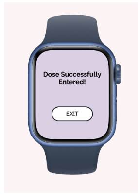
The symptom entry watch interface features large touchpointsand a simplified interface with clear confirmation messages, emphasizing accessibility.
Iterative Design Process and Key Insights
Two Selected Tasks:
- Task 1: Remembering to take daily medication
- Task 2: Journaling symptomology for medical evaluation
We built our initial lofi prototype based on our design and research. We also geared the prototype to be able to complete the two selected tasks. Once we had our lofi prototype, we set out to find participants to gather two heuristic evaluations as well as three usability tests. We gained very insightful feedback from our participants from these tests. Some of the issues in our prototype were with notifications, participants pointed out that it was difficult to distinguish medicine vs symptomatology reminders. Another issue was there was no help page to assist the user in navigating the app. There was also an issue of non functionality with the settings and emergency contact pages not having screens in the prototype. A general piece of feedback we got was participants like consistency and simplicity across screens in the app.
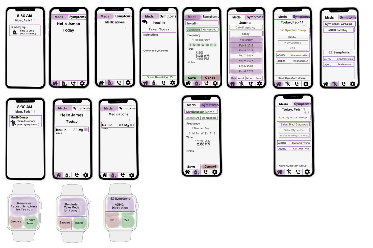
The initial paper prototype featuring a phone app and watch integration
We finalized our lofi prototype by addressing the issues found during testing. Some of the changes include color coding reminders to distinguish between medicine vs symptoms. Another change was adding functionality for settings and emergency contacts as well as a help button for navigation. We also made sure to emphasize consistency and simplicity across the screens, adding in back arrows for pages deeper in the app and help button on each appropriate page. To add to the simplicity we made sure that it was easier to understand for the user to enter medication and submit symptoms.
Based on our final lofi prototype as well as insighful feedback from usability testing and heuristic evaluations, we iterated upon what recieved positive feedback from our original design and ameliorate on the negative feedback to create our digital mockup.
Simplifying Symptom Entry Sequence
From one of our usability tests, the participant found it difficult to submit their symptoms through the phone application. The participant found the initial paper prototype design screen for submitting symptoms confusing, especially the “Load Symptom Group” button.

Initial lofi prototype featuring symptom entry sequence
Taking into account this feedback, we simplified the screens for submitting symptoms by removing confusing buttons and not having too many tabs on one screen so that the user is not confused and to keep the screen easier to navigate. We made sure to separate the phone and watch app by distinguishing symptom groups (phone app) and easy symptoms (watch app).
Digital mockup featuring improved and simplified symptom entry sequence
Adding important functionality of features
The usability tests revealed that the emergency contact page was non-functioning and a relevant feature as 2 of the participants tried tapping on this icon. One participant was confused on the meaning of the emergency contact button and even asked during the test, “What does this phone icon do? Does it link to your phone contacts app?”.

Initial paper prototype feature mobile app main home screen with the emergency contact icon highlighted
Using the feedback, we made sure to add functionality to the emergency contact page so that we could increase accessibility of our product and clear up any confusion. We made sure to maintain simplicity of the app and make the screens of the setting and emergency contact pages clear and easy to navigate. We maintained consistency by making the emergency contact page similar to the list of medication alerts page.
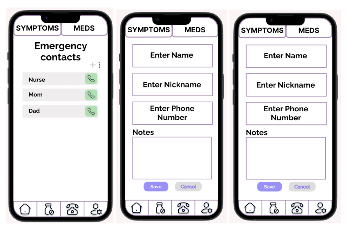
Digital mockup with the added functionality of the emergency contact screen for entering contacts
Improving visibility and readability of the application
From our usability tests, a participant pointed out that it was hard to know if medicine was taking for today. Our initial paper prototype indicated medicine as taken by the filled in box that corresponds to that medicine. Another issue that arose was that the reminders did not give any instructions or dosage quantity when the user received the notification. This was exposed in each of our usability tests as each participant pointed that out.
.png)
Initial paper prototype of mobile and watch app showing medication alerts
To fix these issues, we added a green checkmark to ensure there is no confusion if the medicine was taken. The watch app also visibly tells the user that the medication was taken. Additionally, the watch and phone reminders specify the dosage quantity to the user.
.png)
.png)
Digital mockup of mobile and watch app showing improved and descriptive alerts
Resulting Design
The final design involves a mobile application with watch integration, both of which can be used for mediation notification delivery and symptom tracking. Alerts are created and managed on the mobile app but are delivered to both devices at the scheduled time. Symptom entry on the watch centers rapid, easy entry by setting up the queried symptoms on the mobile application first through “Easy Symptoms”. If preferred, tracking is enabled on the mobile application where a more robust interface is offered including a free text entry box. Past entries can be easily viewed by selecting dates on the calendar interface of the symptom tracking page. Convenience and safety features such as emergency contacts are available to input if desired.
Task 1: Remembering to take daily medication


When the main dashboard is opened on the home page, there are initially no reminders set. Selecting the medication icon leads to a page where new medication reminders can be created. Here information such as frequency, time to take medication, nickname, and any notes can be input. After saving, the alert is set. A toggle button allows the alert to be turned off if desired.
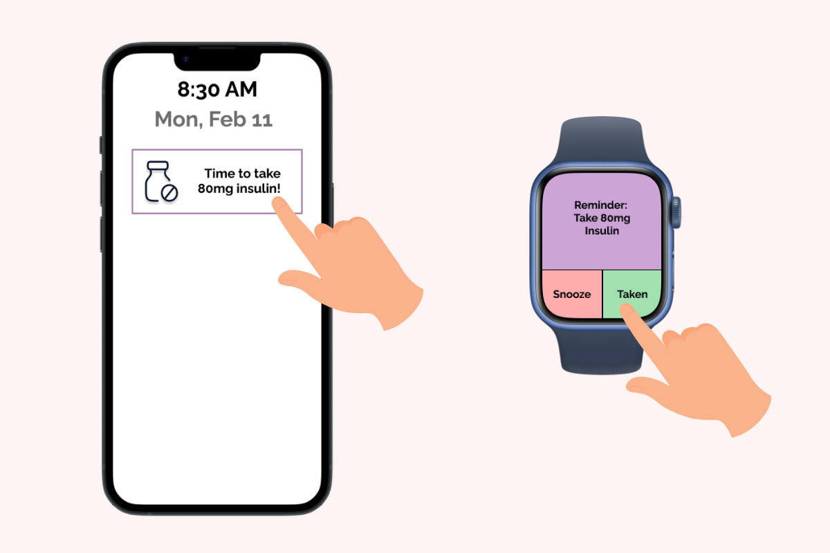

When it’s time to take a medication based on its set alert time, notifications are sent via the phone and watch (if connected). Snooze pauses the alarm for five minutes. By selecting the notification icon or “Taken” on the watch, the app can be notified that the medication has been taken.
Task 2: Journaling symtomology for medical evaluation
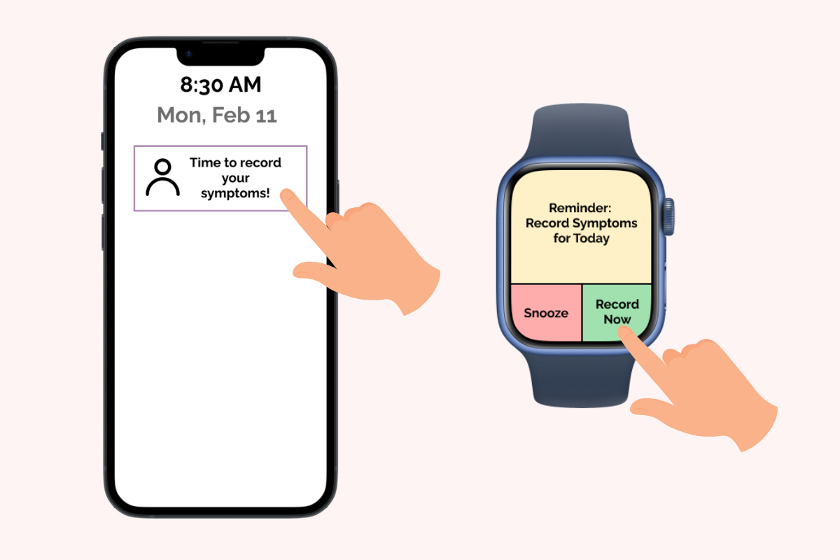

When it’s time to record symptoms, notifications are sent via the phone and watch (if connected). Snooze pauses the alarm for five minutes. By selecting the notification icon or “Record Now” on the watch the symptom entry process is initiated.If on the watch, the preset Easy Symptoms questionnaire begins (to choose preset symptoms queried: see the last two images). If on the phone, selecting the current day brings the symptom entry view where medications and symptoms can be added to a list for today. Optional notes can be added as free text.


From the dropdown menus current medications can be selected. The second menu displays associated symptoms to choose from. These symptoms can be selected and added to a list for tracking purposes. The preset Easy Symptoms queried on the watch can be set and changed via the Easy Symptoms button on the main Symptoms page. This page displays a dropdown menu.

The dropdown menu displays symptoms associated with current medications.These can be chosen and added to the watch Easy Symptoms for fast tracking.