Lingual
A new way to learn languages
Team



Problem and Design Overview
Roughly only 20% of Americans know more than one language. One of the reasons this number is so low is because learning a new language is often repetitive, tedious, and boring. How do we solve this issue? Shockingly, the average American watches roughly three hours of television a day, so what if they spent part of this time learning a new langauge by watching something in the foreign language?
This is what Lingual aims to do: help users learn a new language through watching TV shows, movies, or reading books. With the Lingual app, a user can select the desired language to be learned and get curated recommendations based on their proficiency levels. They are also able to connect and converse with other users who are learning the same language and watching the same content, allowing the users to improve their conversational fluency as well.

Lingual Launch Page
Design Research Process and Key Insights
To address our problem, we decided to gage any shortcomings in current language learning methods (such as the classroom and current language learning applications) and evaluate interest in engaging supplements like entertainment. We then chose to conduct three semi-structured interviews to gather these insights because interviews provided direct audience interaction allowing us to pry into particular shortcomings and any supplement preferences. We wanted available interview participants with current or previous language experience so interviewed two current University of Washington language students (Jane and Howard) and a user of Duolingo (Nicole).
Our interview questions started out with broad questions about their language background. From there we asked the following questions involving their classroom experience/platform.
- How they felt about certain aspects of their current language learning system
- How they engaged in the non-primary language outside of a classroom environment, if at all
- How proficient they were in different aspects of the language (writing, speaking, reading, etc.)
Key Insights
Existing Language Learning Structures focus on grammar and vocabulary more than speaking and listening
Classrooms have occasional speaking and listening exercises, but the grammar and vocabulary is often the focus and the bulk of coursework. Duolingo has a similar pattern as the majority of the exercises are reading/matching and users may even skip speaking/listening exercises. This tends to present a steep learning curve for new learners with regards to becoming conversationally fluent. Lingual is designed to focus more on the speaking, listening, and comphrension aspects of learning the language, helping users bridge the gap of knowing the vocabulary but not being conversationally fluent.
Existing Language Learning Structures occasionally feel like a chore and ineffective
While a user may practice everyday, they may not learn much because they only spend 5-10 minutes each day. Many apps have some sort of reward system or “tokens” that gamify language learning. To some extent this shifts the focus of the app to collect these rewards rather than learning the language. While this is meant to increase the amount of time the user spends on the app learning the language, some users simply start doing the bare minimum to achieve these "tokens" but nothing more. Lingual is designed to have the attraction aspect of the gamification by having a Lingual Score that represents a users fluency. However, this Lingual Score is primarily for self tracking a users progress and cosmetics, which removes the distractions of "rewards" or "spending tokens" that other gamified language learning platforms have.
There is wide interest in engaging with foreign media
While there is interest in engaging in foreign media, for example foreign shows or novels, there is a very large barrier for people to understand the content. Many of the foreign media content is targeted towards those who are proficient or fluent in that language, making it hard for beginning language learners to follow along. Lingual aims to address this challenge by generating media recommendations right at the users level (or slightly more advanced so the user challenges themselves). To do this, Lingual has to measure the users current proficiency and monitor how it increases as the user learns more of the language. Lingaual achieves this by having the user take a placement quiz to assess their inital proficiency, and the user takes check-in quizzes throughout their media engagement so Lingual can update its recommendations to the user.
Iterative Design Process and Key Insights
Reaching a Paper Prototype
We began by making many prospective design sketches and storyboards before we narrowed to making a mobile application focusing on two tasks: Finding media content at the appropriate difficulty level and finding a community/conversational partner. We then made a paper prototype for the mobile application that we took into testing iterations.

Paper Prototype Overview
Testing Process
We iterated on our prototype through two heuristic evaluations based on Nielson’s 10 Usability Heuristics and three usability tests. Our heuristic evaluations were done during CSE440 lecture and allowed for numerous text and button fixes. For our usability tests, our first participant was a Duolingo user and took place in their apartment. We chose this person and environment because they're a part of our target audience and the environment emulates where they'd typically be using the Lingual app. After conducting this test, we refined our background introduction and tasks to become much clearer.
Our second participant was a student and took place in Mary Gates Hall. We selected this individual because they were in our quiz section and they had interest in learning a language. Their advice provided many specific visual improvements.
Our last participant was a previous language student and took place in CSE2. We chose this person because they had expressed interest in more entertaining language supplements. They helped to clarify that the design was clear but also pointed out issues with our placement test process.
Making Pop-Ups More User Friendly
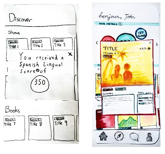
In many of our usability tests, we had confusion from participants over how to respond to pop-ups in our design. Many of the pop-ups didn't include any indication of how to dismiss them in the case of displaying the Lingual score or to remedy an error in the case of leaving questions unanswered in the placement test. In order to improve the heuristic of User Control and Freedom, subsequent paper prototypes included explicit closeouts such as "x" icons in corners and buttons in certain pop-up dialogs.

Original Pop-up Design
Revised Pop-up Design
Including Option to Skip Questions
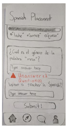
Our initial design required the user to complete every question on placement tests, otherwise they would be met with an "Unanswered Questions" error dialog. Through usability tests, we realized that not allowing users to skip questions doesn't allow for the case where the user genuinely doesn't know the answer and would rather not answer the particular question. We replaced this with a dialog that informs the user that there exist unanswered questions upon attempting to submit the quiz and gives options to "Cancel" submitting or to confirm submitting.
Original Question Skipping Design

Revised Question Skipping Design
Clearer Navigation
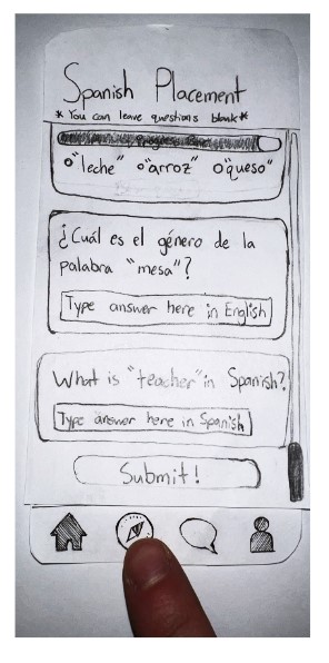
With our design for one of our tasks requiring the user to complete certain actions before proceeding to the rest of the app, we noticed that the app's navigation bar shouldn't appear in certain places, such as during the placemnet test itself. We kept this in mind as we redesigned the onboarding process, including taking the placement test, to have a more linear progression of views and to not show the navigation bar so that the user's workflow is in a more logical, defined ordering.
Original Navigation Design

Revised Navigation Design
Resulting Design
Our resulting design supports two main tasks: Allowing users to discover media content in a foreign language that fits their language comprehension ability, and helping users find a community/a conversational partner for the language being learned.

Final Design Figma Overview.
Task 1: Discover media content in a foreign language that fits one's language comprehension ability
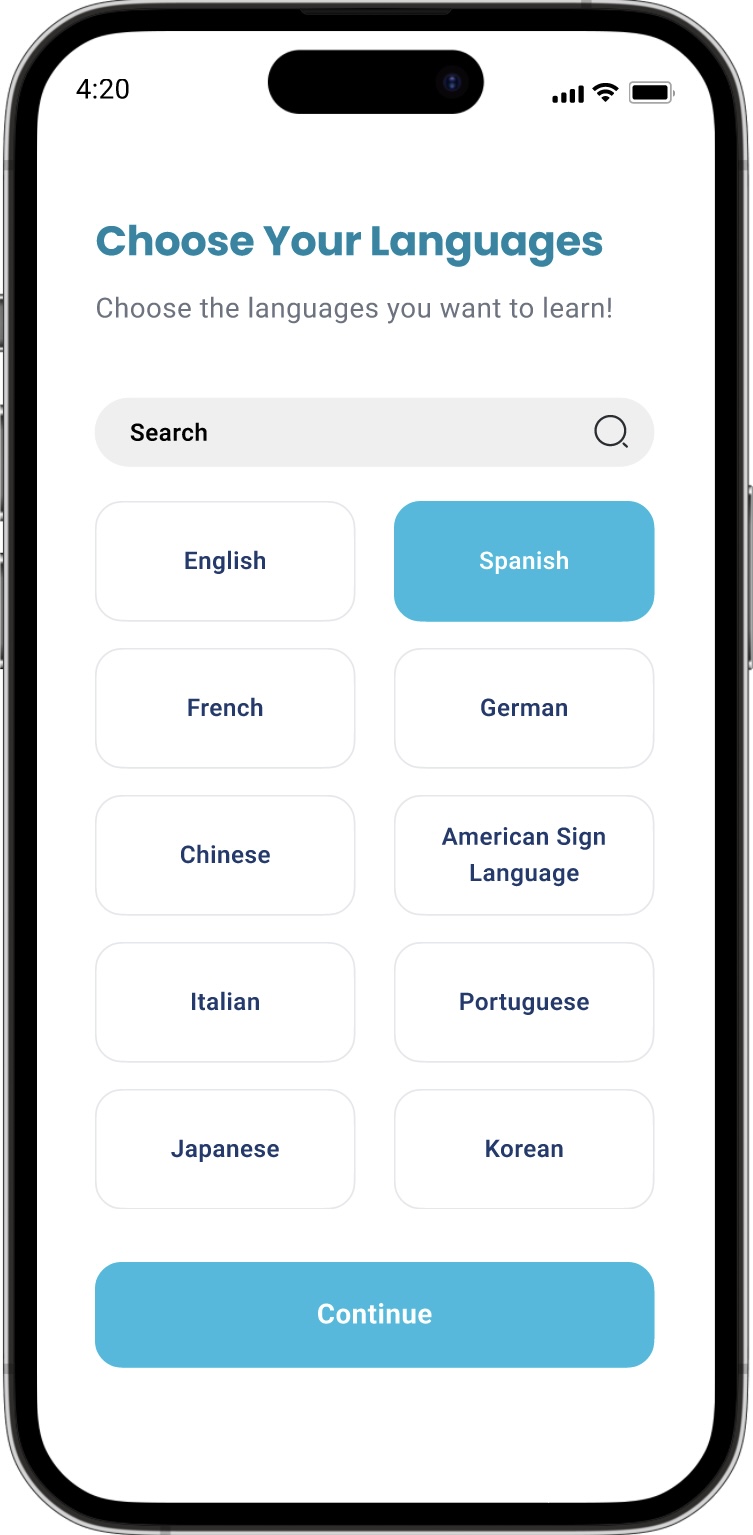
Once the user creates an account, they are prompted to select which languages they would like to learn and which genres of media they enjoy consuming. For this example, the user chooses Spanish and that they enjoy comedy.
Language Selection
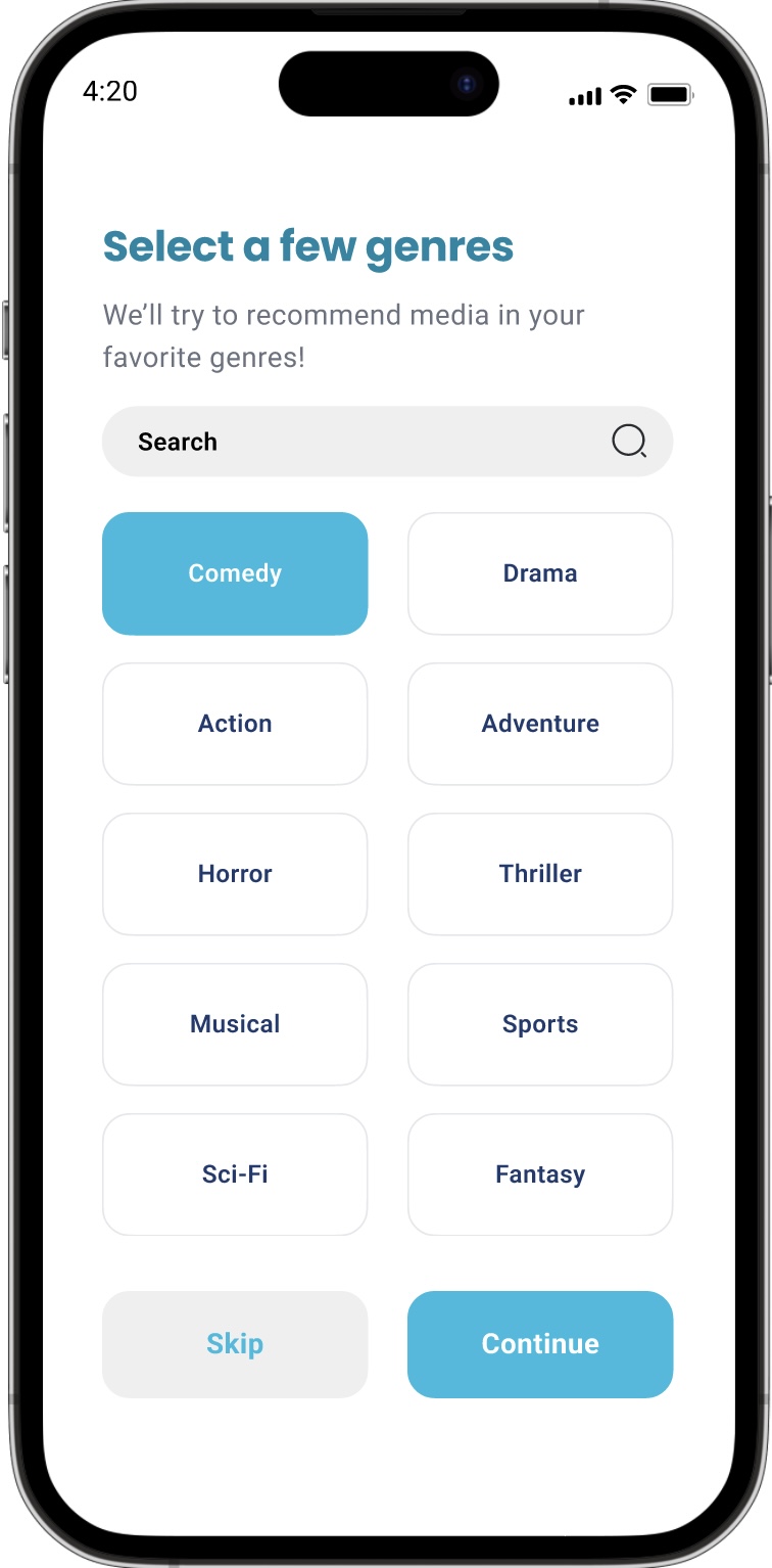
Genre Selection
The user then proceeds to take a placement quiz for the languages the selected. This quiz is meant to measure their baseline proficiency and is used to generate inital media recommentations. They recieve a Lingual Score that represents their relative proficiency in that language. The user can increase their Lingual Score by completing check-in quizzes about a show or movie they are watching.

Baseline Proficiency Quiz
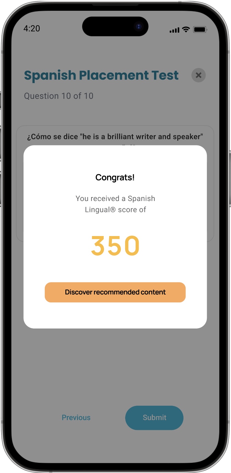
Initial Lingual Score
After completing the baseline proficiency quiz and recieving their Lingual Score, they are brought to the Discover page, where they can browse curated shows, movies, and books are recommended to them. These recommendations are based off of their input favored genres and their current proficiency. They can engage with the media by clicking on each thumbnail.
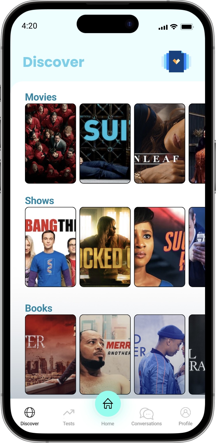
Media recommendations

Media thumbnail with information
Task 2: Find a community/a conversational partner for a language being learned
On the Conversations page in the app, the user can toggle between their individual chats or their group chats. The user can also search for specific individuals or groups they are in. To join a new group or start chatting with a new individual, the user presses the plus button on the top right of the screen. They are then presented with the option to join a group or converse with an individual.

Conversations Page
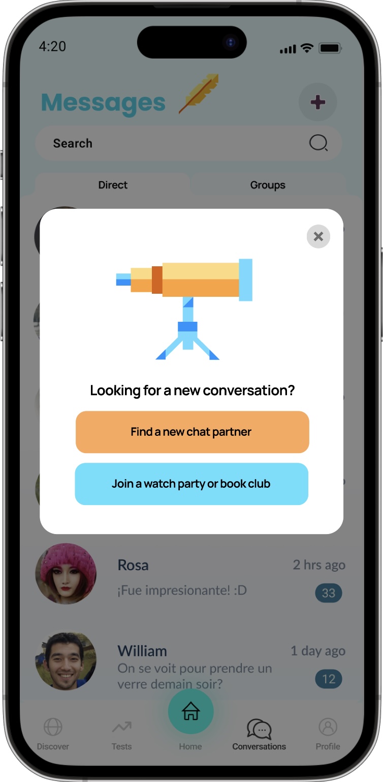
Adding a new conversation
For this example, the user wants to join a new group to discuss the current show they are watching. Based on the show or novel that the user is currently watching, the app will recommend groups that are in roughly the same spot as the user. The user is then able to join the group to practice their conversational skills and discuss the content of the show or novel.

Finding new group

New conversation group