Huddle
Navigate your commute safely with friends
Team


Problem and Design Overview
It's late at night. After a long solo walk from campus, you are finally getting home from your group meeting. Approaching your apartment, you realize your neighbor is also getting back from studying and is unlocking the main door just ahead of you. As you walk up the stairs together, you find out that they were in the same building working two floors down from your favorite study spot.
This situation has happened to most of us in one form or another. Both students and safety professionals have noted that travelling in groups is far preferred over commuting alone. Living in the city, students are put at risk every time a class or project meeting gets out late and no one else from the group is headed in the same direction. What if we extended that circle? We realized that, as students, there is almost always someone we know nearby. However, it is difficult to connect when even a 30 second difference in departure time can destroy the possibility of overlapping paths.
To solve this problem, Huddle connects people who already know each other before leaving for their destination. By collecting data about people's commutes, we can broadcast the data to other people they already trust, thus maximizing the opportunity to have a partner for even part of a commute.
Safety goes beyond companionship, however. We realized that we can't change the relative safety of an area, but we are able to alter how students react to it. This is where the second component of our design comes in. Whether walking alone or in a huddle, app users also have access to our Safer Route mapping. This feature combines real-time safety updates with general safety trends as reported by other users. It provides an extra level of awareness for anyone trying to get around campus, independent of others' availability.

The huddle page is the primary screen of the app. It houses all urgent information pertaining to your huddles.
Design Research Process and Key Insights
For our design research process, we wanted to find UW students who were living on or around the U District area to see if they happened to experience any instances whilst commuting in which they felt unsafe. While researching our topic, we found that 82% of American college students are concerned about their safety, so we wanted to get real feedback from UW students to see if there was anything that they wished could be improved about their commuting experience. We chose to conduct semi-structured interviews because we had specific questions we wanted to ask, but wanted to have flexibility in the conversation based on the students' responses. We interviewed 3 computer science students: a sophomore who takes the lightrail, a junior who usually walks home, and sophomore who busses. We selected these students because they had been commuting around Seattle for at least a year and would be our target audience for improving their commuting experience.
Seeing the Same People on the Way Home but Not Approaching Them
When asked if they saw familiar faces in their daily commutes, our participants explained that they would see the same people on the bus or while walking from home to class everyday, but were timid or uncomfortable with the idea of just walking up and approaching them. One participant said that he wished there was a way for him to talk to those people. Another participant mentioned the recognition of those familiar faces being friends of their friends who they knew lived in the same place as them.
Want to Stay Connected to Others, but Need to Be Aware of Surroundings
Our participants stated that they wanted to keep talking with their friends while they were commuting, but found it difficult because they also had to be extra aware of what was going on around them. One participant said that she commonly uses FaceTime to call her friends on her commute, while another says that she doesn't because "when my phone is on speaker, I don’t like people hearing my conversations and I don’t want to put earbuds in cause I want to be aware of my surroundings.” Our last participant said, "I usually double check to make sure no one’s following me and stuff,” gesturing that he looks over his shoulder frequently.

At night, when someone doesn't want to walk home alone, they can go on their phone to find a friend.

We wanted to make bussing less intimidating with live alerts and suggested things to do inbetween waiting.
Waiting for the Bus Can Be Scary, Unreliable, and Time-Consuming
All of our participants mentioned that they had used the bus before to commute to a destination. One of our participants says that “Waiting at the bus stop by myself can be scary.” Another says that while bussing may be safer, she often opts to walk because of how unreliable the buses can be. As a result of these findings, we wanted to add a feature to our design that allowed for timely alerts of any events that would affect someone's route and, as a result, update the route to reflect any changes from the alerts.
Iterative Design Process and Key Insights
We started off by creating our paper prototype. Since we had two tasks we wanted to focus on, we made sure that the functionalities of our app were targeted towards helping participants accomplish these goals. Our first task was having individuals find a huddle (person or group) to commute with. Our second task was having individuals find a safe route home. After this, we conducted heuristic evaluations to better understand how different participants would interact with our prototype.
Participants executed the previously mentioned tasks while evaluating our designs during our usability tests as well. We asked two evaluators in our CSE 440 class to go through our prototype and they helped us identify usability problems in our design. We were able to gather helpful feedback surrounding Nielsen’s Heuristics. Following the heuristic evaluation, we did usability testing. We asked three different students if they would be willing to participate in our test. First we talked to a freshman in the Nanoscience Building who generally walked to all of his classes and did not spend too much time on West campus. Our second participant was a senior in our CSE 440 section who usually walked to campus. Lastly, we talked to a sophomore at the Odegaard Library who usually took the bus and walked if she was running late. We were able to get very helpful feedback that allowed us to refine our prototype in several ways. We proceeded to complete our digital mockup by using what we learned from all our past evaluations and reflections as a team using the Figma platform.

The final iteration of our paper prototype.
Providing an Initial Tutorial
Initially our main home page had three main functionality buttons but while conducting our usability test with the senior in our CSE 440 section, she mentioned how she was not sure what the buttons were supposed to do. Since we had to serve as “human computers” we were not able to guide her. However, this shed light upon the fact that we should make sure to include a clear tutorial that participants are able to see upon entry onto the main page instead of seeing just the buttons. We added a detailed description bubble for what each button did so that participants could clearly choose one, depending on the task they wanted to accomplish.

Initial design without tutorial on the left and refined design with home screen tutorial on the right.
Adding Proximity Clarity on Finding a Huddle
During our usability test with the sophomore from the Odegaard library, she asked us how close her friends were to her when choosing who to add to her huddle. We could not clarify this during the process since we were practicing an “off-hands” practice but it got us thinking about how we should solve this challenge. She brought up a valid point because with our prototype at the time, there was no way of knowing how close or far your friends were from you. We decided to add an adjustable radius for people to find other contacts that were close to them to commute with. This added more clarity to the process of picking individuals to commute with.

Initial design without adjustable radius on the left and adjustable radius for finding friends to commute with on the right.
Allowing Modification of Huddle Requests
While going through our prototype as a group, we observed that there was no way to modify the request that individuals would send others to create a huddle. At first, our model was very rigid and individuals who received the request could only accept or decline. This seemed very inflexible so we modified our request page by making it more open-ended to accommodate more situations. We made it a text box where we prompted them with some questions that they could use to send their request. We also added more cancel button and back button scenarios to give the participant more flexibility when creating a request.

Initial request design on the top. Iterated screens with more flexibility when sending requests at the bottom.
Resulting Design
Signing Up
To get started, students can create an account and use UW single sign-on to verify that they are a UW student. There is also an option to toggle accessible routing if a user needs it.


User Onboarding
Once signed up, the app executes a tutorial of the home screen. The home (huddle) screen displays where the user can input their next commute, a section showing the current huddle, any huddle requests they have received, and a section for messages.
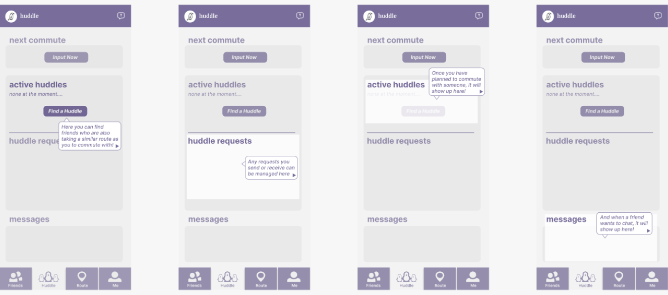
Tutorial sequence
Adding Friends
In the profile screen, a user can change their settings such as who they allow friend requests from. "Contacts only" allows people that are already in the user's saved phone contacts to be added as friends on the app, while "contacts and friends of existing friends" allows a user to also add people their friends have in their friends list. Consequently, in the Friends screen, the user can view their friends, people they can add from their contacts (and people their friends have added if they chose this setting), and any incoming friend requests.
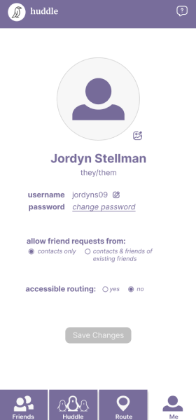

Task 1: Build a Huddle to Commute With Friends
A user can input their commute status, which will allow their status to be seen by friends. Commute status includes where they're starting their route, where they're headed, and around what time they'd like to make the commute.


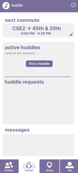
A request for a huddle can be sent through "Find a Huddle". A user can select a friend they'd like to commute with and send them a request based on time and location to meet up.
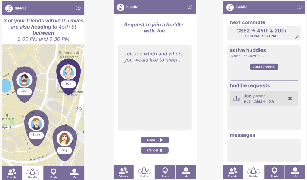
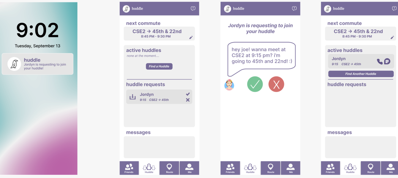
After a request is sent, the friend will get a notification that will appear in the huddle requests section. Once accepted, the huddle will show up in the "active huddles" section for both parties. Messages will also display further communication leaving it open for any changes.

Task 2: Finding a Safe Route
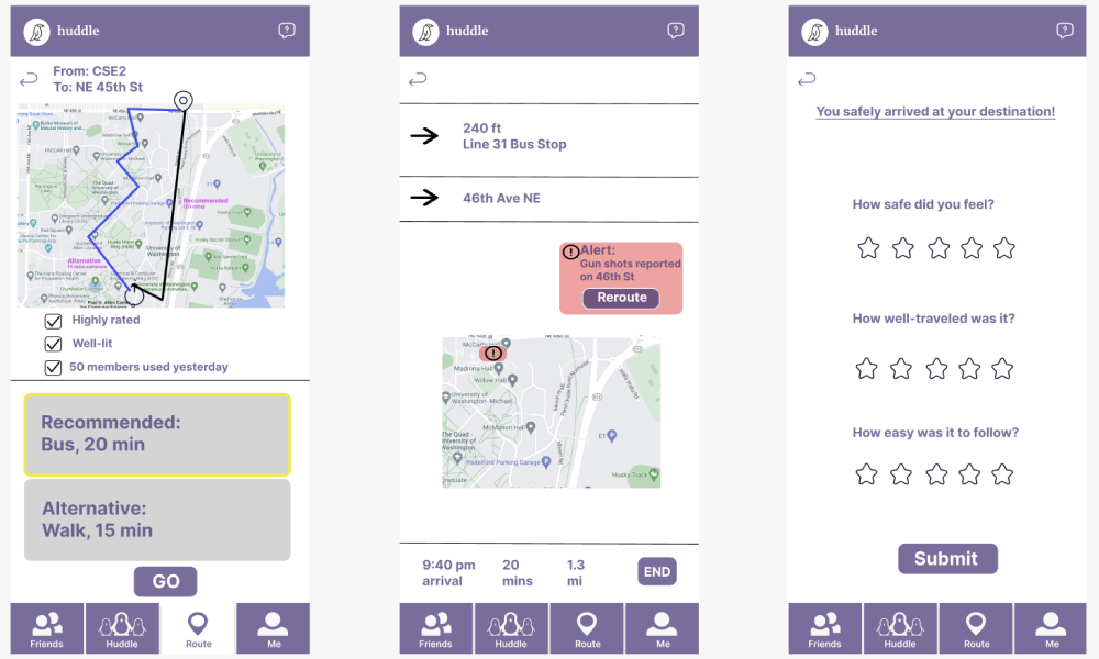
A user can start looking for a commute route after inputting their start and end locations. Our app will display route options and recommend a route based on safety from post-route safety data from users and route information. At the end of the commute, users can submit ratings for the route.
