GymStar
Revolutionizing the gym experience to save you time and overcome knowledge barriers.
Team


Problem and Design Overview
Problem
The overall problem space we explored was that the gym is can be a stressful environment for beginners who don't know how to use equipment, and people often find it difficult to manage their time when they're at the gym because of the busyness in different sections. Within the gym, there is internal pressure, particularly against women and people who don't stereotypically fall into the "gym bro" stereotype. This pressure makes it difficult to work out, and oftentimes, this pressure also leads to a hesitance to ask for help when one is struggling. People also find that machines can be super busy at different times of the day and find it difficult to stick to a schedule and remain on time. As a result, this leads to people not pushing themselves as hard, not asking for help, and sometimes even skipping their gym workout altogether. This results in people seeing the gym environment as a burden rather than a routine.
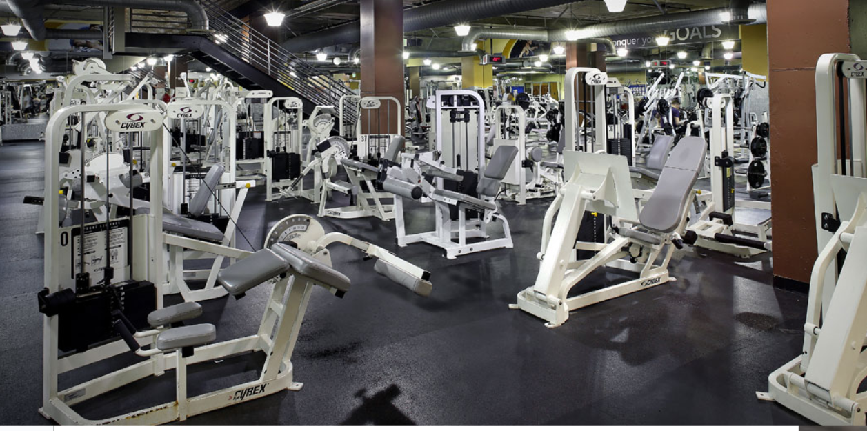
Going to the gym and can be a stressful and time-consuming process.
Design
We designed an application to combat the issues of hostile gym environments, poor time management for the gym, and gym equipment-related knowledge barriers. Our goal is for people to actually find the motivation to go the gym and not see it as a burden in their life routines by having a resource to help manage their time at the gym and provide the information they need to try new exercises and machines. Our app would be specially catered to one gym where all members are required to download the app, and it would include a map of the gym that would help to guide the users and give directions, as well as lead them to specific machines or alternatives available if the machines they want to use are too busy. The app would have two primary functionalities. One of these functionalities is knowing how crowded the gym is before going while measuring the busyness of specific sections and machines. The other functionality is letting the participant understand the various muscle groups and fitness areas that a machine primarily targets and guiding the participant through the process of using the machines effectively to avoid injury. A page dedicated to each type of machine features 3D video tutorials and diagrams of the muscle groups being exercised.
Design Research Process and Key Insights
After a discussion period in which our team carefully considered different problem spaces in our lives, we eventually decided to move forth with the idea of a "virtual personal trainer" for the gym after recognizing how much difficulty we, as beginners, faced with sticking to a gym routine and learning the uses of different gym equipment.
As we entered our design research phase, we worked towards identifying primary issues within our problem space. To do this, we determined the audience that we would target and the people who would ideally use our design. We first analyzed the fitness trends and datasets that we found on the Internet to frame our interview questions around. For example, our analysis from Strava helped us determine that gym membership trends peak in January, but gym attendance sharply falls by mid-January and remains steady until gym attendance trends start falling after mid-March. We used context to lead us to the conclusion that people don't stick to their new year's resolutions of going to the gym more often and at least on a weekly basis. We also made sure to target a carefully selected interview sample space to receive the best results to guide our design. The next step was to write down a few starter questions that would guide the research. These questions were separated into two subgroups in order to satisfy our target audiences: beginner and experienced gym members. This would differentiate our two interest groups and help us better understand the issues that the interviewees had based on their experience level. We ended up choosing participants from the CSE Powerlifters group, Elm Gym, the IMA, and other close family and friends. We aimed to get people from a broad range of experience levels. Our primary research method for this project was through interviews, and we aimed to get a diverse range of interviewees depending on their level of gym experience, as well as an even split between male and female-identifying participants to see if there was a divide in perspectives related to what stops people from going to the gym based on the gender they present as. We interviewed male members of CSE Powerlifters, an experienced weightlifting group on campus, as well as female members of the IMA who take beginner workout classes there. Another research method we used was a meta-analysis of data collected through previous research studies that helped us identify key factors that stop people from regularly going to the gym, such as poor time management.

The UW CSE Powerlifters RSO Logo

The UW Intramural Activities (IMA) Center
Long Wait Times and Time Management
We found that more experienced gym members largely had the most difficulty dealing with long wait times, especially when running on busy schedules. It's often difficult to determine how busy the gym is going to be or different equipment is going to be before heading to the gym, and it's not something they can really anticipate. Our participants found that they often lost motivation to go to the gym in parts of the year where the gym was regularly busy, and it was hard to occupy themselves with something else during waiting time. One participant in particular from the CSE Powerlifters group dealt with an issue where they had a very heavy courseload for the winter quarter, but because of how busy the gym tends to get at the beginning of the year, they found it difficult to stick to their gym routine without planned out machine alternatives.
Learning New Equipment and Avoiding Injury
People who go to the gym more casually and as beginners had more issues feeling fearful of getting injured when learning about how to use new equipment. Because of this, they didn't feel confident enough to try new machines and step out of their comfort zone. For example, one of the beginner-level participants we interviewed often used the treadmill but wanted to try weightlifting. However, because they had difficulty understanding how to use the squat rack properly, position themselves, what weight to start with, and how to perform the exercise correctly without hurting their backs and knees, they lacked the motivation to continue learning. It would be time-consuming without proper aid and help.
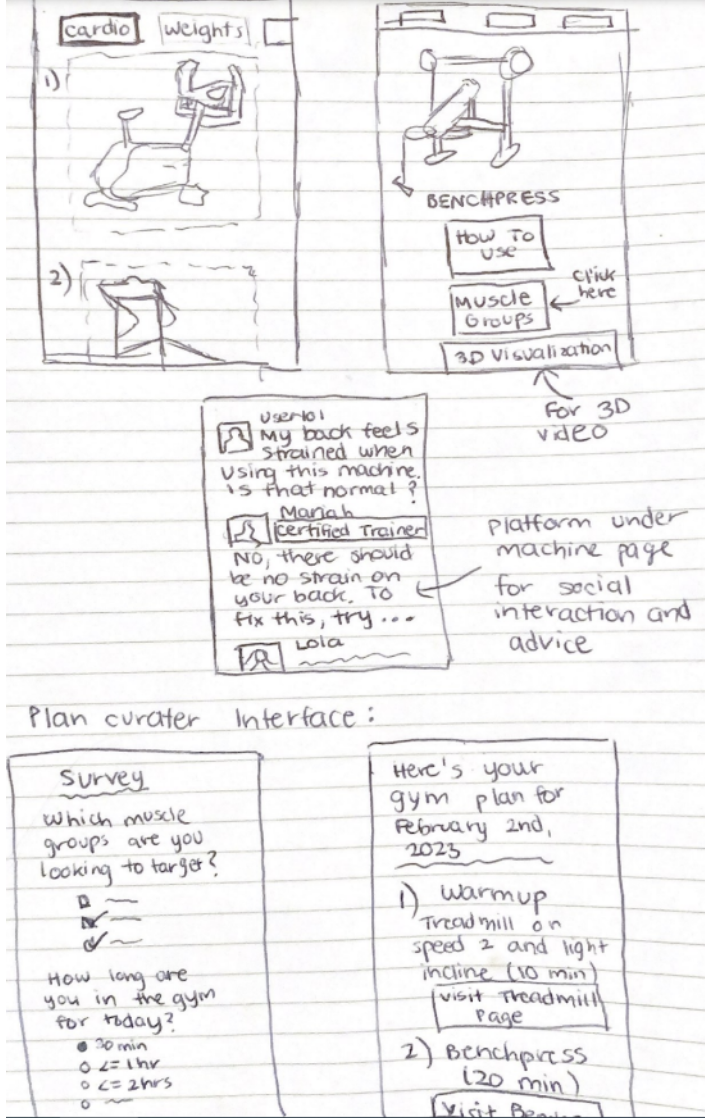
Our first sketch involving video tutorials and a messaging platform
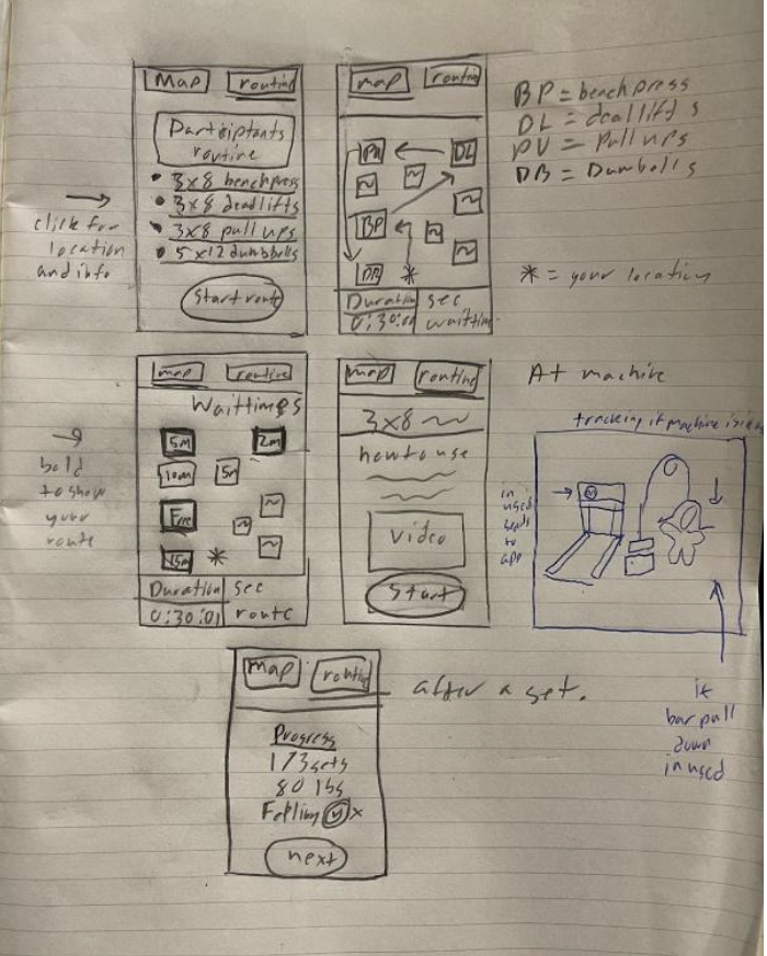
Our second sketch detailing workout plans and wait times.
Intimidation and Fear of Asking for Help
Many participants from our beginner and intermediate-level interviewee samples, particularly female-identifying ones, also faced a lot of intimidation at the gym. When learning new equipment, they felt anxiety when trying to find people to ask for help and often did not ask for help altogether out of fear. For our experienced gym-goers, they faced a similar issue often when looking for people to help spot them. In the case that a gym buddy did not come along, it was often difficult to ask for help without feeling like you were taking away someone else's time.
Iterative Design Process and Key Insights
During the testing process, we realized that it was very difficult to give the participant instructions on how to use the paper prototype without oversharing and giving away details we were already familiar with, given that it was our own design. We didn't want to give too much information because we wanted to get accurate and realistic feedback on the usability and accessibility of the prototype and all the design issues we failed to consider by over-familiarizing ourselves with our own design. For the rest of our research, we aimed to make navigation details easier to infer by modifying the design and sharing less information overall so we could get more valuable feedback.
The 2 primary tasks we narrowed down our design scope to and that we guided our research participants to achieve in the testing process were:
- Being able to assess the busyness of the gym and specific sections of the gym that they might want to go to, as well as assessing the availability of specific equipment at the time they are using the application
- Being able to learn how to use a specific piece of equipment and assess which muscle groups it targets as well as how to prevent injury during the learning process.
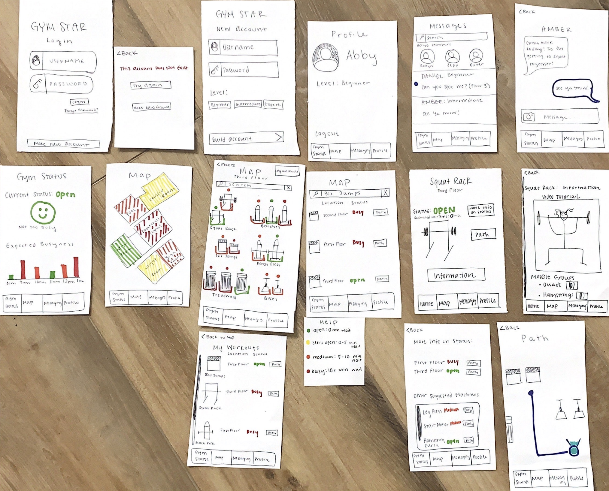
We performed a heuristic evaluation that involved understanding Nielsen’s Ten Usability Heuristics for User Interface Design. This process involved analyzing ten different aspects of the apps for the most concerning features. As a result, we realized that we had issues with helping to guide the user through their gym workout effectively. Additionally, the gym status and navigation weren’t correlated. Particularly the seventh heuristic dealing with flexibility and efficiency of use was the most difficult to perceive through. As a result, we installed shortcuts to help the more experienced users navigate to the location of the machine and a search feature in order to make the machine more accessible and to remove the issue of manually locating the machine. Additionally, we added a “busyness status” so that it can be more apparent how busy certain gym areas are within the map. Lastly, we addressed the issue of navigating the app by adding a navigation bar to the bottom to make it easier to move around to the other pages and to give it a “cell phone app” feel. Overall, the user feedback was very helpful as it gave us realistic and helpful feedback on issues that we didn’t know we had in our design. After making the necessary design modifications, we did usability tests with three different users in our representative population in order to get a better feel of the issues with our app. We tested on a beginner woman, a casual workout woman, and a frequent workout man. The information we gathered from the usability tests was that the naming conventions were confusing and that design and color-coding could’ve improved the process for users. Finally, this led to the final digital mockup, which incorporated all of the design feedback into consideration. In particular, we color-coded the tasks, added icons to the bottom with text, and made the design aesthetically pleasing.
Color Coding for Easy Interpretation
The first important revision was to color code the map of the floors of the gym. When looking at the map of the gym, it used to have no way to indicate the busyness of a room in the gym. By color-coding the gym map, the participant can see how busy the space is before they enter. We learned this was an important feature during usability testing because one of our participants said they would not enter a room in the gym if it were too busy. In our previous design, the participant would have to walk into a room to see how busy it was. We wanted to alleviate this step of having to walk into the room by color-coding the rooms in the gym by busyness. This is important because it saves the participant time and makes going to the gym a smoother experience, which is one of the main goals of our application.
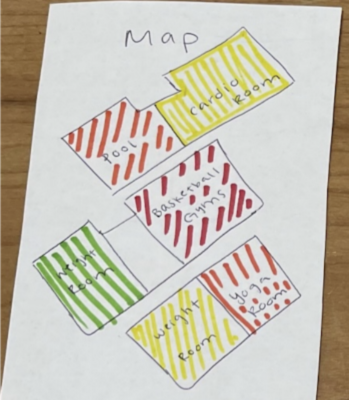
Our updated color-coded map.
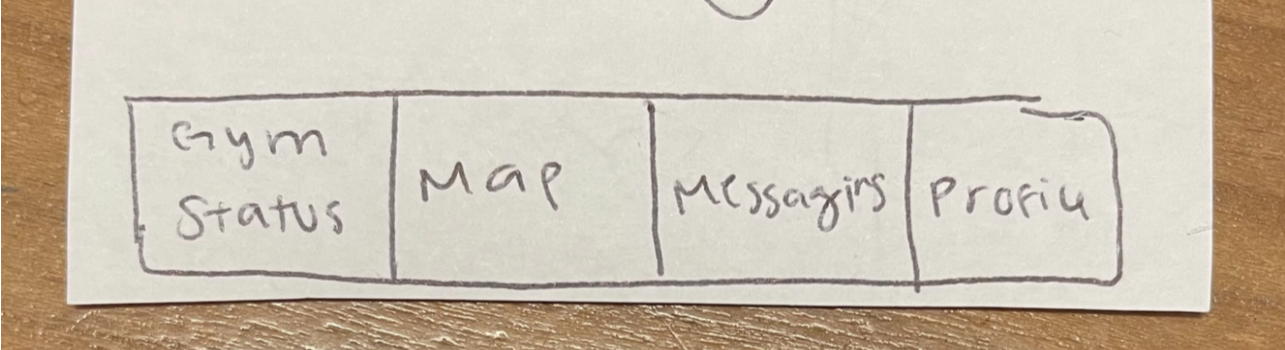
Modifying Navigation Bar
The second important revision we made was changing the language in the navigation bar. In our previous design, we had the home screen labeled as Gym Status. We learned this language by completing the task of “seeing how busy a machine is,” confusing for participants. Rather than going to the map, one of the participants in our usability test went to the “Gym Status” screen to find the busyness of a machine. We combated this confusion by making the home screen titled, “Home.” This is important because it allows participants to clearly achieve the task of “seeing how busy a machine is” without confusion.
Before

After
Promoting Inclusivity
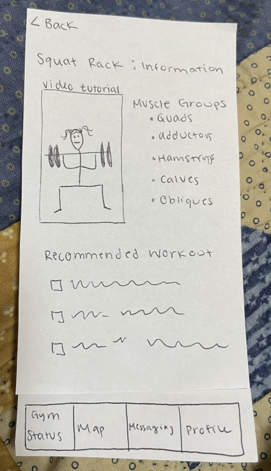
One revision we made to promote the inclusivity of people at various knowledge levels about the gym and their personal anatomy was the revision related to popping up an image showing muscle groups that are targeted instead of just listing them. Oftentimes, people who are attempting to gain more familiarity with muscle groups targeted by different machines might not be able to identify specific muscle groups by just their name, so having a diagram there to aid them in their learning process is essential. We had made an unintentional assumption that the people using our app would already be familiar with where specific muscle groups are located if they wanted to use a specific machine that they believed might target those muscles.
Before
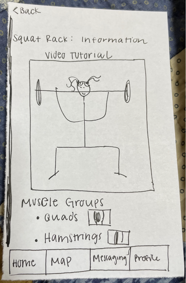
After
Another revision we made related to meeting the Web Content Accessibility Guidelines was increasing the font size of the machine status because it was too small beforehand. WCAG guidelines advise bigger text to ensure that text is not illegible. Conceptually, our design process so far has been targeted toward promoting inclusive environments at the gym, so we didn't have to make many modifications to the overall design process. In future iterations of our paper prototype, we created more distinct and contrasting color options and also turned a lot of the more wordy sections into separate sections using buttons, so text-to-speech applications don’t have to read everything aloud all at once.
Our updated wireframes after we implemented test feedback into our design.
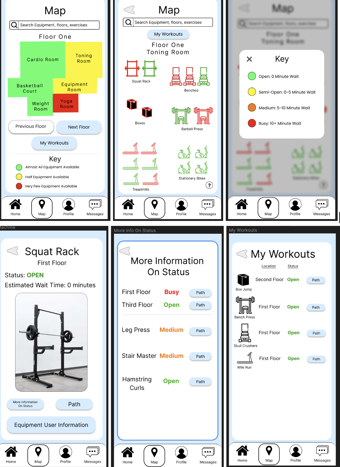
Resulting Design
In implementing the digital mockup, we made a few different design decisions depending on inconsistencies we found in the paper prototype and more realistic options that should be available to users. We formatted the gym map to no longer be diagonal across the page because a horizontal layout is generally more familiar to people using maps for reference. We decided to keep the information on the machine info page fairly minimal and instead of buttons leading up to pages with more detailed information. For example, we have Status Information, Path to the machine, and Equipment User Information for video tutorials and targeted muscles. We added more information to our map legend to indicate the meaning of different colors related to section busyness. We also made the map section more minimal in terms of determining if a machine was open or not, based on the color of the machine, than having two background indicators as seen in the paper prototype. Lastly, we noticed in that there was missing functionality in terms of navigating in-between pages, such as traversing the map if there were multiple floors, and added buttons to reduce navigation time to important pages that could complete the task quickly for the user, such as, “My Workouts” in the overall map page in addition to having it in the machine map page as well.
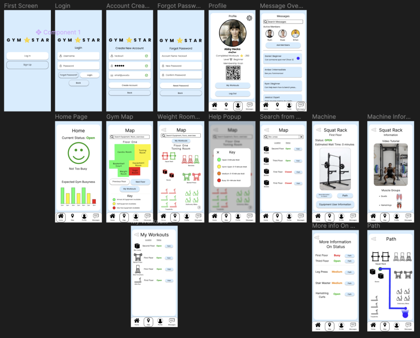
Digital Mockup Overview
Walkthrough: Participants can click on a section of the map that represents a specific floor (Floor One in the diagram) and access the map of a specific room they are hoping to visit (The Floor One Toning Room shown in the diagram). They can access a legend helping them determine how busy specific machines are and even find alternatives on the "More Information on Status" page if they find the machine they're looking for is too busy. The "My Workouts" section helps them keep track of their typical workout machines and their availability.
Task 1: Participants are able to infer the status of various machines from the gym map (i.e. how busy they are and what similar machines are open that they might be able to use as an alternative).
Walkthrough: Participants can click on the “Information” button in order to see a video tutorial and a list of muscle groups the machine works in addition to diagrams of the muscle groups.
Task 2: Participant learns information about the machine (i.e. muscle groups and how to use the machine).