Flutter
Transform your habits, one Flutter at a time.
Team


Problem and Design Overview
Body-Focused Repetitive Behaviors (BFRBs) are a group of disorders characterized by compulsive and repetitive self-grooming behaviors. BFRBs affect approximately 1 in 20 people–hair pulling alone is thought to impact over 10 million people in the United States. Also commonly referred to as “bad habits”, BFRBs include nail-biting, hair-pulling, skin-picking, etc. and can have long-lasting health consequences that negatively impact social, physical, and mental well-being. Our design aims to help individuals track and break these behaviors to improve their quality of life.

A girl struggling with her hair-pulling BFRB.
Design Research Process and Key Insights
To enhance our understanding of BFRBs and learn which aspects need the most help so that we can design our solution tailored to the needs, we interviewed both potential users and stakeholders.
- We interviewed a 21-year-old female college student who has been biting her nails for 15 years to learn more about the details of engaging in a BFRB, such as how often and long they engage in a BFRB and factors that contribute to triggering the behavior.
- We also interviewed a therapist specializing in anxiety and related disorders to gain insights into expert opinions on how to approach solving BFRBs.
- Finally, we posted a survey on online communities on BFRBs to learn perspectives of people from various backgrounds who engage in BFRBs, focussing on the effectiveness of existing solutions.
Staying Positive
A key insight we learned was that our design should not shame or cause more anxiety in an individual, which may lead to engaging in the BFRB even more. We found that engagement of BFRBs could often be triggered from situations when the individual felt stressed or anxious, and being shamed for the behaviors might push them towards increased engagement. For example, one participant from our survey wrote: “Pretty much any punishment and reward based behavior system. [The] pressure made the stakes too high to perform, increased [my] base anxiety too much”. Thus, we needed to be careful with our design to ensure that none of our features would cause the individual anxiety, and instead keep it positive and create a safe environment for them to grow. Keeping this in mind, we focused on using positive and neutral terms in our design, and chose to design a system with no punishment features, to prevent the consumer from feeling discouraged.
Situational Awareness
We found that although concrete interventions that restrict the use of hands (such as entirely preventing the behavior through wearing gloves or acrylic nails; replacing with similar behavior that doesn’t cause harms, such as playing with fidget toys or scratching a piece of velcro) were most effective, it is important to be aware that users can be in various situations when they engage in BFRBs and it may require them to use their hands. Our approach should not distract them from their work or daily lives, and provide options for the individual to suit their needs in different settings. We decided to continue suggesting alternative activities to the consumer, while additionally providing the option to choose a different activity if the suggested activity could not be performed in their current situation.
Keeping Discreet
We also discovered that many of the participants in our research expressed feeling embarrassed for engaging in BFRBs. They mentioned trying to hide engagement from people around them, and not feeling comfortable talking about the behavior with others. Many noted that they would not use a design that could attract attention or allow others to discover that they had a BFRB. We originally based our design around a new wristwatch similar to a FitBit designed specifically to detect BFRBs, but we learned that it was important that our design be as discreet as possible to allow customers to feel comfortable using it. We ultimately decided to switch our design to an application on an existing smartwatch such as an Apple smartwatch, as it would allow for the consumer to keep their habit as private as possible.
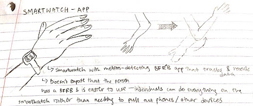
Sketch of smartwatch application using motion detection.
Iterative Design Process and Key Insights
We decided to focus on the following two tasks:
- Teaching healthy alternative behaviors that can replace BFRBs so that we can provide them with a practical way to stop the behaviors.
- Logging engagements whenever they engage in BFRBs so that we can identify patterns or triggers helpful to finding the root cause of the behaviors.
As part of the iterative design process, we first brainstormed and sketched different ideas such as a CBT-based mobile game application, implanted tracking device, and a motion-detecting smartwatch application. We eventually agreed on a mobile application that tracks a person’s engagements in BFRBs, through manual logging and optional automatic motion detection through a smartwatch, and teaches therapy techniques to help them learn healthy and effective coping mechanisms.
Based on the selected tasks and design, we built an initial paper prototype, which inspection and usability testing revealed many small and big issues. For example, a participant attempted to submit a log but the page was missing the submit button. The participant was also confused by inconsistent back buttons, one represented by “X” at the top right corner while the other represented by a back arrow at the top left corner.


Sequence diagrams for mobile and smartwatch paper prototypes.
Addressing these issues, we finalized our paper prototype by adding a tutorial page to clear up any confusions in navigating the app, adding missing buttons that blocked participants from proceeding, and reducing unnecessary pages and details that diverted their attention.
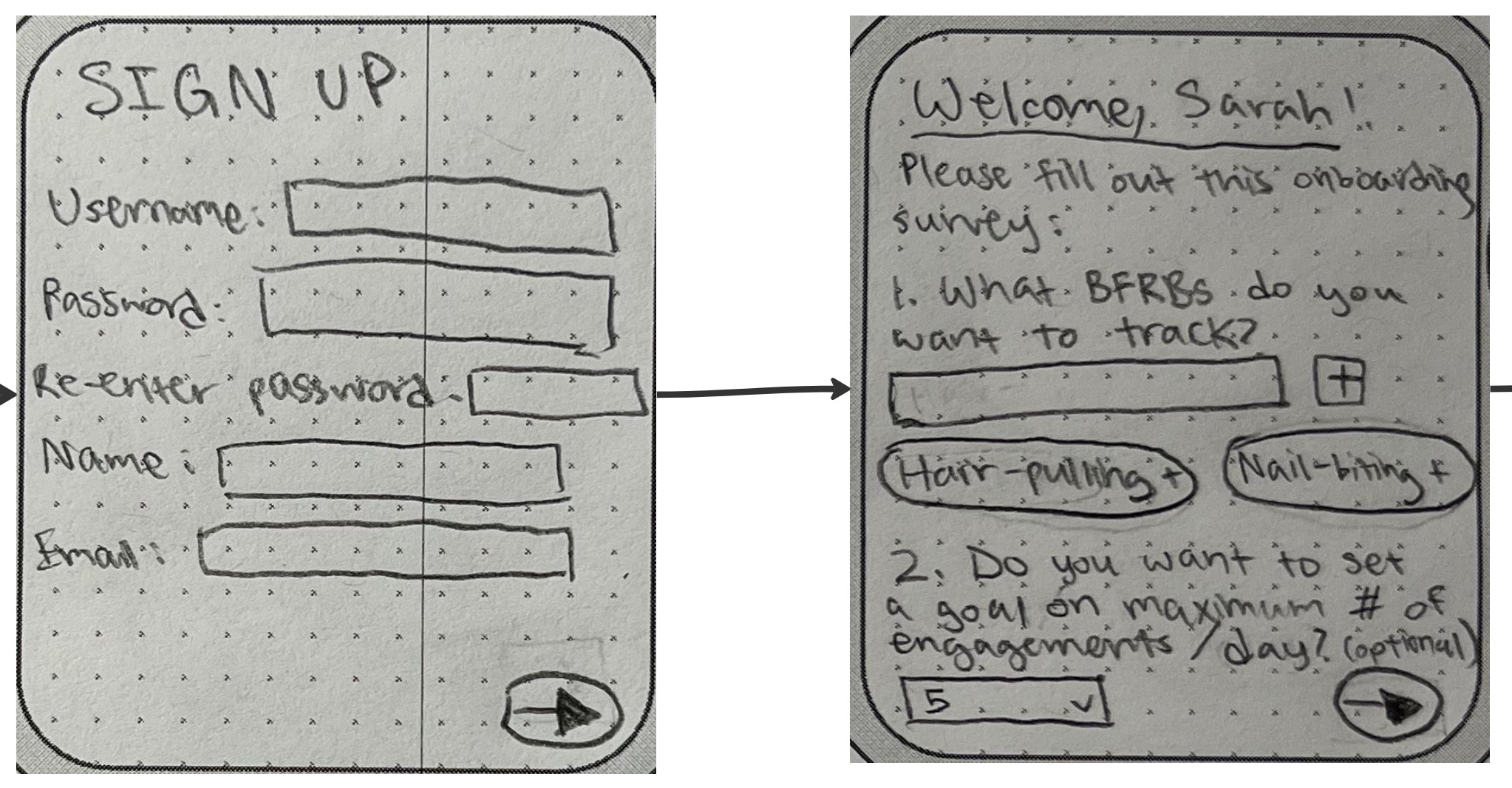
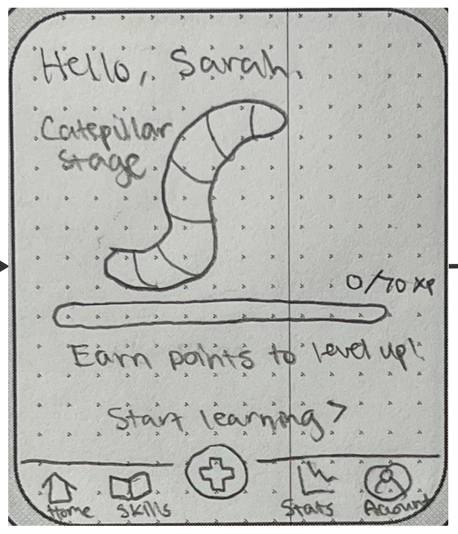
Based on the final paper prototype, we created the following digital mockup:


Digital mockups for mobile and smartwatch designs.
Redirecting Inaccessible Smartwatch Functionalities to Mobile Application
The usability testing revealed our assumption that smartwatch devices could share the majority of UI structure and layout with a mobile app design. In particular, the participants communicated their concerns on the pages for logging in and signing up as they require typing on a small screen, which can lead to inaccuracy and frustration. Following the feedback, we simplified our smartwatch layout by prompting participants to sign in or create an account through their mobile device. We further simplified the smartwatch feature by shifting the focus to the mobile application and keeping the smartwatch as an optional extension. To achieve this, we removed the ability for participants to navigate to other tabs (which would otherwise be available on the mobile application), and have limited the participants’ abilities to just tracking, practicing skills, and quickly checking their avatar’s growth on the home screen.
Before

After
Promoting Accessibility
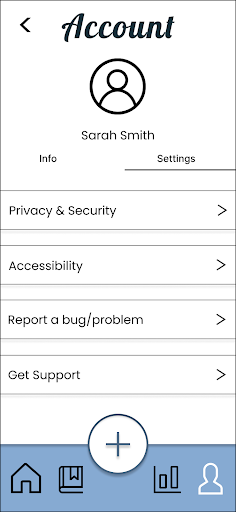
While creating a digital mockup during section, a TA pointed out that our color scheme may not be accessible due to low contrast. It brought accessibility into our attention and made us realize that we made assumptions that everyone using our app could perceive information and stimuli exactly as we can. We unconsciously applied an ableist perspective to our design and made no adjustments for those who have disability or neurodivergent challenges. We have attempted to resolve this by including an accessibility tab in the settings section of the user profile, with potential options for utilizing a screen reader, adjusting colors and intensity, changing font sizes, and adjusting speed/sounds of app animations.

Before
After
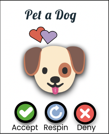
Improving Visibility of Functions Through Labels
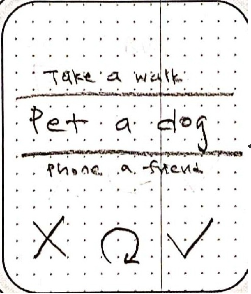
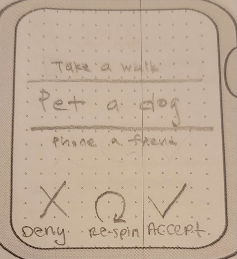
During the usability testing, multiple participants reported confusion in functions of the buttons in the page after a skill wheel chooses a skill to engage in. Originally, the buttons were only represented by icons–a check mark to indicate accept, a circular arrow to indicate respin to choose another skill, and an “X” mark to indicate reject. However, we realized that the icons alone may not be clear enough, especially for new users. To address this problem, we labeled each button with their function to make them more visible and intuitive.
Before
After
Resulting Design
For our final design, we had an application with the following main features:
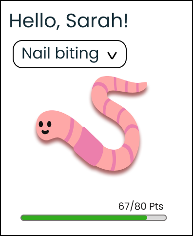
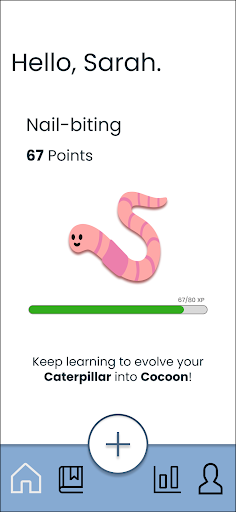
- User can earn (and never lose) points and grow their “pet” by engaging in “skills”, or alternative behaviors
- User can learn new “skills”
- User can manually log on the mobile application and opt-in to automatic motion detection and logging through the smartwatch application
- User can view statistics of the tracked behaviors either daily, weekly, or monthly
Our two primary tasks appeared as follows:
Task 1 (Mobile)
Upon navigating to the home screen on the mobile application, the user can manually log a new engagement by selecting the “+” button in the center of the taskbar. The individual can fill in information about their engagement, such as the specific habit they engaged in, date, location, as well as the specific time, or they can simply select that the engagement is happening now. The individual can view their engagement logs by clicking the graph icon in the taskbar, which leads to the Stats page.


Task 1: Logging engagement in BFRBs with the mobile application.
Task 1 (Smartwatch)
On the smartwatch, an engagement in BFRBs is automatically logged through motion detection. If the smartwatch detects that the individual is engaging in the registered behavior, a pop-up will appear on the screen, inquiring whether the behavior was correctly detected to ensure that it doesn’t incorrectly log engagement. If the user selects “yes,” the second frame will appear on screen, asking if the user would like to engage in an alternative behavior, request professional support, or exit.

Task 1: Logging engagement in BFRBs with the smartwatch application.
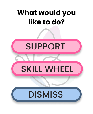
Task 2 (Mobile)
To engage in a new skill, the user can select the book icon in the taskbar, which will show the user the skills they’ve learned, new skills to learn, their progress, and the option to spin the skill wheel to practice skills. Upon selecting to spin the wheel, the user has an option to spin the wheel or select an active skill from their skillbook. If the user chooses to spin the wheel, the selected skill will appear on the screen, while allowing the user to either engage in the suggested skill or respin the wheel. The user may choose to accept or reject the skill, and they will earn points if they accept the skill. If they reject the skill, they will be redirected to the skills page.


Task 2: Suggesting alternative behaviors to BFRBs in the mobile application.
Task 2 (Smartwatch)
On the smartwatch, upon pressing the skill wheel button when an engagement is detected, the wheel will spin and choose a skill to engage in. The user can choose to either accept, respin, or reject the skill, similar to the mobile application, and earn points should they choose to accept the suggested skill.


Task 2: Suggesting alternative behaviors to BFRBs in the smartwatch application.