Waste Wizard
Sorting as Easy as Abracadabra.




Problem and Design Overview
Waste generated by humans has a detrimental effect on our environment. Even recyclable items such as plastics often end up in landfills. In fact, a 2019 study found that “of the 6.3 billion metric tons of plastic waste that had been produced, only 9% of that plastic waste had been recycled” (Downs, Acevedo). Our design sought to fix this problem by answering the question: how can we promote the proper sorting of waste in order to create a more sustainable society?
Our solution was an Alexa enabled application for the Echo Show. It helps users sort their waste when they are unsure of how to dispose of an item. This functionality is activated by asking Alexa how to sort a specific item. Inquiring prompts the Waste Wizard app, where a person can scan their item, answer any clarifying questions about the item, and then get suggestions from the Wizard on how to dispose of the item. For example, some plastics are tricky to recycle because it is hard to remember which numbers are recyclable and which are not. Some items are not recyclable in certain regions so Waste Wizard takes into account the location of your Show. It also helps users find places to dispose of items that cannot go in regular recycling, such as batteries. Below, we recreated the Echo Show home screen to emphasize our Waste Wizard application.

Echo Show home screen to emphasize our Waste Wizard application.
Design Research Process and Key Insights
For our design research we wanted to understand the barriers people had that prevented them from sorting waste properly. We conducted two interviews and sent out a survey that garnered 71 responses. We chose our two interviewees because they were affiliated with UW, one was a student and the other was an alumni, and because they were interested in sustainability. These interviews helped us gain in depth insight to what tasks our design should accomplish. It also helped us generate conversation for potential design ideas. Survey responses came from mostly UW students. This helped us gather a lot of data about specific barriers that got in the way of proper waste disposal. Results from one survey question are shown below:
Our research led us to three key findings on why people are unable to properly dispose of their waste:

Lack of Time
Oftentimes, people are in a rush and can’t afford to properly sort their waste due to time constraints, and some just don’t want to take the extra time. Since the majority of our research participants were affiliated with UW, it’s safe to say that most students, faculty, and staff members have a lot on their plate. A lot of students who are munching on food in between classes are also rushing to get to the next building to attend their subsequent class. When disposing of waste, this can be an issue if time is not on their side - stopping to research what bin each and every item goes into can be tedious, time consuming, and annoying. We found that the majority of our survey respondents clicked “Time” when it came to barriers getting in the way of properly disposing of waste. One survey respondent, when asked to elaborate on their top barrier, described: “It is time consuming to carefully sort food from non-compostable containers.” This result made us realize that our design solution needs to be quick and effective in order to save users’ time when disposing waste.
Lack of Resources and Education
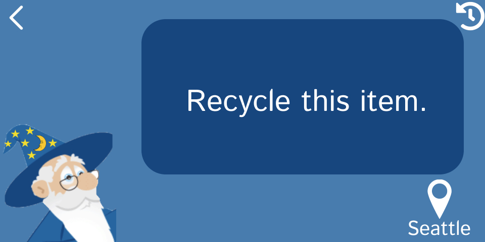
The second finding was a lack of education - a lot of people don’t know how to properly sort their waste because they are unsure if some plastics are recyclable, unsure what can be composted, and unsure of how to dispose of tricky items such as batteries. People also explained that a lack of resources was one of the reasons they could not properly dispose of their waste. For example, only having a trash bin in public and not having proper infographics to educate people on where waste goes. In our survey, a participant explained: “Receipts, pizza boxes, and waxy paper? Some recycling or composting allows these and others do not.” This participant emphasized that certain items can be compostable or recyclable in some cases, and not in others. This can be confusing for people when disposing of waste because by memory, one will sort waste the way they did before. If the “correct” way to sort waste changes even if the item is the same, how would someone know how to dispose of the item? Because of this, we wanted to make sure our design solution was educational, gave straight-forward answers on how to dispose of certain items, and took different locations’ waste management policies into account. Below, one can see that our final design emphasized location in order to provide correct feedback on how to dispose of certain items based on where the item was being disposed of.
Lack of Motivation
Based on our survey and interview results, we learned that a lack of motivation is another key barrier that gets in the way of proper waste disposal. Lack of motivation can be based in laziness or it can be the thinking that one’s personal impact on the environment is not significant enough to orchestrate change. Either way, motivation is another main barrier when it comes to proper waste disposal and needs to be addressed in our design solution. One survey respondent mentioned: “Companies pollute way more than any individual would, so it feels kind of pointless.” Although they are correct in some ways, it is also important to reduce personal carbon emissions to live a sustainable and healthy lifestyle. If we all shared this attitude, our cumulative personal impacts would be large. Incorporating a way to motivate users to properly dispose of their waste is important for our design solution.
Iterative Design Process and Key Insights
For our iterative design process, the tasks we focused on were disposing of a plastic water bottle and disposing a complex item, specifically a battery. With these tasks in mind, we thought through the stages required to interact and properly dispose. We then made a paper prototype that included our app home screen, which has buttons for actions, the scanner, the interactive questions asked by the Wizard, the information given, and little paper items to be disposed of. In inspecting our prototype, we tried to think of the ways our idea could be most helpful and then determined if those functionalities were animated in a cohesive and intuitive design. For usability testing we recruited three participants that were sustainably minded as we concluded our users would have to put in effort to acquire the Waste Wizard and thus were environmentally conscious. We gave them two items to dispose of: a water bottle and a battery. We asked them to navigate through Waste Wizard in order to learn how to properly sort those items. This gave us a lot of valuable insight as to where we could improve our design to be more efficient, helpful, and intuitive.
When translating our design into a digital mockup we made the design visually simple with large text and little graphics because the Echo Show is mainly an auditory device. We also had to re-evaluate the flow and ease of our design, so back buttons and improved descriptive icons were introduced and some intermediary pages that led to unclear action cycles were removed

Intuitive Actions
In our usability testing, some participants had trouble getting started with the sorting process or finding other features of our app. Our participants found our menu structure and labels to be confusing. After further review, we determined that the home menu was unnecessary and just caused added friction for people trying to use our interface. To solve these usability issues, we opted to remove the home screen entirely. To continue to allow users to access the history page, we implemented a history button in the top right corner of all remaining screens. We feel this change allows our design to satisfy the “Recognition rather than recall” heuristic as it is now more intuitive to use. Now when the user wants to scan an item, they simply say a command like “Alexa, how do I dispose of this item?” and the Waste Wizard takes them directly to the scanning screen. No interaction with menus is required and our design is quicker and more efficient as a result.
Instantaneous Feedback and Increased Efficiency
We also realized in our usability testing that it was redundant to make the user ask “Alexa how do I dispose of this item?” and then scan the item separately if the user already knows the name of the item. Our participants, when tasked with throwing away a water bottle, could now say, “Alexa, how do I dispose of this water bottle?” To fix this we added the option to skip the scanner if the user verbally describes the item in their initial question. For example if the user is trying to dispose of a battery the user can ask “Alexa how do I dispose of this battery?” instead of having to ask “Alexa how do I dispose of this item?” and then scanning the battery in the next step. Ability to skip scan item screen either verbally or on the touch screen. Once skipped, the user will be prompted to either re-input or confirm the name of the item.

Before

After
Improve Readability of Disposal Location Information
Finally, we realized having a map displayed on the Echo Show screen would be hard to navigate and ideally the user would be able to view the map and directions on their phone. So we replaced the map with the option to view a QR code that the user can scan with their phone in order to get directions to the nearest disposal location.

Before

After

Resulting Design
Our resulting design is a simple app that can be installed on any smart assistant enabled device like the Amazon Show. Users can prompt the Waste Wizard by asking Alexa how to dispose of a certain item, then scan the item and answer any clarifying questions the Wizard has in order to get advice on how to dispose of the item.
When it’s time to dispose of a piece of waste you’re unsure about, just ask the Waste Wizard!
Asking a question like “Alexa, how do I dispose of this item” will activate the Waste Wizard and prompt you to scan the item you wish to dispose.


You can also ask “Alexa how do I dispose of this plastic water bottle?” and the Wizard will skip the scan screen and immediately evaluate how to dispose of that item. The Wizard can ask follow up questions (you can respond either through voice or touch) and then offer a suggestion for disposing of your waste.

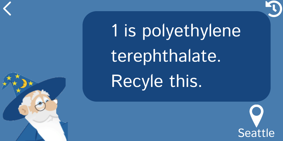
After you’re done disposing of the item, the Wizard asks if you want to dispose of another item. If you say no or simply don’t reply, the Wizard goes back to sleep and waits for another opportunity to help.


Sometimes you may need to dispose of a more complicated item that shouldn’t be placed into a typical at-home waste bin. In these cases, the Wizard can provide more information on locations where it can be disposed of. For example if you want to dispose of a battery, you can open up the Wizard and scan the battery or simply say “Alexa, how do I dispose of this battery?”


The Wizard responds by offering suggestions for ways to to dispose of this item

If you tap or say “Yes”, the Wizard displays a QR code that opens a search for local libraries in Google Maps. This makes it easier to find these locations and navigate to them quickly.


Overall, we hope users can have an easier time sorting waste they are unsure about. Our design enables users to gain knowledge on what types of items are recyclable and compostable, and is efficient, effective, and easy to use.