StackBased
Team Members


Problem and Design Overview:
After hundreds of emails saying “Thank you for your time…” you finally get an email saying “We are interested in interviewing you.” You immediately get excited but feel the anxiety rush as you do not know how to begin preparing for your technical interview. Additionally, you have classes as well to balance leading to stress on how to find a balance between the two. Out of panic you search on the internet for technical interview prep resources and find Leetcode, Hackerrank, and Cracking the Coding Interview and decide to try them out. However, after two days it becomes apparent to you that you’ll end up needing to spend at least one to two hours being fully focused to get the most out of these resources. After a week of preparation, you eventually feel burnt out from using these resources so you decide to just go into the interview to get it over with.
While technical interview preparation does not guarantee your success with interviews, these resources definitely give you great preparation for the interview. However, the inherent flaw with the design of these resources is they require you to sit down for long periods of time, and that is presuming the person is spacing out their preparation. Time is a big deal for college students, which is why we created StackBased, a flexible resource that uses a web app and mobile app for technical interview prep. StackBased aims to help students prepare for technical interviews without the obligation of always having to make a big-time commitment to practice by leveraging on-the-go learning with a self-tailored recommendation system.
Design Research Process and Key Insights:
The goal of our research design was to understand what works and does not from current technical interview prep resources. By identifying these ideas, we would have an idea of how we could help improve the current state of technical interview prep resources to tailor to our target audience, undergraduate students. Our design research process was through semi-structured interviews, in which we interviewed three undergraduate students at the University of Washington interested in getting a technical internship. We chose interviews as they would provide us better insight by probing participants’ responses, specifically understanding what is good and bad about current technical interview prep resources from their perspective. We also chose these three undergraduate students as they had varying experiences in terms of interview prep knowledge and prior internships. Undergraduate students were our primary target audience because this would be the common demographic doing technical interview prep that also has issues with time management.
Our interview questions started out with broad questions about their familiarity with technical interview prep resources and background with interviews. From there the questions went on to be more focused on identifying the topics below with some probing to have the participant elaborate more on their thoughts.
- Thoughts on requirements/need to do coding interview problems
- How confident they are in Computer Science topics
- Learning curve/getting started with interview prep
- Thoughts on the potential design of a resource to help them prepare
3 Key Insights
Consistency is difficult with interview prep
After conducting our three interviews, we noticed a theme that motivation is an issue due to external factors interfering with their ability to sit down and work through problems. All of our participants noted that they would ideally want to have started preparing sooner than they have in the past. We also learned through the interviews they often prepared for interviews in bursts, meaning they would only start when they had a technical interview coming up. Despite wanting to practice consistently, they would find difficulty committing time due to outside factors.
Having a recommendation on what to practice on next is desirable
We noticed throughout the interviews that all three participants progressed based on recommendations from friends and the internet. This often has some undesired results as it often leads to them focusing on those topics while ignoring everything else. An example of this is from one of our participants that recalled focusing on tree problems for an entire week and when they were asked a question on arrays, it completely threw them off. When participants were asked why they end up focusing on one topic exclusively, participants explained that this is because current resources do not provide enough structure as it only recommends problems within the same category. When asked how they think this could be improved, two participants noted that it would be useful if there was a system to recommend topics for them based on their current progression to ensure there was a balance between various topics.
Picking a design is difficult
Initially, we did not have a favorite design we wanted to pick as all three of our designs provided their own way of creating a motivating and flexible interview prep experience. We wanted to focus on these two aspects as from our interviews, these two themes seemed to be common in terms of downfalls or difficulties with current technical interview prep resources. Out of our three designs, we picked the design with the web app and mobile app that emphasized efficiency with time. This design was well suited to our target audience and aligns with the ideas of creating a motivating and flexible interview prep experience through a personalized recommendation system that handles the motivating aspect, and a mobile app to keep learning flexible in terms of time allocation.
Iterative Design Process and Key Insights
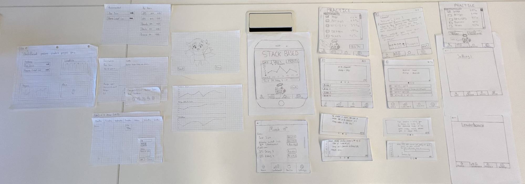
The design focus for the iterative design was on two main tasks: Learning On-The-Go and learning guided by self-tracking. We began our prototyping process through an expansion of ideas and a reduction of refined ideas to choose from. We separated our design into two coupled parts: the web app aspect and the mobile app aspect, each part having its own task that it covered.
Testing Process
We conducted usability tests with three participants. Our first participant was a computer science undergraduate student which took place in CSE2. We chose this person because we were aware of their familiarity with technical interview preparation as they were not a beginner or advanced. After conducting this test, we refined our questions and tasks to become much clearer and more focused.
Our second participant was a CS student which took place in Mary Gates Hall. We chose this person because they were in our quiz section of the Mary Gates basement and they considered themselves to have strong familiarity and practice with technical interview prep. Her advice helped us identify areas that were unclear, and external consistency that we violated, and gave us ideas that reshaped our entire mobile design at a high level.
Our third participant was a computer science undergraduate student which took place in CSE2. We chose this person because they had “very strong” familiarity and practice with technical interview prep. He stated that the design was already usable and contained enough clarity, but he also made suggestions that improved the overall layout of the app and added user convenience.
3 Key Insights
The mobile app needs to be cleaner and more organized
We noted from our usability tests that the most unique feature of our design that set us apart from existing tools and resources is the mobile aspect. A method to conduct on-the-go learning at your own pace is great but has issues focusing on creating precise clarity. A cluttered and disorganized problem menu made it difficult to properly work through questions.
The mobile app needs to have a way to review
The mobile aspect of our design was intended to quickly work through and review problems on various topics. The features we have are great for practicing at the moment but had a major oversight when it came to reviewing. The app lacked the ability to review problems completed before which was a major oversight that prevented users from properly refreshing their knowledge.
The scheduler needs to be consistent with other calendars, and may not be useful to implement an actual calendar
Our initial design of the scheduler was not very consistent with other calendars, as it had no way to scroll by date and had buttons to add an event rather than the columns for days being interactive. We also noted that it became too close to the functionality of Google Calendar, which is not a useful or intended feature for us. We then decided that we would import people’s existing calendars and then add a lesson plan to it.
Resulting Design
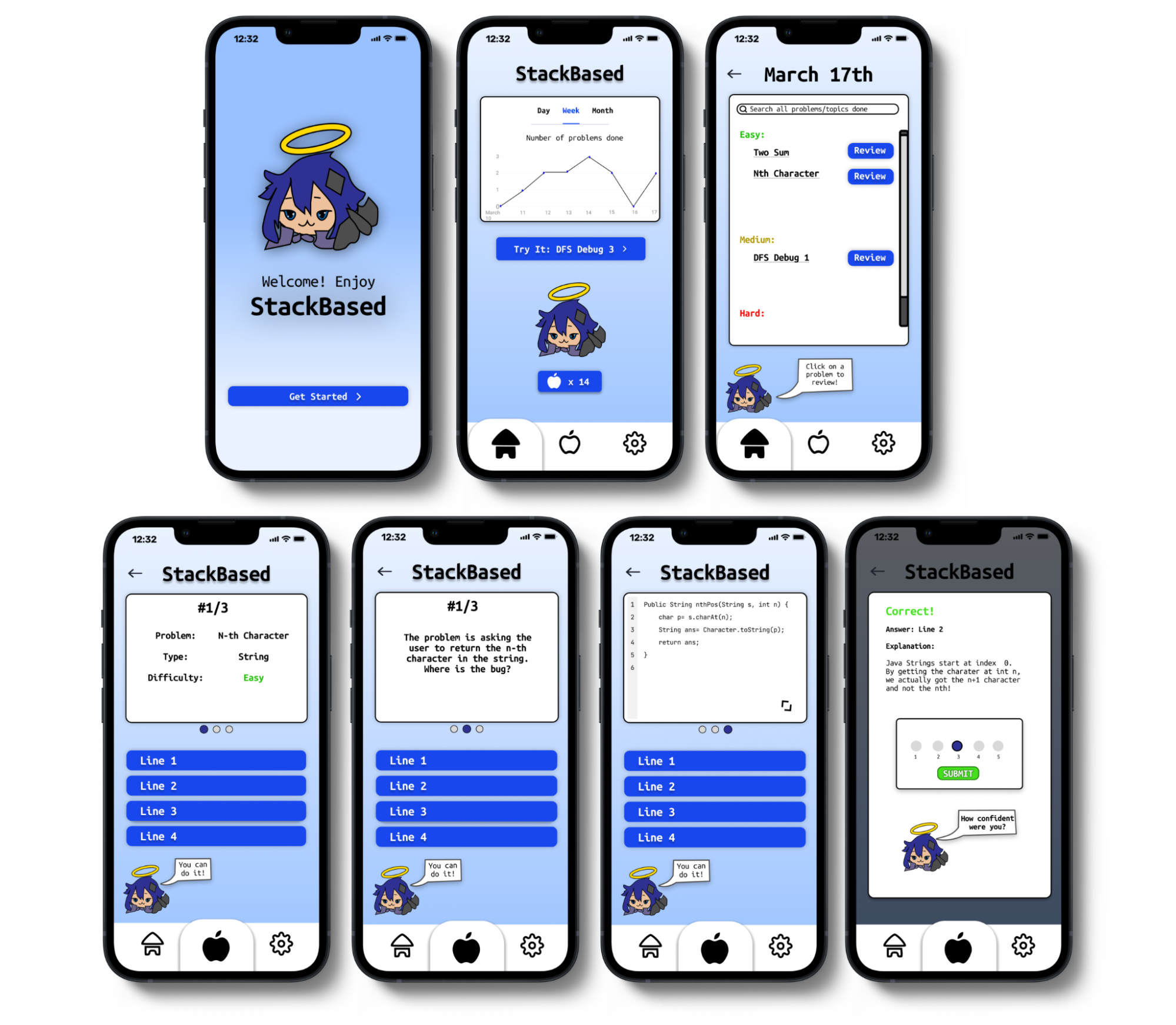
Download the mobile app to learn and reinforce knowledge on the go. Navigate to the practice tab to choose specific topics to practice. Or, quick-start a recommended problem by using the “try it” button on the homepage. Note that you can swipe through each MCQ problem description and code before answering. After answering the question, submit your self-confidence on the problem. Problems done are tracked in the progress bar on the home screen which can be used to go back and review past problems.
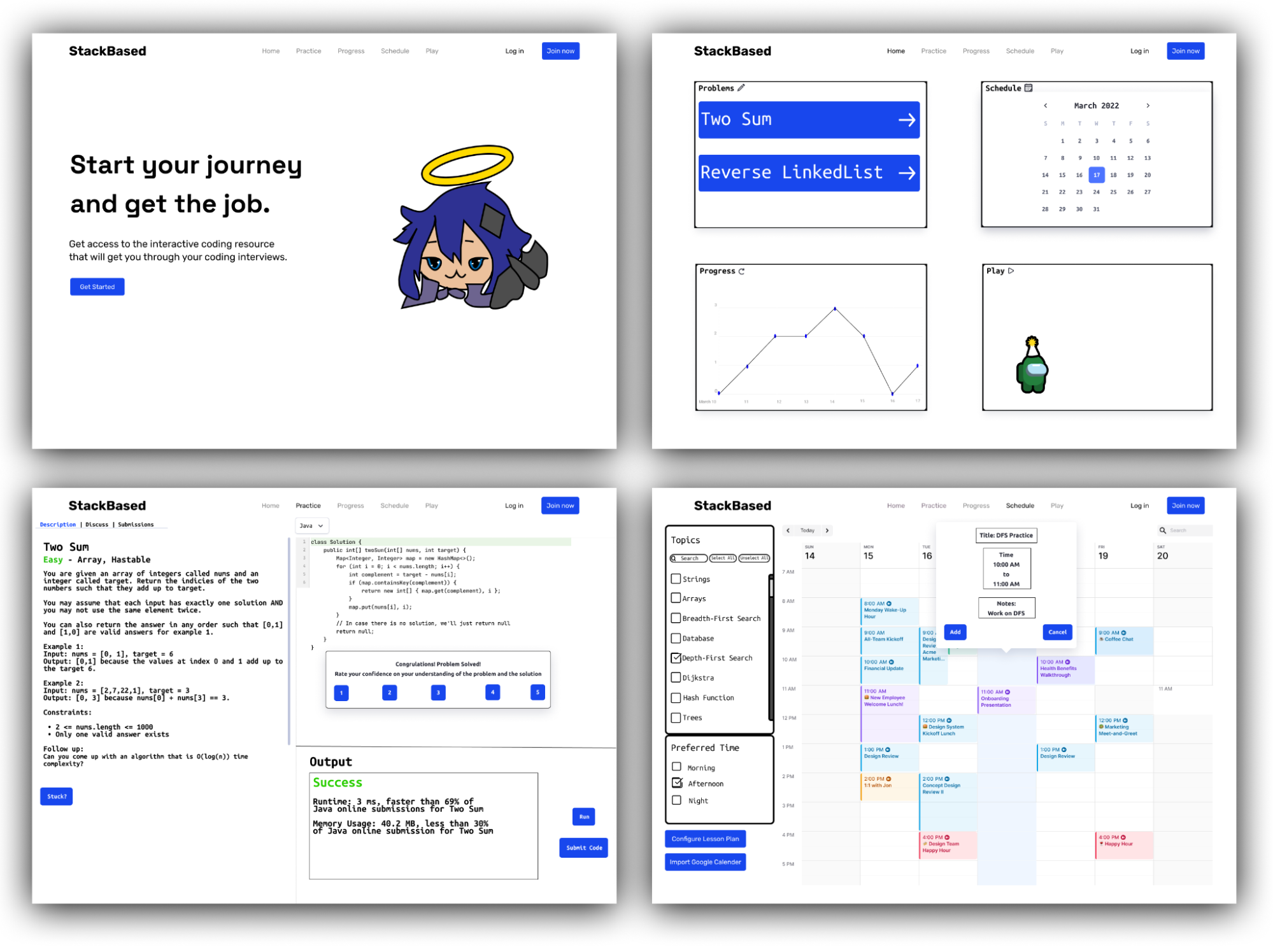
The web app focused on complementing the mobile aspect with full interview preparation problems and progress tracking. You can navigate to the problems menu to start working on a problem and submit a confidence rating when you’re done. Navigating back home you can see your progress has been updated. And under the scheduler, you can add lessons to your calendar.
