SousChef


Problem and Design Overview
Home cooking is an integral part of people’s lives that is often overlooked or taken for granted. In recent years, take-out and frozen foods have become increasingly popular and preferred as easier and faster alternatives to home cooking. This can have significant health effects across a population. A public health nutrition study found that cooking at home leads to healthier eating habits, and ready-made meals from grocery stores and fast-food restaurants are associated with obesity and other lifestyle problems. So, encouraging people to cook more at home is a key problem to tackle with numerous benefits.
Our solution to this problem is SousChef, a better way to cook at home. SousChef is a magnetic fridge attachment that helps provide the smooth integration of home cooking into people’s lives. It is built with a robust set of recipe filtering capabilities that allows people with busy schedules or limited cooking experience to find ways to get started. It also has ingredient tracking functionalities that maximizes efficiency and organization.
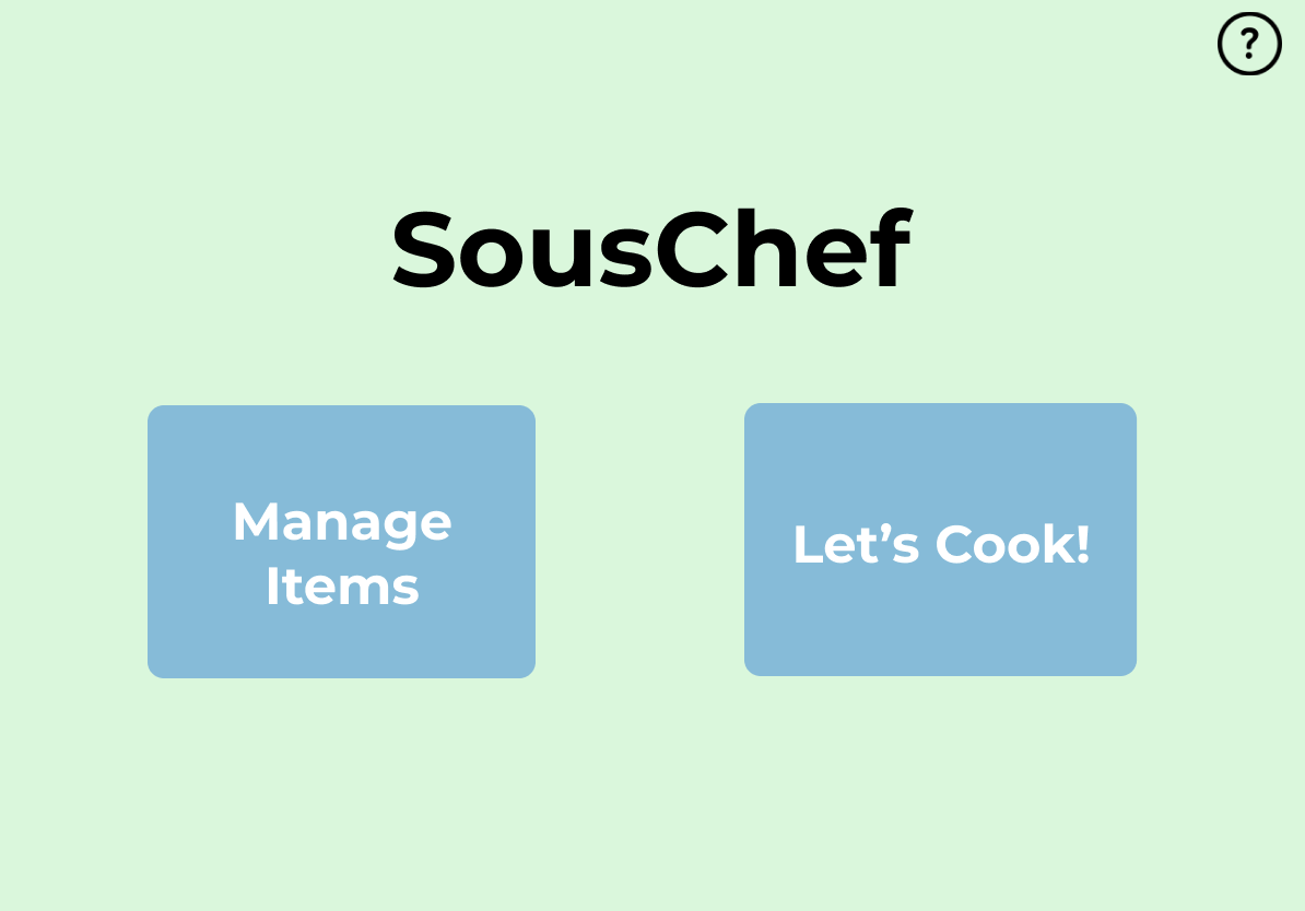
Figure 1: The home page of our design, which we will explore throughout this post
Design Research Process and Key Insights
For our design research process, our goal was to find out how we can encourage home cooking. So, we wanted to better understand how people decide what to eat, the major barriers to home cooking, and how we can address them. Our team conducted interviews for our design research, through which we explored topics such as where participants get their food (restaurants, cooking, etc.), the process of getting food from each source, and the costs associated with them. We believed that a contextual inquiry would be impractical, as it would have required us to accompany each participant around every meal, and a diary study may have restricted the amount of information we can get. The participants we engaged in our design research were all students at the University of Washington living in off-campus housing with a variety of cooking experience. We chose these participants because our target group was college students, and their differing cooking experience allows us to help any kind of person to cook at home more. Also, often in residences like these there are areas available where people can cook.
Time is a Major Constraint to Home Cooking
Through our interviews, we learned that the primary reason our participants chose takeout over home cooking was time. Many of them cited having busy schedules and for that reason they felt they didn’t have time to cook. As a result, we realized it is important in our design to emphasize finding time to cook in a busy schedule. We accomplished this in a few ways. First, we included the ability to find recipes with ingredients people already have, thus saving the time to identify what you already have and get groceries. We also included the ability to filter recipes by time and difficulty so that the person can choose accordingly depending on their schedule.
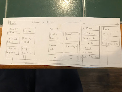
Figure 2: Initial page to choose recipes
Providing Recipe Ideas based on Existing Ingredients
Through our interviews, we learned that our participants struggled with turning their existing ingredients into meals. Sometimes, they wouldn’t know what to cook. Other times they would forget they had certain ingredients, some of which would even expire over time. As a result, we realized it is important in our design to emphasize seeing what meals can be made with what you have. This was something naturally afforded by our magnetic screen design, especially since it attaches to your fridge. When a person buys ingredients, they could easily scan/enter them in as they put them away. The screen would then keep track of what the person has and can suggest recipes accordingly.
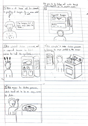
Figure 3: Storyboard for turning existing ingredients into a meal
Video Tutorials are Helpful in Cooking
Through our interviews, we learned that all of our participants rely on video tutorials to help them cook. Initially, we had planned on just including recipes with a list of instructions, ingredients, etc. as they do on the Internet. However, we realized that video tutorials would be a lot easier to follow than having to read a bunch of text. You could also be cooking away from your magnetic screen on your fridge and still be following the recipe as it plays out loud. Therefore, we decided to provide both options so that a person can choose whichever is best suited to them.
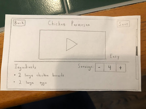
Figure 4: Recipe for Chicken Parmesan, with video tutorial at the beginning
Iterative Design Process and Key Insights
Based on our design research, we decided to focus our initial design around two tasks we wanted it to accomplish. First was the ability to see what meals could be made with ingredients the person has. As mentioned before, we found this to be an extremely useful feature that would assist in cooking. The second task we wanted our device to complete was to find time to cook on a busy schedule. This was to mitigate the most significant barrier to cooking: lack of time. Our iterative design process began with a paper prototype that covered the critical goals of our design and which allowed for testing. We revised it through heuristic evaluations and usability testing, which culminated in our final paper prototype. We then transformed it into our digital mockup, a process that came with its own series of revisions.
Here are our three key insights that we discovered through our iterative design process, which were the most important to our final design:
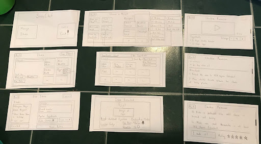
Figure 5: Revised final paper prototype
Hands-free Controls
We found that it was crucial to incorporate hands-free controls in several parts of our design. This emerged from two parts of our design process. First, in our heuristic evaluation, it was noted that it may be difficult to follow directions of a recipe while cooking, as participants likely would not want to tap or scroll the screen with dirty hands. To solve this, we added a button that enables voice control. This turns on the device’s microphone, allowing participants to say voice commands such as “next step” or “previous step” to navigate the recipe. Next, in our second usability test, a participant found it cumbersome to have to type while manually entering ingredients into the recipe. So, we added a button for voice entry of ingredients. This also turns on the device’s microphone and reads in the ingredient the person says. These changes help the device’s usability and efficiency, allowing for better use, especially while cooking.
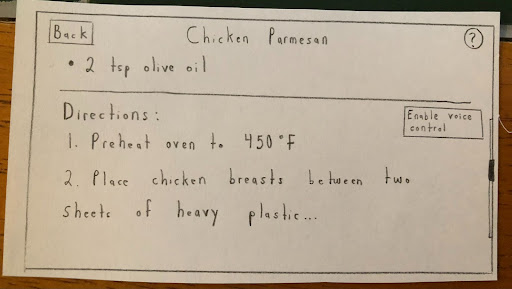
Figure 6: “Enable voice control button” on the directions section of a recipe
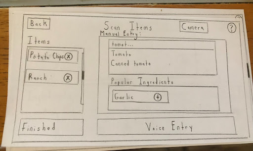
Figure 7: “Voice Entry” button on the page for scanning items in
Missing Key Functionalities
We found that some key functionalities for different features were missed and needed to be added. This was most commonly found in the usability tests. For example, in our second usability test it was found we had no confirmation/cancel buttons for most of our complex filter and entry menus. We also missed a crucial feature where, when a person finishes a recipe, they can update the ingredients stored based on what the recipe required. Another obvious requirement was found in our first usability test, where we had an option for people to rate a recipe when they finished it but no ratings appeared on the actual recipe. The fact we forgot to add these features really shows the value of usability testing, as it was able to highlight important parts of normal use that were missing.
.png)
.png)
Figure 8: An example of adding an “Ok” button to a pop-up.
.png)
.png)
Figure 9: Adding a pop-up to automatically adjust the ingredients according to the recipe
.png)
.png)
Figure 10: Adding ratings to recipes
Changing Pop-ups to Pages
Our final insight occurred when transforming the final paper prototype to a digital mockup. In our final paper prototype, we had two large pop-ups. One was a menu to pick which ingredients the people wanted to filter recipes by, and the second was to adjust the items used after finishing a recipe. When converting these to our digital mockup, we found that the pop-ups were already larger due to the new designs and fonts, so we simply converted them to screens. By doing so, we were also able to improve our design and make it clearer. So, we found that converting to a digital mockup can continue to improve your design by having you review previous screens with real-life proportions.
.png)
.png)
Figure 11: Filter ingredients pop-up, from final paper prototype to digital mockup
.png)
.png)
Figure 12: Update ingredients pop-up, from final paper prototype to digital mockup
Resulting Design
Here is our final digital mockup.
As mentioned before, based on student interviews we conducted we found that there were two important tasks we had to make sure our design can support in order to best tackle our initial problem: encouraging home cooking. Below we explore the final design through these two tasks.
.png)
.png)
.png)
.png)
.png)
.png)
.png)
.png)
.png)
.png)
.png)
Figure 13: Digital Mockup overview
Task 1: Seeing what meals can be made with existing ingredients
On the home screen of SousChef, click on “Let’s Cook!”. This takes you to a page displaying potential recipes for you to cook.
In order to see what meals can be made with what you have, you have a few options. First, you can toggle “Meals you can make now” which will filter to recipes that you can make with your existing ingredients. Secondly, you can click on “Filter Ingredients”, which will navigate you to a separate screen.
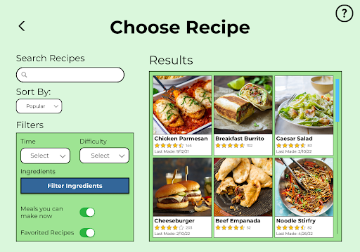
Figure 14: ‘Choose Recipe’ screen of the digital mockup
Here, you can view all of your existing ingredients and select specific ones that you would like the suggested recipes to include. You can also add any other ingredients to filter by, such as ingredients you don’t have. Once you have completed all the desired filtering, you can click “OK” which will navigate you to the previous screen, with the recipes filtered by ingredients!
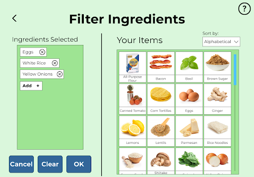
Figure 15: ‘Filter Ingredients’ screen of the digital mockup
Task 2: Finding time to cook in a busy schedule
Once again, navigate to the ‘Choose Recipe’ screen from the home page.
In order to find time to cook in a busy schedule, you have a few options. First, you can sort by “Most cooked” meals. Since you have made these quite frequently, the cooking time should decrease due to familiarity. Second, you can select a difficulty from the “Difficulty” dropdown menu. Easier recipes are likely to take less time, especially if you are a skilled cook. Third, you can select how long you want the recipe to take from the “Time” dropdown menu. Depending on your schedule, you can select an option that best suits the amount of time you have. Once you have completed all the desired filtering, now you can select a recipe from the ones shown to cook!
Figure 16: ‘Choose Recipe’ screen of the digital mockup
Critical Aspect: Manage Items
On the home screen of SousChef, click on “Manage Items”. This takes you to a page displaying all your existing items.
From here, you can view, search for, and sort all items you own. You can also edit these items or add new ones using the ‘Scan Items’ button.
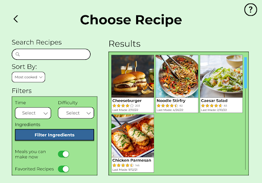
Figure 17: ‘Items’ screen of the digital mockup
Here you can scan the barcode of items to enter it into the device, as well as manually enter items without a barcode through the ‘Manual Entry’ text box or the voice entry microphone icon.
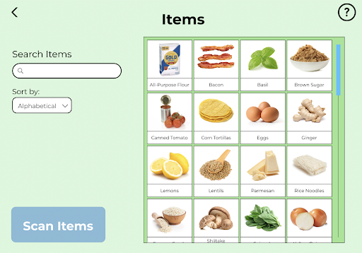
Figure 18: ‘Scan Items’ screen of the digital mockup