RecoverTogether
Recovery Done Right




Problem and Design Overview
The context of the pandemic prompts us, as designers, to contemplate on ways to optimize this new, socially-distanced reality. And even if we may be returning in person, the pandemic forced people to do many tasks remotely, such as school and work. One area in the healthcare system we identified was distant patient post-operation recovery. To elaborate, the pandemic motivated patients recovering from surgical operations to recover remotely, away from their healthcare providers. Our goal as designers is thus to create a design to optimize the way remote post-operative healthcare is done to best benefit the patient’s recovery process. The design that we came up with is a cross-platform application that helps providers guide their patients through their physical recovery in an easy and unobtrusive way.
To illustrate our problem space, we can imagine how a patient may approach post-operative care. For example, suppose a patient, Levi, undergoes an ankle surgery following a workplace injury. His provider, Dr. Zac recommends that he observe a daily routine where he stretches his legs out over a period of a month, which would accelerate his recovery. However, he feels it more comfortable to do these exercises remotely, so he is pursuing his recovery at home.
Design Research Process
We aimed to structure our research in a way to best benefit patients like Levi. In the planning phase, we first had to decide which method of design research would be most appropriate for our stakeholder group. We considered methods such as contextual inquiry on a patient-provider interaction, but we realized that it may lead to legal and privacy concerns with the patient’s medical information. Ultimately, we decided to conduct five semi-structured interviews, which would still provide us deep insights into the personal experiences of the post-operative process. We sought to interview patients and potentially healthcare providers to understand each group’s struggles. We ran into some questions that we struggled to answer at first: who do we reach out to in our stakeholder demographic, and would they be willing to participate in our research? How do we frame interview questions to evoke organic, thoughtful conversations? To answer these questions, we refocused ourselves onto our individual communities; one of our members had connections at a foot surgery clinic after having gone through a recent surgery; another was a participant in extracurricular disabilities services; and another had a friend who underwent a surgery. We all had contacts that could be separated into two categories; medical professionals and patients. We then separated interview topics by these two groups of people; while the common theme may have been post-surgical care, healthcare professionals and patients overall have such different goals and priorities that it was necessary for us to personalize the topics to their roles. We combined these strengths by devising interview questions together for each group of people. While we may have had these connections, we would not have gone anywhere without each other’s deliberation on interview questions and high-level goals during these interviews.
Key Insights
Our design research indicated that healthcare providers have different priorities that often come at a detriment to patient recovery. Our participants consisted of a podiatrist, a physical therapist, an orthopedic surgeon, a physical rehabilitation volunteer, and a recent mastectomy patient. We grouped the podiatrist, physical therapist, and surgeon as ‘healthcare providers’, and the patient represented themself. When we analyzed our design participant data, we learned that interactions between both parties were difficult. This emerged from a number of factors; healthcare providers are often overworked, leading to them not having enough time to take care of patients. In addition, healthcare providers are slow and stubborn to adopt new technology, especially with patient interaction, since they have many other patients and little time to afford one-on-one patient communication. The necessity for healthcare providers to do their work may often be a detriment to patients, especially those who are more dependent on healthcare providers. One of our participants mentioned that older patients require more attention and care, whereas younger patients are more likely to be independent in their recovery. Identifying both the difficulty in communication and the priorities of both healthcare providers and patients refined our design scope of optimizing the post-operative process.
Due to these differing priorities between the patients and healthcare providers, the next key insight we discovered was that bad communication often leads to confusion between patients and the healthcare providers. Due to the amount of patients that healthcare providers process, it is common for patients to receive a generic pamphlet or otherwise uninformative medium in their post-operative recovery. Surgeons must attend to several patients at once, and it is in their best interest to dismiss patients as soon as possible. They might only have the bandwidth to send the patient home with verbal instructions or a generic pamphlet about their surgery and recovery advice. However, the patient may not be able to recall the details of those instructions when they leave the office, and they must call at a later time for clarification. This is an inconvenience for both the patients and providers. Overall, we gleaned that communication and patient independence would be the biggest hurdles to overcome in our design process. Finally, we learned that pain is a widely used metric to inform healthcare providers how patients are doing. During our interviews, we discovered that it is common for healthcare providers to ask patients how much pain they feel during a recovery process. Furthermore, providers adjust the recovery process of a patient to reflect that change.
Iterative Design Process
Our iterative design process involved further deduction into the key design features we wanted to focus on. Looking over our previous design research, we want to develop a solution that takes into account the healthcare providers’ priority in processing patients as quickly as possible while also addressing the patients’ need for support in their postoperative recovery process. This also takes into account the other key insights, including the poor communication between the two groups, and that pain is a metric to inform providers on how their patients are doing. We then prioritized two main tasks in our final design; patients want to receive recovery plan instructions from their provider directly and not through intermediary mediums, and in addition, patients want to complete routine tasks on a regular basis to track their progress.
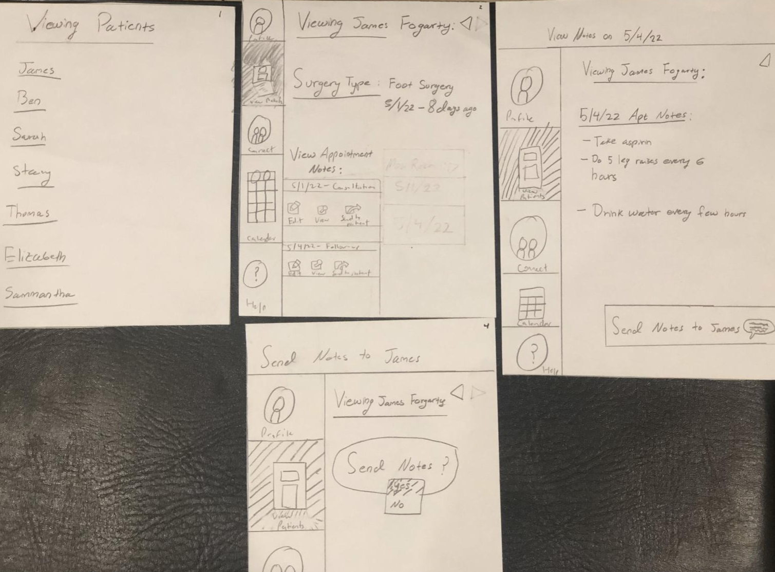
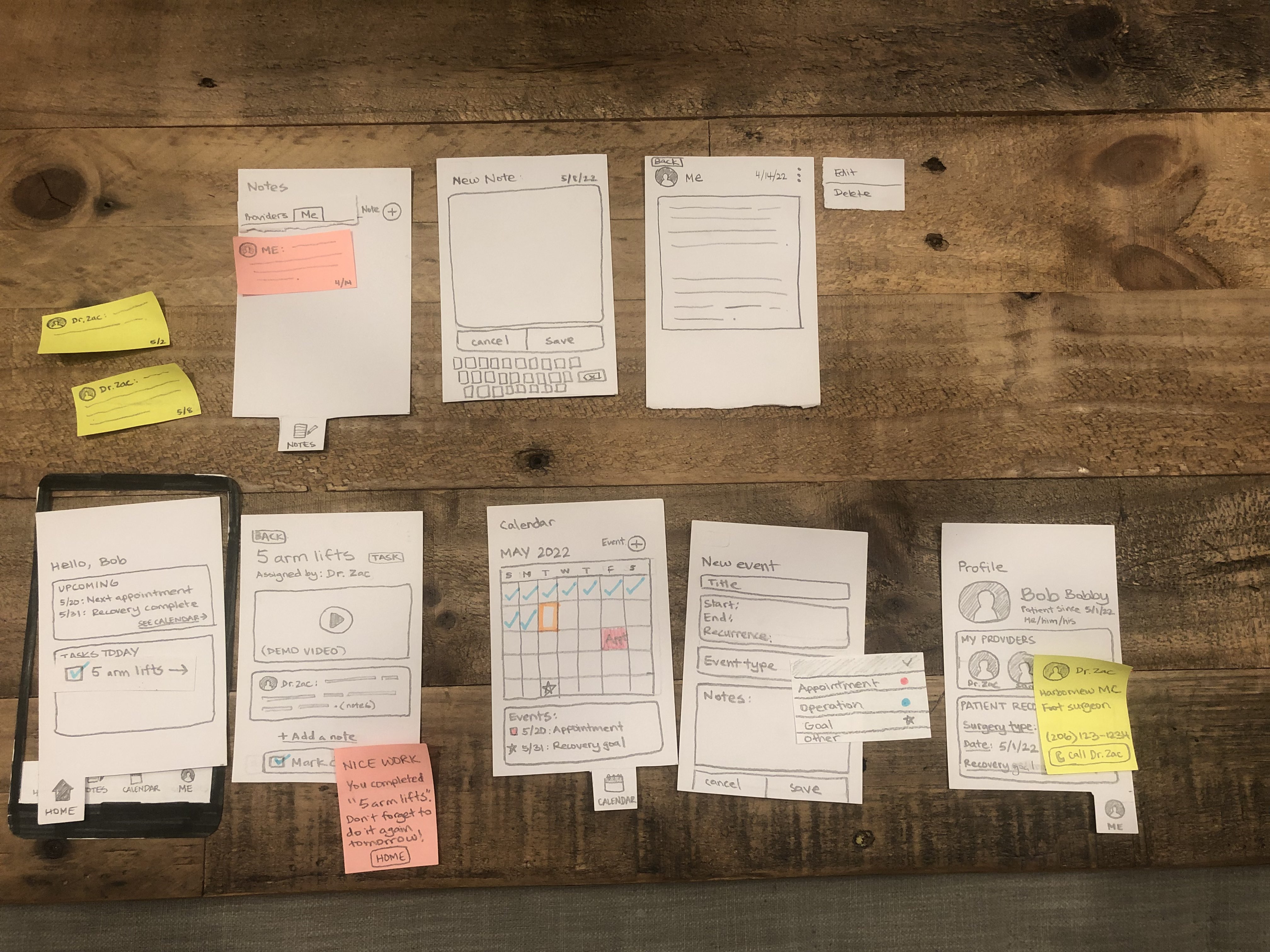
We first did paper prototyping for the two faces of the application. For the patients, we designed a mobile application that displays daily tasks that a patient needs to accomplish and appointment notes sent from the provider. The mobile application design also features a calendar to visualize the patient’s progress and a user profile page, where the user can view their records and provider information. For the healthcare provider, we designed a desktop application that can create and send appointment notes to the patient. Each appointment note can be linked to tasks that the provider can add, which are things the provider wants to prescribe for the patient to do. For example, if the provider wants the patient to complete five arm raises each day towards their arm recovery, then the provider can create a new task for that and share it with the patient. The reason we chose two different mediums is because we believe that a mobile application is most accessible for many post-operative patients. For healthcare providers like Dr. Zac mentioned earlier, it would be most convenient to use a desktop since they already use computers to store patient information, including appointment notes and patient data.
After our first prototypes were complete, we tested our design with three heuristic analyses and three usability tests. The heuristic analyses were conducted with CSE 440 peers during class. The testers interacted with our design and identified any usability issues that they found based on Nielsen’s heuristics. The usability tests were conducted by a 19-year-old male who had gone through a minor surgery in the past, a 21-year-old male UW student in class, and a 38-year-old female who has had hearing impairments. For each of the tests, our group members rotated between the roles of the facilitator, observer, computer, and notetaker. The testers were given realistic, hypothetical scenarios related to the three priority tasks of our design, which involved viewing appointment notes and completing assigned tasks from the provider, and then had to accomplish the tasks in our prototype. They narrated their thought processes as they were stepping through our design, which helped us identify areas of confusion and dead ends that we needed to repair.
Provider Application Paper Prototype
Patient Application Paper Prototype
Key Insights
During the heuristic analysis, a key insight we found is that our paper prototype had incomplete features which limited user control. In practice, this means that a lot of our features, such as the notes page, the calendar page, and the profile page lacked interactions, or looked quite plain, which made the design overall lack the focus on remote post-operative recovery. The lack of detail on many of our features, in particular the notes page, also confused what the purpose of it was. As we proceeded with the design process, we reaffirmed the purpose of each feature in relation to our overall goal in making remote self-recovery attainable.
When we conducted our heuristic analysis, we counted the number of instances a certain heuristic law was violated; in particular, we discovered that heuristic #3, user control and freedom, was overall lacking in our design. What this means was that while our paper prototype had a lot of functionality, even if it was incomplete, it lacked shortcuts and clarity that people could have used to speed up the interactivity of the application. The reviewer of our heuristic analysis suggested adding more shortcuts. This insight led us to flesh out the task bar at the bottom with further detail, and also adding buttons in the digital design to skip certain interactions.
In addition to lacking features, another key insight that we found was that buttons lacked clarity, which made the user experience difficult. In particular, many of the icons on the desktop application lacked labels, which made them confusing for the other party in the heuristic analysis. This was also an issue in the mobile application. For example, on the desktop application, the icons on the left, such as profile, patient notes, and the calendar lacked labels and only had icons. On the mobile application, we had similar issues with the task bar at the bottom. When we moved forward with our design, we kept this into account, adding frequent labels to make each interaction both seamless and accessible for the user. Furthermore, we spent a significant amount of time reworking the notes feature. Our participants sometimes struggled with understanding how to use the feature on the tasks screen and its greater importance in the app. Therefore, we redesigned it into a ‘check-in’ questions feature where the provider can add check-in questions which can help the patient to reflect on their recovery progress at particular intervals of time.
Resulting Design
Provider viewing patient notes
This interaction indicates one of our key tasks, which is where a provider can send appointment notes to a particular patient.
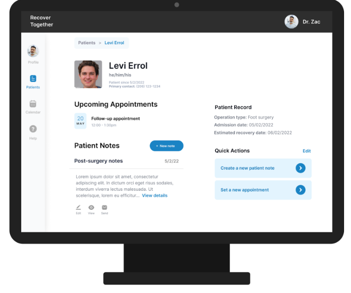
Furthermore, the provider has added a rehab task, notes, and a demonstrational video relating to the rehab task for their patient, Levi Errol.
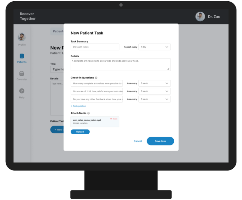
Patient can confirm and send the notes to the provider.
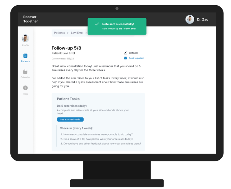
Patient receiving the notes (patient side of task 1)
Patient views notes sent from provider. Patients can view tasks, notes, and check-in questions.
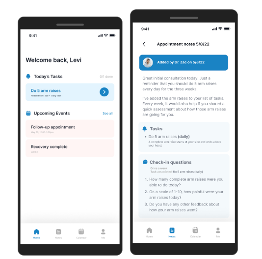
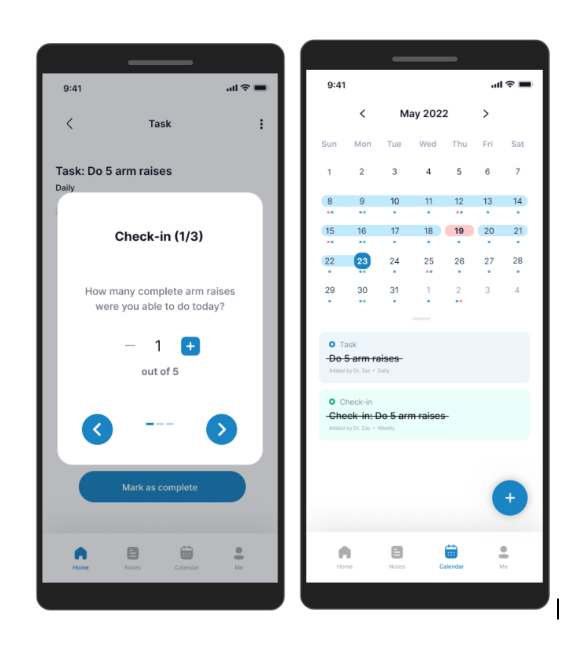
Patient completing and tracking the rehab plan provided by the provider (task 2)
Patient answers tracking questions related to the tasks provided. Patient/user views calendar to see completed tasks, upcoming tasks, and track their progress.
