Quik
Run Quick & Safe


Problem and Design Overview
Amateur and professional runners are frequently running into constant injuries and chronic illnesses that prevent them from progressing towards their respective goals. From our research, our group found that there is currently no accessible and affordable product in the market that can reliably track sports data, manage exercises, and deal with injury prevention. Thus, after a quarter-long design process, we arrived at Quik. Quik is a specialized design that allows its users to track their exercise progress while preventing injuries and strains. Our design is an app paired with a wearable insole. We wanted to create something simple, effective, and intuitive to use.
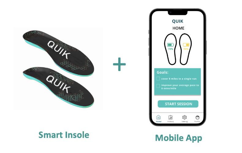
Figure 1: Design Concept (Smart Insole and Mobile App)
Design Research Process and Key Insights
Methods
We conducted three semi-structured interviews to gain insight into what kind of features could be included in our design. We chose interviews because they avoided time conflicts between group members and allowed us to hear from a wider range of participants. Our primary population of interest was professional/semi-professional athletes and enthusiasts because they are the target audience of our design.
Goals
Our interview prompts began with general questions to get the athlete’s background information and then transitioned into a more focused interview with the aim to answer the following questions/topics:
- Is there a correlation between intensity/frequency of exercise and injury risk?
- Are existing modes of data tracking (smartwatches, phones, etc) sufficient, and what kind of features are desired?
- How to prevent injury? How to prevent re-injury?
- What kind of statistics would be beneficial to track?
- How do you go about self-improvement when it comes to your sport?
- What are some ways to motivate yourself?
Participants
We chose participants that are currently active professional, semi-professional or enthusiast-level athletes. We figured that these are the people who would benefit from data tracking beyond smartwatches and phones. As such, we contacted these three participants:
- HMH - plays for the collegiate men’s volleyball
- DT - a professional soccer player
- WT - running enthusiast who frequently takes part in marathons
Identified Tasks
Based on the user design research, we determined that our group wanted to tackle the following tasks:
- Track running statistics during runs
- Allow socializing between friends, for example, an option to share user statistics or look for new friends with like-minded interests
- Injury prevention activities before and after running
- Decide whether it is safe to do more exercise sessions
- Pre-programming training routes, sessions, and exercises to save some time before a workout begins
- Generating personalized insights and setting achievable goals
Insights
Quick Response Time
“Strava cannot give me real-time heart rate measurements, it would be a neat feature to have” - WT Based on our feedback, participants want instant feedback and data tracking. Therefore, our design would need a quick response time. In addition, our design would need to give users insights and personalized recommendations within a reasonable amount of time (before the next workout) so users can adopt these suggestions in time.
Accuracy of Data Tracking
“Apple Watches are not accurate” - DT One common theme between participants was that they wanted an active and accurate tracking of heart rate and workout data. Interviewees mentioned how they were skeptical of how well current smart devices track their progress during workouts. We found that if the device cannot give precise data, participants are less willing to use them. Therefore, accurate data tracking at all times is a key feature to have.
Scheduling and Personalized Recommendations
“Preparing for workouts can be tedious, it would be nice to have recommended routes” - HMH Our group also got the impression that interviewees wanted some sort of scheduling feature to cut down the time it takes to prepare for a workout. Furthermore, they also expressed interest in a design that would incorporate personalized training data while also giving suggestions as to how to condition to prevent injuries and detailed steps to recover from them.
Iterative Design Process and Key Insights
Overview
We conducted two heuristic evaluations based on Nielson’s 10 Usability Heuristics and three usability tests with participants from diverse backgrounds. This is because we recognized that different people will focus on different aspects of the design.
Tasks
We simulated the following tasks in our usability tests:
- Setting up hardware and mobile app:
- Signup
- Pair insole with a mobile app using Bluetooth
- Create a profile containing user information
- Preparing for a workout:
- Setting goals for a workout
- Performing the stretches
- Working out and receiving feedback:
- Check the active running statistics
- Checking the injury notifications
- Checking the status of the device (battery)
- Checking injury history after the workout
- Setting goals for future sessions
Goals
- Ensure the participants can transition between pages
- Minimize confusion in interacting with the application
- Maximize efficiency for runners using the design
- Improve accessibility to people with vision impairment
Participants
- Casual Soccer Player: In our initial test, we tested if the participant can navigate the flow of the application and accomplish the tasks we had in mind.
- CSE Student: In this test, we focused more on the UI design and making sure the participant can understand how to interact with the design.
- Active Runner: In the final test, we were trying to gain insight into the practicality of a runner using the design.
Methods
During our 3 usability testing sessions, we followed the protocol listed below:
- Introduce the background information of the project & the role of each team member to participants
- Encourage participants to voice their concerns and questions during the testing
- Inform participants about the two tasks they will perform during the testing
- Wrap up the testing, collect additional feedback from participants, and answer questions/concerns that participants have
Key Insights
Designing for Accessibility
Previously, our injury page only used a color-coding spectrum (yellow, orange, red) to show the severity of a particular injury. We assumed that people could recognize the severity level based on the color. However, our third participant (who is a TA) pointed out that using this single mode of communication would lead to inaccessibility for colorblind people. Therefore, we used dual encoding, in which we added a scale of boxes to make this interface more accessible for colorblind people
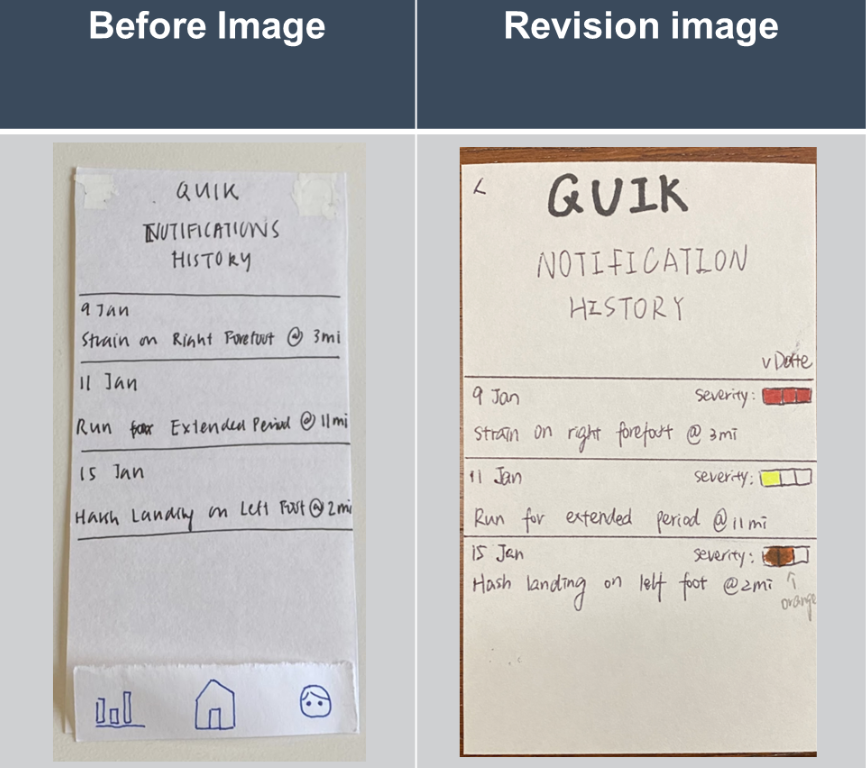
Figure 2.1: Added dual-encoding (both color and text)
Standardization of Interface
Our initial prototype contained many different buttons to transition between pages. For example, our participants found that the buttons were of different sizes and shapes. This made the design confusing to the participant and led to problems in navigating the application. We also caught this issue during the heuristic evaluation, as it violated the “consistency and standards” heuristic. Therefore, in the final prototype, we standardized the page design to have all the buttons to be rectangles underneath all the text and added a navigation bar with 4 buttons to ease navigation.
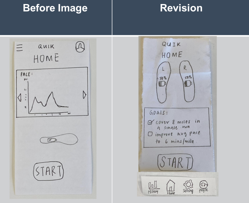
Figure 2.2: Added navigation bar & Changed homepage layout
Improving Workout User Interaction
Previously, we did not have the necessary features that a user would need to complete a workout. For example, the user was not able to pause and resume the workout after the workout had started. In our second usability test, our participant intended to pause the workout but instead terminated the workout. This made us realize the need for a feature to pause the workout when the user takes a break. To implement this, we added a pause button on top of the end workout button (with a transition screen in between) to support this feature.
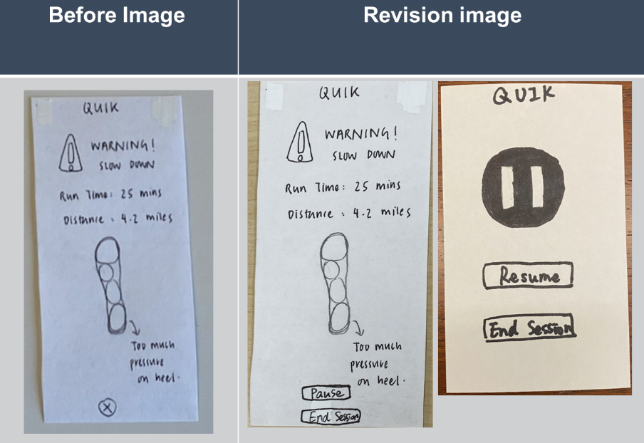
Figure 2.3: Revised buttons & Added a pause page
Resulting Design - Digital Mockup
Overview
We used Figma to make the final high-fidelity prototypes (fig 3).
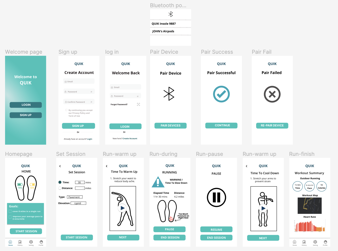
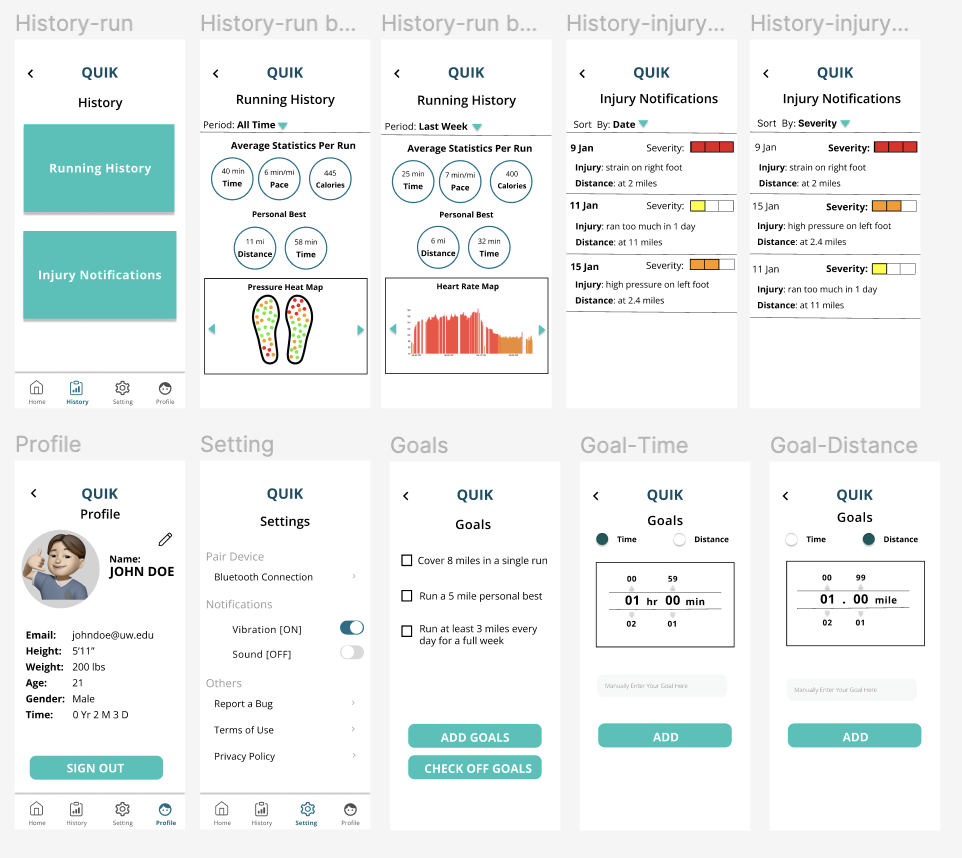
Figure 3: Overview of high-fidelity prototype.
Task 1: Reduce the risk of injury
From the Home (fig 4.1) if the user starts a session by clicking the “START SESSION” button, they will be brought to a “Set Session” page (fig 4.2). From here, the user can choose between selecting a time or distance. If time is selected, distance will be grayed out and vice versa. Next, the user chooses the type, and elevation of exercise before pressing the “START SESSION” button.
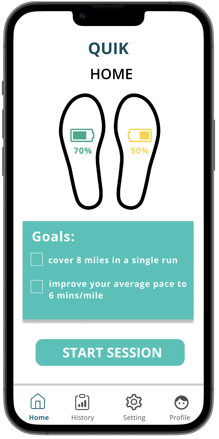
Figure 4.1: Home
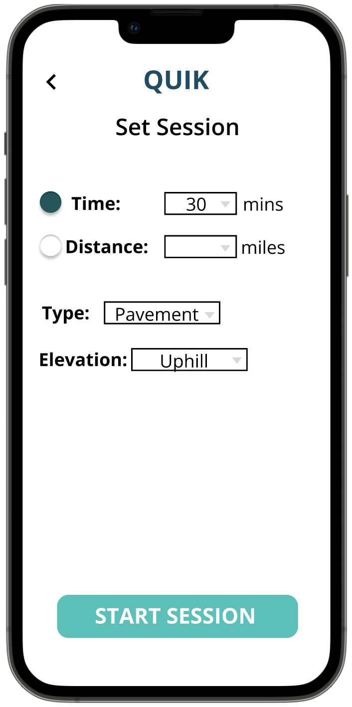
Figure 4.2: Set Session
After setting the session, the user will be prompted to stretch through a demo video (fig 4.3). After a series of these videos, they can click “NEXT” to move to the stretching page and start running, which will lead them to the live tracking page. Whenever the user experiences too much pressure on a part of the foot due to things like unsafe landings, the application sends a notification (beep or vibration) to alert the user (fig 4.4). Users can then “PAUSE” their workouts, which will take them to the pause page where they can take a break and then choose to resume or end the session or they can just “END SESSION” straightaway (fig 4.5). If the user ignores the warning, the page will disappear after 10 seconds.
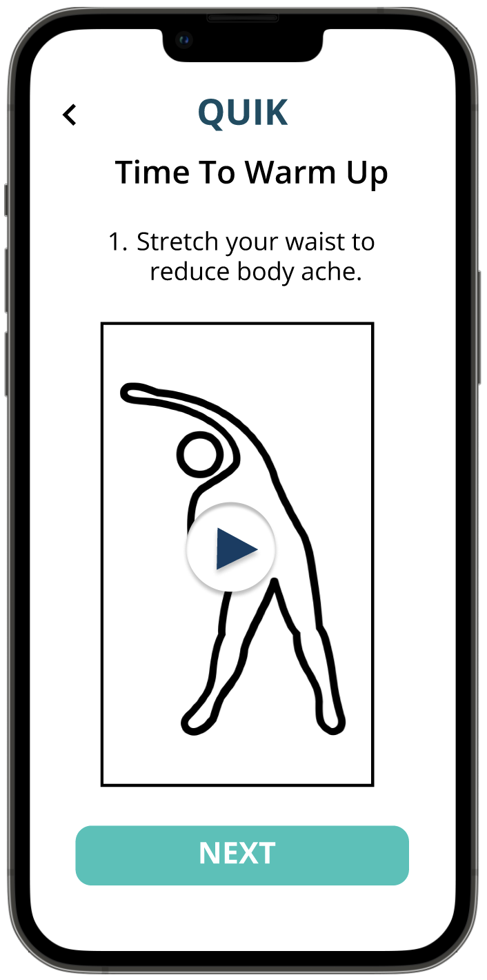
Figure 4.3: Warm-up
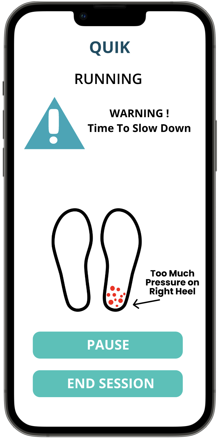
Figure 4.4: Warning page
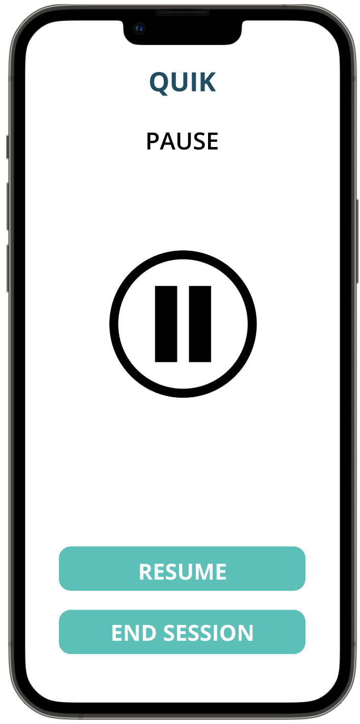
Figure 4.5: Pause page
After the workout session ends, users will be brought back to a stretching page (fig 4.6) to cool down. Finally, users are taken to a statistics page to show their workout summary (fig 4.7). From here, users can use the navigation bar to navigate back to the home page.
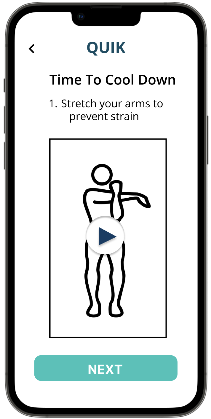
Figure 4.6: Cool-down
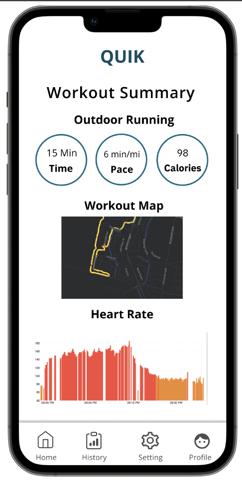
Figure 4.7: Workout Summary
Task 2: Tracking statistics
From the Home page, users can click the “History” button in the navigation bar, where they are taken to a History page with two buttons (fig 5.1). For the running history page, users can sort the period with whichever specific time slot the user wants. For example, “All Time” (fig 5.2), “Last Week” (fig 5.3), etc.
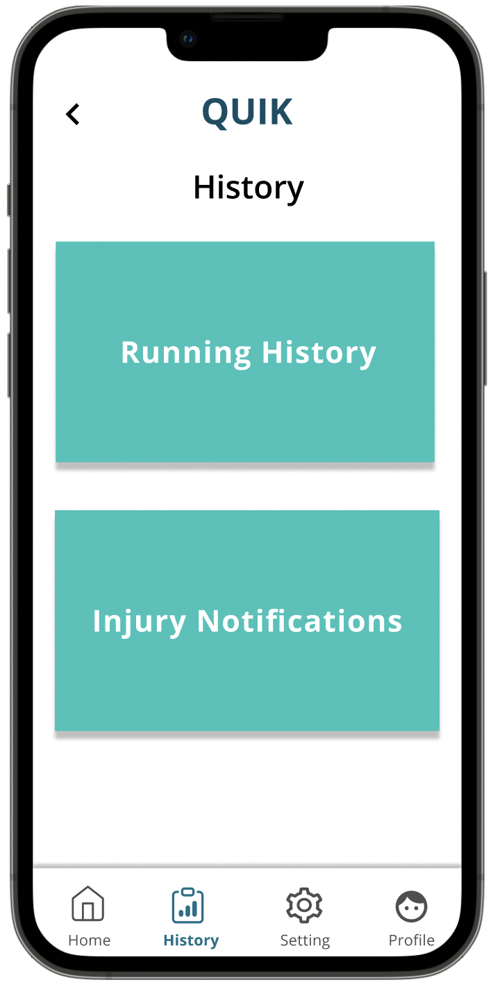
Figure 5.1: History
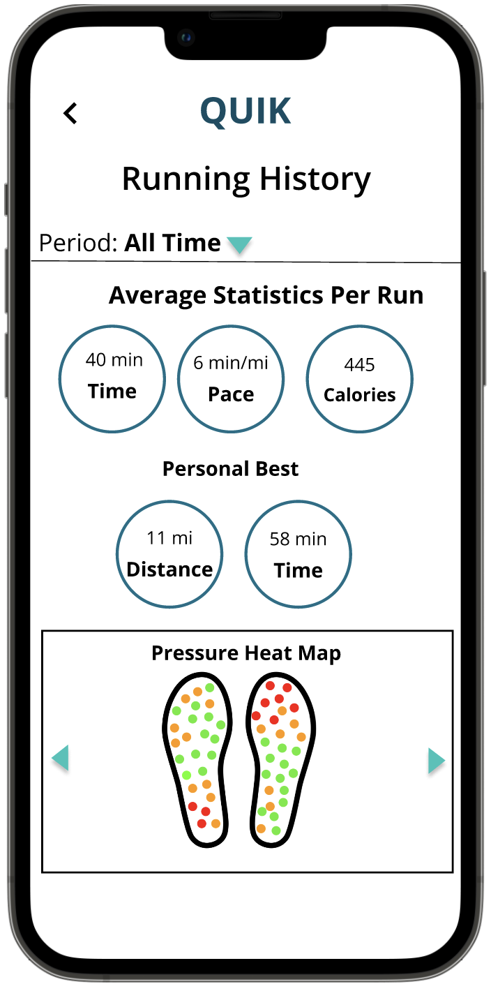
Figure 5.2: All-Time Running History
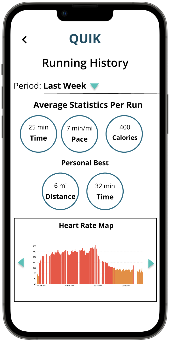
Figure 5.3: Last Week Running History
Users can also view injury notification history, which users receive during runs, with a severity bar that is also color-coded to show how bad an injury was. This page has a sorting feature.
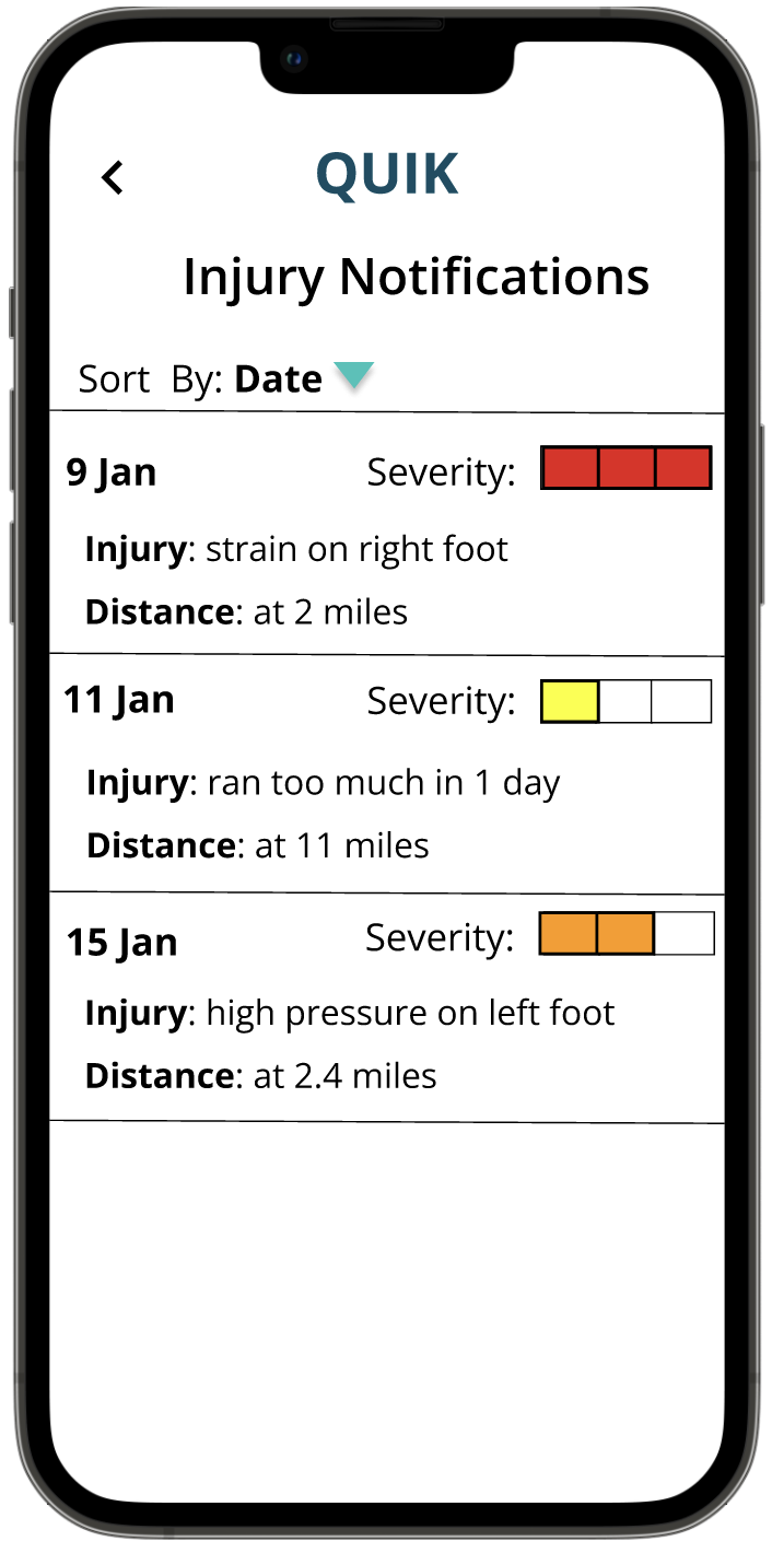
Figure 5.4: Injury Notifications By Date
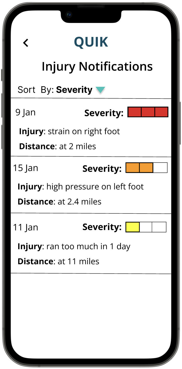
Figure 5.5: Injury Notifications By Severity