FoClass
A System to Improve Class Engagement
Team Members


Problem and Design Overview
Staying focused and engaging in the classroom has always been a contributing factor to university students’ academic success. However, not every student has the ability to maintain their focus due to various reasons. While students are required to follow the restrictive structure of the course curriculum and the school’s culture, many educational institutions don’t adjust enough to fit the needs of their students. We are motivated to increase the college student's success rate and find a solution using technology, incorporated with research about the current university students’ needs.
The problem of not focusing in the classroom is a broad topic that intersects different professional fields such as education, psychology, etc. Many existing applications are designed for either the instructors or for the students, which causes a disconnection in students’ feedback and the instructor’s lecturing, such as adjusting the pace or pausing for questions. We proposed a bi-direction system with embedded tablets and computers at the podium, which provides students with access to a communication network with the instructor as well as ways for them to interact with the lecture material. Our hope is that with this new system, students will feel more comfortable expressing their thoughts and confusion while instructors can have a better understanding of how the class is doing.
Design Research Process
Our design research focuses on UW students and instructors. We want to learn what causes their lack of focus and engagement, their needs, and things they find distracting. The primary design research method we use is contextual inquiry, including an in-class observation and a post-class interview. For the in-class observation, we observe and take notes on behaviors, where the student’s attention goes, and how the student reacts to events in the classroom. The post-class interviews are conducted after the observations. We first do a debrief on their in-class behaviors, then dive deeper into specific moments to figure out the reasons behind them. We also explore their preferences for various potential solutions. The goal is to understand students’ actions and their needs. We have three design research participants: one UW student studying Economics (pseudonym: Leona), one student studying Computer engineering (pseudonym: Luna), and an experienced college professor (pseudonym: Melissa). By having both students and instructors as participants we can gather information to develop a solution that can enhance communication between the two groups.
Design Research Key Insights
Asking Questions in Class
Instructors use whether a student asks questions or not as a clue for whether they are engaging. However, most student participants do not ask in in-person classes because they cannot be heard by the instructor, need time to formulate questions, or feel awkward if the instructor does not notice them. They may not pay attention to what the instructor answers if a question is too easy or too personalized either. Two of them mentioned how they love the voting question features in the PollEv. They want similar questions to be combined and generalized. Melissa also says that if two people ask the same question, then there can be 15 people who are confused about the same thing. Students also mentioned how anonymity encourages them to ask more, which has been a feature on Ed Stem. However, Melissa points out that instructors also want to develop students’ skills of speaking up and asking in public since it is essential in the long run.
Communication between Instructors and Students
Participants want a feedback system which the students can interact with while the instructors can be informed right away. This can be about asking a question or requesting to adjust the pacing. They all find Zoom chat good for communication. Students are more willing to interact, type their questions or just add a “same” in the chat, while the instructors can check those questions once they are done with a big topic. Melissa does not like surface-level responses, and she wants more specific parts on what to repeat or slow down. Besides, Leona suggests that periodic breakpoints can be added for checking in.
Information with Insufficient Context is Distracting
Student participants enjoy organized lectures with useful content. They find some instructors spend too much time on course-irrelevant topics, which is distracting. An example brought up by Leona is a food system instructor who used 80% of the time talking about equity when that is not the focus of the class. They also mentioned that sometimes the instructors will improvise and start talking about a book or their personal stories, which do not come with slides, meaning they have little background knowledge. Leona also points out that sometimes the slides can be hard to read due to low contrast or sitting further away from the screen. When that happens, she would also zoom out easily.
Iterative Design Process
For the iterative design process, we first choose the two main tasks to focus on: “communicating students’ thoughts on lecturing material” and “resolving useful or interesting common confusion first”. Achieving these two tasks lets students control what to go over and encourages them to express themselves timely. We came up with our initial prototype which aims to complete the two tasks. We then have heuristic evaluations and three usability testing to refine our paper prototype. We have two students studying CSE 440 as our evaluators. Then, we bring our updated version to complete usability tests. We got three participants: one student studying Business with tutoring experience, one studying Computer Science, and also one student who has taught a 30-people class. We take notes on the challenges they face to complete the two tasks. After refining our paper prototype, we convert it into a digital mockup.
Overview of the Final Paper Prototype
Student Paper Prototype
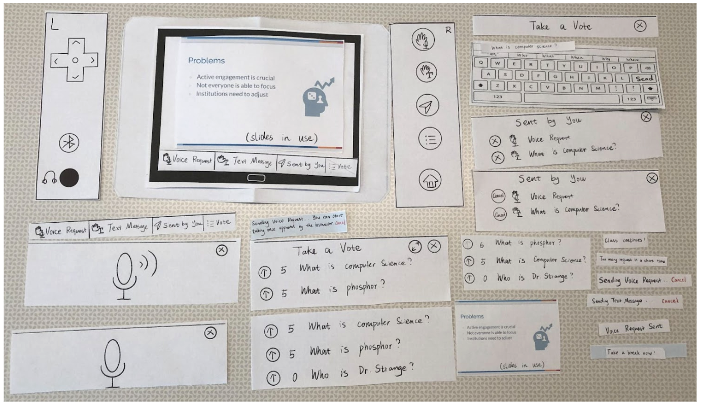
Instructor Paper Prototype

Iterative Design Key Insights
Simplifying Features to Reduce Visual Load
During our heuristic evaluation session, we got a comment that there were too many things to interact with, making it hard for instructors to focus on teaching. We simplify the features by removing the “Feeling good/bad”, “Circling on slides” and “Handwriting” functionalities on both the students’ and instructors’ sides. Fixing this is important because the student’s input will be more concise. And a keyboard input enables faster generations of messages without waiting for the hand-written characters to be recognized. On the instructor side, the functionalities get minimized to answering questions and taking breaks, which reduces their workload.

Initial Prototype with Many Features

Updated Prototype with Simplified Features
Ensuring Equal Weights on Different Types of Questions
In our first usability test, the participant pointed out that since it took an extra step to view the voice requests compared to seeing the text questions directly, it is likely that voice requests get less noticeability. We want all the questions to get a fair chance of being noticed and answered, so we revised our design by putting the list of voice requests next to the list of text messages. In this way, whenever the instructor is back to the screen, they can see both types of questions side by side.

Initial Prototype with a Button on Voice Requests
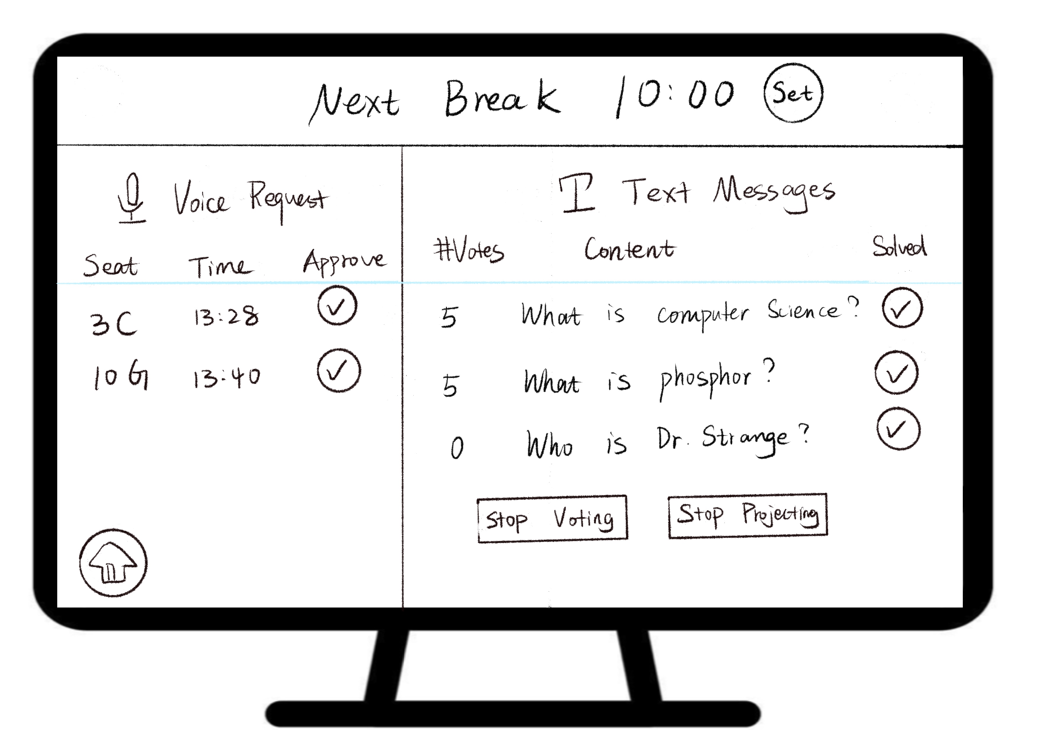
Updated Prototype with Different Types Side by Side
Removing Ability Assumptions
We unintentionally assumed that people are able to see it initially. We realized that this was an unfair assumption for students with different levels of abilities. In an attempt to make our design more inclusive we have added some tactile buttons to the sides of the desks as another way for interactions. The buttons allow the student to quickly record and send a question to the professor as well as navigate around the tablet’s interface. People can also plug in or connect headphones via Bluetooth in order to hear the voice description of their interaction with the tablet. Considering the different levels of abilities that students have, we also attach the corresponding Braille next to the buttons.
Resulting Design
Overview of Digital Mockup
Student Digital Mockup

Student Desk Layout
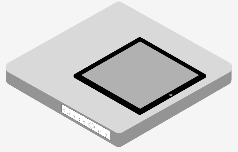
Student Tablet

Student Controller

Student Controller

Communicate Thoughts on Lectures
Subtask 1: Students can express themselves and raise questions via various methods
(1) Text Message
The student clicks on the “Text Message” button.


Default Tablet Screen and Controller.
A keyboard is shown up, with word suggestions enabled. Once finished typing, the student can send the message.
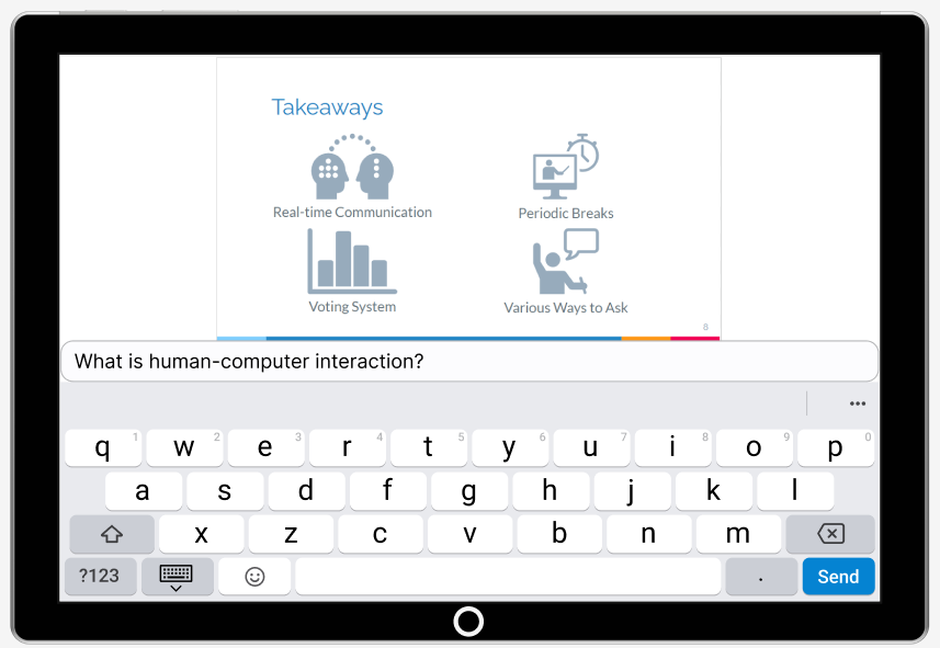
Type Questions with Keyboard.
Students can always view their sent requests and text messages by clicking on the “Sent by You” button. They can also cancel if they want.

Sent By You Screen.
(2) Voice Request
The student clicks on the “Voice Request” button on the tablet screen or the controller to send a voice request to the instructor.
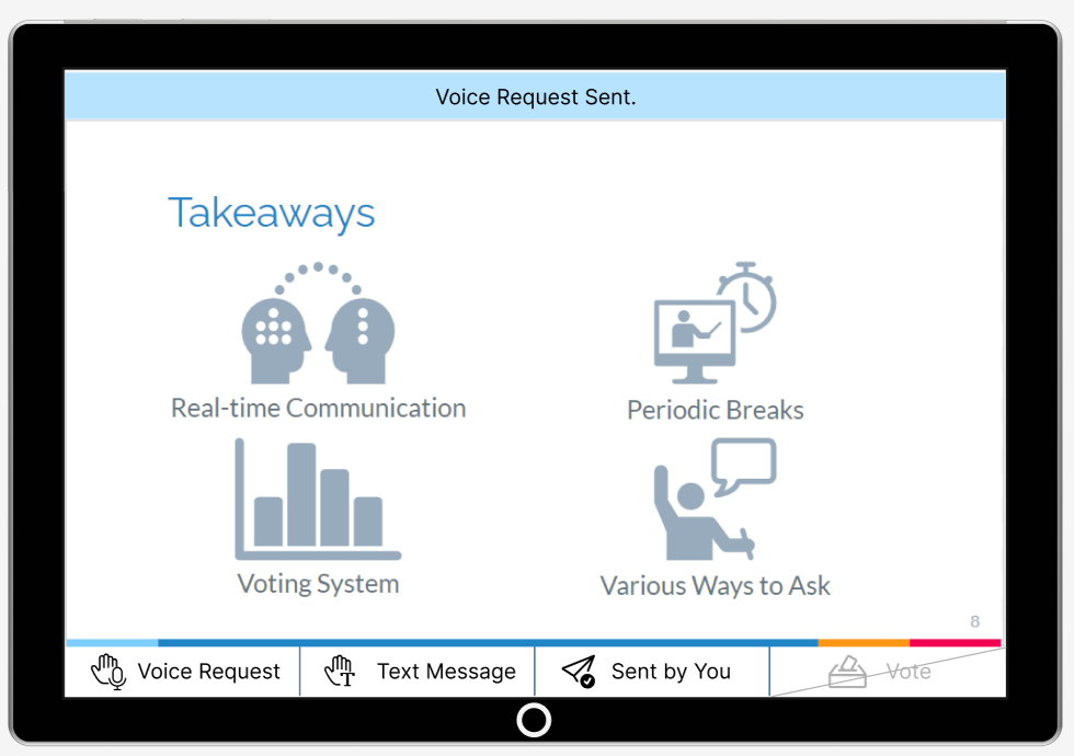
Voice Request Sent Notification.
The voice request is approved by the instructor. Once the student clicks on the “Talk” button, a microphone is shown on the screen.
The student can long-press the microphone button to speak up, which will be broadcasted to the whole classroom. When the student is done, they can exit through the close button.
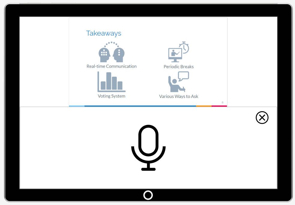
A microphone is Shown after the “Talk” Button is Clicked.
Subtask 2: Instructor adjust pace by incorporating breaks accordingly
It is time for a short break where the instructor can check on students’ questions and feedback.

Class Break Window.
The instructor clicks on the “start” break to notify students, who can use this time to rest.

Class Break Notification.
When the time is up, there is a notification for the class to continue. Instructors can decide whether to extend the break or not.
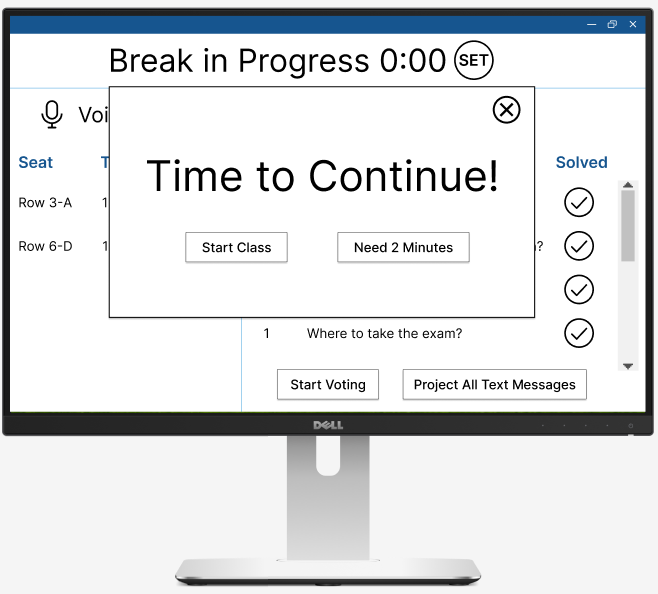
Class Continue Window.

Class Continue Notification.
Resolve Useful and Interesting Common Confusion First
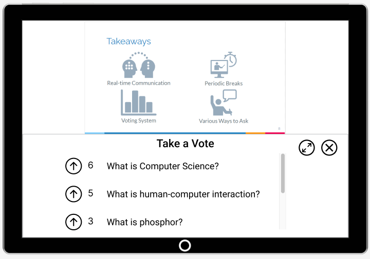
Subtask 1: Students can vote for questions they find helpful
When prompted by the instructor, the voting page will be shown on the screen. Students can press the “up” button to vote for a question.

Voting Screen after Prompted by Instructor.
If students exit the voting screen, they can re-enter by clicking the enabled button “vote”.


Re-enter Voting Screen through Homepage or Controller.
Students Re-vote in the Popped-up Window.
Subtask 2: Instructor resolves questions
(1) Take text questions based on students’ votes
The instructor has a list of questions. They can start the voting process by clicking the “start voting” button.

Default Screen for Text Messages.

Screen after Initiating Voting.
Once the instructor is good with the votes, they press “stop voting” to stop the voting process. All the questions will be ordered based on the number of votes. They can also choose to project all the text messages onto the bigger display screen.

Screen after Projecting Text Messages.
The instructor answers the top-voted questions. Once they finish answering, they can click on the “Solved” button to remove that question from the queue.
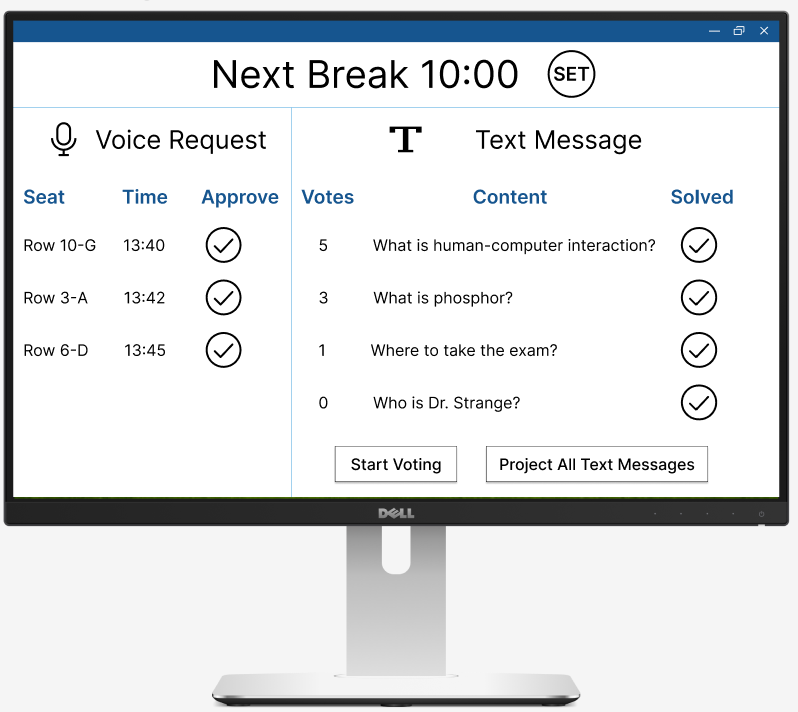
Remove Questions after Solving.
(2) Approve voice requests
The instructor has a view of all the voice requests. They can click on the “tick” button to approve that voice request, allowing students to speak through their microphone.

Default Screen for Voice Request.
That voice request will be removed from the queue since it has been taken.
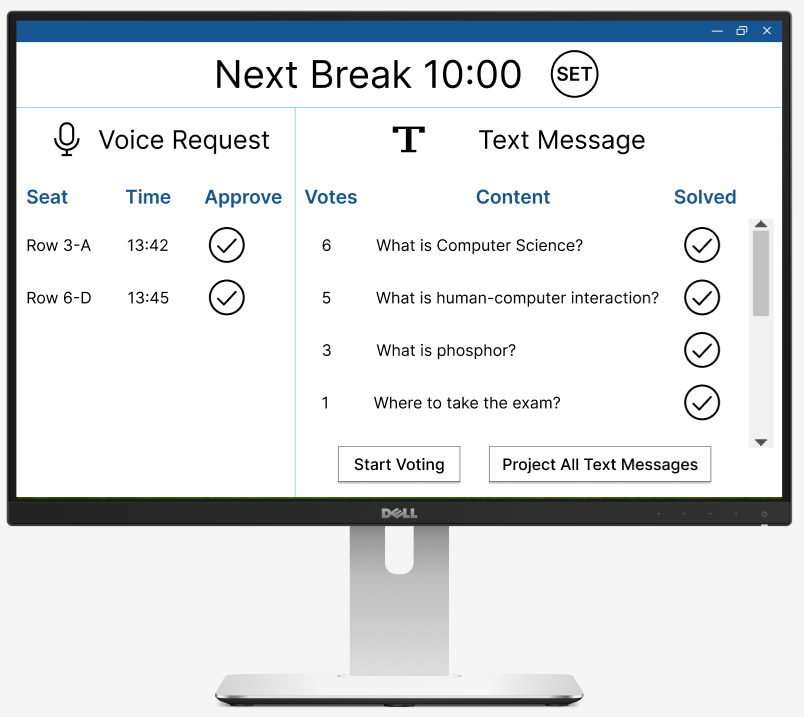
Remove Voice Request after Approval.